Browse the Architizer Jobs Board and apply for architecture and design positions at some of the world’s best firms. Click here to sign up for our Jobs Newsletter.
Less is a Bore. Yes is More. More is More. One may put whichever witty spin on Mies van der Rohe’s much-referenced catchphrase, the original still sounds the most believable. That is, if you know what you’re doing. Thanks to a growing community of CG artists willing to share their knowledge, those interested in architectural visualization are able to acquire incredible technical skills and use them to create pretty much anything. Architectural visualization has come so far that photorealism has become the new industry standard.
As with photography, the field has reached a point in its history in which mere reproduction of reality isn’t enough. And like photography, there is and always will be myriad ways in which practitioners engage with the medium, but the amount of creativity flourishing within the architectural visualization community seems all too disproportionate to the dismissive treatment of their work by the architectural community. Instead of whining about its deceptive nature and treating it as the dark side of the force, perhaps it’s time for architects and visualization artists to transform the art of rendering into something other than a service industry.

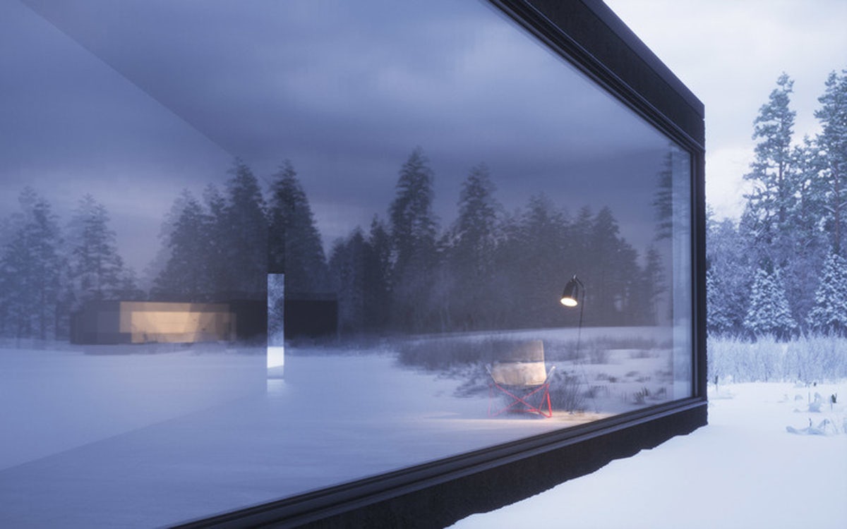
Twin Houses, images by Peter Guthrie
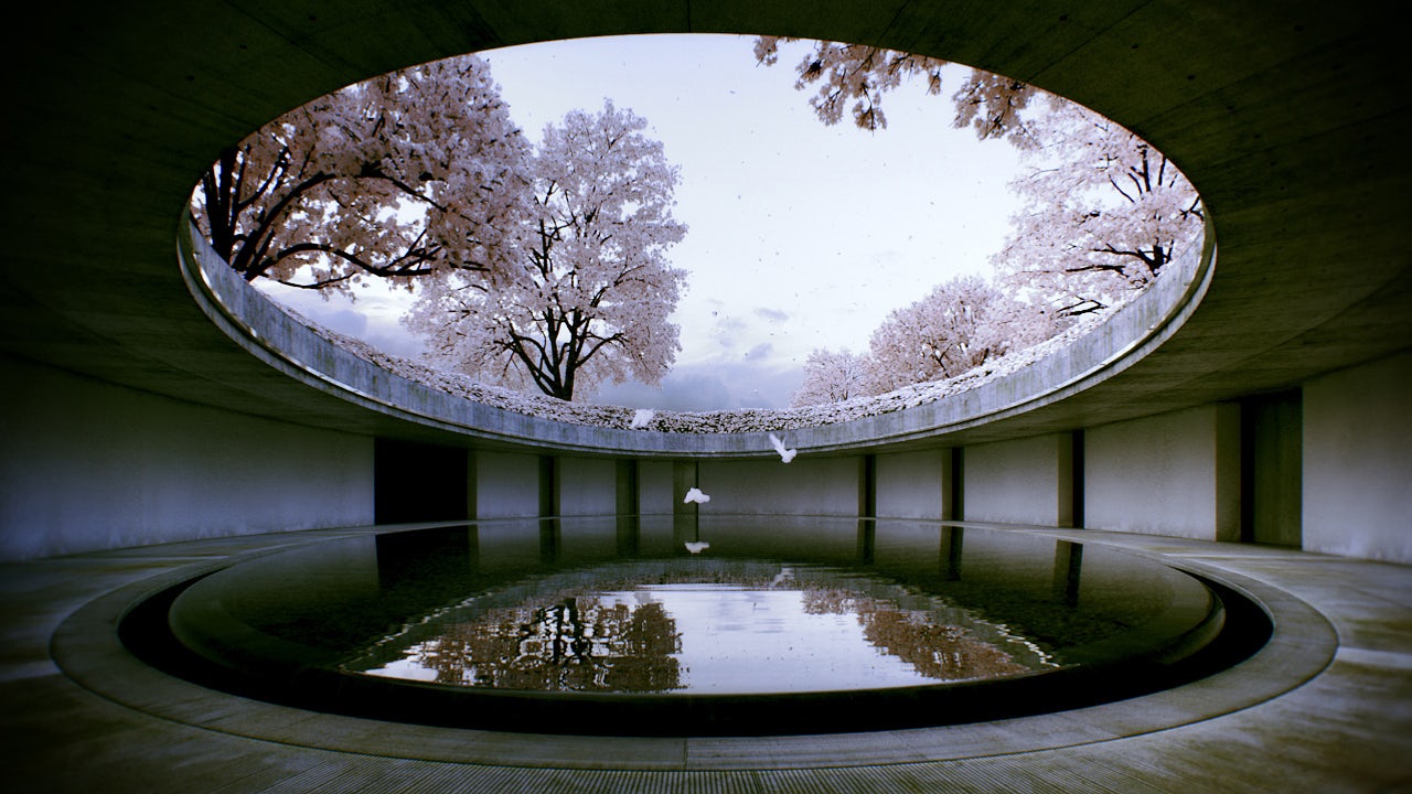
Naoshima – Cherry Blossom, image by Alex Roman
An increasing number of architects are leaving the architectural mainstream and attempting to explore ideas using their strong rendering and animation skills. They are no longer willing to put up with notoriously slow turnover, office hierarchies and insane work hours. Thanks to their rendering skills and background in architecture, these guys are managing to create and market their work at the same time. Less is more.

© Mir AS
The Flying Dutchman, images by MIR
Meanwhile, the market in which architectural offices commission professional visualization firms and freelance artists drives the aesthetics of architectural visualization, demanding that nearly identical images that visually fit into the company’s brand identity. Artists are happy, clients even more so. Now what? How about if, for now, we stopped obsessing over making that pretty life-like picture and spend more time contemplating concepts and storytelling?
One can find tutorials on how to model a Gothic cathedral, simulate explosions, optimize render times, or create icicles, but when it comes to tips on composition, color theory, atmosphere, or storytelling in architectural visualization, the internet is curiously silent. Achieving technical perfection is highly desirable, but it seems that many practitioners hide behind it as an alibi for not spending enough time thinking about what it is they want to say. The examples shown here prove that, as long as there is a strong concept, less is still definitely more.

Kazakh Hero, images by MIR
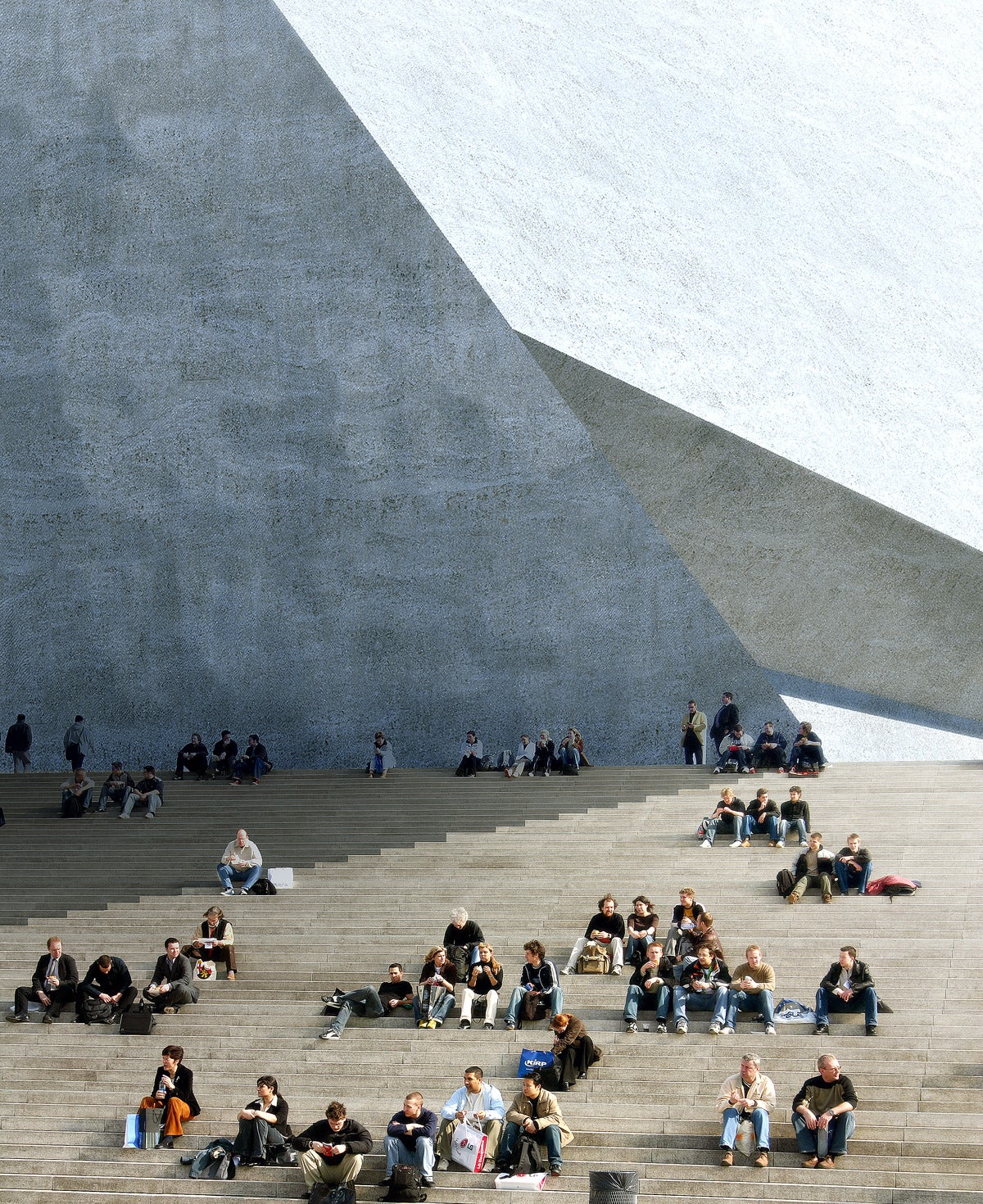
Malmö Concert Hall and Conference Center, images by MIR
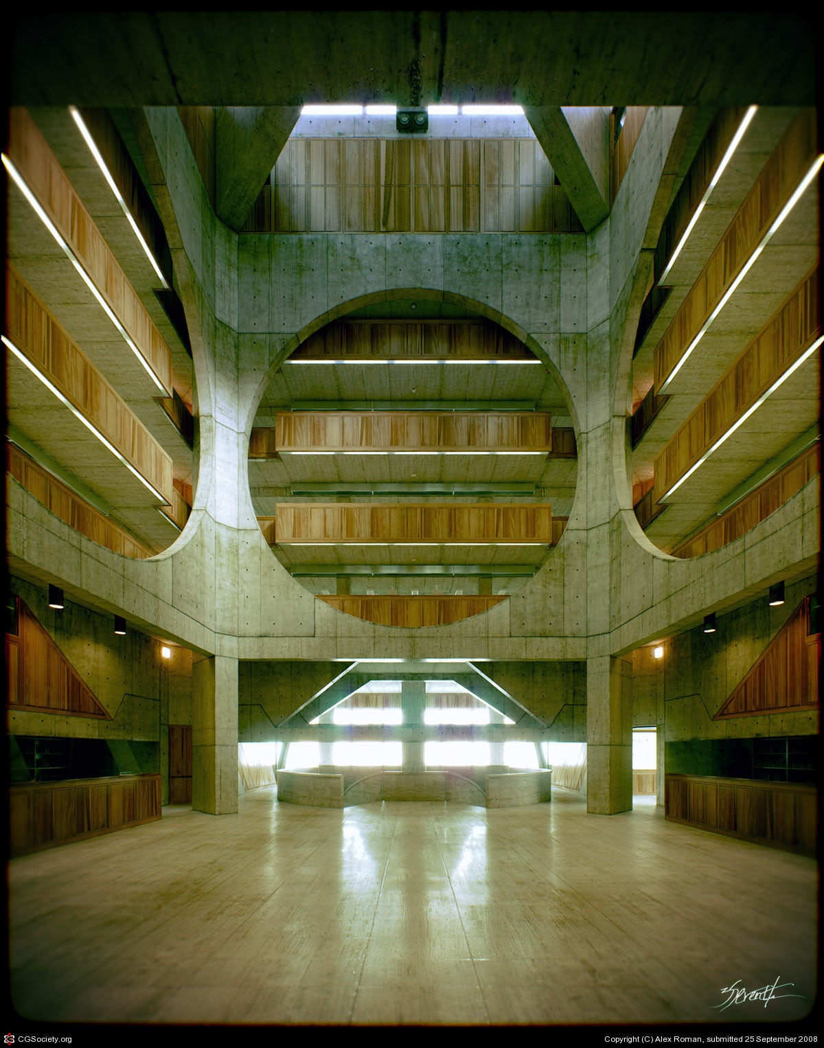
Still from Kahn’s Exeter Short Film by Alex Roman
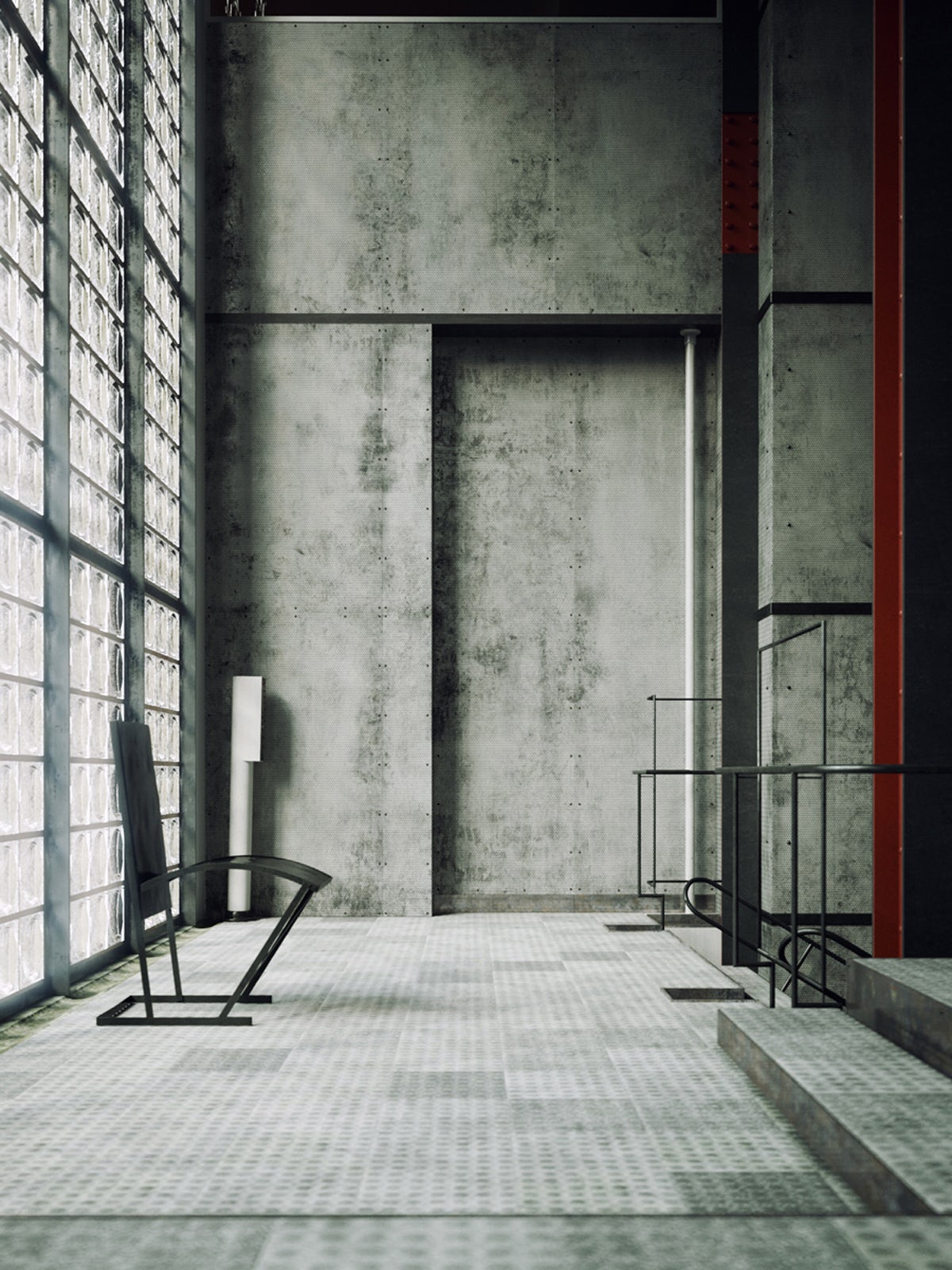


La Maison de Verre, images by Bertrand Benoit
Browse the Architizer Jobs Board and apply for architecture and design positions at some of the world’s best firms. Click here to sign up for our Jobs Newsletter.


