
Alex Hogrefe is the creator of Visualizing Architecture, a blog dedicated to educating people in the art of architectural visualization. He is also part of rendering studio Design Distill, generating compelling illustrations for architects around the world.
Architecture visualization is notorious for producing complex and messy Photoshop files. Sometimes, it’s the little things that can make a big difference, and in my opinion, layer management is one of those little things that many people don’t put enough emphasis on. Properly managing your layers in Photoshop can lead to better efficiency, a more editable file and in many cases better-looking illustrations. Over the years, I have moved toward a system of building up PSD files. This system may not be perfect for everyone but has streamlined my workflow and has led to cleaner looking illustrations.
The problem with PSD files is that they can quickly get out of hand; many of my Photoshop files that I work on easily exceed several hundred layers. Being careless about naming files or not properly grouping them may save a little time in the beginning. However, once you are several hours into Photoshop, the time wasted trying to find the right layers or make changes far exceeds the time saved at the beginning. Not only that; the image itself will start to get messy and unrefined because it becomes difficult to mask layers and control lighting.
I put together an illustration that takes into account a lot of the different types of groups that I typically use in my PSD files. Obviously, the specific groups change from illustration to illustration depending on the type of image, but for the most part, the overall structure remains consistent. One other note: I am in no way saying this is the “right” way to organize PSD files. I am sure there are other ways and even better ways to do this. However, this system works well for me and provides a good amount of flexibility depending on the type of illustration I am working on.

Groups, Masks and Adjustment Layers
Groups
One of the keys to a clean Photoshop file is groups. Groups are folders in the layers palette that contain one or more layers. Groups allow you to collapse many layers down to a single line, allowing you to navigate between several hundred layers quickly. One more big advantage is that you can apply masks to groups, which is useful for editing. A group can be created by clicking the folder icon at the bottom of the layers palette. Layers can then be dragged into the folder one at a time or several at a time.
Masks
A big part of working efficiently and keeping your files extremely editable is by using “nondestructive” methods to edit your layers. The idea is to edit the illustration in a way where changes can be reversed later on down the road. If you’re not using them already, masks are essential for nondestructive editing. I have talked about masks on my site only a few times because they can be difficult to understand at first.
However, they are a lifesaver when it comes to cutting out backgrounds or removing parts of layers. Masks are exactly as they sound, allowing you to mask or hide parts of the layer. Masking is similar to erasing, the key difference being that the mask can be removed later to bring back the area of the layer that was erased. I talked about masks more in depth in my “hatch patterns” post, about midway through.
Adjustment Layers
Just like masks, adjustment layers are nondestructive and allow you to adjust things like levels, contrast, hue, etc., to several layers at once and also reverse the adjustment at any time later on down the road. Adjustment layers act like real layers, allowing one to adjust the strength through opacity or even apply a mask to the adjustment. I don’t use these too much but have found them really useful from time to time.

Organizing the Layers
Above is a screenshot of the layers palette for this illustration. You will quickly notice that everything is grouped. Having everything grouped allows me to collapse all layers and move around the palette more easily. It also forces me to really think about the best place to locate layers so that finding them later won’t be so time-consuming.
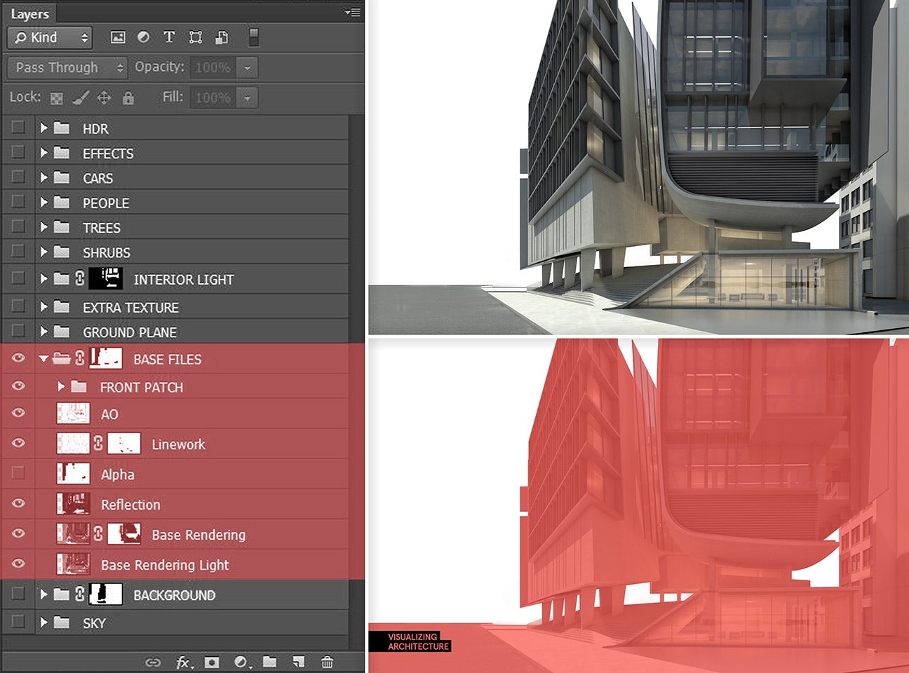
1. Base Files Group
The Photoshop process begins with several images exported from both SketchUp and a render engine such as V-Ray. These images often include the base rendering, a reflections export, refraction export, line work, ambient occlusion pass, z-depth, Alpha, among others. All of these layers are placed in the “BASE FILE” group. These layers represent the core layers from which everything else in the Photoshop file builds off of. Once these layers are compiled, a mask is applied to the group to remove the sky and background elements using the Alpha layer.

2. Sky Group (Below the Base Files Group)
After compiling the base files, I bring in the sky. I like to do this early on because the sky plays a big role in setting the tone of the image. It can impact the coloring and mood, so figuring this out first gives the image good momentum. I will often combine several sky images to get the exact look I am going for. Because I masked out the BASE FILES group, I can simply drag the SKY group below the BASE FILES group and shift and scale the location until I get something that looks good.

3. Background Group (Below the Base Files Group and Above the Sky Group)
Along with the sky, I bring in the background elements, which includes the surrounding site buildings and any landscape not modeled or rendered. The background information comes from many places such as the client, Google Images or Google Street View.

4. Ground Plane Group
The ground plane consists of road textures, sidewalk textures and green areas such as grass. At this point, the entire image has been tweaked and a good base is in place. From here, there will be a lot of detailing with light, cars, people and trees.
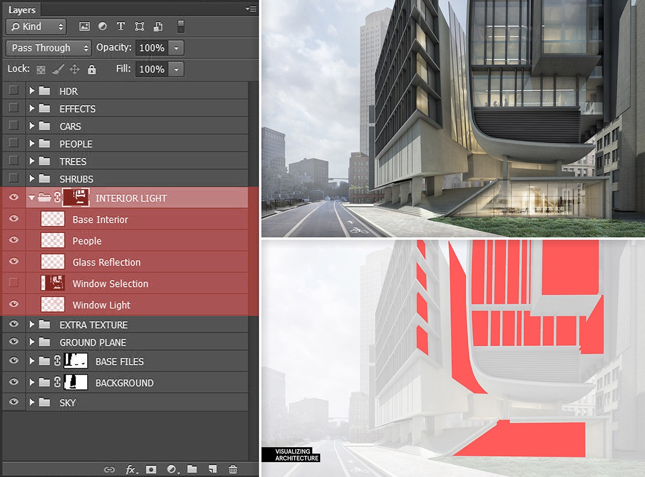
5. Interior Group
In the case of this illustration, there is a lot of glass and interior information. I like to keep this a separate group instead of making these adjustments with the BASE FILES group. The reason being that this group houses all things interior including people, furniture and lights, which can sometimes add up to a ton of layers. The advantage of keeping all of these layers in one group is that I can use one master mask to cut out mullions and define the windows.

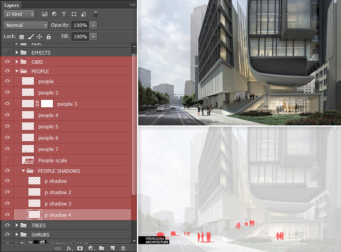
6. Tree, People and Car Groups
Now that there is a good base, sky and ground plane, I begin inserting trees, cars and people. Each category gets its own group folder. Within each one of these groups, there is a subgroup for shadows. I place all of the shadows in a subgroup so that I can control the opacity of all of the shadows at once instead of dealing with opacity individually. This is also important when two shadows overlap. Because it is the group controlling the opacity, shadows overlapping inside the group will blend together instead of overlaying on top of one another.
In many situations, I will have multiple groups of trees and people. Sometimes there are trees in the foreground covering everything and sometimes there are trees in the background behind buildings. This requires separate groups to avoid complicated masking placed in different areas of the layers palette.

7. Effects Group
This group is always at the top of the layers palette and contains layers such as color overlays, sun glare, fog and overall adjustments. Introduction of this group varies; it sometimes happens early on in the process, but other times not until the very end. Either way, this group is one of the most important in giving the illustration character and atmosphere.

8. HDR/Plugins Group
Occasionally, I will tweak the final illustration using some plug-ins/filters like Topaz Labs Adjust to bring out some detail and refine the coloring. This involves copying and merging all of the layers (ctrl+alt+shift+e) to get a single layer that the plug-in can be applied to. I keep this group at the top so that I can lower the opacity and lessen the effects of the plug-in if needed.
To clarify, most of my illustrations follow this structure with some minor deviation depending on the illustration type. For the purpose of this tutorial, I carefully named every layer, but in the heat of the moment, it is not always possible to take the time to perfectly name everything. I do, however, make a point to thoroughly name groups in all caps no matter how bad the time crunch. The point is to have a solid system in place that ultimately leads to a more efficient workflow and produces cleaner work.

All images by Alex Hogrefe. This post first appeared on Visualizing Architecture. Enjoy this article? Check out the other features in our series on “The Art of Rendering”:
How to Add Realistic Textures to Your Architectural Visualizations in Photoshop
How to Bring Your SketchUp Model to Life Using Nothing but Photoshop
Create a Stunning Watercolor Visual Using SketchUp, AutoCAD and Photoshop
Methanoia Reveals the Story Behind Architecture’s Most Striking Visualizations
7 Magical Demonstrations of Hyper-Real Environments
When Architectural Visualization Gets It Right: Victor Enrich’s Surreal Art
A Photographic Approach to Architectural Visualization
Alex Hogrefe Creates Stunning Architectural Visualizations Using SketchUp and Photoshop
4 Unique Approaches to Architectural Visualization
Architizer is building tech tools to help power your practice: Click here to sign up now. Are you a manufacturer looking to connect with architects? Click here.


