

Ronen Bekerman is an industry leader in Architectural Visualization who hosts in-depth tutorials on his specialist blog. Architizer is pleased to present a selection of these guides written by some of the world’s best rendering artists.
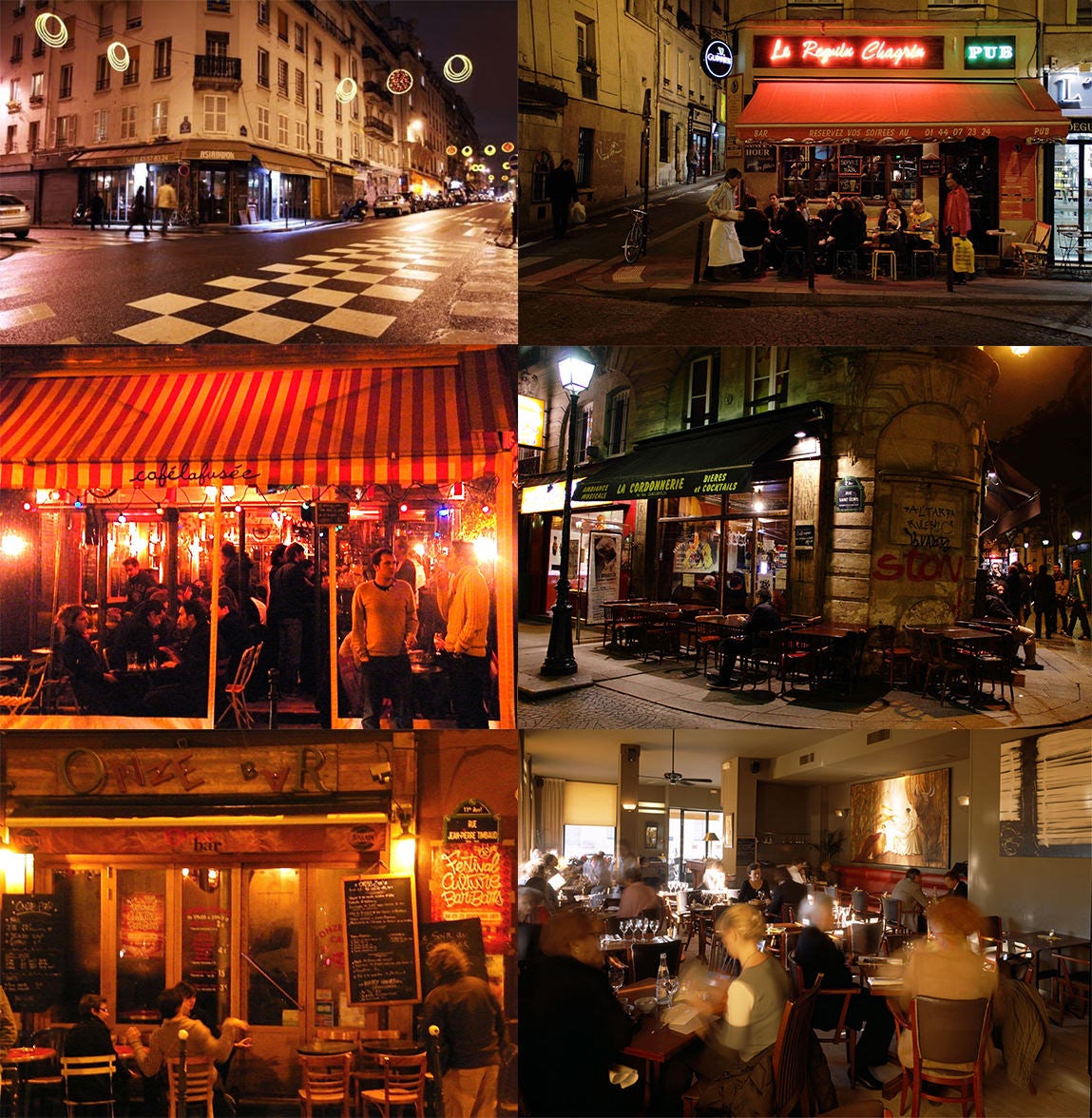
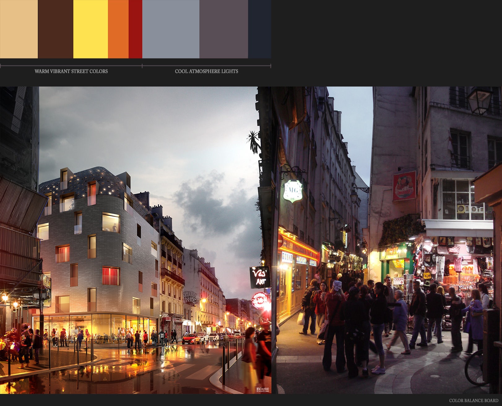
Thomas Vournazos ofSlashcube posted a super-cool-looking visual of Hotel 114 — a small project he did for a hotel design in the Oberkampf area in Paris — on the forums. Showcasing a vibrant, nightlife scenario was the main goal for this image and was very nicely done. Using Maxon’s Cinema 4D along with Corona Renderer for C4D, Thomas describes his workflow in this article for all to learn from. Enjoy!
Introduction
Hotel 114 is a project I did around May 2015. This was a commissioned image for Herault Arnod Architects, and it is for a new hotel and restaurant in Oberkampf, a well-known nightlife area in Paris. The nighttime mood was chosen to amplify the vibrant mood of the area. The architects love to have conceptual images, so this one was a nice challenge for me. The whole process for this one image was a week, so things had to be structured.
Concept and References
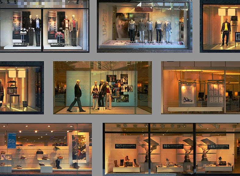
When starting a project, the main focus in Slashcube is collecting references. This is not news to you I’m sure, reading previous making-ofs on the blog. Usually, references help me to both understand the site and also try to make a solid base for the image itself.
Here are some of the images I used as a mood board. From here onward, color values, contrast and composition were based on the references I collected.
I will explain just a little about the render process because the main focus is on the post-process stage.
3D Modeling
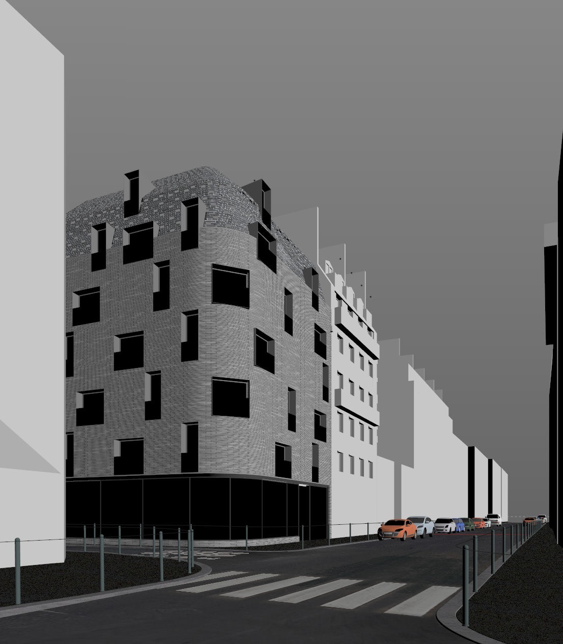
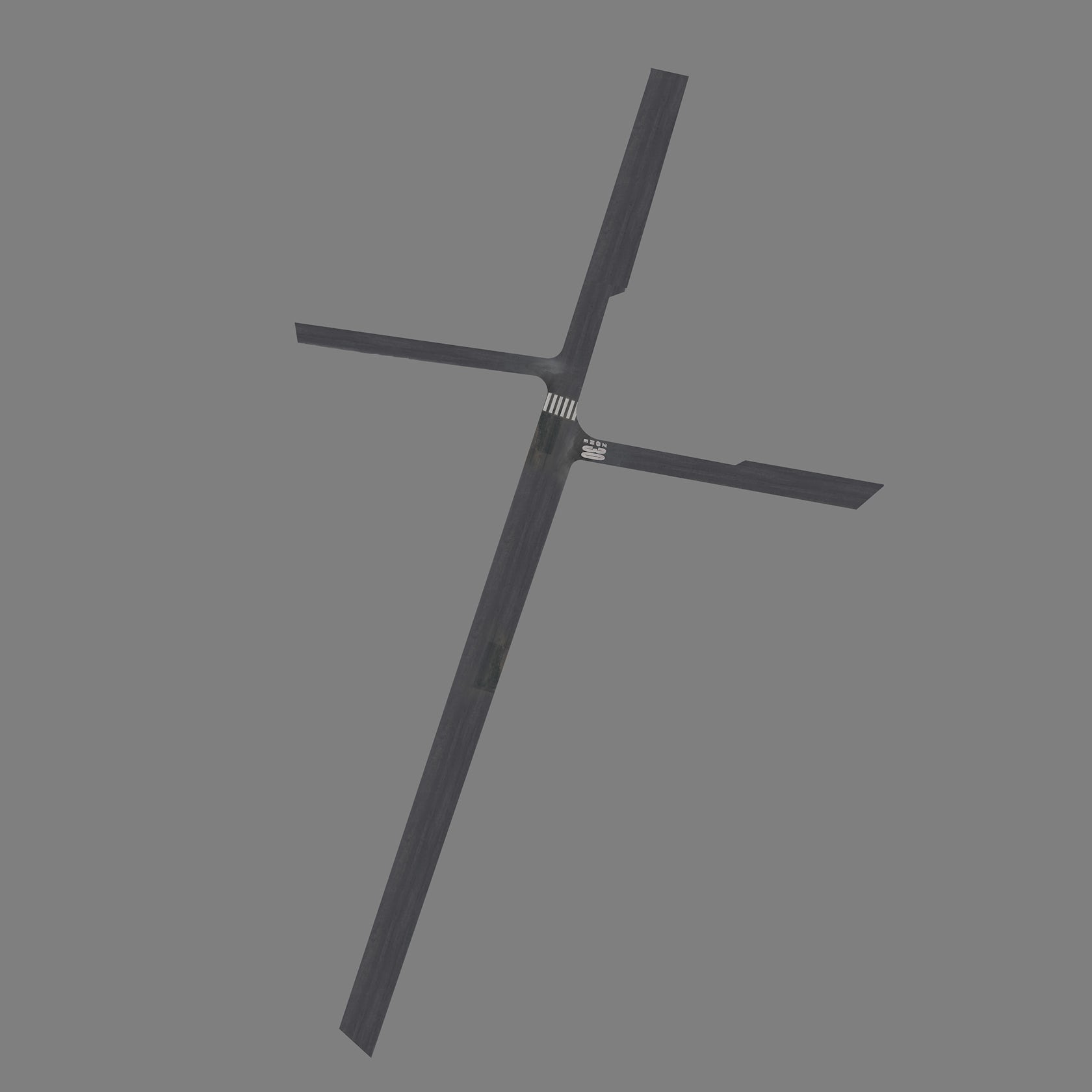
Most of the model was given to me by the design team. The only things I had to take care of were things like the street, the sidewalks, the ground floor interior and some tweaking on the façade.
All modeling was done in Maxon Cinema 4D. Here you see the viewport from the model itself:
Texture and Materials
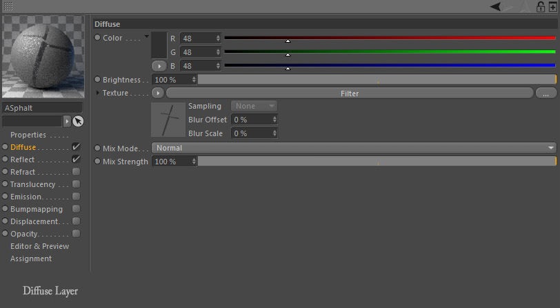
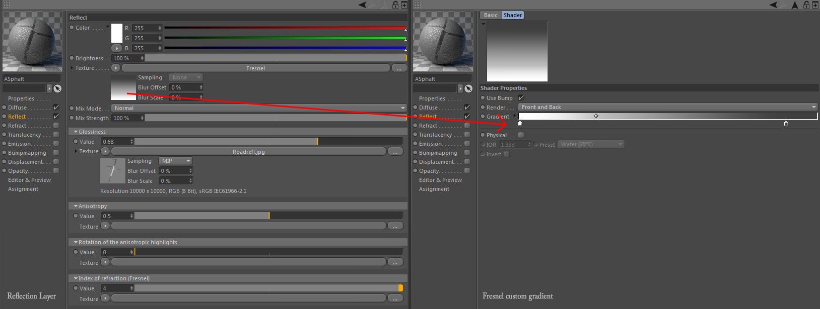
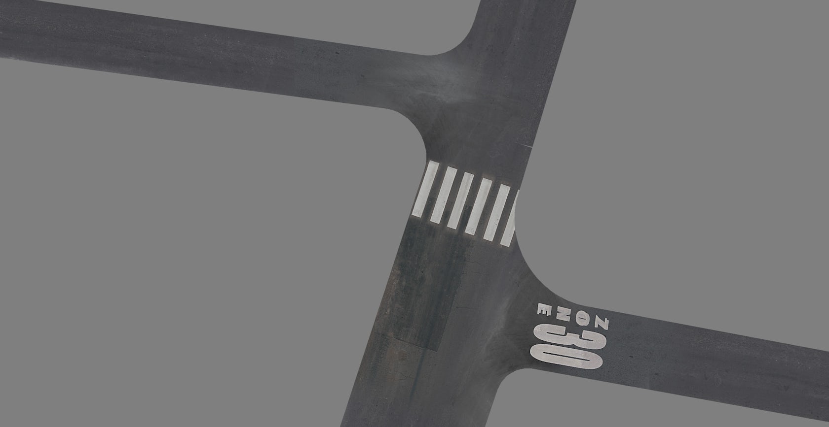
The only thing I wanted to have in the image from the rendering itself (before postproduction) was the road reflecting the building and all its lights as natural as possible. So, I had to make a wet-looking road. Doing this in 3D was a lot easier. For the final render, I used Corona Renderer for C4D. This program was still in early alpha as of May 2015, but I was really happy with what I was able to do with it.
A lot of custom brushing in Photoshop and a 15K texture for the whole street was more than enough. Again, the basic map was the reflection map. Most of the textures came from Textures.com.
The material was nothing too special — a simple shader with a reflectance map and a bit of a fresnel map to control the specular reflection of the shader.
Lighting
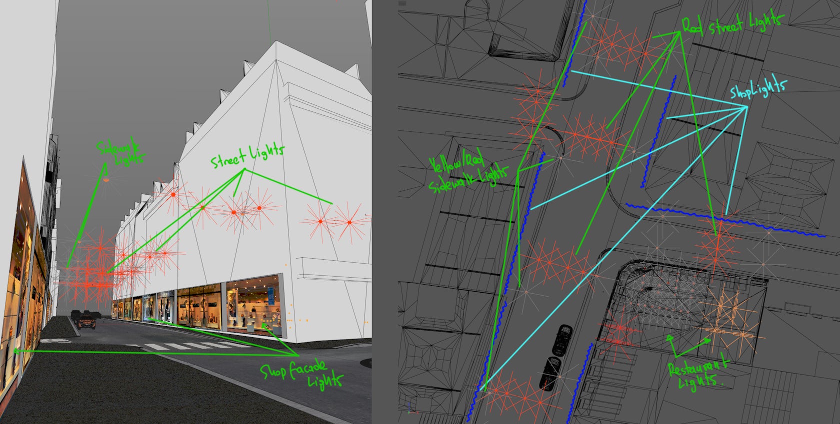
Most important of all is the lighting!
I played with a combination of area lights for road lights, area and spot lights for the restaurant lights and some custom JPG shop façades for lighting the ground floors of the surrounding buildings, simulating the shops on the ground floors. I kept them hidden from the camera but visible on reflections.
In general, I like to have a more random, chaotic placement for the light sources so it works like a natural “noise.” The light propagation feels better in the end due to this.
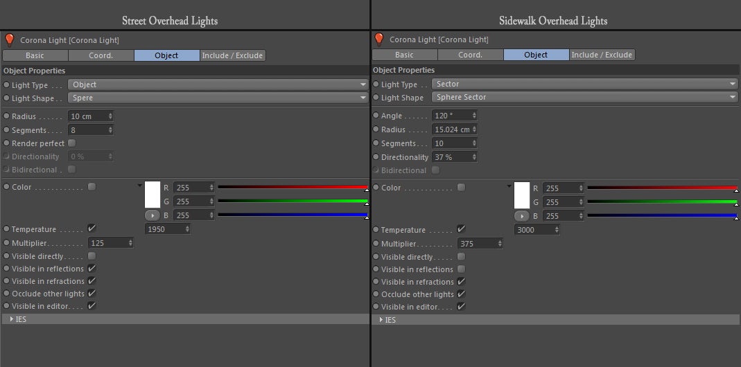
Above you can see the light setup for the artificial lights. I tweaked them using temperature values and not with the simple color picker. With this scene, temperatures were from 1,950K for the street lights and 3,000K for the sidewalk lights.
Sky
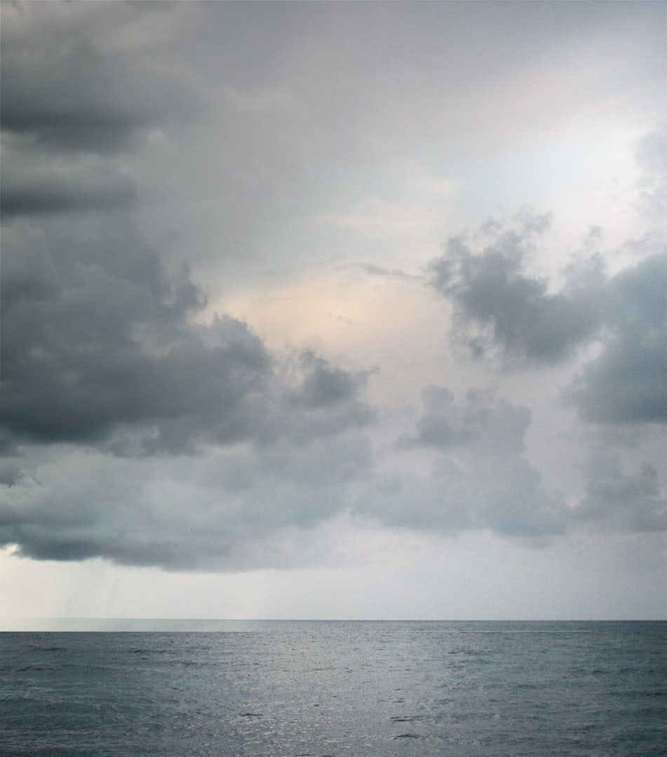
For the main light source, I played a bit with HDRi skies. The perfect balance between corona light intensities and sky color balance was with Peter Guthrie’s 2009 HDRi sky.
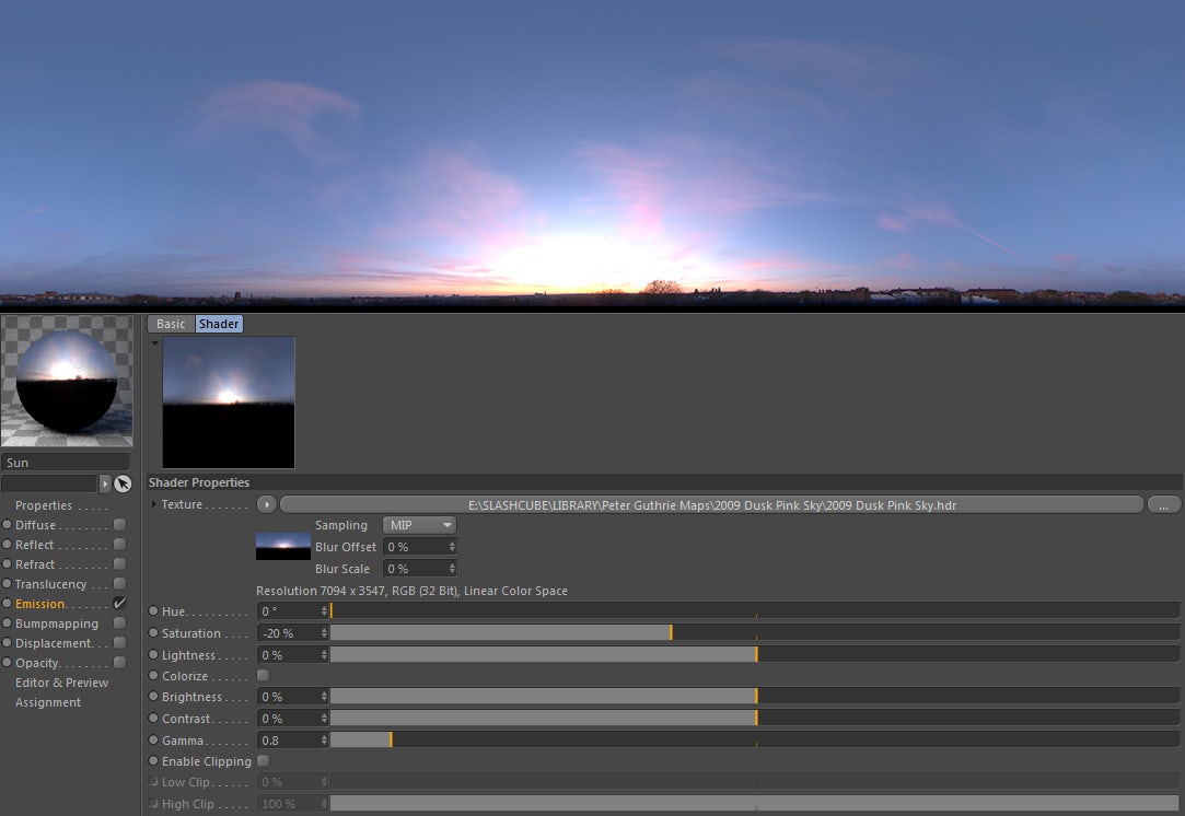
Usually, I also try to lower the overall saturation of the sky a little, toning down what is initially too vibrant of an evening sky for my taste.
Rendering
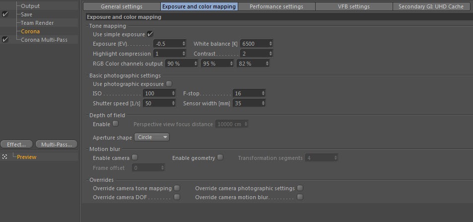
Corona Renderer is quite easy on settings. I just keep the default settings.
The only things I had to control were overall exposures and the highlight compression. But this is a project-related issue, so it fits the needs of each project differently.
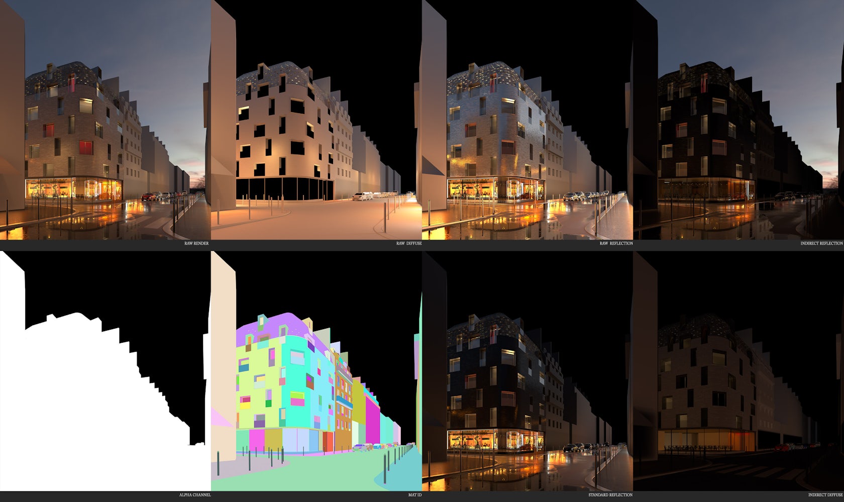
Great and worthy of mention are the channels you can have from Corona Renderer for C4D. From simple Raw Diffuse to Indirect Reflection, I found that Corona has lots of choices for me to post-process things I want in Photoshop. On the next chapter, I will show the series of channels I like working with.
Post-Process: Basic Values and Color Scheme
It all comes to this now. Most important are values and then colors. I always use a reference to compare my values and to extract my colors from.
Sometimes I might only use one image as reference, other times it can be two or three images like in this project. Using a black and white adjustment layer, I can check where my contrast is all the time. I build a base for my contrast, using a reference and sometimes an early sketch. This way I know that my values will be exactly where I want them to be.
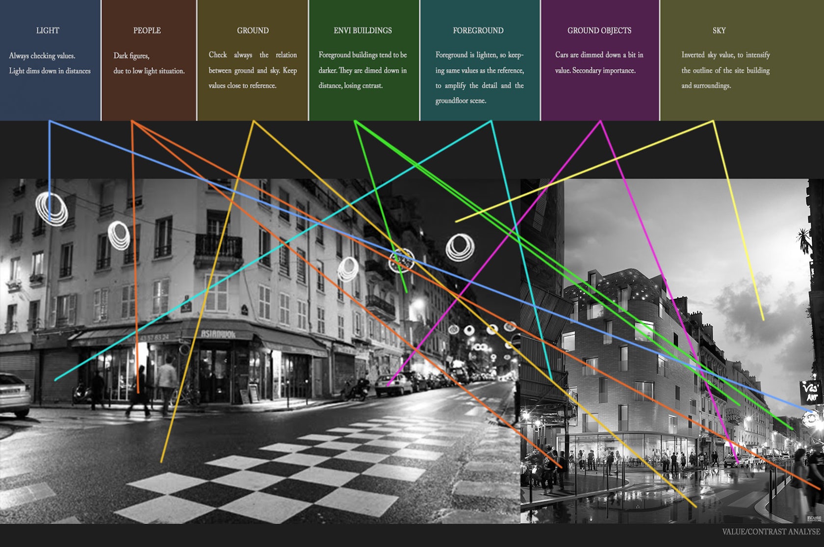
Color can come second inside the post-process. If the values are solid, color can be controlled. Again, based on references, I can keep an eye on my colors so that I don’t lose the sense I want to have in the end. Constructing a basic color scheme is always important. Again, references are key, so gather as many as possible!
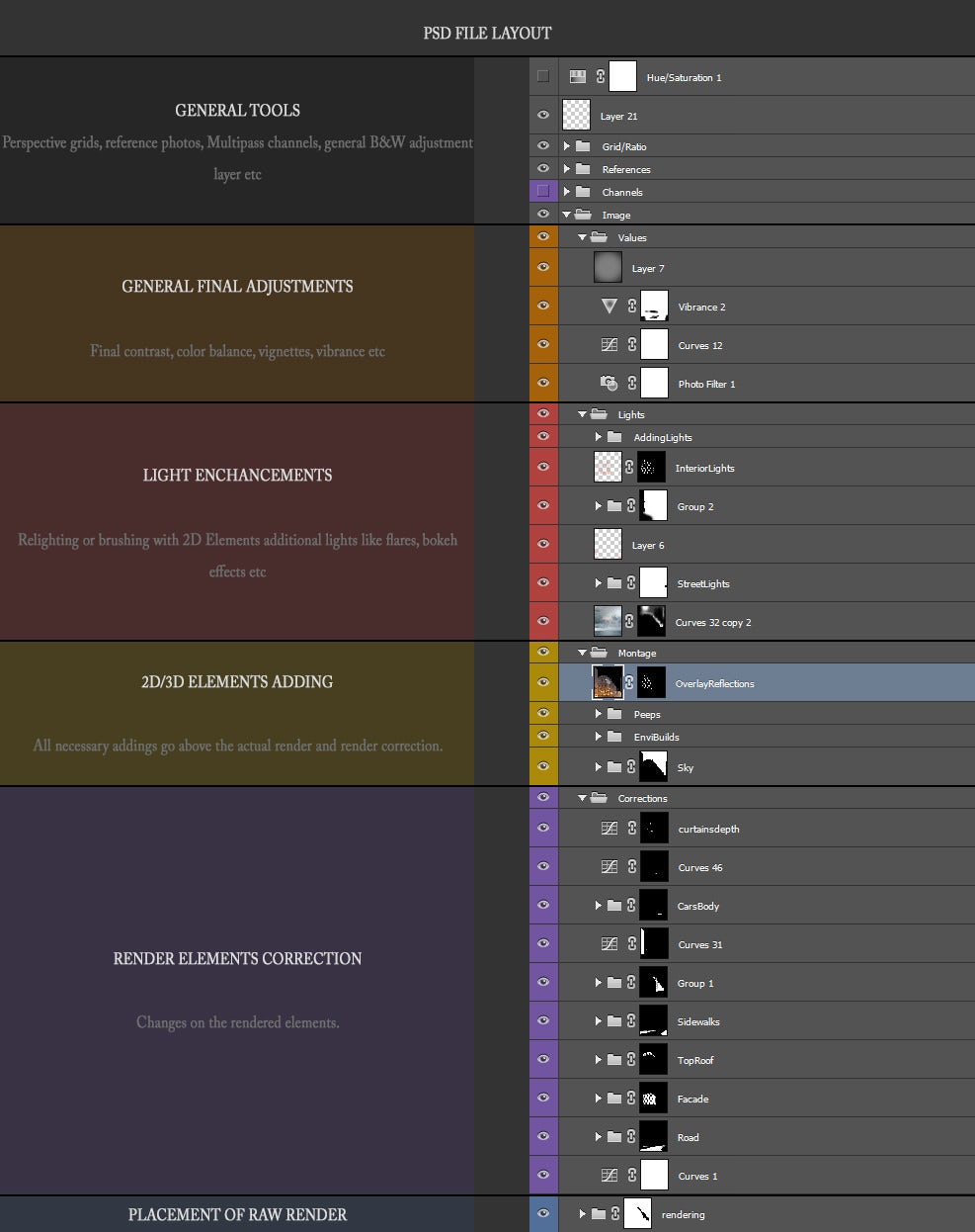
PSD File Layout
Now, this is my personal way of organizing a PSD file. I have managed to work for a long time like this, so now I cannot really change it much. It is helpful and well-organized, and it can help you out, particularly with really big files.
The Process
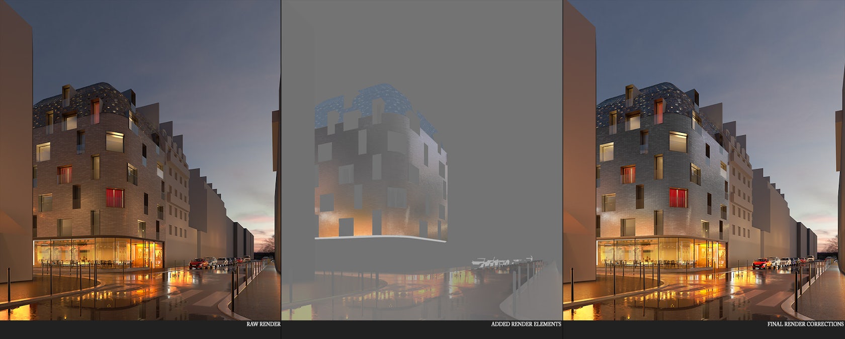
The image was rendered at 5K resolution along with channels I always use (Mat ID, Alpha, Reflection, Diffuse, etc.). Here is the raw rendering and all the channels I used for this one.
Correcting Rendering Elements
Starting from the rendering, I had to bring the façade and the street on the level I wanted it. Checking contrast and values is just one basic first step. I had to make the brick façade more reflective due to demand and also bring it to a more whitish color. Also, as in the reference image, the street had to be fixed, too, just a little to match my reference image.
Constructing 2D/3D Elements: The Sky
Sky is the first thing I try to solve. A solid ground and sky pairing is essential to every project. In this case, a slight, moody bright sky, not too vibrant or blue, was the key.
The Hotel 114 is a new design, so I had to place it in the real environment. Here you can see the site as it is now:
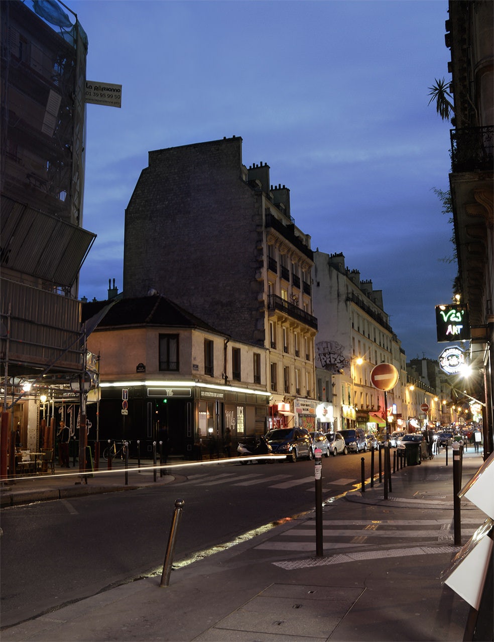
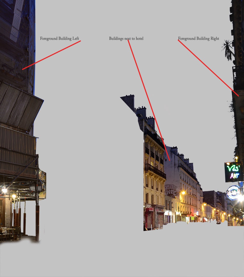
Adjacent Buildings
I had to break the 2D buildings’ information down into three levels because it seemed a lot easier to ensure correct scale and positioning. I used a variety of photos the architect’s team provided me with to benefit as much as possible from resolution and avoid blurry or low-res images.
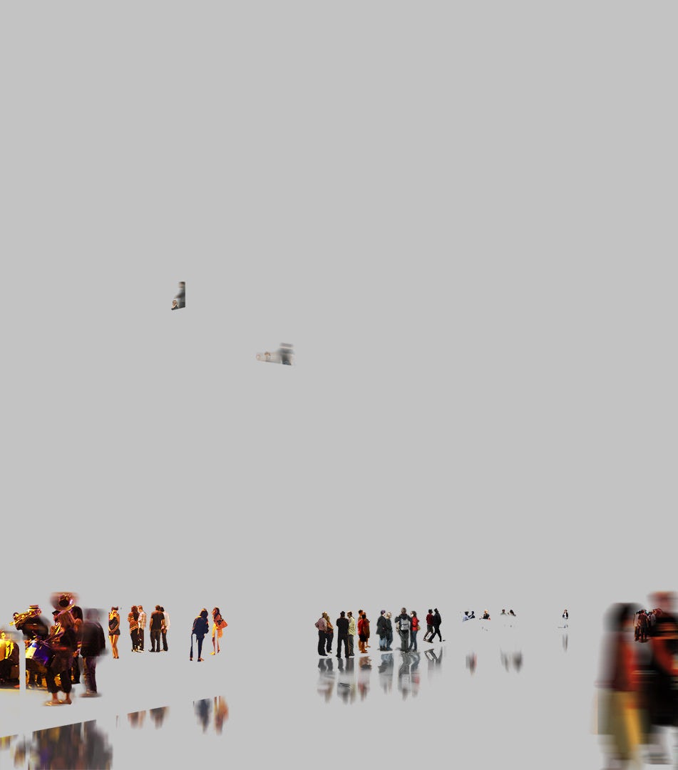
2D People
Finding and placing people is the most time-consuming thing for me. But they help create the scenario and bring a dynamic feel, along with contrast and color, to the scene. They are essential to the image, making it great if done right … or ruining it otherwise!
Reflections on the wet road were done by flattening all people, stamping them with a rotated stamp brush and smudging a bit to give noise from the water waves and the asphalt surface.
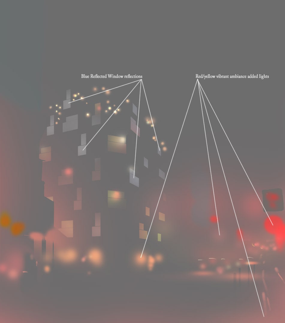
Light Enhancements
After all the 2D Montages, the light enhancement always brings the final image a lot closer to being realistic. Usually, working with a combination of layers on screen mode, I add ambience to my existing light sources.
You don’t have to exaggerate. Usually I keep my brush opacity to 20 percent max and keep my colors not too vibrant. If you keep light brushes, the light will be a lot more natural in the end. Avoid doing this step in just five or 10 minutes!
In this case, I added a bit more red ambience on the streetlights along with some more yellow and orange light in the interior spaces. I also brought in a little blue toward the top of the building, simulating the sky reflection on the glossy bricks.
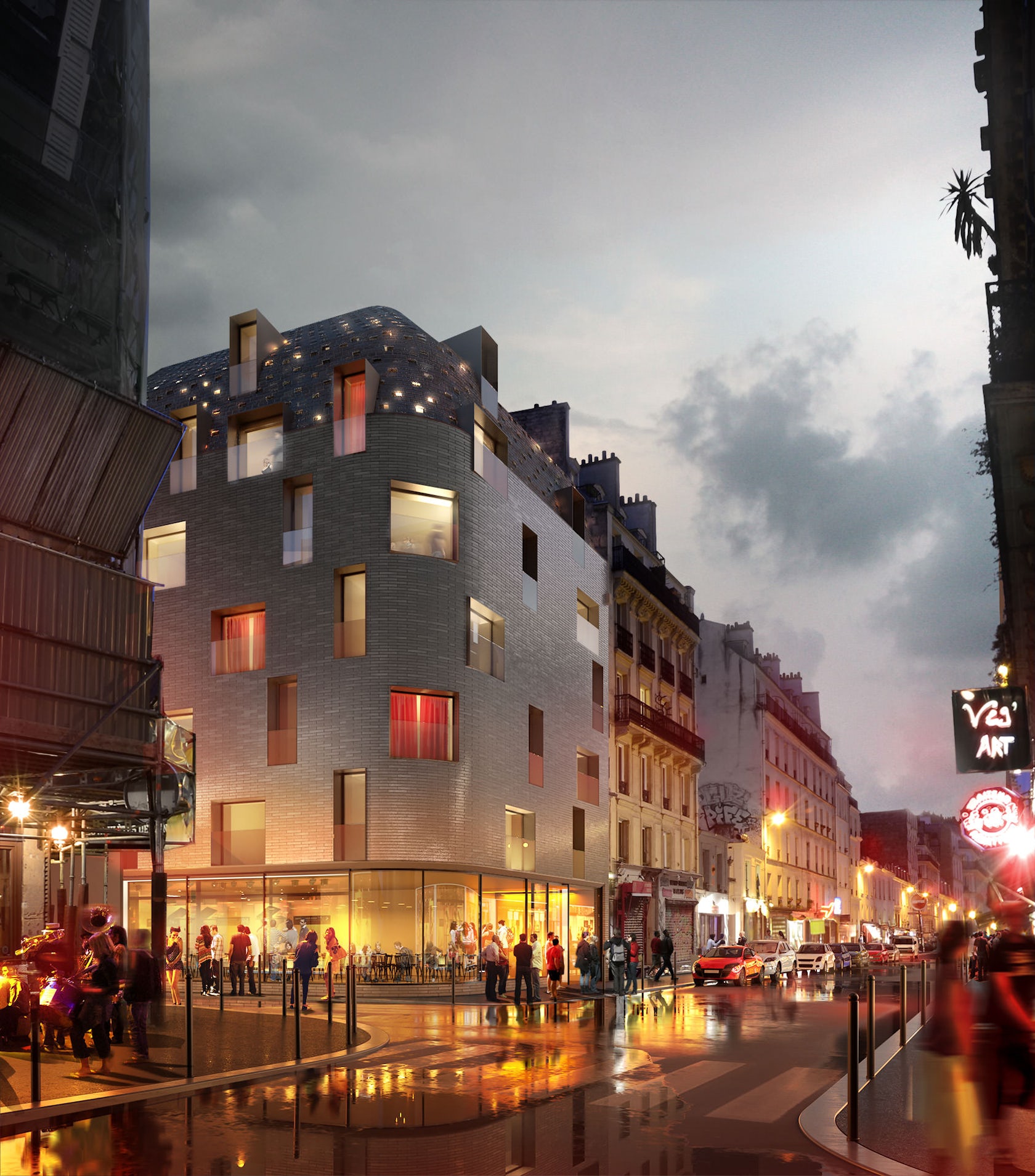
Final Adjustments
For this one, there wasn’t much to do as a polishing touch. I tweaked the general color a little to be less blue. I added more of a highlight on the curve to make it more “punchy” and added a light vignette to darken the lower foreground part of the image a bit.
I try not to take color out too much. I avoid using desaturation and prefer to change hues instead. This way the image feels more natural and doesn’t look flat. Sometimes, in the end, I work with a bit less vibrancy, but only locally.
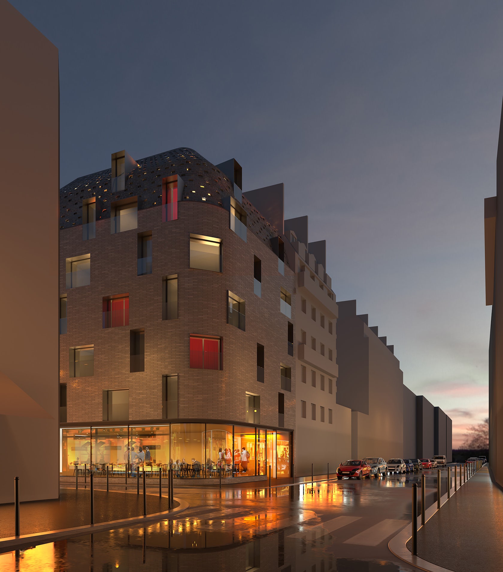
Here is the final image with all the above put together:
I also made a small time-lapse video with the PSD process … but a bit more cinematic. Check it out and let us know what you think!
So that’s all. I want to thank Ronen for this opportunity to share some stuff!
Cheers,
Thomas
Check out these other amazing how-to features from our “Art of Rendering” series:
How to Create “Lugano Lake House” Using SketchUp, V-Ray and Photoshop
How to Create “House on the Lake” Using Corona Renderer
How to Create “Arrival” Using SketchUp, V-Ray and Photoshop
How “Cliff House” Was Brought to Life Using V-Ray and Photoshop
Showcase your visionary architectural concepts: The 2026 Vision Awards features categories that reward UNBUILT projects presenting bold ideas for the future of architecture. Take advantage of early bird pricing before April 17th.


