Ronen Bekerman is an industry leader in Architectural Visualization who hosts in-depth tutorials on his specialist blog. Architizer is pleased to present a selection of these guides written by some of the world’s best rendering artists.
Rafal Barnas is the founder of UNIQUE VISION STUDIO. He is interested in various creative fields connected with visual arts: architecture, digital and concept art, animation, film, music and journalism. Barnas undertakes creative projects that are accomplished on the basis of an independently developed creative approach in which the main workload is focused on the idea, concept, thought and high aestheticism.
Pushing on with the exploration of the various workflows in architectural visualization, I’m presenting you today the unique works of Barnas. Contrasting the previous article about a Photographic Approach in ArchViz by Lasse Rode, you can tag Rafal’s methods as postwork heavy. When compared with the usual Photoshop techniques, Barnas is way out there doing his own thing — a UNIQUE VISION STUDIO indeed! I previously featured some of his work. Here, in his own words, Barnas presents how he approaches a project with a number of examples. Enjoy!
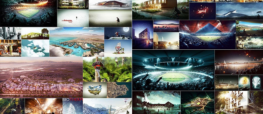
The work of Rafal Barnas; via UNIQUE VISION STUDIO
Introduction
Let me start by stating an important rule that I follow: When working on visualizations, I reach for various techniques, and I approach each project individually!
Concept and Target
Being aware of the target — the final effect that I want to achieve for the particular project I work on — is always a priority. Once the concept has a clear shape in my head, I can already say that the major part of the work has been completed. Everything that happens after can only be considered as a development of the first stage. Always being aware of the final effect makes it impossible to get off track or to waste the idea on insignificant details.
When I have an idea that both my client and I find exciting, I think about how to make it real. Choosing proper techniques, design and tools is absolutely crucial as it determines not only the final effect, but also the pace of work. I refuse to approach different projects equally, as is frequently practiced by fellow designers. Creativity in finding new ways brings many benefits. On one hand, it allows me to always be passionate about my work. It also helps me develop and learn and makes every new project a stimulating challenge.
At the same time, the appropriate choice of techniques and tools positively influences the final shape of the projects. Let’s see some examples …
1. Plastic surgery and animated cutouts
When working with Franta Group, one of my responsibilities was to create visualizations and animations of a hospital and a hotel. The basis for both was an already-existing but rundown object that, according to the initial projects, was supposed to be super-structured revitalized, and its function was to be changed.
First, I was asked to perform a kind of a plastic surgery on the buildings of a hospital complex in Chrzów. I was put in a position of a doctor, and the hospital was my patient. The assignment was to do a photo shoot with the “patient” and then to perform several beauty treatments that would enable visualizing the objects after rebuilding. The results can be seen here:

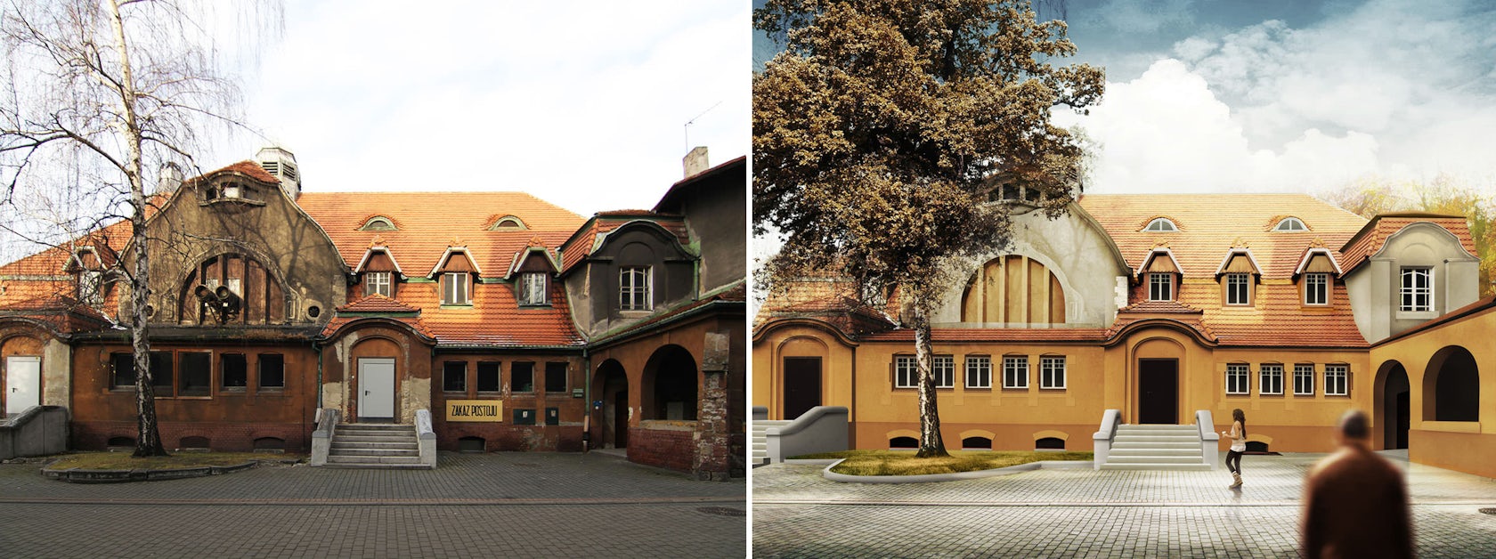
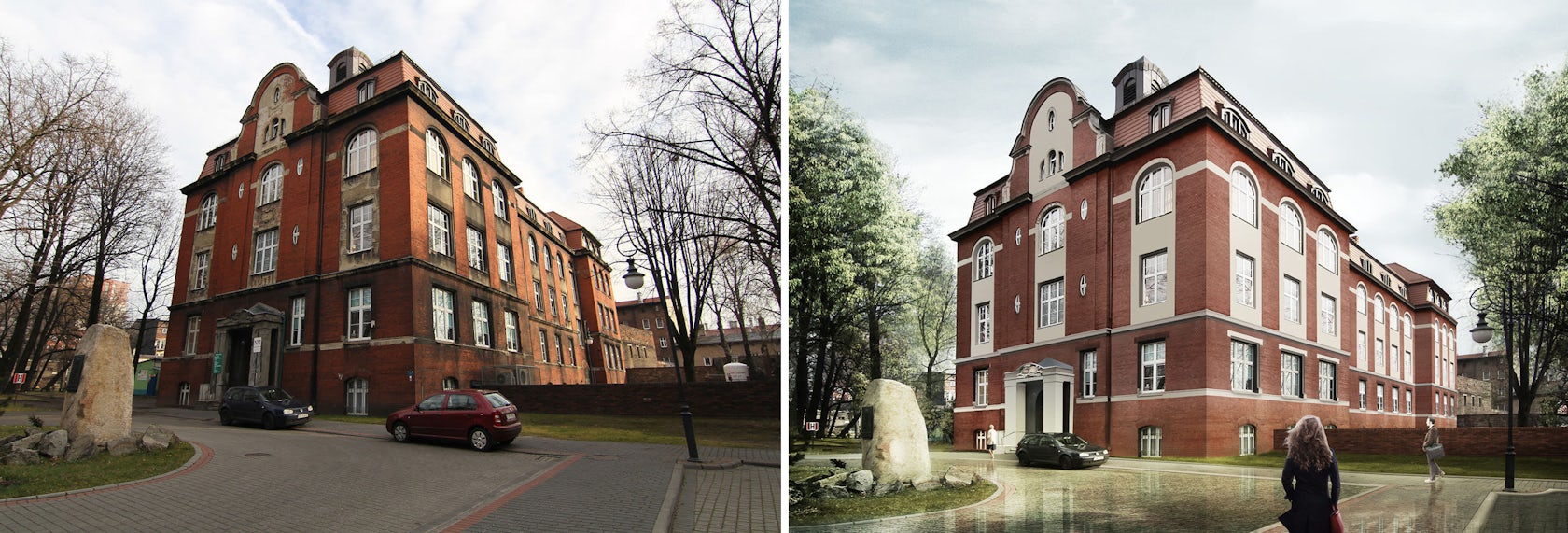
Some of the buildings required work based on their existing structures, while others had to be created from scratch. In all cases, the building was given a heavy makeover, and I used similar techniques and procedures for every part. In the first stage, I was doing a photo shoot. At my work, I use the Canon 7D. On the basis of architect’s’ drawings and with the help of SketchUp, I created a 3D model of the redesigned buildings. The rest of the work was done in Photoshop.
When working on a the short animation of the hotel, I decided to give it the feel of a cutout and the appearance of a painted picture.

Above is the photo I started with (top left), the final result (top right) and the animation. For the animation, I used a stop-motion technique. Individual frames were prepared in Photoshop, and the final montage was done in Adobe After Effects. Such elements like hands, brushes or a cropping person were done in a very simple way. It was enough to quickly take some photos of my own hands.
2. Precise visualization without a 3D model
The task here was to create visualizations for the Krakow architects’ projects that would later take part in an international competition for the best concept of revitalization of Nowa Huta. Illustrations had to present a vast public area, Aleja Róż and its surroundings. Therefore, I decided to take one widescreen picture.
As a basis, I used several pictures of its current condition and a very basic 3D model that could outline the height and geometry of objects. This simplistic model was necessary for precision and proper perspective. I excluded the possibility of creating a precise model of the designed area as it included numerous details, very little architecture and greens.


Work on the model would have been time-consuming and exhausting, so I decided to do it in Photoshop environment. Above you can see selected stages of the process. At my work I use a Wacom tablet, so very often the process of creating visualizations looks and feels like painting.
3. From architectural model to visualization
What if I want to make an effective visual presentation of a project but modeling and working with 3D software makes me sick? I would still like to have nice (GREAT) visualizations, but I completely lack the patience to prepare, arrange and wait for the rendering. What then?
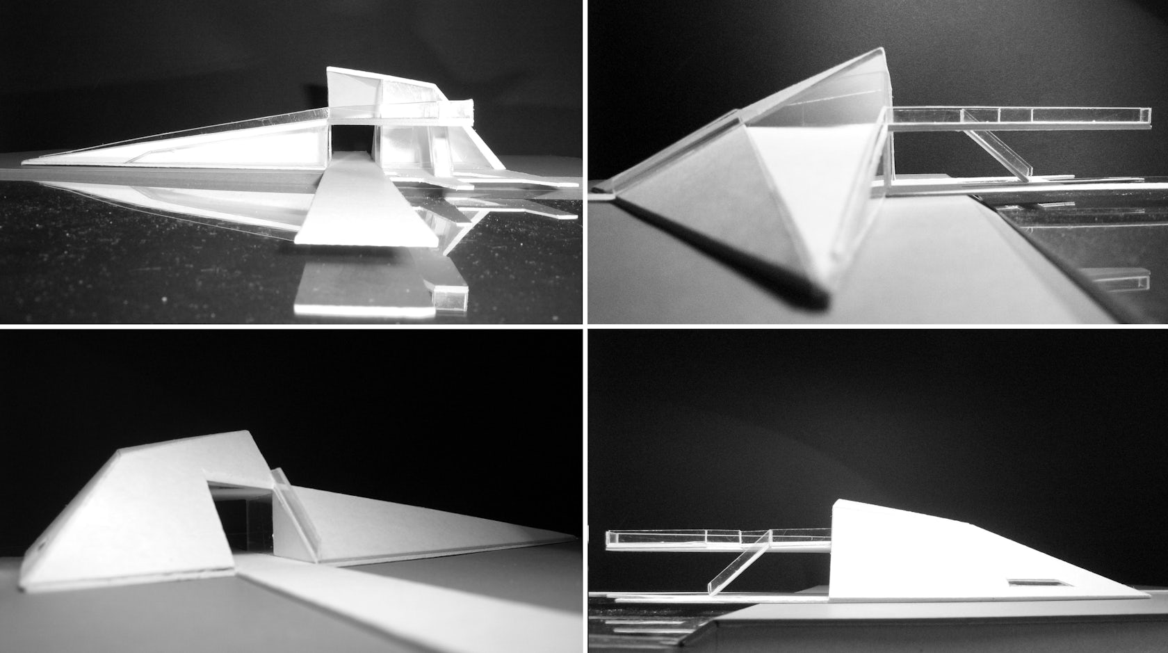
It turns out that an architectural model — a simple, linear 3D model built in just a few minutes or even a quick sketch — can make the basis for the project. In this way, I created visualizations for a project that I was working on a few years ago: the Harbor. The starting point was to shoot photos of an architectural scale model.
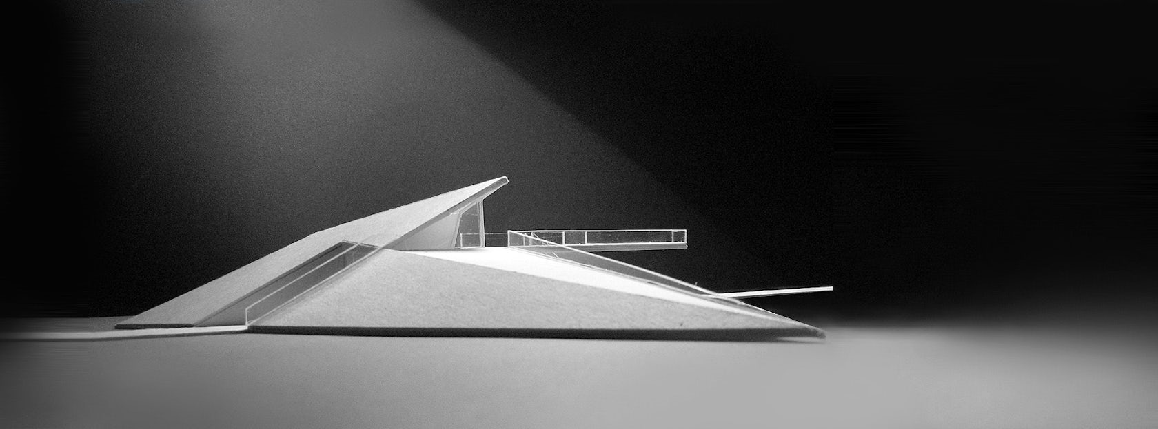
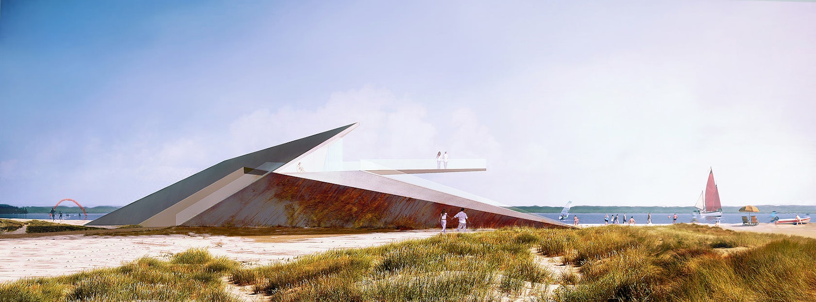
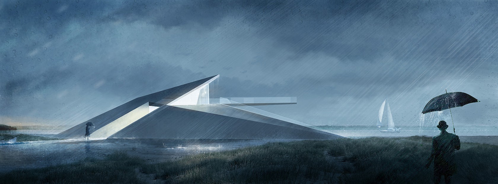
The first image above shows the model photo that I selected, while the second two photos are the final paintings based on the model. The following video illustrates the process:
When designing, I am in favor of combining various techniques that can work in a harmonious way. Everything has its beginning in the head, somewhere among various thoughts and ideas, with continuity in sketching, simple architectural model, working 3D model, technical 2D drawings. Such correlation enables fluent and highly conscious development of the concepts and helps maintaining control over the space, function and aesthetics at the same time.
4. SketchUp line work painted as final visual
When working on the visualizations of my independent project of an aviation museum I used simple, linear pictures exported from the SketchUp. The whole postproduction painting process was done inside Photoshop. Here is the exported line work from SketchUp:

… And here is Wacom + Me / Painted result:
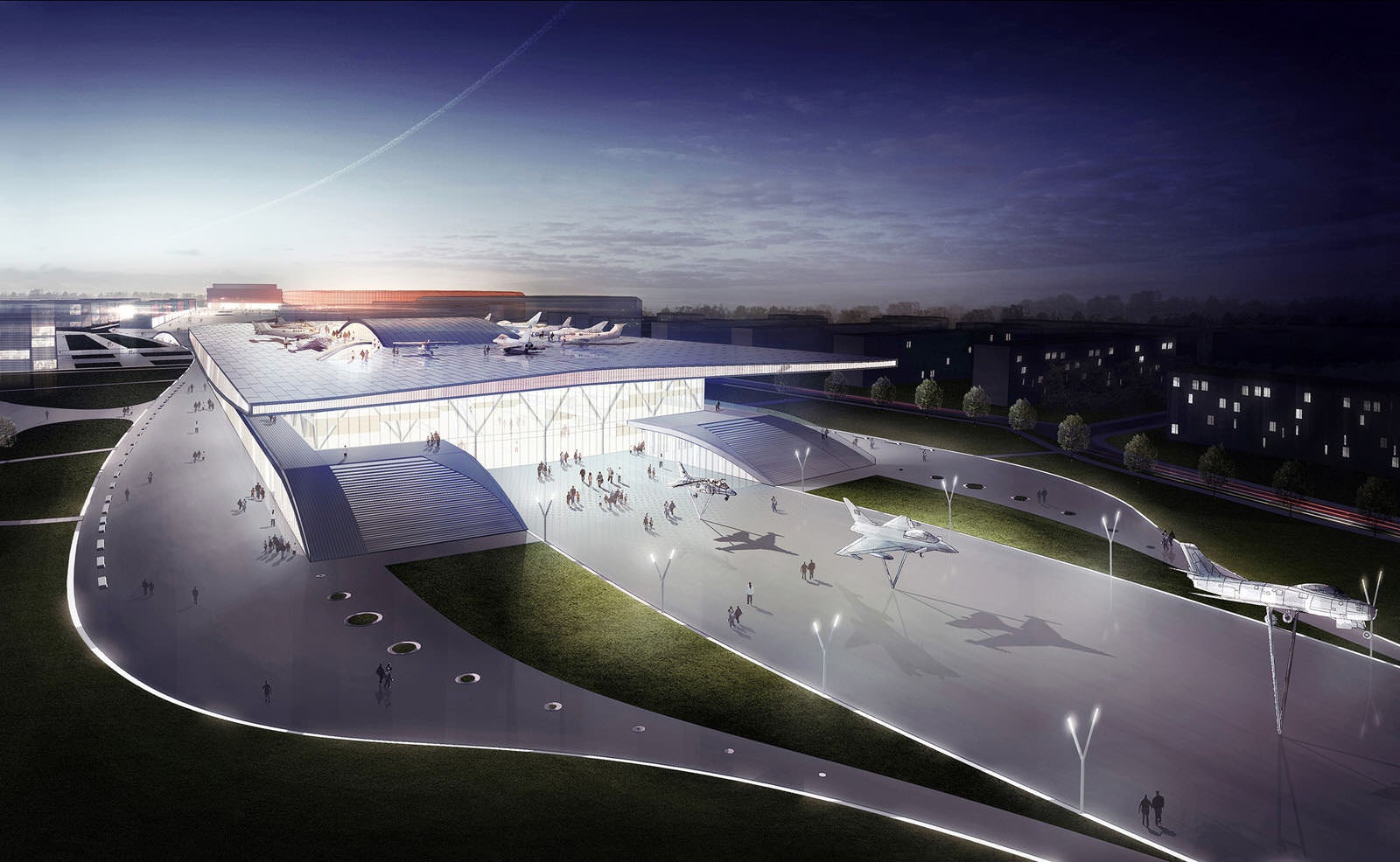
The visualizations I did for Jems Architekci of the LKS Stadium and Sport Complex also started with linear renders exported from SketchUp. I added to that the power of V-Ray to get the basic clay rendering and shading frame and then did a massive amount of postproduction inside Photoshop, painted with the help of my Wacom tablet mostly — several stages of this shown below, together with the final result.
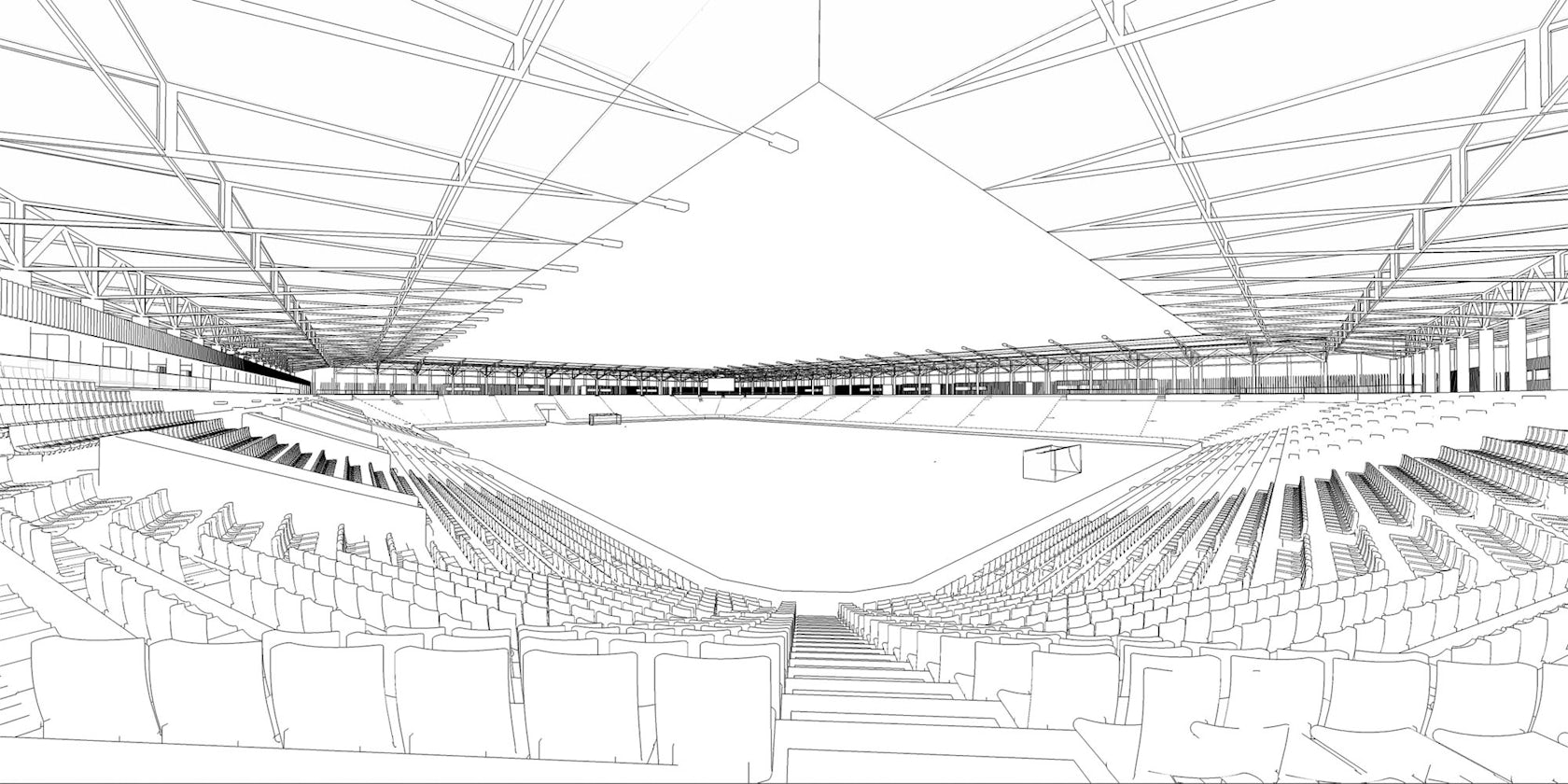
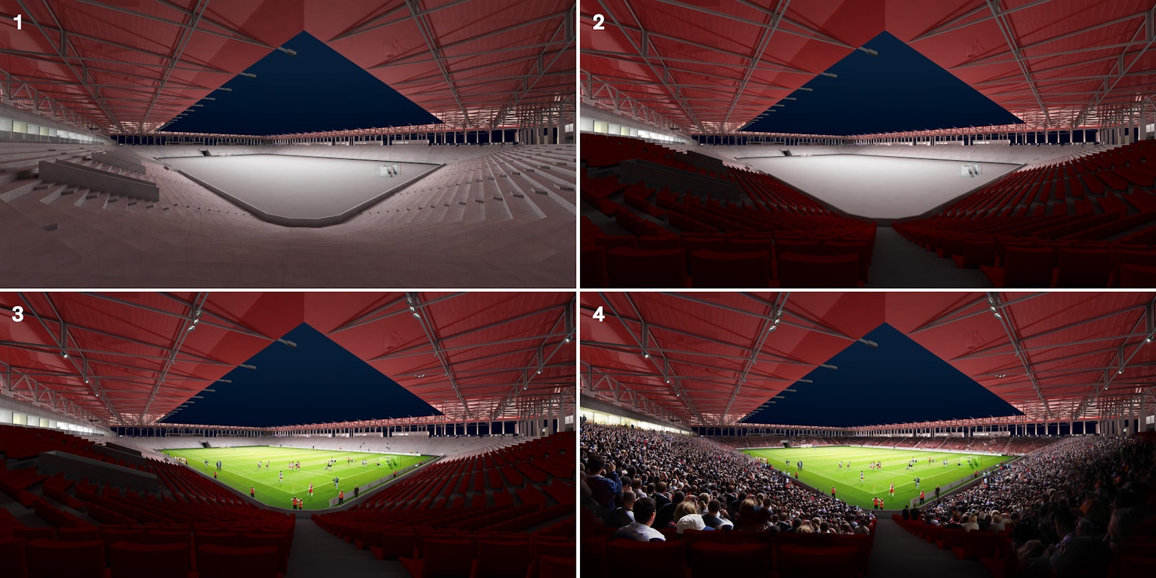
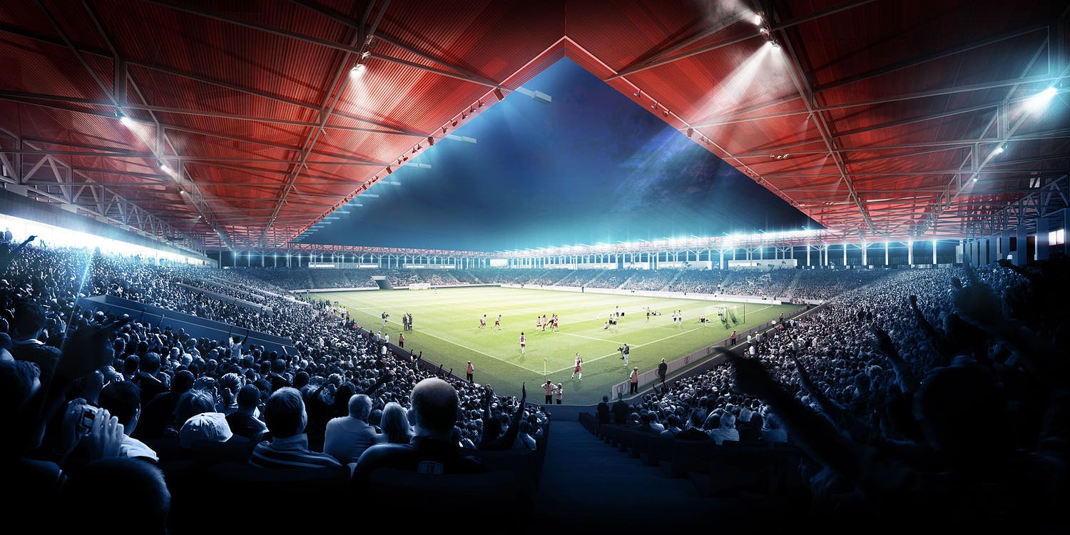
Here’s the animation I created in AE out of all the layers made in Photoshop:
This article was first published on Ronen Bekerman Architectural Visualization Blog in April 2013 and refers to software available at that time. Enjoy this article? Check out the other features in our series on “The Art of Rendering”:
Showcase your visionary architectural concepts: The 2026 Vision Awards features categories that reward UNBUILT projects presenting bold ideas for the future of architecture. Take advantage of early bird pricing before April 17th.


