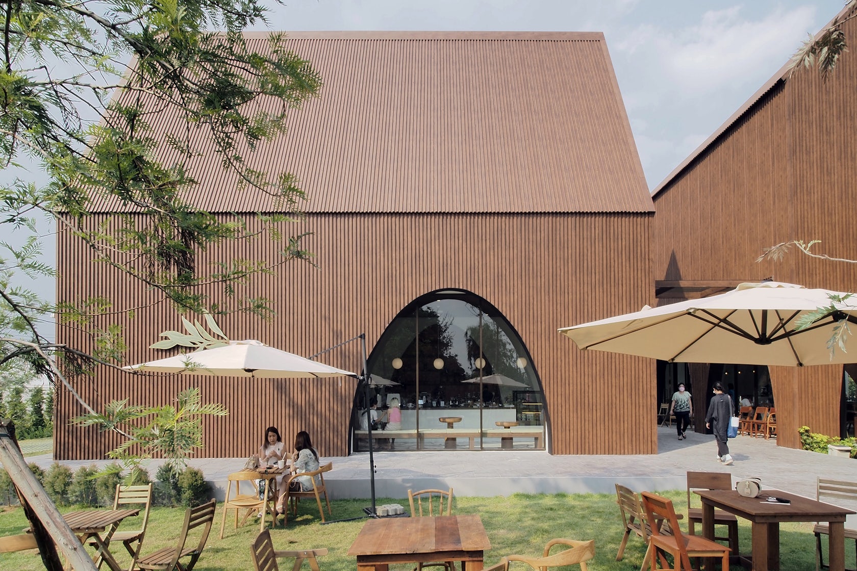
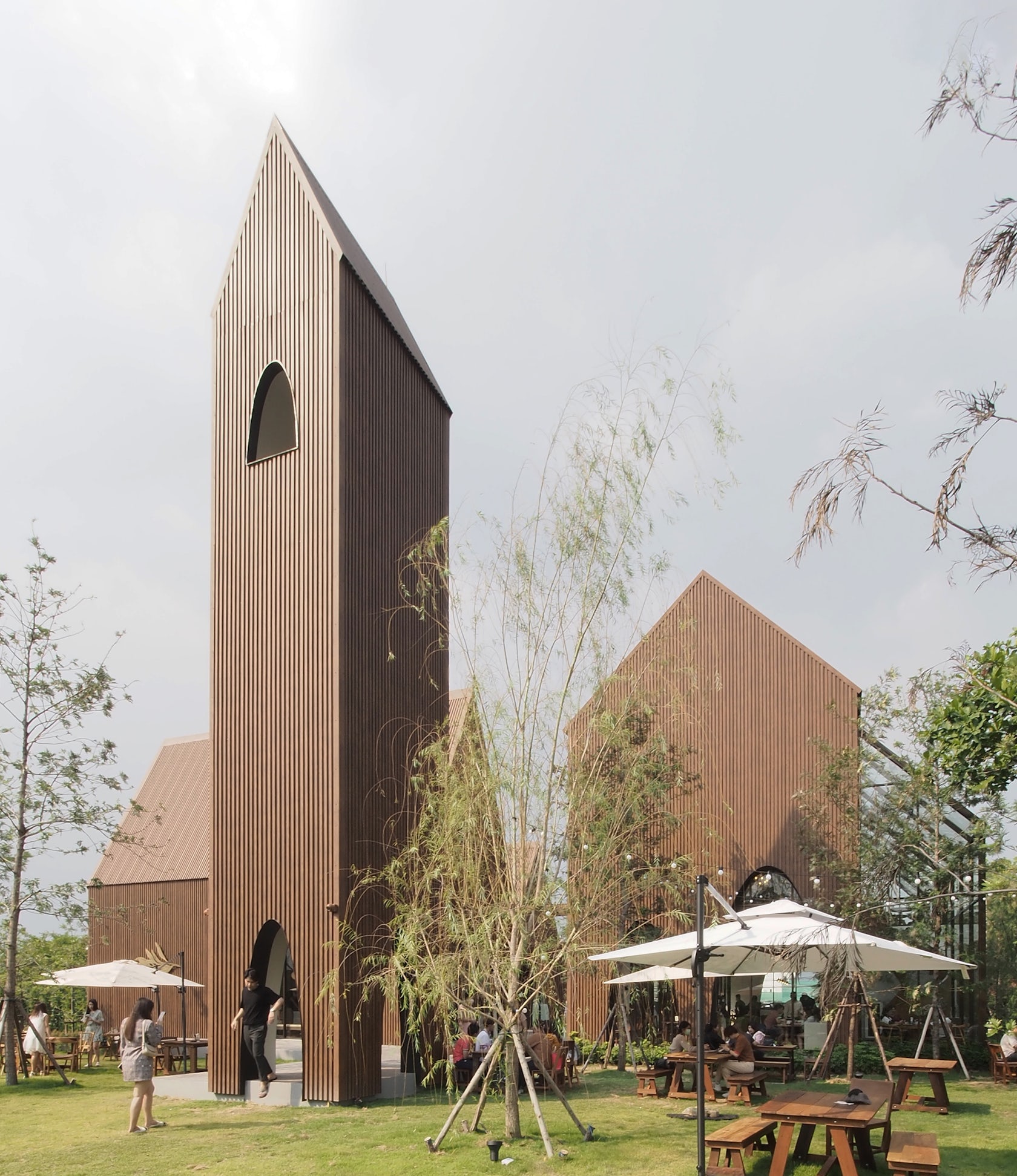
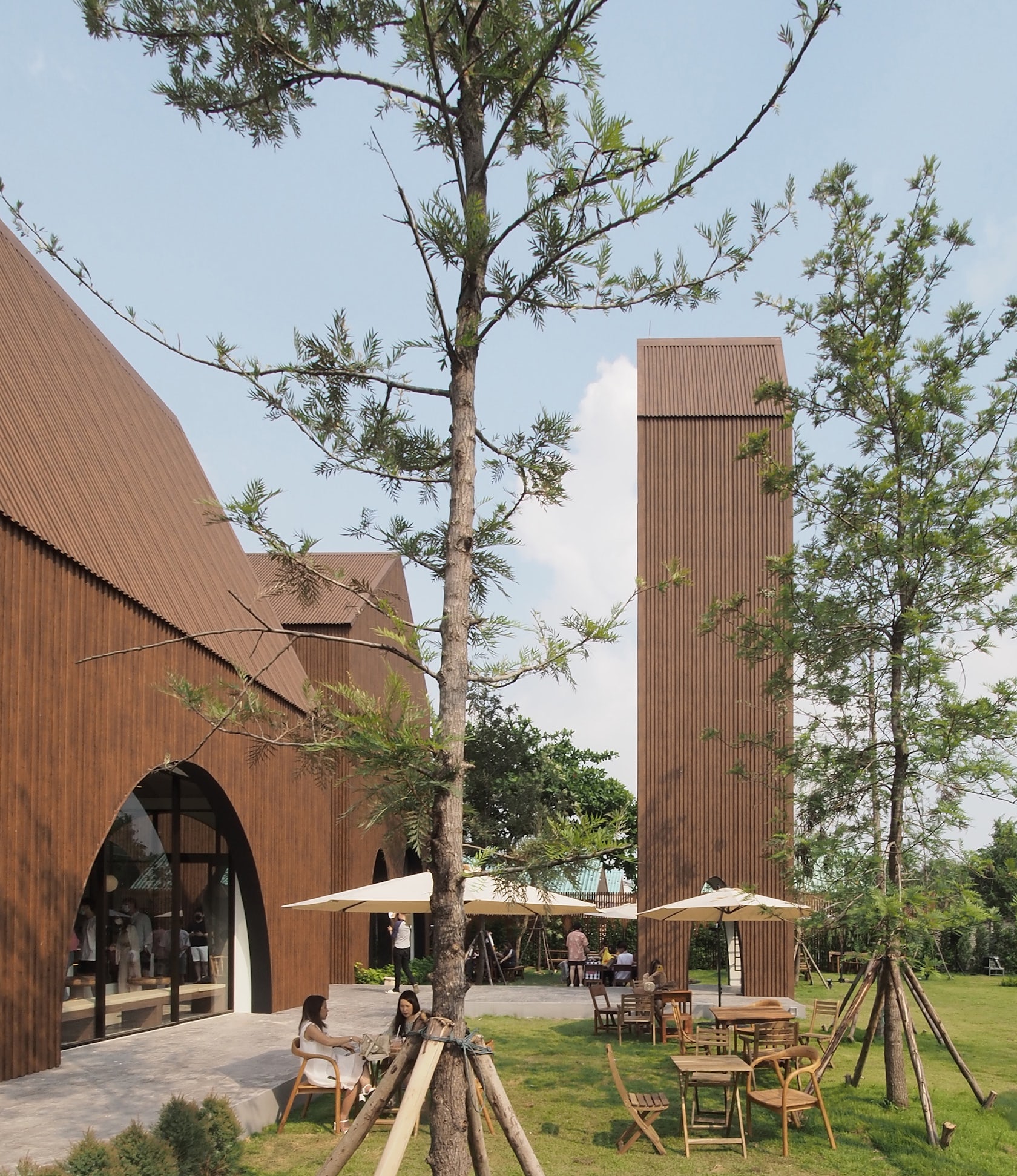
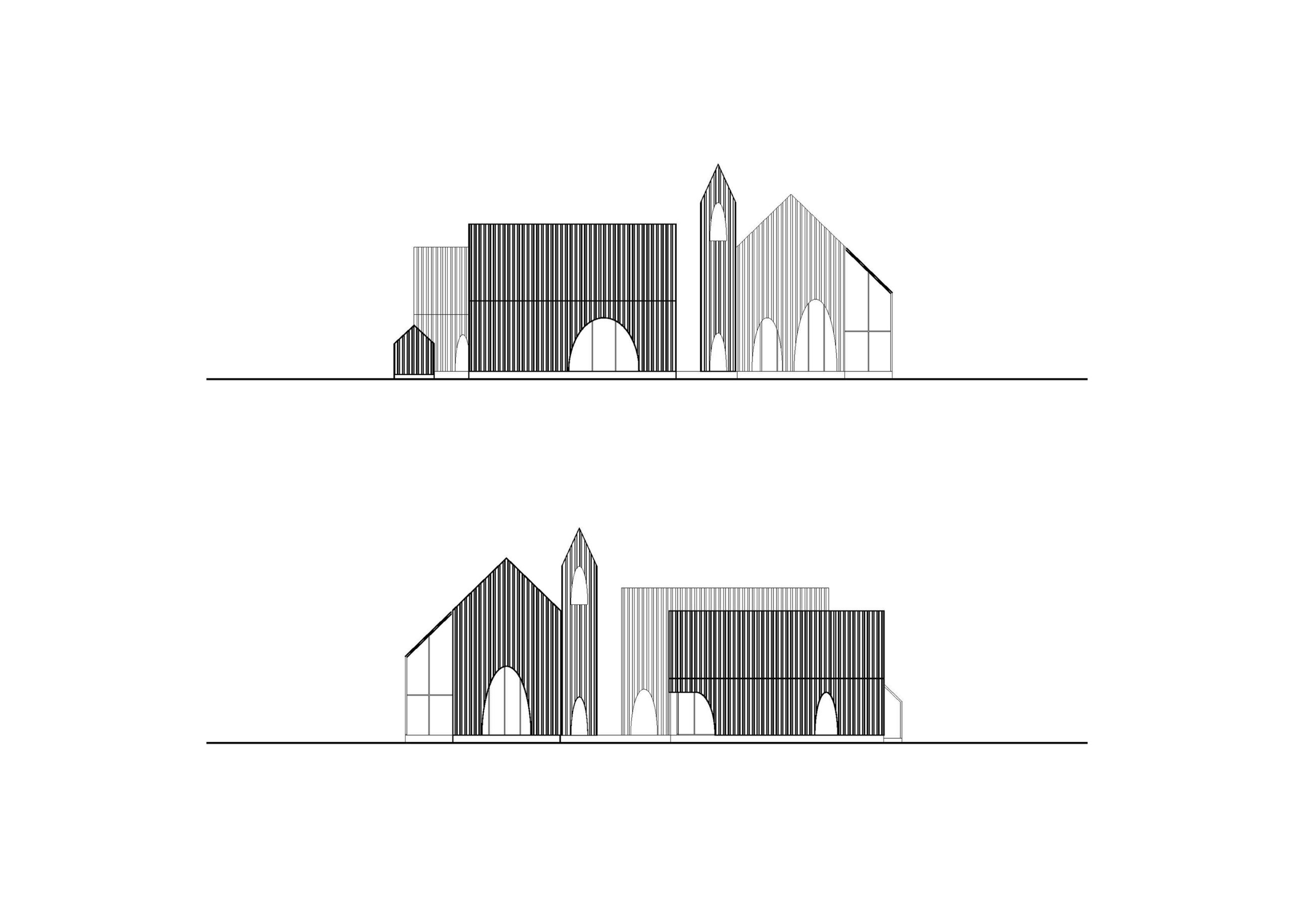
Take A Breath Cafe – is a new cafe and restaurant; we have a chance to design this project from the recommendation of our interior designer friend, taste space, who has the first image of the barn in the wood. After hearing their story, we applied the idea of a cluster of barns in different sizes with the same material and the outstanding arch-shaped openings as the secondary skin, separated into three main buildings by their functions: cafe, restaurant, and kitchen with a bell tower.
Architizer chatted with Chotiros Techamongklapiwat and Phuttipan Aswakool from ASWA (Architectural Studio of Work – Aholic) to learn more about this project.
Architizer: What inspired the initial concept for your design?
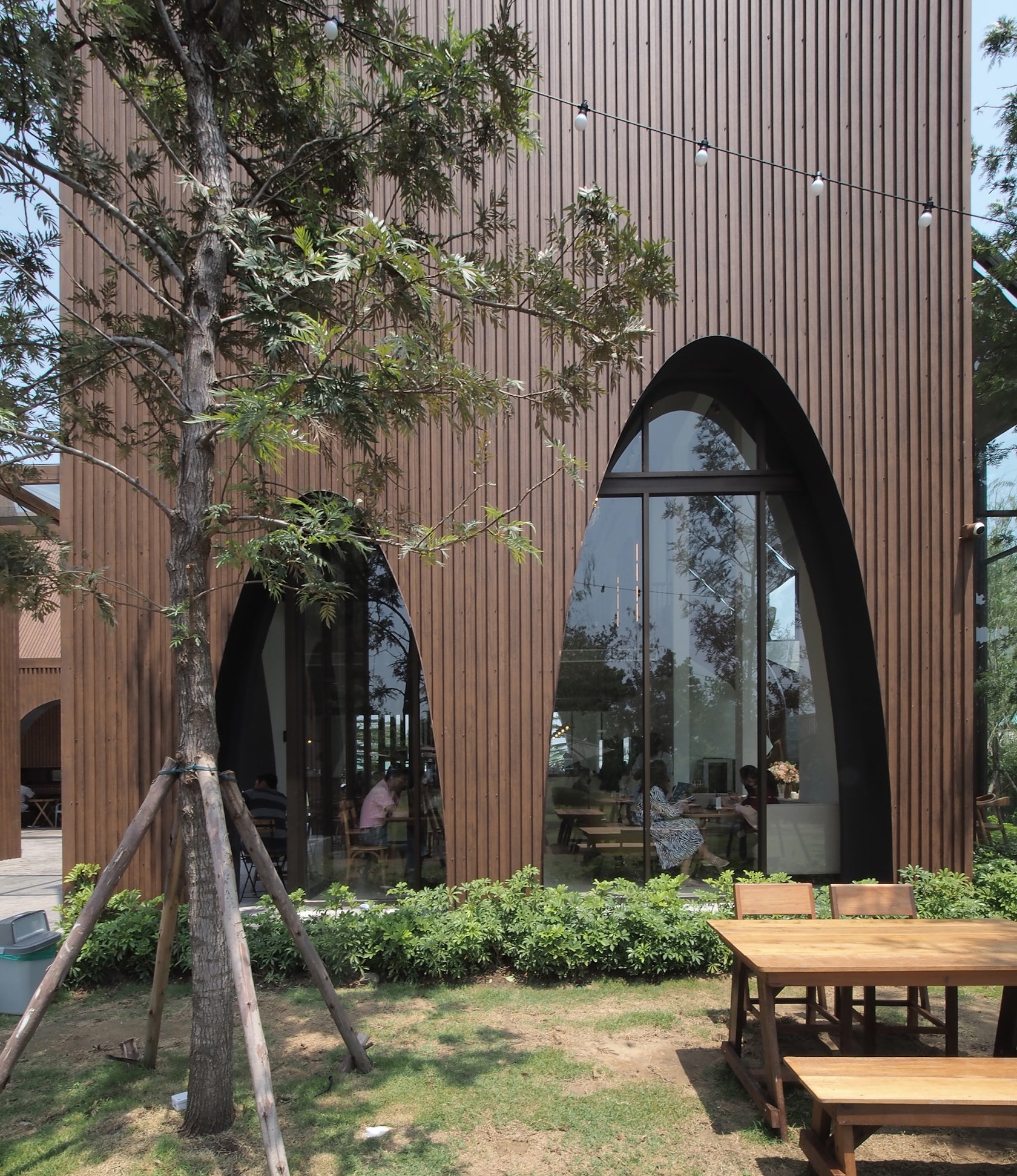
Chotiros Techamongklapiwat and Phuttipan Aswakool: We imagined and applied the idea of the cluster of different size barns in the wood on the site where the layout can separate into three parts from the front to the back of the site; sequencing is the parking area, the functional area, and the backyard area. A wood-like metal sheet was selected as the primary material to clad all siding along the roof, with arch-shape openings making them a homogeneous look bold from the surrounding context. Various size of arch-shaped voids is specifically randomly located, such as the corner of the central kitchen, which tends to show the movement of the chefs for the newcomer guest, the backside of the main dining area, and the cafe to provide the view to the backyard behind.
© ASWA (Architectural Studio of Work - Aholic)
© ASWA (Architectural Studio of Work - Aholic)
What do you believe is the most unique or ‘standout’ component of the project?
Each barn’s different sizes and shapes with the arch-shaped voids and the monotone material.
What was the greatest design challenge you faced during the project, and how did you navigate it?
The law and regulations in this area only allow the commercial building to be at most 150 sq.m. per building but also make the bold concept of the barns more prominent.
© ASWA (Architectural Studio of Work - Aholic)
How did the context of your project — environmental, social or cultural — influence your design?
The site, located in Bangkok’s western suburb, approximately 4,600 square meters, is surrounded by a high-density residential zone. The restaurant aims to connect people with nature by creating modern style barns in the forest. We followed the first concept by Tastespace, our collaboration team and interior designer for this project. After the design development, the cafe has a cluster of three main volumes with almost 500 square meters of the total built area., all with the gable roof: a cafe, restaurant, and kitchen, along with the highest volume of 8-meter height for a bell tower and two small glasshouses.
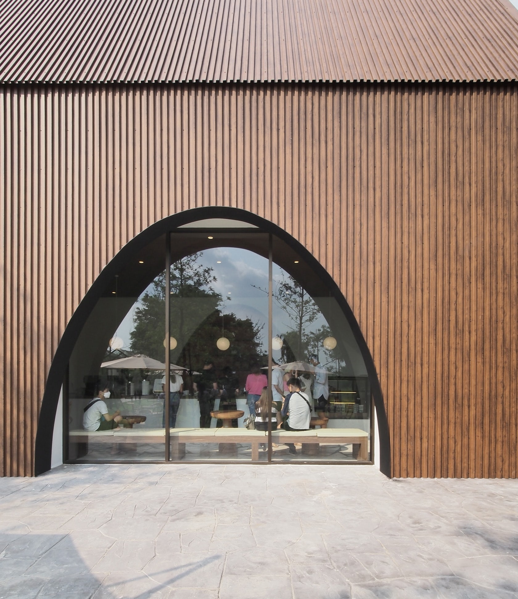
© ASWA (Architectural Studio of Work - Aholic)
What drove the selection of materials used in the project?
A wood-like metal sheet was selected as the primary material to clad all siding along the roof, with arch-shape openings making them a homogeneous look bold from the surrounding context.
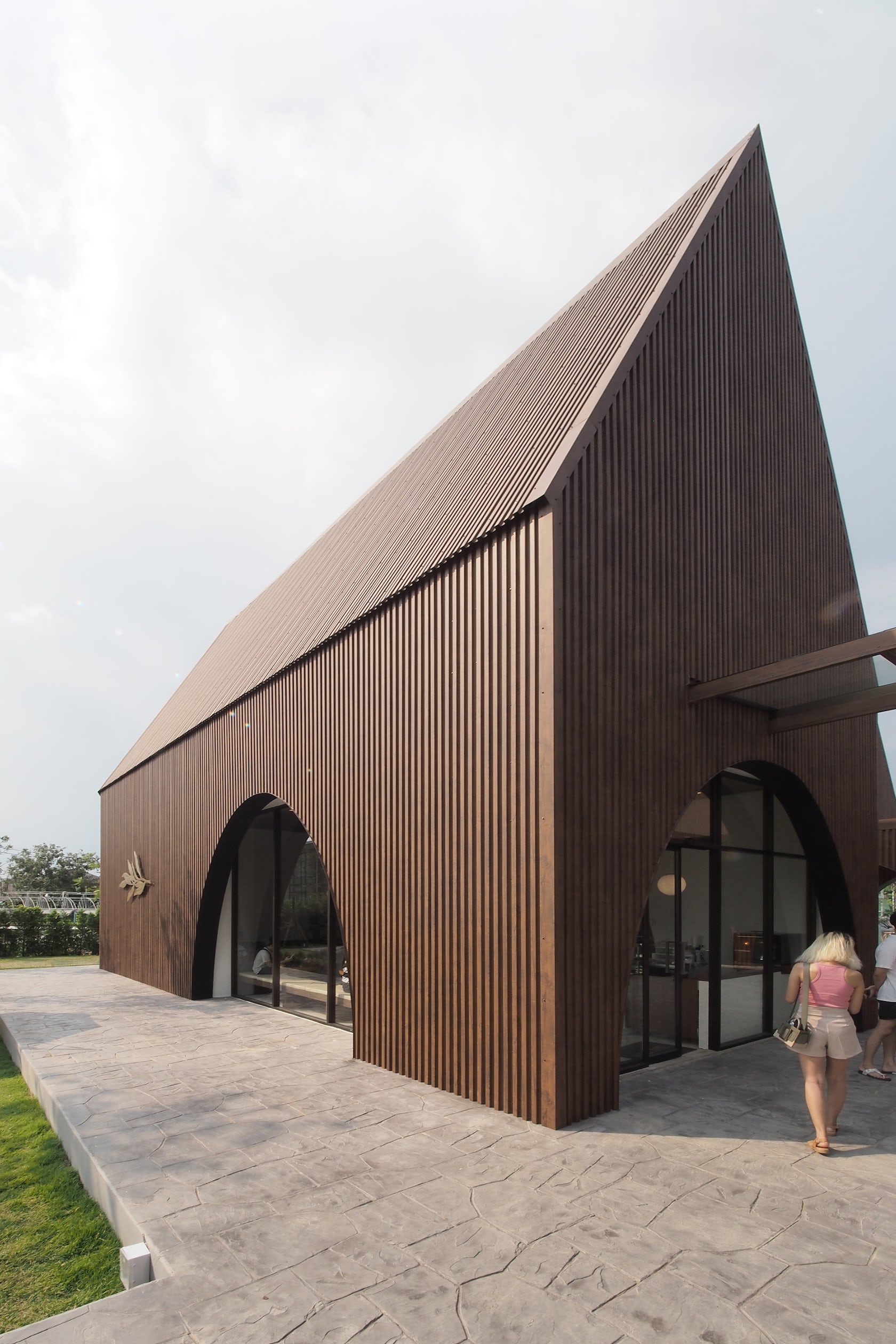
© ASWA (Architectural Studio of Work - Aholic)
What is your favorite detail in the project and why?
The contrast of the arch-shaped voids with the various size and shapes of barn-like architecture can all go along with each other very well.
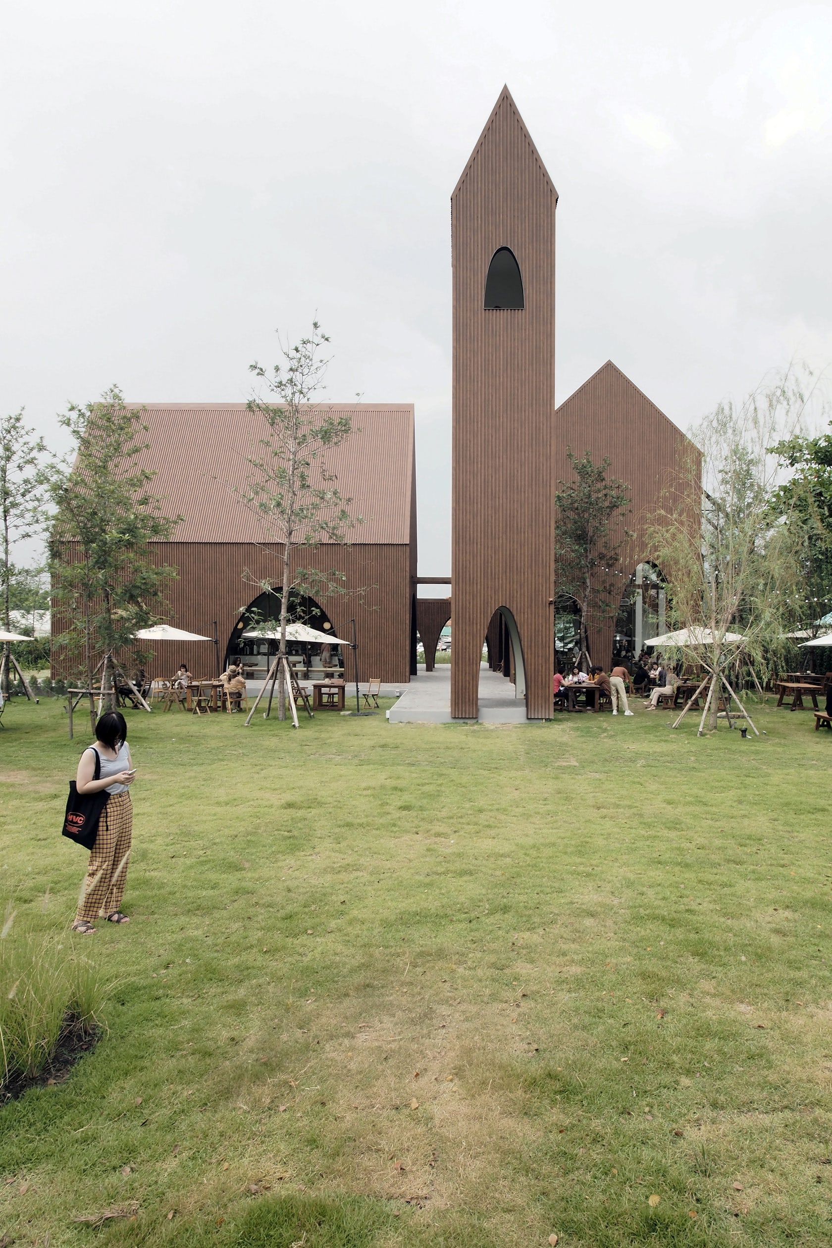
© ASWA (Architectural Studio of Work - Aholic)
How important was sustainability as a design criteria as you worked on this project?
For a sustainability design, we try to use the roofs’ height and double skin facade and allow air-flow ventilation to avoid the heat wave for this project.
In what ways did you collaborate with others, and how did that add value to the project?
We always listen to our collaborators in all projects in which we are involved, and we believe in people’s different points of view in other fields. But we will summarize and translate it simply as we always think it can communicate with all users and everyone visiting our projects.
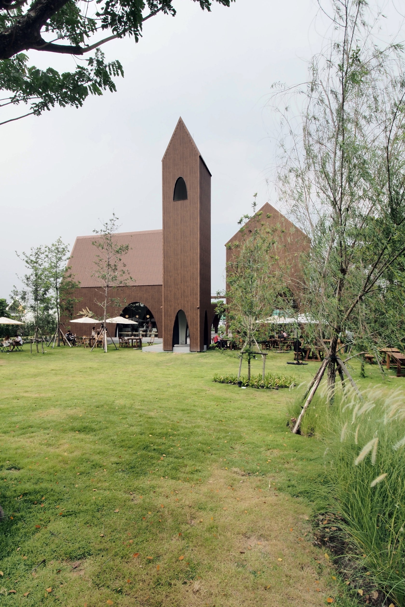
© ASWA (Architectural Studio of Work - Aholic)
Were any parts of the project dramatically altered from conception to construction, and if so, why?
It is mainly about the budget that sometimes we need to go for the alternative option which will match the budget. This project is the facade material, but we can find a good solution.
© ASWA (Architectural Studio of Work - Aholic)
What key lesson did you learn in the process of conceiving the project?
Sometimes we need to calm ourselves to get an excellent solution.
How do you believe this project represents you or your firm as a whole?
The simpleness. We always try to apply a simple architectural language that can make everyone understand the simpleness of our projects from our space, form, and materials.
How do you imagine this project influencing your work in the future?
It is a great project to learn how to deal with unexpected things that will influence us in the future.
Consultants
Taste Space (interior designer) and the one who brings us to design the architecture of this project.
Products / Materials
Fonde (Metalsheet)
For more on Take a breath cafe, please visit the in-depth project page on Architizer.


 Take a breath cafe