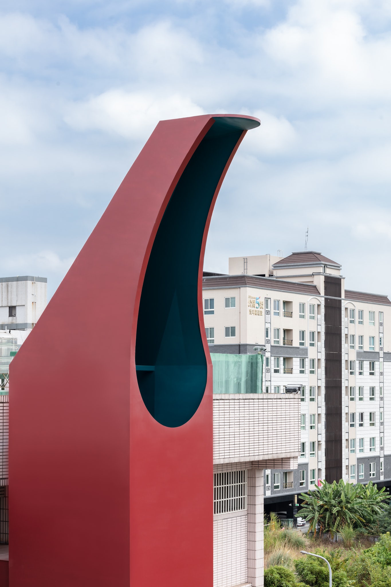
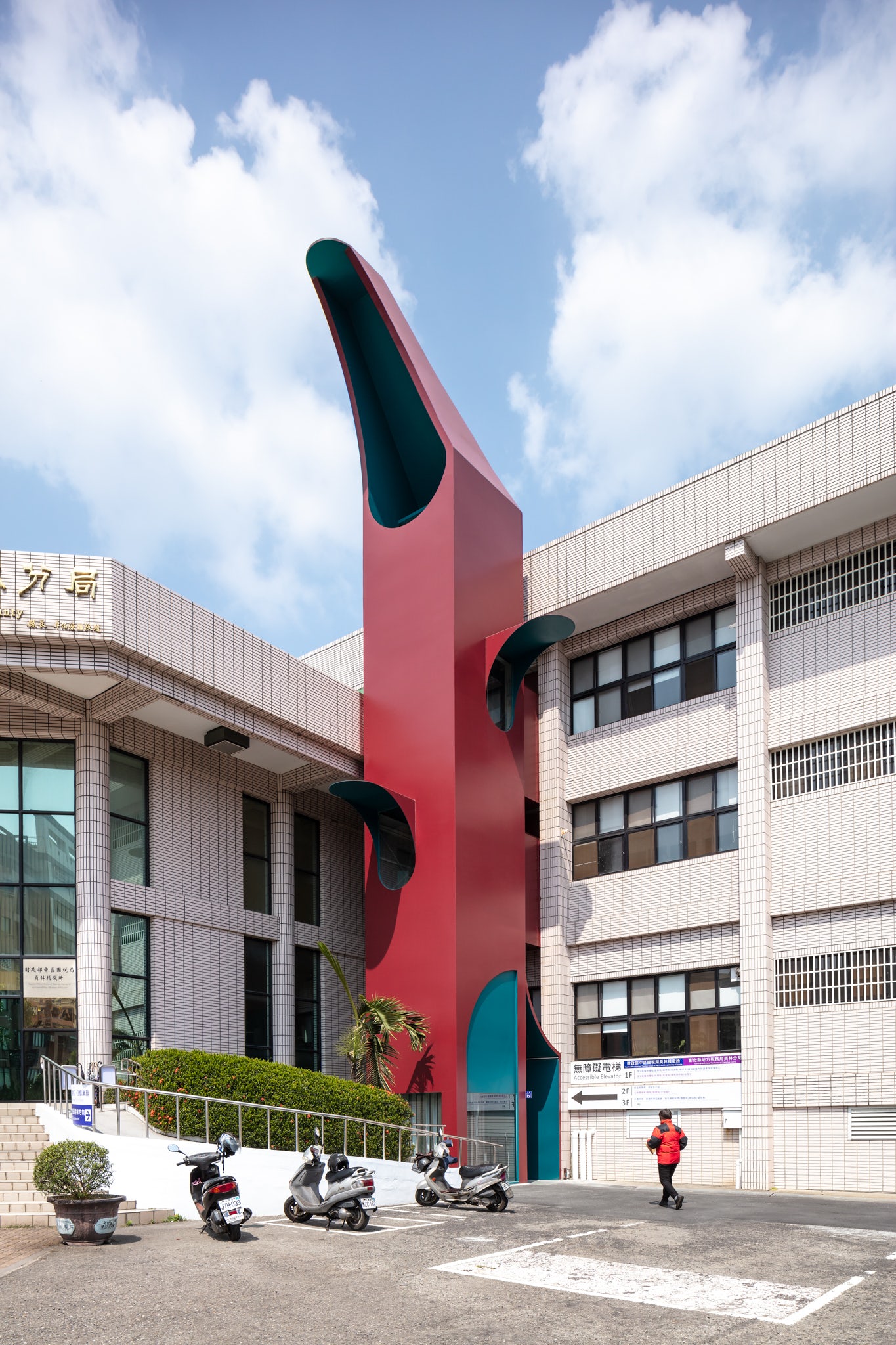
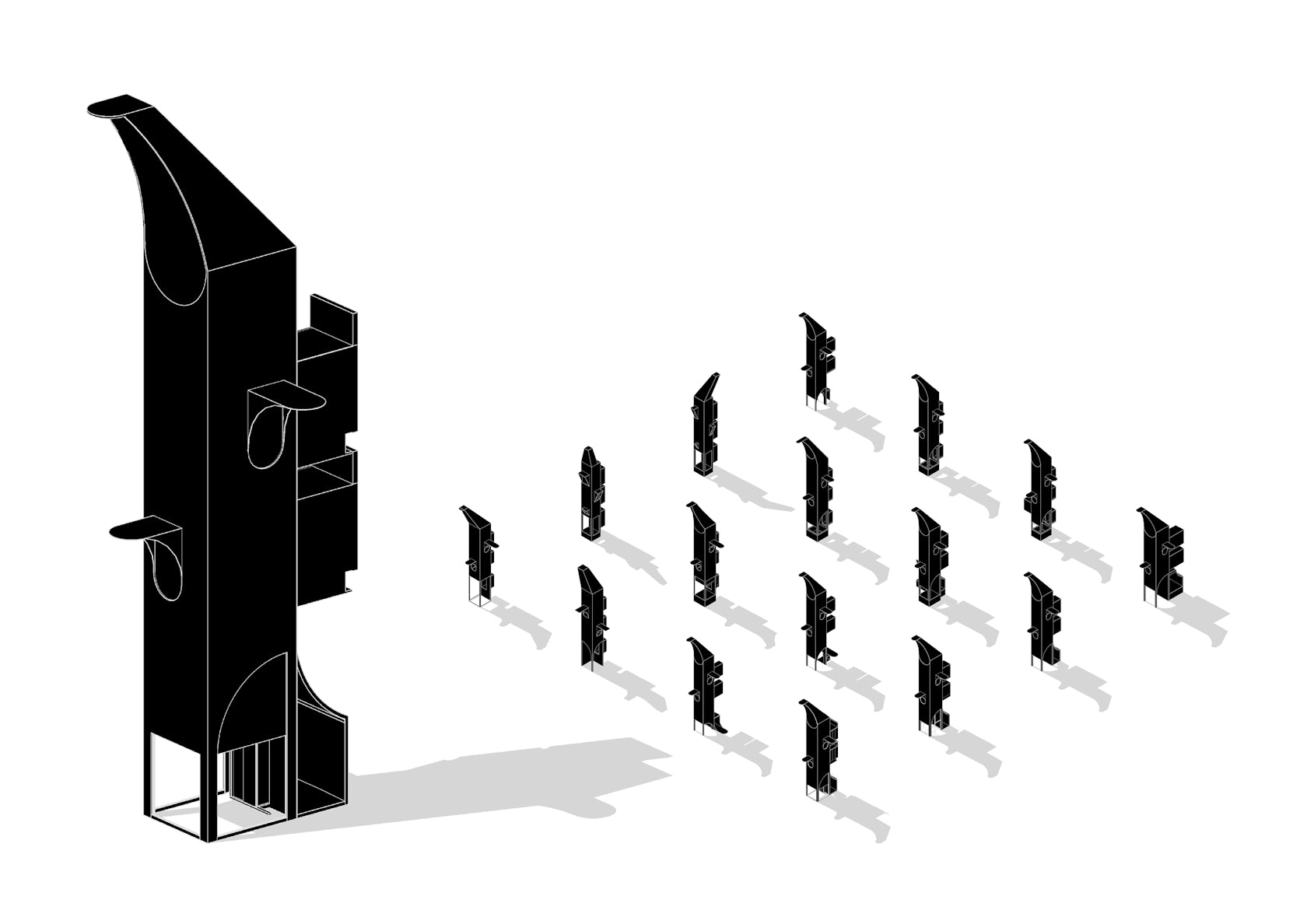
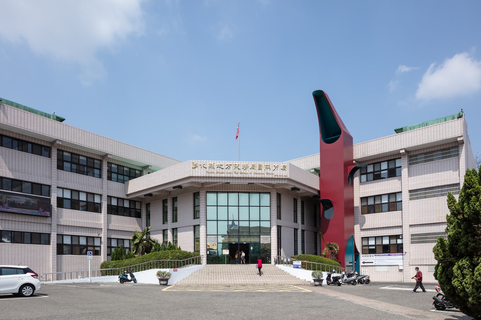
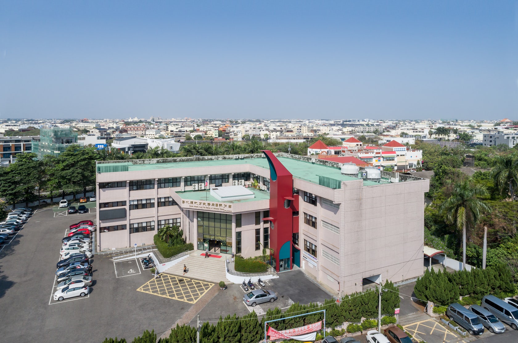
The RED ElevaTor is a parasitic extension of the main building, inheriting the spatial order, scale and form of the original institute. With its heterogeneous presence, we are able to repurpose the underused open space and regenerate a dialogue with the city. Nowadays, buildings last much longer than the pace of our city develops.
Architizer chatted with Eric Yu & Ming Ching Hsu from Atelier S.U.P.E.R.B. to learn more about this project.
Architizer: Please summarize the project brief and creative vision behind your project.
Eric Yu & Ming Ching Hsu: Public buildings built decades ago are often lacking accessible amenities in Taiwan. For our client, they need a practical solution to fulfill this demand; For us on the other hand, we re-evaluate the existing tax office building as a whole and perceive it as an opportunity to transcend the image of the urban landscape.
© Atelier S.U.P.E.R.B.
© Atelier S.U.P.E.R.B.
What inspired the initial concept for your design?
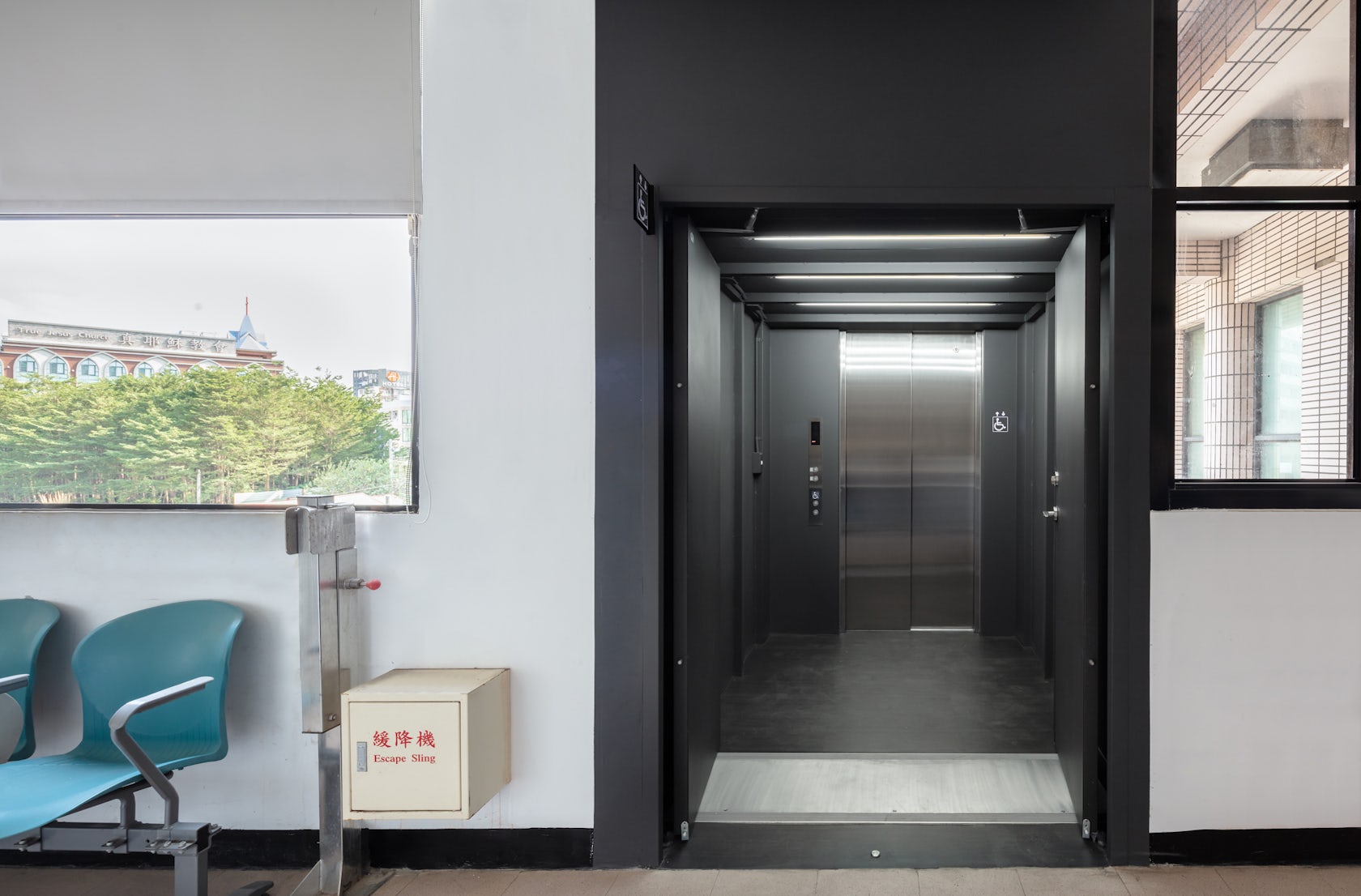
Adding a lift core to an existing structure is never a straightforward task. We knew the last thing we want to do is making it a back-of-house appendage of the original building. We want to take it further and explore its possible new role in its context. We felt there might be a chance for this small structure to break the symmetry and authoritative ambiance of the administrative building. The new structural logic should be an inventive addition evolved from the existing architectural order.

© Atelier S.U.P.E.R.B.
© Atelier S.U.P.E.R.B.
What do you believe is the most unique or ‘standout’ component of the project?
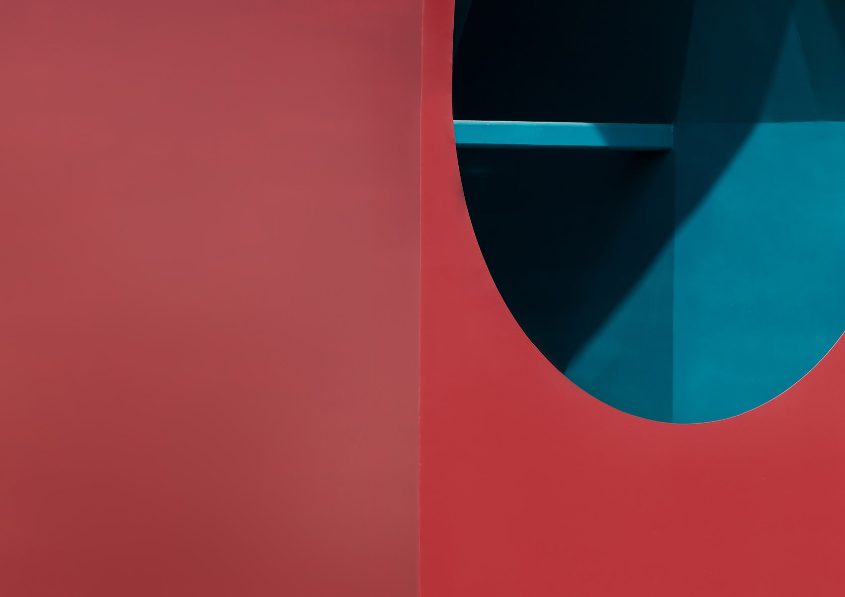
We see this project as an architectural representation of “parasitism”. We have allowed the eccentric and the conventional to coexist in both differentiation and harmony. Its form narrates how the order of the existing building morphed into a heterogeneous state and made an impact on the urban environment. The color selection highlights and corresponds to the function of the accessible space and its spatial recognition, and distinguishes the lift tower as a landmark from its surroundings.
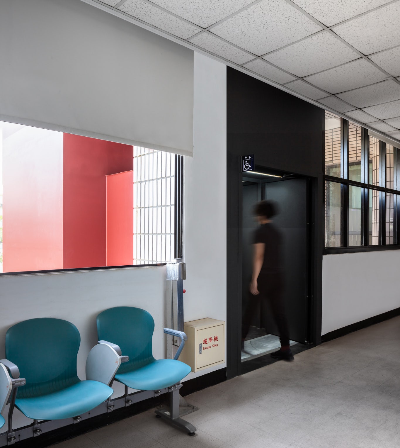
© Atelier S.U.P.E.R.B.
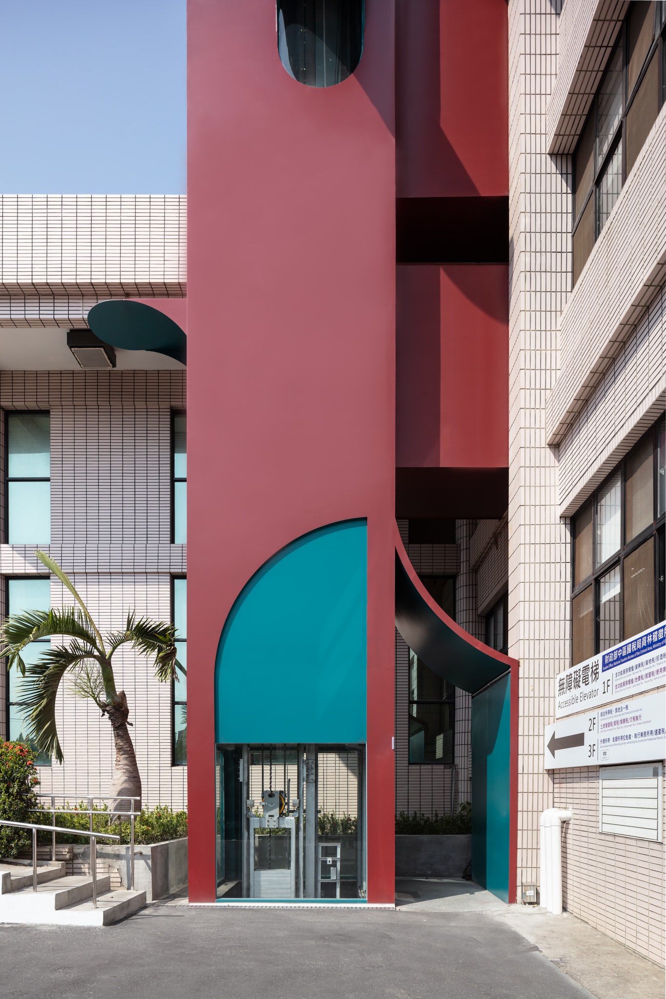
© Atelier S.U.P.E.R.B.
What was the greatest design challenge you faced during the project, and how did you navigate it?
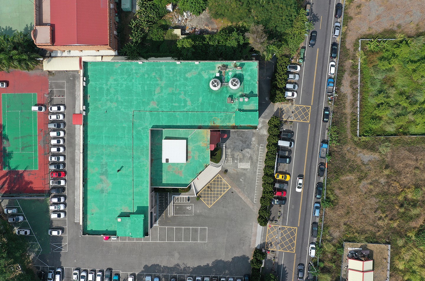
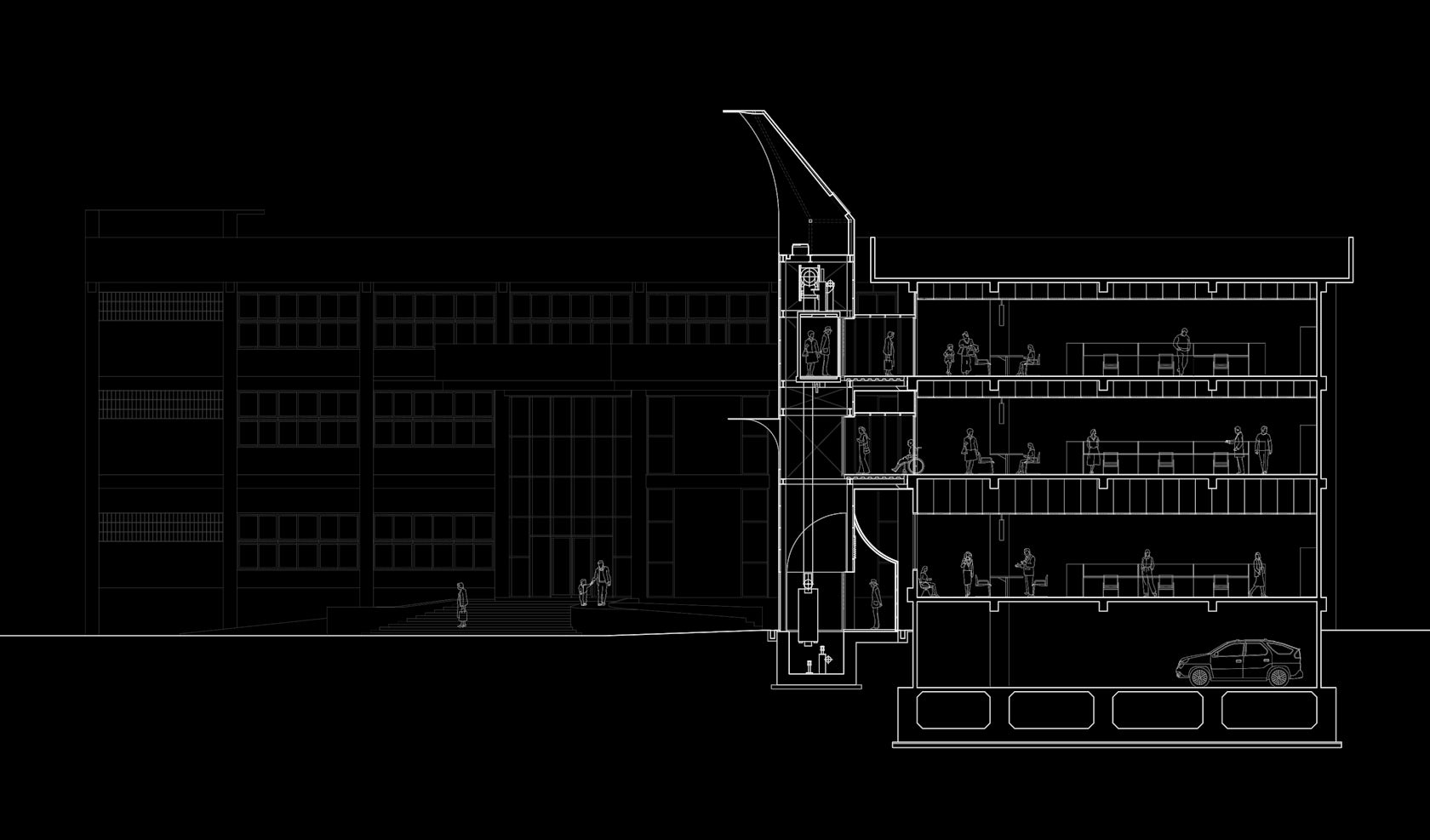
The greatest design challenge for us was to decide on the insertion point of this new lift addition. There were several key factors and limitations to ponder upon. Sticking to the budget constraints was critical, we also wanted to reduce any extra administrative management by minimizing the length of the circulation. The placement of the new openings on the original building and the limitations of the old structural system were also challenging for us. For the foundation of the lift, we had to avoid the service facilities such as the septic tank underneath the ground floor carpark. Hence the final lift location is possibly the only legitimate and feasible outcome after we completed our study.
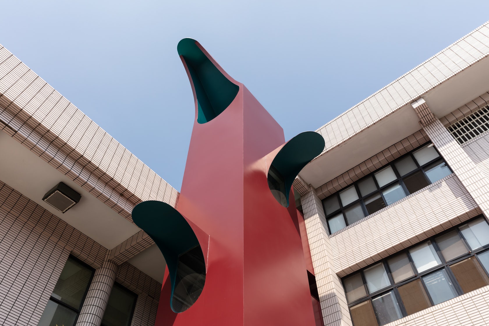
© Atelier S.U.P.E.R.B.
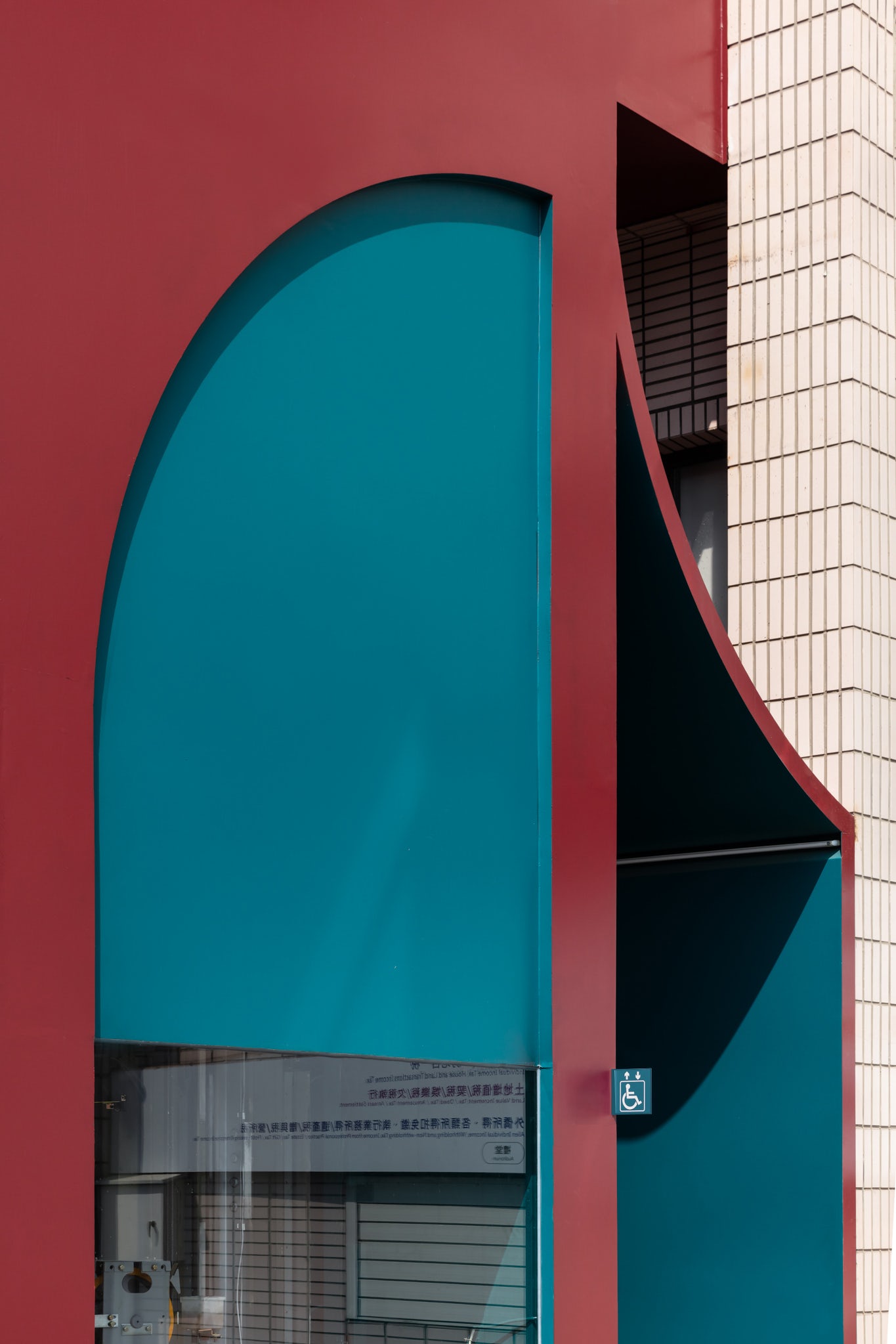
© Atelier S.U.P.E.R.B.
How did the context of your project — environmental, social or cultural — influence your design?
This public building, like many others, has lasted decades after the war, and many of them need an upgrade to meet the accessibility code. Small renovations like the addition of accessible facilities are highly sought after nowadays. There is a substantial amount of these small-scale government projects on tender waiting to be completed. We often see a more passive approach to these accessible elevator projects. It satisfies purely the practical and purposeful requirements. The brutal addition of the volume to the original building and construction without intention is slowly accumulating a negative impact on the city. We really hope we can make a change.
© Atelier S.U.P.E.R.B.
© Atelier S.U.P.E.R.B.
What drove the selection of materials used in the project?
In contrast to the existing building constructed of reinforced concrete, we hope that the additional structure is light, so a steel structure system with painted steel panels is deployed. Such structural system also reduces the extra structural load on the existing building.

© Atelier S.U.P.E.R.B.
© Atelier S.U.P.E.R.B.
What is your favorite detail in the project and why?
Our favorite details of this project are the openings on the steel panels and the sculptural form.
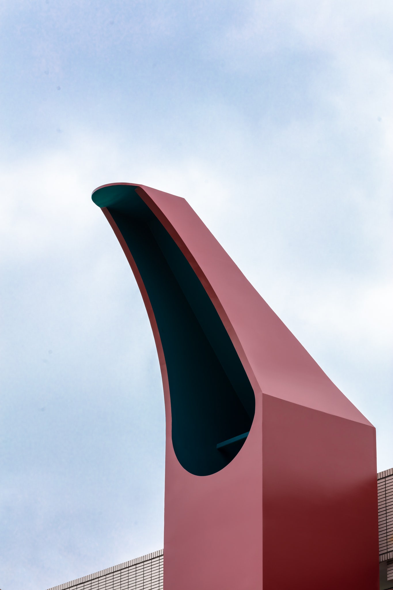
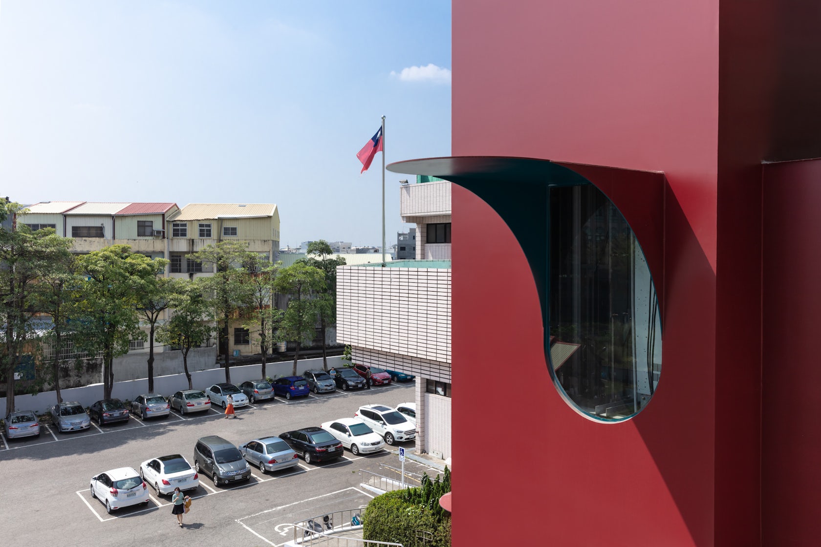
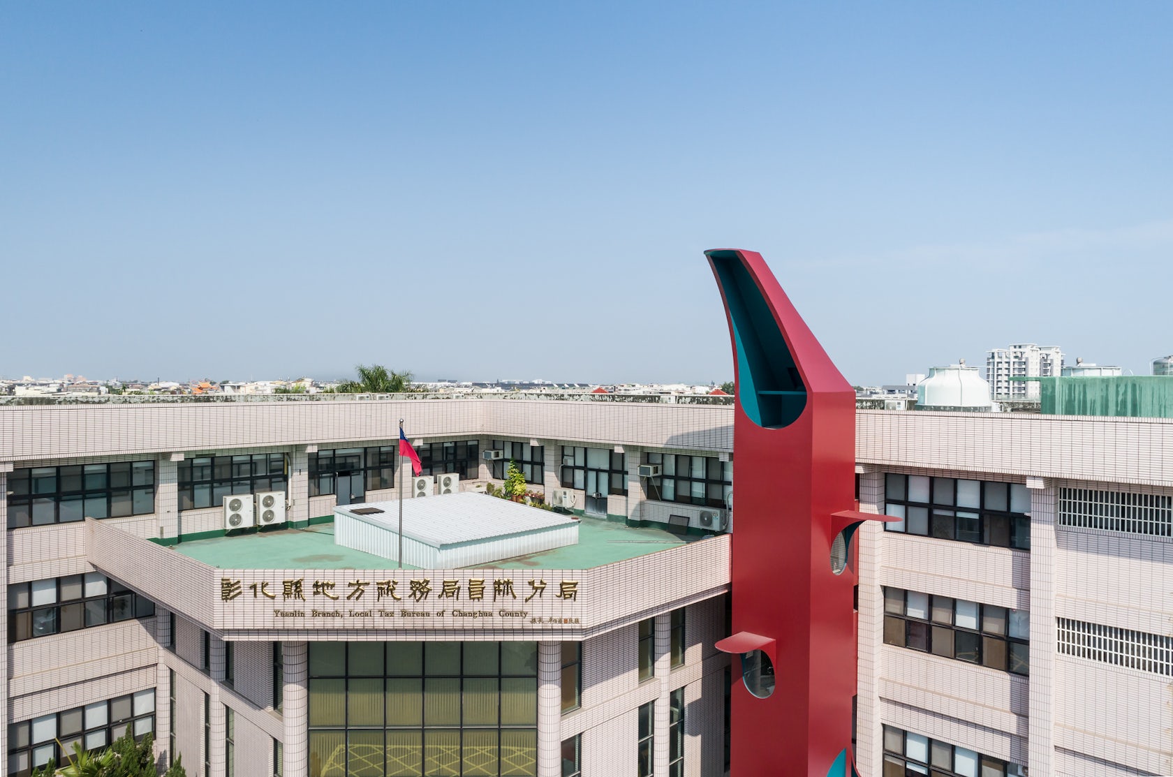
The openings of the lift tower affect the visual massing, thus the proportion and position were precisely designated. Every shape has its purpose to fulfill the internal and external conditions. For example, the top of the elevator is like a visor of a cap. It acts as a cooling well for the lift internally, and at the same time emphasised its significance as a “tower”, an urban landmark that is like a little monstrous parasite inseparable from the original building.

© Atelier S.U.P.E.R.B.
© Atelier S.U.P.E.R.B.
How important was sustainability as a design criteria as you worked on this project?
Sustainability for us in this project is shown through the gesture of being future proof, minimizing building waste, and maximizing a building’s potential. The ground floor square is one of the few public open spaces in this city. We believe that this vertical volume can redefine the openness of the ground, so the hat-shaped top of the tower and the window hoods on the facade all made allowance for adding projection lights in the future. In the next phase of the project, it can be transformed into the role of a lighthouse in the city and become a real public landmark.
© Atelier S.U.P.E.R.B.

© Atelier S.U.P.E.R.B.
In what ways did you collaborate with others, and how did that add value to the project?
In this project, the elevator manufacturer and steel structure manufacturer were heavily involved, and a lot of time was spent to work out how to collaborate with each other; such as how to comply with the regulations for elevators and to accommodate the elevator inside the steel structure; how to break through the conventions and restrictions while taking care of performance and structural safety. The construction sequence of the steel structure directly affects whether the office can operate normally for the employees and the duration of the construction period. There were also a lot of back-and-forth discussions regarding all the above matters and more.
© Atelier S.U.P.E.R.B.

© Atelier S.U.P.E.R.B.
How have your clients responded to the finished project?
We were very pleased to know that the client thinks the project exceeded their expectation.
What key lesson did you learn in the process of conceiving the project?
We learned that even small projects or minor renovations can still effectively make a positive impact on the urban environment.

© Atelier S.U.P.E.R.B.
© Atelier S.U.P.E.R.B.
How do you believe this project represents you or your firm as a whole?
Our firm does not limit the size or type of design projects we take on. Our cross-disciplinary background is committed to finding opportunities to integrate design and jointly investigate a project from different scales and design perspectives. The Red ElevaTor is a great example of it.

© Atelier S.U.P.E.R.B.

© Atelier S.U.P.E.R.B.
How do you imagine this project influencing your work in the future?
The urban parasite will be a design prototype and approach that we will continue to develop for our future projects, we hope to continuously contribute to improving the urban environment of Taiwan.
© Atelier S.U.P.E.R.B.
© Atelier S.U.P.E.R.B.
For more on RED ElevaTor, please visit the in-depth project page on Architizer.


 RED ElevaTor
