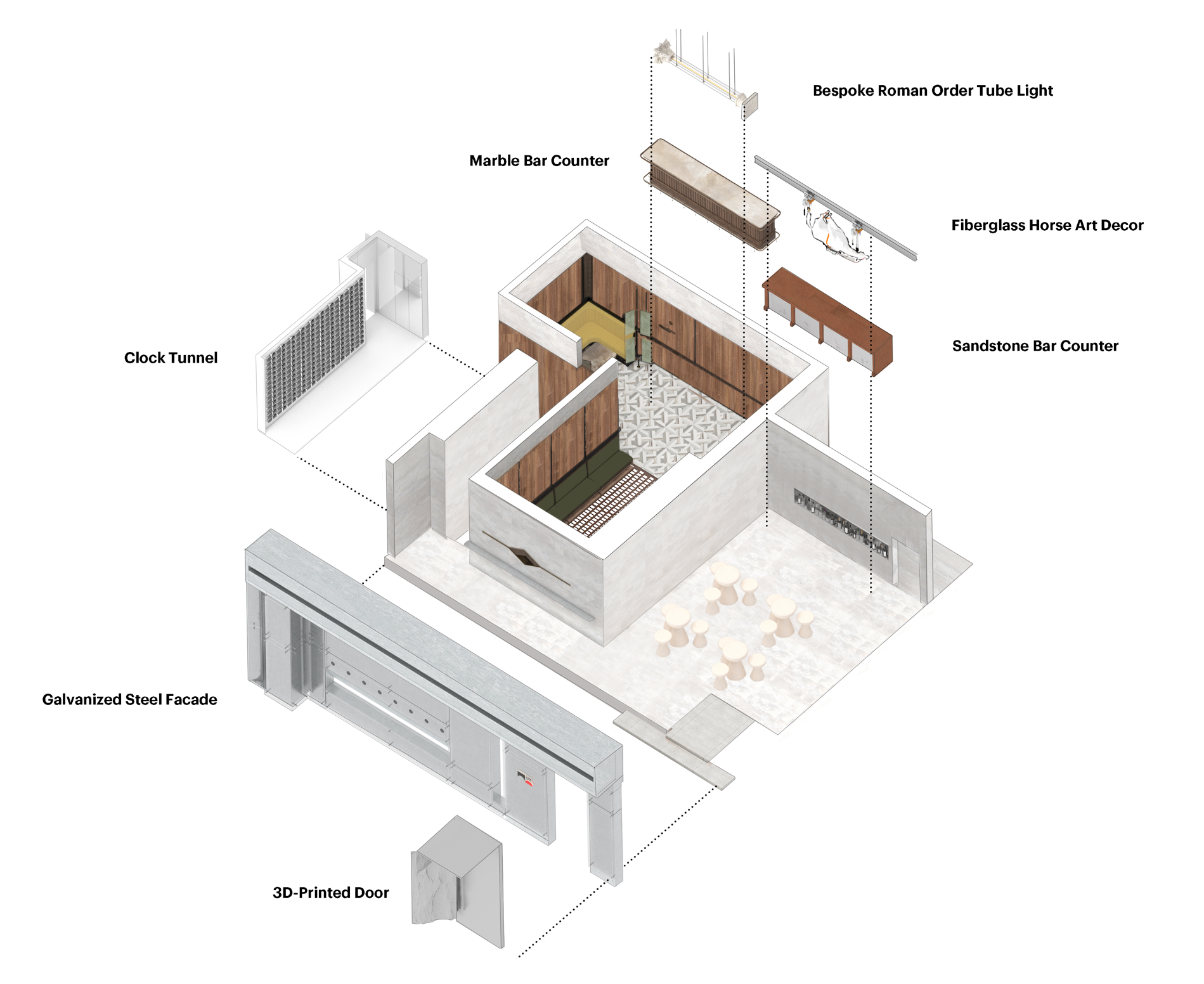
MASSminors – Blazing Night is a modest space of 128 square meters, containing two bars. So we took the “store within a store” layout as the starting point to create a dialectical spatial narrative. Like a shifting mixed wine, we hope this space interweaves with various emotions and desires and becomes interactive. We developed three distinct areas in the idea of “multifold space-time” while strengthening their link through dramatic three-dimensional art installations. The contrast and organic fusion provide a series go multi-layered spatial experiences, shaping a distinct identity as a contemporary bar with the spirit of wild and inclusive.
Architizer chatted with Jump Lee, Co-founder and Design Director at One Fine Day Studio & Partners, to learn more about this project.
Architizer: What inspired the initial concept for your design?
Jump Lee: The original idea for the design came from the client’s demand for a ” store in store” layout, so from branding, we provided the name for the space—Massmionrs—hoping it would contain a contradictory and dialectical meaning. A bar is a place with great social attributes, and bartending is also an art of variation, so we conceived this space to be a place with multiple cultures and intertwined relationships.

© yuuuunstudio

© yuuuunstudio

This project won in the 10th Annual A+Awards! What do you believe are the standout components that made your project win?
The store-in-store model is not novel. I think the Massminors project is more remarkable for its concept. We focus on the changing mood and clear relationship of the space, and the idea of dialectic and contradictory well brings a harmonious output in terms of spatial experience and brand culture, as well as a rational use and upgrading of the small space.

© yuuuunstudio

© yuuuunstudio
What was the greatest design challenge you faced during the project, and how did you navigate it?
The most challenging issue was the budget. Our design included a doorway with specific shapes, a door made of special material, and several unique art installations, all of which required sufficient cost to implement. So we sourced low-cost structures and customized them to be done by our design team.
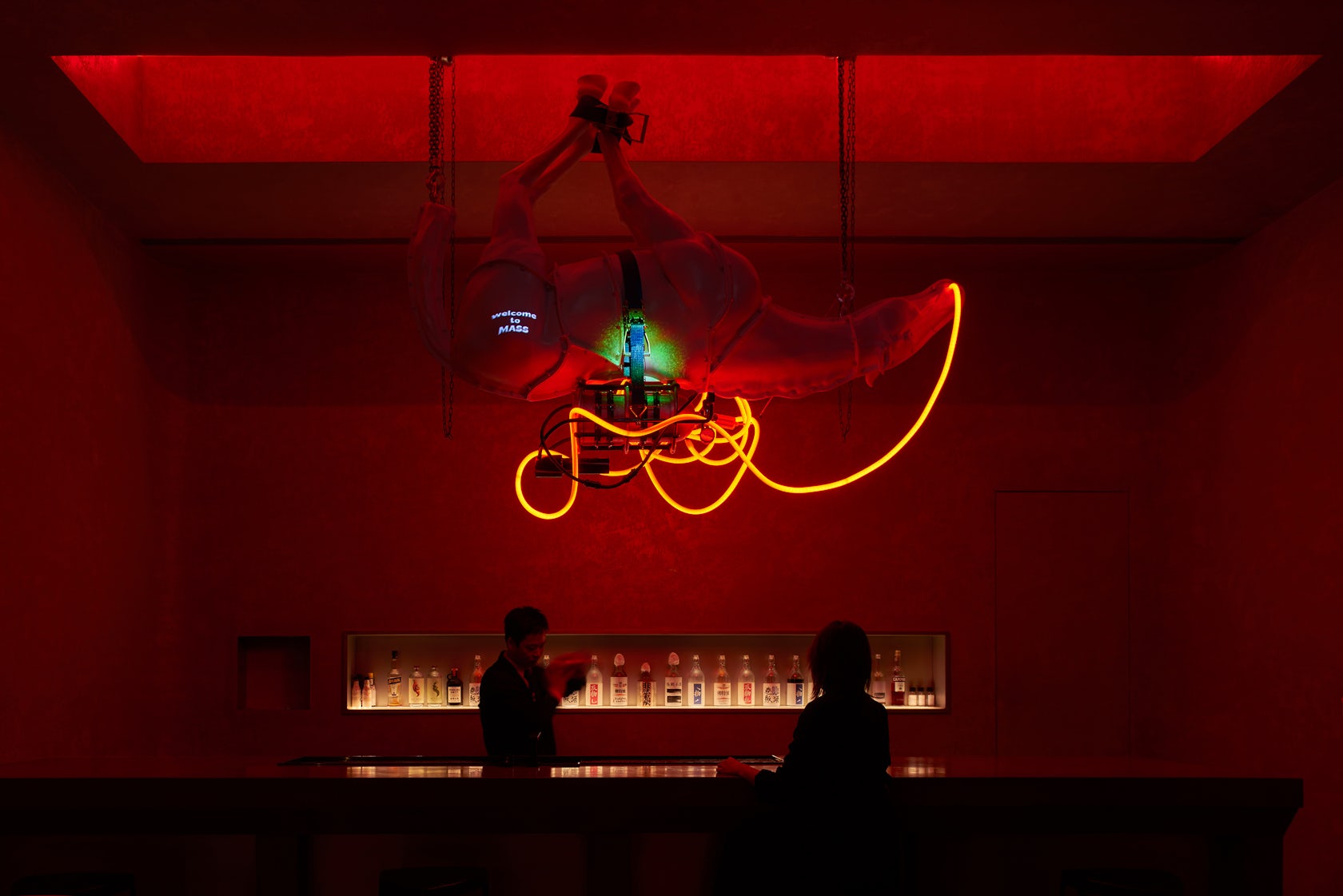
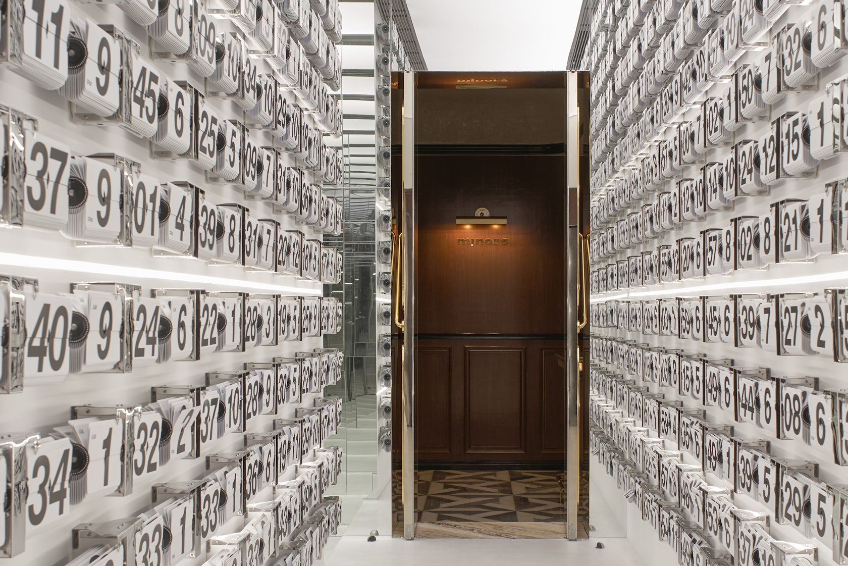
For example, the Leap Tunnel, in our initial conception, was programmed to interact with the people’s steps, but due to cost control, we took off-the-shelf clock components, arranged and presented them in an array, then disrupted their time-setting, and the final outcome was also great. The mechanical form of the “upside-down horse” installation was also assembled through the procurement of lights, straps, and hardware, eventually achieving a cyberpunk form.

© yuuuunstudio

© yuuuunstudio
How did the context of your project — environmental, social or cultural — influence your design?
Nowadays, our social communication is becoming more active on the Internet. People spend most of their time on social apps and sharing their lives on social media. For example, the most popular Little Red Book and Instagram are all spread in the form of photos and short videos. So we will emphasize more prominent visual effects and emotional atmosphere in the design.

© yuuuunstudio

© yuuuunstudio
What drove the selection of materials used in the project?
On one side, it is for the novelty and interest of the design. We applied galvanized iron to the exterior facade, a material that reacts to oxidation in the open air – producing rust stains. Moreover, to slow the oxidation reaction, we covered it with a layer of glass. In the end, the space, like people and objects, aged over time and assumed a different appearance years later.
Another side is the cost and efficiency of the work. We used 3D printing technology to make the hanging horse installation, the Roman Order-shaped pendant light, and the customized door, which used to take a lot of time and cost, but the new technology helped us to be more efficient and cost-saving.

© yuuuunstudio
What is your favorite detail in the project and why?
The best is the Leap Tunnel. We made three to five satisfactory design proposals for this space, yet the cost could not meet the budget. The most unexpected thing was once I was picking items online, I saw this clock and was inspired instantly. It is such a sparkling moment that design is sometimes a rare and momentary thing. And the final result is also surprising.

© yuuuunstudio
How important was sustainability as a design criteria as you worked on this project?
In this case, sustainability is perhaps not reflected in environmental protection, but in the eco relationship between commerce and design. It presents the value of design. Thinking about how to get the best performance within a manageable budget, rather than relying on expensive materials or products, influences our design considerations. It is the point of view that we consider it is sustainable.

© yuuuunstudio
In what ways did you collaborate with others, and were there any team members or skills that were essential in bringing this Award winning project to life?
Each of the designers involved in this project was important. In particular, Qizhen Cai conceived the crucial naming of the space in the branding and visual construction.

© yuuuunstudio
How have your clients responded to the finished project?
The client was very impressed with our work. He said the space exceeded expectations and conveys well his thinking on the cocktail culture—conveying the inner wildness and various emotions—and representing high quality and creativity. It is a good illustration of his motivation to provide consumers with an enjoyable experience.

© yuuuunstudio
What key lesson did you learn in the process of conceiving the project?
The shop-in-shop layout and the nature of the bar required improved sound insulation. It gives us a lesson during the construction process. We even test with sound right after completing the wall construction work.

© yuuuunstudio
How do you believe this project represents you or your firm as a whole?
Our firm promotes diverse cultures and specializes in utilizing multiple media and techniques. Besides our spatial design practice, we specialize in graphic visuals, art installations, and creative planning. It helps us to draw the brand’s DNA effectively and deliver its spirit through the spatial narrative.

© yuuuunstudio
How has being the recipient of an A+Award evoked positive responses from others?
Being an A+ award winner, we have gained more exposure to quality projects and others’ natural confidence in our work. We appreciate the effort of the A+ award team.

© yuuuunstudio
How do you imagine this project influencing your work in the future?
It helped us to have a deeper understanding of the bartending culture and brewed a better practice for wine culture space in the future.
Is there anything else important you’d like to share about this project?
Not only is the red hue presented in the picture, but this space also has more possibilities in color and lighting. We can do all the control and adjustment of lighting changes via mobile phone. Lighting is an essential detail in the design, and we believe it can bring a changing mood, but a short-term shot cannot fully reflect how it is presented in a lively.

© yuuuunstudio
Team Members
Rei SU, Chun-jie HE, Hao LIANG, Yong-jie LAO
Products and Materials
galvanized iron, light fiberglass
For more on MASSminors, please visit the in-depth project page on Architizer.


 MASSminors


