© Dick Clark + Associates
What inspired the initial concept for your design?
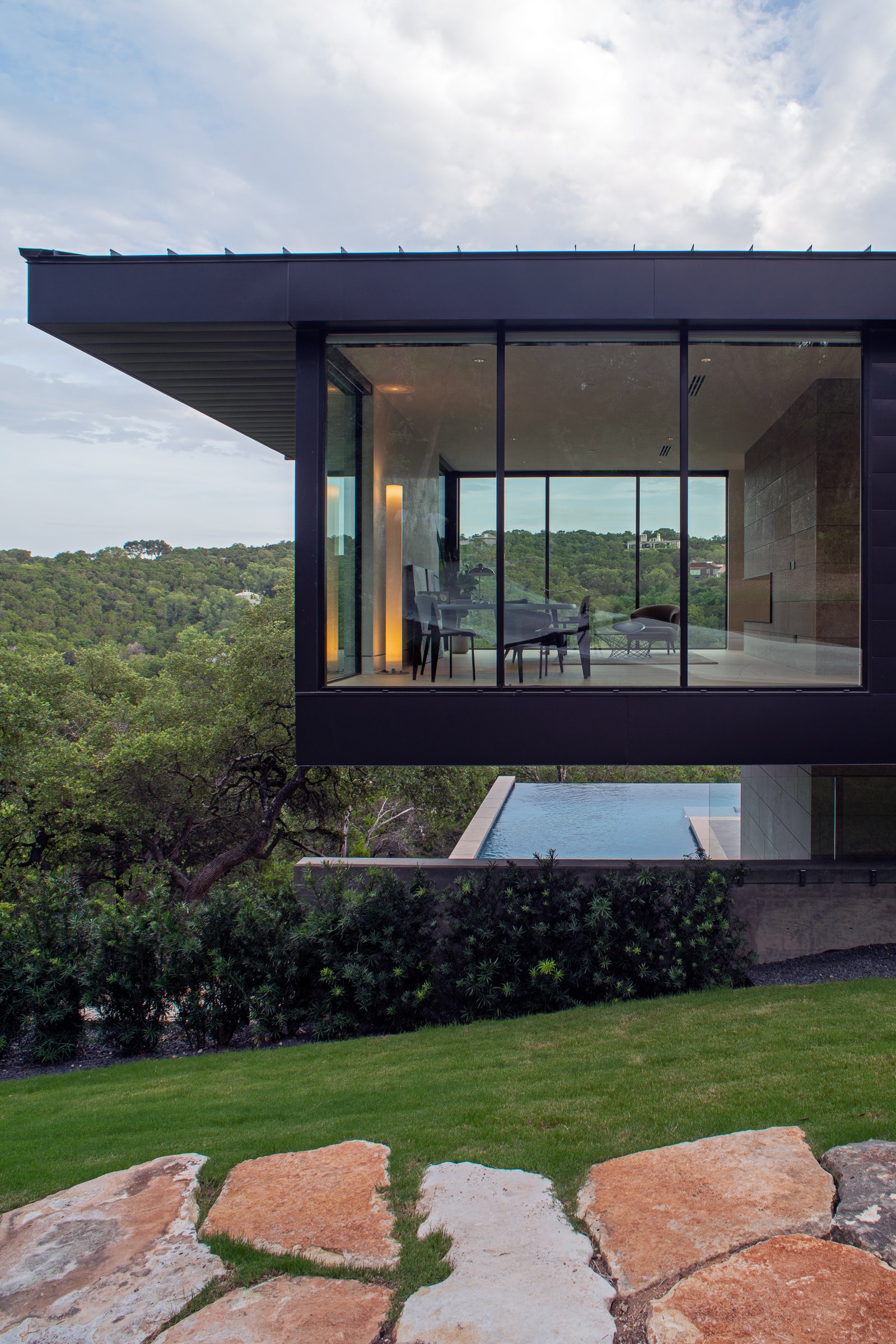
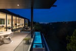
The steep slope of the site meant that the house needed to be multiple layers, stepping down the hillside. We organized it into a main level, with primary living spaces; an upper level, with secondary bedroom spaces; and a lower level with social and activity spaces. A spacious patio and pool anchor the lower level, shaded by the main level living spaces above. The form of the house was expressed as a series of long, layered elements to follow the contours of the site.
© Dick Clark + Associates
What do you believe is the most unique or ‘standout’ component of the project?
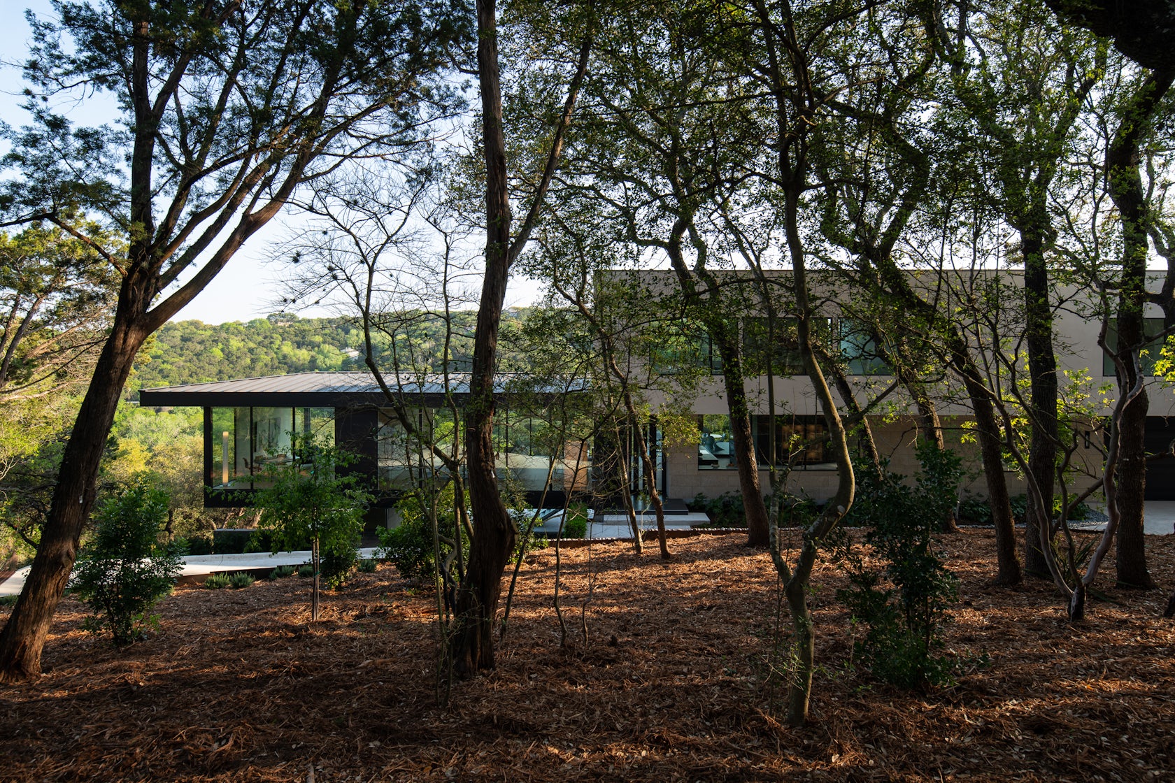
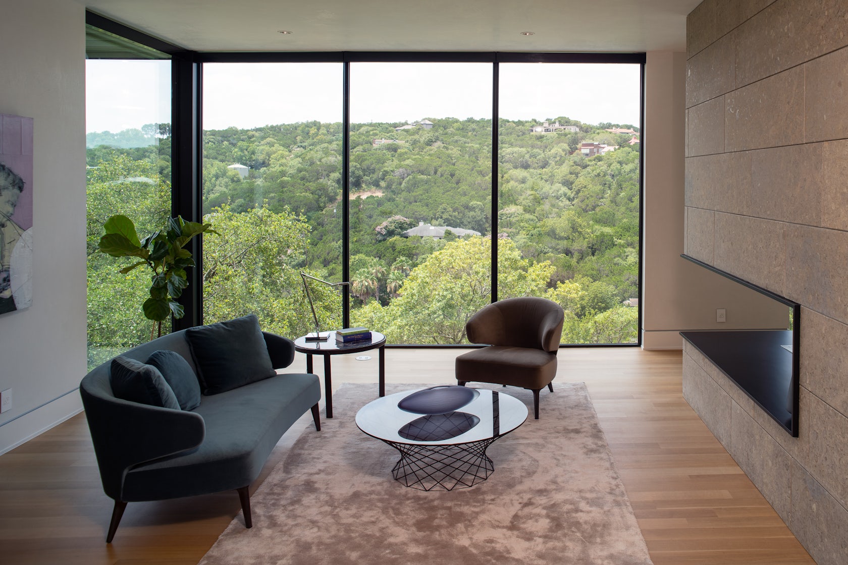
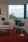
The dramatic cantilever of the living room and office makes a big statement. It’s a long, glass box that floats over the lower level deck, punctuated by a stone fireplace that extends down to the ground below. The distinct form definitely captures the eye, and creates a really incredible interior space within the house as well.
While the cantilever is a defining characteristic of the house, it also serves as an incredibly functional cover for the deck spaces below. This helps achieve one of the critical design goals, of fostering a strong connection to the surrounding nature, by providing comfortable and enjoyable spaces outside.
© Dick Clark + Associates
What was the greatest design challenge you faced during the project, and how did you navigate it?
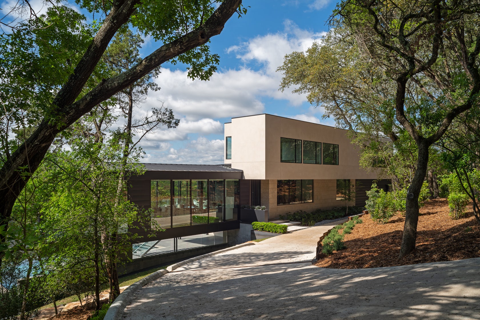
The terrain was a significant challenge. The height restrictions and tree protection requirements of the local codes substantially restricted the shape and footprint of the building envelope. But, limitations can be a good thing because they force you to be incredibly thoughtful and intentional about your design. Navigating the site and code requirements informed every step of the process, but we addressed each consideration specifically and in the context of the design as a whole, with the goal of developing a design that is so well-integrated into the surroundings that it looks like it belongs there.
© Dick Clark + Associates
How did the context of your project — environmental, social or cultural — influence your design?
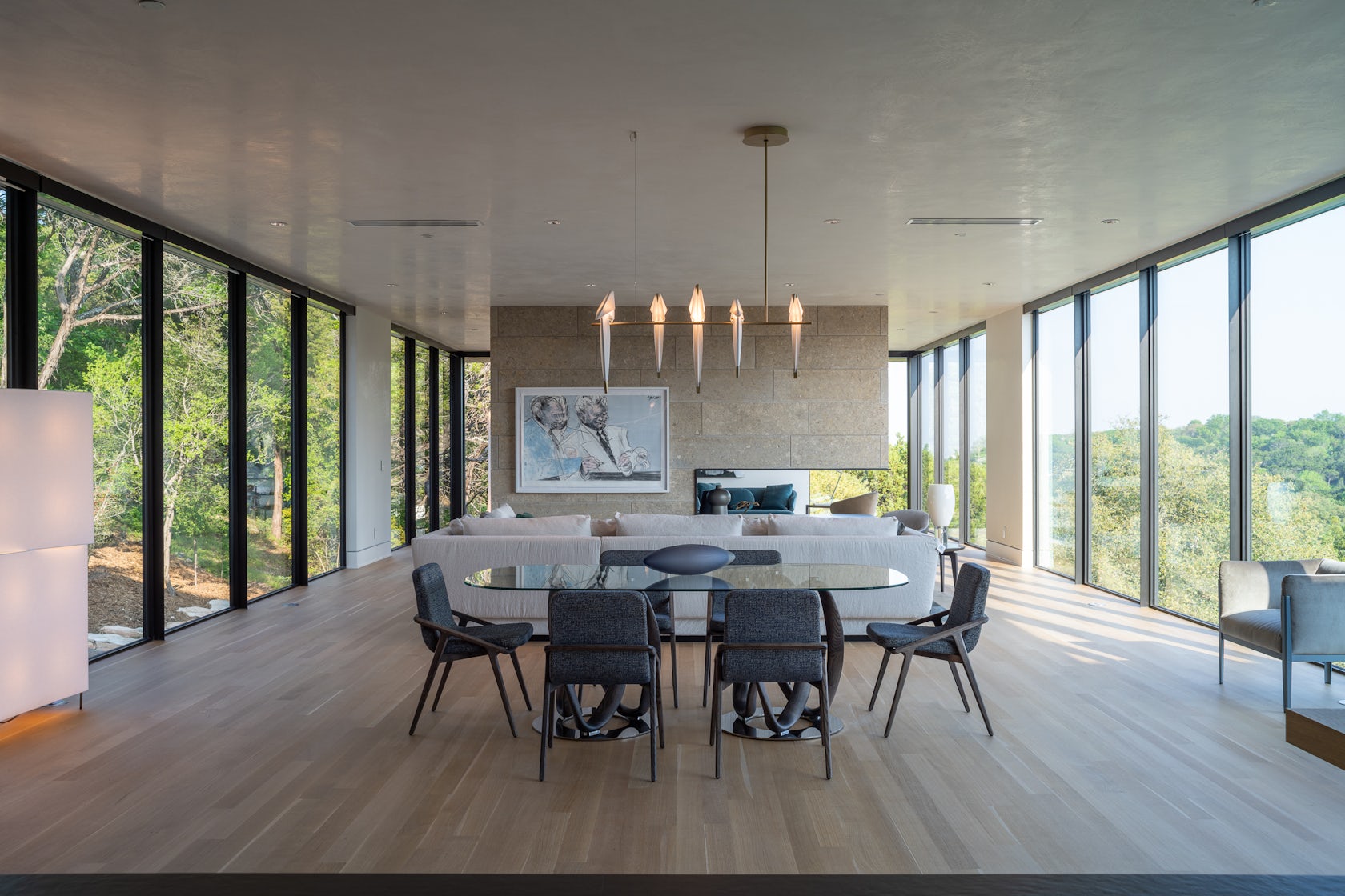
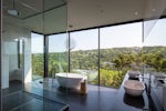
West Lake Hills is an area of tremendous natural beauty, with steeply sloping terrain and mature tree cover. The challenge to create a design with architectural significance that was as well-blended into the site as possible informed our thought process every step of the way. Stacking the spaces into three levels reduced the overall building footprint, minimizing site disturbance and maximizing tree preservation. Layering the forms stepped the roofs down to follow the terrain. And the extensive use of glass took its cues from these minimalist intentions.
© Dick Clark + Associates
What drove the selection of materials used in the project?
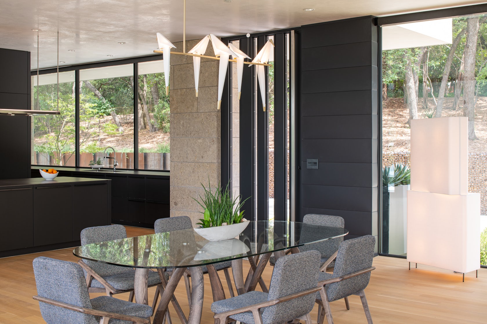
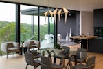
The material palette was inspired by the existing natural features of the site. A big part of the main level is completely see-through, which gives it a subtle but compelling presence. The window frames and roofs take their direction from the dark tree cover, blending in with the trunks and shadows. The solid walls are a warm neutral stucco and stone, which echoes the limestone hillside on which the house is placed.
© Dick Clark + Associates
What is your favorite detail in the project and why?
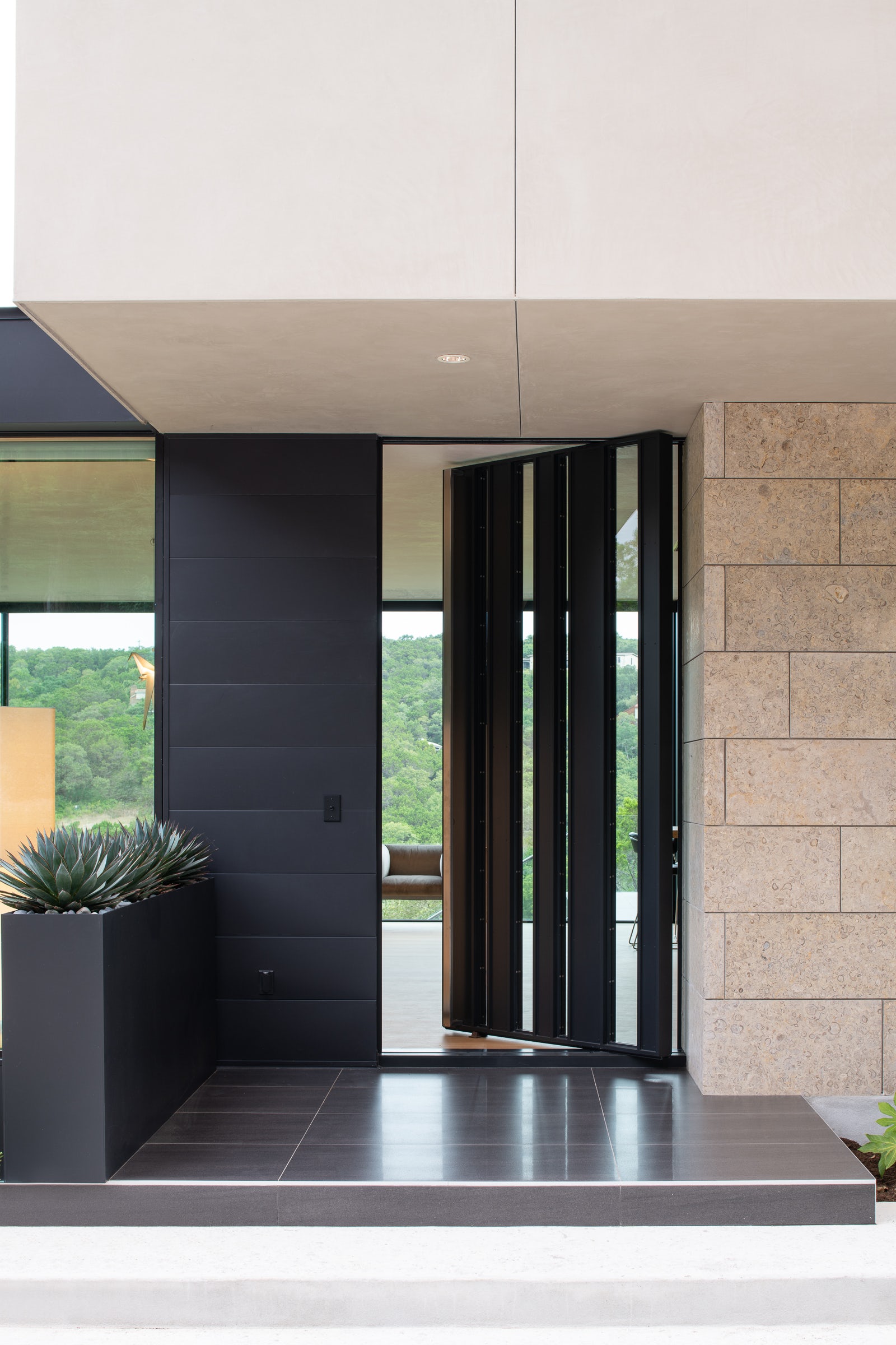
The front door is a really special detail. We designed it specifically for this home, and it was custom-built locally with exceptional craftsmanship. The door itself echoes the clean lines and black-and-glass palette of the exterior, while bringing in a hint of texture and element of the unexpected. It’s a captivating and memorable feature to welcome guests inside.
In what ways did you collaborate with others, and how did that add value to the project?
The client encouraged us to push ourselves and dive further into ideas, and the structural engineer was creative and collaborative as well. It is an absolute joy to work on a team like that, because it results in really unique outcomes. The most visible example of this is the prominent cantilever on the end of the house – not an easy accomplishment, but with a committed and enthusiastic team, well worth the extra measure.
© Dick Clark + Associates
Were any parts of the project dramatically altered from conception to construction, and if so, why?
The driveway was completely reconfigured during construction, in response to reassessment once the sitework was underway and the building forms were shaping up. The access approach moved to the opposite side of the house, which created an even more dramatic entry sequence as the house was now introduced from the cantilever end.
How have your clients responded to the finished project?
The finished project exceeded everyone’s expectations. From the first meeting walking the site together, knowing there were significant code and site challenges ahead of us, the client was both confident and curious. The end result is one they are proud of and enjoy as an exceptionally unique home, that embraces and displays the natural beauty of the site.
© Dick Clark + Associates
What key lesson did you learn in the process of conceiving the project?
I learned to lean in fully to an idea, whether that be editing and restraint, or pushing a concept further than you may think is reasonable. This makes for a cleaner, more cohesive design.
How do you believe this project represents you or your firm as a whole?
This project is a direct illustration of relentless problem-solving abilities. Using knowledge and experience, along with creativity and a constant search for new solutions, we were able to create a design that is fully intentional, and responds to the challenges of site and code constraints by using them as an opportunity to think more creatively.
Credits / Team Members
Kim Power, AIA
Consultants: Jon Luce Builder (General Contractor & Interior Design), Design Ecology (landscape), Design Aquatics (pool), Steinman Luevano Structures (Structural engineer)
Products / Materials
Leicht Cabinetry (from Arete European Kitchens), Reynaers Windows & Doors
For more on Live Oak, please visit the in-depth project page on Architizer.




 Live Oak