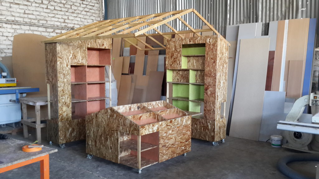
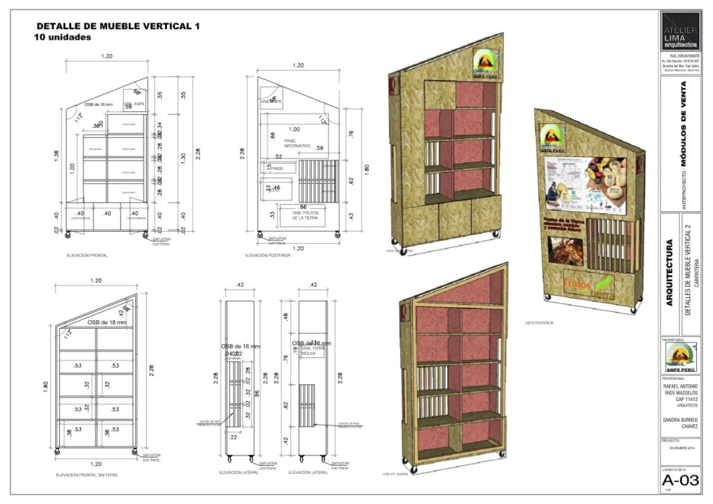
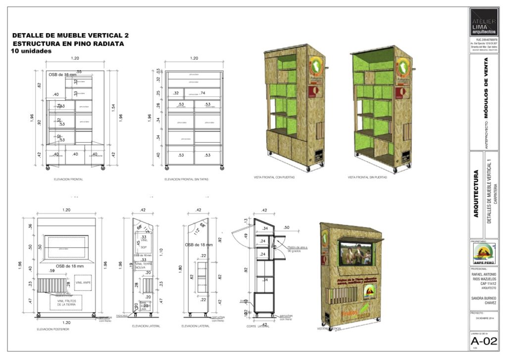
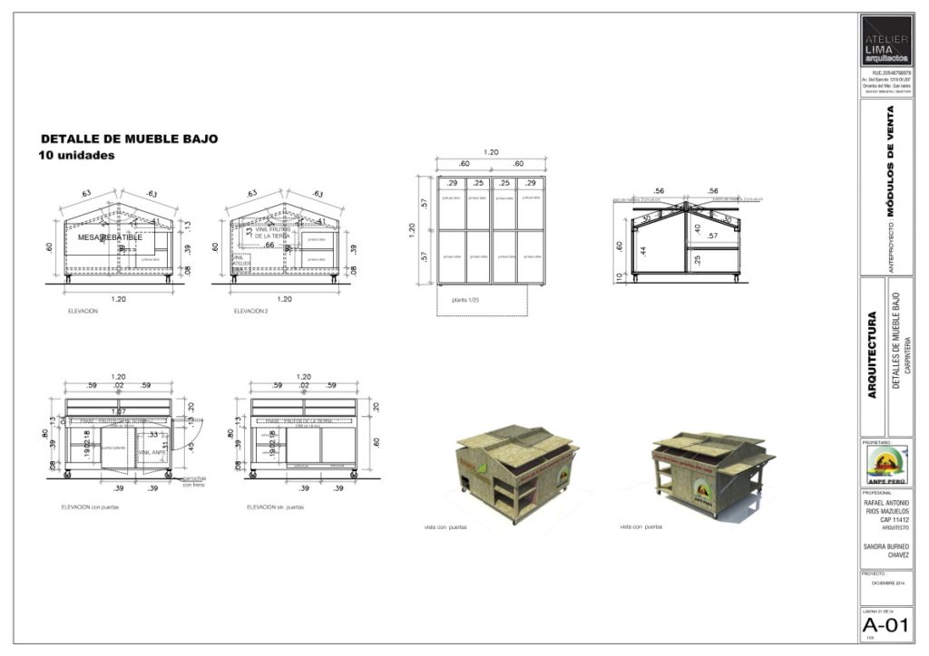
Itinerant market OSB – The idea of the project is based on an ephemeral, flexible and economic architecture with the capacity to invade public space and generate new dynamics within the idea of a “street market”, with a unique and particular materiality, modular construction and materials recycled and eco-friendly. Each kiosk is assembled from pieces that can contain different products, likewise the spatial configuration can vary according to the shape of the square, street or park where they can be implanted. To give a recognizable and symbolic image, the volume adopts the formal archetype of the “house”. Finally, the kiosks rely on technology so that through screens they can transmit information from the merchants of organic products.
Architizer chatted with Rafael Ríos Mazuelos from Atelier Lima arquitectos to learn more about this project.
Architizer: What inspired the initial concept for your design?
Rafael Ríos Mazuelos: The main inspiration was, on the other hand, the needs expressed by the client, such as the ability to move objects to different places, or the explicit requirement to have a “small house” shape, this together with the idea of granting colors and a felxible construction system.
The pieces had to come together and form a small contained space where people could interact. Another important idea was to vindicate the history of “street markets” and evoke the memory of those interventions that are being lost today due to the advancement of more formal “retail” options.

© Atelier Lima
What do you believe is the most unique or ‘standout’ component of the project?
I believe that the main value of the project is the ability of the object to be able to connect with people to the point of generating a genuine appropriation, in which despite being a strange object in the environments where it is located, it is capable of participating. of the dynamics of public space with naturalness, impacting the use and later disappearing without a trace.
This is a very powerful phenomenon because we are used to the idea of permanence of architecture, to a fixed and inert matter, however in a world that changes so much and so fast, small temporary interventions can mark and evidence things that giant buildings sometimes they can not.

© Atelier Lima
What was the greatest design challenge you faced during the project, and how did you navigate it?
When we just started the project we already had a first design of the module, we didn’t know how we were going to really build it. For which we had no other option to build models and prototypes until reaching full scale, with which certain parts and cuts could be perfected for better assemblies and ease of transport.
Another important challenge was the economic factor, since we had a very small budget, which forced us to be as efficient as possible with the material, and opt precisely for recycled and simple materials to solve the design.

© Atelier Lima
How did the context of your project — environmental, social or cultural — influence your design?
The context of the commission has to do with competitiveness, the markets for organic products normally do not have adequate infrastructure, improvised kiosks, often with supplies on the floor, exposed to contamination, despite being a high quality product.
Generating an architecture that can adapt to different products, locations and that is consistent with the possibilities of the promoters and that also dignifies the work of the community of farmers, producers and merchants, is gratifying because it also allows them to raise the price standard. and improve people’s perception of their services.

© Atelier Lima
What drove the selection of materials used in the project?
We think that the choice of the OSB panel as the main material was oriented towards practicality on the one hand, being a recycled material of an industrial nature, easy to obtain and cheap, but at the same time a material that expresses in its roughness, that relationship it has with history of the markets, the “wooden boxes” in which the fruits and vegetables originally arrive are recognizable elements in the imagination of the person and generates a tremendous visual connection.
What is your favorite detail in the project and why?
Undoubtedly the favorite detail of the project is the final result of the coupling between pieces, since it is conceivable through three modules that could function as independent shelves, however when they are together they generate something else, giving a phenomenon of “synergy”, in where definitely, an image, a spatiality is created and complete functionality is resolved in a single element.

© Atelier Lima

© Atelier Lima
How important was sustainability as a design criteria as you worked on this project?
From the beginning the design already played with sustainability, conceiving itself as the container for organically produced products, without preservatives and chemicals. Precisely to follow this premise is that both the choice of materials and the temporary condition of the location is the one that generates the smallest possible footprint, to the point that when the market decides to leave the context, it can remain intact, despite being able to be located in a historic square full of restrictions, in a forest or in the middle of a highly crowded street.

In what ways did you collaborate with others, and how did that add value to the project?
The project was developed as a team both from the design part and the execution of the project, which was also addressed by our office. In these stages, both the interaction with the client, the visits to the carpentry workshop and the participation of the workers was essential to have the modules on time, since we had a very structured schedule due to the deadline for the start of the first fair. in the historic center of Lima


Were any parts of the project dramatically altered from conception to construction, and if so, why?
A complicated part was the weight of the modules, these had to be able to be transported and installed by the merchants themselves, this forced us to think about accessories such as wheels and try to fragment as many four pieces as possible so that they can be transported on trucks with relative ease.
How have your clients responded to the finished project?
They loved it, they were quite satisfied due to the good comments from the public and from the merchants themselves highlighting how the modules attracted attention and animated the space where they will be placed.

© Atelier Lima

What key lesson did you learn in the process of conceiving the project?
Designing with real limits but with unlimited creativity is the main lesson because it is a motivating exercise that tests knowledge and talents in a more multivariable way.
How do you believe this project represents you or your firm as a whole?
It represents the predisposition that we always have to make a different project, that responds to all the variables of the environment, that does not respond to a specific fashion or style, but rather that interprets the needs of the user as the center of the design process and that is supports the material elements of the architecture to provide a viable and pertinent solution

© Atelier Lima
How do you imagine this project influencing your work in the future?
I think the main influence is the sense of scale, these projects, despite being based on small elements, almost furniture, have an impact at an urban level. This generates a versatility in our office that allows us to tackle projects of different sizes, without losing quality or complexity.
Is there anything else important you’d like to share about this project?
We would like to highlight the attitude of the client who simply trusted that we could achieve the objectives together, and who opted to participate in a project with a certain risk, perhaps not economically, but in the unusual aspects of the assignment and its characteristics.

© Atelier Lima
Team Members
Sandra Burneo, Ernesto Verlarde, Moises Quispe
Consultants
Asociación Nacional de Productos Ecológicos
Materials
OSB panels, acrylic paint, polycarbonate
For more on Itinerant market OSB, please visit the in-depth project page on Architizer.


 Itinerant market OSB


