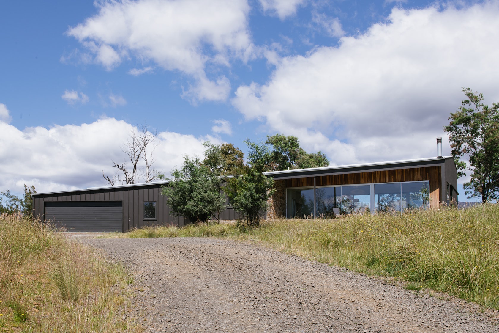
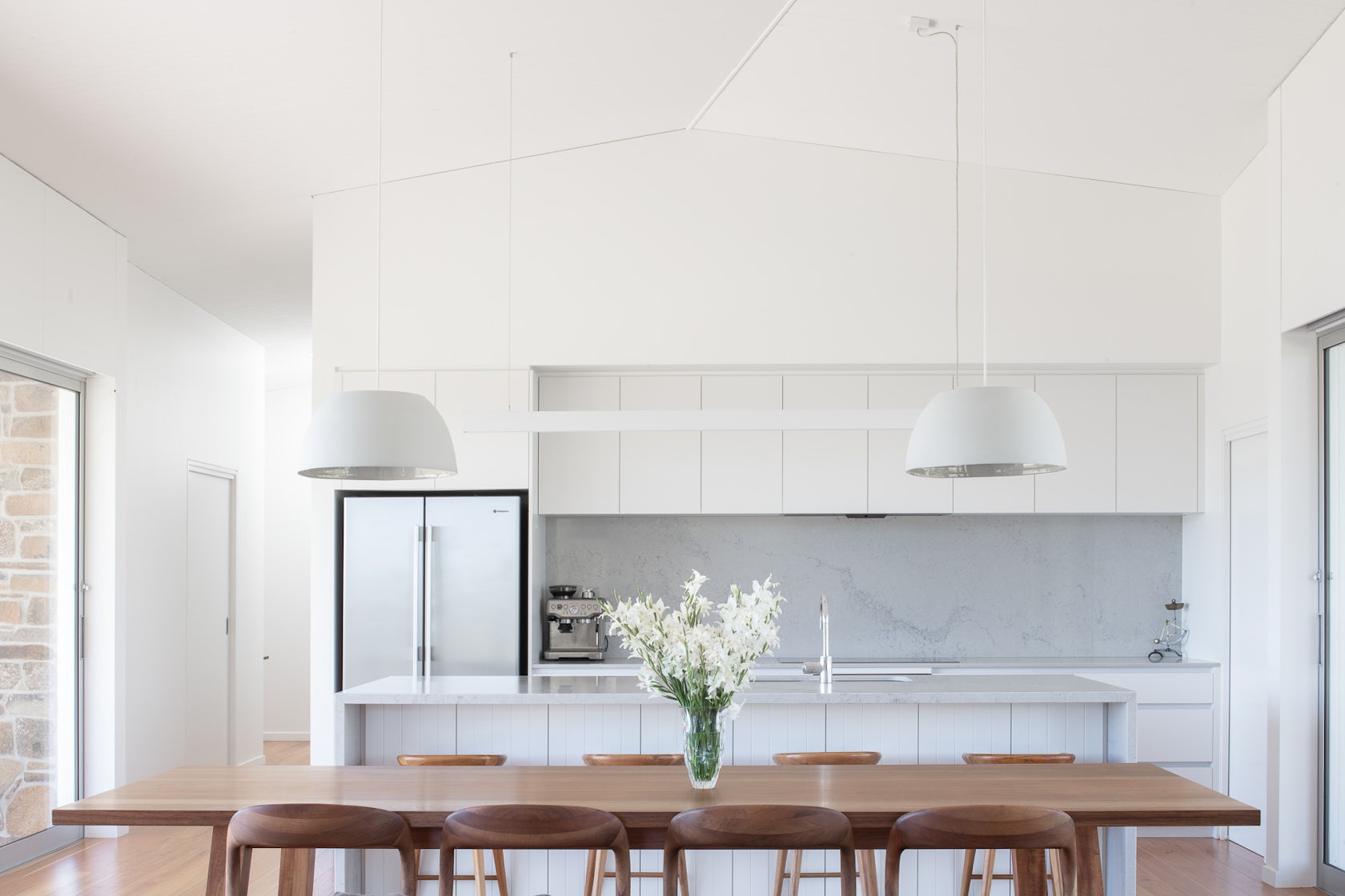
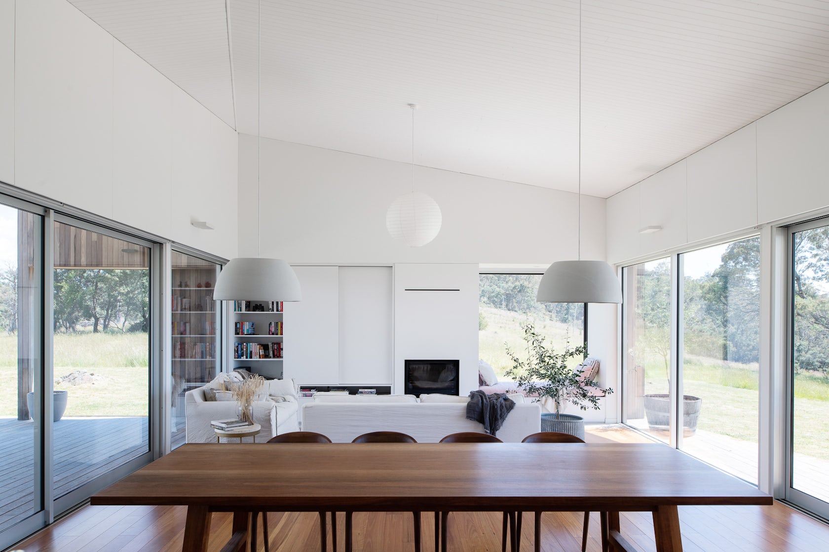
Hill House – Both brief and design were a reflection of the location and the realities of life on an established farm in Tasmania’s Northern Midlands. The owners wanted a modern two-bedroom house, a welcoming space that would create a calm separation between work and home. They asked for light interiors, a sense of volume in the living area, and a design flexible enough to accommodate future additions for a growing family. Because of the location and modest budget, we focussed on a simple design, providing a warm retreat from the region’s harsh weather, maximizing natural light, and prioritizing the property’s striking views.
Architizer chatted with Phil Ackerly from Cumulus Studio to learn more about this project.
Architizer: What inspired the initial concept for your design?
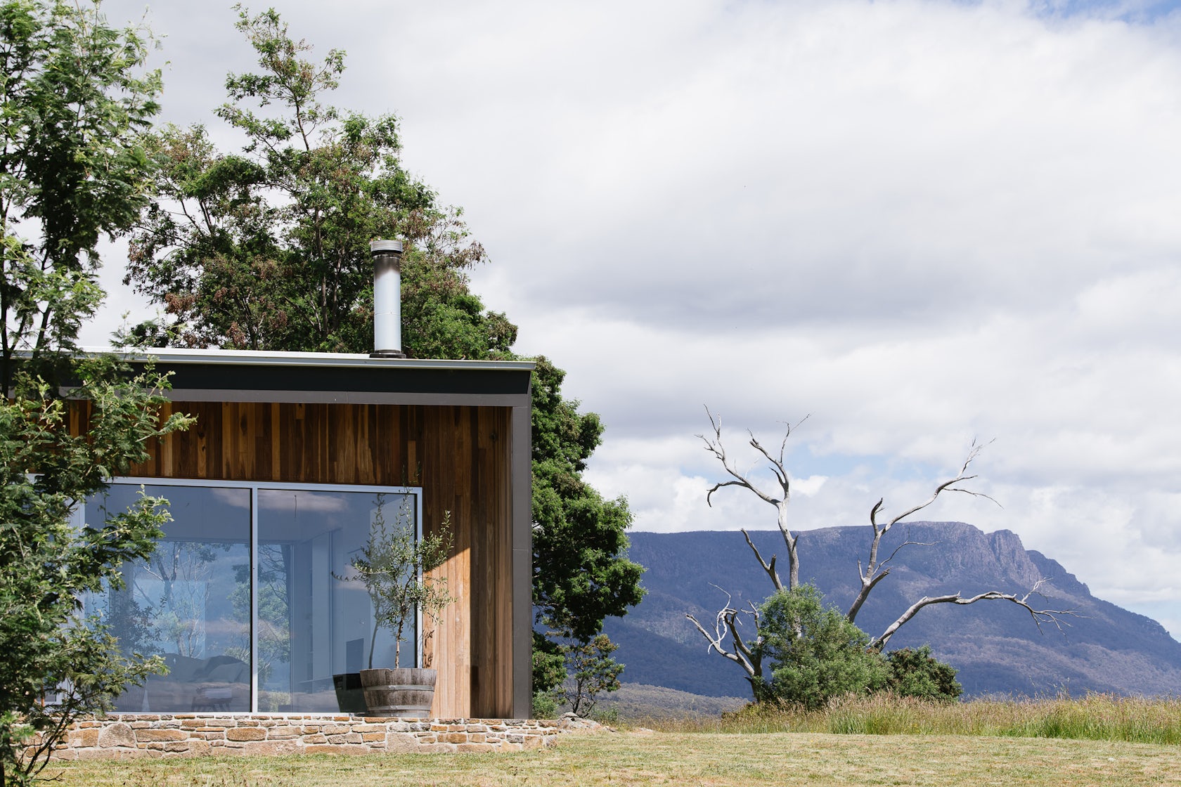
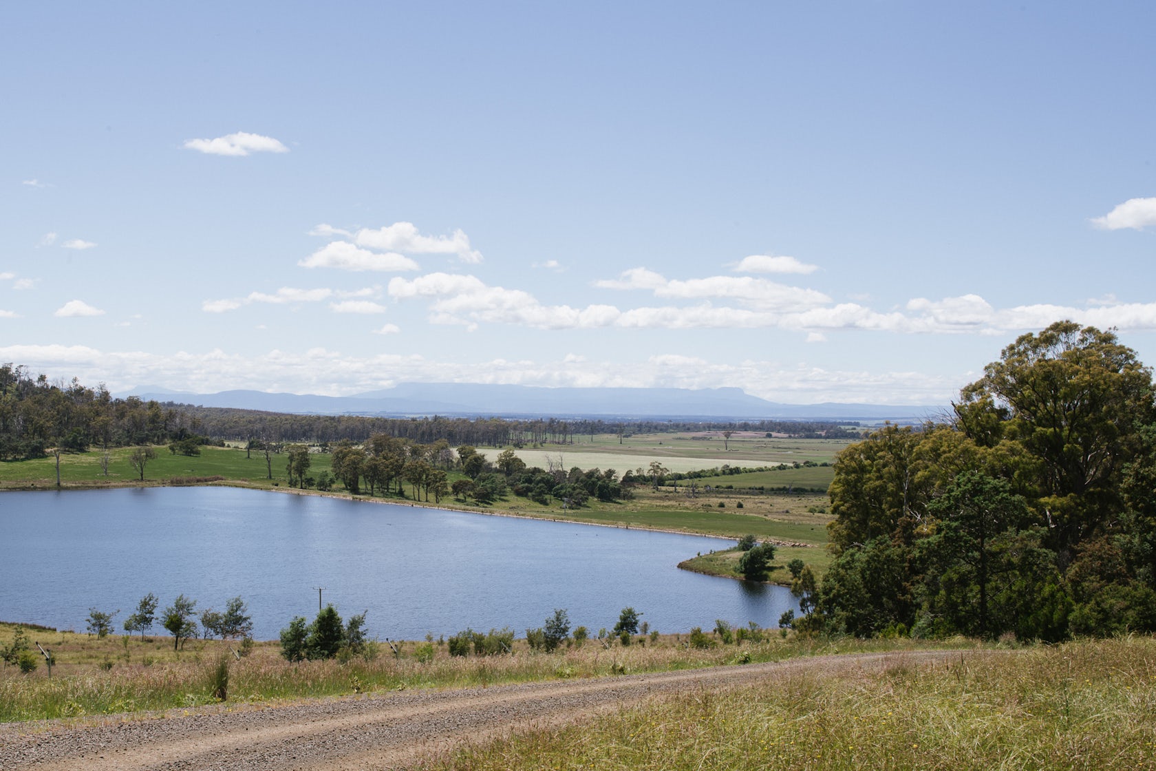
Phil Ackerly: Our initial inspiration came from the landscape surrounding the project. From our very first visit to the site (the highest point on the owner’s property, overlooking their farm to the east and the Great Western Tiers to the west) we knew that the views had to be naturally connected to the design. But our ideas also had to respond to the realities of life on the farm: keeping things practical, using robust materials that would stand up to the region’s weather, and making simple design choices to suit the owner’s daily life — such as a covered ‘workers entrance’ on the house’s eastern side where muddy clothes and boots could be easily removed before entering the house itself.
© Cumulus Studio
© Cumulus Studio
What do you believe is the most unique or ‘standout’ component of the project?
The covered main entrance is one of our (and the owners’) favorite aspects of the design.
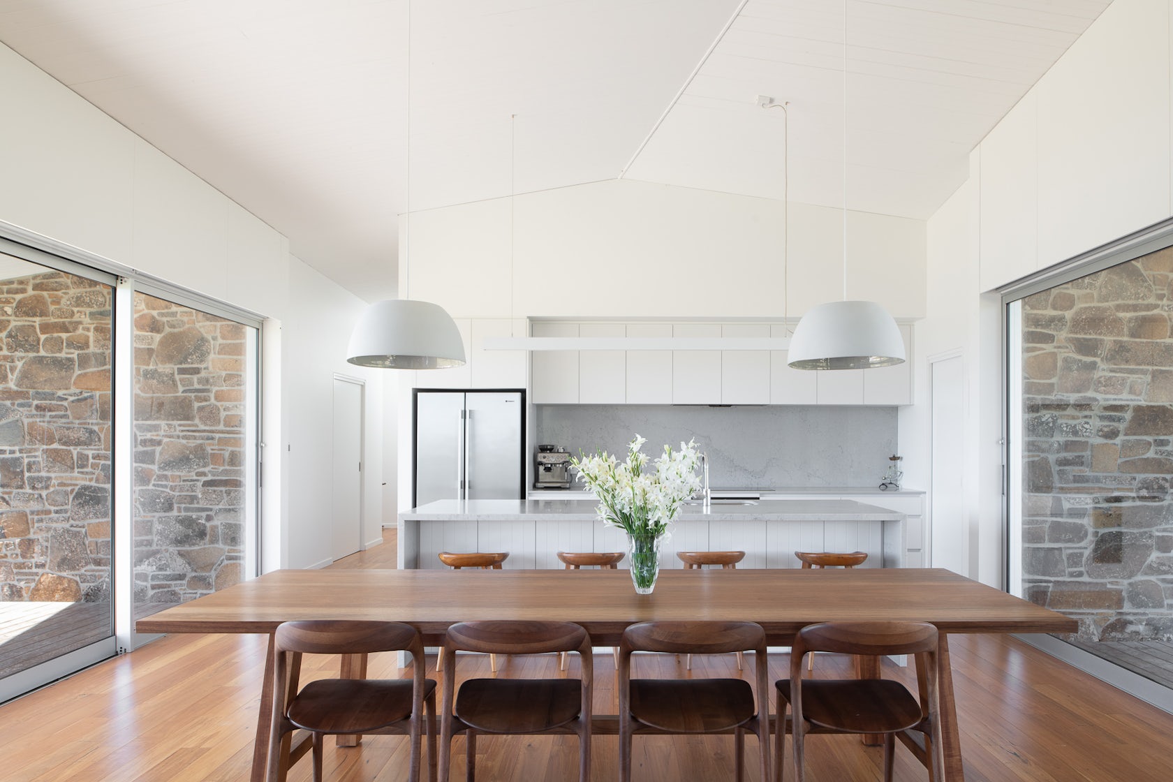
Because the house is at the heart of the farm, visitors easily get a clear sense of their surroundings on arrival — a house framed by the property’s expanse on one side and the towering Great Western Tiers on the other. When visitors come in, they expect the views to greet them straight away. But as they enter, the landscape is intentionally concealed, the view denied, only a skylight above them lets in the diffused light from the outside. It’s only when they take the short walk along the hallway gallery into the main living room that the east-west views framed by the large sliding doors on either side of the home come into play.
© Cumulus Studio
© Cumulus Studio
What was the greatest design challenge you faced during the project, and how did you navigate it?
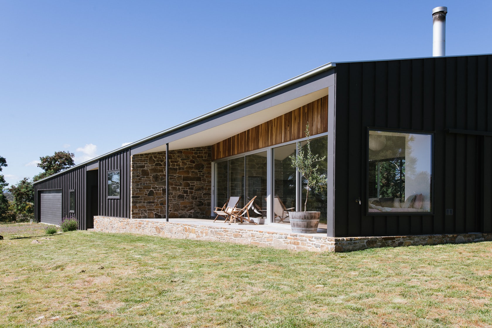
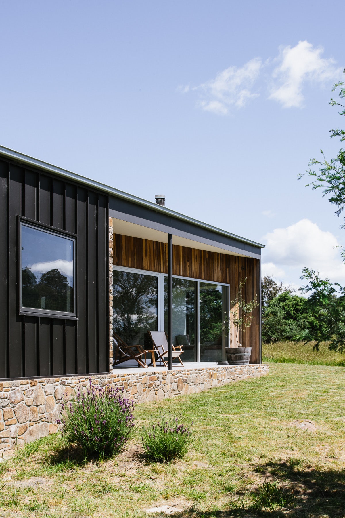
Hill House’s location within a remote working farm meant that two challenges had to be addressed, both of which worked hand in hand. Firstly, the space needed to be an enduring structure, one that would tolerate the region’s weather while being wildlife and bushfire proof. Secondly, we wanted the design to blend with the property’s context, not dominate it. Both were addressed by the materials chosen for the exterior. In keeping with the initial brief, we used locally sourced stone as the plinth, which we tightly wrapped with a muted steel cladding. Beyond meeting bushfire requirements, the cladding complemented the dark tones of the surrounding wattle trees and reflected the productive side of the farm — the traditional aesthetics of the machinery sheds dotting the property.
© Cumulus Studio
What drove the selection of materials used in the project?
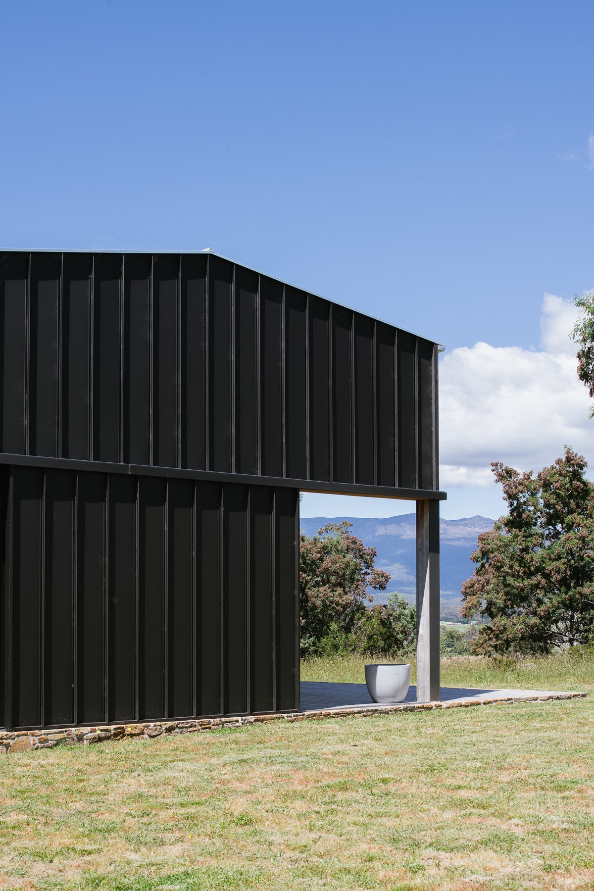
The materials for the exterior were chosen for the durability, practicality, and also for their visual aesthetic that settled the home into the ridgeline. The site is located on a prominent rise in a region that often experiences harsh weather conditions. The steel exterior is weatherproof and meets bushfire safety requirements. It also sits flush on a foundation of stonework that grounds the building, keeps out snakes and other wildlife, and allows for future additions to accommodate a growing family.
© Cumulus Studio
What is your favorite detail in the project and why?
The simplicity of the outdoor deck and stone work as it reflects the decisions made for the rest of the house. We resisted making the design overly complex, choosing commonly-used materials but using them in interesting ways to give the home a refined look without being disruptive of its surroundings.
How important was sustainability as a design criteria as you worked on this project?
There were some important environmental factors to consider. The locally-sourced stone was an important part of the design and was initiated by the owner. Being on a remote site, we looked to make the home as energy efficient as possible, relying on good orientation and passive design, adding hydronic heating to the floors, and using double glazed windows.
© Cumulus Studio
In what ways did you collaborate with others, and how did that add value to the project?
The location of the site meant that close collaboration with bushfire assessors ensured that our material choices met all safety requirements for the area. We also formed a relationship with a very good local builder (Minchin Construction), making the construction process a collaborative effort between owner, architect, and builder.
How have your clients responded to the finished project?
The clients love the home. It’s a space they can retreat to after a day’s work on the farm and enjoy the natural landscape that surrounds the property. They have come back to our studio with another project for their property.
How do you believe this project represents you or your firm as a whole?
The whole project was a process of close collaboration with our client. They were very much a part of the evolution of the design’s different iterations, working with us on-site from the start, asking questions as to why we’d arrived at certain ideas or materials, and adding suggestions that would help us better understand their needs and the site. As a studio this style of close collaboration and open communication is central to our practice and something that has continued as we’ve grown.
© Cumulus Studio
How do you imagine this project influencing your work in the future?
Hill House highlights how a simple design made from commonly used materials can create a unique home within a modest budget. It was a process where the brief was constantly refined through collaboration, teasing out the priorities of the client as well as the realities of the site and budget. This made sure the design was practical and the house no bigger than it needed to be. We think it has exceeded the client’s expectations. It’s a calm space that can grow with the family and be a lasting structure. It’s a good point of reference to have, especially with the increasing costs across the construction industry in Australia today.
© Cumulus Studio

Team Members
Phil Arckerly, Todd Henderson
Consultants
Minchin Constructions, Green Building Surveyors, Rebecca Green & Associates, Brierley Consulting Engineers.
For more on Hill House, please visit the in-depth project page on Architizer.


 Hill House