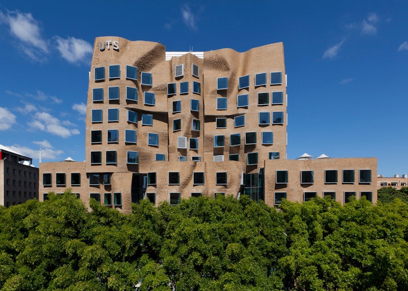
London might be home to the Gherkin, and soon, the Can of Ham and the Tortilla Wrap, but a city halfway around the world is now home to an enormous brown lunch bag — meant, perhaps, to put them all in. Frank Gehry’s addition to the business school at the University of Technology in Sydney is now complete, and its undulating brick façade has been greeted, predictably, with tidal waves of witty comparisons and polarized opinions.
Upon the building’s official opening last Monday, Australia’s Governor General Sir Peter Cosgrove called the building “the most beautiful squashed brown paper bag I’ve ever seen.” Meanwhile, Miranda Devine, journalist for The Daily Telegraph — and a former architecture student — was somewhat less complimentary, likening the distorted forms to “Escher on acid” and, worse still, a “poor man’s imitation Gaudí, without the wit.”
These contrasting views are befitting of a typically flamboyant design by Gehry, but the starchitect’s latest gem certainly begs further analysis — let’s take a closer look…

Via BBC
Viewing the building’s ‘iconic’ eastern façade from a distance, Devine’s cutting critique appears unfortunately valid. The rippling waves of hand-laid bricks attempt to draw attention to the building through architectural theatrics, which — considering Gehry’s preoccupation with formal gymnastics over function — means balance and composition are all the more crucial.
In this respect, the elevation is cumbersome in the extreme. The upper section is composed of two large distorted sections, overlapping a central panel that appears compressed (crinkled, perhaps) and in danger of being snuffed out altogether, given the building’s appearance of perpetual fluidity. At their base, these rippling skins sit atop a triptych of similarly irregular forms, and the correlation between each element appears awkward and poorly resolved.

Via BBC
On top of this, the windows suffer from the same affliction as the fenestration at Gehry’s equally outlandish Lou Ruvo Center for Brain Health in Las Vegas, Nev. They are conventional in form and detailing, clashing with the organic curves of the walls that surround them, and leading to a number of lips and ledges that will surely require continual maintenance in the long term to avoid water ingress between the bricks and the steel frames.

Via BBC
Having said this, Peter Cosgrove’s “most beautiful” comment can be more easily understood when the façade is viewed up close. Bricks epitomize the flexibility of small modular components, as they can be laid to form curves and waves despite their individual geometric rigidity. The subtle variation in brick bonding provides a playful surface, presenting another innovative way in which masonry can be used to produce unexpected forms — following in the footsteps of O’Donnell and Tuomey with their fragmented student center at the London School of Economics.
The warm texture of the material makes for a refreshing change to the cool steel and glass palettes of most modern institutional structures, but it came at a price: the 320,000 bricks were laid at angles so tricky that one of Australia’s master bricklayers had to come out of retirement to help complete the project, and the overall construction cost stands at an eye-watering $180 million AUD (just under $140m USD as of press time).

The entrance lobby stairs. Via BBC
The interior presents an equally incongruous picture. A chaotic jumble of metallic plates accompanies a staircase with no apparent reason other than to fill space and expand the construction budget, and the entrance lobby looks like the centerpiece of a fairground funhouse as a result. Delightful to the eye, perhaps, but a devil to polish up each day — call me a killjoy, but I can’t help but feel for the janitors that toil within Gehry’s creations…
On the contrary, the oval-shaped classrooms — designed by one of Gehry’s interns, no less — are a satisfyingly solid intervention amidst the formal turbulence. Each was formed by the stacking of 150 laminated timber beams, weighing around two tons apiece, with glass infills allowing light to filter through to the internal spaces. These gigantic Jenga sculptures seem curiously at odds with the building’s warped external planes, but can be considered its most successful feature nonetheless.

Internal classrooms. Via BBC
As with a large number of Gehry’s recent buildings, the University of Technology in Sydney illustrates just how fine the line is between an adventurous architectural triumph and an egregiously experimental misfire. Opinions will undoubtedly be split over which of these two most accurately describes Gehry’s Australian debut, but one thing is certain: The Brown Paper Bag forms a new and undeniably memorable landmark within Sydney’s ever-changing Ultimo quarter.
Yours distortingly,
The Angry Architect
Top image via BBC


