

“Instagram, Facebook, and Twitter are fomenting the biggest revolution in architecture since the invention of steel, concrete, and the elevator. It is a media revolution.”
Architizer cofounder Marc Kushner’s recent Op-Ed on how social media is changing the way we consume architecture felt all the more prophetic this week, as Facebook’s brand new headquarters in Menlo Park was given the Instagram treatment by an army of local photographers.

Via NDTV on Instagram
The resulting collection of images forms a comprehensive and visually striking tour of Frank Gehry’s newest landmark, instantly accessible to anyone with a smartphone or tablet. Just search for “#MPK20,” and you are immediately teleported into Mark Zuckerberg’s vast new workspace – a world of computer islands, easy chairs, low plywood coffee tables… and art. Lots of art. In fact, Facebook’s new hub looks much more like a gallery than an office; more on that later.

Via Mark Pike on Instagram
The grand scale of Gehry’s design was trumpeted around the web when it was unveiled three years ago. This was to be “the world’s largest open plan office,” a whopping 40,000 square meters of heaven in the Valley; an ocean of floor space dotted with desks and swivel chairs, stretching away to the horizon. Sure, there are plenty of workstations, but this overview of Gehry’s model of the finished interiors reveal that the reality of Facebook’s new hotbed of activity is somewhat more complex than original headlines suggested:
{% instagram “06ghZEG7CH/?tagged=mpk20” %}
Via Lu Wang on Instagram
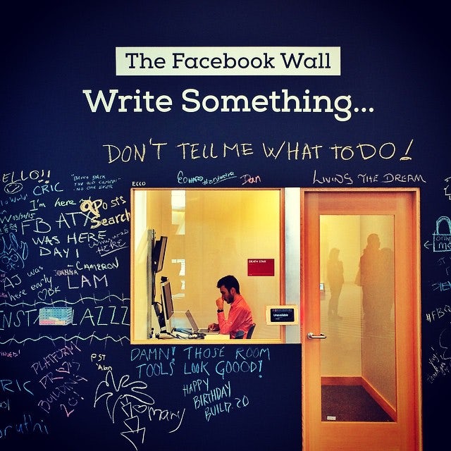
Examining each space in turn, one thing quickly becomes apparent: This building is designed to be anything but an office. It is a studio, it is a workshop, it is a warehouse, it is an amalgamation of many different typologies — but it is not an office as we have come to know it. Conventional workplaces, even those that are open plan, are split into territories for the individual. Everyone has their own personal space, and there are well-defined areas for communal gatherings, whether it is for lunch breaks, business meetings, or gossip sessions around the water-cooler.

Via Cory Maryott on Instagram
On the contrary, Facebook’s HQ is consciously loose with its layout, a patchwork quilt of spaces with programmatic overlaps: engineering desks merge with coffee bars, which segue into social lounges. The campus dispenses with preconceived ideas of functionality, and is deliberately left open to future manipulation and rearrangement.
Via zobebh on Instagram
Like Facebook itself, this space is merely a container or platform, waiting to be filled by its occupants however they see fit. The workspace is continuous, but not entirely open plan — it has niches, supporting spaces, offset alcoves that foster collaboration on a more human scale.

Via Alyse Allain on Instagram
As Mark Zuckerberg explained on his own Facebook page, “We want our space to feel like a work in progress. When you enter our buildings, we want you to feel how much left there is to be done in our mission to connect with the world.” The aesthetic qualities of the interior echo this sentiment: Gehry has created an architectural blank canvas, upon which 15 artists were commissioned to make their mark and transform the identity of different spaces within the building.

Via Cindy Loughridge on Instagram
Artists such as Scott Boms, Josh Higgins and Drew Bennett — who produced similar artwork in Facebook’s original campus, on the other side of the highway — have enlivened the interior with bold strokes of vivid paint, which drips down the walls like the remnants of a Jackson Pollock or Barnett Newman masterpiece.

Via Joey Tyson on Instagram
The wall of the café is covered with plates in sunset shades; another surface is engulfed by a sculptural tidal wave of picture frames. These pieces speak to the culture of innovation and creativity that has transformed Facebook into an online superpower, and the workspace appears infinitely richer for it.

Via Christophe Tauziet on Instragram
While the artworks are the clear highlight of the interior, the building’s greatest asset surely lies above: a vast nine-acre park covers the building’s roof, planted with dozens of trees and intertwined with meandering pathways. Facebook’s head of human resources Lori Goler likened the elevated natural landscape to New York’s The High Line.

Via John Barnett on Instagram
If this seems like a somewhat wishful comparison — the High Line is an inspired example of urban renewal that will never be matched by a contrived swathe of new-build landscape roofitecture — the green space will undoubtedly mature into a welcome retreat for staff, the ideal place to get away from the blue and white pixels on their computer screens.

Via Toby Harriman Photography on Instagram
The campus is notable for its absence of “Gehryisms”: The architect’s trademark flourishes are kept to a minimum, such that a faintly distorted staircase and a dash of titanium cladding on the exterior are the only clues as to the authorship of the building. The restrained design responds to Zuckerberg’s desire for a space that is “unassuming, matter-of-fact, and cost effective”: given these priorities, some might be bemused at his choice of architect for this project.

Via Elizabeth Gilmore on Instagram
However, Gehry appears to have ticked those boxes with aplomb, and staff will enjoy putting their own mark on the space over time. If the goal was to produce the epitome of a social network in built form, the architect has surely earned a new ‘like’ from both Zuckerberg and his army of Instagrammers. This is great design, gone viral…
Yours socially,


