Architizer’s newest print publication is available for pre-order! How to Visualize Architecture is an educational guide designed to help you master the craft of architectural storytelling and visual communication. Secure your copy today.
All architectural spaces have their special atmosphere. The space may be majestic, calming, tedious, depressing or more. Whatever the atmosphere is, it is specific to the building’s own history and site contexts. While being in a building is a four-dimensional experience, photographs capture static two-dimensional moments of the building. Photographs recreate the atmosphere of architectural spaces without bringing people to the building. The architectural space and its stories are presented to more people, especially in the age of digital photography.
Moreover, photos frame ephemeral moments and use these captures to tell stories in a much more straightforward way than the actual space does. Through careful decisions on all aspects of the photo, such as light, color and composition, a set of visual elements are filtered from the vast amount of spatial information to best compose a narrative.
While the margins of photos are already frames of images, creating a second frame within the image is a powerful way to direct the focus. When the photo is divided by the second frame, there are usually contrasts between the inside and outside of the second frame. The contrasts then emphasize the characteristics of both parts of the photo. See how the second frame works in the photos of six finalist from last year’s One Photo Challenge.
Superhero by Giorgio Marafioti
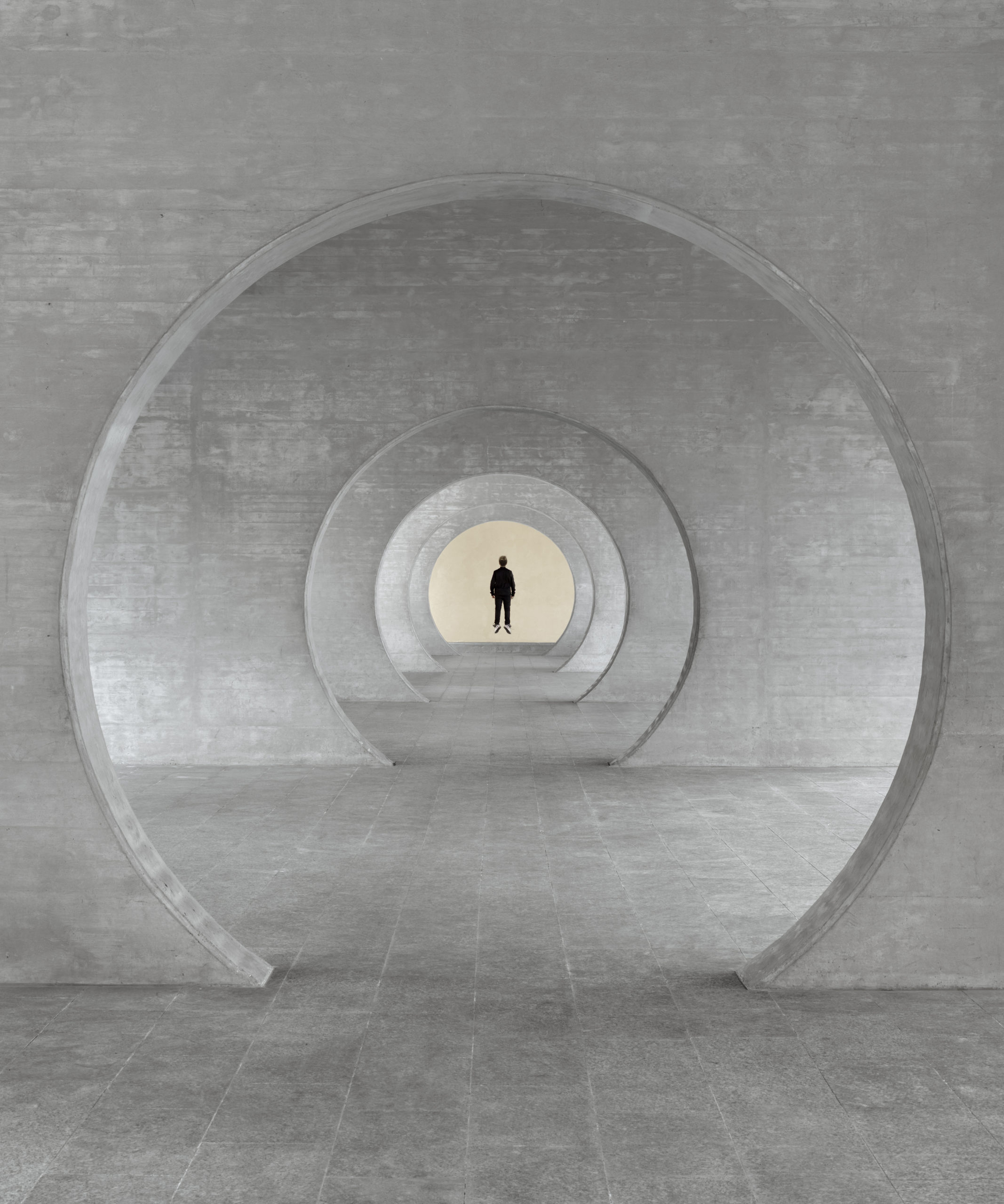 Taken in Novazzano Residential Complex in Switzerland, this work imagines the site as the residence of a superhero. The view looks through a series of circular openings and lands on the end of the space. There, a figure is floating as only a superhero can. The figure occupies the center of the composition and is backed by a warm, bright background.
Consecutive openings form a strong sense of perspective and a series of cold-color frames, both emphasizing the figure in the center. The repetitiveness of the identical frames expresses the “sense of bewilderment” of nowadays society that is “closed in on itself.” Ending this repetition is the hero who brings hope to society.
Mid-Century (birds) by Lisa Stinner-Kun
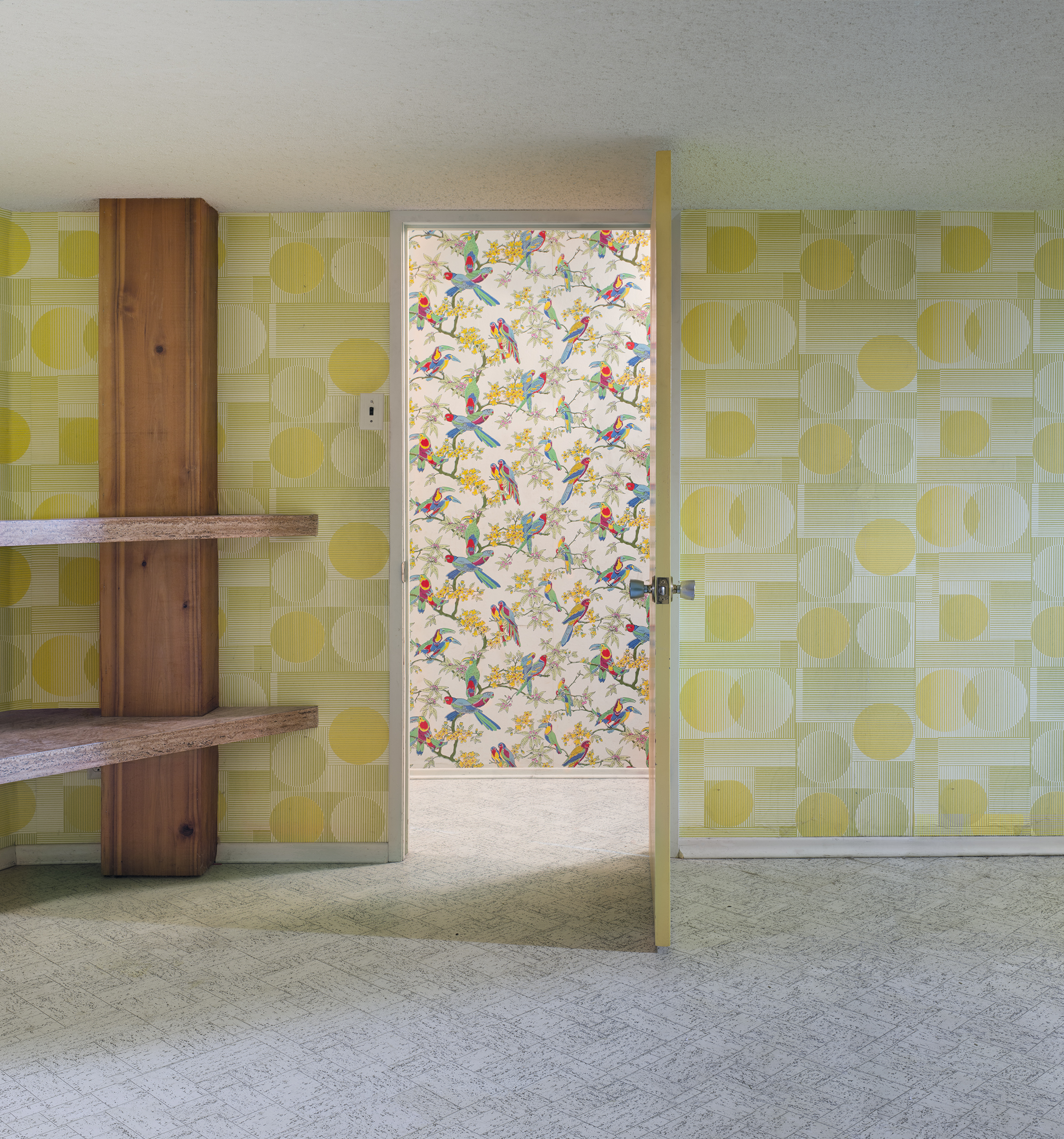 Framed by the doorway in this image is a wall covered in wallpapers depicting birds and plants. In the foreground is a darker room with abstract geometric shapes on its walls. The rather modernist patterns in the foreground contrast the nostalgic patterns behind them in terms of brightness, color schemes and the complexity of shapes.
When the space in the foreground was built, it was meant to get away from the “old-fashion,” figurative decorations. Interestingly, what was seen as old-fashion is now in-style once again. The image displays a subtle coexistence of the aesthetics from two time periods which turns into a loop of fashions over time.
The Oculus Sky by Melissa Teo
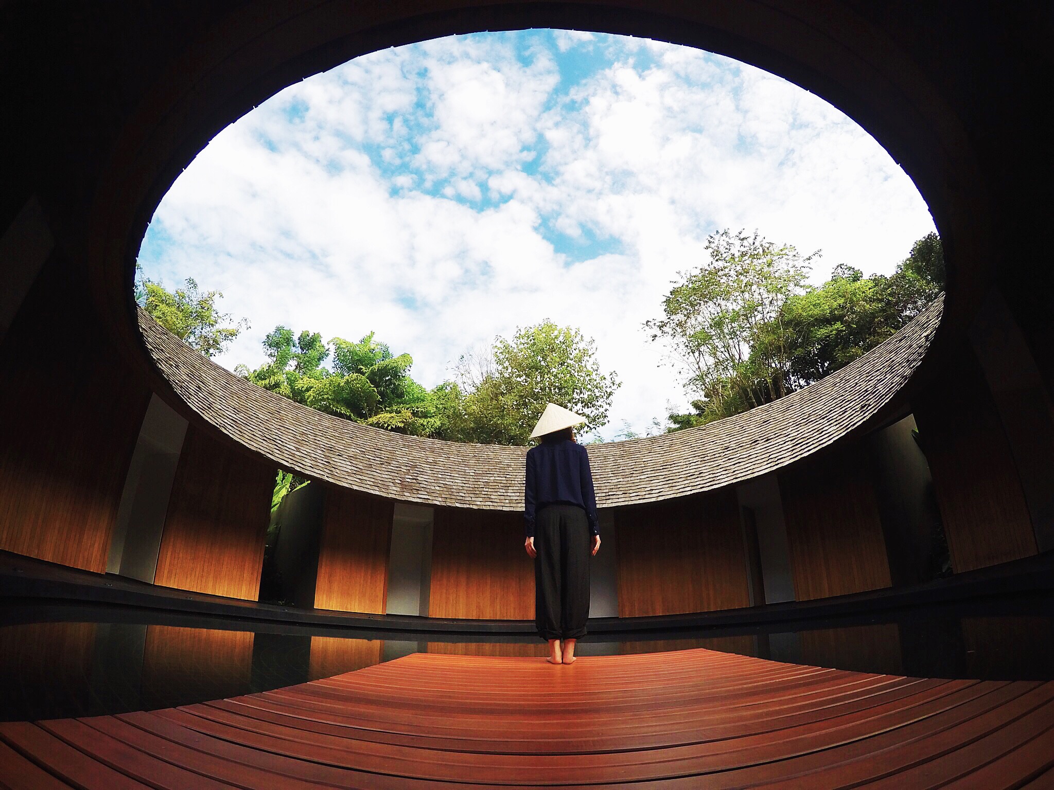 In this photo, the first thing that grabs the viewer’s attention might be the sky framed by the building’s roof. Inside and outside the frames are respectively the bright natural environment and the built environment in the roof’s shadow.
The frame is broken by a figure in the lower middle of the composition. By connecting the inside and outside of the frame with the figure, the framing allows two separated, contrasting parts become a coherent image. The upward-looking self-portrait conveys the author’s positive feelings toward the future.
Expo’98 Portuguese National Pavilion by Tomáš Hejzlar
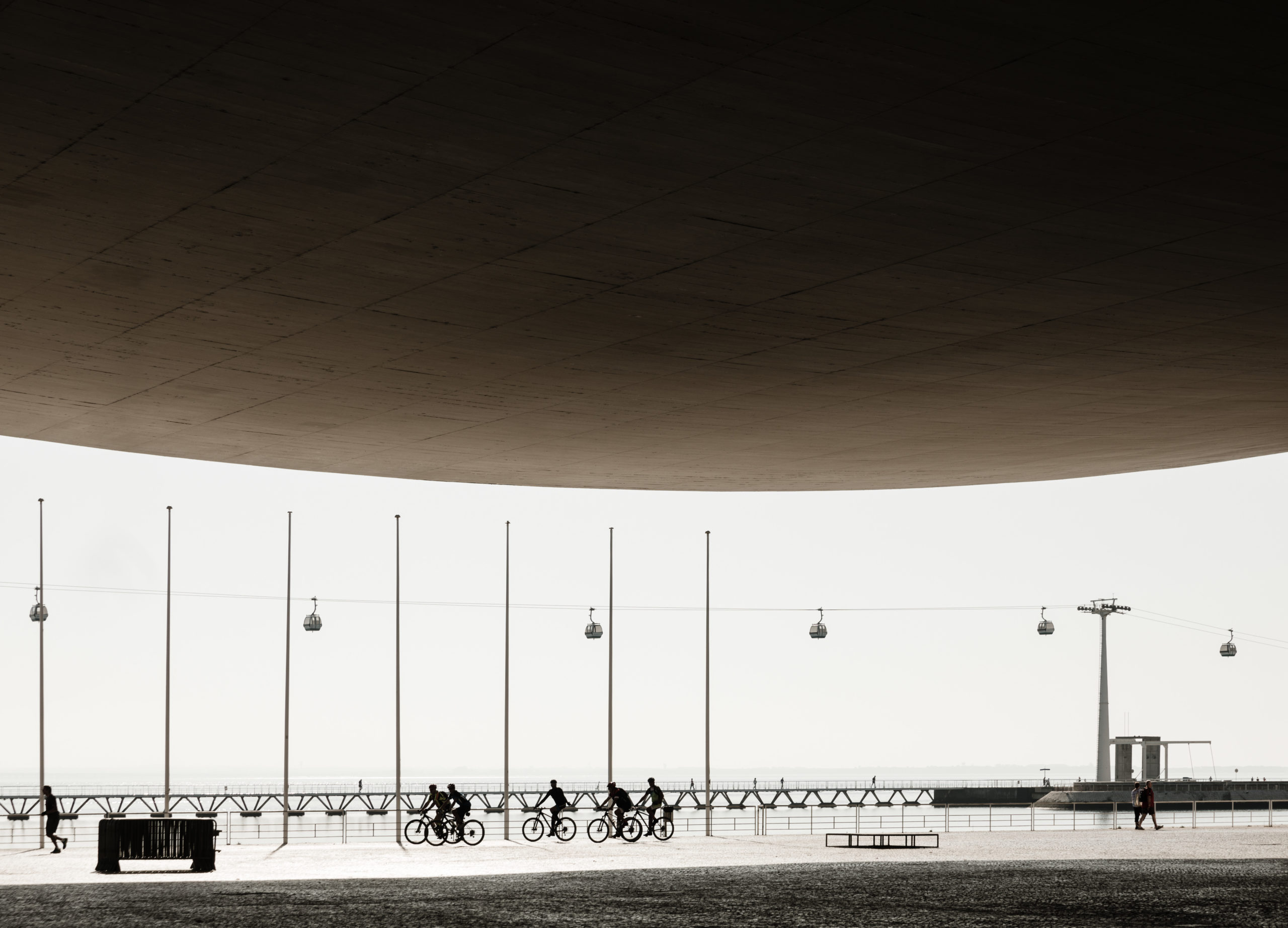 Nearly half of the image is occupied by the canopy of Álvaro Siza’s Expo’98 Portuguese National Pavilion, which reframes the image. All contents, the street, the pedestrians, the cyclists, etc, are concentrated in the lower half of the composition. The brightness of the late morning sunlight becomes a white canvas, while the shaded inner side of the canopy seems so dark that forces your view down.
The canopy is plain and massive, and the shapes in the light look elegantly delicate. The slight curvature of the canopy neutralized the heaviness and harness. Moreover, as the frame curves upwards at both ends, it indicates a space that gradually opens up outside the photo.
Habitat by Manolo Langis
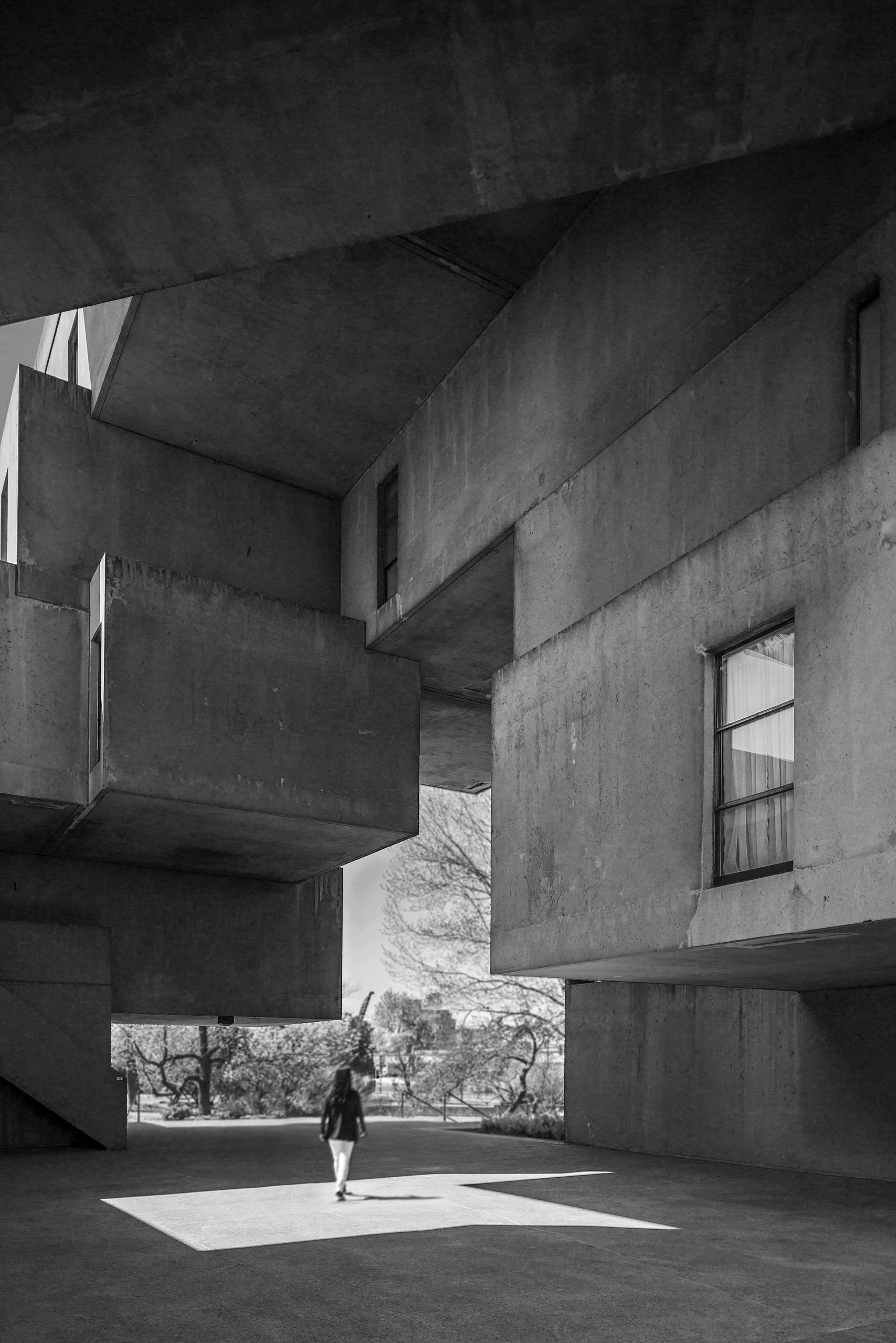 The author creates an irregular second frame with the building Habitat 67 by Moshe Safdie. Heavy concrete volumes are layered one over another, while each rectangular volume is different in length and thickness. Together, they frame the green space in the background with straight lines and clear angles, highlighting the contrast between natural and built, organic and industrial.
The skylight in the upper-left corner drops a piece of light on the floor as well as the figure walking in the foreground. The geometrical outline of the skylight echoes that of the inner frame and hence that of the building.
Overhead by Tommy Lei
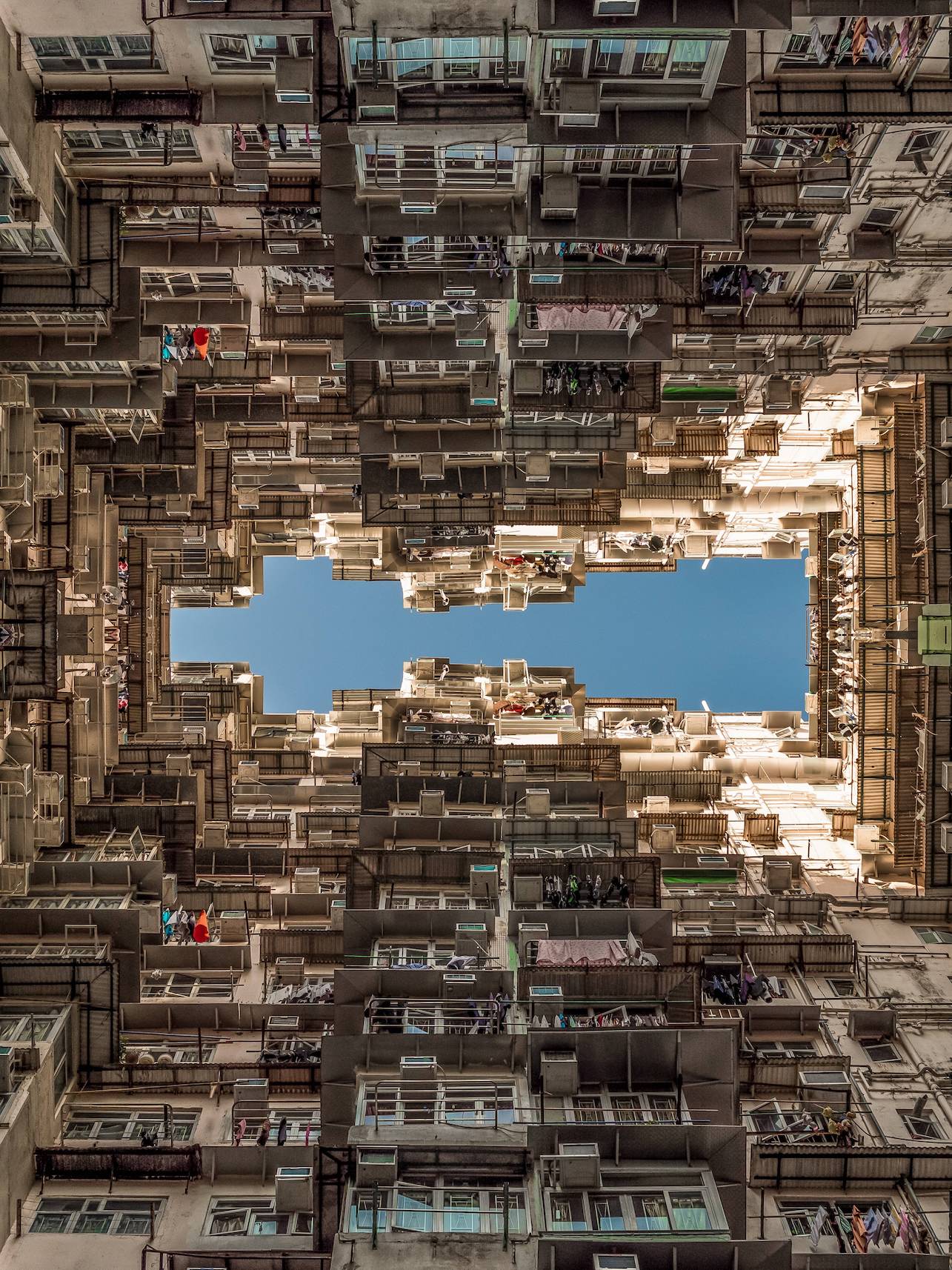 The image depicted here might be striking to those who never lived in areas of dense population. However, it is the type of view that the author grew up with. The building here is one of the government-subsidized residences for low incomes. In this photo, the sky is clear like a plain color block while buildings are rich in forms and textures. The windows are rhythmic as your view goes upwards from the bottom of the photo. The rhythm comes to a sudden end as it reaches the top of the building, where the sky frees you from the intense building surface. The photo is mirrored to form the symmetrical frame in the middle. This creates a feeling of being surrounded by buildings and multiplies the intensity of the textures.
Architizer’s newest print publication is available for pre-order! How to Visualize Architecture is an educational guide designed to help you master the craft of architectural storytelling and visual communication. Secure your copy today.
