Sign up to be informed when the next One Drawing Challenge competition opens for submissions. Be sure to check out the incredible work by this year’s extraordinary Winners and Commended Entries.
Architizer’s annual One Drawing Challenge poses the simple question — can you tell a powerful story about architecture in a single drawing? As last year’s amazing winners illustrate, it’s completely possible to do just that, and, in the process, fundamentally change how we think about the built environment.
While architectural drawings hold incredible potential as a visual medium, our efforts to communicate through them can fall short if mistakes are made in the creation process. There are plenty of great guides that explain how to draw architecture in a clear, compelling manner, but not so many that talk about what not to do. As you prepare your entry for this year’s One Drawing Challenge, take heed of these common mistakes and be inspired by the exemplary drawings shown to put your best foot forward for the competition:

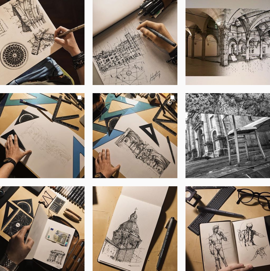
Well planned architectural illustrations by Giuliana Flavia Cangelosi; via Instagram
1. Drawing without a plan
Putting pencil or pen to paper without having an end goal in sight is particularly common in architecture because we tend to confuse visual brainstorming with total improvisation. Even if you are creating conceptual sketches, you should ask yourself key questions about your desired outcome before you begin.
How many concepts are you aiming for? How much detail are you going to include? Are you thinking about a concept in 2D, 3D or both? Miriam Slater of Empty Easel states that “more often than not, people immediately begin sketching without establishing some kind of intention in their mind first. You’ll find that a well-thought out drawing always seems more focused and clearer than one that doesn’t.”
2. Relying too much on outlines
While lines work well for diagrammatic drawings, their use should be carefully considered when sketching out a perspective street scene or natural environment. “Every time we touch a drawing tool to paper it desires to make a line,” says John Morfis of Hello Artsy, “but the real world does not contain any outlines.” The trick, according to Morfis, is to view the world in terms of values — levels of light and shade — and use these to define the edges of buildings and other objects in the drawing.
3. Focusing on details too soon
With architectural drawings, the overall composition and structure of a drawing is vital — without a solid foundation in these areas, no amount of detail will save you. “It is very easy to get lost in the details,” explains Slater, “but all that work goes to waste unless you have the proper larger forms in first.
“The temptation is to start ‘finishing off’ the drawing too fast, resulting in some beautifully rendered areas that have to be erased later. Get the drawing laid in correctly from the start, always remembering to work from large to small. The main forms go in first, followed by the details that can be considered icing on the cake.”

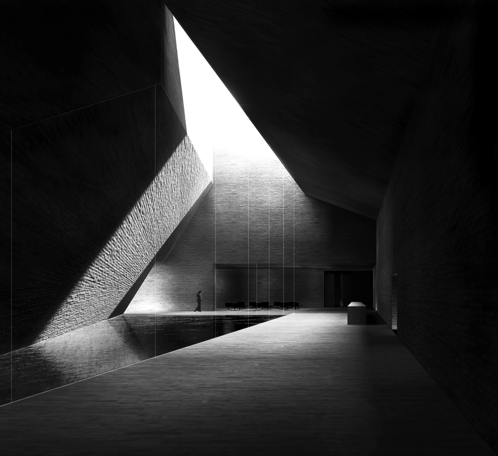
Drawing for Museo Neanderthal by Barozzi Veiga; image via Barozzi Veiga
4. Inconsistent illumination
Following on from the previous mistake, applying the correct lighting throughout an architectural perspective or section drawing is crucial in achieving a realistic scene. “We see because of light,” says Morfis. “Don’t forget to hint at a light source in your drawing. This means that one side of an object will generally be lighter or darker than another side.
“For example, perhaps the top of all of your objects should be depicted as the lightest.” Regardless of where you place your light source, the key is consistency — if your shadows do not run parallel with each other in the appropriate places, your drawing will instantly look wrong.
5. Not utilizing line weights
If there is one guaranteed way to make your architectural drawings look lifeless or lack clarity, it’s neglecting to vary the thickness or shade of your lines. “A diversity of line styles and weights allows you to distinguish depth and emphasize different parts of a drawing,” explains Eric Baldwin in his guide to architectural drawing. “A drawing can quickly read as flat when only a single type of line is used on a sketch or projection.”
6. Using an unnatural perspective
Architectural visualization expert Alex Hogrefe explained the importance of perspective in his article “7 Rules for Composing Powerful Architectural Perspectives.” While Hogrefe is in the business of renderings, his rules apply to drawings too. “If you are going to create an eye-level view, set the camera height to around 6 feet to better connect the viewer to the experience of being at that space,” explains Hogrefe. “People often rationalize that they want to better see the ground plane, so they raise the camera to just above head height at 8, 10, 12 feet, etc. However, this makes for an awkward and uncomfortable composition.”

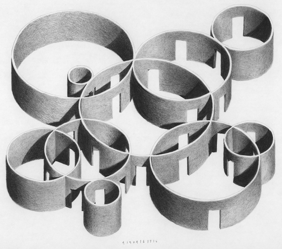
Pencil drawing for the Vara Pavilion by Mauricio Pezo and Sofia von Ellrichshausen; image via Dezeen
7. Drawing circular forms incorrectly
Most people are pretty adept at drawing two point perspectives — as long as the forms remain straight-edged. As soon as you introduce a curved façade or a circular window into the mix, things get complicated — and often rather distorted. “Viewed from any other angle other than straight on, a circular shape should be drawn as a ellipse,” says Morfis. “This will account for the proper perspective necessary to create effective illusions of form and space within your artwork.” Hello Artsy’s simple guide to drawing ellipses is a great starting point.
8. Smudging
It’s a drawing problem everyone has faced at some point in their life — you begin to shade in shadows with your pencil, and before you know it, there are black marks on your hand and across your paper.
The best way to avoid this scenario is to plan ahead — develop your drawing in such a way that you never have to lean the heel of your hand on parts you have already drawn. For larger drawings, sometimes you have to but your hand somewhere, but fortunately there are tools to help you — you can lean on a mahl stick or drawbridge to elevate your hand while you work.
9. Neglecting texture and pattern
Oftentimes, architects view every drawing as a clean diagram, and while this approach can be appropriate for certain drawing types, texture and pattern are ignored at your peril. Why? Because, as Eric Baldwin points out, “texture can be the primary means of telling a story in a drawing.”
While hatching can be vital in identifying different parts of a technical construction details, more conceptual drawings are aided by a creative approach to pattern and texture. “Varied densities of texture can create movement and pattern, defining their own forms of reading,” says Baldwin.

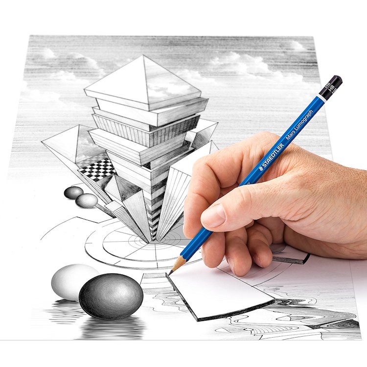
A correct use of shading can add a strong three-dimensional quality to your drawings; image via My Modern Met
10. Using the wrong grade of pencil
If you are attempting to create depth in an architectural perspective drawing, selecting pencils with varied graphite grades is essential. If your pencil is too hard, you will not achieve the desired contrast between light and dark areas of your scene.
In the U.S, the graphite grading scale is numeric. The hardness of the core is often marked on the pencil — look for a number (such as “2” “2-1/2” or “3”). The higher the number, the harder the graphite core and the lighter the mark left on the paper. As the pencil core becomes softer, it leaves a darker mark as it deposits more graphite material on the paper. Bear in mind that softer pencils dull faster than harder pencils and require more frequent sharpening.
11. Using poor materials
You can have all the skill in the world, but it all counts for nothing if you use a blunt pencil, a blotchy pen or smudging eraser. Invest in good quality tools to ensure that your drawings are sharp, clean an full of contrast, just the way you envisioned them. “Quality drawing tools will give you’re a broader range of mark-making ability and be more forgiving,” says Morfis. “If you are going to spending time learning how to draw, please treat yourself to the best supplies that you can afford. Good art supplies may seem expensive but you’ll get countless hours of use from them.”
12. Having a fixed mentality
Drawing, like any aspect of architectural design, is challenging, and takes persistence practice to master. There is always a danger in any artistic pursuit to view this challenge as insurmountable. However, with patience, mastery is possible for everyone. “So many students look at someone who seems to have more skill then themselves and decide that they are not talented,” says Morfis. “They have then locked their own mental state into a level that determines that they will never be any good at drawing. This form of self-defeatism is a tragedy and unfortunately very common in the field of visual arts.
“The truth is: drawing CAN be learned, and if you’re aware of common drawing mistakes, you’ll learn to draw even faster! Studies show that people tend to be good at something because they took an interest in something at a young age and were allowed to thrive in an environment that nurtured the interest. It takes practice and learning. If you are willing to learn and willing to practice you can learn anything … even drawing!”
Sign up to be informed when the next One Drawing Challenge competition opens for submissions. Be sure to check out the incredible work by this year’s extraordinary Winners and Commended Entries.


