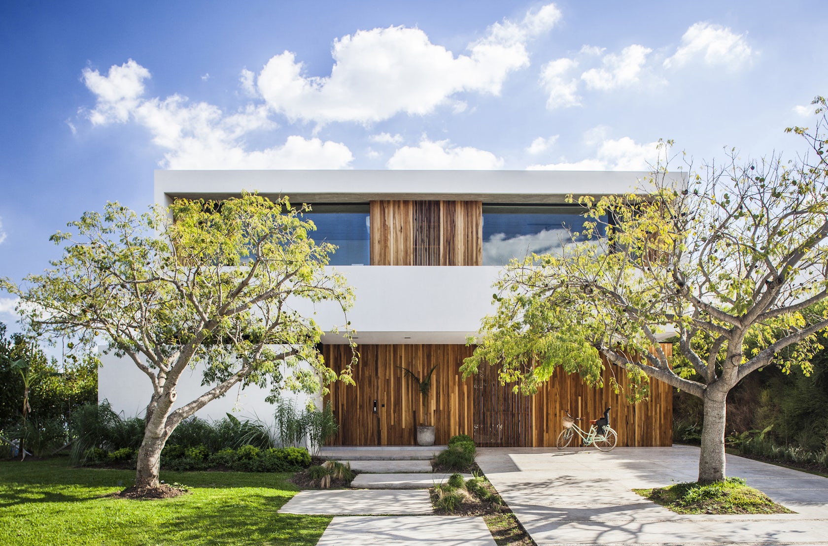
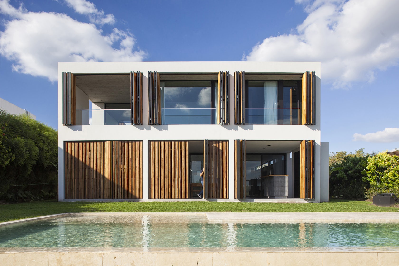
Casa M&M – Located in the Santa Teresa neighborhood, Tigre, province of Buenos Aires with views of the lagoon, Casa m & m is projected from a solid volume, openwork and with a management of light control. The idea of the project started with a pure volume. Then, we added empty spaces inside this volume, to create space for the sunlight to come in.
Architizer chatted with PESSAGNO and KANDUS at Estudio PK to learn more about the project.
Architizer: Please summarize the project brief and creative vision behind your project.
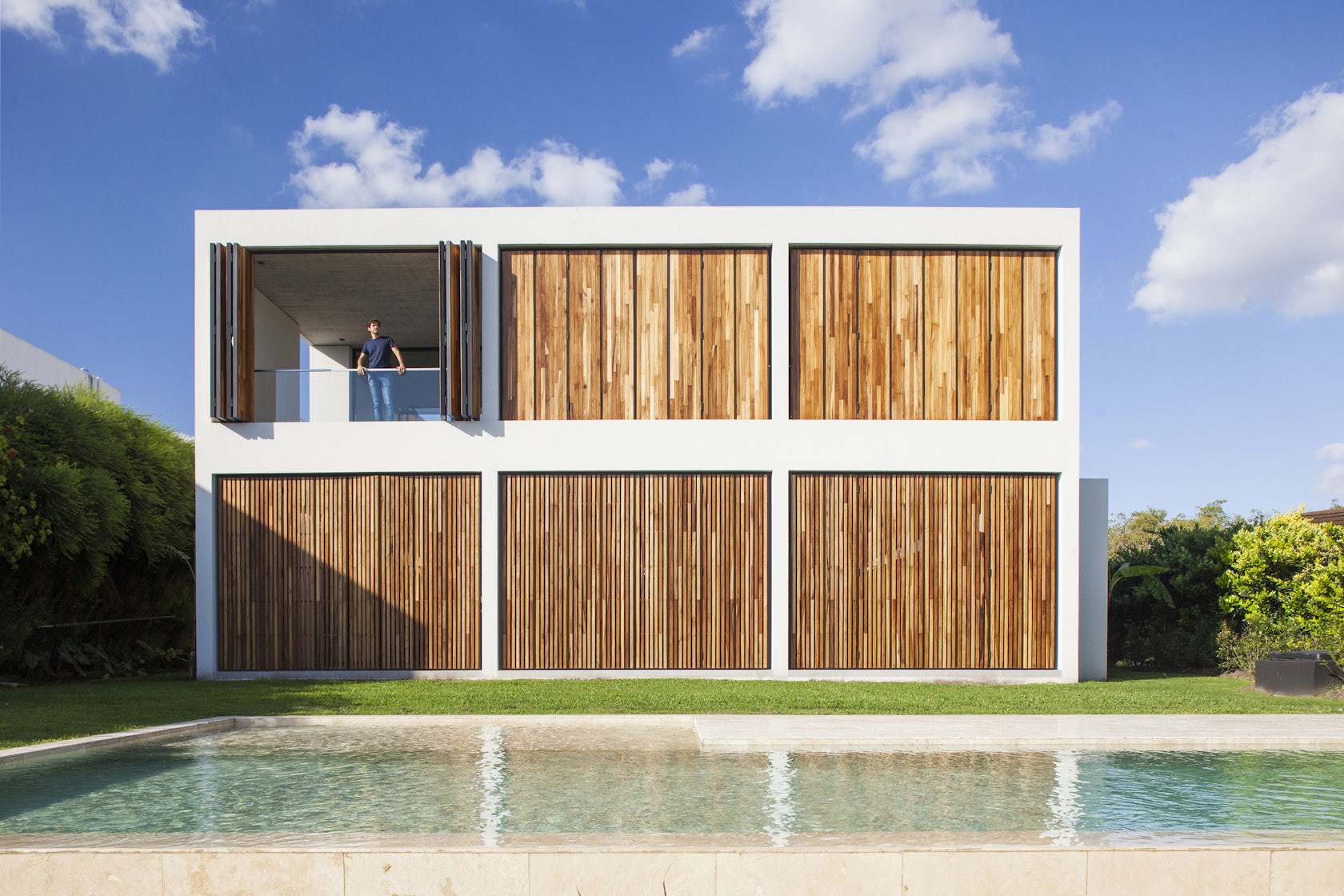
Pessagno & Kandus: The idea of the project start with a pure volume. Then, we added empty spaces inside this volume, to create space for the sunlight to come in. The empty spaces locations were chosen having into account the orientation of the house, which is fundamental. These different operations are powered by different systems, shutters are used on the back facade, parasols are used on the side and a continuous window is used on the facade according to the orientation.
© Estudio PK - Ignacio Pessagno & Lilian Kandus
What inspired the initial concept for your design?
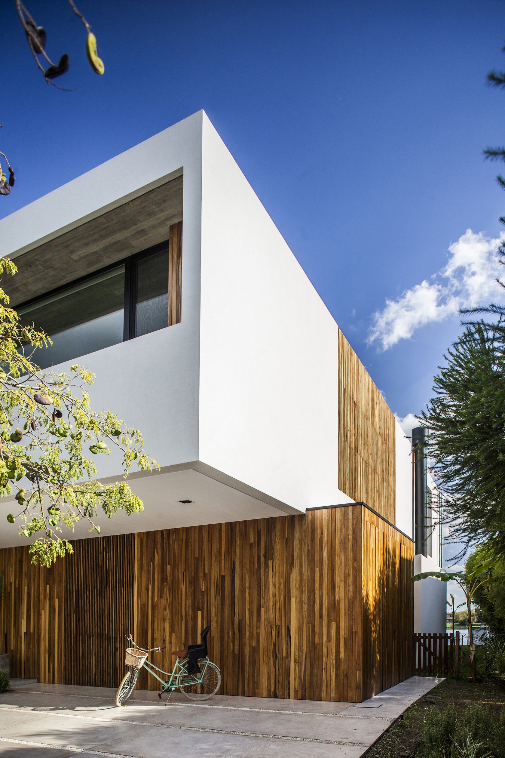
The initial idea was conceived from the location. The west facing facade conditioned the entire project, creating orations as a result of the dialogue between the needs of the program, its orientation and the conexion with the lagoon.
© Estudio PK - Ignacio Pessagno & Lilian Kandus
What do you believe is the most unique or ‘standout’ component of the project?
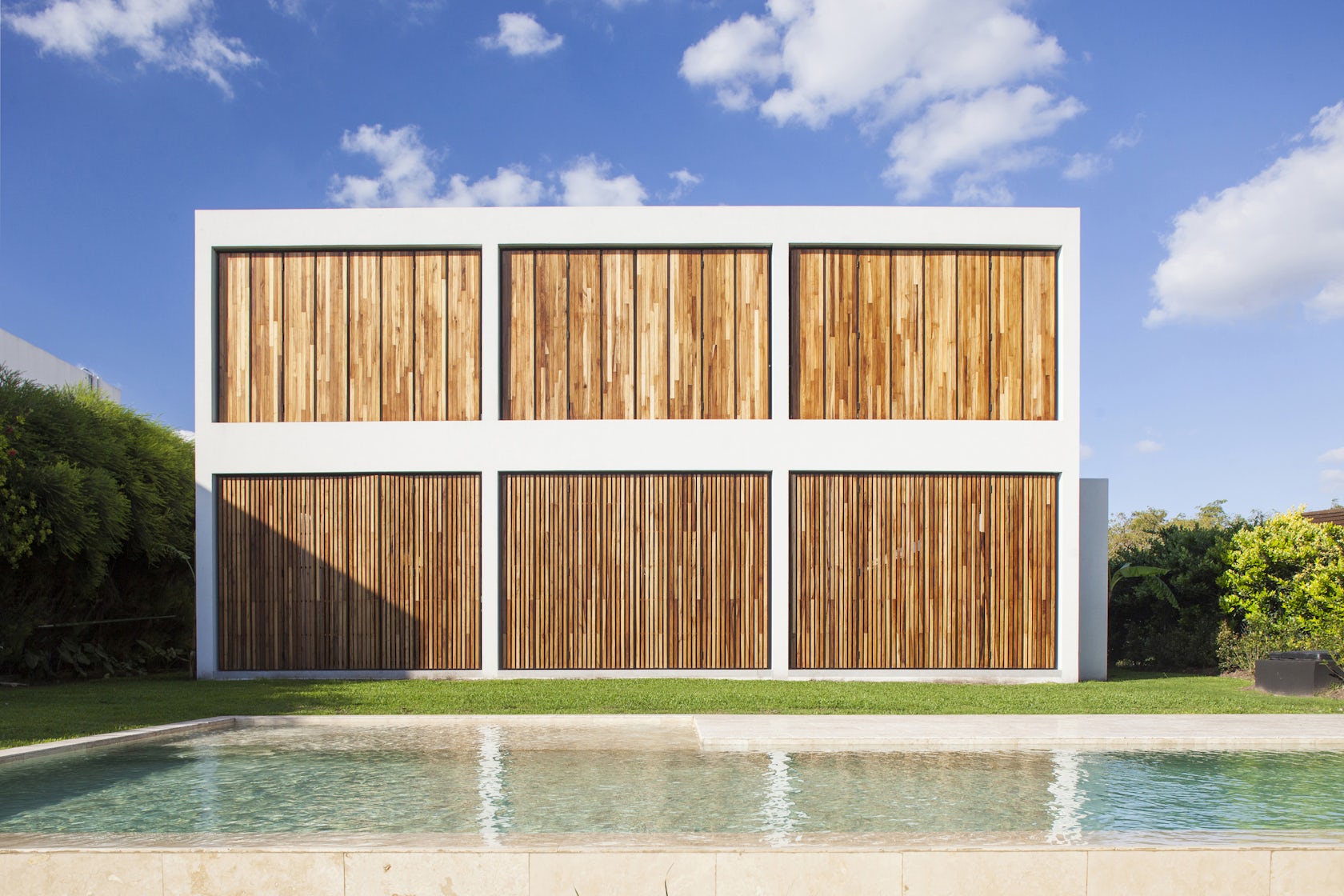
The way it responds to the environment. The dynamism of a volume that closes completely and opens according to the time of day and the season of the year.

© Estudio PK - Ignacio Pessagno & Lilian Kandus
What was the greatest design challenge you faced during the project, and how did you navigate it?
The biggest challenge was to respond to all the faces of the volume with respect to its orientation. To deal with the west, to receive the north, to capture and filter the east of the morning and to close to the south.
© Estudio PK - Ignacio Pessagno & Lilian Kandus
How did the context of your project — environmental, social or cultural — influence your design?
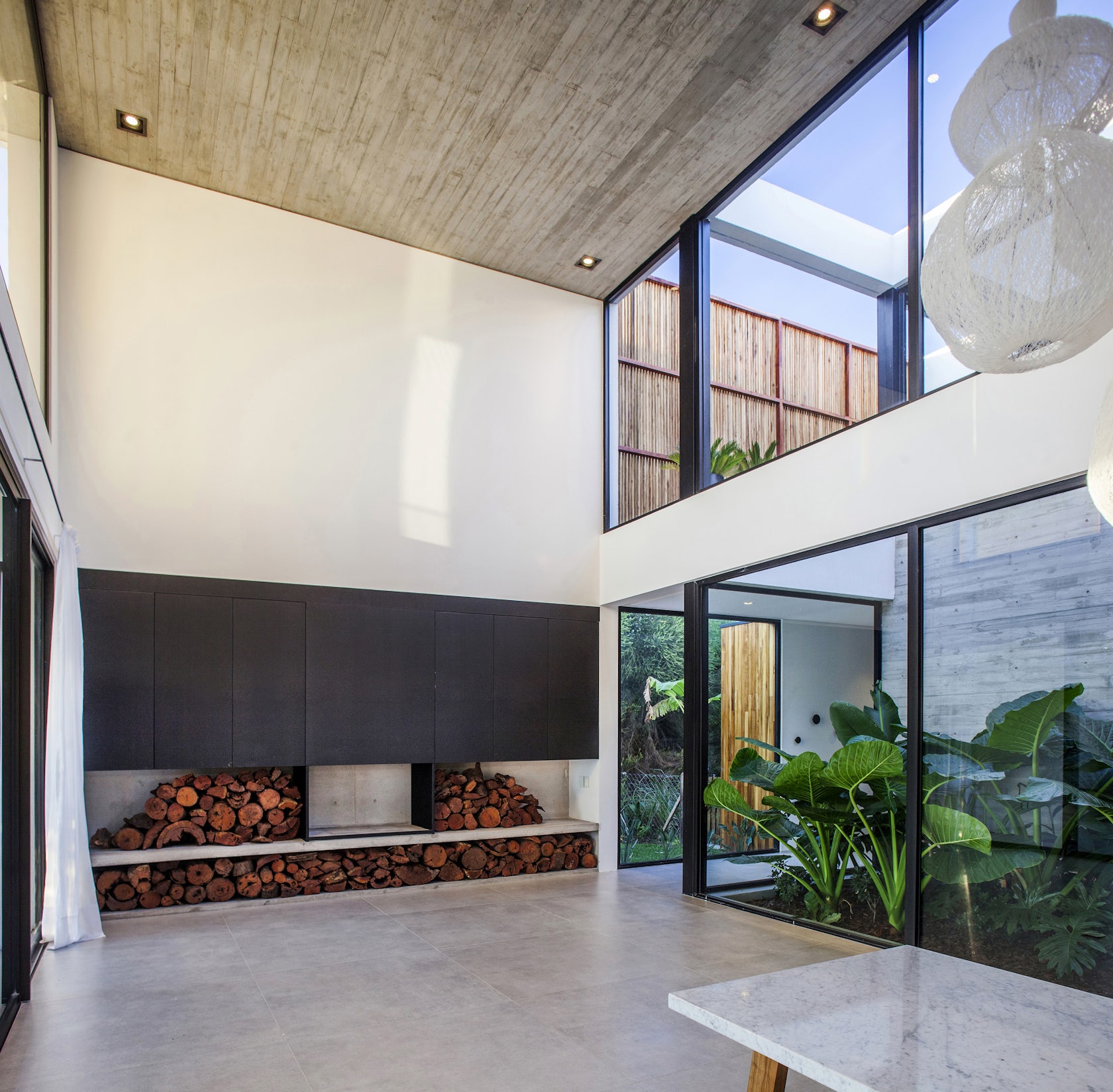
From the social and cultural approach, the client had a very particular request. He aspired to a main space that could bring the whole family together and that had a strong connection with the environment. Although the master suite is to the west and the children’s rooms to the east, the central space, which is the north, had to have that nexus that could bring them all together and be connected to the outside.

© Estudio PK - Ignacio Pessagno & Lilian Kandus
What drove the selection of materials used in the project?
We chose noble materials such as wood, concrete and aluminum.
The color white was chosen to complement the synthesis of a volume as pure as possible.
What is your favorite detail in the project and why?
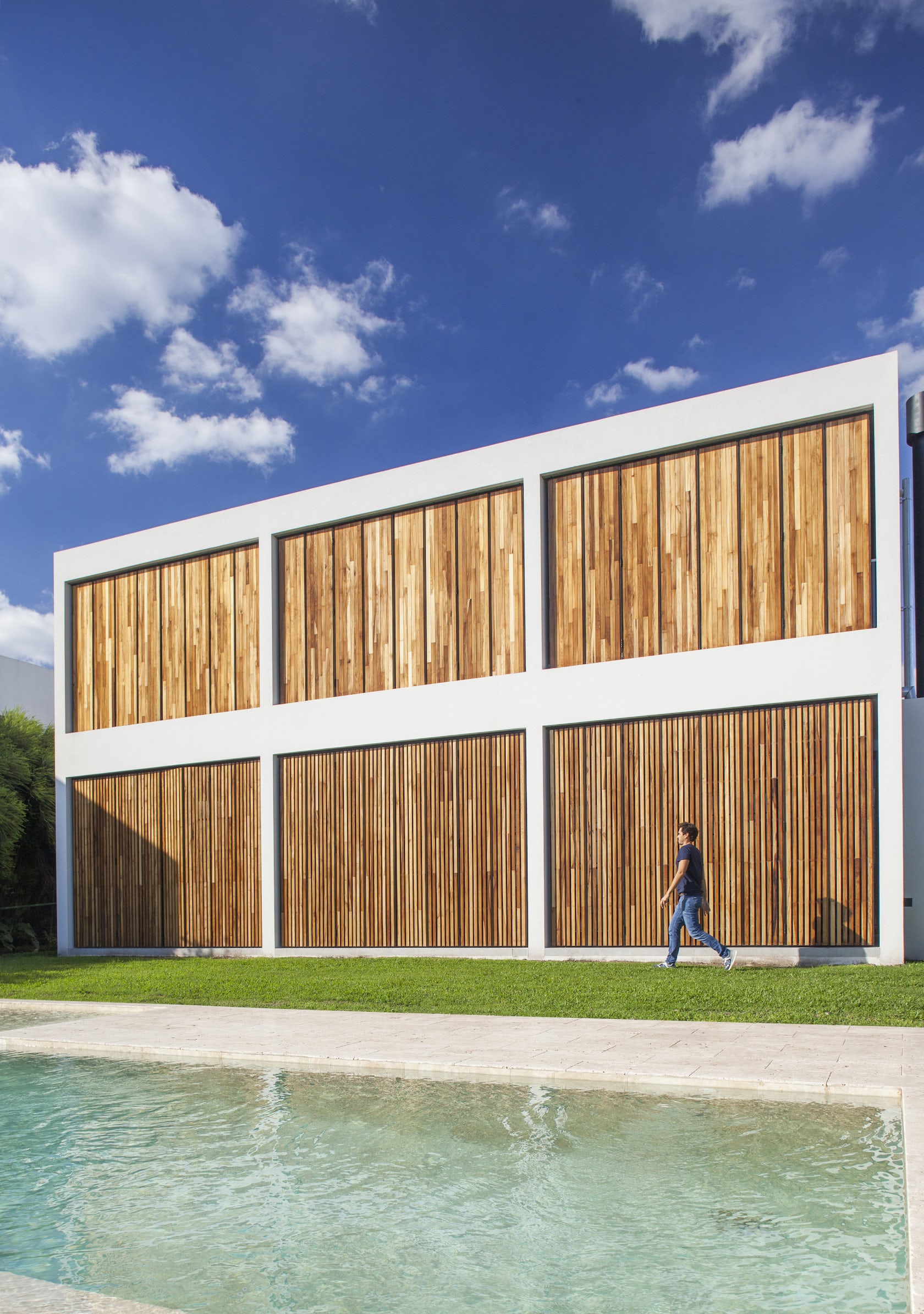
Our favorite detail is all the rear wood enclosure to the west looking to symbolize the nobility and how it articulates the facade and gives order and modulates the structure.
© Estudio PK - Ignacio Pessagno & Lilian Kandus
How important was sustainability as a design criteria as you worked on this project?
Hermetic DVH double glazed openings were considered, with aluminum profiles with thermal bridge break. The south facade, which is the coldest, was treated with double walls and does not have large windows. It prevents the temperature connection between the exterior and the interior, thus moderating the use of heating. The north facade captures the orientation of the courtyard which is the most important for capturing natural heating. The boys’ rooms were oriented to the east where it captures the morning sun. The west façade, which receives a very harsh sun, has the possibility of being completely closed, reducing the need for air conditioning.
© Estudio PK - Ignacio Pessagno & Lilian Kandus
In what ways did you collaborate with others, and how did that add value to the project?
We relate to the morphology and heights of the neighbors to collaborate in the balance of the neighborhood.
Were any parts of the project dramatically altered from conception to construction, and if so, why?
Fortunately we did not have to go through that problem. The house structurally was intended as a free-standing concrete structure that adapted very well to the system and the concrete routes to the house were sufficiently clear to be able to work in an orderly manner without major problems.
© Estudio PK - Ignacio Pessagno & Lilian Kandus
How have your clients responded to the finished project?
The result exceeded their expectations. From the moment they moved in, they understood the reason for every decision they made. The house was a tool that helped them to sort out everyday situations in their lives.
What key lesson did you learn in the process of conceiving the project?
The idea about the importance of understanding and reinterpreting a customer’s request. The customer has a need but does not know how to solve it and does not even know that the resolution can unfold a range of possibilities.

© Estudio PK - Ignacio Pessagno & Lilian Kandus
How do you believe this project represents you or your firm as a whole?
The project represents us on how we point the response to the environment and think of the projects as a synthesis, noble and pure.
How do you imagine this project influencing your work in the future?
We think that showing the way we relate to the environment and orientation can influence the approach of new customers, so that when you think of your home you do not only think of the needs at the family level, but also the environment.
© Estudio PK - Ignacio Pessagno & Lilian Kandus
Is there anything else important you’d like to share about this project?
The route. The house has a very synthetic route. Not to lose circulation space and to go through it in a simple and synthetic way, in order to conceive the project in an orderly and simple way.
Credits / Team Members
Arq. Ignacio Pessagno, Arq. Lilian Kandus, Ing. José Luis Pisani, Arq. Lucila López, Arq. Denise Andreoli, Arq. Belén Luna Crook, Arq. Vanesa Rolón, Arq. Barbara Schubert, Arq. Belén Lopez Astrada, Arq. Milagros Caride, Denise Bardelli, Melany D’angelo, Sofía Vier Abinet, Renata Stechina
Fotografía Alejandro Peral
Products / Materials
Alumetal (openings), Vier Abinet (paneling), Hansgrohe SE (taps), Roca (Sanitary)Barugel Azulay (bathroom coverings),


 Casa M&M