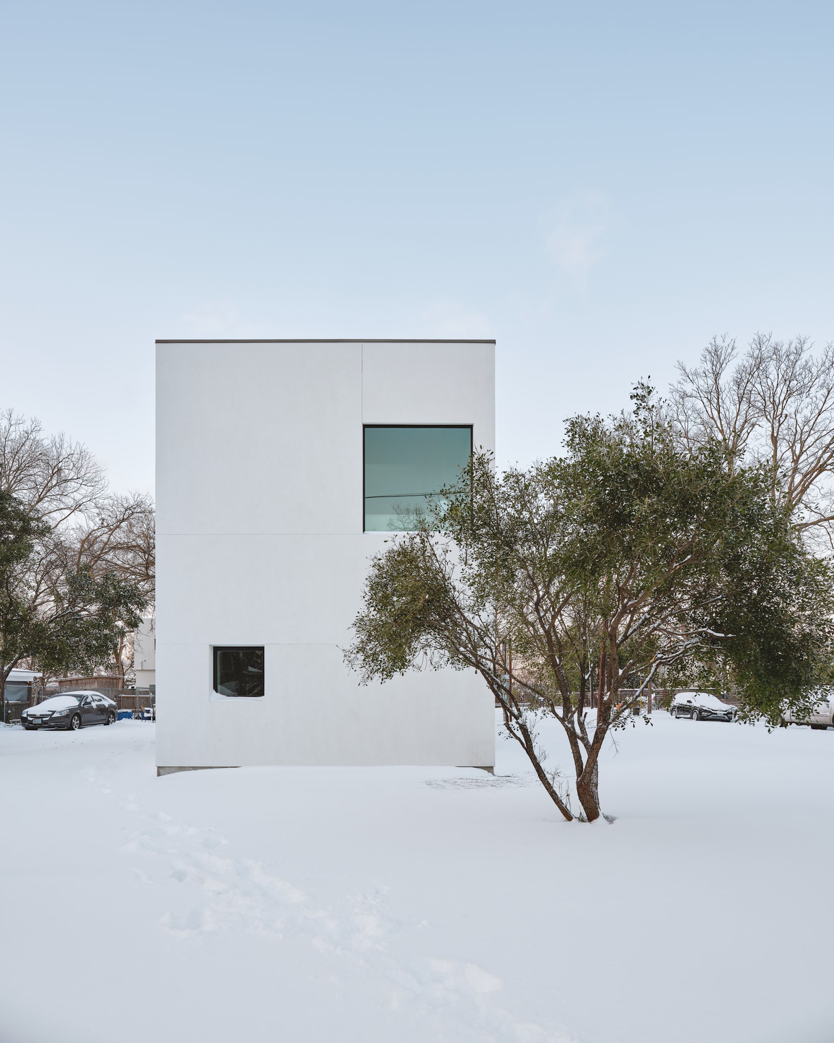
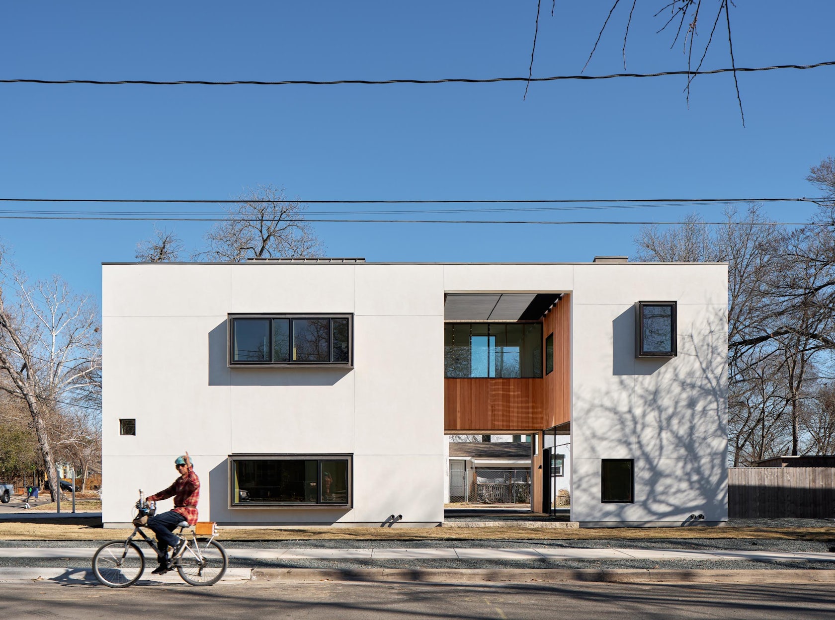
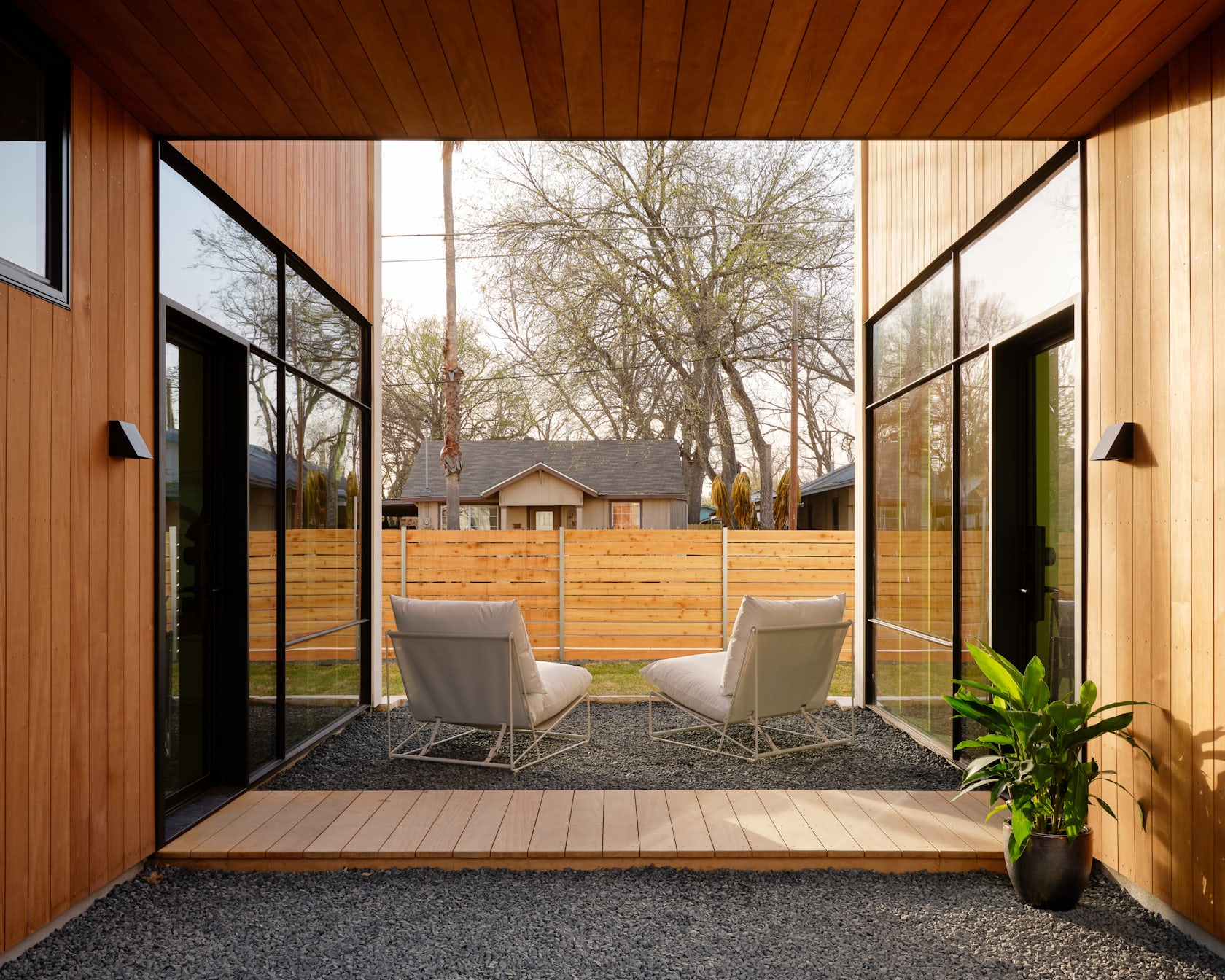
The Canterbury House – is a compact urban home. It contains two bedrooms, a media room, and a fully detached guest suite in only 1680 square feet. The home’s form is inspired by traditional dog-trot houses; a courtyard serves as the core of the living space, extending the compact spaces on either side into a private outdoor space. All three bedrooms as well as the main living space have views into the courtyard, bringing an abundance of natural light while maintaining privacy. The house is a reverse coconut, white on the outside and brown within the over-sized courtyard which cuts dramatically through the middle of this otherwise efficient and compact home.
Architizer chatted with Murray Legge, Founder at Murray Legge Architecture, to learn more about this project.
Architizer: What inspired the initial concept for your design?
Murray Legge: The reverse coconut, a box with a hole in it. The core idea was to create a compact and economical home that was cut into by an oversized hole.
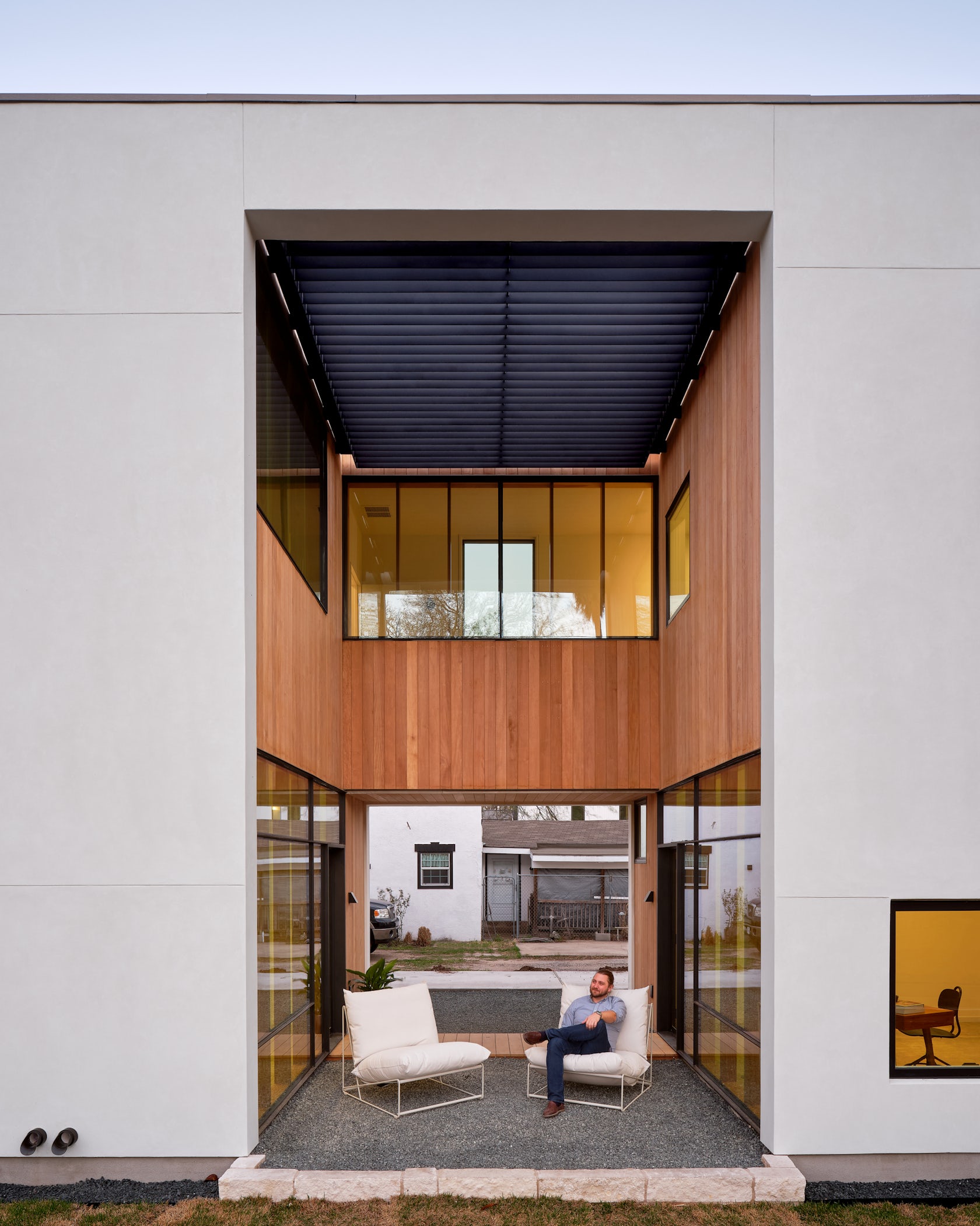
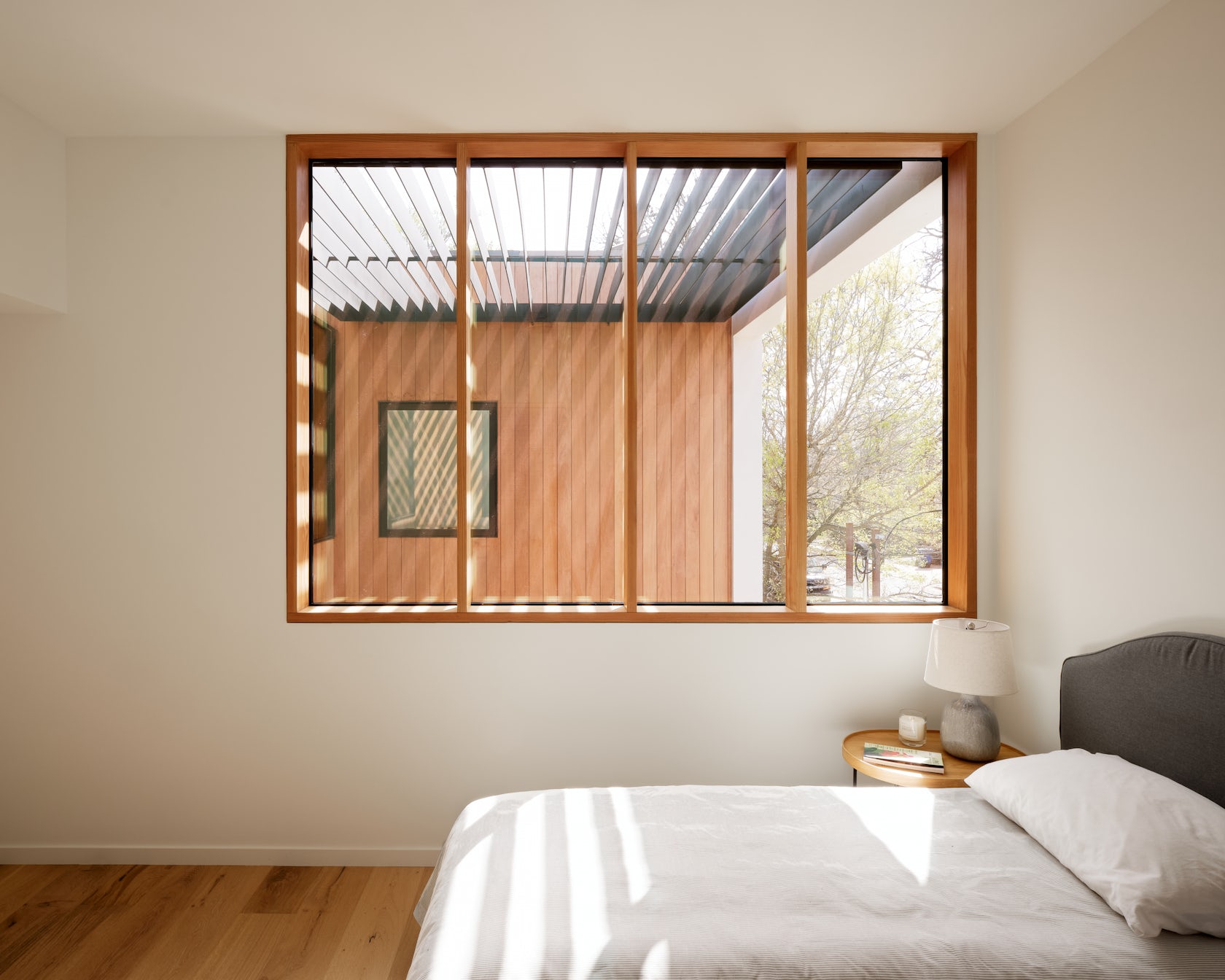
The hole reveals a material rich wooden interior courtyard space which contrasts with the white stucco exterior. This hole is a central focal point to the house. It’s a light source, entry and unprogrammed outdoor living space. Most of the interior rooms look into this space. The hole and it’s brise soleil roof provide a diffused ambient light to the interior. The hole also creates the opportunity to see from inside to outside to inside. An effect that can make the smallest of house feel grand in scale.
© Murray Legge Architecture
What was the greatest design challenge you faced during the project, and how did you navigate it?
Austin is facing a housing crisis. We’re trying to create economical and affordable homes and minimize the amount of lot area used. Historically homes in Austin, with their traditional front and back yards and generous, set backs are very low density. The greatest design challenge was to create a house that contained all the necessary spaces and to be able to keep it under 2000SF but also use the lot area efficiently. We’re effectively doubling the density while respecting the scale of the neighbourhood which is composed of smaller homes. The courtyard space goes a long way to make the interior spaces feel open and spacious but also offers a portion of the exterior space the opportunity to play a role on the inside.
© Murray Legge Architecture
How did the context of your project — environmental, social or cultural — influence your design?
Context is extremely important. We’re increasing density in the neighborhood while respecting the smaller scale of homes that are traditionally found in East Austin. We achieve this by building a house of similar size to the traditional homes in the area but we place them on smaller portions of the lots. Formally we are also very interested in responding to the neighboring homes. Right next door is a proto-modern home that would have been built around 1950 in CMU and white stucco with a concealed low slope roof was a direct inspiration for simple box shape of our house.
© Murray Legge Architecture
What drove the selection of materials used in the project?
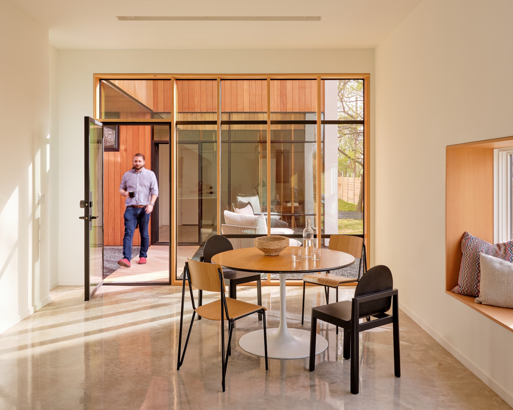
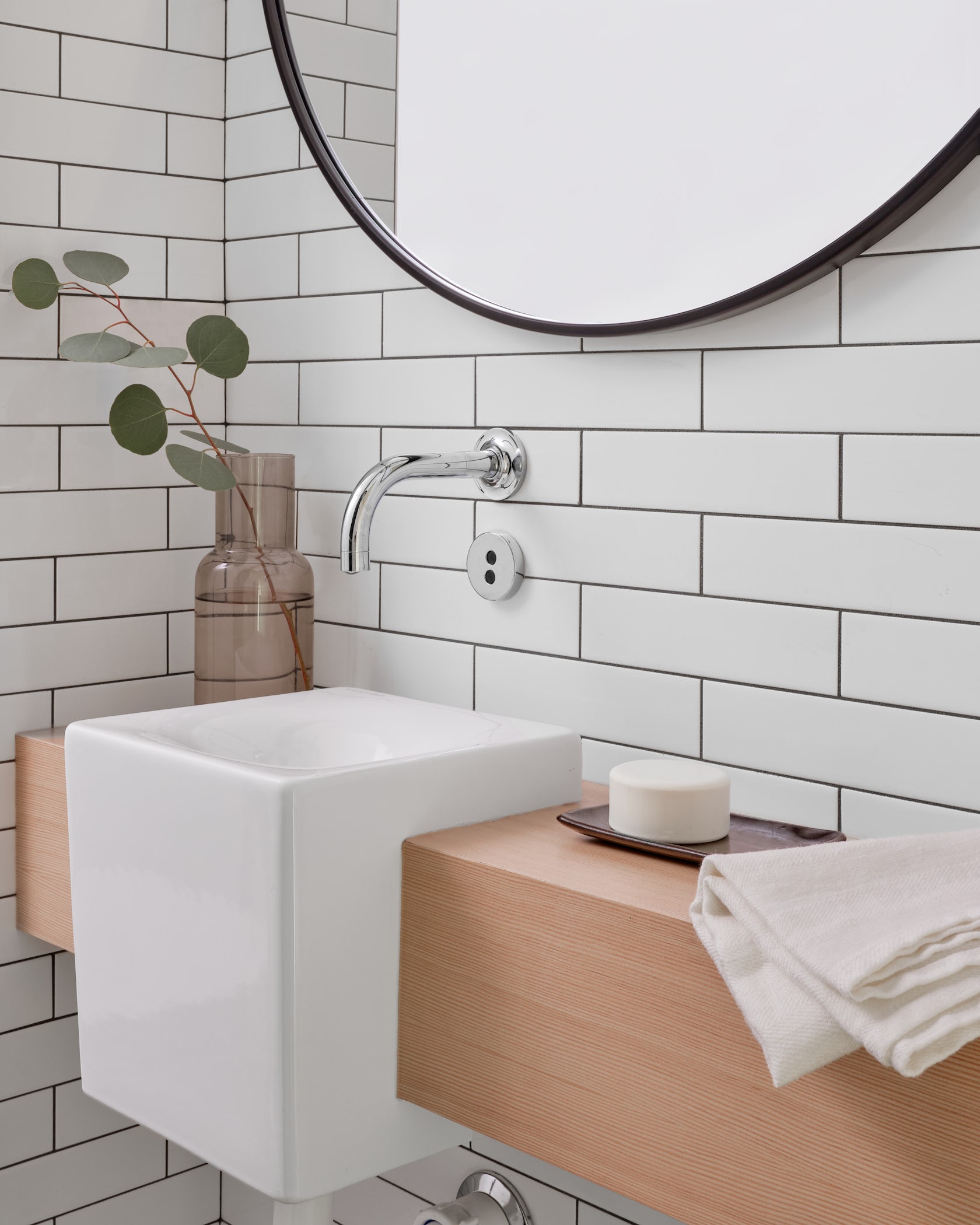
The white La Habra exterior stucco was a direct response to the early modern homes built in the neighborhood in the mid 20th century. Our neighbours were a direct inspiration. In smaller homes we like to use white and balance with the tones of natural materials like wood and concrete. This simple palette makes the interior spaces feel brighter and more spacious. In a smaller home furnishings can bring color and texture to the space. We used wood casing in and around the deep bay windows that double as little office work areas.
© Murray Legge Architecture
What is your favorite detail in the project and why?
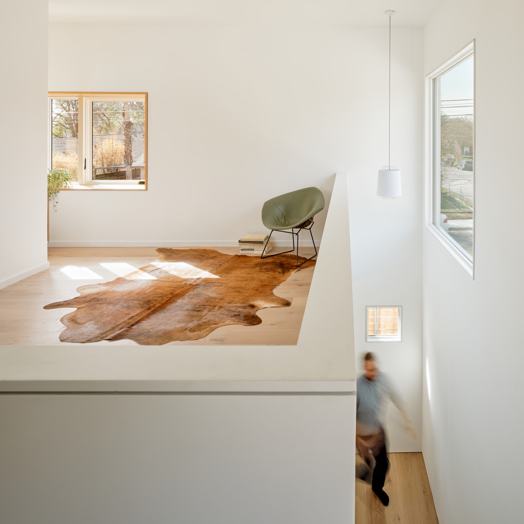
I have a couple of favorite details. I love that you can see from the interior spaces through the outdoor courtyard space and back into rooms on the other side the courtyard. There’s a kind of magic to that. It makes the house feel infinity large. There is also a surprise on the second floor. A clerestory roof object, not visible from the exterior, brings natural light from above into the media room and bathroom. The compact bathroom has a soaring ceiling and is awash in natural light from the east. It’s a little hidden secret.
© Murray Legge Architecture
How important was sustainability as a design criteria as you worked on this project?
Sustainability is important in every aspect of the design. We are strong believers in passive technics. In Austin one of our main concerns is limiting solar gain to reduce energy use. The sun is a powerful force here and typically a main consumer of energy is in cooling during the long hots summers which seem to be getting worse. The ideal building orientation, to limit solar gain in buildings, is to create a long building in the east-west direction and have the larger portions of glass on the north and south faces of the building there by reducing the amount of solar again. For this house the lot was oriented north-south, the worst direction. Creating a big hole in the house allowed us to create more north and south exterior wall which we could install large areas of glass and thereby limit solar gain. The portion of the west facing courtyard wall is deeply under cover and shaded.
© Murray Legge Architecture
In what ways did you collaborate with others, and how did that add value to the project?
We were fortunate to have a great builder, Curate Homes, who’s attention to detail was extremely important to the realization of the house. They followed through with many important details both on the interior and exterior.
© Murray Legge Architecture
What key lesson did you learn in the process of conceiving the project?
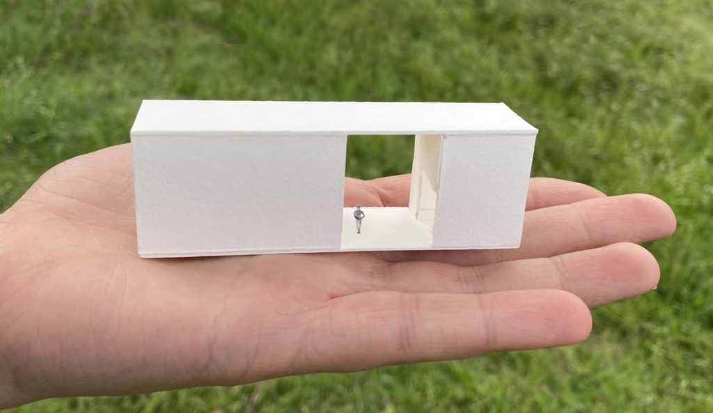
For this house we worked through many design solutions initially. Some of the early versions were quite complicated. In the office we will often start with small physical models. We have a very collaborative team approach to design in the office and when we landed on the model of the linear box with the hole in it we were all pretty convinced. The simplest solutions are often the strongest even if they appear plain or uninteresting on the surface.
How do you believe this project represents you or your firm as a whole?
We like the challenge of elevating the mundane. To see the wonder in seemingly boring things. I think this house is achieves that.
© Murray Legge Architecture
How do you imagine this project influencing your work in the future?
We believe in test runs and modeling ideas in full scale. We’re building a lot and through making buildings we are able to test ideas, technics and methods. There are many influences on a building project and even when we want to repeat ourselves the outcomes are all different. This is what keeps it alive.
Team Members
Curate Homes
Photography: Leonid Furmansky
Consultants
Duffy Engineering, Structural and Land Dev Consulting Civl
For more on Canterbury House, please visit the in-depth project page on Architizer.


 Canterbury House
