Archibiz provides business education and consultancy services to architectural practices globally. Through courses, coaching and other business advisory services, Archibiz helps architects fill in the gaps in their business education so they can lead more profitable and sustainable practices.
Ask any architect to show you their website, and they will likely redirect you to a site featuring some glossy images, a black-and-white headshot of their principal and an out-of-date blog article from last year. While it’s evident that many architecture firms have websites, how many of those websites are serving the purpose they should?
A study of more than 400 architecture firm websites in the United States revealed that 75 percent of those firms failed to meet the four basic criteria recommended by Google. The study, led by Florida-based branding and marketing firm, Archmark, was based on key factors like website performance, mobile responsiveness, Search Engine Optimization (SEO), and SSL security.

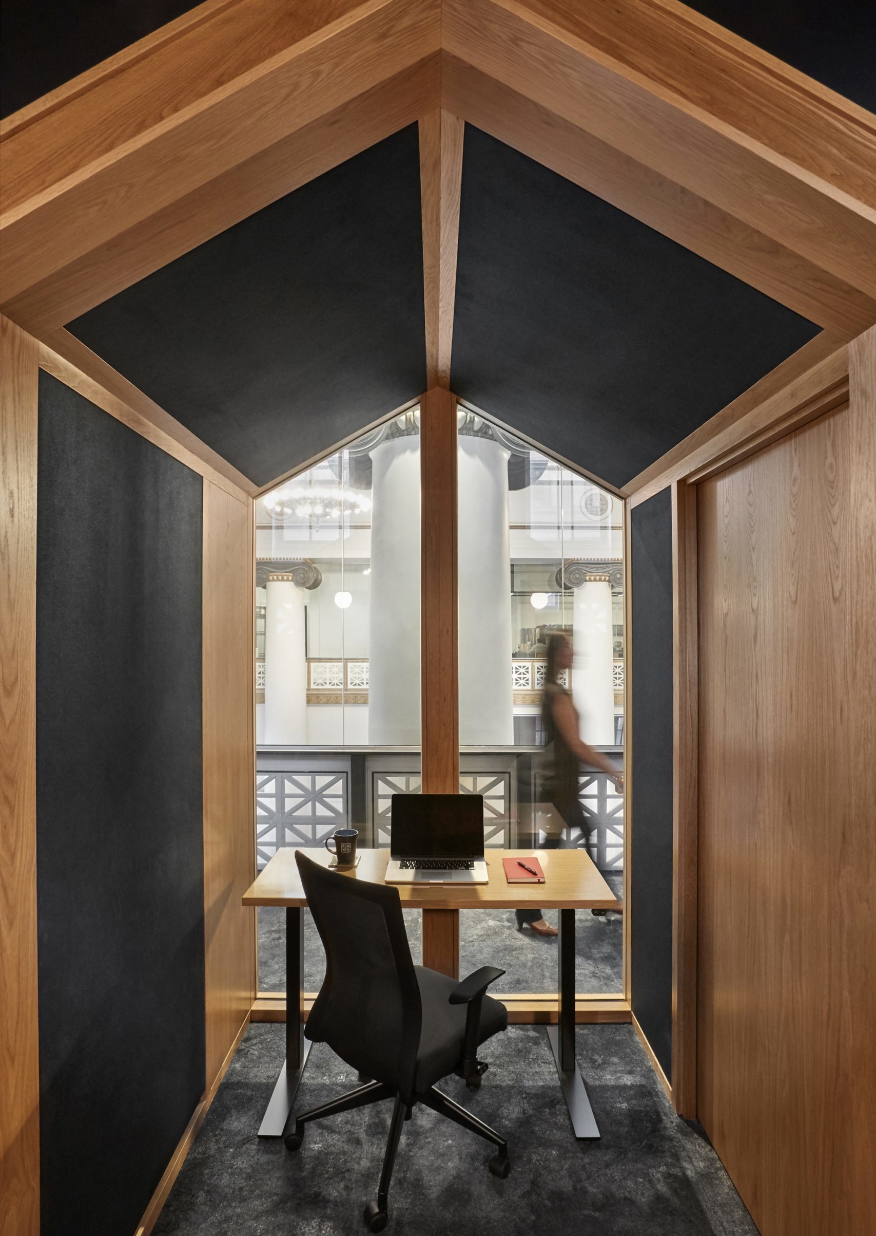
Expensify Portland Office by ZGF Architects, Portland, Oregon. Jury Winner, 2019 A+Awards, Concepts – Plus-Architecture +Workspace
Many architects struggle with creating a powerful website because they often look at their websites as an “online brochure” for their work, says Bryon McCartney, who leads Archmark alongside his partner Kellie. “Instead of thinking about the ideal future client they want to attract,” he adds, “they end up creating a showcase of all their awards or the projects.” Architects also often copy their competitors’ sites when creating their own, which leads to a lack of differentiation which, according to Byron, is about the “worst” thing an architect can do.
“There are tons of searches going on for architects, and if you are not able to get found online — if your website is letting you down — you are just giving up opportunities,” he argues. “A lot of times when someone comes to your website, and they are looking for an architect, what they are really looking for are ideas and inspiration. If you can have a way of connecting with them, establishing that relationship, then you can continue that conversation as they are going through that decision-making process. And when they are ready to hire an architect, you are going to be top of mind.”

Expensify Portland Office by ZGF Architects, Portland, Oregon. Jury Winner, 2019 A+Awards, Concepts – Plus-Architecture +Workspace
So what does a good architects’ website look like?
For starters, people who are not in the industry should be able to read it and have a clear understanding of what it is about. They should also be able to learn about who you are as an individual. Whether you’re just one individual or a team of twenty, make sure to include a high-resolution photo and few lines about yourself. People buy people, not projects. Your website can be a great way to make a connection with a potential client right off the bat, so don’t be afraid to get personal with it.
Architects should also have their contact info readily available on their website. With nearly 60 percent of search traffic coming from mobile search, it is imperative that architects list a phone number on their websites so that a contractor or potential client out on a site can reach them easily.
Another crucial part of a standout website is the copy. Well-written copy can go a long way in attracting the right kind of client to your site. It can also help tremendously with where you rank on search engines, making it an absolute priority for architects.
Lastly, consider adding some videos. Video is a powerful tool to communicate project case studies and testimonials while also showing some of the processes that go into projects.
“Architects think it’s all about the portfolio, but when clients are looking at a bunch of different firms, they get portfolio (or photo) fatigue,” Bryon said. “Video that can tell a story, and take you through the process and communicate what you do and how that serves the needs of the clients, that is extremely powerful.”

 Expensify Portland Office


