Art Hub Copenhagen – The client needed to upgrade their existing space both in terms of functionality and to support their public ambitions and their identity as a progressive institution supporting creative and artistic thinking.
The life span of the project might be short (in architectural terms) as we know that the client will move to their new HQ during 2023. To justify making an architectural intervention instead of leaving the space as it is, we proposed this dogma: Every existing element must be reused. Nothing can be discarded but should be revitalized through a creative alteration of function and appearance.
Further, it was important to leave as few traces for the new users, so instead of adding new elements we rearranged what was there. We believe flexibility comes from leaving things out. An empty closet is more flexible than one filled with stuff.
Architizer chatted with Søren Pihlmann, founder of pihlmann architects to learn more about this project.
Architizer: What inspired the initial concept for your design?
Søren Pihlmann: The space itself with all the existing materials and components. Instead of seeing the many often disregarded standard elements as inferior, we pursued possibilities within them. From what we found we created a kind of “catalogue” which laid the foundation of our architectural intervention. With this catalogue the task was to create as much value and opportunities for the client.
© Hampus Berndtson
What do you believe is the most unique or ‘standout’ component of the project?
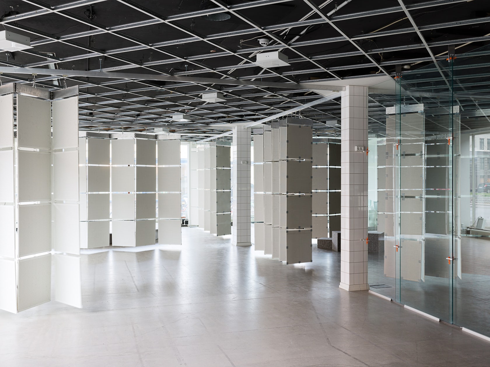
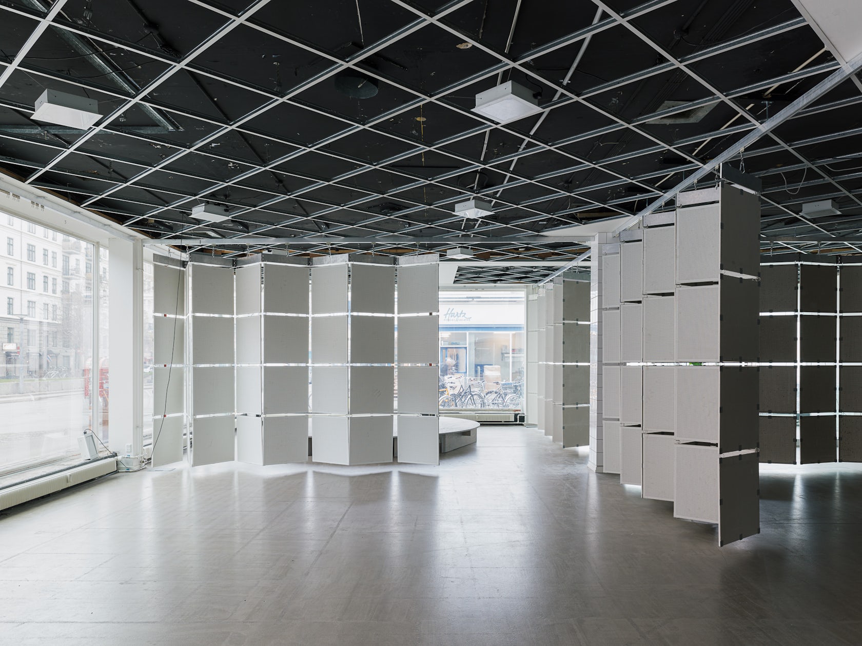
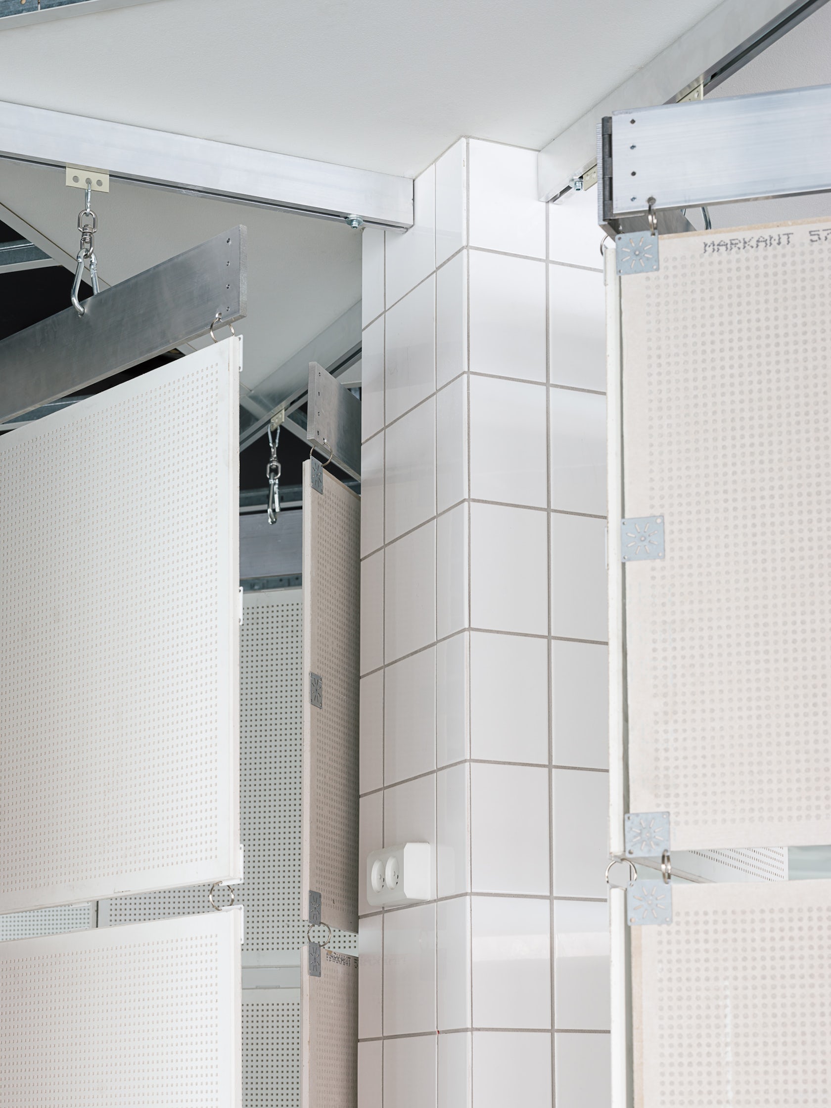
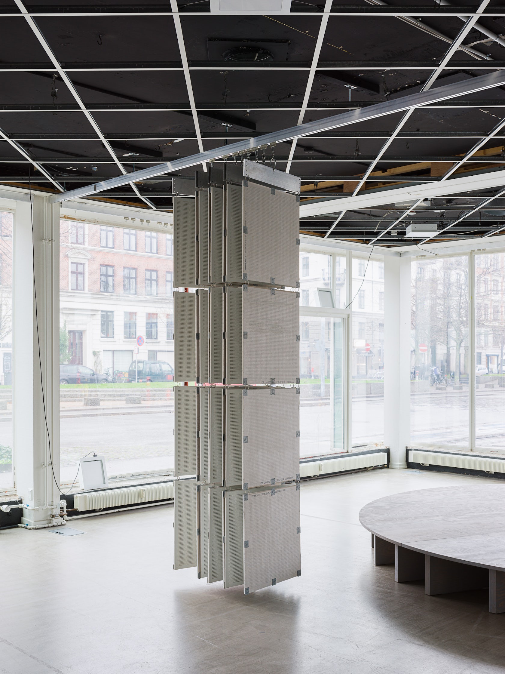
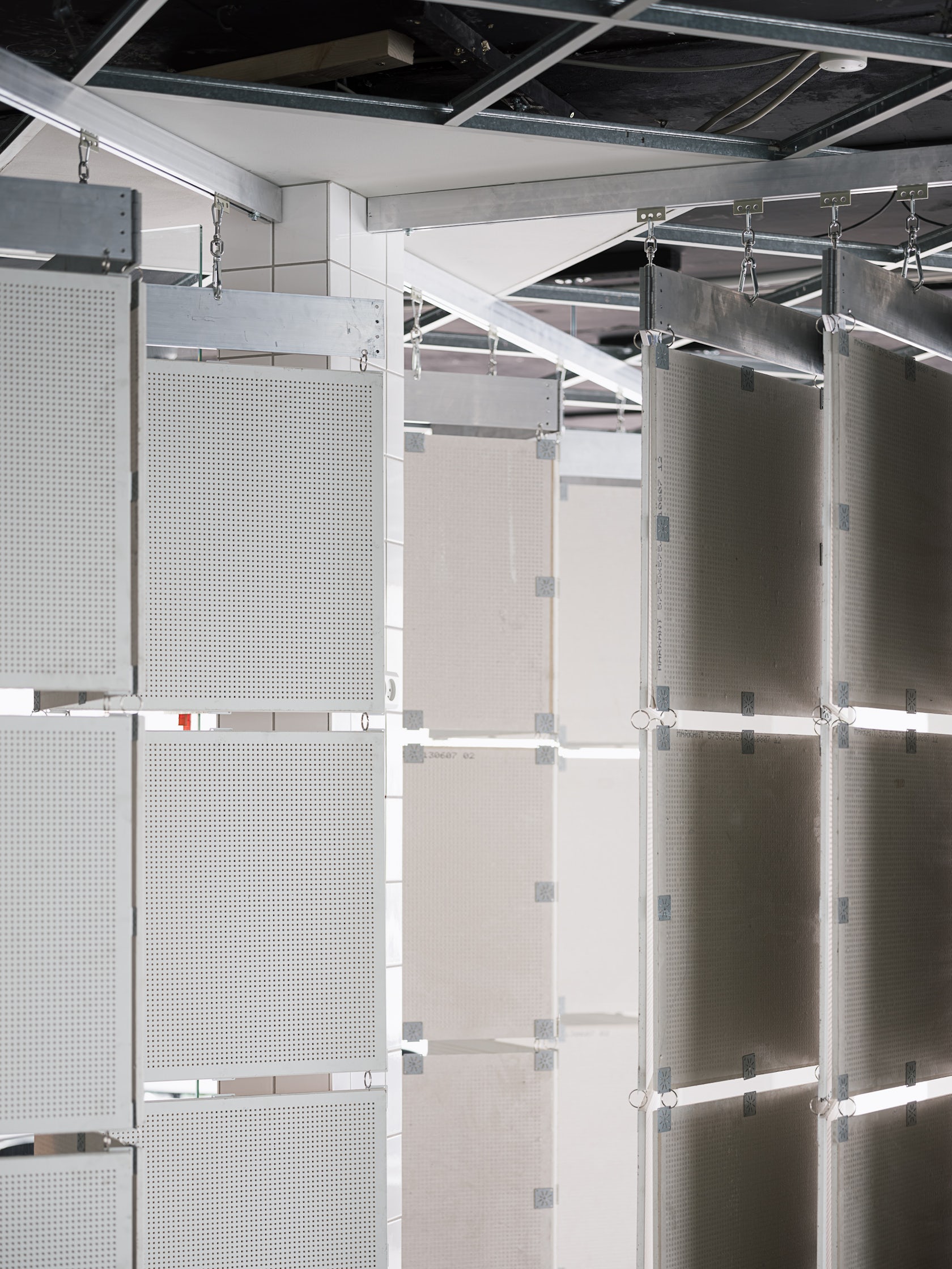
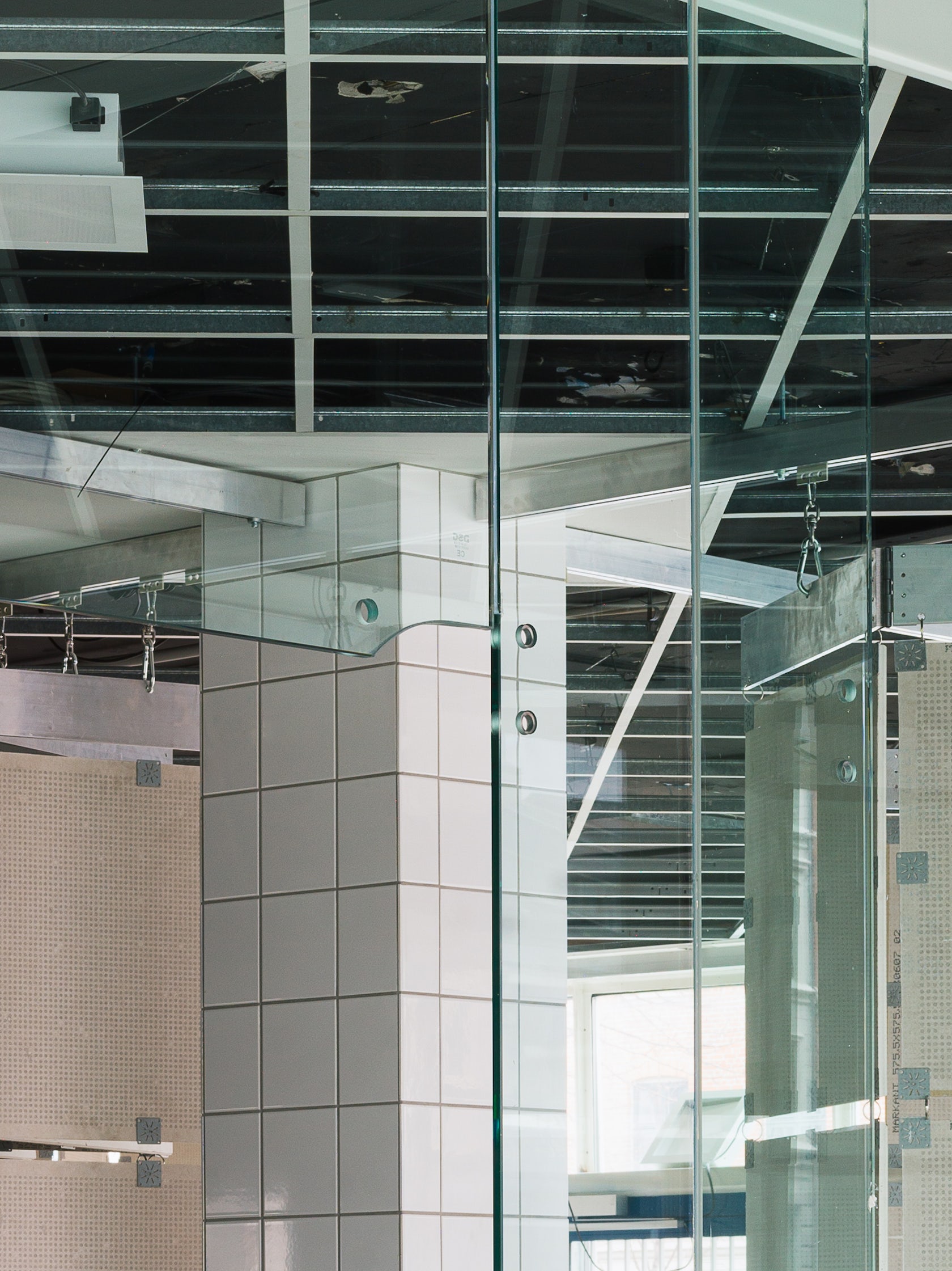
It might not be a component, but I really like the fact that you don’t recognize what the components actually are at first glance, but as soon as you take a closer look, you see that they are basic elements which you can find cheap in every building supply store. After recognizing this you might also see that they are reused, as they leave traces of their former figuration.
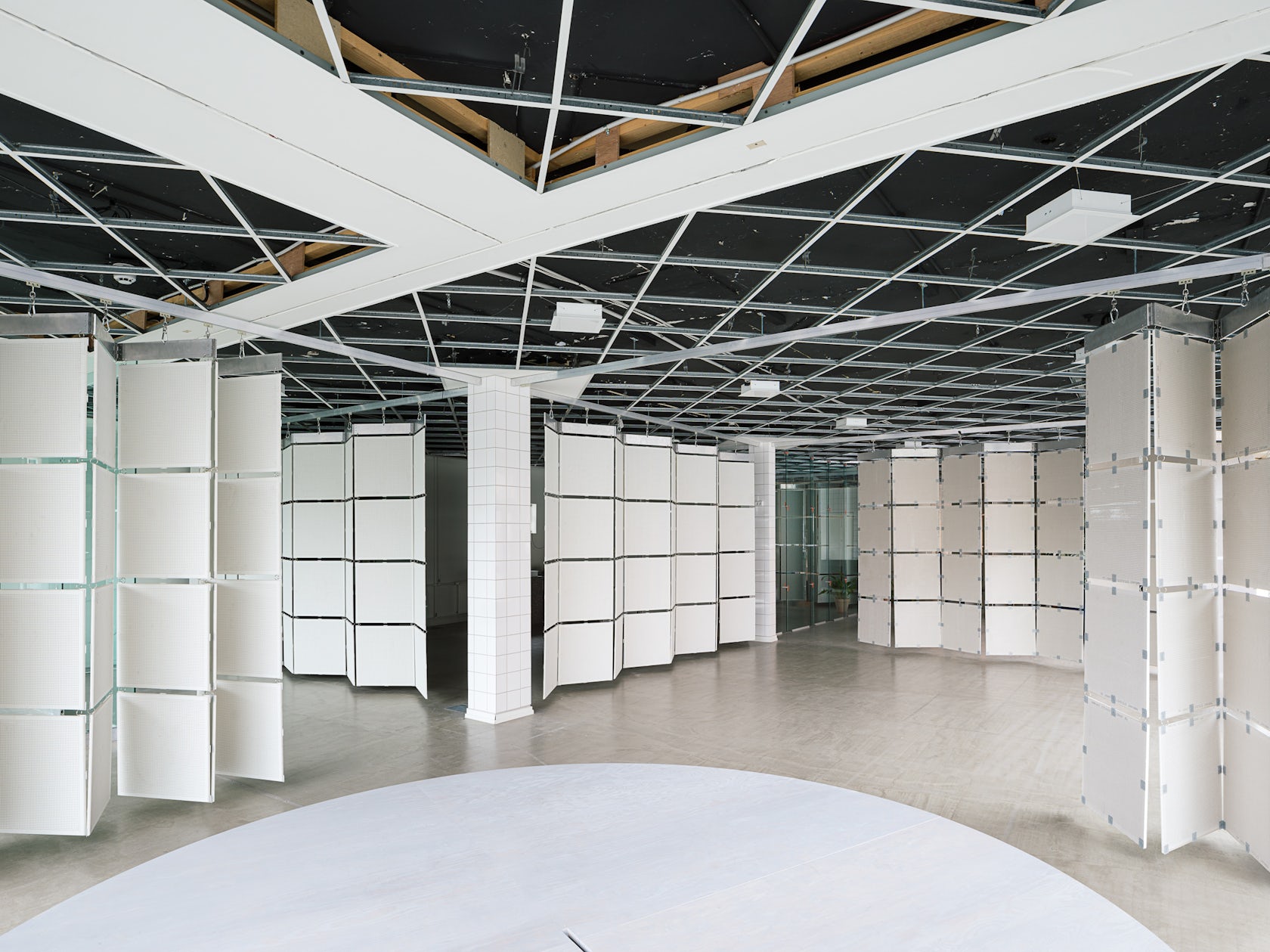
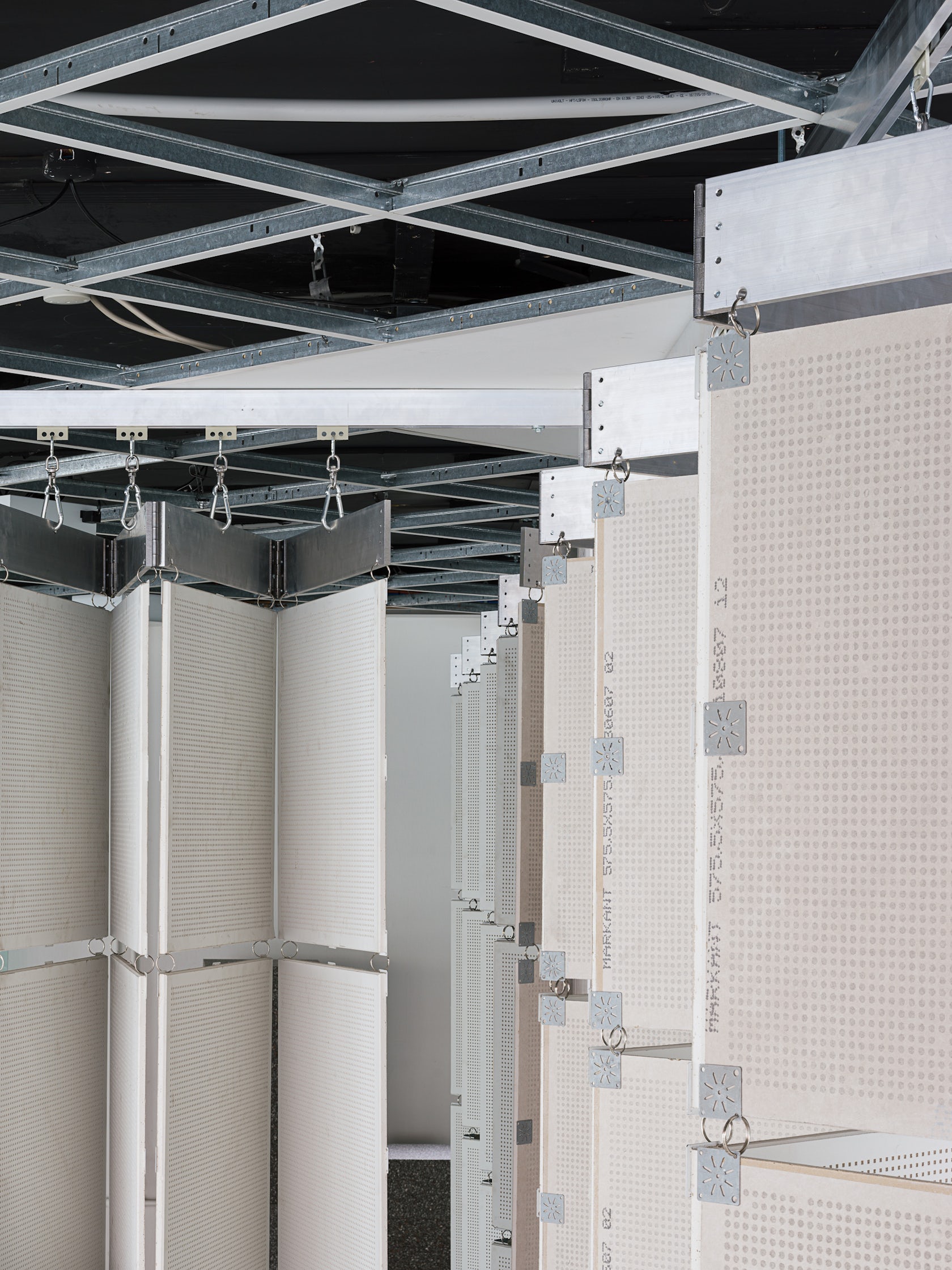
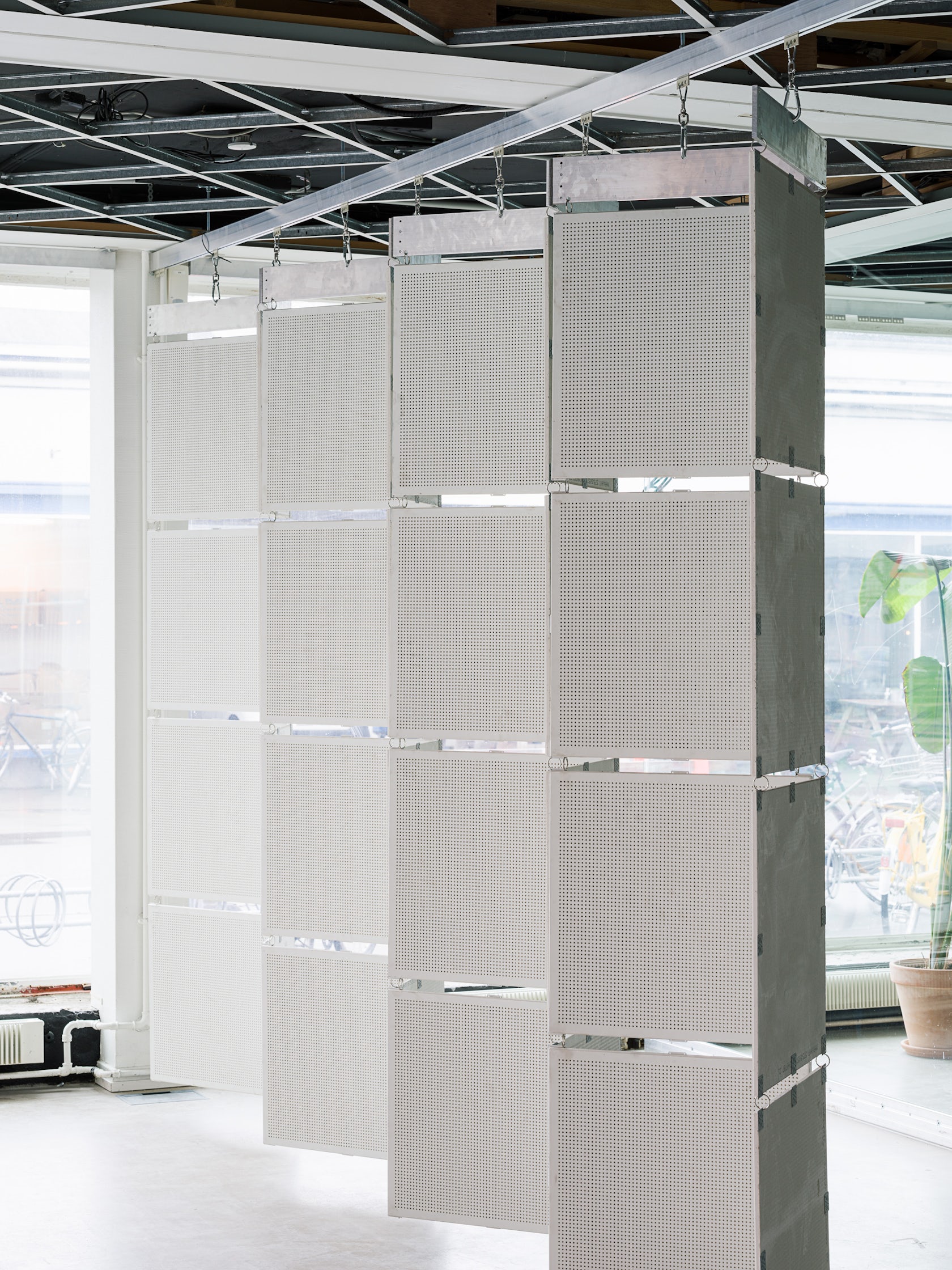
For example, the ceiling tiles which are turned into folding walls leave a visual trace in the ceiling through the empty aluminum grid. In this way the elements are telling stories of their genesis.
© Hampus Berndtson
What was the greatest design challenge you faced during the project, and how did you navigate it?
In some ways our dogma set some natural limitations, which we had to navigate within and around. People tend to see challenges as something negative, but I believe we managed to turn into a productive catalyst of fulfilling our ambitions.
© Hampus Berndtson
How did the context of your project — environmental, social or cultural — influence your design?
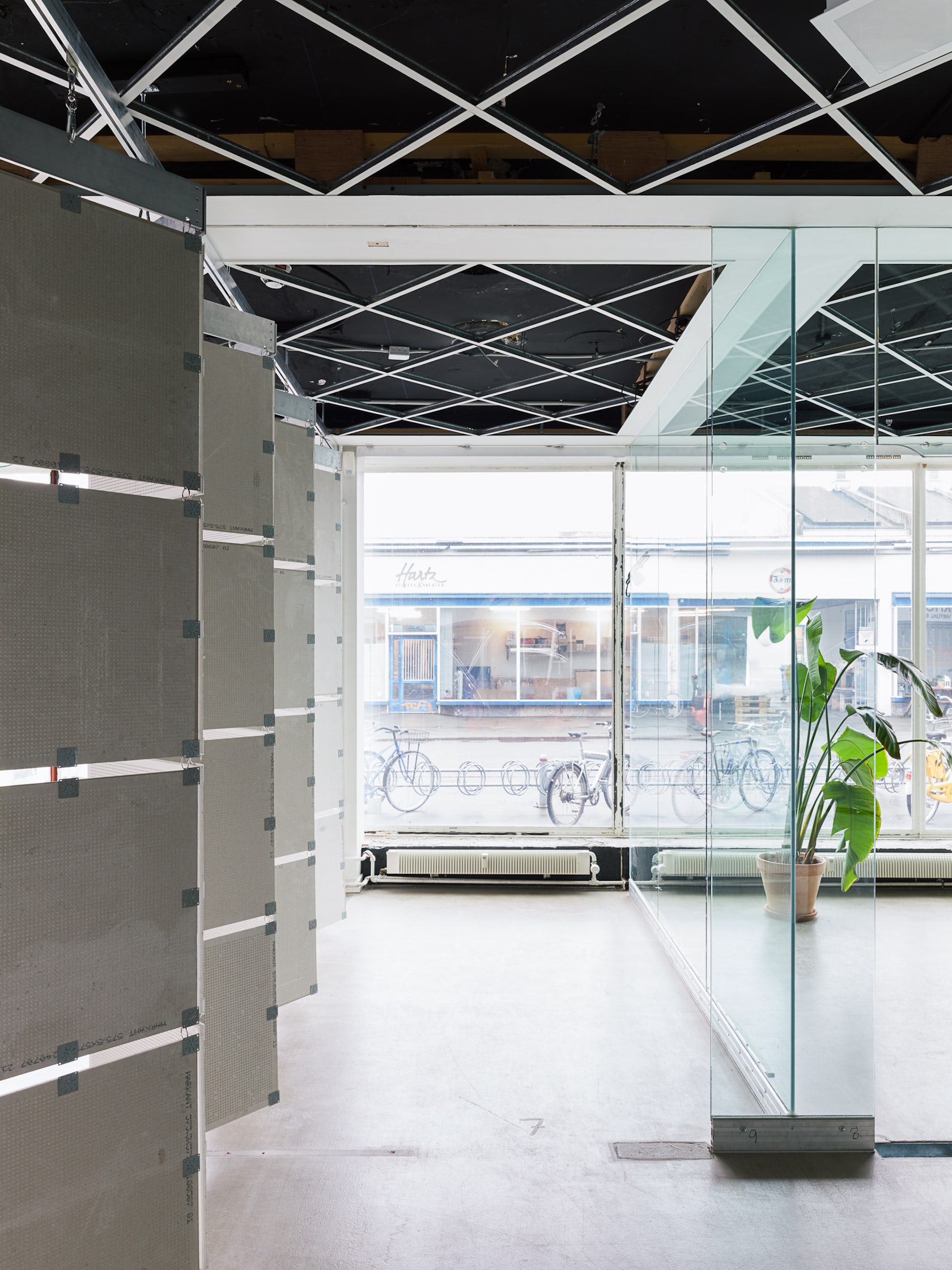
There’s no doubt that the environmental context had huge impact on how we approached the project: by reusing almost every existing found component, the foundation on which the concept is built aims for reducing both waste and the need to use new materials.
© Hampus Berndtson
What is your favorite detail in the project and why?
To assemble the acoustic panels to each other, we needed to apply components which were not already inside the space. To make it as simple, cheap and dismountable as possible, we used splitrings known from keychains and standard carabiners. It’s a small thing, but I like how they fulfill a purpose in a very unpretentious way.
© Hampus Berndtson
In what ways did you collaborate with others, and how did that add value to the project?
The partnership with Archival Studies was great. They have a lot of hands-on experience, also when it comes to working with architectural objects, so exploring the construction site together with them searching for potentials was valuable in many ways.
© Hampus Berndtson
Were any parts of the project dramatically altered from conception to construction, and if so, why?
In a way, the conception was to develop the project along the way. We have described it as an archeological approach, we work with what comes to us when searching. We didn’t make any renders or other visual conceptions beforehand, so the construction itself gave form to the project before we had imagined the outcome.
© Hampus Berndtson
What key lesson did you learn in the process of conceiving the project?
Sometimes architecture can become (too) complicated, especially for the person in the street. The concept behind this project is extremely simple. I still haven’t met anyone who doesn’t get what we are trying to achieve. When on-site, I don’t even have to explain it, people get it by themselves. It’s simple without being plain. That’s something to aim for.
© Hampus Berndtson
How do you believe this project represents you or your firm as a whole?
In a lot of ways. We like to change people’s impression of (architectural) value, which I hope this project can contribute to. We also aim for exposing what architecture is truly made of instead of hiding it behind endless layers of plaster and the like. Here, what you see is what you get.
How do you imagine this project influencing your work in the future?
We have described this project as a kind of case study, how far can you go by almost only using what is already there. It’s a way of thinking and working which permeates our work, and even though it’s not always possible to take this way of thinking as far as we have done with this project, it’s something which has a great importance to all of our work, not only transformations.
© Hampus Berndtson
Please list any team members you’d like to include in the credits?
We like to thank Archival Studies for great cooperation, Art Hub Copenhagen for a great amount of trust and Hampus Berndtson for some amazing images.
© Hampus Berndtson
For more on Art Hub Copenhagen, please visit the in-depth project page on Architizer.


 Art Hub Copenhagen


