Architizer’s newest print publication is available for pre-order! How to Visualize Architecture is an educational guide designed to help you master the craft of architectural storytelling and visual communication. Secure your copy today.
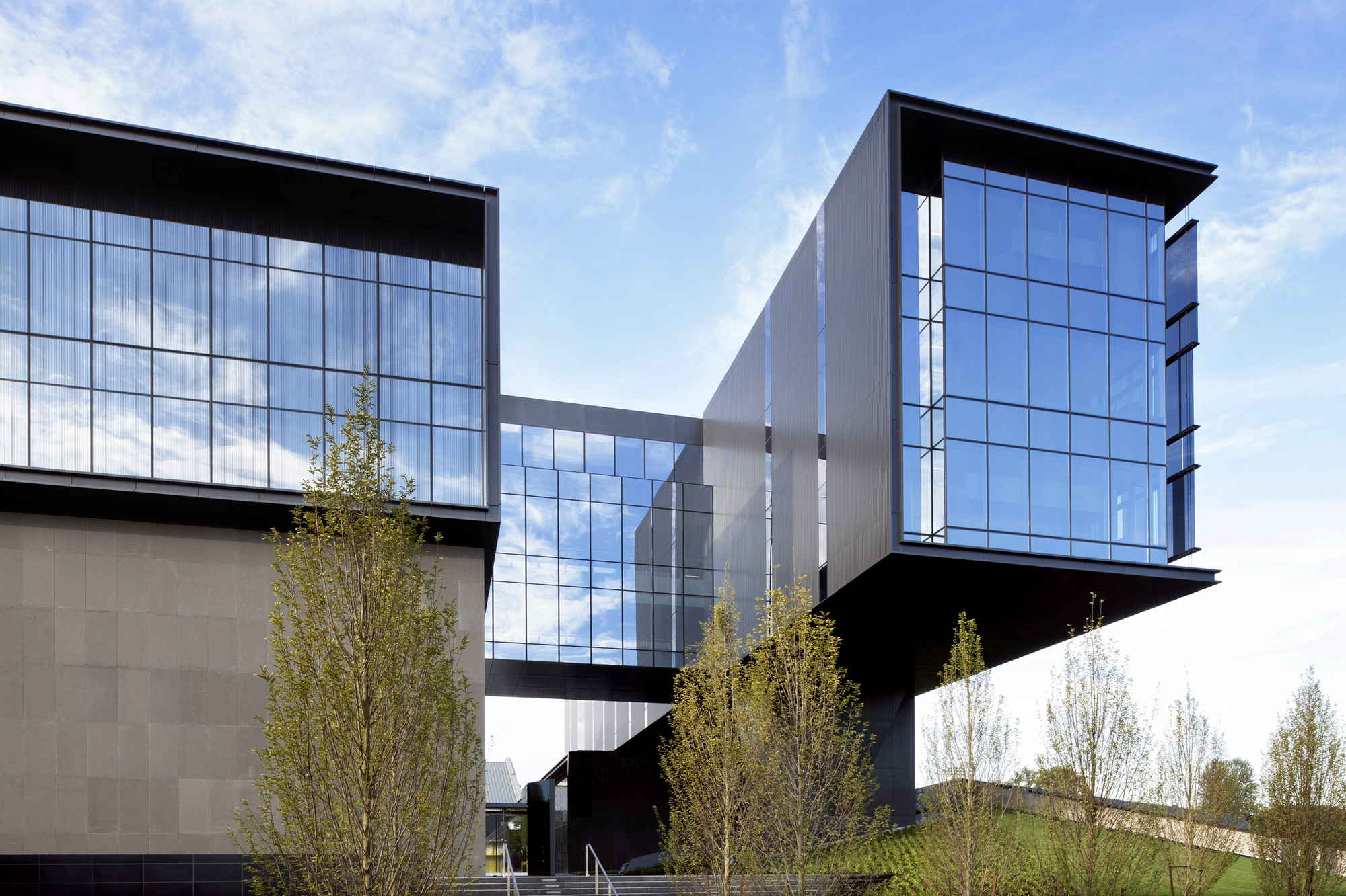
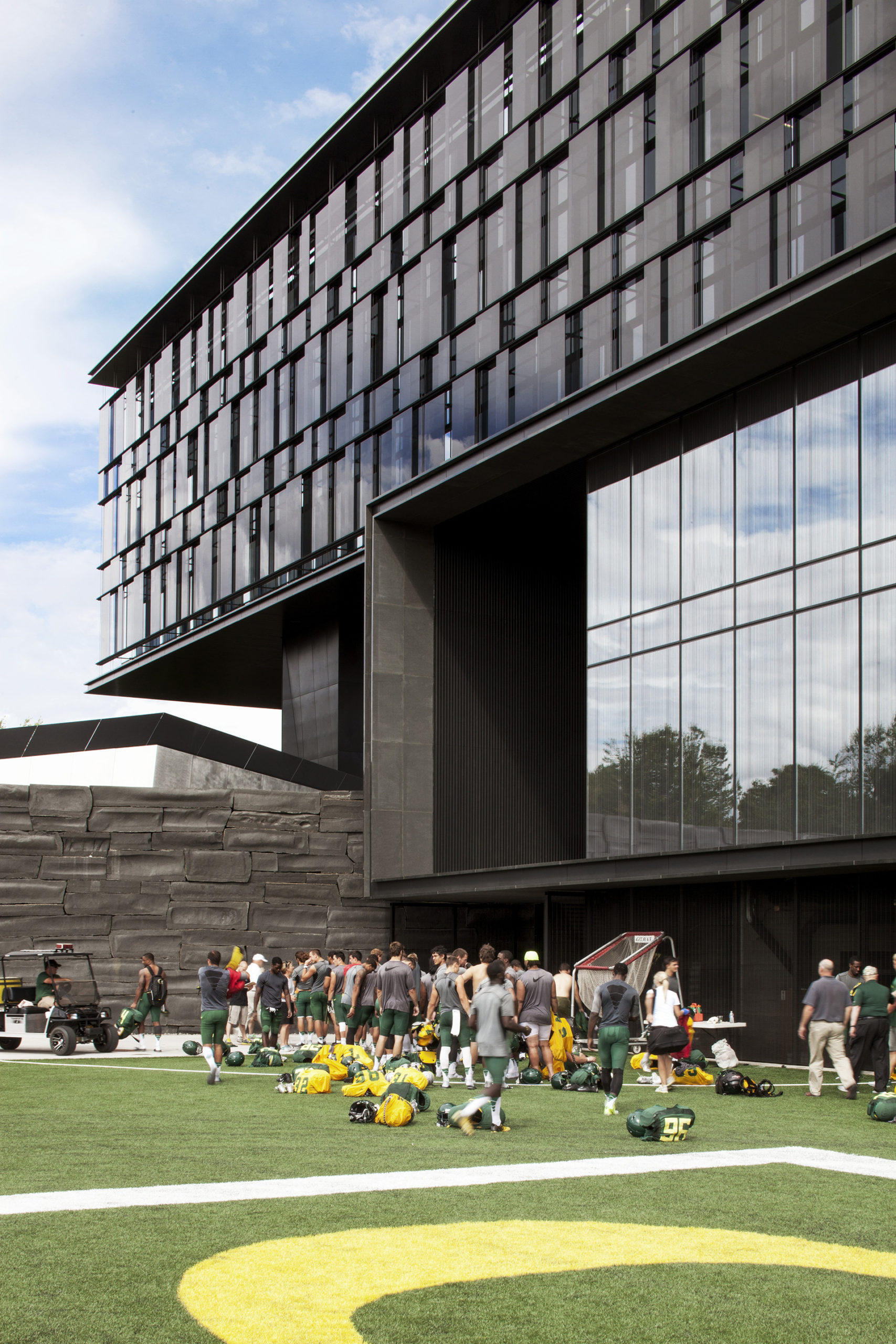
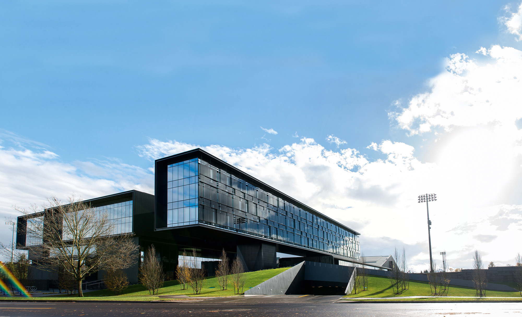
Architectural design is grounded in materials. How a structure is built, and what materials are chosen, shape our spatial experience. When ZGF Architects designed the University of Oregon Hatfield-Dowlin Complex, the team set out to create a structure that physically represents the strength and innovation of the university’s football program. At its heart, the 145,000 square foot complex features a textured black glass façade that functions as solar glare “armor,” symbolizing the program’s ethic of stealth and complexity.
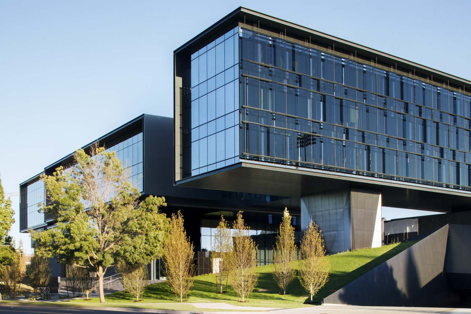
 As the design team notes, the project makes a formal (albeit abstract) reference to football players on the line of scrimmage bracing to dominate their opponents. It features 40-foot cantilevers that seemingly defy gravity, and, similar to a football player’s athletic abilities, the building expresses values of strength, agility and speed.
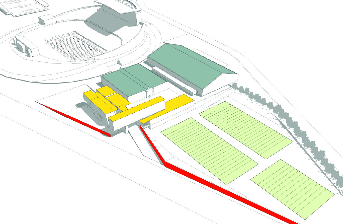
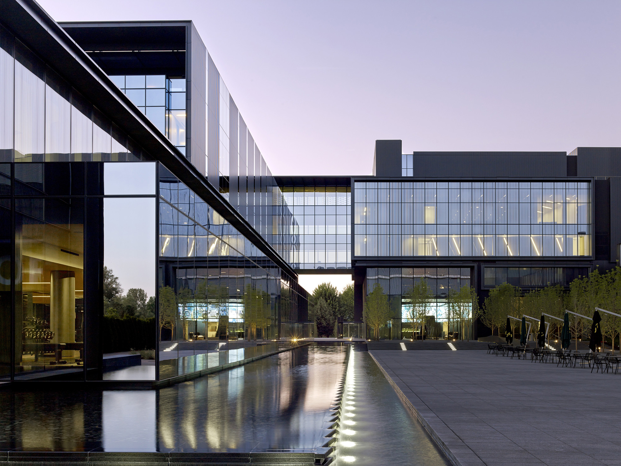
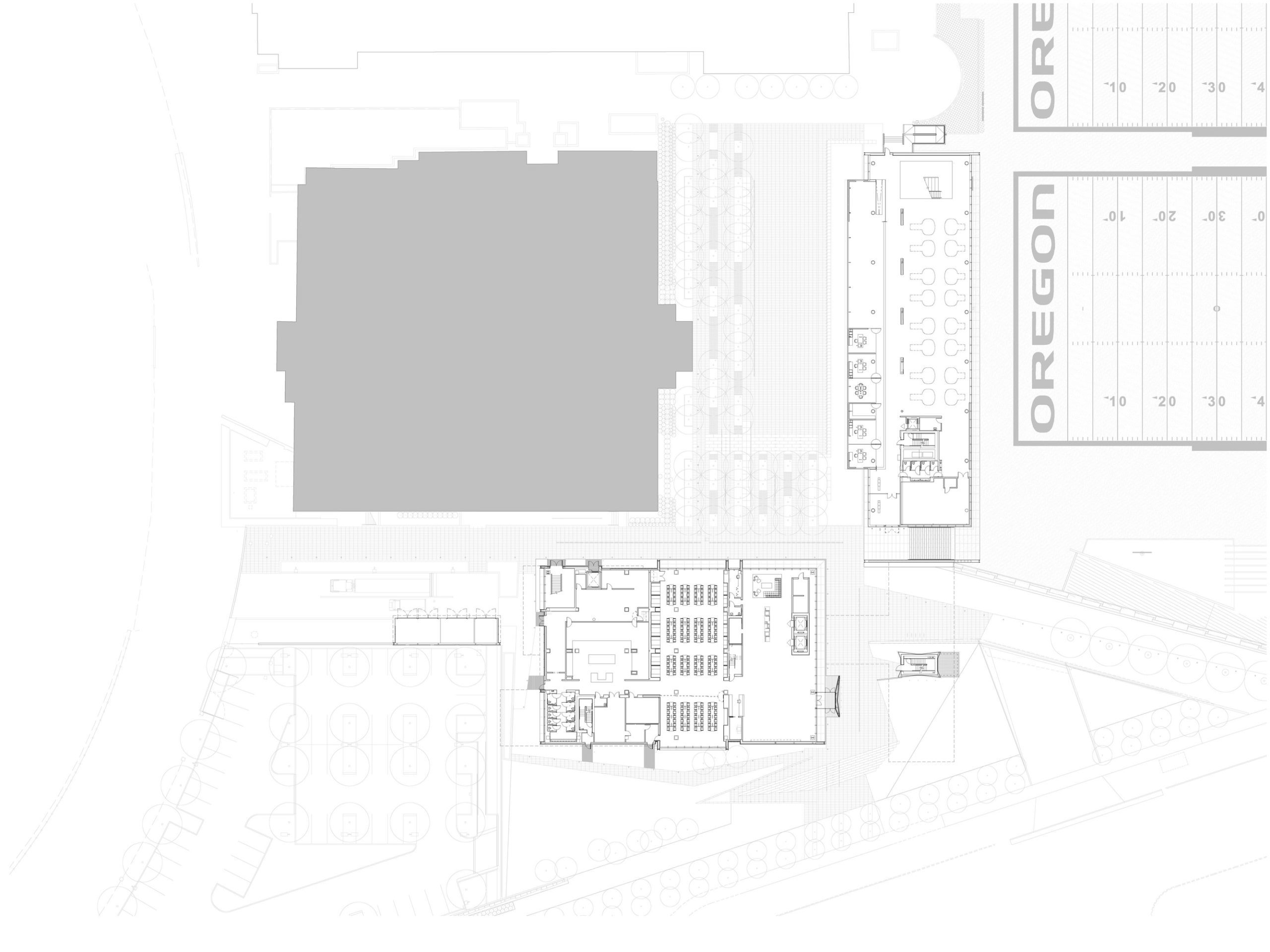
The complex is comprised of two separate volumes — a “teaching box” and an “office bar” — with the building program divided into box-like elements, interlocking as a cohesive and interdependent composition. The public lobby and reception areas feature elements that celebrate the legacy of the football program and acknowledge the program’s donors and sponsors.
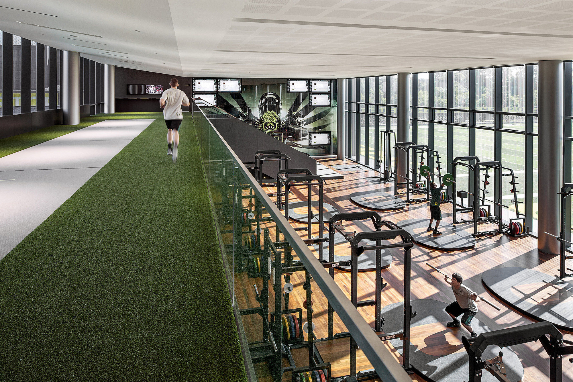
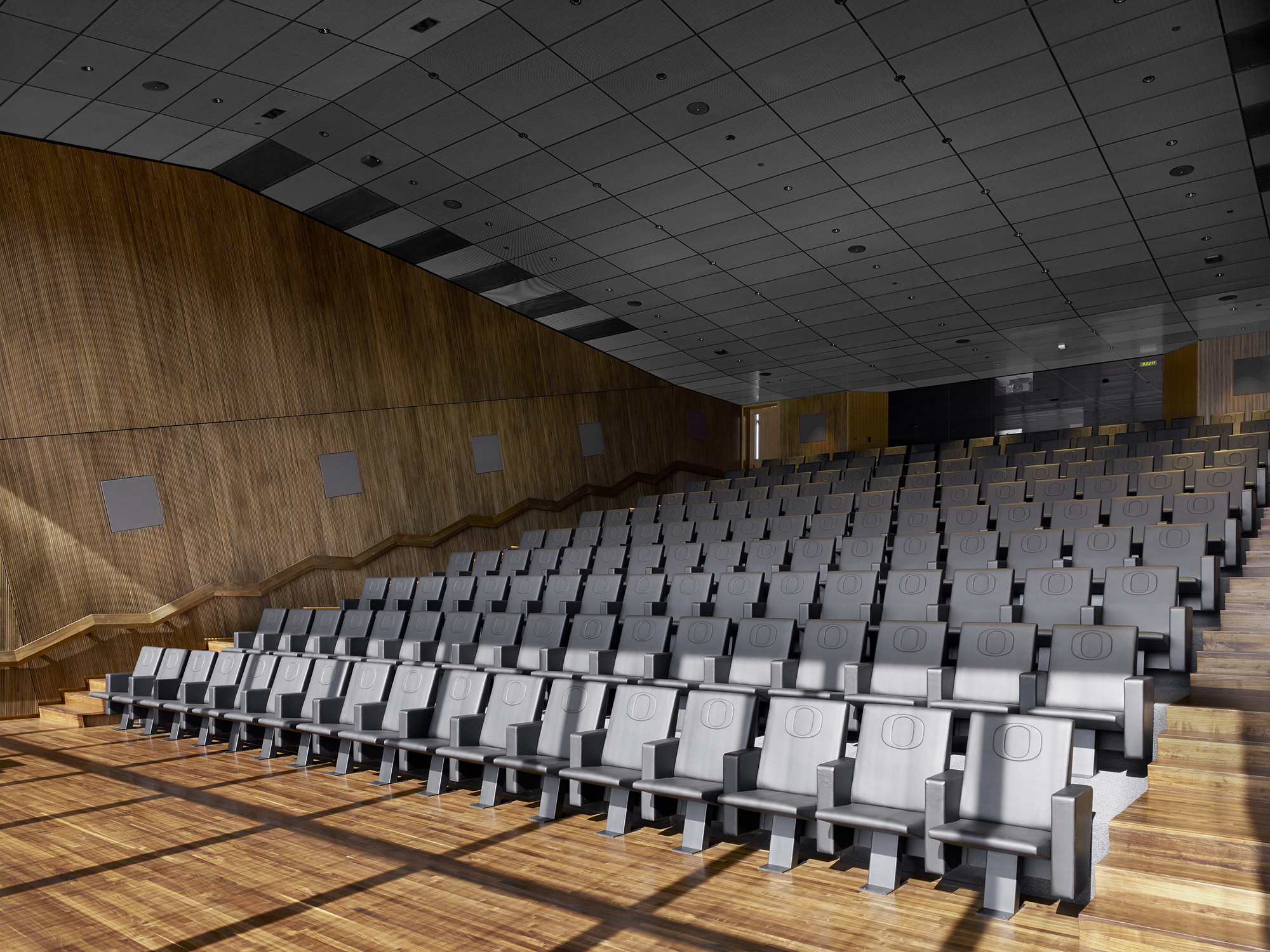 The public lobby and reception area of the football performance center celebrate the proud accomplishments of the Oregon Ducks’ football program. The Hatfield-Dowlin Complex includes a weight room, indoor sprint track, dedicated football position meeting rooms, team video theaters, offense and defense strategy rooms, and a conference suite that accommodates the entire coaching staff.
ZGF explained that the suite serves as a central hub for fostering communication and collaboration among offensive and defensive coaches. The core area is flanked by office and locker facilities for players, coaches, and support staff. Additional amenities include a players’ lounge, a nutrition bar, equipment room, a full-service dining facility, a recruiting center to host prospective players, dedicated areas to accommodate professional scouts, a media interview room, an advanced video editing and distribution center, and training and medical treatment facilities.
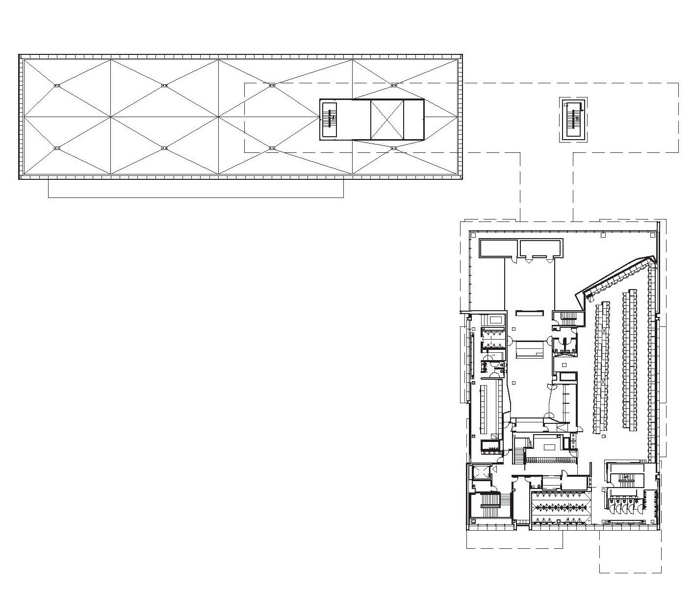
 From the outside, the site plan includes a new plaza with a cascading fountain and benches that serves as a public hub. It also encompasses a new, enhanced grass football field and two new synthetic turf practice fields. The design solution takes advantage of the site’s natural slope; a 190-car parking garage and plunge pools are tucked beneath the plaza. ZGF also handled environmental graphics and branding, with visual elements that include custom carpets and patterns, such as the University’s signature “O” symbol in the reception lobby and the typographic “DUCK” used in the lounge area. Donor names are etched in various sizes and depths on aluminum panels in the elevator banks, allowing for new donors to easily be added in the future.
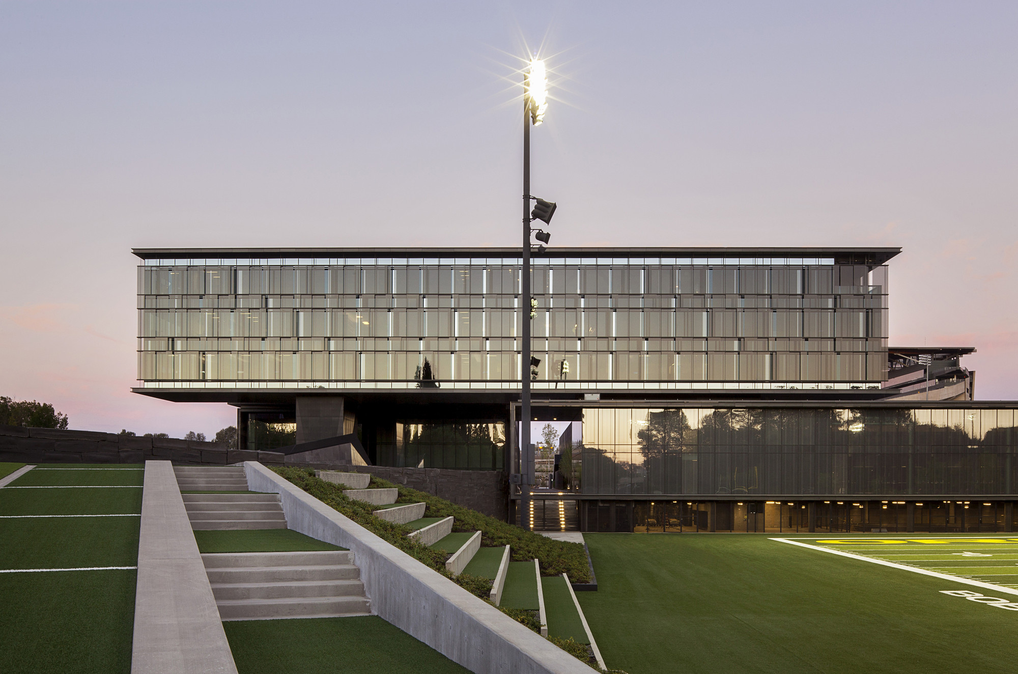
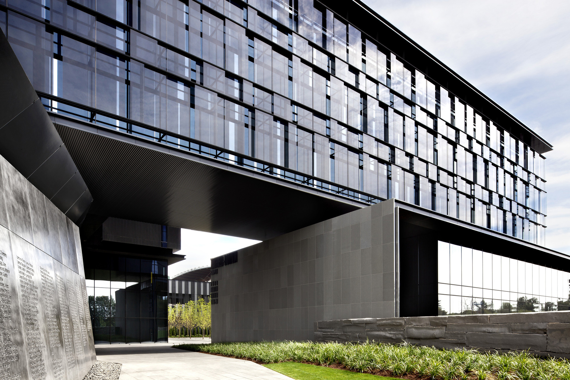
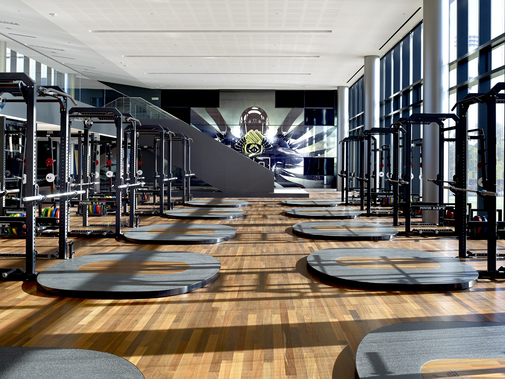 The key component of the Hatfield-Dowlin Complex is the glass, granite and metal cladding; the building’s “armor” is made to balance strength and grace, formidability and transparency. The building was designed to address the solar challenges faced in Eugene, where sun hovers near the horizon for long periods all winter long. To minimize glare, the designers placed a floating sunscreen across the western face of the building. This was done using a series of tinted glass panels held in an aluminum frame created by Benson Industries. The resulting pattern of overlapping rectangles is one layer of this “armor” idea.
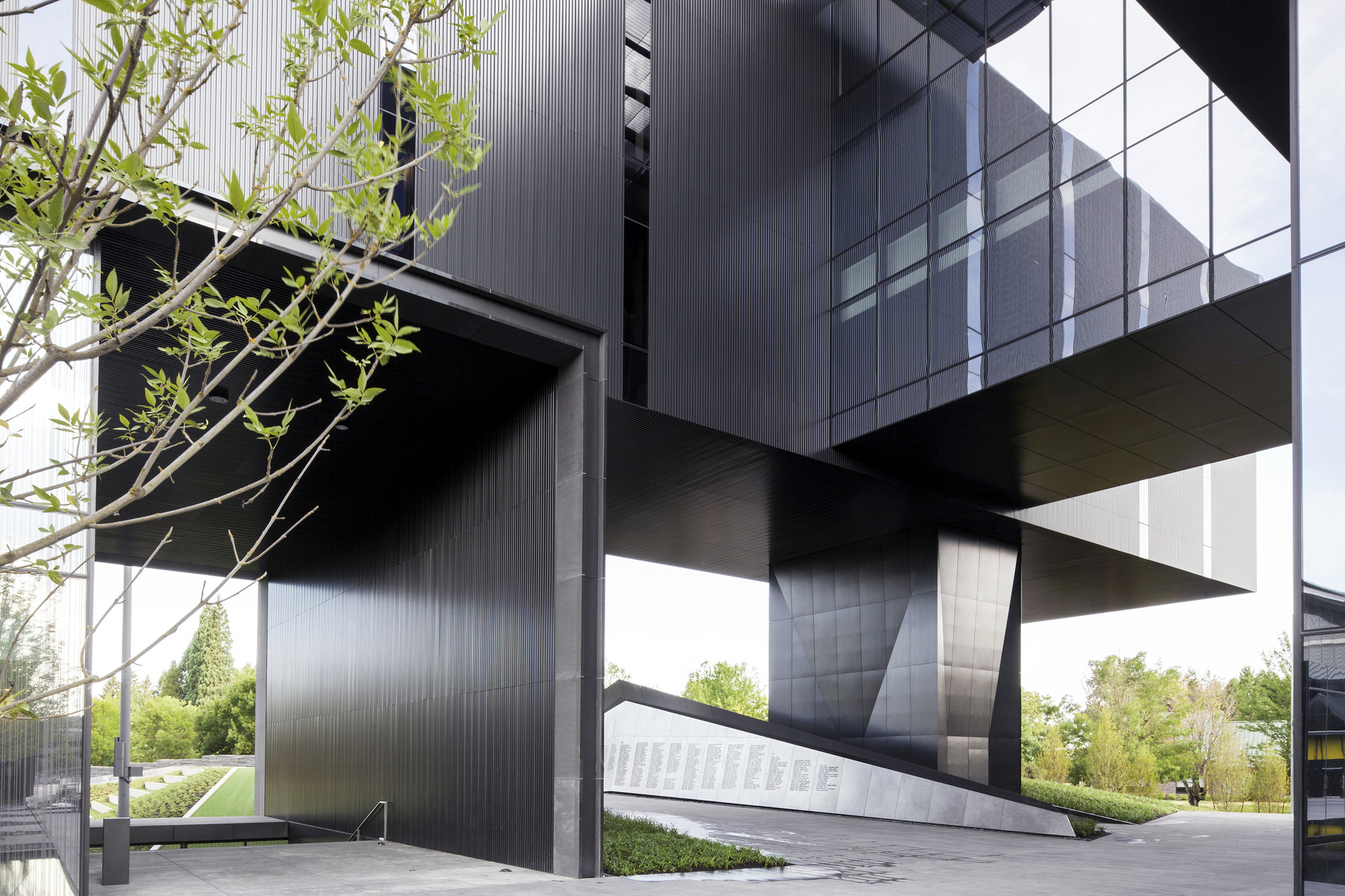
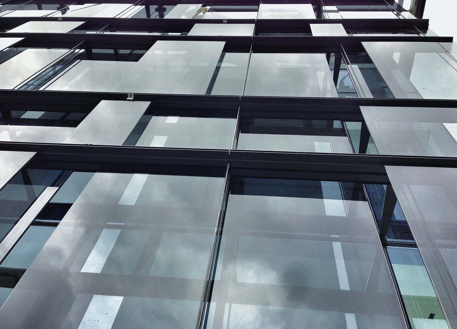 Besides the sunscreen wall, ZGF created a curtain wall of fritted, triple-pane insulated glass units supplied by SYP. As the team notes, the frit pattern was developed to be visible from both outside and inside the building, and to suggest movement along the façade. The team also chose granite and basalt from Western Tile & Marble, which was treated with water jets for a striated texture. They architects and designers worked with Streimer Sheet Metal Works to create transitions between the stone and metal work.
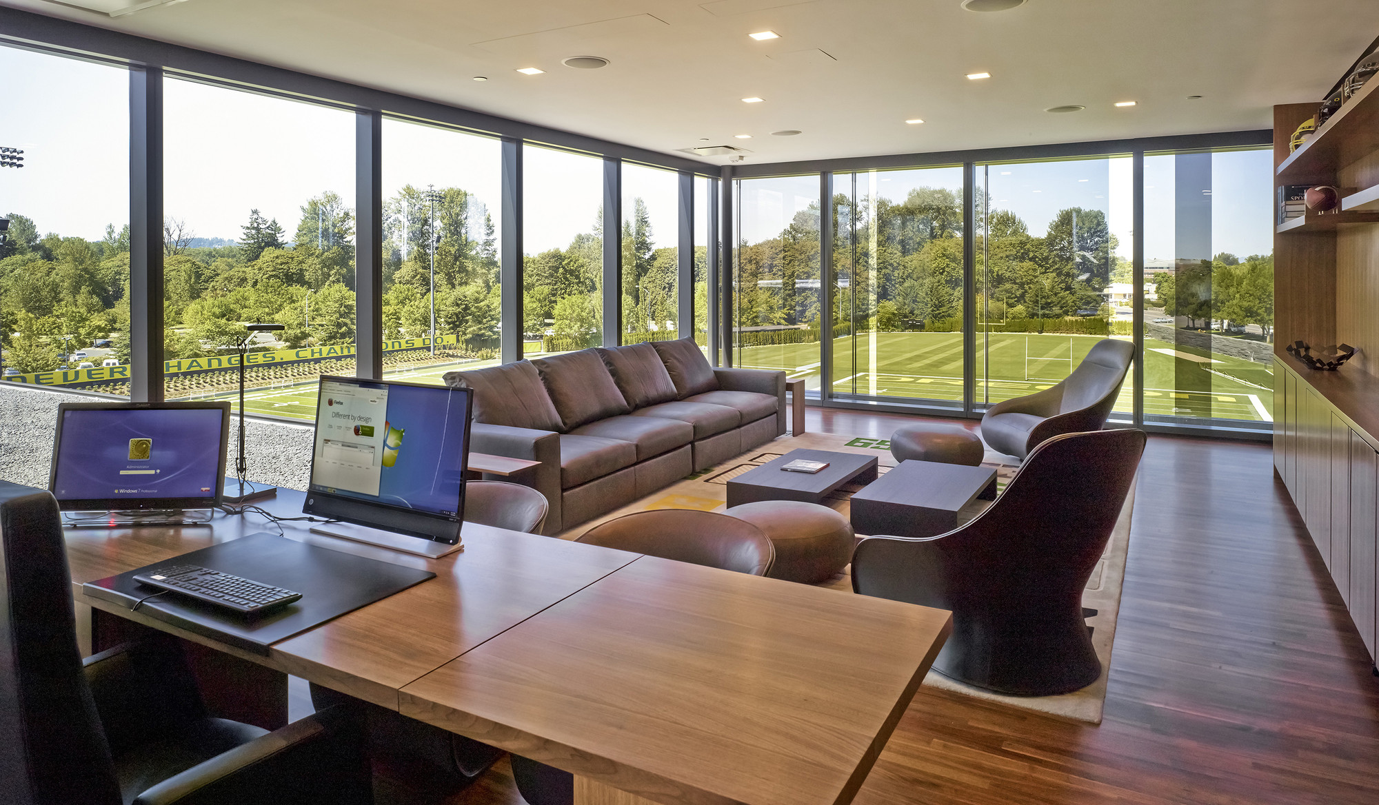
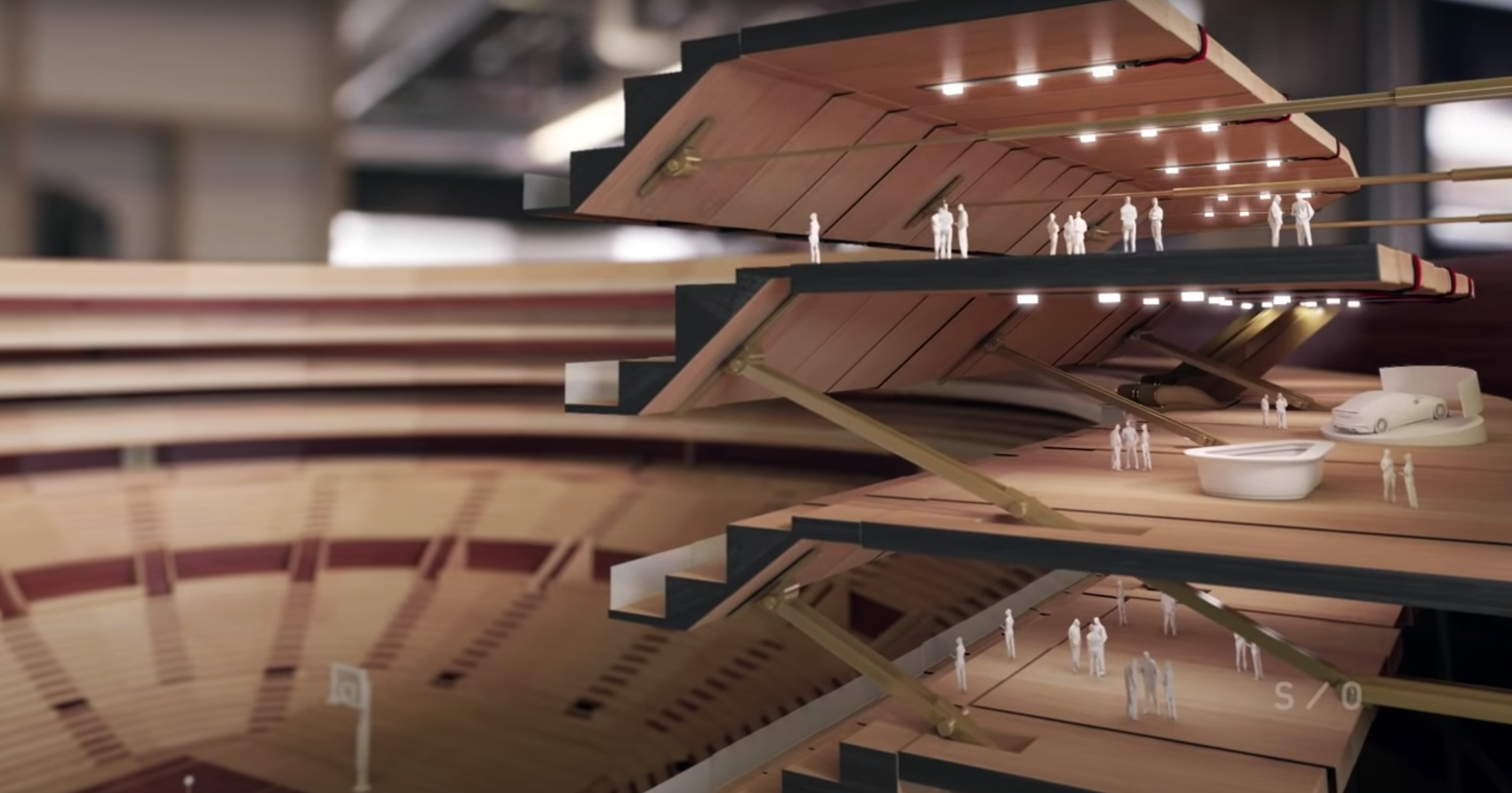
 Finally, the ground floor, as well as the meeting rooms and lounges on the mezzanine level, are clad in glass, creating a connection and transparency to outdoor spaces. The interior spaces were made to “reinforce the formidability and transparency of the armor with reflective surfaces that mirror the exterior and the movements of users within—rich wood-clad spaces contrast the starkness of the black façade and support a more focused environment and accommodation of players and coaching staff through the gracious scale.”
The building program is divided into box-like elements of black granite, corrugated metal and fritted glass. The team made it so that the boxes are arranged in a Jenga-like manner, interlocked as a cohesive and interdependent composition. It was designed to represent the collective strength and balance of individuals working together as a team.
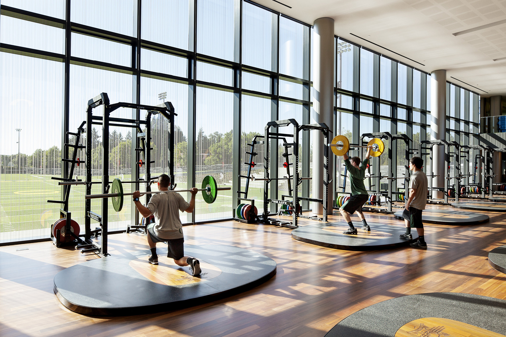
 In addition, many walls have magnetic glass, which is both durable and offers a surface for writing and working during impromptu meetings. The team explained that from the slate to the various patinas of metal panel, all interior finishes were curated to encourage touch and comfort. Much of the hardware and furnishings were custom fabricated in order to fit seamlessly within the architecture, accommodate the weight and proportions of the football players and to synchronize with Oregon’s Pantone yellow and green colors.
 Designed to appeal to the rising stars of high school football nationwide, the Hatfield-Dowlin Complex will play an important role in the recruitment and retention of the University of Oregon’s football program. The project challenges the norm and expectations of design and materiality in sports facilities. The team worked closely with craftspeople, artisans, manufacturers, furniture makers, and stone and metal suppliers to add texture and richness. The result is a building envelope and “armor” that’s well-suited to the elements and the monumentality that ZGF set out to create.
Architizer's diverse jury of global experts is currently reviewing submissions to the 14th A+Awards! Sign up to receive updates on Public Voting and spring winner announcements.
 University of Oregon Hatfield-Dowlin Complex