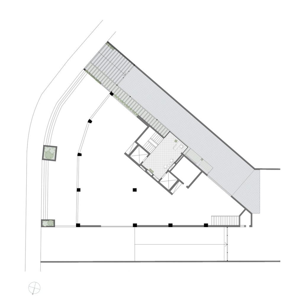
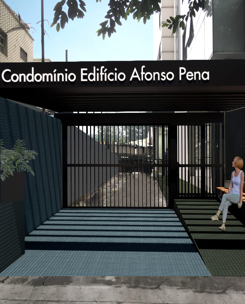
Afonso Pena Building – The renovation of the ground floor of this commercial building sought to facilitate the identification of its entrance, both for pedestrians and cars. The project should be elegant and neutral, and serve all companies that work there.
Architizer chatted with the partners Camila Caiuby, Carolina Gurgel and Gabriela Panico at Angá Arquitetura to learn more about this project.
Architizer: What inspired the initial concept for your design?
Camila Caiuby, Carolina Gurgel & Gabriela Panico: The entrance to the building went unnoticed by customers and visitors because it appeared to be a restricted garage access, so going into the building next door was very common. We sought a simple but a high impact solution that would call the visitors’ attention. A single material in two colors brought the new identity: ceramic tiles all over the entrance.
Besides that, we designed an aluminum pergola. The cover guarantees protection from rain for pedestrians and frames the illuminated sign with the building’s identification. Furniture and landscaping finish the space.
In the entrance hall, the cleaning and restoration of the original floor along with the new paint job in a lighter tone gave the environment a new appearance, brighter. The old millwork was replaced by metal panels, bringing a more modern look and greater durability.

© Angá Arquitetura

© Angá Arquitetura
What do you believe is the most unique or ‘standout’ component of the project?
We believe that the simplicity of the solution is what stands out: one material in two colors. With it, we reached the impact to the facade that we aimed for, we were able to organize the car and the pedestrians entrances and exits and, most importantly, the building’s new identity now allows it to stand out from its neighbors.

© Angá Arquitetura
What was the greatest design challenge you faced during the project, and how did you navigate it?
Our biggest struggle during this project was the execution. Since it was the only entrance to the building, it was impossible to block the access. So we organized a schedule where the most delicate areas would be remodeled during holidays.

© Angá Arquitetura

© Angá Arquitetura
How did the context of your project — environmental, social or cultural — influence your design?
Located on a famous avenue in São Paulo, the building was just another entrance between many garage doors, so going into the building next door was very common. The entrance had to call attention at the same time that it had to be neutral, since there are a lot of different companies in the building.

© Angá Arquitetura

© Angá Arquitetura
What drove the selection of materials used in the project?
The tiles, commonly used on sidewalks and garage ramps, were applied in not so common colors both on the floor and on the wall. Blue is responsible for highlighting the access for cars and green, for pedestrians. A single material. Two colors. A new identity. Because we were dealing with the entrance of a corporate building with a great diversity of offices, we chose a more neutral palette.

© Angá Arquitetura

© Angá Arquitetura
What is your favorite detail in the project and why?
We are really fond of using common materials in unexpected ways. The entrance flooded with colorful tiles had a really interesting price, good resistance and the colors we picked – although not obvious for an office building – suited it really well.

© Angá Arquitetura

© Angá Arquitetura
How do you believe this project represents you or your firm as a whole?
This project represents our attempt to develop different solutions by using day-by-day materials. Designs that solve our clients problems and wishes but at the same time respecting their budget without losing the innovation in the process.


Products / Materials
Angá Arquitetura (Architecture) Ladrilhos Rochbeton (ceramic tile) Estilo CV (illuminated sign) Forchela (blacksmith) Ampliazi (roofing) Luciano de Deus (millwork) Amanda Rodrigue (Landscape designer) Polishtec (Stone pavement cleaning)
For more on Afonso Pena Building, please visit the in-depth project page on Architizer.


 Afonso Pena Building


