From introducing the now-ubiquitous Post-it Note to perfecting adhesives and glass films, 3M is a brand synonymous with scientific ingenuity. But science is only one part of the equation for developing successful everyday products. That’s where the company’s design team comes into the picture — and why the company set out to create the 3M Design Center.

“3M Design is at the forefront of creating customer-driven experiences,” says Eric Quint, the company’s chief design officer. “The new studio reflects our culture of spontaneous collaboration, creativity and translation of insightful solutions that positively impact the world.”

© Richard Brine
This new central hub is situated within a distinct, existing 1960s structure at the 3M global headquarters in St. Paul, Minnesota. Working closely with MSR Architecture, Quint and 3M Design reconfigured the 38,000-square-foot, three-floor building to bring it up to date and meet the modern needs of the company.
After stripping the building down to its shell and structural components, the contractors enhanced existing concrete floors throughout using 3M’s own products including the Trizact Concrete polishing system, Scotchgard Stone Floor Protector and Scotch-Brite Sienna Diamond Floor Pad Plus. In fact, more than 30 3M brand materials were used in the project, including several types of window films, adhesives and finishes. Then the team went to work on laying and carving out the spaces needed for fostering creativity and productivity.
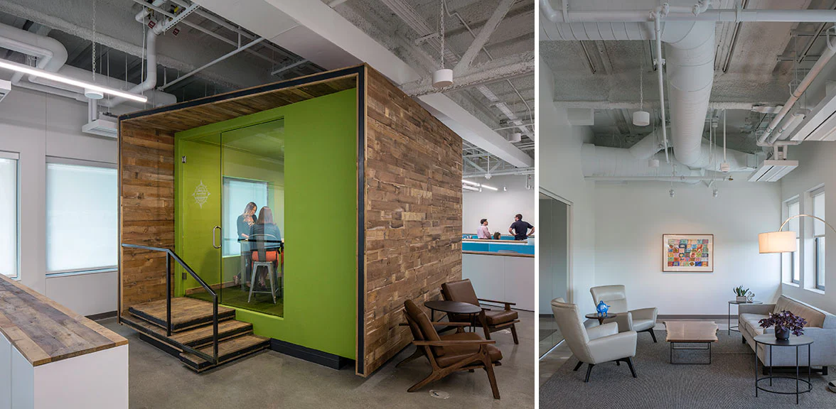
“When you think about scientists, they need labs. In the same way, designers need creative space,” says Quint. “There is no one-size-fits-all model for creative spaces, but we wanted to have optimal flexibility — a kind of adaptive space. Our designers are encouraged to interact and work with people of all levels and across all disciplines within the company.” To address all of the above, the project team developed a plan that balances openness and privacy via more intimate meeting rooms, prototype and brand labs, cocoons and private workspaces within the open floor plan, all with a decidedly industrial aesthetic.

© Richard Brine
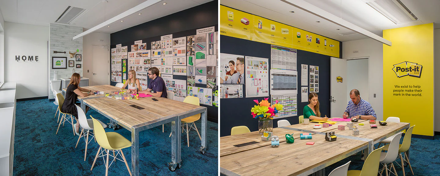
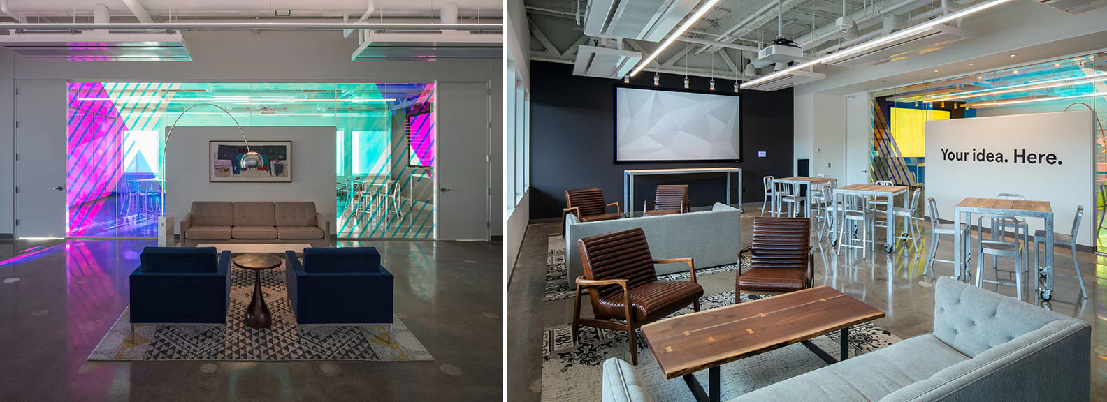
In the enclosed rooms and wood-clad “Creative Cabins,” as well as select communal or breakout lounge zones, rugs formed of carpet tile anchor furniture groupings that include custom tables with tops constructed of wood reclaimed from old scaffolding and freight train wagons.
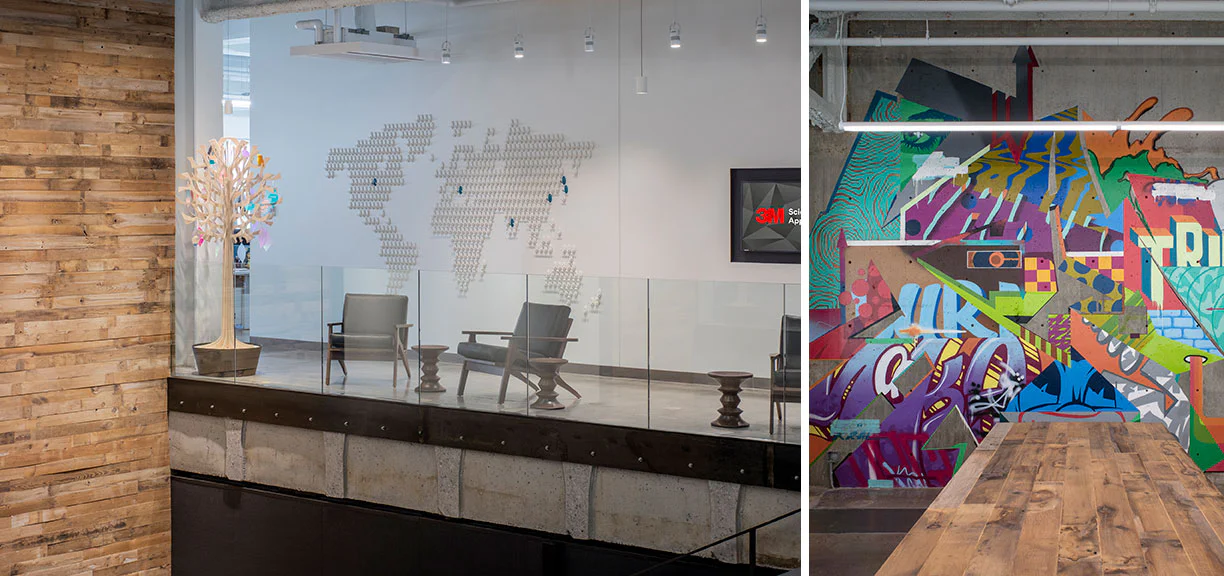
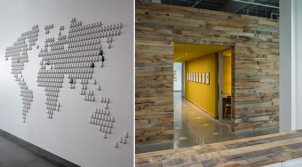
Regionalism appears in artwork. One concrete wall is emblazoned with a mural created by local graffiti artists, for instance, while another wall exhibits a series of posters highlighting Minnesotan inventions to “honor the entrepreneurial and inventive heritage that is a foundation to our location,” explains Quint. Some of the other visuals, rather than symbolizing locale, represent the brand by implementing 3M products: Dichroic films in vibrant color compose striking graphics on an interior window wall, for instance. Command removable hooks playfully map the world on another wall. And DI-NOC film covers some walls to provide whiteboard space.
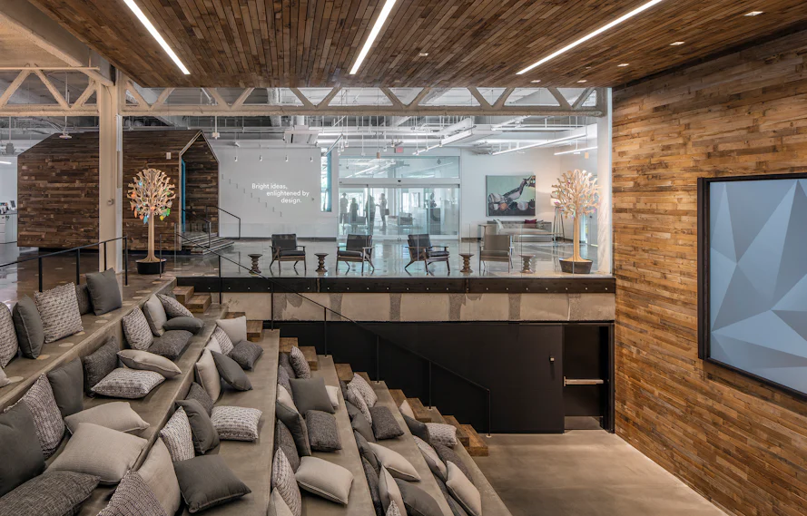
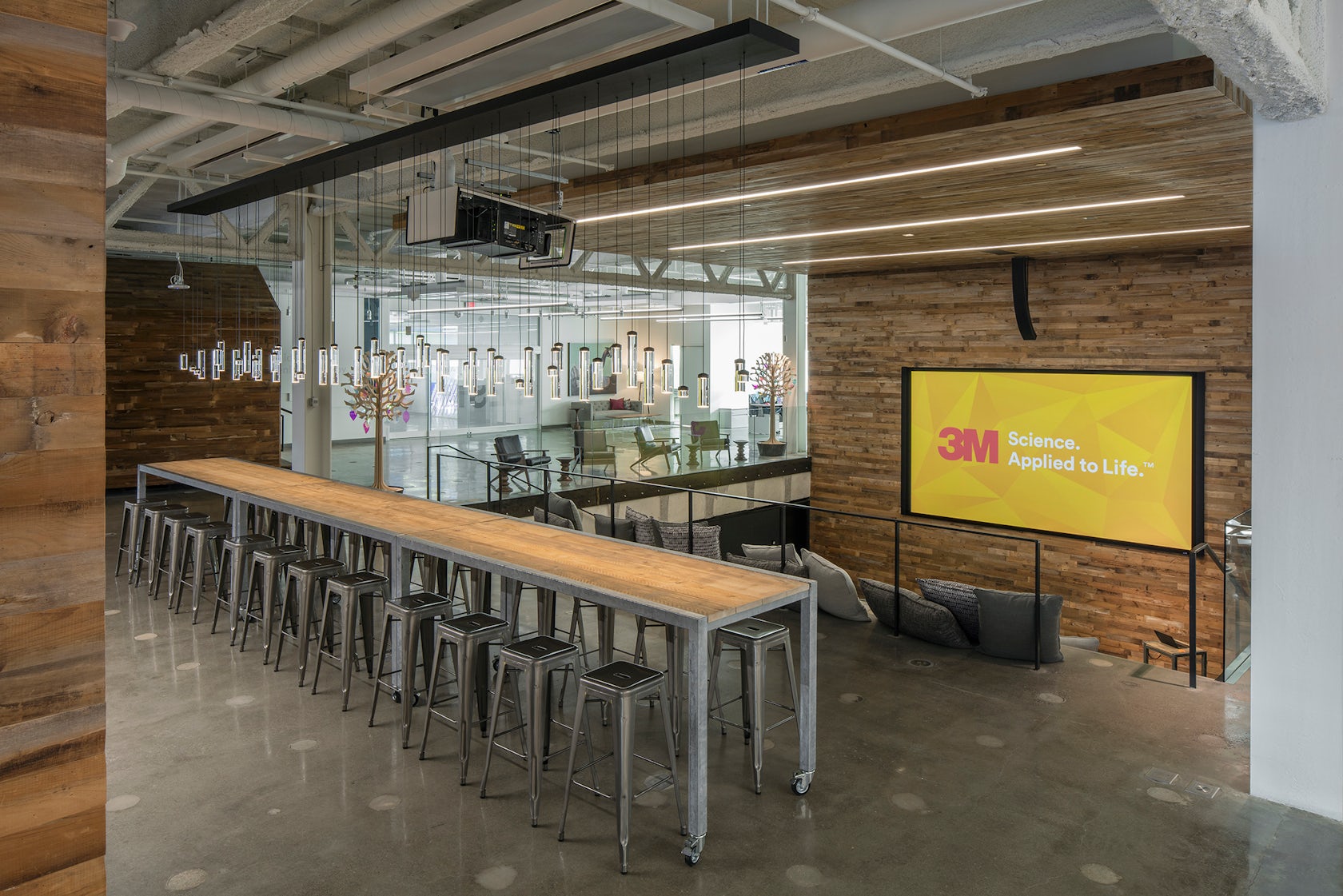
The design team looked to a typical Mediterranean village with a market square for inspiration behind the grandest of spaces in the building — the “Design Hive.” This amphitheater-like space is stepped and furnished with throw cushions to provide stadium- or riser-style seating. According to Quint, the Design Hive is used daily for smaller creative collaborations and lectures, presentations or training sessions. Timber step inserts to the side form a more climbable staircase for ascending and descending, and the same wood clads the front presentation wall, continuing upward across the ceiling here. This warm-material wrap essentially provides touches of residential comfort to such a lofty space.

© Richard Brine
“The theme throughout the studio space is meant to evoke a ‘living room’ atmosphere, enabling the designers to feel more at-home and secure to stimulate spontaneous creativity and collaboration.” He concludes, “We created the space by our designers, for our designers.”
© Richard Brine
