Architects are used to seeing high-profile buildings in a privileged light, often through a flash of coverage upon opening that treats their design as an end unto itself. Far less often we see such buildings from the perspective of people who use them every day.
To correct this, we conducted interviews with the inhabitants of a noteworthy building to better understand how they interact with, perceive or react to certain design features on a daily basis. The purpose of this is to communicate the effect specific design decisions have on the people who use a building, beyond the project review or photo shoot, in hopes that such an awareness can help architects design better buildings.

Via Field Condition
The Vagelos Education Center is a medical school designed by Diller Scofidio + Renfro for Columbia University in New York City (Gensler was executive architect). This building is new enough to steal the spotlight, as it has won several recent awards, but it has also been open long enough to shape the impressions and routines of its user base.
According to interviews, the strongest forces shaping the experience of this building are a consistent presence of natural light, expansive views to the outdoors and an apparent desire for sociopetal and health-promoting spaces. Least noticeable, though specifically highlighted in the building’s design narrative, was the composition of certain boilerplate elements in the program layout. In this case, aspects of building design that often take the most time for an architect to work out seem to have the weakest effect on the Vagelos Center’s inhabitants, while relatively simple decisions have the greatest impact.

Via arcspace
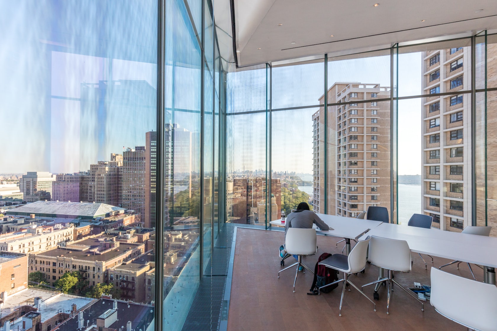
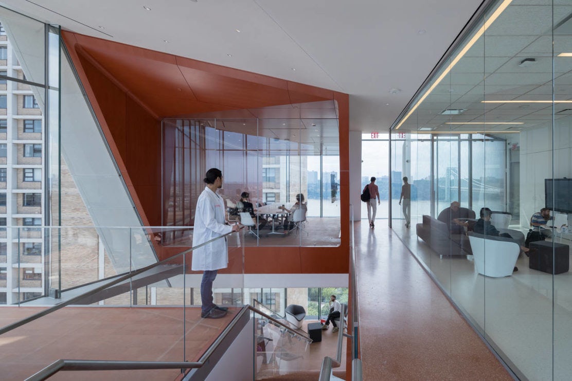
The building’s most noticeable element, a 14-story vertical arrangement of open stairs and seating spaces on the south side, dubbed the “study cascade,” is wrapped with floor-to-ceiling glass on nearly every surface. This speaks to an obvious — though for this reason, frequently undervalued — design move that seems to have the most significance for this building’s users: the amount and quality of daylight admitted to the interior.
The importance of this space’s transparency is noted by first-year medical student Taiwo Alonge: “You will often spot me doing the bulk of studying and relaxing between classes on the 14th floor. Having spent my whole life in Florida, moving up north, I have definitely realized how much I appreciate sunlight. The study cascade provides great lighting even on cold and cloudy days.”

Via arch2o
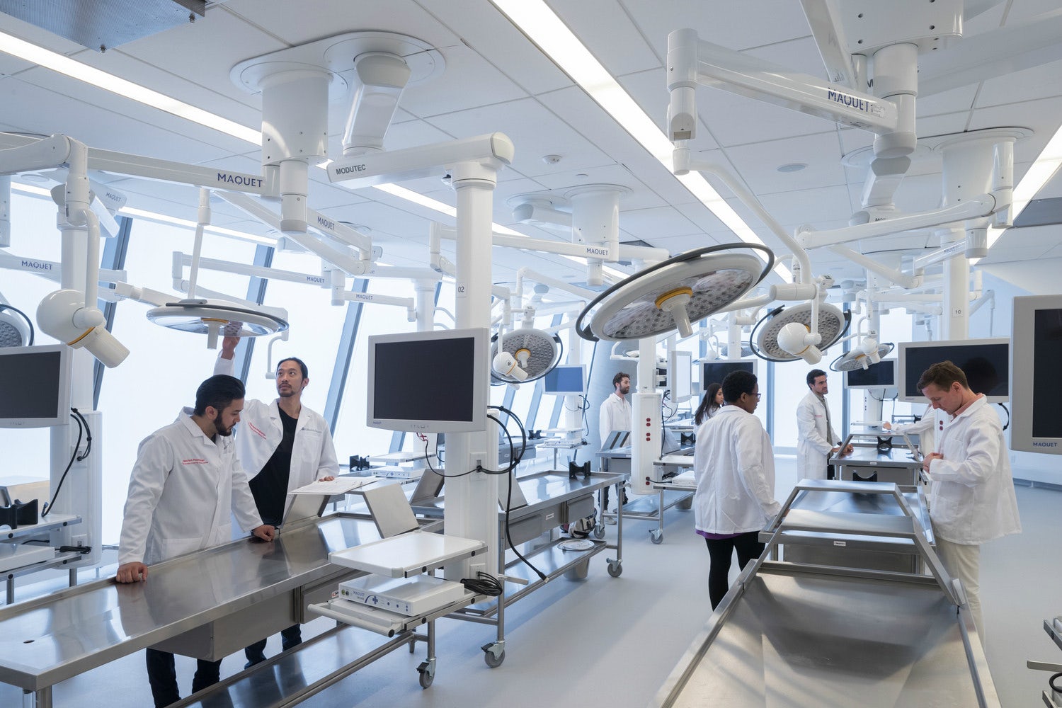
Lab spaces also have large expanses of windows; a departure from the typical design of these rooms in educational buildings. Mary Raddawi, another first-year medical student, mentioned the improvement in her performance due to this: “I think the natural light reduces stress for me,” she said.
There are, of course, trade-offs. Dr. Paulette Bernd, who directs the school’s anatomy program and counts the lab as her favorite space in the building, notes that “the sun can be problematic in the classrooms, especially at sundown. In this situation, the shades can be pulled down.” Though often viewed as an aesthetic blemish in design circles, it seems the application of shades here is a small price to pay for gaining the psychological benefit offered by natural light throughout the day.

Via Curbed
Outside the lab, the positioning of the study cascade highlights the most-discussed aspect of this building: its views of the city. Dr. Bernd referred to them as “spectacular,” while Raddawi stated that “there have been numerous times where I will be on the 14th floor, stop studying for a moment and just stand at the window.”
She noted how the views give her a sense of connection with the city, explaining: “Especially in medical school, it can be easy to become unaware of your surroundings, particularly before an exam. This building really makes me aware of my surroundings and provides me with daily opportunities to remember that I am in school in such a beautiful metropolis.” This reveals the massive importance of both building orientation and site planning — decisions typically made early in a building’s design process and rarely changed later due to time and budget constraints.

Via area
The study cascade embraces a growing trend to design spaces that encourage chance encounters between a building’s users. In this case it combines circulation and study, activities that might otherwise occur in a quiet library or an empty hallway, and distributes them among a variety of comfortable social spaces students necessarily pass through on their ways to class. By all accounts, this strategy is working, as Raddawi recounts: “One time before a histology exam, I ran into a second-year student as I was climbing up the stairs that are exposed to the study spaces at each floor. We ended up chatting, and he gave me advice about what to study for my exam before I continued on with my day.”
The effectiveness of the cascade in keeping students engaged with each other was further echoed by Alonge, who mentioned: “When I am studying during evening hours, I definitely prefer the open study spaces of the VEC to my room … with the great spaces in the VEC, it always makes it worth my while to to study there instead.”

Via Pinterest
The study cascade’s verticality — a necessity driven by the building’s height on an exceptionally tight site — lends prominence to its primary stair (a DS+R hallmark), suggesting a desire for design that promotes occupant health by encouraging people to eschew the elevator. Raddawi notes that “the open and direct access to the study spaces makes it actually faster to take the stairs.” That she mentions “If I am in a hurry, I will skip the elevator for floors past the ninth” is a testament to how impactful this design is on the habits of the building’s users.
Alonge had similar sentiments, stating that “whenever I have a guest come into town, I always take them up the study cascade. Even though they may initially tense up at the prospect of climbing up 14 flights of stairs, by the time they see the cascade they are completely at ease and enjoy the sights and scenes of the city from the VEC.”

Of particular interest was confirmation from interviewees that the term “study cascade,” despite being coined by the architects, is also actively used by students and faculty. An architectural element’s nickname can often reveal more about how it is perceived than any formal investigation, which is why it was equally interesting to discover that “academic neighborhood,” a term put forth by the architects to describe groups of customizable classrooms, was not mentioned by any interviewees.
This is hardly a shortcoming because an architect’s name for an aspect of their design is typically just a tool to help them refine it, though a lack of communicating design intent in this area might be a missed opportunity to reinforce a sense of identity between different areas of study. The fact that an architect will likely spend far more time laying out use-specific spaces from a program list than they will orienting a building on a site or determining vertical circulation seems to suggest an inverse relationship between the intensity of a design decision and how impactful it is on the people who will live with it.

The Vagelos Center presents a worthy example for understanding how people live with high-profile architecture. By digging in to how the design decisions of a celebrated practice are experienced by the people who use them every day, insight can be gained into how similar strategies might function in other situations. To that end, it’s important that architects value what they learn from the people who use their buildings equally as much, or more, than what they learn from one another.
Top image via Architect’s Newspaper


