“Great things are not done by impulse, but by a series of small things brought together.”
The words of Vincent Van Gogh must have resonated with Hans van Heeswijk of Amsterdam-based firm Hans Van Heeswijk Architects when he sat down to develop ideas for a new addition to the museum dedicated to the world-renowned Dutch artist. The architect’s challenge was to create a space fitting of the post-impressionist painter’s artistic legacy while also facing the museum’s mind-boggling practical challenges, primarily pertaining to the 1.6 million people who now come through the doors each year.

© Ronald Tilleman Photography
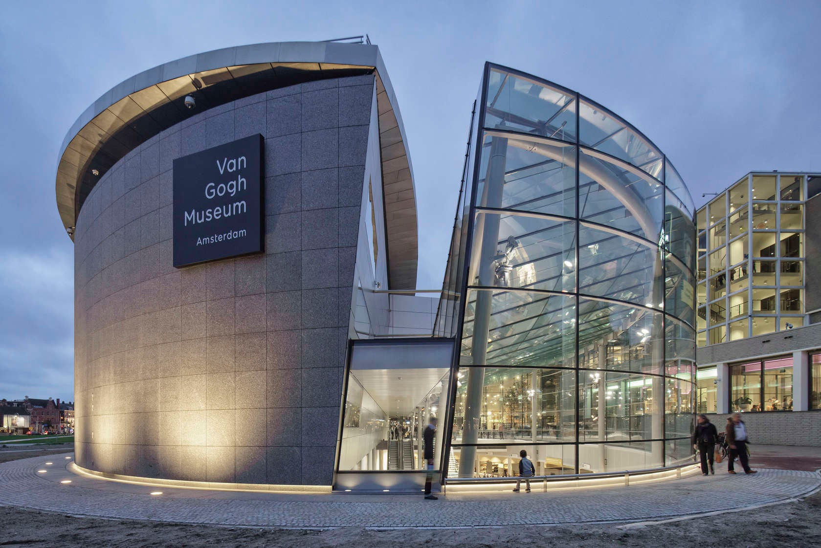
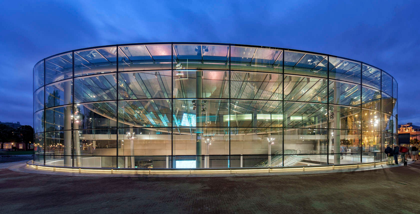
It figures, then, that the Van Gogh Museum’s new entrance — opening tomorrow in Amsterdam’s Museum Square — is at once poetic and pragmatic. Two interlocking volumes of stone and glass form a large elliptical building that acts as a modern gatehouse for one of Amsterdam’s key cultural institutions. The glazed section of this curving edifice is the largest glass structure in the Netherlands, supported by the country’s longest structural glass fins, which measure 39 feet (12 meters).
The glazed atrium makes for an impressive architectural spectacle, but the building’s primary role is not as an iconic structure, but rather as an efficient funnel for the extraordinary number of visitors that the Van Gogh collection now attracts.

© Ronald Tilleman Photography
“The Rietveld Building, which was completed in 1973, was designed for approximately 60,000 visitors and had sufficient reserve space to cope with a steady growth in visitor numbers in subsequent years,” explains Van Heeswijk. “However, those numbers immediately skyrocketed, and, by 1986, they had reached 600,000. For the first major public exhibition in the Rietveld Building during ‘Van Gogh Year’ (1990), one million visitors were expected … The actual number was 1.2 million, and, thereafter, numbers continued to climb.”
The addition of a new wing for temporary exhibitions by famous Japanese architect Kisho Kurokawa went some way to easing the strain on the institution, but more modifications were desperately needed to allow people to freely flow through the museum entrance to the works themselves.
The architects’ main aim was to create an atrium in which there was a great clarity of space and a clear path for visitors to quickly orient themselves. “Upon entering the museum, visitors are immediately able to grasp the layout of the building complex and choose a direction,” says Van Heeswijk. “In the specification of materials and detailing, clear organization, visual calm, and a high standard of finishing were the main ambitions.”

To achieve this sense of “visual calm,” glazing is extensively used to allow a huge amount of natural light to infiltrate the space, even extending as far as the treads on the main staircase. Van Heeswijk explains: “The glass staircase is supported by a triple-laminated glass arch, which transfers the highest loads from the stairs and also stabilizes the staircase. Because of this glass arch, the amount of steel is kept to a minimum and the staircase can be seen as a transparent piece of furniture. LED lighting has been integrated inside the glass stair steps.”

© eva kees photography
The finish and detailing of this gleaming staircase is of incredibly high quality, designed to withstand the feet of thousands of tourists each day while also providing a strong aesthetic focal point for the soaring, light-filled atrium. This architectural feature is symptomatic of Van Heeswijk’s design as a whole. While the building is designed as a largely functional space, it possesses a touch of refinement and sophistication that Van Gogh himself would surely approve of.


