Architects: Want to have your project featured? Showcase your work through Architizer and sign up for our inspirational newsletters.
What’s scarier than your architectural peer disapproving of your design? A horde of social media critics.
When it comes to divisive architecture, it is the layperson that seems to carry the strongest option. They are, after all, the ones confronting our built environment on a daily basis. And while designers have always faced the unpredictable inundation of critiques, it appears today’s architectural community arguably faces the toughest crowd to please: social media commentators.
Some attribute this phenomenon of extreme frankness to the mask of anonymity one can wear via social media, while others believe such online rhetoric simply mirrors existing societal beliefs. Nonetheless, the architecture community has not been spared from divisive online debate, and polarizing conversations surrounding ‘ugly’ architecture fervently play out on social media. Twitter has become the modern-day stage for deliberation, and Buildworld has rounded up some of the most maligned buildings in the UK and US. The results? Both predictable and surprising.
In this article, we highlight a few structures from the list of Global Eyesores that caught our attention. In the name of healthy debate, let this list serve as the next topic of your dinner table dialogue.
Scottish Parliament

New Scottish Parliament by RMJM & Miralles Tagliabue, Edinburgh, Scotland, 2004.
First up on the firing line is the Scottish Parliament, designed back in 2004 by Miralles Tagliabue in partnership with RMJM, and has since become an infamous eyesore in the nation and abroad. The vision for this project was to erect a de-institutionalized and organic design that embraces Scotland’s verdant landscape. The structure takes on a free-form shape that defies the canonical rules of architecture and embraces the region’s greenery — an interesting approach towards the design of a legislative body.

New Scottish Parliament by RMJM & Miralles Tagliabue, Edinburgh, Scotland, 2004.
Despite its fresh take on governmental design, this project has remained unpopular since the get-go. It opened three years later than planned, was designed by a foreign architect and went wildly over budget. Local distaste for the building clearly existed from its inception, and it doesn’t help that prominent voices, like a former MP, have coined this structure as unwelcoming and “dark and gloomy.” But the building’s effort to steer clear of hierarchies and classical design, shouldn’t that be celebrated?
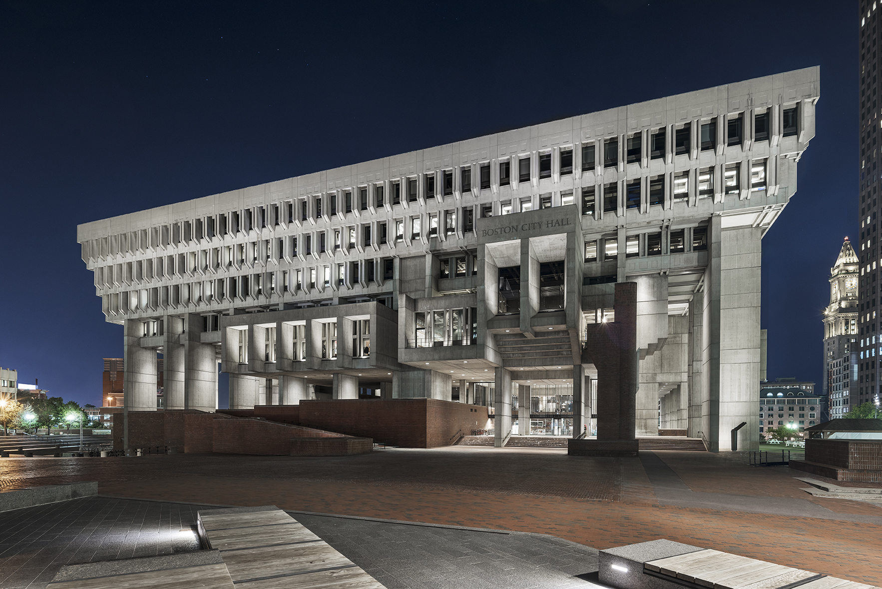
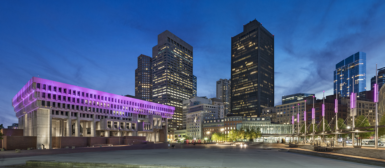
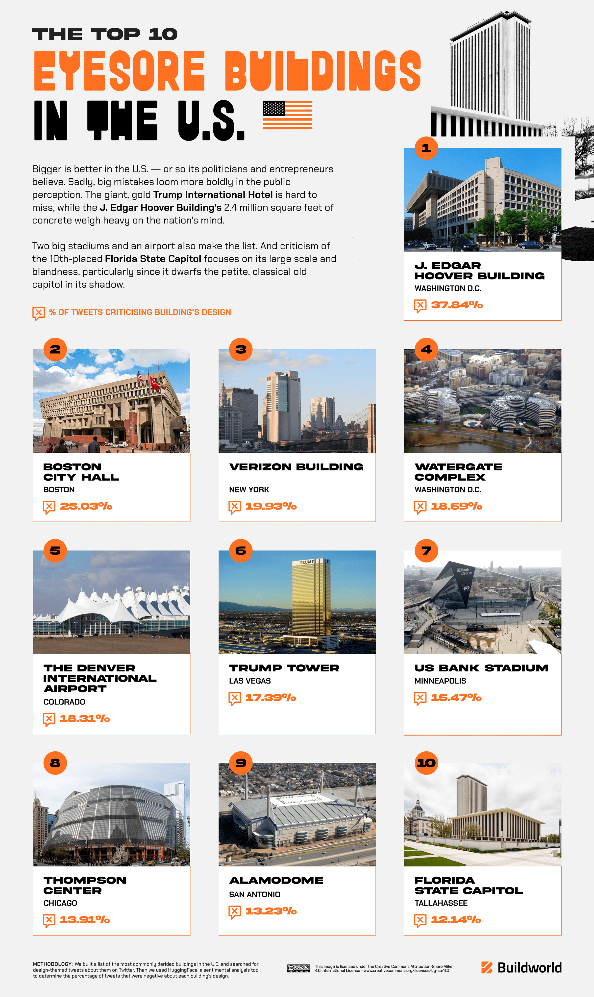
Boston City Hall
Boston City Hall by Utile, Inc., Boston, MA, United States, 2018. Jury Winner, 2019 A+Awards, Concepts – Plus – Architecture +Preservation.
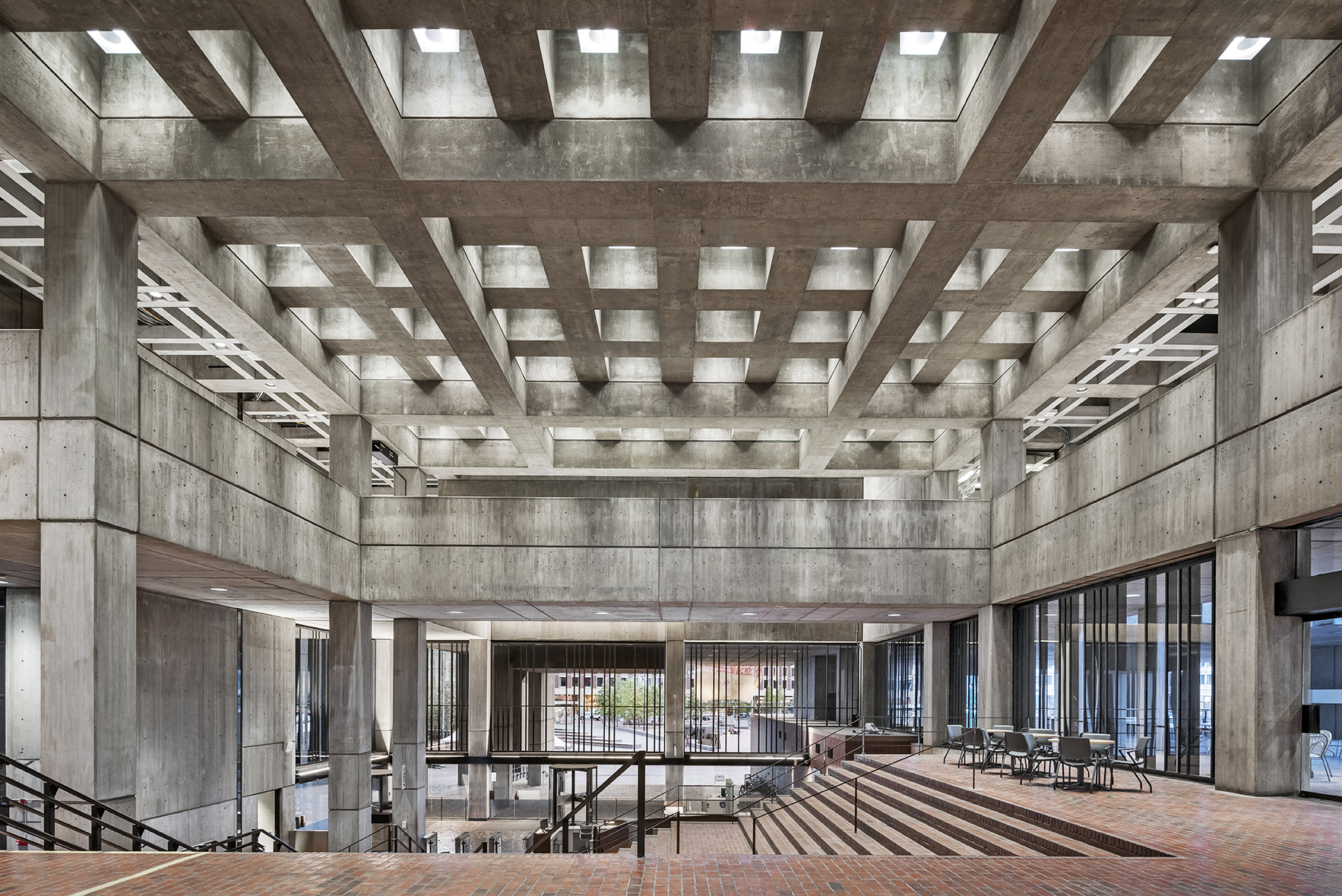
The Boston City Hall ranked #2 as top eyesores in the US, and ironically, despite being dubbed the world’s ugliest building time and time again, this structure won a prestigious A+Award back in 2019. Designed by the Boston-based firm Utile, Inc., this project was an immense undertaking by the design team and held great significance to local Bostonians, making it extra important to get it right. The original Brutalist structure was built in the 60s and underwent a massive recharacterization by Utile, Inc. in 2018.
Boston City Hall by Utile, Inc., Boston, MA, United States, 2018.
Among the major transformations were the main lobby, the public transaction windows and a new lighting scheme that leveraged LEDs and followed the city’s sustainability goals. Utile’s approach: to celebrate the original edifice by accentuating its existing features. Then why so much hate? Was it the preservation of such a polarizing Brutalist building? The obtrusive LEDs?
And while the case can be made for public disdain of civic structures — edifices meant to represent every and all citizens — it is fascinating how many utilitarian buildings also came under social media scrutiny.
Royal Liverpool Hospital
The Royal Liverpool Hospital has also made it on the list of architectural misfortunes. The original Brutalist mammoth was designed in the 60s and has since been replaced by a brand-new edifice in 2022. And it appears both the original and new structure have come under Twitter scrutiny. The hospital has been an icon of ‘ugly’ design since its inception, which made the new development a welcomed change by local residents. But according to Buildworld’s findings, Twitter critics have maintained their distaste for the Royal Liverpool Hospital.
The construction of this new hospital broke ground in 2013 and was designed by NBBJ and HKS — two firms well-versed in medical architecture. The design replaces the Brutalist eyesore altogether, sitting on an entirely new plot and designed to improve healthcare and patient experience. The new site provides a safe and healing environment, with state-of-the-art operating theaters, clinical research facilities and improved inpatient bedroom entertainment. One might see this upgraded hospital as worthy of celebration; however, Twitter critics say otherwise.
Denver International Airport
Or take the Denver International Airport for example. Completed in 1995 by Fentress Architects, this design ranked number four on the AIA list of favorite American architectural landmarks, yet scores very poorly on public opinion. The design broke the mold of traditional airport architecture by relocating infrastructure underground. The result — a rising structure that speaks to the forms and movement of the surrounding Rocky Mountains. Designed as a welcome symbol to Colorado and the West, this airport features the largest structurally integrated tensile-membrane roof in the world and certainly catches the gaze of the in-flight aircraft passenger. Nonetheless, the court of public opinion deemed it an ugly structure.
Full List of Top American and English Eyesores

So, what’s the takeaway?
Designers don’t create with the intention of falling behind the shadows of the ‘status quo.’ Most architects would agree that there is no greater sin than to be boring — to go unnoticed. So perhaps we should see this list as a welcomed conversation, a healthy debate, a frivolous airing of our grievances. After all, bad press is better than no press.
Architects: Want to have your project featured? Showcase your work through Architizer and sign up for our inspirational newsletters.
 35 Best Architecture and Design Firms in New York
") The Rise and Fall of the Starchitect Olympic Stadium (and What Paris Is Doing Right)
The Rise and Fall of the Starchitect Olympic Stadium (and What Paris Is Doing Right) Historic Fabric, Modern Framework: How 19th Century Architecture Is Shaping Adaptive Reuse Today
 Modern Classics: Visiting Alvar Aalto’s Paimio Sanatorium In the Present
 Archi-Quiz: How Well Do You Know Famous Olympic Buildings of Yesteryear?
 boston city hall
  New Scottish Parliament