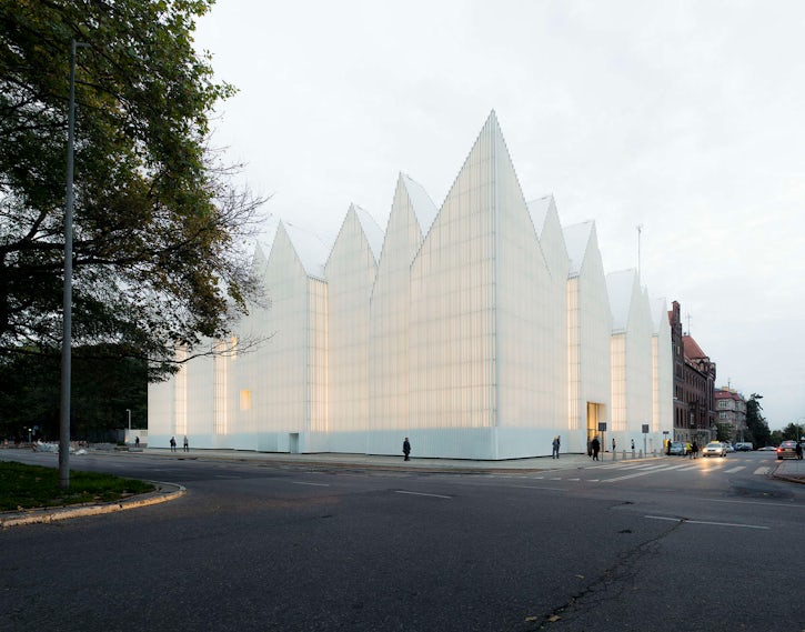
Although the traditional white box endures as the ideal space for exhibiting and viewing art, we also expect museums to offer an aesthetic experience in and of themselves. The challenge, then, is to strike a balance between the form and the content, and it is Japan’s current crop of top architects who have mastered this typology better than anyone else. From SANAA’s 21st Century Museum of Contemporary Art in Kanazawa to Tadao Ando’s stunning Chichu gallery on Naoshima, the country is full of museums rich with subtle sophistication, and Shigeru Ban has recently added another to this prestigious list: this spring saw the opening of the Oita Prefectural Art Museum (OPAM) in the capital city of the prefecture of the same name, in Kyushu, the southernmost of Japan’s four main islands.
© Hiroyuki Hirai
Photos by Hiroyuki Hirai.
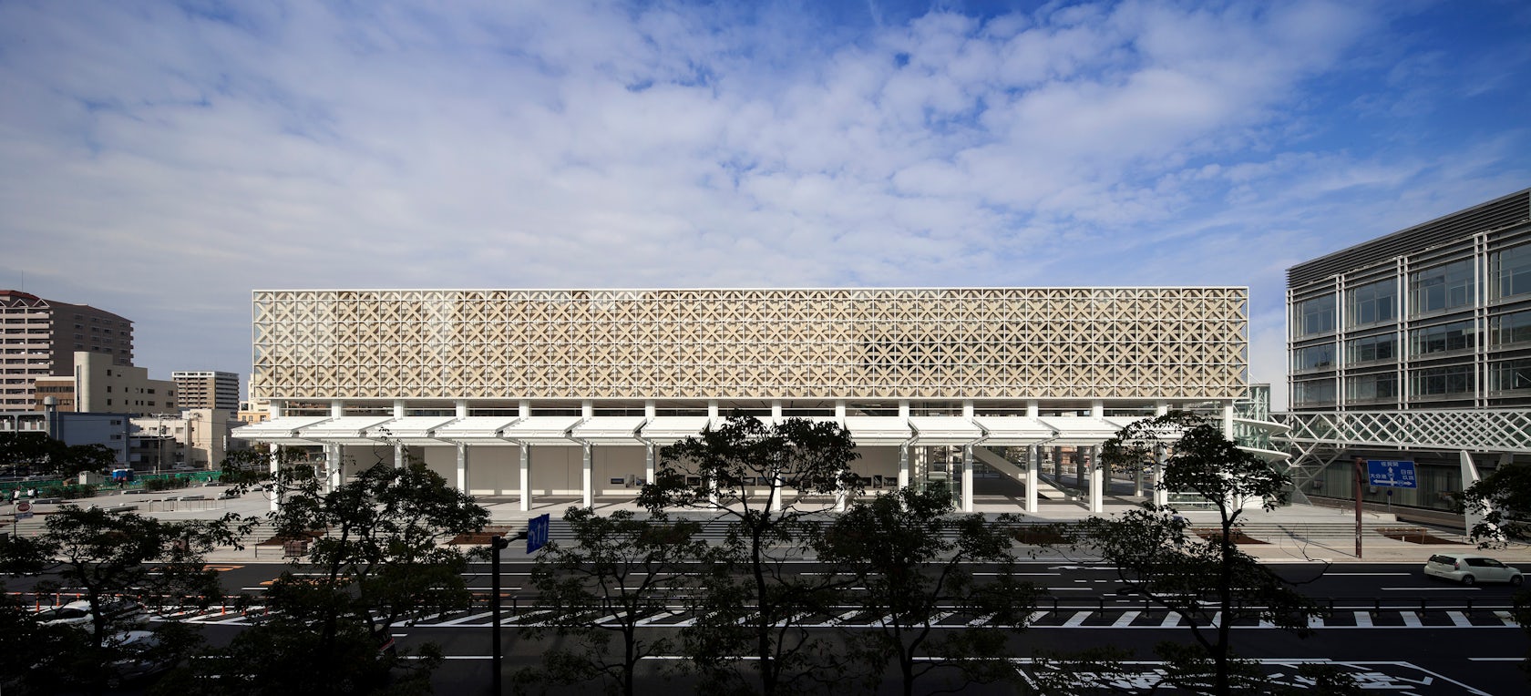
OPAM joins attractions such as the Kisho Kurokawa-designed Oita Stadium and the Umi Tamago aquarium in Oita. Sited opposite the Oasis 21 tower (to which it is linked by a pedestrian bridge), Ban’s museum takes the form of a simple rectangular box resembling a simple stack of two volumes, each wrapped in glazing; as in Renzo Piano’s Whitney, the ground floor is open to the public, as is the café on the second floor.
© Hiroyuki Hirai
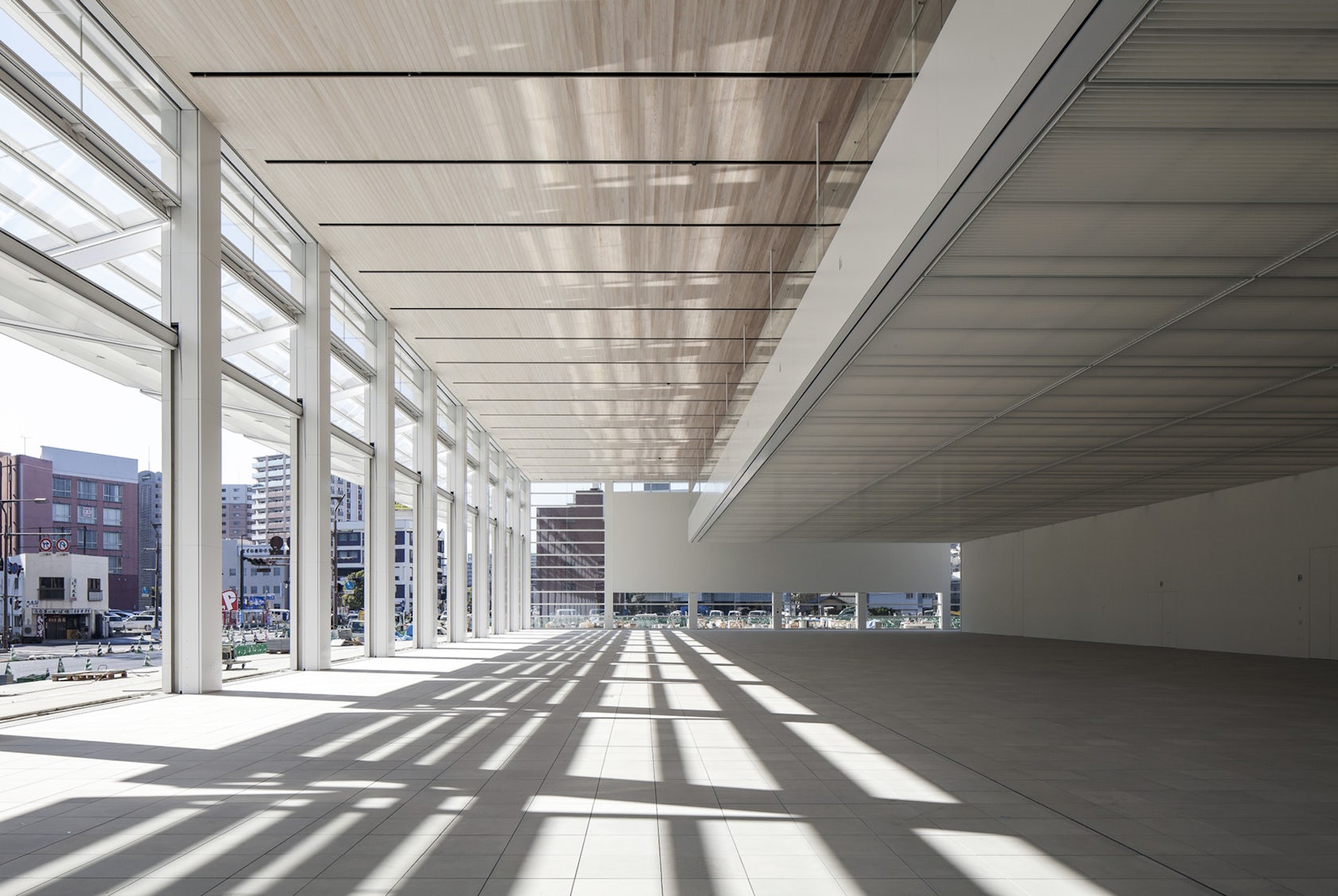
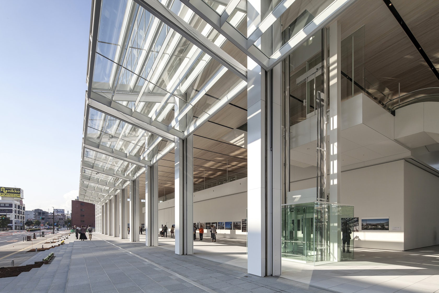
Ban’s design takes the concept even further with his first museum in Japan, making the most of the region’s mild climate: along the street-facing portion of the lower volume, each of the 20-foot-high glass panels folds in half at a single horizontal hinge. Ever sensitive to context, the architect has previously employed similar features in an NYC condominium, but the technique is particularly suited to this cultural venue where the double-height foyer welcomes the public as a kind of rectilinear arcade short setback (the street can be closed to traffic to function as a proper plaza).
© Hiroyuki Hirai
So, too, is the museum distinctive for its timber lattice made from local cedar, at once an allusion to the region’s long tradition of bamboo craft and a felicitous extension of Ban’s growing list of medium-sized museum projects. Where the Aspen Art Museum’s gridded carapace sits solidly in the Colorado resort town, the OPAM is characterized by the crisscross lattice of the top half of its façade; glazed to literally and figuratively reflects its context, the upper stories appear to float above ground level. Meanwhile, the triaxial weave of the ceiling echoes that of the Frei Otto-inspired Centre Pompidou Metz, though the hexagonal design itself reportedly dates back some seven millennia.

© Hiroyuki Hirai
© Hiroyuki Hirai
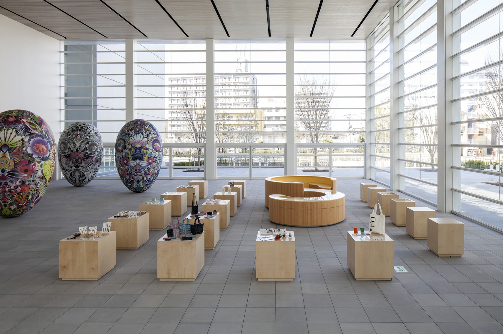
The largely open program of the second and third floors affords a high degree of flexibility for Museum Director Ryu Niimi: about a third of the 140,000-plus total square footage is dedicated to galleries where visitors can admire selections from the permanent collection of about 5,000 Japanese artworks both historic and contemporary.

© Hiroyuki Hirai
If there is one architect who is most adept at combining slick yet understated contemporary design with vernacular craftsmanship, it is surely Shigeru Ban. Once again, the Japanese architect has taken inspiration from the local context — both in terms of materials and traditional building techniques — and merged this with the programmatic flexibility and sense of scale now expected of modern cultural institutions. In a country that is home to countless examples of world-class exhibition spaces and hubs for contemporary art, Oita Prefecture now has one of its very own.
With additional reporting by Paul Keskeys.

