
Architects: Want to have your project featured? Showcase your work by uploading projects to Architizer and sign up for our inspirational newsletters.
There is a place online that I do not recommend visiting unless you have a lot of free time. It is called the Consumer Aesthetics Research Institute, and it is as compulsively browsable as Wikipedia once was, before the novelty wore off and it became a utility, inconspicuous yet essential, like water from the tap.
The Consumer Aesthetics Research Institute is an archive of commercial art styles, or “consumer aesthetics,” that appeared in various forms of media from the 1960s to the present. Each entry includes both visual examples of the style in action and a brief description of when the aesthetic appeared and what it represents.
Reading this site greatly expands your vocabulary for kitsch design. You learn to say, for instance, that your mom’s “It’s Wine O’Clock Somewhere” wall sign features the Live, Laugh, Love font instead of merely calling it cringe. You also discover new forms of nostalgic longing. I never realized there was such a thing as The Global Village Coffeehouse aesthetic before, much less that I missed it.
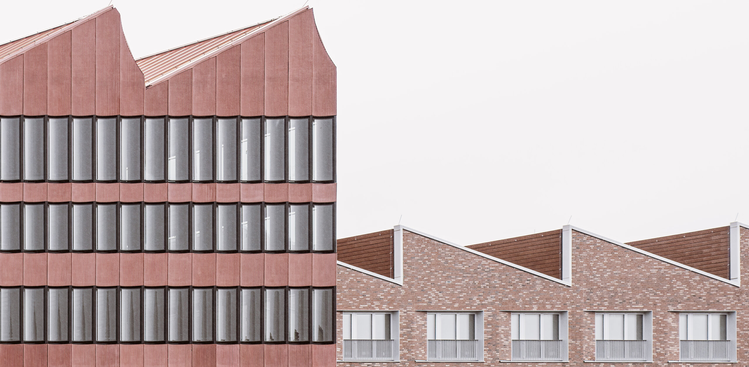
One thing you might notice is that all of these styles seem super dated. This is true even — especially? — of the most contemporary looks like Corporate Memphis, an instantly recognizable and widely hated visual language that just might be the hegemonic consumer aesthetic of our time.

Very few people will admit to liking Corporate Memphis graphic design. Luckily, it has little in common with the original work of the Memphis Group. Katharina Brenner, Corporate Memphis (2019), CC BY 4.0
The Institute describes Corporate Memphis as “The Generic 10s ‘Friendly’ Corporate Aesthetic, neo-Memphis, pastel colors, Mondrian influence, corporate appropriation of Vaporwave motifs, geometric sans typefaces, Monstera plants, exposed plywood, white walls, Matisse-influenced graphics.” For some reason, this style often features oddly proportioned human figures with wobbly arms and legs. Outwardly approachable yet ultimately distant, the style is like an affable boss who says they want to destigmatize talking about mental health — but then balks when you ask to take a personal day.
The only truly offensive aspect of Corporate Memphis, however, is its name. The “Memphis” part is a reference to Memphis Milano, or the Memphis Group, a revolutionary design collective that was founded in Milan in 1980 by the architect and industrial designer Ettore Sottsass. The name speaks to the bright, almost fauvist color palette of Corporate Memphis as well as its emphasis on flat geometric patterns. These were certainly features of the original Memphis group’s work, but the similarities end there.
While Corporate Memphis is bland and conformist, the work of the Memphis group was radical and anarchistic, a deliberate challenge not only to Modernism, but to the very notion of good taste. These were designers who knew that to create a new visual language, one must be willing to create objects that are ugly. And to be sure, much of what this group created was brilliantly ugly.
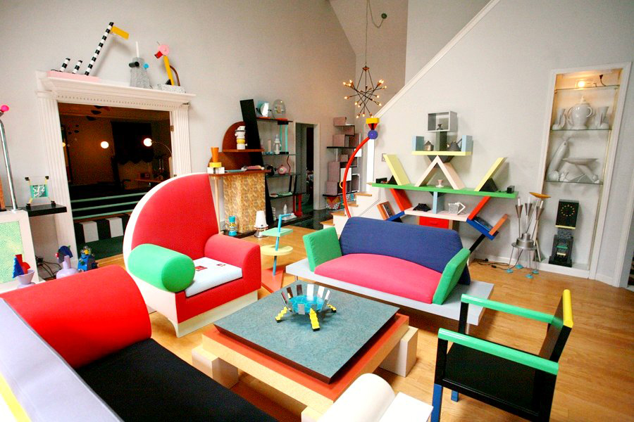
Memphis Milano furniture and design objects displayed in an apartment. Check out the birdlike objects displayed on the mantle. Dennis Zanone, Memphis-Milano Design Collection, CC BY-SA 3.0
Memphis Milano was not just a consumer aesthetic, but an attempt to overcome the dialectic between modernism and traditionalism that characterized design thinking in the latter half of the 20th century and still hinders designers today. Like other postmodern tendencies in architecture and design, Memphis was a response to this crisis. What was unique about Memphis was its utter lack of self-seriousness. This sense of play is the secret to its mischievous vitality. It is why David Bowie owned over 100 Memphis objects, and why architects and designers should look to the movement for inspiration today.
As the story goes, the group took its name from Bob Dylan’s song “Stuck Inside of Mobile With the Memphis Blues Again,” which they played on repeat on the meeting when they first joined together and resolved to create a new visual language. This song has always been one of my favorites by Dylan. Using mythic and hallucinatory imagery, Dylan describes a nightmare of stasis, or what Nietzsche called “eternal return.” This is precisely what the designers, who came from different generations and nations, wanted to escape via clashing neon colors.
Memphis artists designed furniture, lighting, fabrics, carpets, ceramics, glass and metal objects. Their designs often incorporated plastic laminate and terrazzo, consciously eschewing the fetish for raw materials that is still characteristic of Modernism. To the contemporary eye, Memphis objects are reminiscent of Nickelodeon sets from the 1990s — which were inspired by Memphis — but when these objects were first exhibited they seemed simply crazy. An assault on good taste — but a good natured one.

Sottsass’s famous “Carlton” room divider, an object that violates every Modernist notion of unity, proportion, and good taste. Sailko, Ettore sottsass per memphis srl., libreria carlton, milano 1981, CC BY 3.0
Sottsass, who died in 2007 at the age of 90, was an entertaining speaker who maintained a paradigmatically postmodern outlook on the world. That is, he had what Lyotard called an “incredulity toward metanarratives” and believed that the only possible knowledge of the world was partial or fragmentary.
In a 2001 interview with the art critic Hans Ulrich Obrist, Sottsass opines that “Existence is fragmentary, because we no longer accept the logic that we hoped would tie up everything. Even that great scientist strapped to a wheelchair, Hawking, said this: ‘If we could find a formula that holds together the universe, I’d know what to think of God.’ The fact remains that this formula can’t be found! It doesn’t exist!” He continues, “At any rate, the same problem exists in everyday life. When I read a newspaper, for example, I can’t grasp the dimensions of what’s happening between here and, say, the Middle East, between here and New York.”
Like Derrida, Barthes, and other thinkers commonly labeled “postmodern,” Sottsass believed that recognizing the limits of one’s knowledge was liberating. It frees one of the pressure to define a unified picture of the world. Fragments of knowledge, of beauty, can be appreciated for what they are, and not subordinated to a larger system. This was Sottsass’s picture of the world, and he believed that one’s ideas influenced everything one creates.

Martine Bedin was the youngest member of the Memphis Group. She described her “Super Lamp” as “like a small dog I could carry with me.” This was the Memphis Group’s most profitable object. You can still buy them online. Caffe_Paradiso, Memphis Super Lamps by Martine Bedin, CC BY 2.0
“It’s clear that if I’m designing architecture, I need to know things that are not the same as what I have to know to design a glass vase, and to design a glass vase you need to know things that are not the same as what you need to take a photograph,” he said in the same 2001 interview. “But apart from these technical differences — which are certainly important because they have an effect on what I can design and condition — there still remains, deep down, what I think of life, why I do things, what I imagine happens when I design something.”
What Sottsass and his allies in the Memphis Group believed in was restoring joy and fun to architecture and design. They did not seek a unified aesthetic with a single message, but rather a style that embraced the wild diversity of life. The closest musical analogy to the visual language of the Memphis Group is jazz.
There is a lightness to Memphis — a real lightness — that should not be confused with the forced and inauthentic cheerfulness of Corporate Memphis. While Thomas Heatherwick does not name the Memphis Group in his book Humanize, a polemic against the drabness of much contemporary architecture, I believe that they were responding to the same issue he lays out, a problem that is still relevant today. Heatherwick complains that architects today are afraid of playing with ornamentation and other design quirks that don’t fit within their overarching vision or theory of design. For Sottsass and his allies in the Memphis Group, there didn’t need to be a theory. A building or lamp could be adorned with any color or pattern — just because.
While you might find the first wave of Memphis designs garish, several alumni of this group such as Nathalie du Pasquier have gone on to incorporate Memphis motifs in textiles, paintings, and other designs that can honestly be described as beautiful. This, to me, is a sign of Memphis’s triumph in paving the way for new forms of thinking.
Architects: Want to have your project featured? Showcase your work by uploading projects to Architizer and sign up for our inspirational newsletters.
Cover Image: Created by DALL-E. Prompt: “Memphis Milano Style Building.”