Architects: Want to have your project featured? Showcase your work by uploading projects to Architizer and sign up for our inspirational newsletters.
In a recent essay on the failed architectural experiments of the rapper Ye, I argued (perhaps tendentiously) that his designs are “fascist” because they fail to account for the fact that “architecture is.. both an art form and a type of social infrastructure.” Whether designing a school or a home, Ye is scornful of the infrastructure part, creating spaces that are harsh, sterile, and that sometimes lack plumbing.
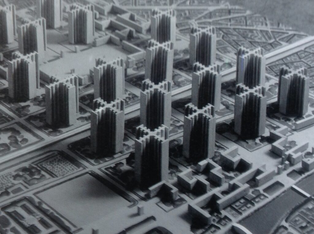
It’s easy to pick on Ye, a figure few are eager to defend, but the history of architecture is littered with such ideologues. Le Corbusier’s Plan Voisin — which called for the flattening of Paris to make room for rows of uniform concrete towers — is perhaps the most famous example of an architectural vision that sought to iron out the messy and idiosyncratic needs of real people from the urban fabric. Indeed, sometimes one wonders if in trying to transform homes into “machines for living in,” Corbu didn’t also want to engineer a more machinelike human being, an architectural version of Trotsky’s “New Soviet Man.”

Le Corbusier’s Plan Voisin, presented in 1925, would have replaced a large area of central Paris, on the Right Bank of the River Seine | SiefkinDR, Plan Voisin model, CC BY-SA 4.0
Similarly, Etienne Louise Boullee’s Dark Neoclassical vision for a post-Revolutionary France featured buildings designed to dwarf the individual human being. In my essay on Boullee, I argued that the monumental grandeur of his work reflects a political ideal in which the individual is subordinated to the state in both mind and body.
If Plan Voisin was actually accomplished, it would have been a tragedy, and an infinitely worse one than Ye’s desecration of a Tadao Ando house. And if Boullee’s Church of the Cult of the Supreme Being was constructed, it would stand today as the first example of totalitarian architecture, a sort of proto-Stalinist monument that one could never admire except with an asterisk.
However, blessedly, these ideas have remained on paper where they can be approached with pleasure as objects of contemplation. Indeed, it is not just fun to think about jarring and uncomfortable models of building and living. It is necessary if architects are to break through old paradigms.
Imagine being Le Corbusier and drawing up plans for the bulldozing of Paris to make way for a utopian social housing scheme. Thrilling! And proposing it to the horrified bourgeoisie — even better! Corbu’s insane scheme confronted postwar leaders with their own conflicted values. Did they really value social housing and the improvement of living standards? More than beauty? How much more? The virtue of Plan Voisin is that it forced these contradictions to come to the surface.
Paper architecture, or building schemes that are ultimately meant to be contemplated rather than built, is a great way to break new ground in ideation. Sometimes, what is revealed through the fearless process of ideation isn’t so flattering to the artist. For instance, Boullee’s latent totalitarianism was probably unknown to himself. He thought he was just an Enlightenment thinker, a Republican. But that is what art does. It exposes the creator, and one must (as the adage goes) write like your parents are dead.
The point is we learn a lot from paper architecture. The following three architecture movements produced very few if any buildings, but the ideas they proposed opened new ways of thinking about architecture and urbanism.
Metabolism (Japan, 1959 – 1975)
Buildings are solid structures, designed to endure for decades or even centuries. Yet societies are constantly evolving, and capitalism accelerates this change at an unprecedented pace, especially today, with algorithmic trading programs capable of identifying and responding to market trends in fractions of a second. This contradiction between the fluidity of capitalist society and the permanence of the built environment was explored memorably by the Metabolists of Japan.
The Metabolist movement emerged in 1959. Spearheaded by Kiyonori Kikutake, Kisho Kurokawa and Fumihiko Maki, the Metabolists envisioned buildings and cities as dynamic, adaptable organisms — much like the biological process of metabolism. Their ideas were characterized by a belief in the impermanence of structures, advocating for architecture that could grow, evolve and even deconstruct as society’s needs changed.
One of the few completed examples of Metabolist architecture is Kurokawa’s Nakagin Capsule Tower in Tokyo, completed in 1972. This building consists of a central core to which individual, prefabricated living units, capsules, are attached. These capsules were designed to be replaceable, reflecting the Metabolist ideal of flexible, modular living spaces that could be easily updated or recycled.
Nakagin Tower is — or was — real, but the Metabolists also proposed visionary urban projects, such as Kikutake’s “Marine City,” a floating city designed to expand onto the ocean, and Arata Isozaki’s “City in the Air,” a concept for a city suspended above Tokyo’s existing infrastructure. These projects were not just never realized, they were impossible to ever realize. This was the very source of their charm.
Kikutake’s floating Marine City is free from the constraints of national borders and the threat of war. The artificial ground supports agriculture and the residential towers extend deep into the ocean, reaching depths of up to 655 feet (200 meters).
Untethered to any specific location, Marine City drifts freely across the ocean, adapting to its environment and expanding as needed. When the city eventually ages beyond its capacity for habitation, it is designed to submerge itself into the ocean, completing its life cycle and making way for new structures to take its place.
At its core, Metabolism was about building not just for the needs of the present, but for a future that is by its nature unknowable. This is more relevant today even than it was in the 1960s, as we are confronted with the ecological costs of construction and the necessity of repurposing existing infrastructure.
Archigram (UK, 1960 – 1973)
Kikutake’s Marine City is a beautiful concept piece, something like an architectural poem that embodies the Buddhist ethic of transience. Peter Cook’s “Plug-In City” is a dystopian counter to this ideal of a constantly changing, infinitely adaptable urban environment. In the Plug-In City, there are no buildings, just modular cells that can be “plugged in” to a giant machine. Just like modern society, the Plug-In City is always changing; it is not rooted in place. In the future, Cook theorized, more and more people would take up a nomadic existence, and the idea of cities with unique and stable identities would become a thing of the past.
Between 1960 and 1973, the radical collective Archigram published over 900 illustrations. Not all of them were as cold and alienating as the Plug-In City. Other Archigram projects, such as Ron Herron’s Walking City were more humorous. In this scheme, people live in giant robots that stalk the Earth, likely in the wake of some apocalyptic event.
In all cases, Archigram was interested in urban planning that reflected the dynamism of the city as a site of habitation, interaction and protest (this was the 1960s, after all). They took inspiration from figures like Buckminster Fuller and Yona Friedman, who emphasized the need for light and adaptable structures. But they also were inspired by the Situationists in France, who saw the urban landscape as a canvas in which to stage politically charged performance pieces. Like the Situationists, Archigram intended to change consciousness through shock and disruption.
To learn more about Archigram, I highly recommend Simon Sadler’s 2005 Book, Archigram: Architecture without Architecture. Sadler does a great job of situating the group’s sci-fi vision within the context of the psychedelic 60s.
Superstudio (Italy, 1966 – 1978)
Also a product of the 1960s, the Florentinian architecture firm Superstudio was more explicitly Marxist than Archigram. As James Imam put it in his 2021 New York Times review of a Superstudio retrospective, “The starting point of everything Superstudio did was dissatisfaction with the uniformity of modern architecture, which its left-wing members saw as an instrument of capitalism that disempowered the masses, robbing them of their individuality and freedom. Sometimes, they made fun of the status quo, or took it to absurd conclusions; other times, they imagined utopian futures.”
The most important motif in the work of Superstudio, both their brilliant photomontages and their furniture designs, is the grid. For them, the grid is an image of deep ambivalence, representing both a framework for transformation and the uniformity of capitalist city planning. As Imam writes, their work consists both in imagining utopian futures and in pushing the status quo to “absurd conclusions.” What he overlooks is the fact that it is sometimes hard to determine which strategy Superstuio is pursuing in a given image.
A good example of this is the “Continuous Monument” series, in which a black and white gridlike structure expands across urban and natural environments, defining the space around it in a manner that would have been appreciated by Wallace Stevens. In this series, the line between utopia and dystopia is not always so clear. Is it a tragedy that capitalist modernism has conquered the globe? Or is it a perverse type of triumph — an opportunity for sublation?
Architects: Want to have your project featured? Showcase your work by uploading projects to Architizer and sign up for our inspirational newsletters.
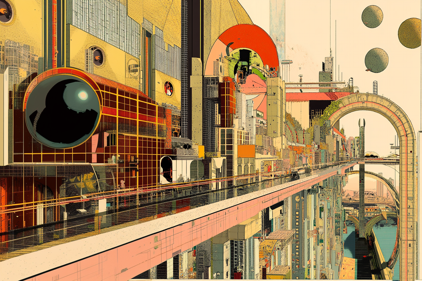
Cover Image: Created by Architizer on Midjourney.


