A Note to the Reader: The interiors pictured here are impeccable. I would be ecstatically happy if my own home looked anything like these photos. Visually, quiet luxury is indeed an attractive, even seductive aesthetic. That is part of its danger….
A specter is haunting the design world — the specter of quiet luxury. In Vogue, GQ, Harper’s Bazaar, and even Architizer, a flurry of articles have appeared offering definitions of the trendy aesthetic along with guides on how to “get the look.” Mostly, these have been fashion articles, but increasingly, the term quiet luxury has been creeping into discussions of interior design and architecture as well.
Quiet luxury is being pitched as the “timeless” successor to normcore, cottagecore, and all the other “aesthetics” that have proliferated over the past decade, trends that often started out as jokes before making the leap to the runway. (For a full list of these, check out Aesthetics Wiki). It is prophesied to end all of this chaotic irony by reintroducing “good taste” into popular culture, allowing yuppies to yup again like they did in the 80s. No longer will one have to wonder if Crocs are actually cool or if the cool kids are just wearing them to make some kind of incomprehensible statement. Quiet luxury promises to vanquish all this semiotic gamesmanship, allowing rich people to again feel at ease wearing cashmere and loafers in their beige apartments.
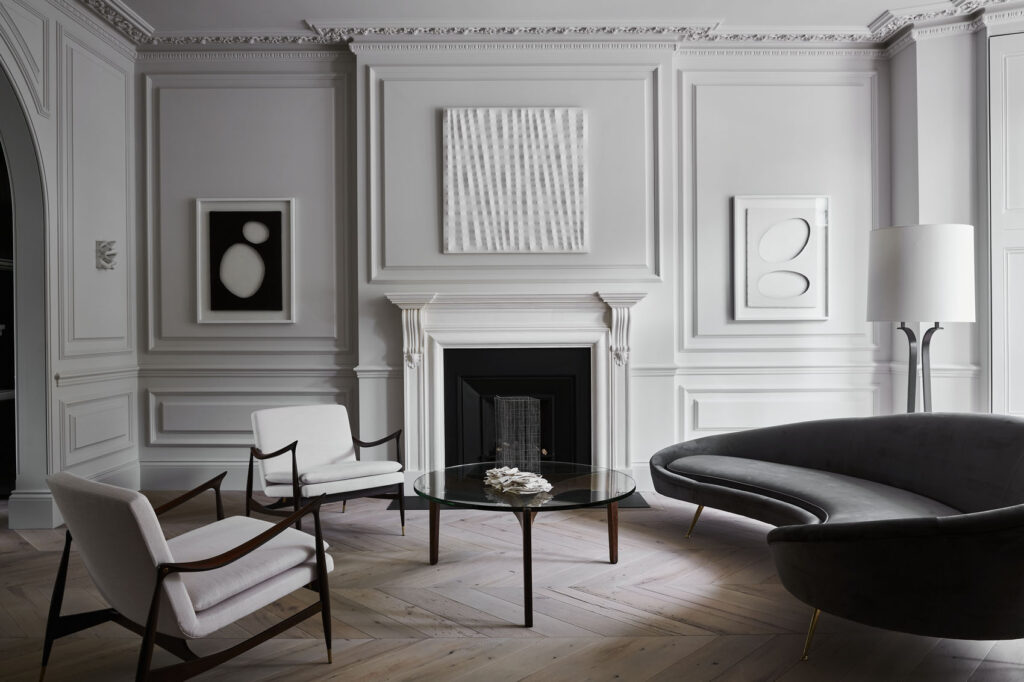
Little Venice Residence By Originate Architects, London, United Kingdom. Photo by John Munro.
Defining quiet luxury is not difficult; that is its appeal. It is more or less equivalent to what was once called “tasteful:” fashion and decor that is glamorous but not ostentatious. And as far as that goes, I can’t hate. I spent the better part of the summer deliberating between different shades of white paint for my living room, taking into account how the undertones would relate both to the reddish hue of my hardwood floors and the light conditions in my south-facing house. (I went with Sherwin Williams’ Pure White. Softer, I felt, than Benjamin Moore’s Chantilly Lace, the Instagram favorite). My wardrobe consists of elevated basics — OK, maybe elevated is a stretch. The point is that I am not immune to the charms of subtle, even boring designs. Boredom, in fact, is a mood I feel is critically underappreciated in our hyperstimulating times. Greige walls and a nice oriental rug underneath a Noguchi coffee table — or an affordable Noguchi knockoff — are enough to make me feel at home.
What is objectionable about quiet luxury isn’t the quiet part — it’s the luxury part. The aesthetic is rooted in signaling wealth and status. The goal is to communicate one’s membership in the elite without being flashy or gauche. As Samantha Frew explained here in Architizer, “Quiet Luxury brands have nothing to distinguish them visually from other high street brands, yet they bear the astronomical price tags of pieces from some of the biggest fashion houses in the world — why? That’s a question I can’t answer.” In Vogue, an article on quiet luxury recommends a $320 plain white t-shirt. I am sure this garment is lovely, but the point of it is not just to exist as a quality t-shirt, but to make a statement. A quiet statement, sure, but that only makes it more insidious. The point of subtly expensive fashion is to signal elitism to other elites. If the message flies over the head of the average person, well — isn’t that the idea?

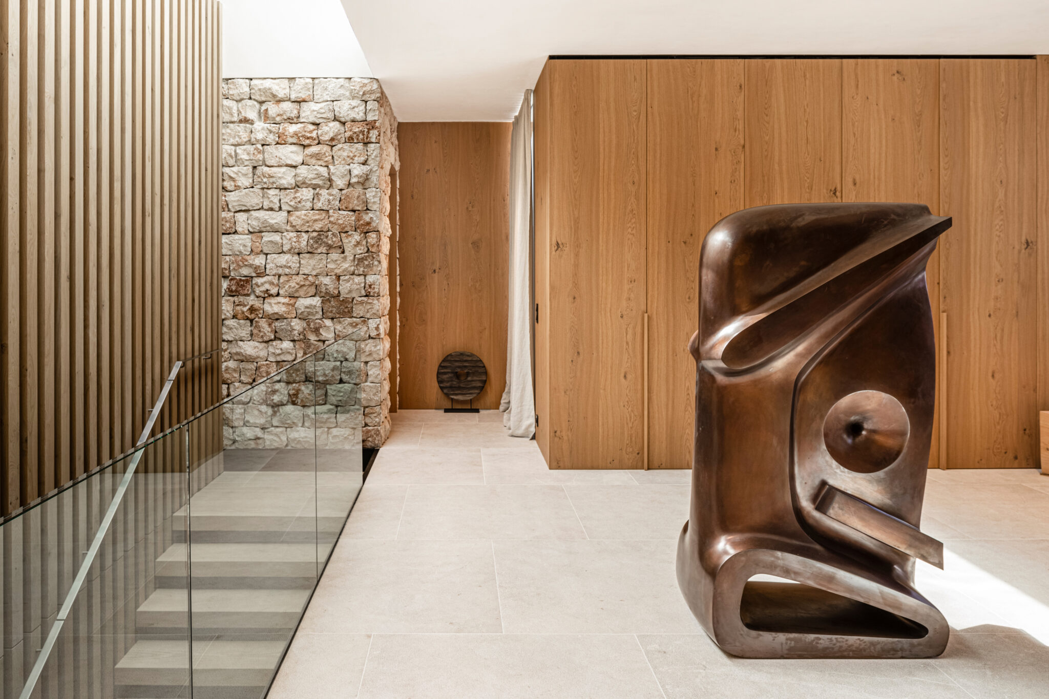
Casa Fly By Beef Architekti, Balearic Islands, IB, Spain. Photo by Tomeu Canyellas
This is the very essence of snobbery. Against quiet luxury, give me Gucci Mane and his candy colored diamonds any day of the week. At least Gucci knows that wealth is superficial and, at bottom, somewhat ridiculous, an accident of circumstance. With quiet luxury, with this notion of “taste” that is wedded to elitism, one is presented with an altogether more mystified idea of social status that ties one’s wealth to one’s inherent worth and capacity for judgment. As someone must have noted in the 17th century, there was more vanity in the clapboard houses of the Puritans than the gilded palaces of the Roman popes.
Quiet luxury represents what I call the dark side of minimalism — the elitist side, which relishes in austerity as a vehicle for demonstrating discipline and moral superiority. This can be distinguished from the other side of minimalism, the democratic side.
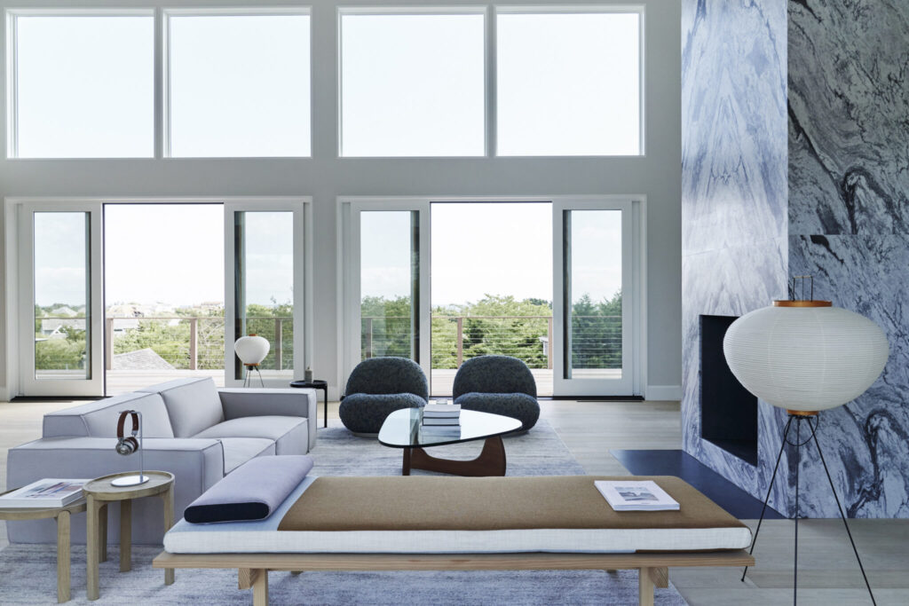
Atelier 211 By Studio Zung, Amagansett, NY, United States. Photos by Adrian Gaut.
Minimalism has historically been a utilitarian, even socialist aesthetic. Its first great flowering in architecture was Russian Constructivism, which emerged after the Russian Revolution and was inspired by the dream of a proletarian society. The Bauhaus, too, had an egalitarian ethos. Designers like Lilly Reich fell in love with industrial materials because they could be cheaply mass produced. This was a virtue to her; unlike a quiet luxury partisan, she did not shun the common and industrial in favor of the rare and artisanal. Quite the opposite. Reich dreamed of a world in which every worker owned elegant chairs in which they could recline at night, relax and dream. Marble and gold held less appeal for the Bauhaus artists than concrete and steel.
While the sensibility is over a century old, the term “minimalism” was not widely used until the 1970s, when it became associated with the sculptural practice of Donald Judd and other artists in his New York milieu, including Dan Flavin and Yayoi Kusama. These artists purposefully used cheap, mass produced materials that could be purchased at hardware stores. This was the essence of their minimalism, which was ultimately aimed at defamiliarizing, or transforming, the viewer’s experience of the everyday. Imagine if Donald Judd’s 100 untitled works in mill aluminum were titled 100 untitled works in pure platinum? The meaning would completely change. Instead of the boxes themselves standing as “specific objects,” they would exist ostentatiously as commodities, as carriers and signifiers of wealth.
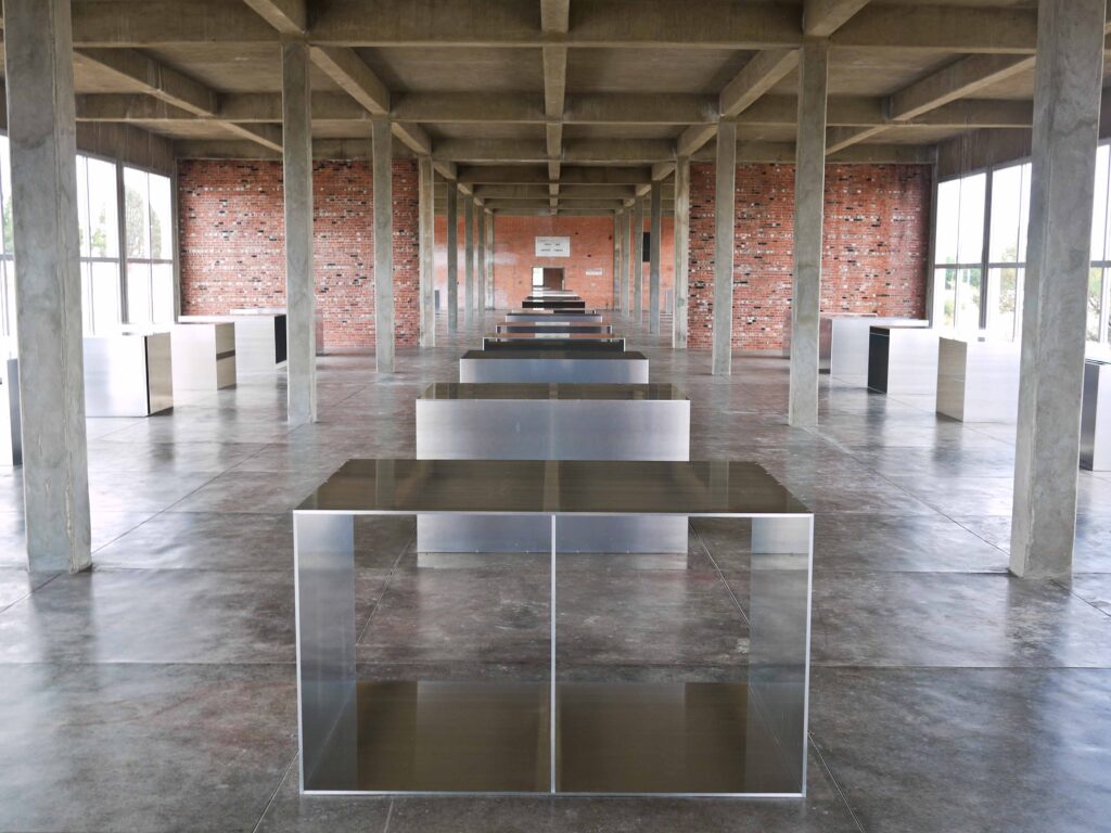
Detail of Donald Judd’s 100 untitled works in mill aluminum, 1982-1986. Photographed at the Chinati Foundation site in Marfa by Paul Joseph. CC-BY-2.0, via Flickr
This is also the status of most quiet luxury items. While there is nothing wrong with the interiors pictured in this article, there is something wrong with appreciating them because they embody “quiet luxury.” To do so is to reify the attitude that things are valuable only insofar as they are exclusive. In innumerable ways, this snobbish attitude contributes to the ugliness of our contemporary built environment. In a world where luxury is admired, “ordinary” places — places like big box stores and subsidized housing developments — are not designed to be beautiful. People assume they aren’t supposed to be, because they are ordinary and not exclusive. The very notion of design has been tangled up with wealth. Honestly, it’s a nightmare. If Donald Judd was still alive, he would tell us that there is a better way.
Architects: Want to have your project featured? Showcase your work by uploading projects to Architizer and sign up for our inspirational newsletters.
