Paula Benson is Founder and Editor of Film and Furniture, a curated resource of iconic furniture seen in classic movies and TV shows that includes links to purchase the featured products.
Whether an arthouse classic or a mainstream blockbuster, film sets are laden with hidden narrative. Film set designers, production designers and set decorators spend months, sometimes years creating houses, scenes and rooms. Carefully chosen locations, furniture, decor, lighting and art all convey nuances about the protagonists personalities – subtleties which dialogue cannot always communicate.
We at Film and Furniture are fascinated by these details and we’ve made it our business to seek out others who feel the same. That’s how we came across the Instagram feed of Floor Plan Croissant – the clever artist who analyses the floor plans and decoration of intriguing film set interiors and renders them in lyrical watercolour paint.
It is Architect and Illustrator Boryana Ilieva who creates these “poetic surveys of space, light and matter in cinematic architecture” under the name Floor Plan Croissant. From Will Byers house in Stranger Things and Elio’s Italian summer villa from Call Me By Your Name, to the octagonal house in Mother! and the London house in Phantom Thread, we were intrigued to find out more. Boryana shares with us the motive and method behind this movie obsession including some behind-the-scenes work in progress.
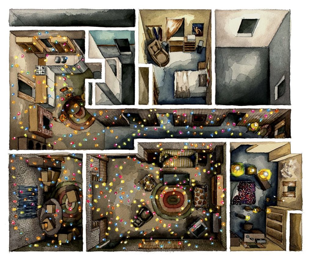
Stranger Things (Will Byers’ House) film set floor plan and set decoration painted by Floor Plan Croissant. Available to buy as an art print (from $48) from Society6.
Film and Furniture: We have to ask, where did the name Floor Plan Croissant come from?
Floor Plan Croissant: I found out recently that croissant in Latin is a particular stage of the moon. But no, that’s not why I named the project so. The reason has to do with cooking—the morphology of tasty stuff growing in the oven.
Please tell us a little about your background – we are guessing you work in architecture or design?
In 2008 I co-founded an architectural studio in Sofia, Bulgaria, under the name of 11AM together with architect Panayot Savov. We develop small design projects, mostly condo interiors and single family houses. Panayot is a tutor in public buildings at The University of Architecture, Civil Engineering and Geodesy (UACEG) in Sofia and he brings a solid theoretical backup to every film house explored in Floor Plan Croissant.
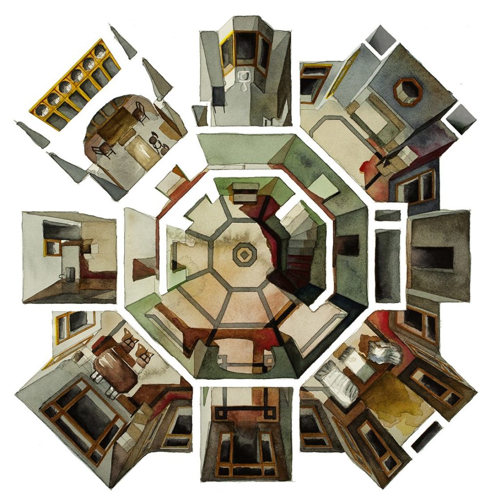
The house in Mother! Floor plan painted by Floor Plan Croissant. Available to buy as an art print (from $48) from Society6.
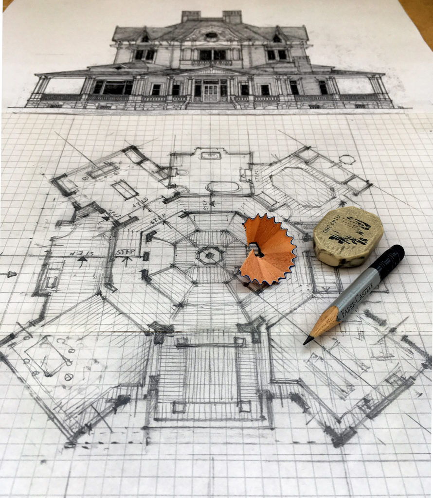
The workings and sketches of the Mother! floor plan (see above) in progress
When and why did you start painting floor plans of famous film sets from movies and TV?
I can’t live without cinema. I watch tons of films all the time but in 2015 the situation became unbearable. Any person can consume film their whole life without stress, unless that is, the person is a creative! When this is the case, films can start to become a burden at some point and that’s what happened to me. I needed to take the load out of me, to throw back. Being an architect, I have turned this emotion into the language of architecture.
What was the first film you painted?
Elena by Andrey Zvyagintsev. Amour by Michael Hanneke immediately followed.
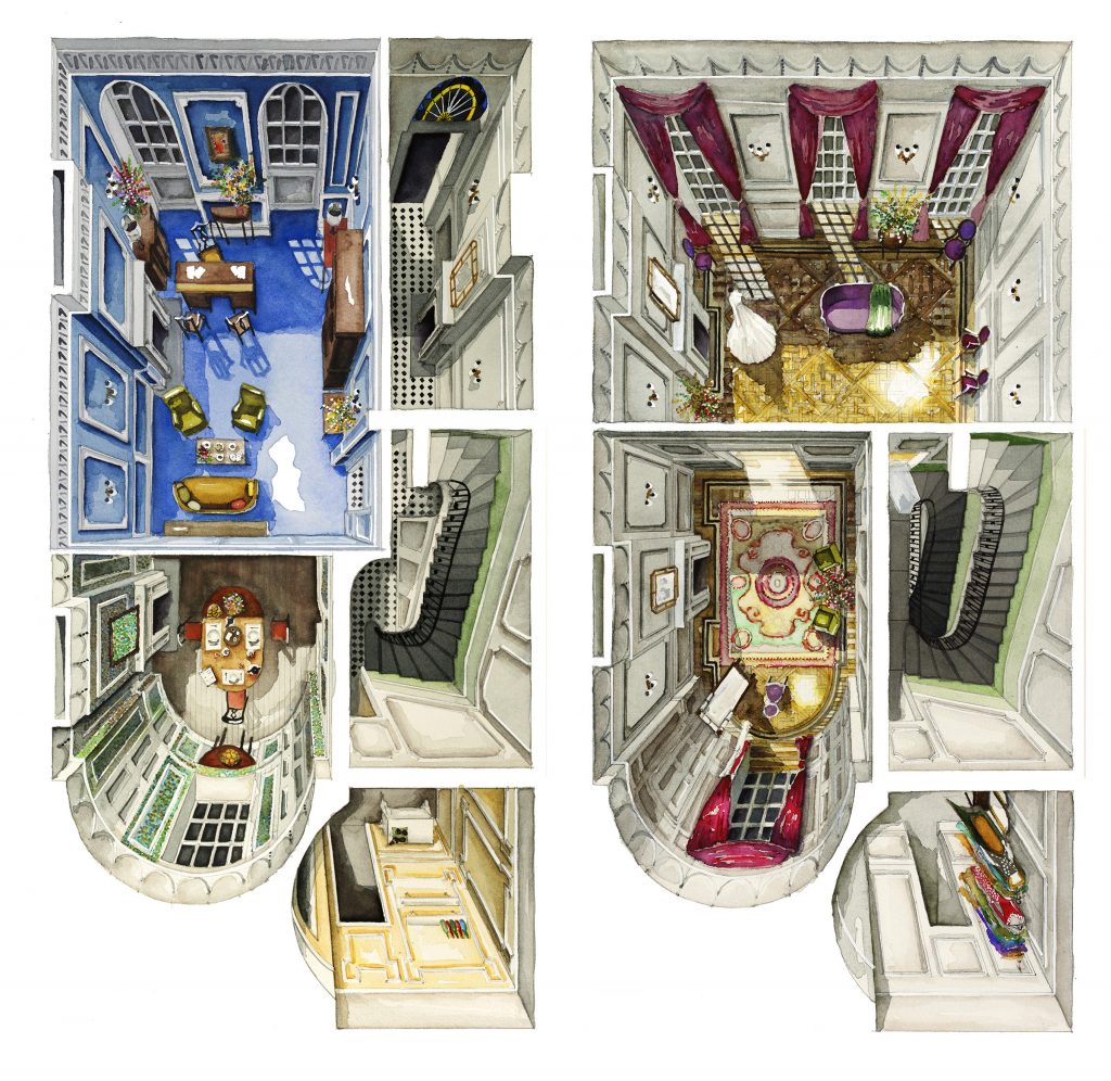
The ground and first floor of the London house in Phantom Thread. Film set floor plan and set decoration details painted by Floor Plan Croissant. Art prints available (from $49) from Society6.
Your painting approach is full of character and sensitivity adding a real individuality to the works. Is there any reason you choose to paint these as loose but careful watercolors rather than say, graphic vector representations?
Watercolor – with its unpredictable flow – fascinates me. The “mini flood” created by this medium (never knowing what direction it might take) always surprises me. Also, when watercolor dries, it slowly forms round hairy splashes. I love how they add to the floorings, walls and furniture of the film house.
But who knows, one day I might jump to pencils, clay, or why not Lego? The hidden grid of the floor plan is what I am hunting, the medium I choose to represent it is second place.
Do you create these cinematic floor plans by watching the films and TV programs and methodically analyzing how the rooms all come together? Do you speak to the film set designer and production designers to ask for their designs or guidance?
Yes – by watching the films over and over for several days to fit pieces of a puzzle together. These days are absolutely my favorite part of the process: The silence of the blank paper, seconds before I play the film and start scratching with the pencil the living room for example. Then I head to another room, and another room and my thoughts run like that: Ahaa, these two rooms connect through that door!…Oh, this is the painting on the wall I saw in a while ago through the small corridor!… Little by little the secret boxes begin to fit and form a logical home seen from above.
Of course sometimes the boxes don’t fit and this is because production designers use their ‘magic’. I contacted Alexandra Schaller, production designer of Maggie’s Plan to ask how the children’s room fits Maggie’s blue apartment and that’s exactly what she said to me: “Magic!”. And she blinked.
I love to chat with the production designers, I always write to them if I am in trouble with figuring out the floor plan. So far all of them who I’ve contacted have been really kind, supportive and excited about the Floor Plan Croissant project.
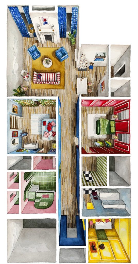
La La Land (Mia’s apartment) floor plan painting by Floor Plan Croissant. Available to buy as an art print (from $48) from Society6.
The detail of the set decoration in your work is amazing – even the cushions sitting in Mia’s room in La La Land – are you as interested in the detail as the overview?
Thank you! I am interested in detail when I feel it matters for the film. In La La Land it is all about detail. Objects are constantly surrounding Mia and are telling a story themselves. In the beginning of the film her clothes, her home — the furniture and decoration in it — all shines in bright colors: yellow, red, green, blue.
Little by little, passing through the seasons, Mia moves into the grayish apartment of Sebastian, her sweaters pale, in the end of the story we find her in a calm stylish jazzy black and white. It would have been a crime not to pay attention to detail while painting Mia’s apartment.
Another example with important detail in the protagonist’s home is K’s apartment in Blade Runner 2049. I noticed that the room and most of the furniture have their edges or vertexes geometrically trimmed—table, shelves, kitchen cabinets, bed—thus each of them forming a single capsule, just like K isolated himself from his fellow replicants.
Sometimes though, there are film houses where details are transparent to me. The overview is what attracts my attention. For example The Armitages House in film Get Out by Jordan Peele. I immediately zoned the floor plan in my head: Formal area and informal area. In the informal area they cooked meals (the kitchen) and cooked people’s brains (the office).
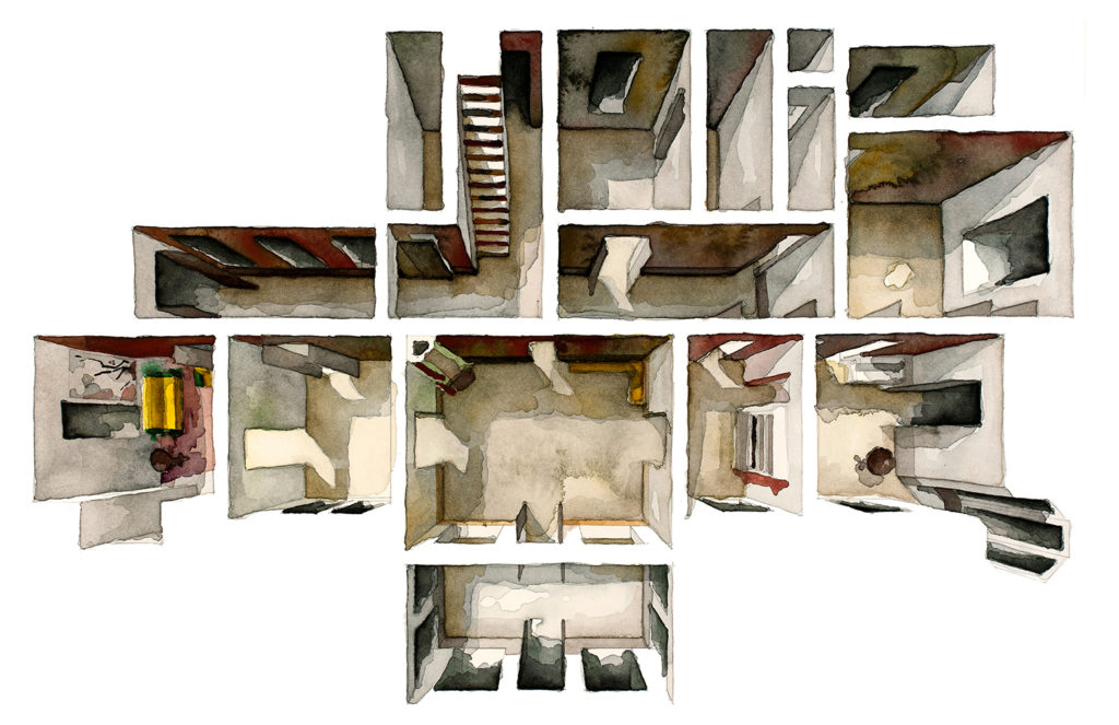
Film set floor plan of Personal Shopper painted by Floor Plan Croissant. Find prints for sale here.
A third example, my favorite, is an empty house – naked, only walls and holes for doors and windows – a victory of the pure architectural grid over the impermanent decoration. The example I am referring to is the ghost house in Personal Shopper by Olivier Assayas.
I also had doubts about how to illustrate the house in David Patrick Lowery’s A Ghost Story because it had the empty stage as I have described. It attracted me so much, but in the end I decided to paint the house with objects and detail because the furnished house is where the characters of Casey Affleck and Rooney Mara lived together – and their love was all that the film was about, wasn’t it?
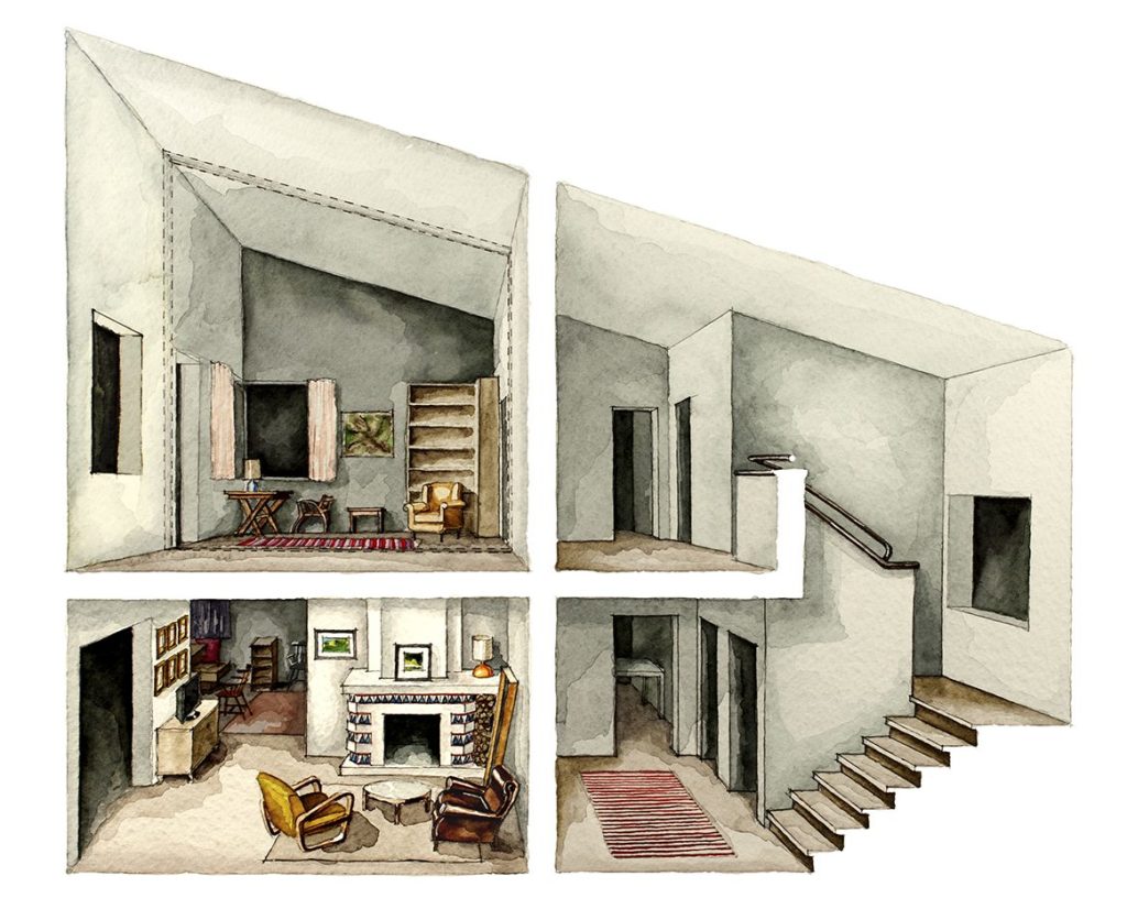
Film set floor plan of Clouds of Sils Maria painted by Floor Plan Croissant. Find prints for sale here.
Did you have a dolls house as a child?
I wish I did. But no. Maybe that is the big Freudian truth behind the reason I started this project.
What’s your favorite film and why?
That is a difficult question to answer. I love films which tell stories about duality, doppelgängers, parallel selves, twins and mirrors. I love when directors leave it to my imagination to finish a story. I love to discover hidden gorgeous houses in films – houses which nobody else has noticed. And all of the above are summoned in Deadpool. Kidding! It’s Clouds of Sils Maria by Olivier Assayas.
You can follow Floor Plan Croissant’s wonderful work on Instagram, buy her art prints of floor plans including Mother, Phantom Thread, La La Land and many others in her store at Society6 or follow her process on Patreon.
This article was originally published on Film and Furniture.

