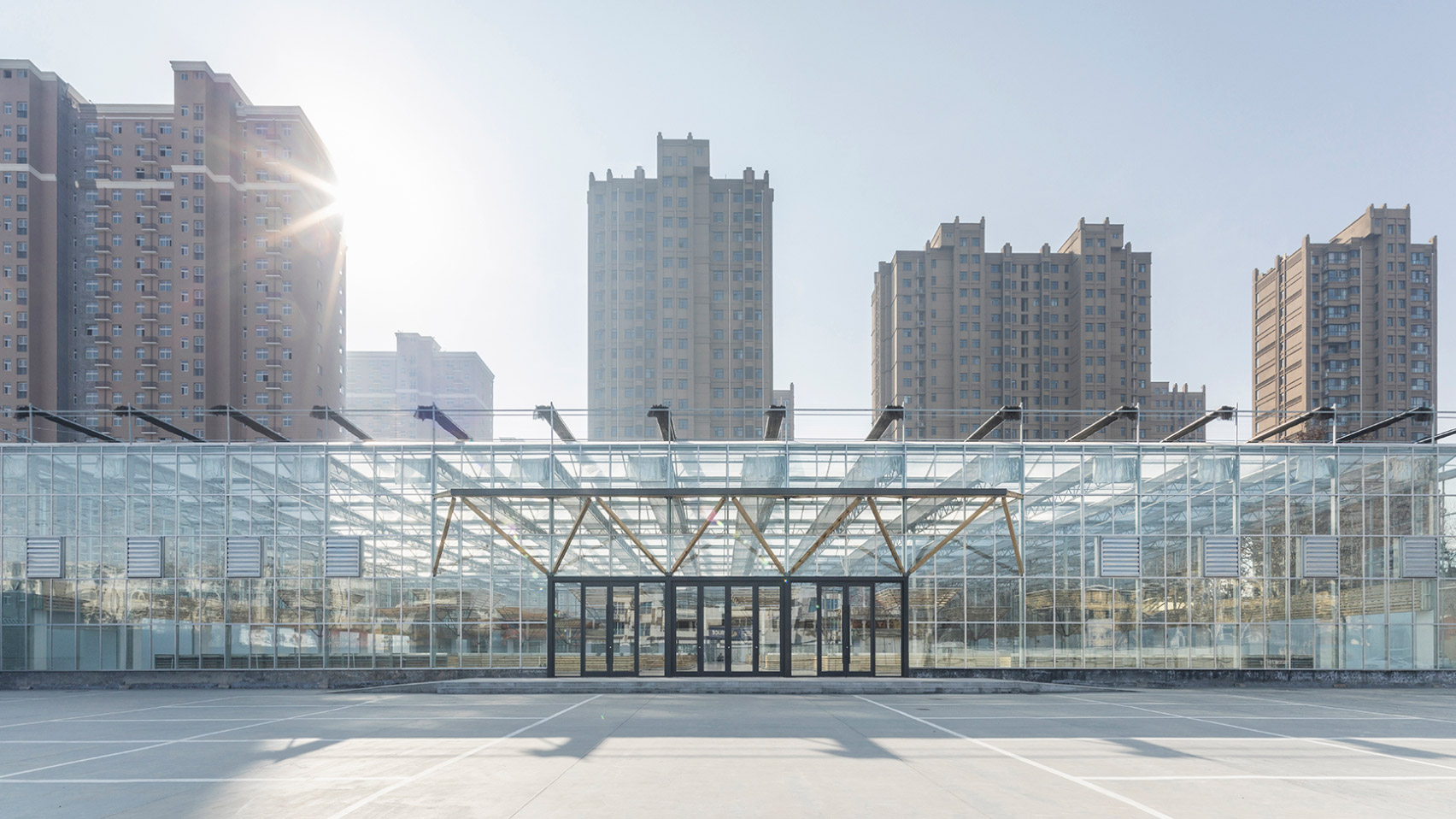
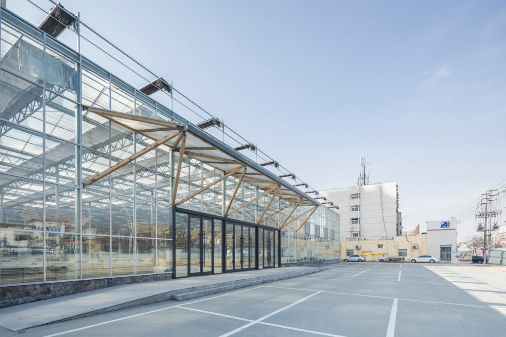
Prefabricated structures — especially temporary ones — often carry connotations of flimsiness or impermanence. But LUO Studio was committed to doing things differently when they took on a commission to build a temporary home for the Shengli Urban Market.
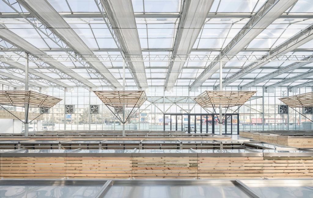
The market had served the community for several decades, but had become messy and dysfunctional over time, requiring demolition. While plans for a new permanent home for the market are still underway, LUO’s temporary, modular design is serving the community’s needs wonderfully. Unlike the older market, it is both functional and attractive, including generous amounts of natural light, great ventilation and rationally oriented space for vendors. It is also environmentally efficient, as the pieces will be reused once the structure is dismantled. This practice — a trademark of LUO studio — resulted in a project that won a prized 2020 A+Award in the Pop Ups and Temporary structures category.
For its precedent-setting qualities, “Temporary Site of Shengli Market — Creation of Spatial Order” is also the recipient of a 2020 A+Awards Special Honoree Award. We were pleased to speak with LUO Studio’s chief architect Luo Yujie to discuss the project.
Pat Finn: Congratulation on your A+Awards! What encouraged LUO Studio to enter the A+Awards this year, and what does winning a 2020 A+Awards Special Honoree Award mean to you?
Luo Yujie: Before LUO studio was founded, we had seen a lot of excellent projects awarded A+Awards. Those projects inspired and drove us to design greater projects to serve users. It was beyond our expectation that we won the Special Honoree Award, because the project didn’t take too much time to be completed.
However, it was also a very special project, since it intended to serve the most ordinary as well as the largest group of people. The project was designed for living, for better life. Therefore, the recognition of A+Awards encourages us to continue insisting on designs that we believe achieve this goal.
In designing this market, did you spend a lot of time studying the original market? What were your big takeaways?
I liked to go to the market and observe it. The first impression I had of the local market was that it was dim and dank, dirty and messy, which caused concerns to the public health of the city. When I was entrusted to design this project, I hoped to create a bright and clean market to give shoppers a different feeling.
Did you talk to the vendors as you tried to design stalls and shops that worked for them?
Yes, I had communications with those vendors and shopkeepers, to better know the widths and lengths of the stalls they needed, as well as the dimensions of the enclosed spaces for those shops.
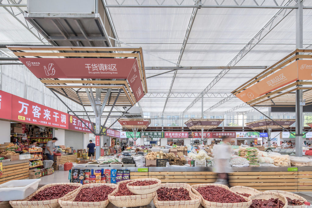
What steps did you take to ensure customers could move through the space in an orderly fashion and find what they need?
Firstly, based on the lighting fixture installation, every steel column in the hall is topped with an inverted pyramid structure, resembling an umbrella. Those structures are used for signs, with different colors indicating the market’s different areas. For example, green represents vegetables and fruit area. This area is set at the front since it has shelf units with various types of merhandise. Yellow is used for bean products, and this section is arranged at the side due to less product types.
Secondly, enclosed shops are arranged on the edge areas of the space, mainly selling frozen foods, flour foods, and meat, etc. The center and edge areas have wider passages than other stalls. The width of the passages also can separate different areas.
In brief, the whole market space is orderly divided in spatial width and sign color, enabling customers to find what they need quickly.
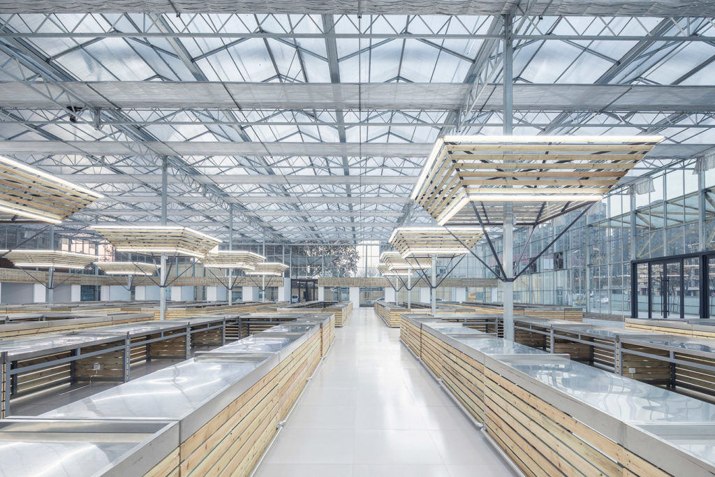
The “umbrella-shaped” support columns double as signs. This is a very clever touch. Where did the inspiration come from?
I have a passion for plants, and love to observe and collect photos and objects about plant growth. Growing is one kind of inspiration of space that we always ponder over. The “umbrella-shaped” structure also took cues from the growing plant and tree branch. Besides, the structure was suitable for downward light and also convenient for shoppers to look up at the signs.
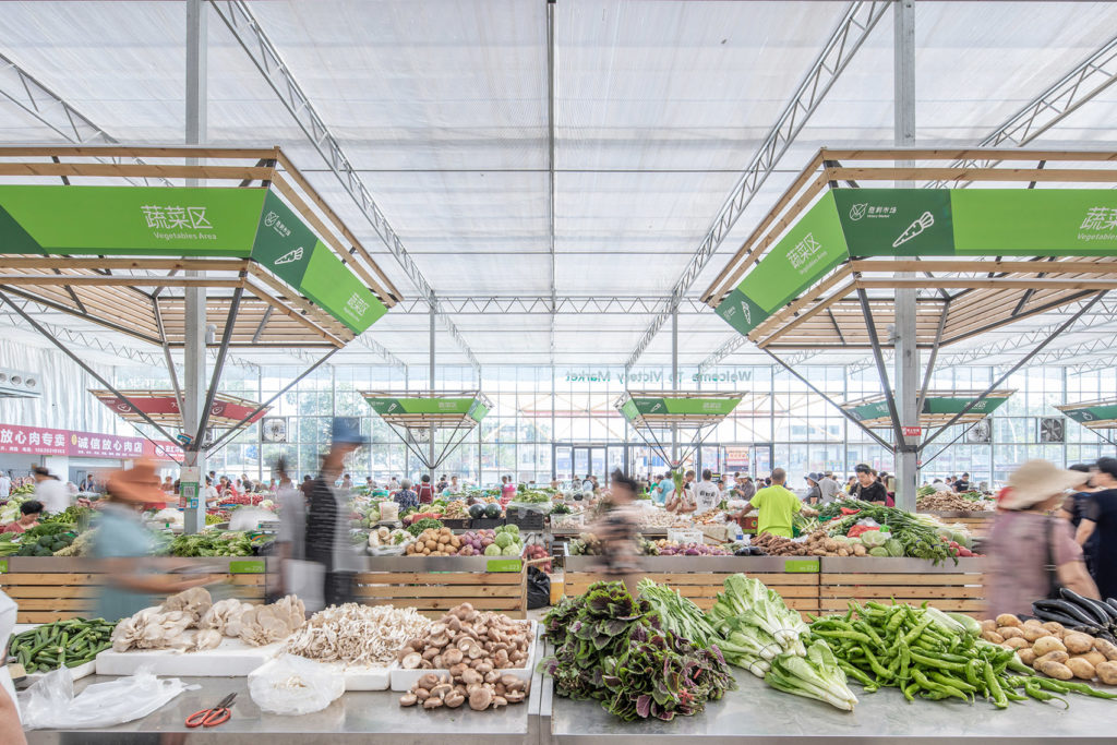
Is the market still open? Have any adjustments been made due to COVID?
The market was closed during the outbreak of COVID-19. Some shops were opened in mid-March. And all of them resumed business in April, according to the official notification of returning to work and production completely.
In my opinion, the dim, enclosed and dank market environment was a negative part of the outbreak in some markets, like Beijing and Dalian. However, as the project strove for a clean and bright space with great natural ventilation at the very beginning, there was no need of making adjustments in space and construction. Still, regular disinfection and cleaning have been indispensable.
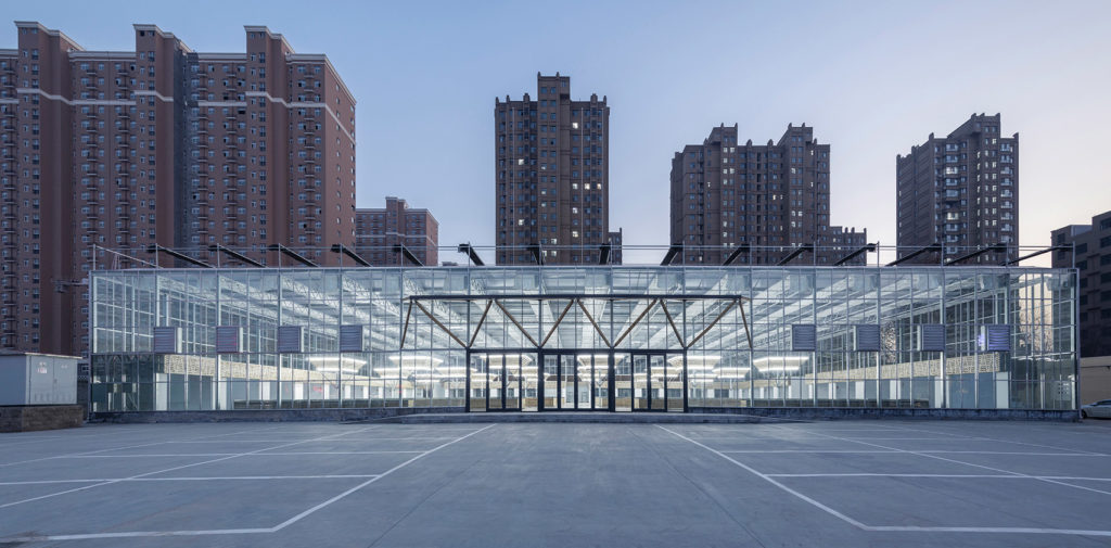
The brief mentioned sustainability as an important dimension for the project. When the market is dismantled, do you have a plan for re-using the materials?
Yes, I’m planning to reuse the materials in two ways. Firstly, the project is going to stay in place for other uses after the new, permanent market is complete. Very early in the design process, I decided to use standardized columns and trusses to build the whole space, which makes it easy to change its function later.
Secondly, the project is built entirely from standard components used in industrial sheds and greenhouses. These materials are prefabricated and can be dismantled, recycled or reused for constructing the ecological farm nearby.
Do you have any other comments to make about the project? Which element of it are you especially proud of?
I’m proud of the rapid construction, and every party was satisfied with it since it had no effect on people’s daily life. However, I’m not so pleased with the lighting design. It would be better if there was no dazzle and had more reasonable lampshades. But it failed to do that due to the time and cost.
