Architizer's 14th A+Awards judging is live! Subscribe to our Awards Newsletter for updates on Public Voting and the big winner reveal later this spring.
Thomas Heatherwick is not an architect. He makes this revelation about two-thirds of the way through his new book Humanize, a slim and readable volume with engaging pictures and page layouts. The book is both a breezy introduction to key concepts in design thinking and a manifesto for rejuvenating cities by resisting the “deadly global epidemic of boring architecture.
“In the UK, the title ‘architect’ is protected by law,” Heatherwick explains. “For a person to call themselves one, they must be approved by the Architects Registration Board.” Heatherwick claims that one time, he was actually contacted by an investigations officer at the Architects Registration Board because “someone else” called him an architect. “Continued use of the word may amount to a criminal offense,” they said. For some reason, I imagined this message being delivered by a medieval town crier.
This anecdote is deployed to illustrate Heatherwick’s contention that architecture today is a kind of insular priesthood — a “cult,” to use his words — that lost touch with public taste over a century ago and, since then, has maintained this separation through snobbery and gatekeeping. Even Heatherwick, the esteemed designer of buildings like The Hive in Singapore and Zeitz MOCAA in South Africa, isn’t considered part of the club! This kind of cliquishness has helped perpetuate a situation where the tastes of architects are totally at odds with the tastes of ordinary people, resulting in cities that the majority find cold, alienating, and unlovable.
-

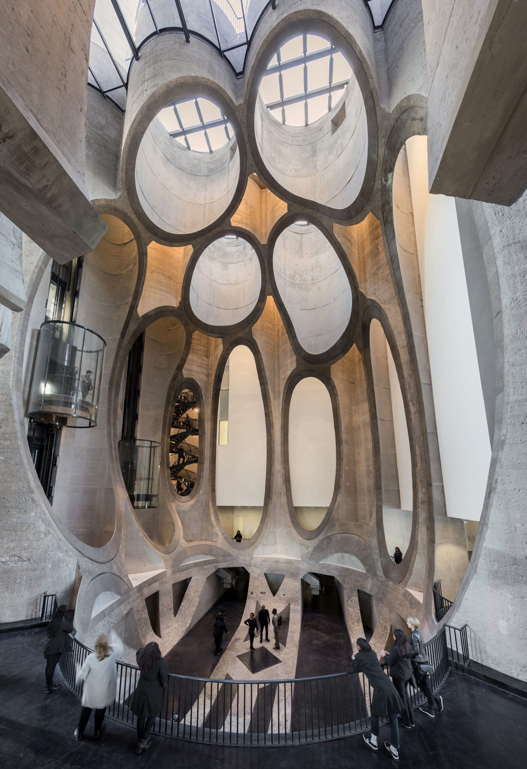
Built from a converted grain silo, the Zeitz Museum of Contemporary Art Africa in Cape Town is one of Heatherwick’s most recognizable projects. It reflects his devotion to the curved line. I also see the influence of Gaudi in this building, who Heatherwick names as a key influence. Photo by Iwan Baan
Like many before him, Heatherwick blames the modernist International Style for turning cities into ugly and monotonous places. Since the end of World War II, interchangeable concrete and glass boxes have been popping up everywhere from Cleveland to Shanghai, eventually pushing out the kinds of structures that once gave these places unique visual identities. Successor movements like postmodernism and deconstructivism are, for Heatherwick, just modernism in new guises.
His key point is that most modern buildings are too flat, too shiny, and too angular. They lack the texture and visual complexity that has been proven to serve as a balm for passersby, making them feel at ease in the built environment. “Kondo style” minimalism might be a good approach to your wardrobe or even the interior of your house, Heatherwick argues, but when it comes to a large object such as a building, it takes on a sinister character, enveloping people in environments that feel profoundly unnatural. He supports this claim with convincing research from environmental psychology.
“Scientists have found that when we enter any environment, we unconsciously scan it for information,” he explains. “During the millions of years in which our brains were being moulded by evolution, we lived in nature. And natural environments are crammed with complexity… The human brain has evolved to express this base level of information, a bit like the body expects base levels of oxygen, water, and food.”
Heatherwick goes on to describe a study by the neuroscientist Paul Ellard, which compared the stress levels of people strolling a lively Lower East Side Street to those walking past the Whole Foods in that neighborhood, which takes up a whole block and, at street level, appears repetitive and monotonous. He found that those on the lively block were far less stressed; subtle environmental clues put them at ease and made them feel less exposed than they did when walking past the stark facade of Whole Foods.

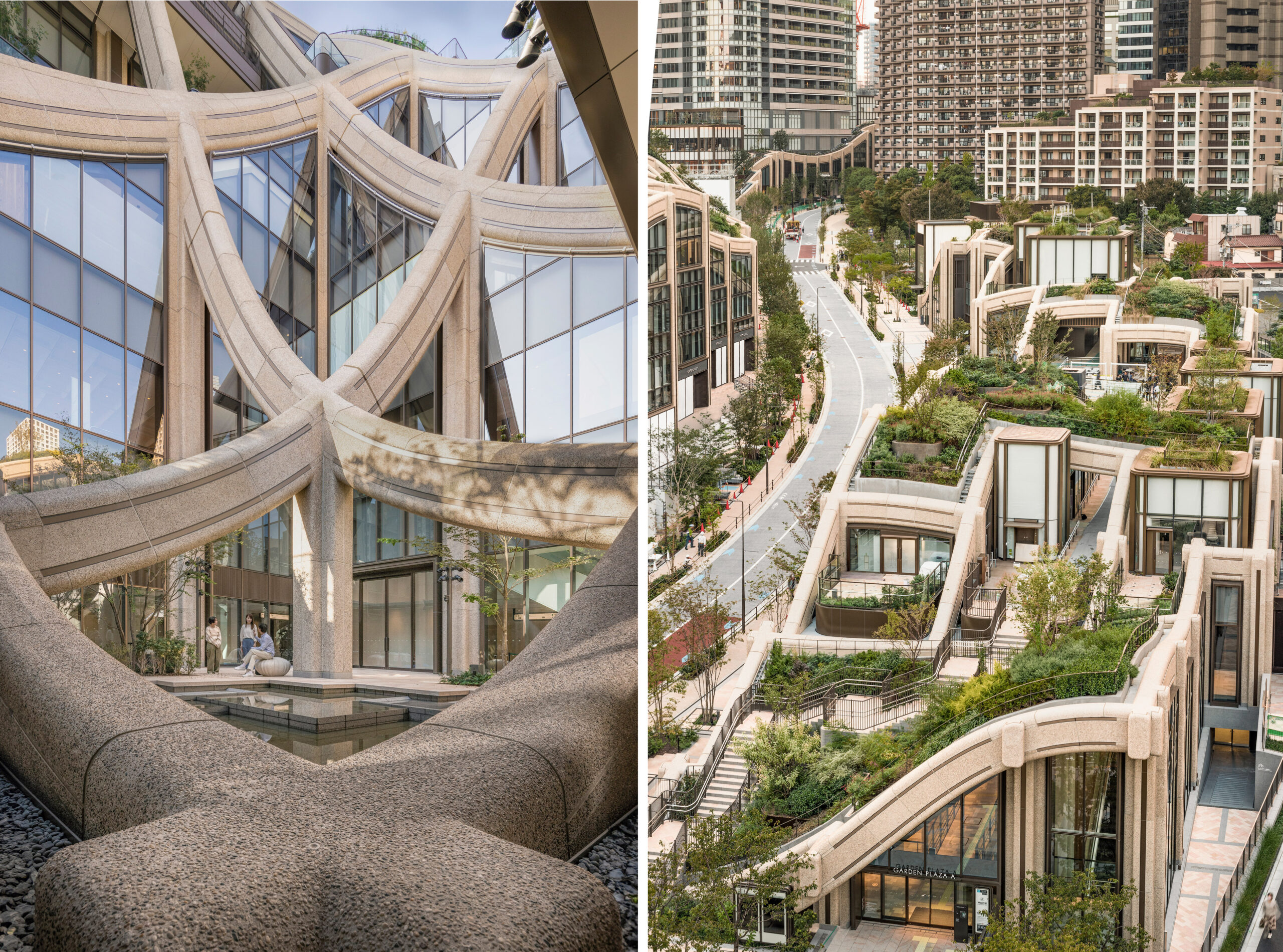
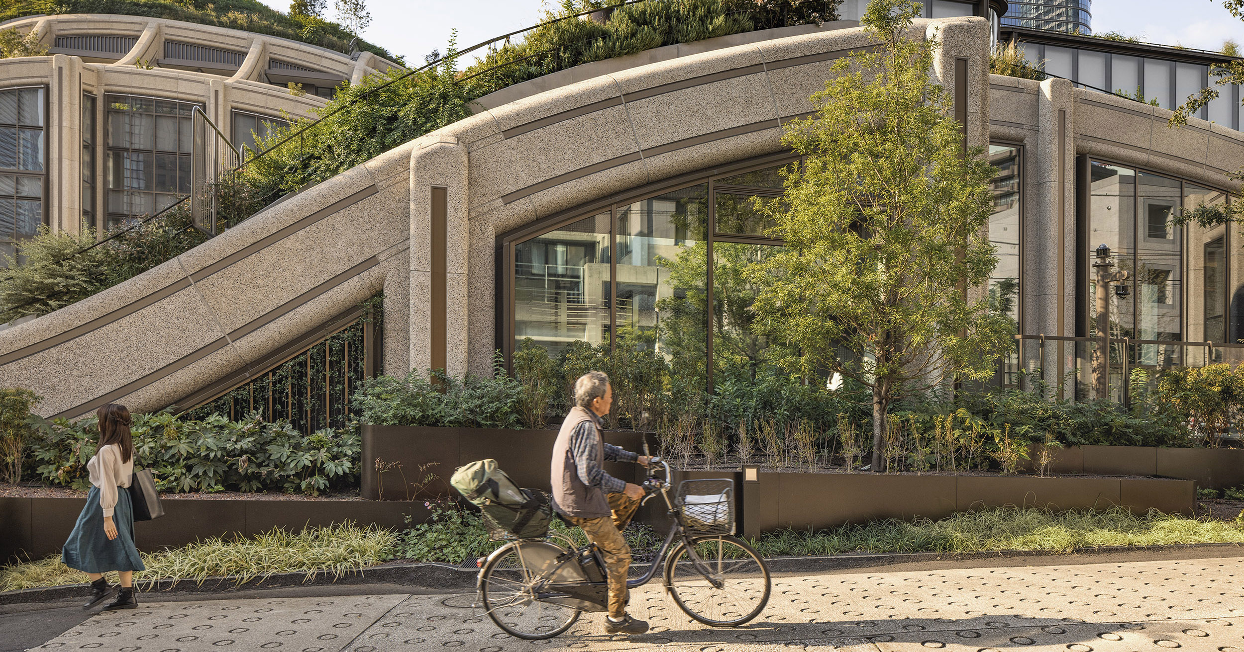
Heatherwick argues that architects must consider how their buildings appear at street level. They should have enough complexity to engage the interest of passersby. This principle is illustrated in the greenery and curvature of his Azabudai Hills residential development in Tokyo (also pictured above). Image courtesy of Heatherwick Studio.
Heatherwick speculates that building more city blocks that look like the Whole Foods will add to the net amount of stress in the world, taking a toll on people’s mental and physical health by spiking the cortisol levels in their bodies. He points to other studies that show that communities that lack spaces to stop and chat casually, especially “positive front entrance” spaces like porches and stoops, are less healthy, with residents experiencing shorter lifespans. Finally, one cannot help but notice that historic and “messy” cities such as Venice are more popular tourist destinations than modernist utopias like Brasilia and Chandigarh.
Heatherwick’s point is clear: architects and developers have not been taking public taste and the findings of environmental psychology seriously enough. The vogue for minimalism and efficiency has outstripped a concern for human wellbeing, as architects have, for almost a century, failed to consider buildings from the point of view of those who live near them and experience them from the outside.
This thesis is compelling, but many will find it familiar. Isn’t this just the conservative critique of modernism all over again? I actually don’t think so — not exactly. Humanized improves on the arguments of antimodernists like Tom Wolfe, Nathan J. Robinson, and King Charles in two key ways.
First, he provides a more sympathetic account of the origins of modernism than these other critics do, emphasizing that in the wake of two world wars, the past really did seem like something the modern world needed to transcend. The medieval city centers that tourists love today were, at that time, crowded and unhygienic. Many had also been destroyed in the wars, creating an opportunity to reimagine urban space. Why wouldn’t architects dream of lifting the masses up into high rises surrounded by parks? Conservative critics of modernism often don’t even try to comprehend this historical context.
Heatherwick also heaps a fair bit of criticism on the shoulders of developers, who embraced the modern style not out of any utopian pretensions, but because minimalism is in the end a money saver. In his account, architecture theory is sort of like the public relations arm of cheap architecture, giving a patina of artistic integrity to structures that are simple to design and construct.
The second aspect of Heatherwick’s book that makes it special is the formula Heatherwick proposes for designing “human” buildings. He uses the principle of fractals to explain how architects should consider their designs from three standpoints: city, street and door. His idea is that buildings should be made visually complex and interesting at all three levels, and thus designs should be considered not primarily as a whole, but in terms of how people will actually engage with the space at different scales.
I thought this formula was too simple at first, but then I saw that the two modern projects Heatherwick used as examples of this principle were buildings I already knew and loved: The Parkroyal Collection Pickering in Singapore, designed by WOHA, and Edgewood Mews in London, designed by Peter Barber Architects. Both of these inspiring projects are hard to capture in photographs, which is perhaps a sign of their brilliance. They weren’t made to be photographed, but to be experienced in three dimensions.
Heatherwick should be commended for his original twist on the classic populist critique of architecture. He does not embrace nostalgia, but rather uses psychological principles to point the way toward new building practices that would make the urban environment healthier.
I have been hot and cold on the buildings designed by Heatherwick Studio. For example, in my home city of New York, I like Little Island, not so much The Vessel. However, this book shows him to be a compelling thinker with an entertaining style of writing. In a way, my fondness for Heatherwick the writer is ironic, as he spends much of the book urging architects to consider themselves as “makers” instead of intellectuals. As Khaled says, c’est la vie!
Architizer's 14th A+Awards judging is live! Subscribe to our Awards Newsletter for updates on Public Voting and the big winner reveal later this spring.
Cover Image: Heatherwick Studio’s Coal Drop Yards project, with its trademark “kissing roofs.” Image courtesy of Heatherwick Studio.


