Showcase your visionary architectural concepts: The 2026 Vision Awards features categories that reward UNBUILT projects presenting bold ideas for the future of architecture. Take advantage of early bird pricing before April 17th.
Long before modern rendering software, before even the invention of the camera, Canaletto created unforgettable portraits of London, Rome, and especially his home city of Venice that included a nearly photorealistic level of detail. While Canaletto wasn’t the only painter of vedute, or detailed cityscapes, in 18th century Italy, his paintings stand apart for their immersiveness.
Canaletto understood his craft better than most; he knew that for many viewers of his paintings, this would be the closest they ever came to actually visiting Venice. A successful painting, then, was one that invited viewers to imagine themselves inside the scene the way readers often imagine themselves inside their favorite novels. Canaletto was not just a painter of cities; he was a storyteller.
I sometimes wonder what Canaletto would make of the capabilities of modern rendering software. Like Canaletto, rendering artists craft a scene that the viewer is encouraged to imaginatively project themselves into. Here are five ways that artists can create this type of narrative immersion in their renderings.
These tips were not only inspired by Canaletto and other painters, but by the many incredible visualization artist contirbuting to Architizer’s platform over the years. In case you haven’t heard, this year, we’re honoring the industry’s best architectural visualizations and the talented creators behind them by relaunching Architizer’s Vision Awards. Interesting in learn more about the categories and how to enter?
1. Place Human Figures in the Foreground
 Built environments matter to us because they are places where people live, work, and move. Without life, spaces are just that – empty. Most architecture firms understand that, which is why they include human figures in their renderings of proposals.
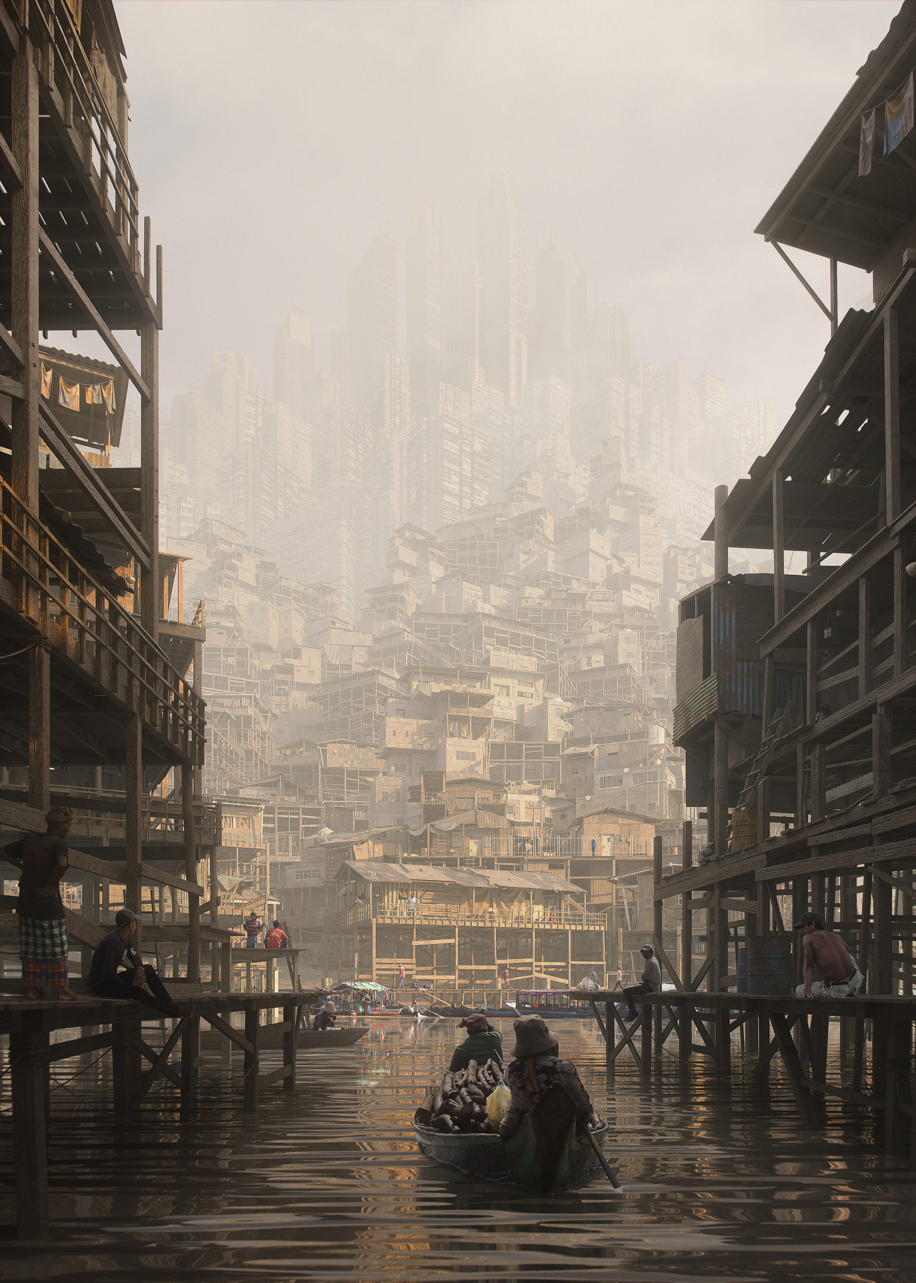
Human figures are just as important for renderings of imagined environments – a genre Canaletto would have called capricci. The non-student winner of the 2022 One Rendering Challenge, Arnaud Imobersteg’s “Shanty Shack,” is a great example of well positioned human figures can draw the viewer into the composition by giving them a point of identification. Like the figures in the boat, the eye is drawn upwards toward the towering skyscrapers in the background, almost invisible behind the hazy air and seemingly unstable stacks of slum dwellings.
As a depiction of out-of-control development, the work might owe something to Monet’s 1872 painting “Impression Sunrise,” which captured the London smog during the Industrial Revolution. Like Monet’s piece, the work is implicitly critical of the kind of dense, under-serviced urban environments that emerge during periods of explosive growth. However, by contrasting the smallness of the human figures with the size and complexity of the built structures, this rendering also evokes a sense of the sublime.
2. Use Chiaroscuro
 Chiaroscuro is the one term from Art History classes people tend to remember. Perhaps this is because this vocabulary term is introduced when learning about Caravaggio, the Baroque master who understood the importance of light and shadow in leading the viewer’s eye.
What chiaroscuro is really about is contrast. Take Caravaggio’s “Judith Beheading Holofornes.” The dramatic contrast between the shadowy background and the lighted foreground emphasizes the action of the scene in a way that prefigures cinema. But there are other contrasts too, such as that between the calm, vaguely disgusted look of Judith’s face and the anguish in Holofernes’s.
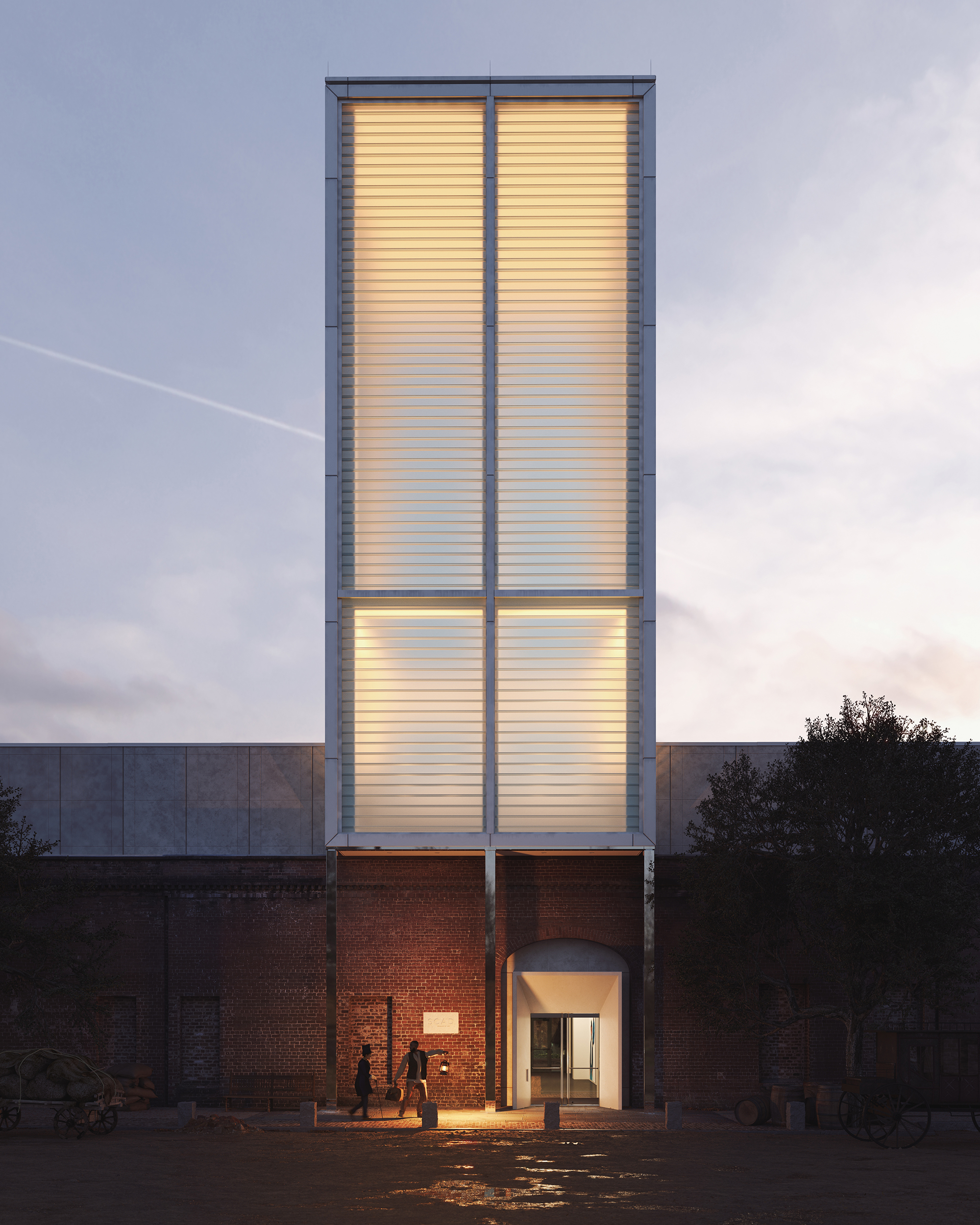
Even Mott’s rendering “The Lantern,” a commended entry in the 2022 One Rendering Challenge, is also a study in contrasts. Chiaroscuro is used to excellent effect in drawing the viewer’s eye to the two figures at the bottom, who Mott’s text tells us are runaway slaves entering the Savannah Railway Station to seek safe passage to Boston, where they hope to receive medical care. In addition to light and shadow, though, chiaroscuro also helps highlight another contrast, that between temporalities. The composition features a magical realist blending of past and present, as the runaway slaves leave their 19th century world to enter a 21st century railway station.
3. Emphasize Atmosphere and Texture
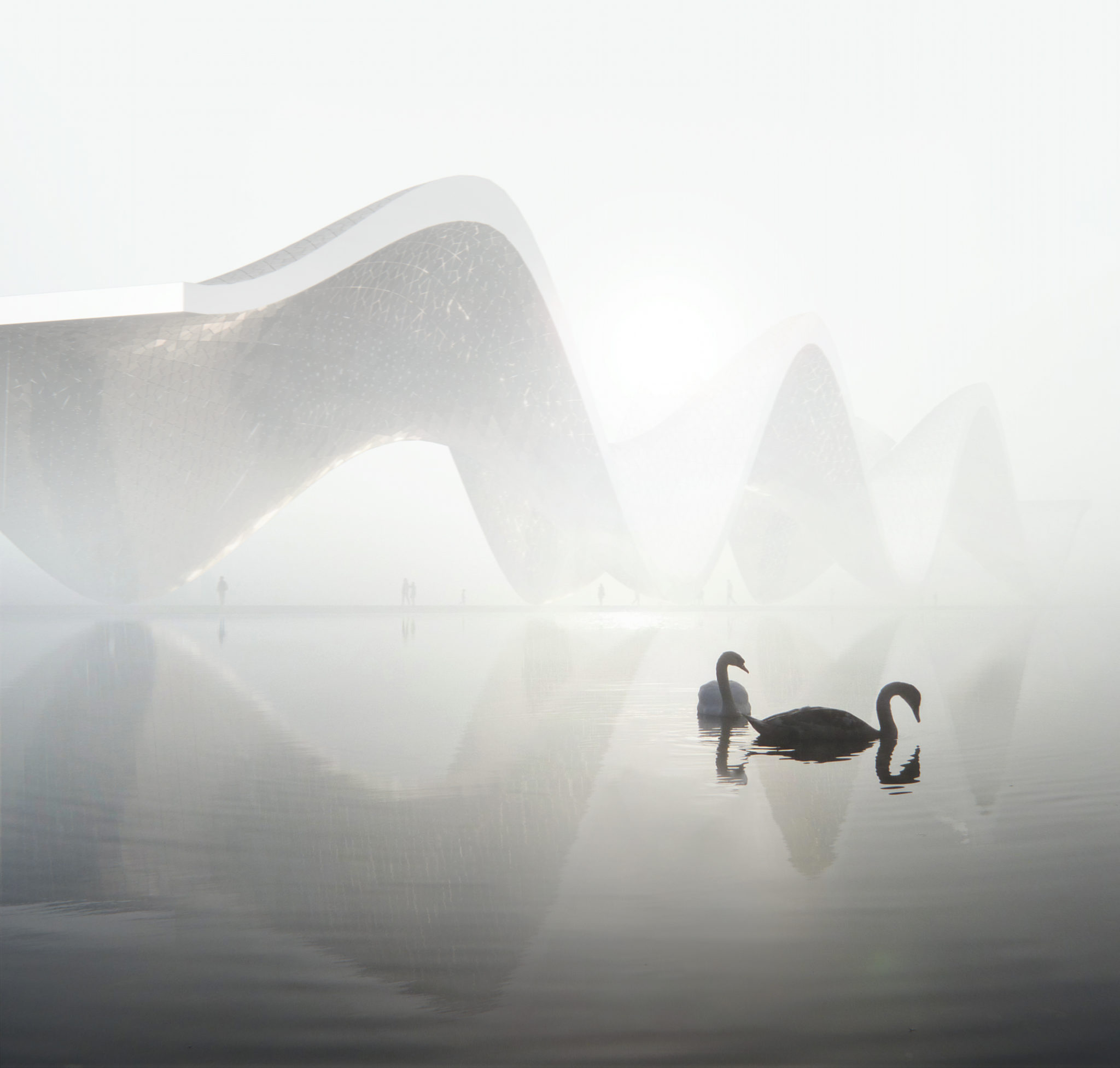 Another commended entry from 2022, Roman Huzar’s “WAVE,” showcases the importance of atmosphere in making a space feel immersive. By turning the fog up to 11 — or whatever the setting is in 3ds Max – Huzar reduces the background architecture to a silhouette, emphasizing its most striking feature. The correspondence between the shape of the swans and the curve of the buildings is another great touch, as are the ripples in the water. All these details serve to emphasize the connection between the built environment and the natural world.
4. Embrace Mystery
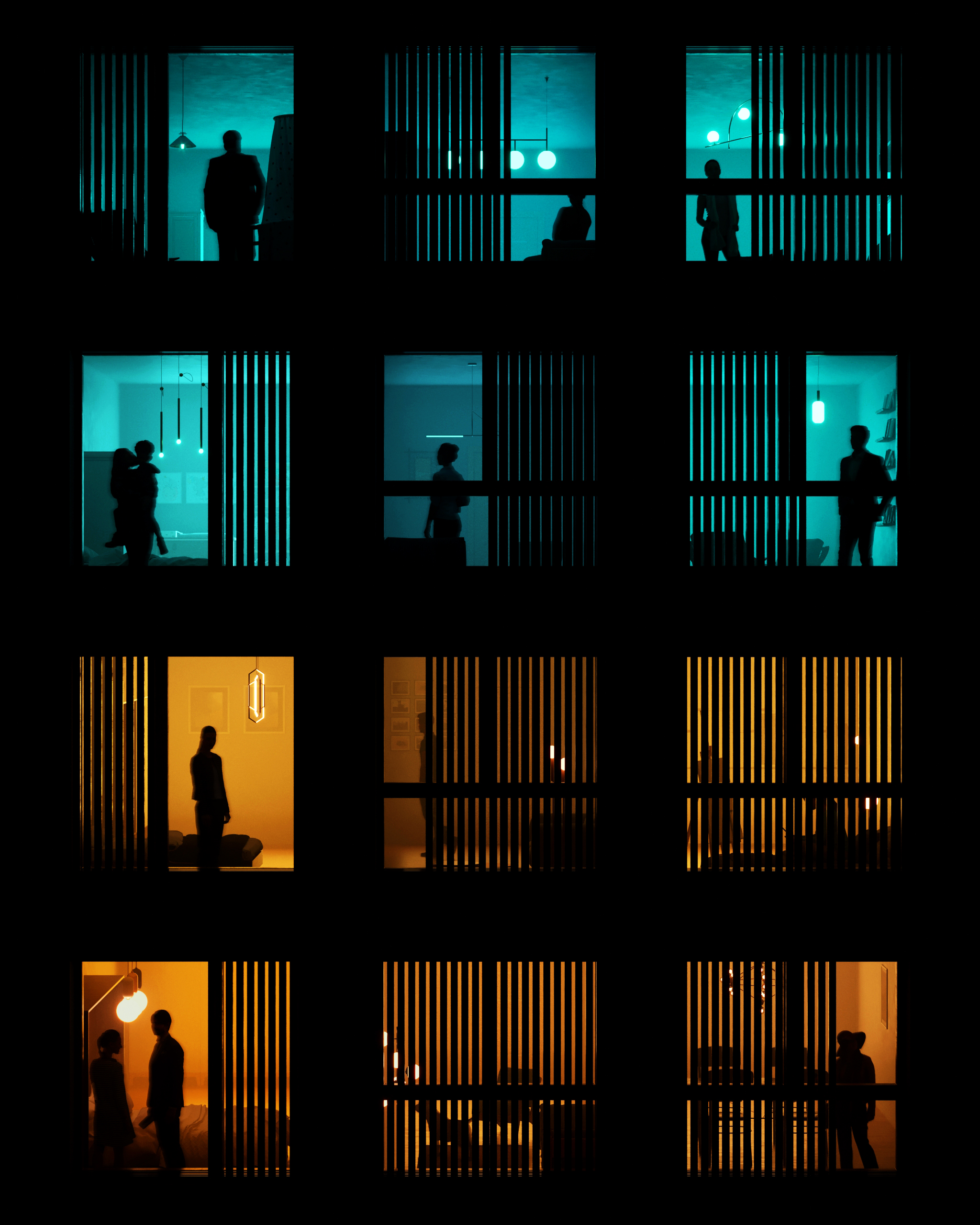 Ask any random person what their favorite Hitchcock movie is, and they will likely say Vertigo or something. But, if you ask someone who knows what they are talking about, and they’ll give you the right answer, Rear Window — a chilling and riveting study of the role voyeurism plays in urban life. The film has proven prescient, as in the age of social media people spend more time peering into the lives of strangers than ever before.
Guilherme Marcondes’s commended entry, “About Storeys and Stories” strikes me as an homage to Hitchcock’s masterpiece. It is a piece that makes us reflect on the disturbing fact that windows aren’t just looked out of – they are also looked into.
5. Look to the Future
 In the 2010s, Mark Fisher wrote often about the “slow cancellation of the future.” His argument was that with wages and living standards declining in western countries, especially the UK, people had lost their taste for thinking about the future as a site of possibility. Instead, it had become an object of dread, and people’s imaginations invariably returned to the past, to film sequels and music that was little more than nostalgic pastiche.
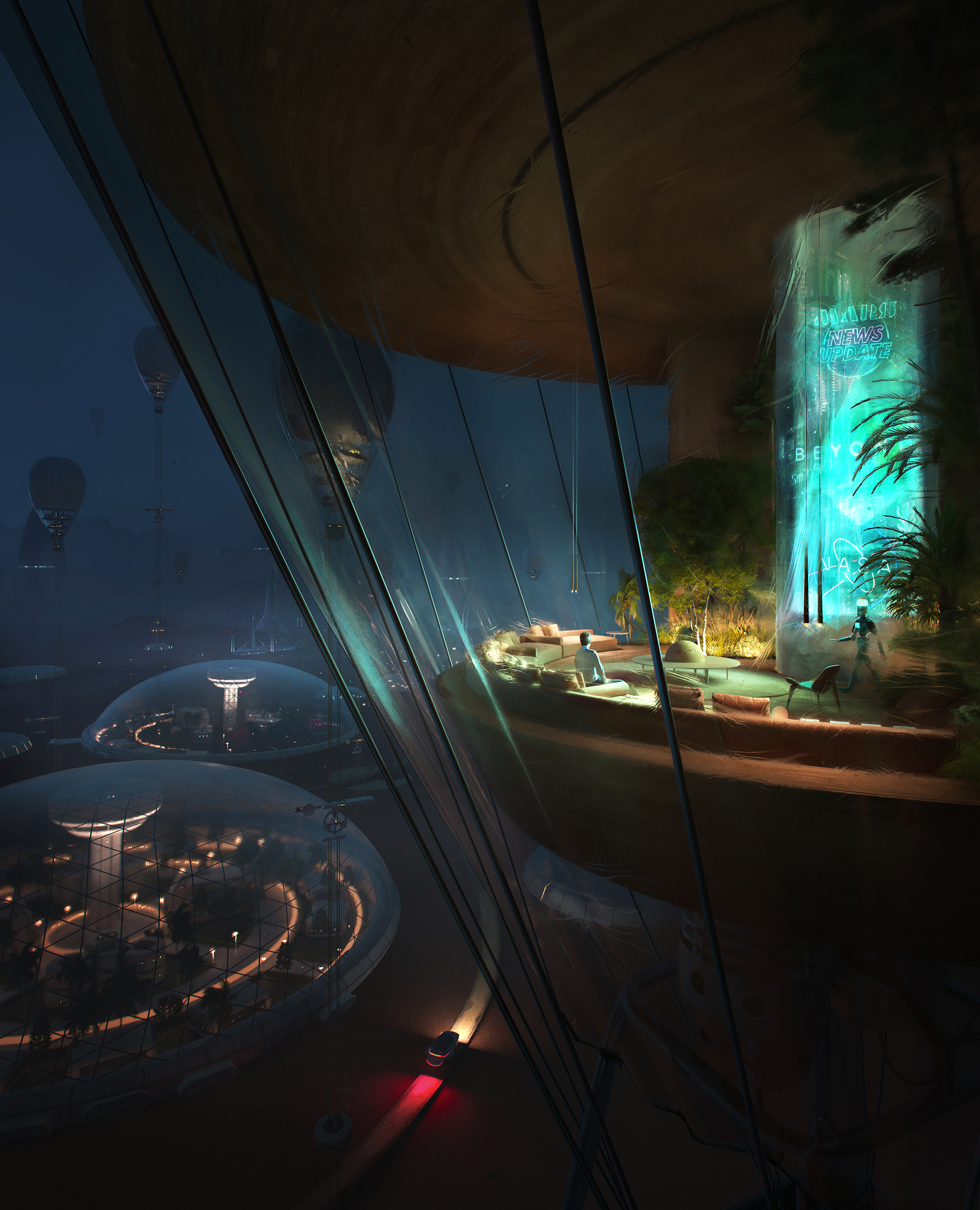
It is the duty of architects to help us think about the future in a more hopeful way. Vittorio Bonapace took up this challenge in his commended entry “Up in the Air,” which envisions the first colony on Mars “It’s not about the first epic human’s landing on the planet,” Bonapace explained, “but the whole concept is about the confidence of living there, enjoying home.”
In short, this rendering dares to imagine that human beings might feel at home someday — somewhere else.
Showcase your visionary architectural concepts: The 2026 Vision Awards features categories that reward UNBUILT projects presenting bold ideas for the future of architecture. Take advantage of early bird pricing before April 17th.

