The Woodhull Medical Center (1969–1978) by Kallman & McKinnell — designers of the oft-loathed Boston City Hall — and Kenzo Tange’s Yamanashi Broadcasting and Press Center (1961–1966) are two geographically and typologically remote projects, but ones that emerged from the same architectural ethos: an unabashed structural expression of buildings as containers for social activities rather than formal ideals.
While the first is a hospital facility at the intersection of three Brooklyn neighborhoods, the second is a media headquarters complex for three different Japanese companies. Both projects are monolithic megastructures that tower over their surrounding contexts, and yet they both attempt to instantiate similarly utopian ideals of growth and adaptability within a coherent structural frame.
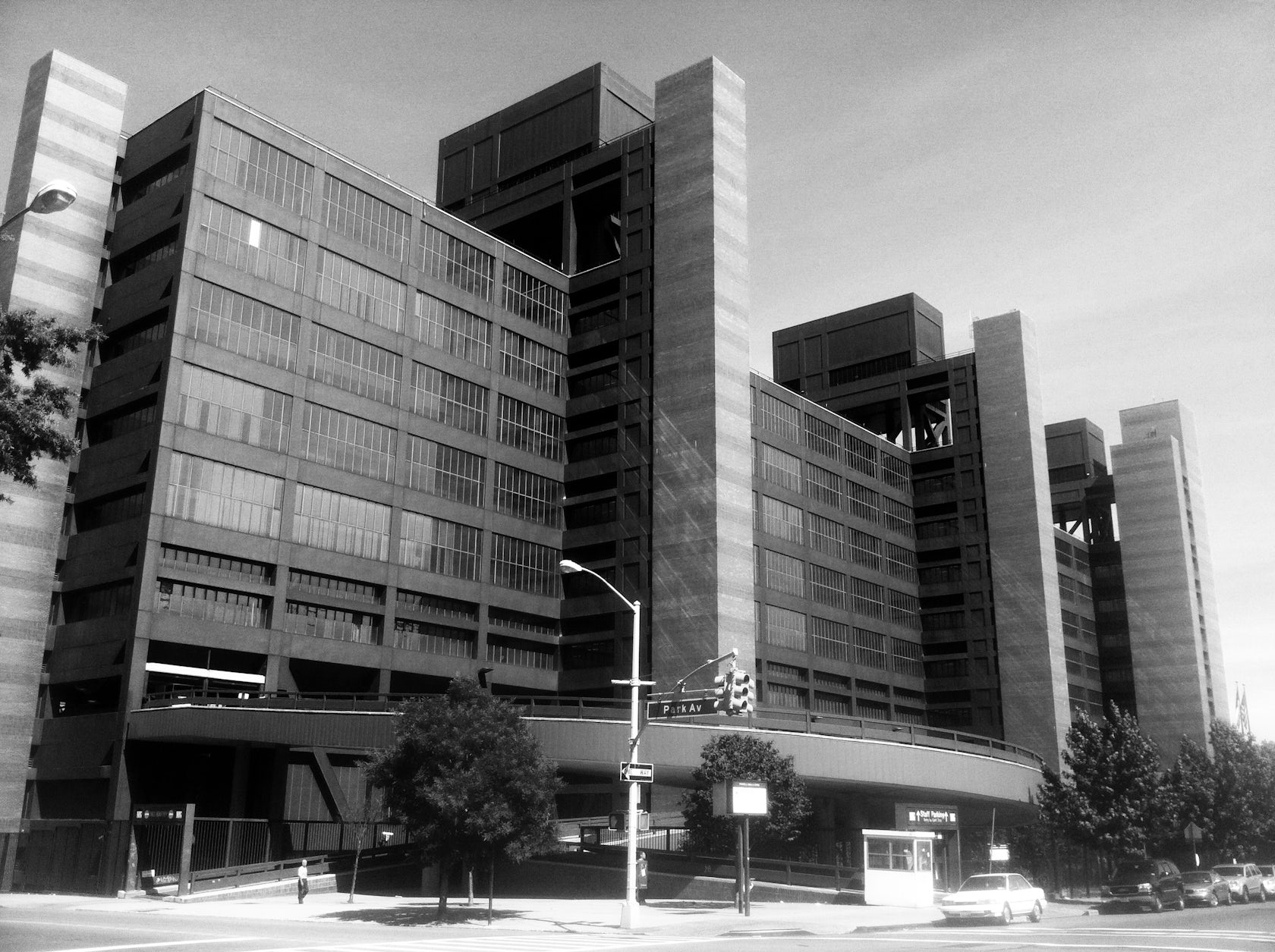
The Woodhull Medical and Mental Health Center (1969–1978), built by Kallman & McKinnell, Brooklyn, N.Y. Via Teach Me Teeth
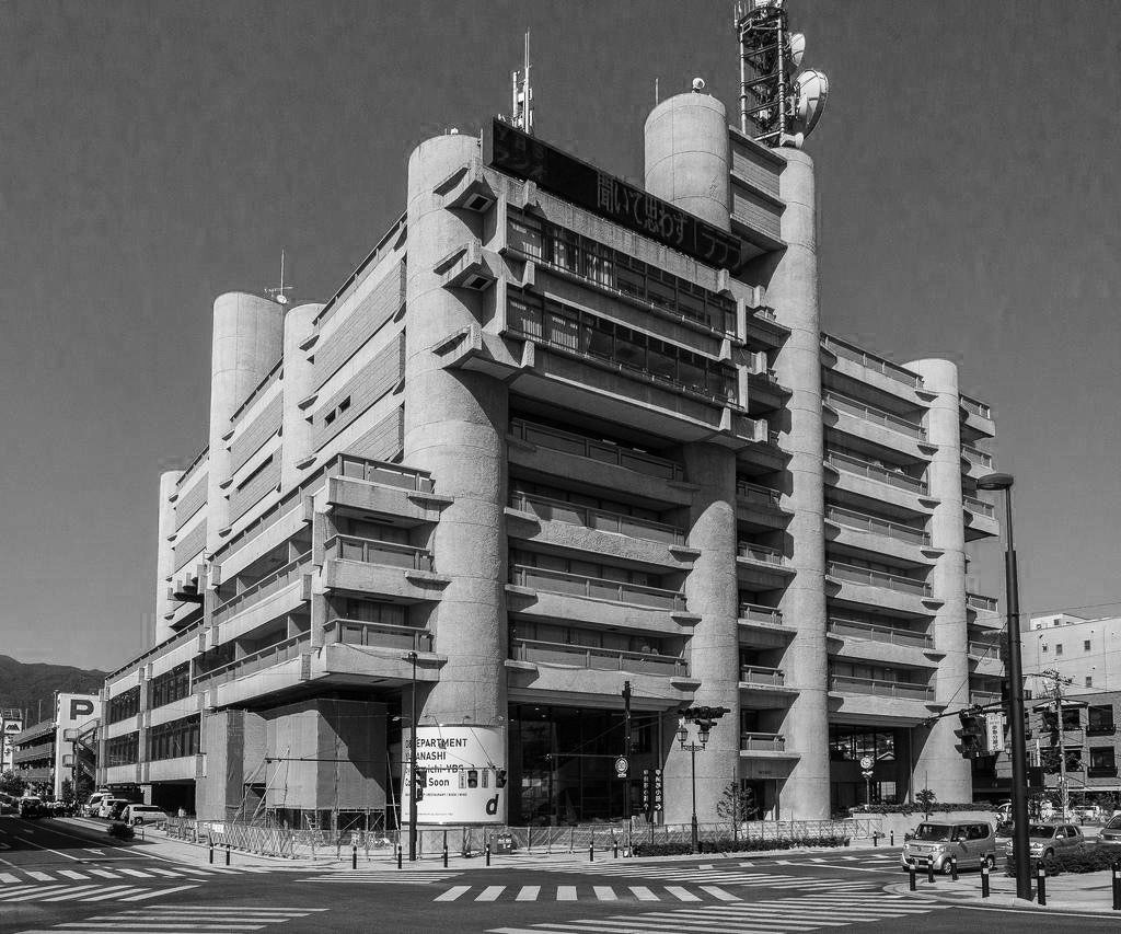
Yamanashi Broadcasting and Press Center (1961–1966) by Kenzo Tange, Yamanashi, Japan.Via Jacome
In order to understand the impulses behind the designs of the two projects, one must examine the state of architectural discourse after World War Two.
The Congress for International d’Architecture Moderne (CIAM) was the preeminent think-tank of sorts for avant-garde architecture from the 1930s onwards. However, in the 1950s, a younger generation of architects calling themselves Team 10 challenged the functionalist dogmas of Corbusier and others by proposing an integrated urban configuration, one which would more precisely express the unique character of individual places.
These two projects can be seen in light of the theoretical and formal programs offered by Team 10: the Woodhull Medical Center evokes the New Brutalism of Alison and Peter Smithson, while the Yamanashi Broadcasting Center is a symbol of the Japanese Metabolist movement, led by Tange himself. At the same time, one can view both the projects under the larger rubric of Structuralism, and the mat-building typology in particular.
“Architecture becomes a unified vessel for diverse clusters of activities moving in multiple directions.”
Mat-buildings were a counterpoint to the functional zones advocated by Corbusier. These layered grids of linked space were proposed as architectural accommodations of natural orders of growth and variation. The organizing principle of mat-buildings was a system of relationships, or patterns of encounter, wherein activities were materialized in spaces as a result of their enactment over time. The spatial framework of architecture then becomes a container that encloses various hierarchies and associations, a unified vessel for diverse clusters of activities moving in multiple directions.
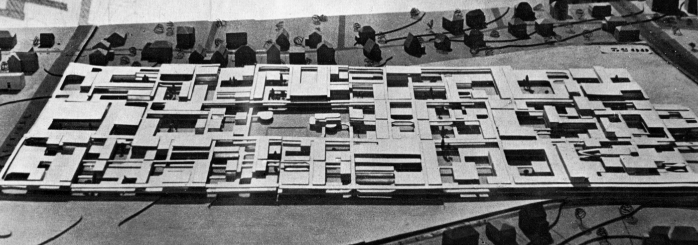
A model of Berlin Free University by Candilis, Josic and Woods, a prototypical example of the mat-building typology. Via Study Blue
The Woodhull Medical Center is a state-run one-million-square-foot, 610-bed hospital facility set on a 12-acre superblock, serving the neighborhoods of Williamsburg, Bedford Stuyvesant and Bushwick. Hailed as a modern marvel of hospital design when construction first began in 1971, the architects implemented a fast-track construction strategy to avoid the inflation costs beguiling other projects, finishing final design plans along the way.
This did not seem to deter construction costs, as the price eventually ballooned to $300 million, well above original projections of $85 million. The city’s fiscal crisis of the 1970s didn’t help either, and the city attempted to sell the building to the federal government for use as a prison. After sitting empty for years, the facility finally opened in 1982.
“The hospital has the appearance of a futuristic factory from a 1920s metropolis.”
The 700-foot long slab of Woodhull’s main volume is sheathed in gray-tinted glass and panels of rust-colored weathering Cor-ten steel. The grand-scaled structural framework has a distinctly machinist aesthetic quality, giving the hospital the appearance of a futuristic factory from a 1920s metropolis. The building was notable for its use of the Kaiser corridor system, in which patient rooms were organized along a central service corridor reserved for hospital personnel and patients.
Side-facing visitors’ corridors flanked by double-height diagonal glazing allowed light to enter the inward-facing rooms and increased operational efficiency. Above these corridors are the interstitial full-height floor plates of deep-set transverse trusses, which facilitate a column-free interior and mechanical area easily accessible without disturbing other hospital functions. The architects imagined these interstitial spaces to adopt automated systems of materials delivery and trash disposal, maintained by electric cars moving within the floor plates.
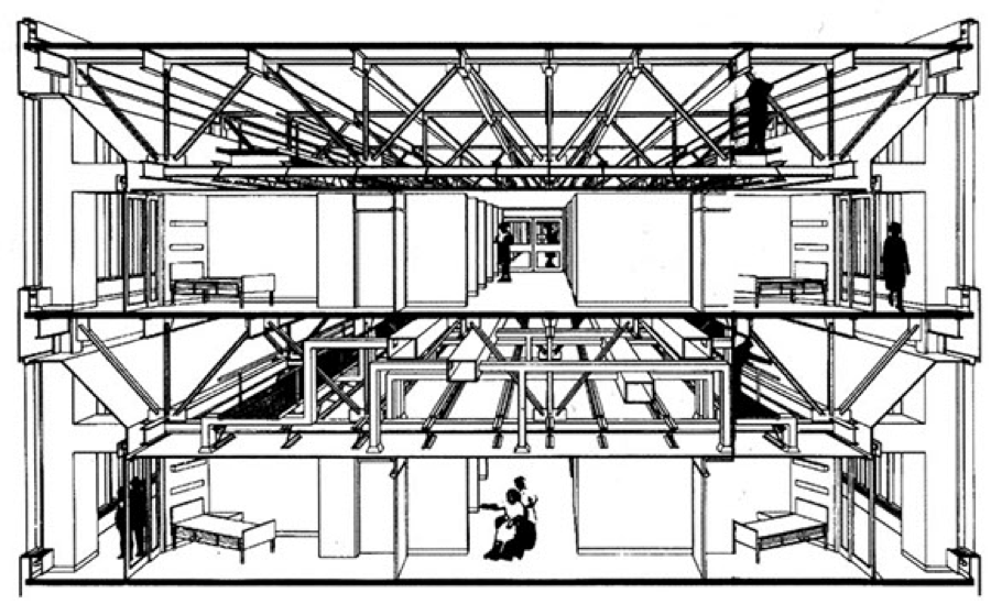
Section through Woodhull, showing the transverse truss structural system. Via Tectonica Online
One of Woodhull’s most significant formal gestures was the tripartite organization of the street façade between the exposed elevator shafts that extend two stories above the final floor to contain the rooftop mechanical systems. These steel trusses tower over the occupied volume as sculptural, mechanistic possibilities of expansion, allowing the city to increase the square footage of the hospital as needed. Yamanashi Broadcasting Center employs a similarly open-ended structural framework of spatial voids that reserves space for unknown programmatic contingencies that might arise in the future.
“…steel trusses tower over the volume as sculptural, mechanistic possibilities of expansion…”
Tange’s building is a prime example of architecture as expandable urban form. Three media companies’ headquarters are housed in the building, grouped into functional zones according to their needs: printing facilities on the ground floor, broadcast studios in enclosed spaces above street level and office spaces between. The program-based organization allows the companies to have separate units and share common facilities. The services including stairs and elevators are housed in 16 tubular reinforced concrete wells 16 feet in diameter, perhaps referencing a latent classicism in their column-like shapes.
These also rise above the roofline in varied stature to contain satellites and antennae. The blocks on tubes megastructure with concrete block infill has a Brutalist material composition, but one that is softened by the double-height solids and voids, giving the building a spotted object-presence that defies immediate sensory apprehension. The relatively small site plan and floor area — 60,000 square feet compared with Woodhull’s 12-acre superblock — necessitated a vertical arrangement of stacked floor plans.
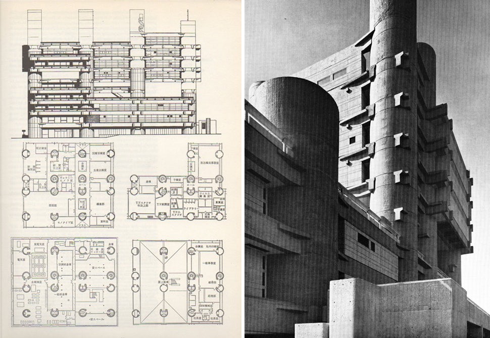
Left: Elevation and plans of Tange’s Broadcasting Center, via THVM; right: building detail, via F*ck Yeah Brutalism
Whereas Woodhull appears as an elongated horizontal volume of transparent glass and weathered steel, Tange’s Yamanashi building has an upright interiority interrupted by punched openings in the mass. Tange envisioned these spaces to enable future expansion, but the building’s occupants have in fact utilized them as gardens and terraces.
“Yamanashi revels in exuberant morphological explorations…”
This creative appropriation outside of the architect’s prescribed functional expectation demonstrates an inadvertent adherence to both Metabolist and mat-building principles. If Woodhull hews closer to a straightforward geometric and figural presence, Yamanashi revels in exuberant morphological explorations by virtue of its asymmetrical modules, expressing the structural frame in periphrastic spatial hierarchies.
While the Woodhull Medical Center and Yamanashi Broadcasting Center are not perfect manifestations of the mat-building typology, they do assume certain key elements that illuminate their utility. Though they are in a sense additive or generative structures, they are also practically mono-functional and programmatically discrete within.
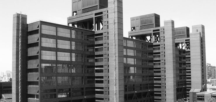
Woodhall Medical Center. Via NYC Health + Hospitals
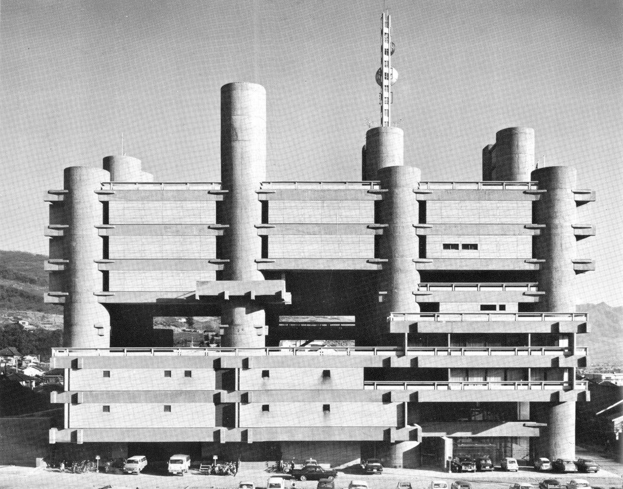
Yamanashi Broadcasting and Press Center. Via F*ck Yeah Brutalism
Mat-buildings are supposed to function as continuations of the surrounding urban context, yet these two projects are conspicuously out of character interruptions in the built environment. Furthermore, they were both products of singular institutional or corporate initiations, rather than organic or collective forces. At the same time, the projects began as investigations into the specific organizational needs of their respective place-times, out of which the building’s plastic expression derives.
Tange’s Yamanashi Broadcasting Center might ultimately be a better example of the ideals first set forth by Team 10, if only due to the absence of the restrictive ethical, regulatory and humanistic covenants central to Woodhull’s program. If this is the case, however, Yamanashi is able to more freely express the idiosyncratic patterns of human association at the expense of a robust public program so forcefully advocated by the Woodhull Medical Center, an impulse sorely lacking in contemporary practices of both architecture and government.
Sources
Ferrier Forés, Jaime. “Mat Urbanism: Growth and Change.” MIT Journal of Planning: Projections 10: Designing for Growth and Change.
Goldberger, Paul. “Woodhull Hospital, A Controversial Giant, Cast in a 60’s Mold; An Appraisal.” New York Times. November 5, 1982.
Lin, Zhongjie. “Kenzo Tange and the Metabolist Movement: Urban Utopias of Modern Japan.” New York: Routlege. 2010.
Stern, Robert A.M. “New York: 1960.” Monacelli Press.


