Architects: Want to have your project featured? Showcase your work by uploading projects to Architizer and sign up for our inspirational newsletters.
In 1939, George Orwell declared that “all art is propaganda.” The year alone is enough to grasp the basic context of the statement. With World War II encroaching, and the Western intelligentsia dividing itself into different ideological camps, it seemed naive, even deluded, to suggest that art inhabited a zone beyond politics. Everything was part of the global struggle for the future of civilization.
Architecture, too, was at this time deeply political. In Germany, the Nazis had declared the modernism of the Bauhaus to be “degenerate,” forcing Walter Gropius, Mies van der Rohe and other architects to flee to the United States. In the Soviet Union, Constructivism had long been sidelined in favor of an eclectic imperial style with classical elements known as Stalinist architecture.

In the early days after the Russian Revolution, Constructivist buildings like this appeared all across Russia. By the thirties, the style had fallen into disfavor. Image: “Izvestia” newspaper building. Architects: Barkhin G.B., Barkhin M.G. Engineer: Loleyt A.F. 1925-1927. Photo by Sergey Norin. Via Flickr.
Both Nazi Germany and the Soviet Union under Stalin perceived modernist architecture as a threat to the regime. Whether the modernists were aware of it or not, the form of their buildings had a clear political meaning: they advocated transparency, a fundamentally democratic value. (Some modernist architects were clearly not aware of the implicit political content of their work, as there were fascists among modernism’s ranks.)
Unlike, say, a neoclassical building, a modernist building does not hide its structural elements behind a facade. It points toward a future of openness, a world where nothing will be hidden. In such a world, authoritarianism could not flourish, as it draws its power from the shadows — that is, the control of information. It’s not a coincidence that the walls of Versailles conceal hidden passageways.
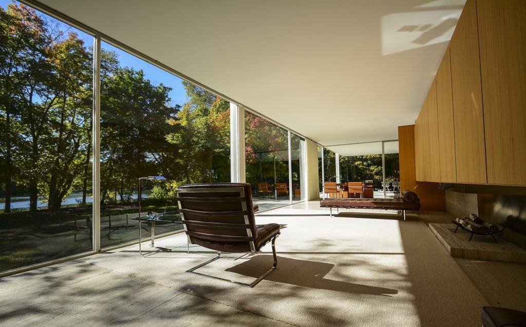
Modernist architecture promoted an ethos of transparency. Image: Interior of Mies van der Rohe’s Farsnworth House. Image via Wikimedia Commons.
Modernism eventually won against its opponents, becoming more ubiquitous than even the previous hegemonic style, the Beaux Arts style, was in its heyday. The Beaux Arts style was a kind of proto-modernism that flourished in the late 19th and early 20th century, combining modern building materials and techniques with the decorative trappings of various eras. Unlike the Bauhaus, the École des Beaux-Arts did not advocate the abandonment or transcendence of historical architectural forms. What they did do was open up the possibilities for their recombination. As long as architects followed certain parameters, they were free to mix and match architecture’s greatest hits, allowing Baroque, Rococo, and Neoclassical motifs to intermingle with resolutely modern elements, including massive windows crafted from iron and glass.
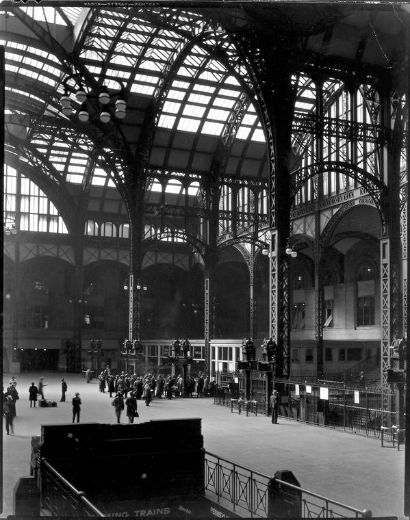
The vaulted iron and glass ceilings of the original Pennsylvania Station exemplify the way Beaux Arts architects embraced modern building materials. Photo by Berenice Abbott, 1935-38, via Wikimedia Commons.
Beaux Arts architecture allowed for the integration of industrial technology into urban spaces that were built in a much earlier era. Modern yet traditional, playful yet restrained, these buildings spoke to the aspirations of a confident bourgeoisie that embraced the present. Unlike modernism, the Beaux Arts style did not propose a radical break from the past, but it also wasn’t looking to recreate the grandeur of an earlier period. Neither nostalgic nor futuristic, these buildings embodied the ethos of the gilded age and propagated the values of the capitalist class.
It’s no wonder that this style was favored by leading American industrialists of the gilded age, especially for projects carried out with philanthropic donations, such as the Metropolitan Museum of Art and the Main Branch of the New York Public Library. The Beaux Arts Style was also used for public buildings in this era including the original Pennsylvania Station and Grand Central Terminal. Above all, this style signified prosperity and power while avoiding ostentatiousness. Architects who worked in this style demonstrated both their good taste and their academic expertise.
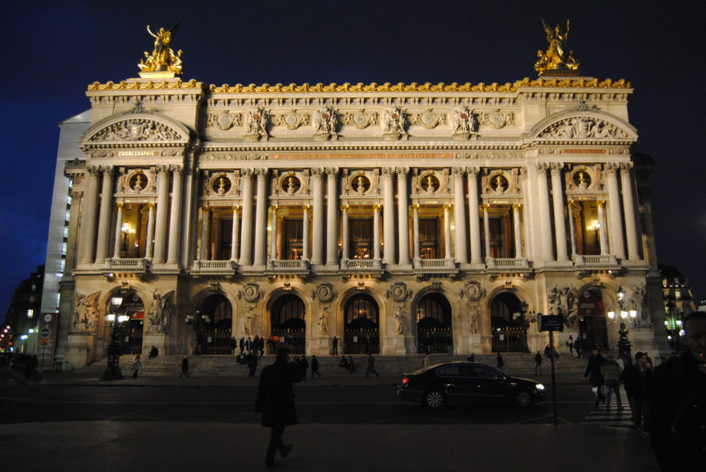
Architects trained at École des Beaux-Arts learned to mix and match architecture’s greatest hits to create buildings of balance and refinement. Image: The Opéra Garnier in Paris at night. Photo via Wikimedia Commons.
The Beaux Arts style can be juxtaposed with the architecture of figures like Frank Furness, who really did embrace out and out eclecticism, pushing aside traditional notions of taste and restraint to produce buildings that felt truly new. It should also be seen as distinct from the vogue for revivals that dominated the 19th century. Between these two extremes, Beaux Arts forged a middle path, preserving “good taste” while making concessions to the way industrialism had re-shaped urban life.
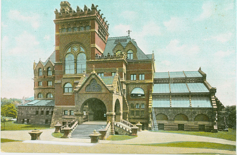
With unusual proportions, Gothic gargoyles, and a bright red exterior, Frank Furness’s 1891 Fisher Fine Arts Library at the University of Pennsylvania is an example of bold eclecticism. The Beaux Arts Style, while also eclectic, was far less adventurous. Photo: vintage postcard via Wikimedia Commons.
Couldn’t one say the same for postmodernism, the style that superseded modernism in the 1970s and 80s? According to the familiar narrative, postmodernism brought “decorative details” and a sense of “play” back into an architectural landscape that had become monotonously austere in the hands of the modernists. But it didn’t do so by embracing decoration with abandon, returning to the Beaux Arts, Art Nouveau, or any other pre-modernist aesthetic. Rather, postmodernist architects introduced archaic design elements into their buildings in obscure ways that tended to baffle those outside the architectural profession. There was always something self-consciously “off” about the way decorative elements fit into these buildings, and this disjuncture signified the architect’s understanding that they were violating a taboo.
In his provocative 1981 book From Bauhaus to Our House, Tom Wolfe writes that postmodernist architects were “permitted” to re-introduce ornament because they did so with “infinite subtlety.” The profession, he writes, had sneered at bold, visionary architects like Edward Durrell Stone (in his late period) and Eero Saarinen, but it embraced Robert Venturi because his “apostasy” from Bauhaus “worker housing” principles was carried out with a wink, a nod, and a heavy dose of theory, signaling that he was at heart member of the architectural “clerisy.”
Whatever one thinks of Wolfe — and his declaration that Saarinen was widely sneered at is dubious — there is something to his observation that postmodernism was a deeply academic, meta-referential style of architecture. A project like Philip Johnson’s AT&T Building is hardly legible outside its self-conscious departure from modernist norms. Like the Beaux-Arts masters of old, the postmodernists had mastered an elaborate body of principles and codes, and their buildings were displays of their erudition.
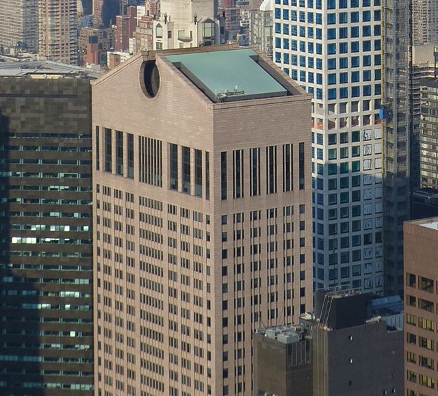
Philip Johnson’s 550 Madison Avenue (formerly the AT&T Building) is topped with an oversized pediment, a wry subversion of the architect’s own avoidance of ornamentation during his modernist period.
It is no coincidence that postmodernism came to the fore at the dawn of neoliberalism. In the 1970s and 1980s, as global markets became integrated and the Cold War drew to a close, an idea began to emerge that the world had entered “The End of History.” In his landmark 1991 book Postmodernism, or the Cultural Logic of Late Capitalism, the philosopher Frederic Jameson argues the postmodern architecture is but one example of a new cultural sensibility, one that disfavored bold, blunt political statements such as those represented by modernist buildings.
Ambiguity, intertextuality, play – these were the values of a society that had made its peace with capitalist alienation, or the idea that history was guided by the impersonal, amoral hand of the global market. What Wolfe had seen as academic insularity in postmodern architecture was really a new worldview, one that was hyper aware of human limitations, essentially an anti-utopianism.
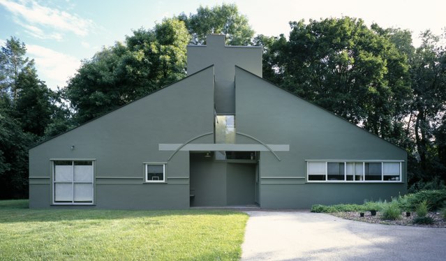
Robert Venturi’s Vanna Venturi House in Chestnut Hill, Pennsylvania is considered a sort of mission statement on postmodernism. The inclusion of nonstructural features — like the applique arch over the door — were a direct challenge to modernist orthodoxy. And yet, the building retains a certain indebtedness to modernist aesthetics too. Photo by Carol Highsmith
What Jameson doesn’t note is that many of the features he recognizes in postmodernism were also present in the Beaux Arts. Both styles were basically a highly refined form of pastiche, a sensibility that affirms the status quo even when it presents itself as subversive. Indeed, a certain type of academic subversiveness helps keep tradition alive, as T.S. Elitot understood. There is a conservative bent, basically, to postmodernism, which need not be a bad thing. Indeed, one could argue — I would argue — that postmodernism was good for modernism, as it kept its tropes and ideas in play after they had worn themselves out. What postmodernism was not, however, was new.
In times of seeming stability, architecture can afford to become an academic game. But in other times, in Orwell’s time, such an attitude is unthinkable – there is too much hunger for the new. All of this leaves us with an open question: what kind of time are we living in?
Architects: Want to have your project featured? Showcase your work by uploading projects to Architizer and sign up for our inspirational newsletters.
Cover image: Venturi Scott Brown, National Gallery Sainsbury Wing, 1991. Photo by Rory Hyde.
