Architizer's 14th A+Awards judging is live! Subscribe to our Awards Newsletter for updates on Public Voting and the big winner reveal later this spring.
The latest installment of our Architectural Details series turns its attention to an architect who understood the importance of considering every last element of a building with the greatest reference. German-American Modernist Mies van der Rohe is widely credited with coining the classic motto “God is in the details,” a mantra perfectly captured within every slender component of his most iconic residence: Farnsworth House.
As architect and author Georg Windeck accurately sums up in his new book Construction Matters, Doctor Edith Farnworth’s one-room weekend retreat represents an uncompromising exploration of the “artistic potential of structural steel sections.” The innate strength of this material allowed Mies to achieve his ideal architectural language, a crystallization of rigorous ideas pertaining to light, space and structural expression.

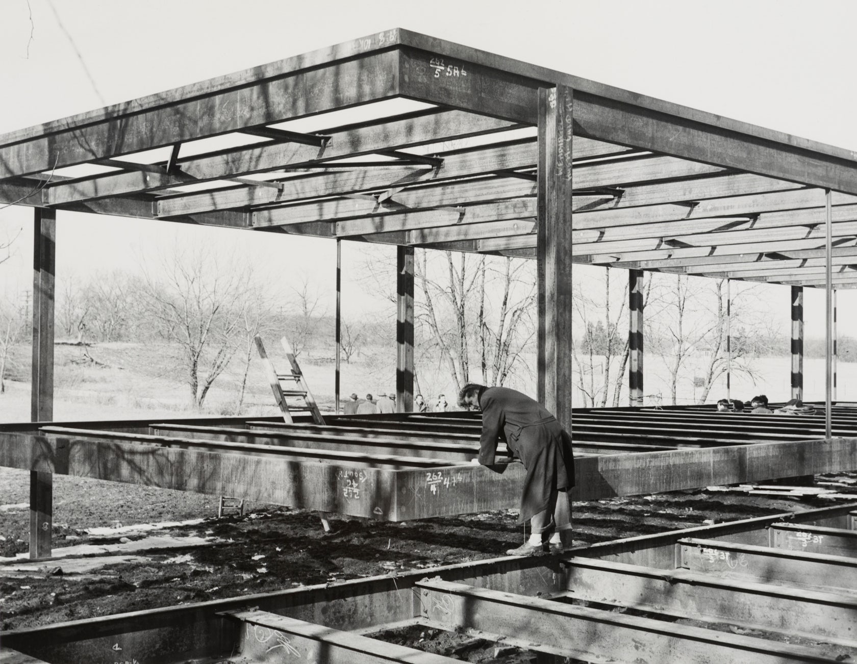
Farnsworth House construction photo, winter 1949-50; courtesy Myron Goldsmith fonds Collection Centre Canadien d’Architecture / Canadian Centre for Architecture, Montréal
Situated on a picturesque, waterfront site alongside the Fox River in rural Illinois, Mies aimed to create a structure that would serve to frame views of the countryside with minimal obstruction. Windeck describes this form of architecture as a “bodiless framework,” distilling the building to its most simple elements and eschewing all that could be deemed superfluous to the building’s primary functions.
Mies employed a rigid rationale for the building’s plan, defined by the wider context. “The surrounding landscape provokes the rectangular proportions and structural grid of the Farnsworth House,” explains Windeck. “Three rows of columns run parallel with the river. They are connected with girders, which support smaller cross beams.” Vertical elements echo the rhythm of surrounding trees, while horizontal members align with the surface of the river.

Structural frame; drawing by Construction Matters
This “one-way flexural system” is ideal for use with rolled steel sections, and the entire skeleton of the building is essentially defined by a kit of parts, as Windeck describes: “The house becomes a catalogue of ‘I’s, ‘C’s, ‘L’s and rectangles that are used for different parts of the system. Their shape exhibits their structural function and their size reflects the magnitude of the load they have to resist.”
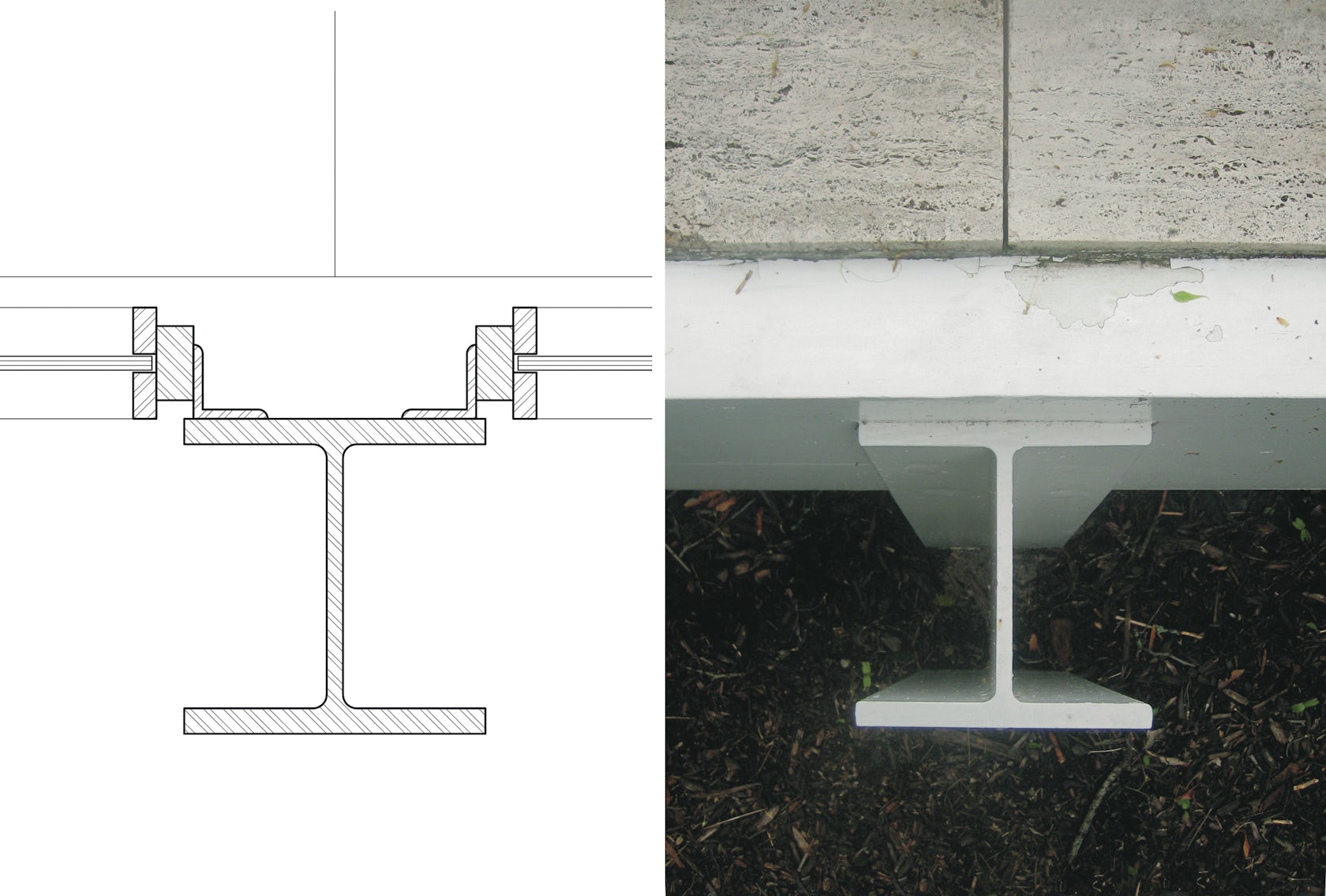
Because the residence is contained within a flat-roofed, single-story structure, vertical loads are relatively insignificant — instead, the profile of each steel I-beam is necessitated by the horizontal forces applied by wind. As Windeck explains, “Flanges and webs act as small walls that have been evacuated from the interior of the building and compressed to the scale of a construction detail.”

I-beam detail; drawing and photograph by Construction Matters
While many architects attempt to conceal such details behind façades or within wall buildups, Mies celebrated the tectonic nature of the steel, granting viewers an instant understanding of how the structure stands up and what materials it is composed of. Between these columns, the floor and ceiling slabs are edges with C-section girders that wrap around the corners to provide a seamless finish.
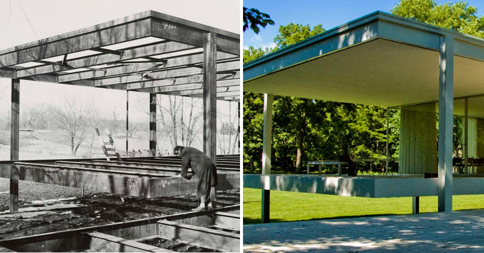
With the vertical I-beams running past them to the ground, these slabs appear to float, akin to rafts drifting upon the adjacent river. The building is characterized by an apparent weightlessness that belies the solidity of its primary construction material. Such an effect could only be achieved by carefully considering how the different structural elements would connect at each junction, as Windeck explains: “Mies uses conventional bolted connections for the invisible parts of the framework. All visible connections are plug-welded.”

Farnsworth House; via Wikipedia
The resulting aesthetic is pristine, and each detail lends itself to the architect’s original mission — to create a sublime manifestation of modernist ideals. Despite its forward-thinking nature, Farnsworth House also nods to ancient artistic practices: Mies’ columns dissect views of the surrounding landscape, transforming them into flattened images that evoke the painted panels of Japanese screen walls. The building effectively merges art and architecture, and will continue to stand as one of Mies’ seminal masterpiece.
Enjoy this article? For more amazing designs in steel, check out Construction Matters — available here — and enjoy the first three features in our series on Architectural Details:
Toyo Ito’s Flowing Concrete Canopy
Elissa and Alvar Aalto’s Patchwork Wall of Bricks
Herzog & de Meuron’s Pristine Timber Box
Architizer's 14th A+Awards judging is live! Subscribe to our Awards Newsletter for updates on Public Voting and the big winner reveal later this spring.


