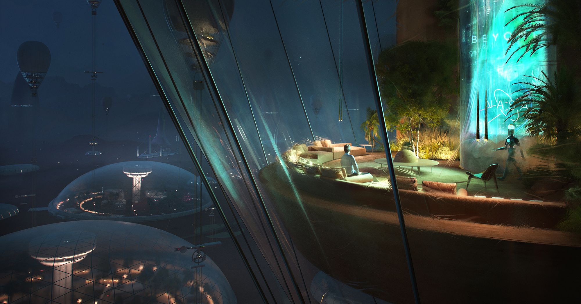
The judging process for Architizer's 14th A+Awards is now underway. Subscribe to our Awards Newsletter to receive updates about Public Voting, and stay tuned — winners will be announced later this spring.
COOP HIMMELB(L)AU has gained attention for masterfully adopting technology in the design process. Their portfolio features several cultural and commercial projects that are almost like large-scale sculptures. Much like the color that the firm’s name represents – light blue – their designs often have a cloud-like quality that transcends their large stature to embody an overall lightness with an element of whimsy.
The firm’s co-founder, CEO and design principal, Wolf Prix, said, “Architecture should be flexible and movable, like clouds. Space should react to the activities of people and not the people.”
Going beyond space, he compared architecture to an iceberg. The visible part of the iceberg is the tangible structure that you can see. But the part that is below the surface of the water is just as important and has a large impact on the visible architecture. And it is important for architects and critics of architecture to understand the whole story instead of just seeing what is visible to the naked eye.
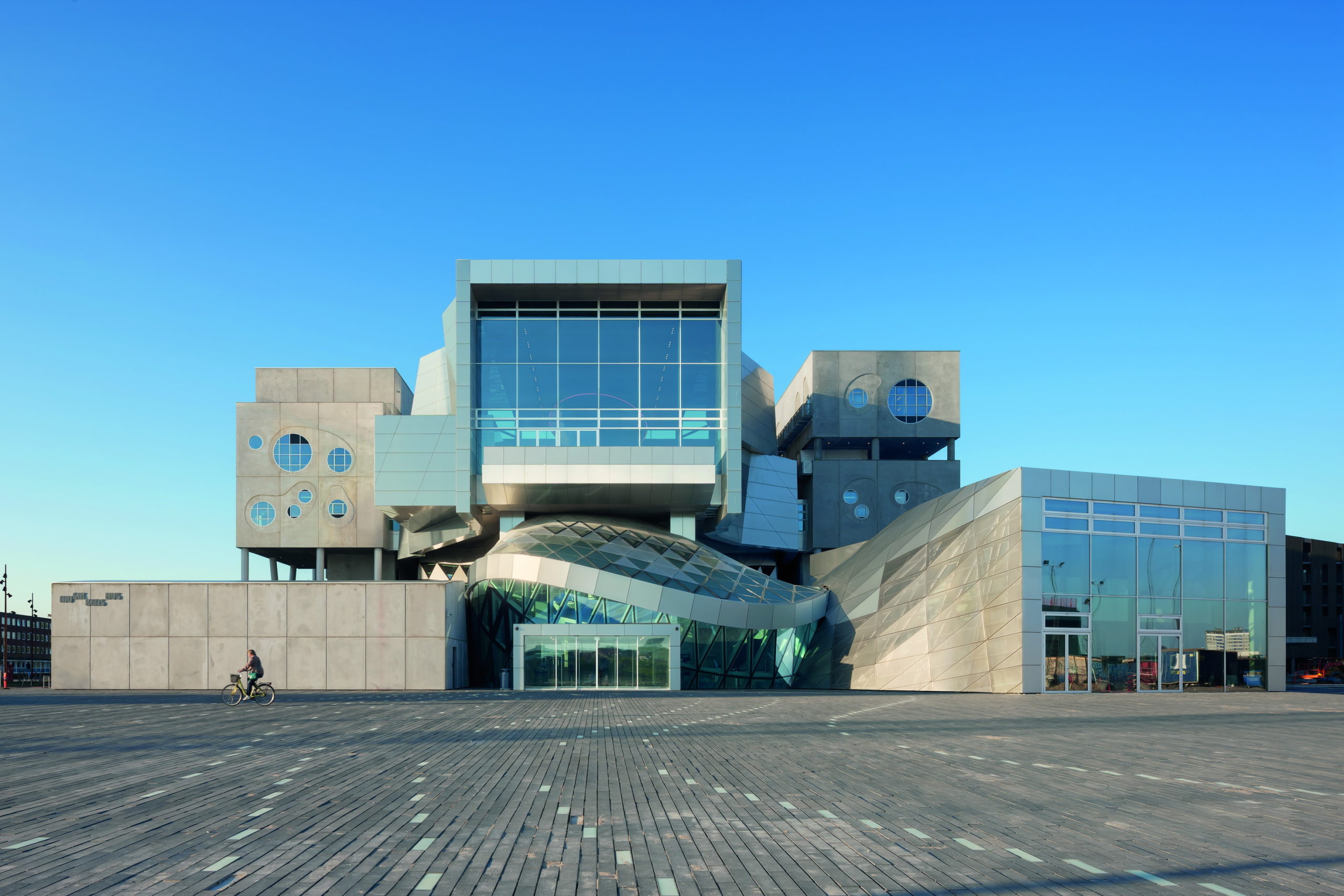
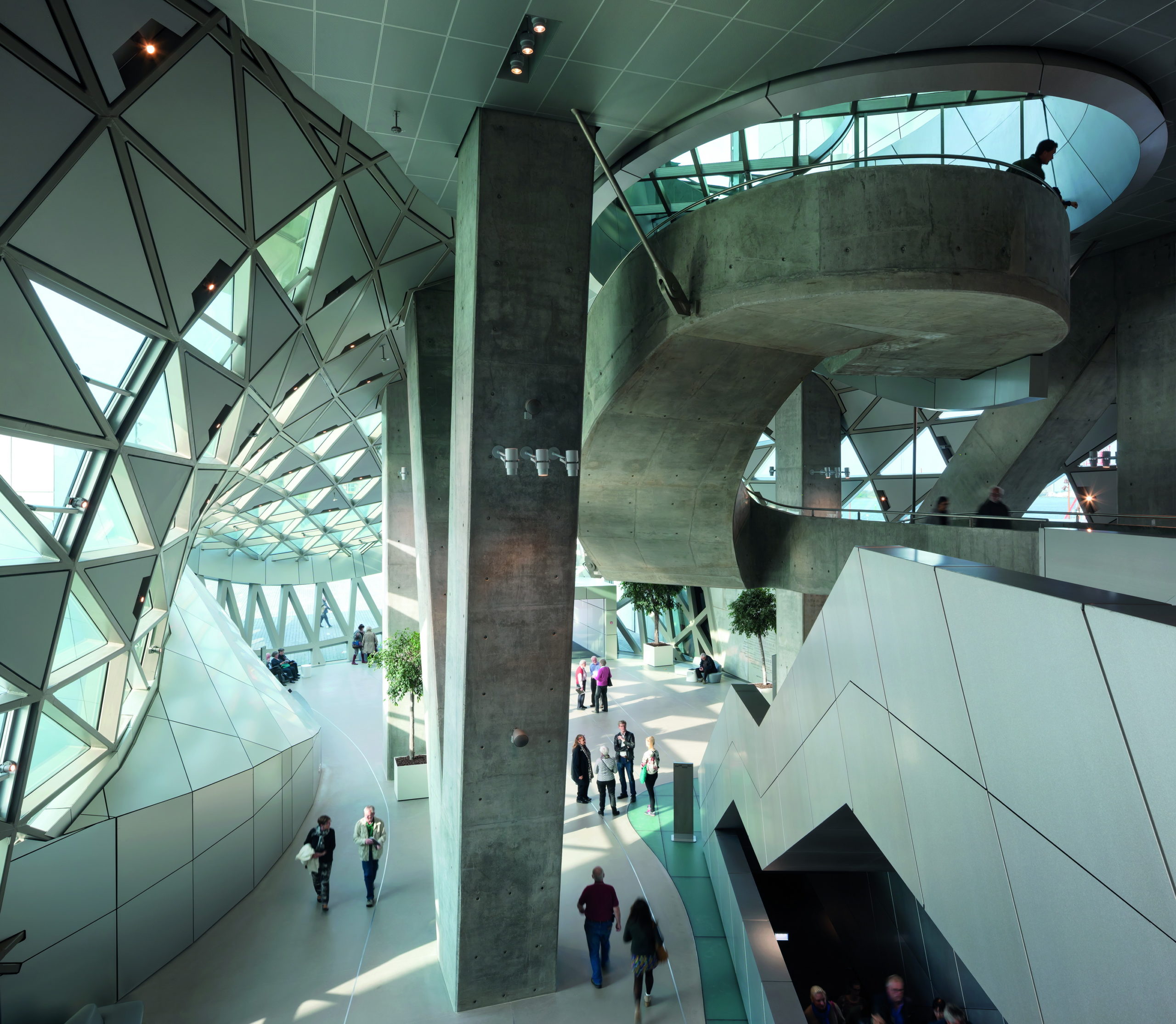
House of Music by COOP HIMMELB(L)AU, Aalborg, Denmark | Images by Markus Pillhofer
A great example of the studio’s signature design style is the House of Music in Aalborg, Denmark. From the outside, the structure looks like a mass of interconnected blocks. But on the inside, it is a fluid space that houses a large concert hall that can seat about 1,300 people. The walls of the hall have perforated windows so that people can look into the hall, creating more interactions. In addition to optimal acoustic performance, the structure is also designed to maintain ideal thermal conditions in an energy-efficient manner by use of natural thermal buoyancy, cold or hot water pipes, piping air vents and more.
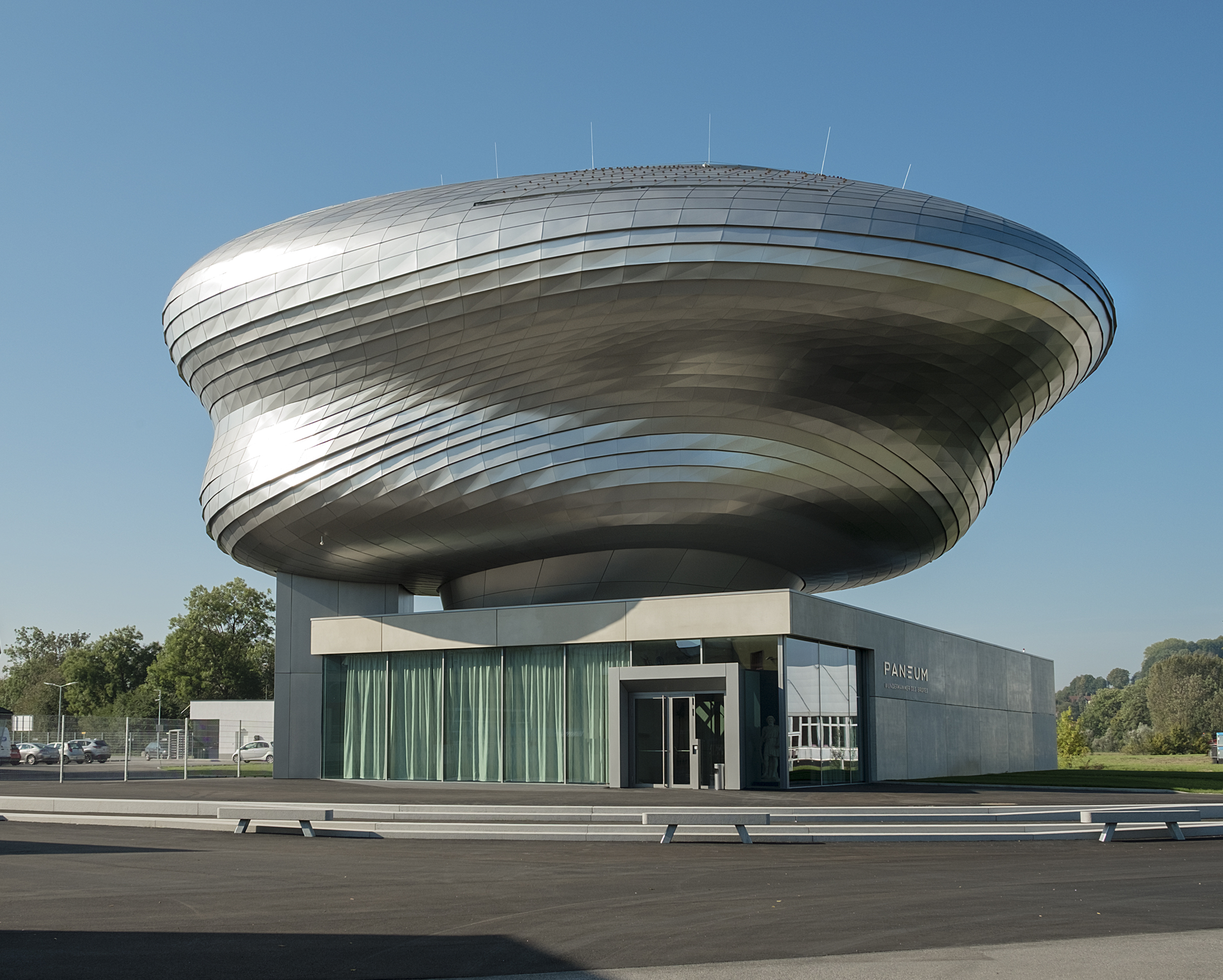
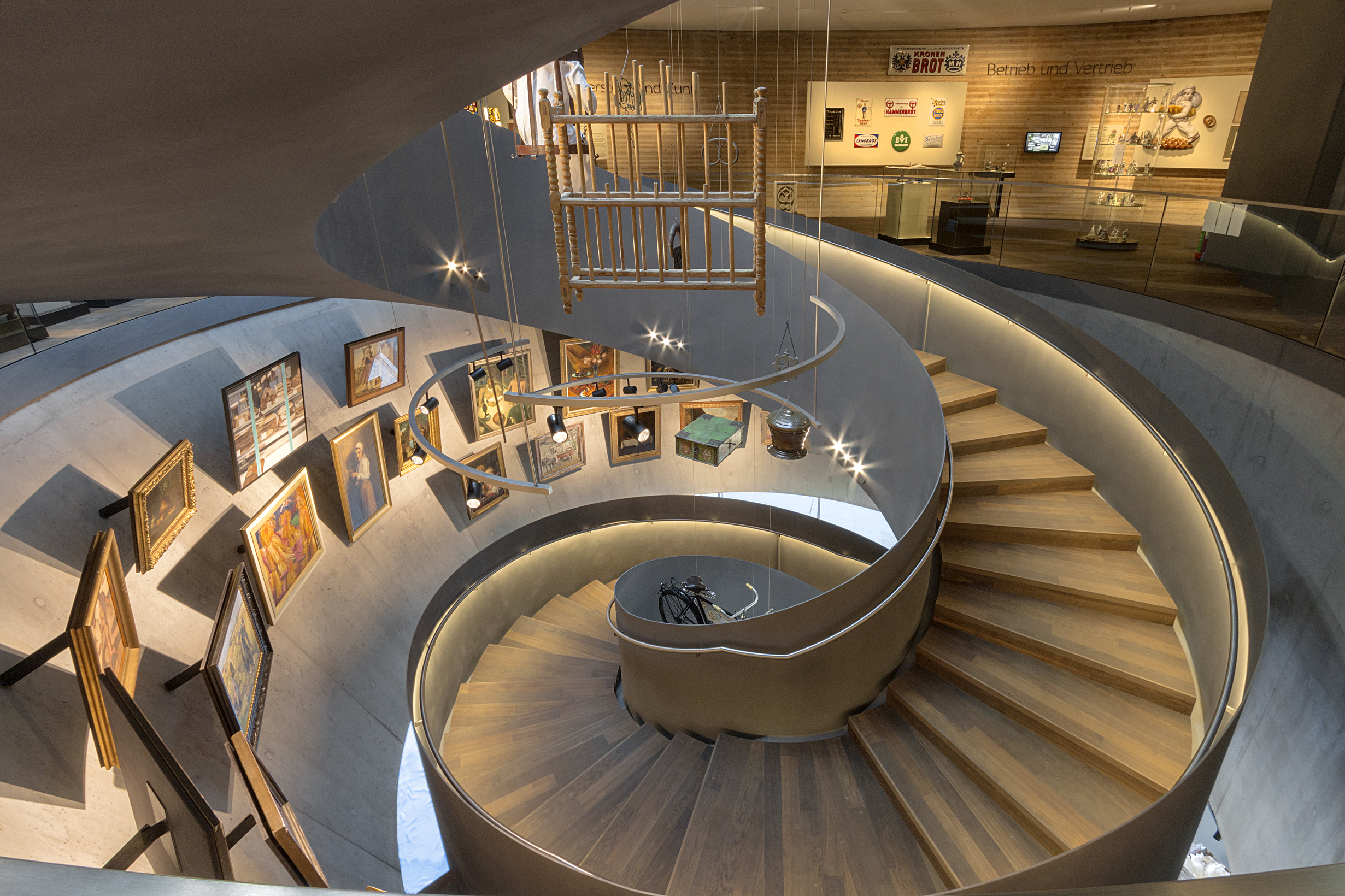
PANEUM – Wunderkammer des Brotes by COOP HIMMELB(L)AU, Asten, Austria | Images by Markus Pillhofer
Their experimentations with fluid forms is also evident in the PANEUM – Wunderkammer des Brotes in Asten, Auntria. This building is made up of a rectangular concrete base with a free-form exhibition area on top. This curved mass is covered in stainless steel shingles, creating a modern interpretation of a traditional roof. Its wooden shell is visible when walking through the cabinet of curiosities-inspired gallery inside. The two levels of the gallery are connected by a free-standing spiral staircase that allows for better views of the exhibits.
Evolution through experimentation and coincident are both a big part of the team’s design process. Prix compares the team to a football team. “Everyone has to play a certain role and everyone knows that he or she must be flexible,” he explains. “And then we can try to achieve passes which provokes new ideas by discussion.”
The team’s process of designing is constantly evolving with the innovation in technology available. Having achieved great results with parametric design, the firm is now exploring the realm of AI as well. “We try to achieve a complex way of thinking, which is our brain is not trained for. So, we use all tools we can use in order to get the complexity visible in our buildings.”
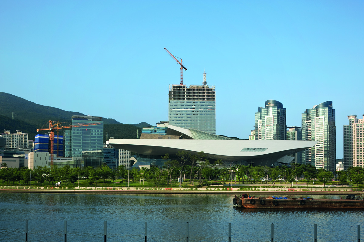
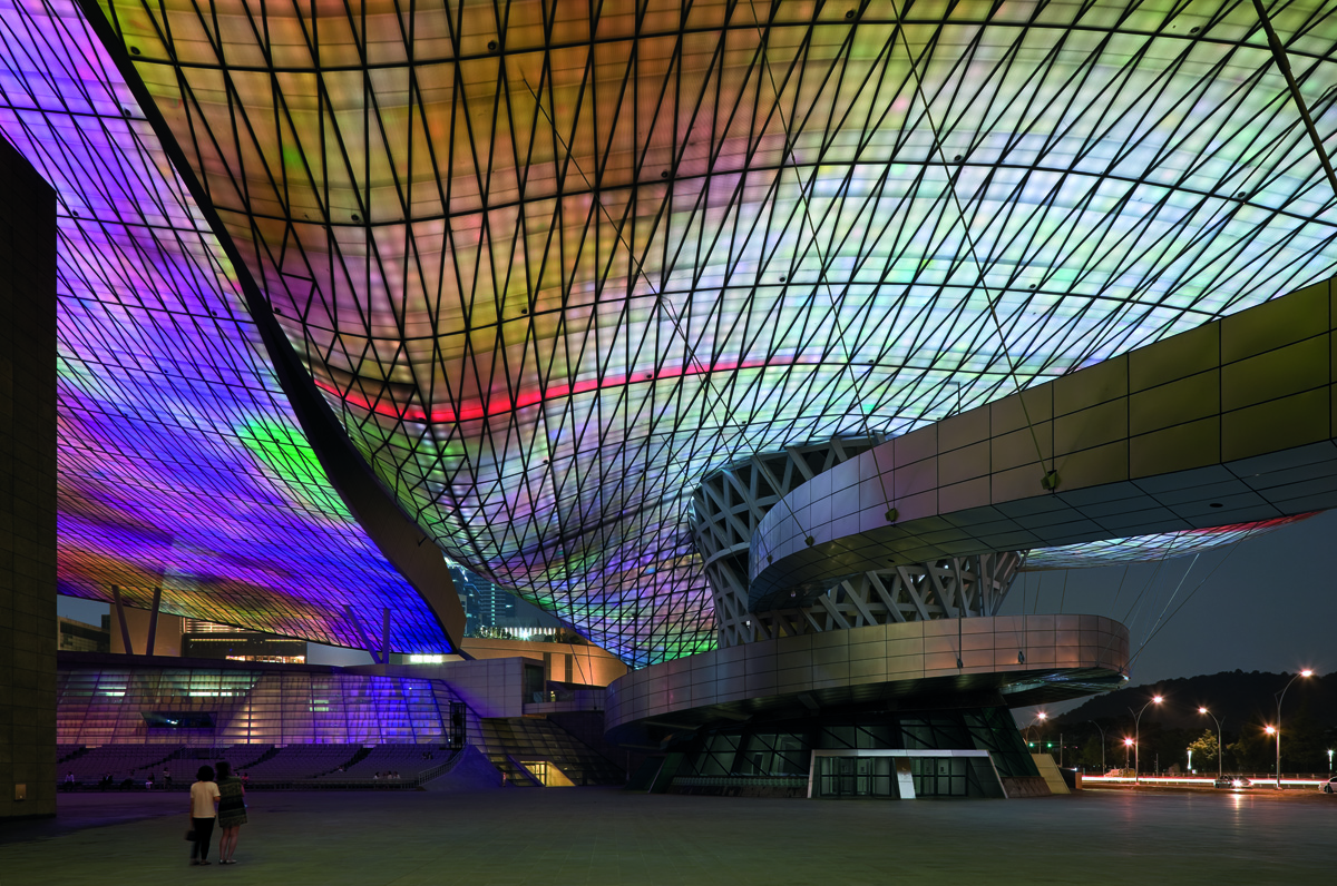
Busan Cinema Center / Pusan International Film Festival by COOP HIMMELB(L)AU, Busan, South Korea
For Prix, the central question is never if something can be built or not; it is always about how it can be built. He said that their goal is to break regular shapes to create a new kind of perspective, while technology is not seen as method of creating design but rather as a means of making it easier to actualize. To better control the design, digital models are translated to physical working models to get a better understanding of the experience of spaces that are created at different points in the overall design. This often results in the back and forth process of adjusting both the physical and digital models till they achieve the desired result.
When thinking of challenging feats of architecture, the Busan Cinema Center is one of the few structures that come to mind. The cultural center boasts a large 280-foot column-free cantilever. The entire roof is supported by a single conical column and is covered with multicolored LED lights. The structure contains a theatre, multiple cinemas, office spaces, studios and outdoor spaces. The overall form is punctured by several blocks and connectors that house different programs.
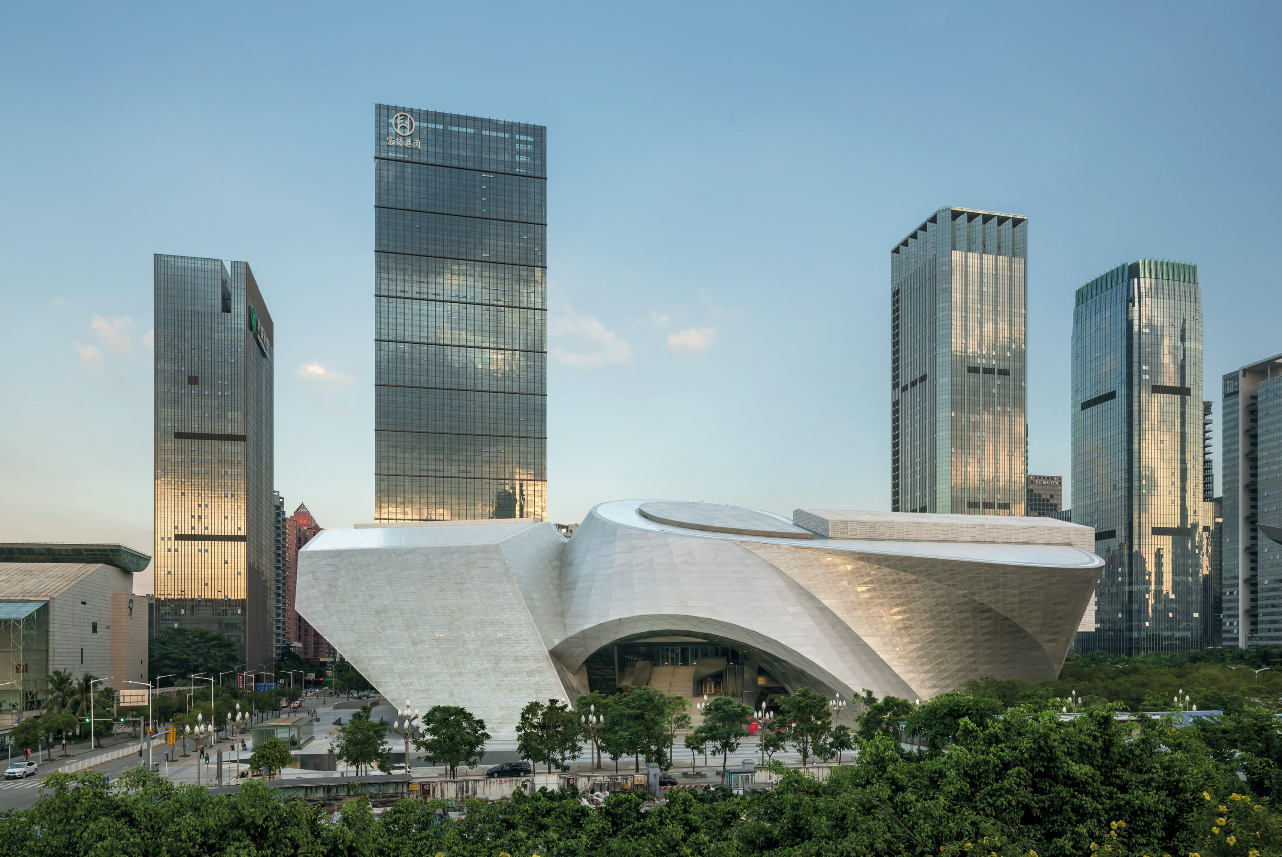
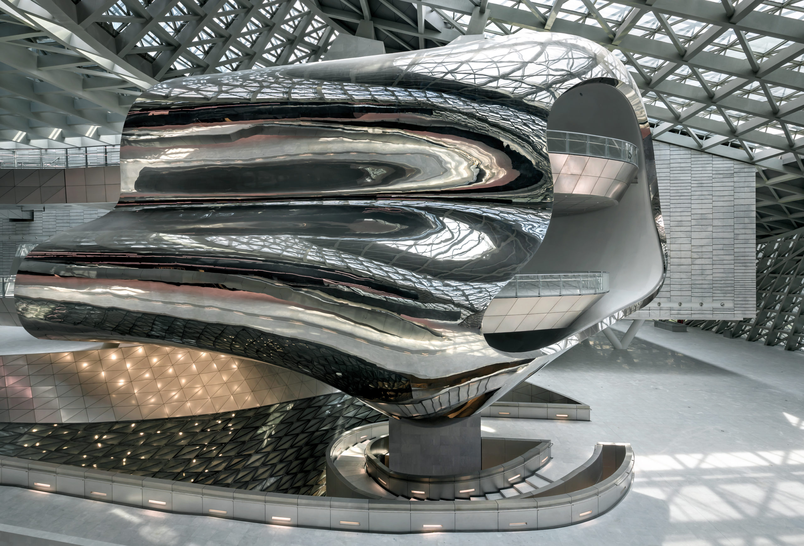
Museum of Contemporary Art & Planning Exhibition (MOCAPE) by COOP HIMMELB(L)AU, Shenzhen, China | Images by Duccio Malagamba Fotografía de Arquitectura
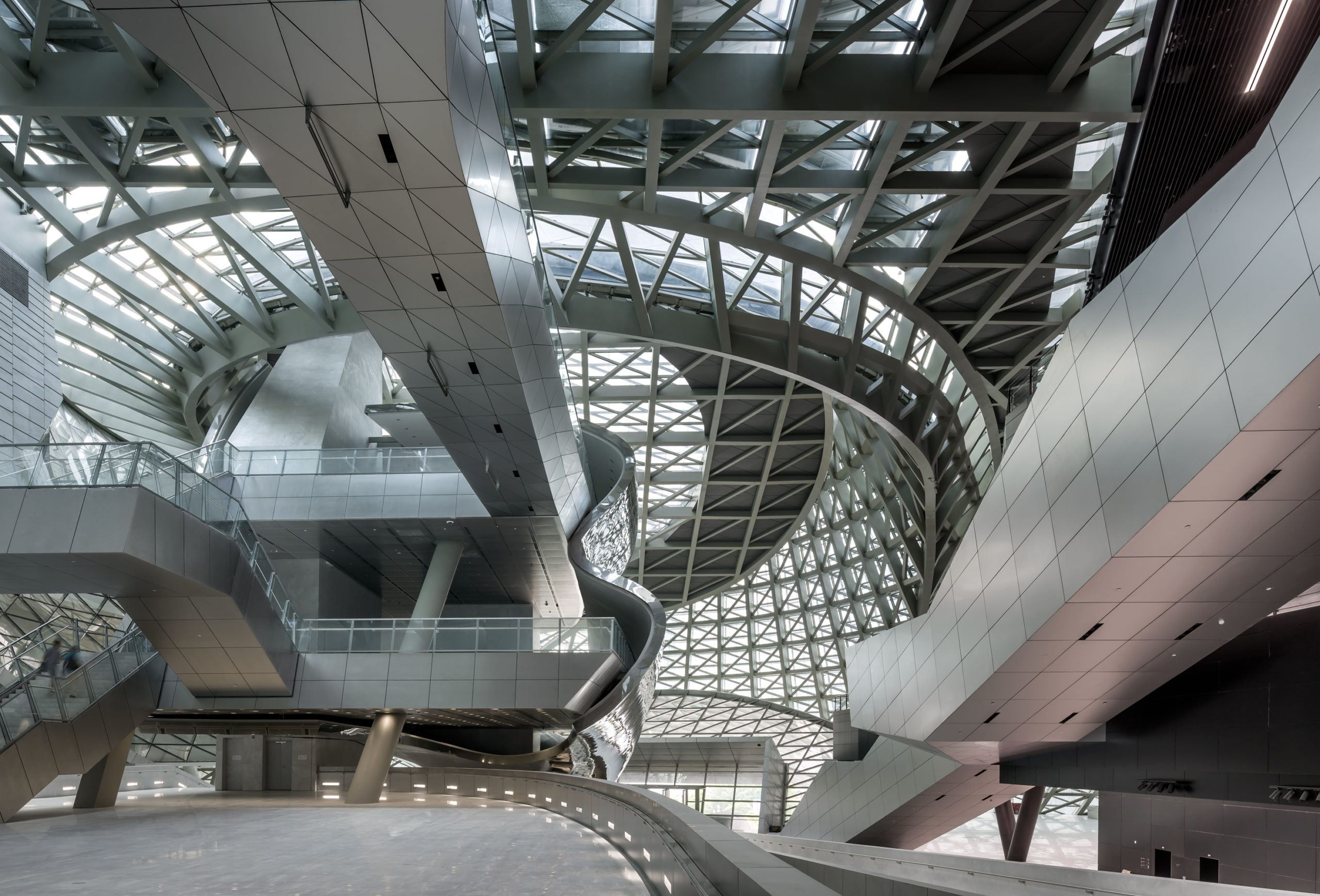
The Museum of Contemporary Art & Planning Exhibition (MOCAPE) also features large column-free exhibition spaces. The monolith appears to be an intersection of polygons and cones made of concrete and glass. The interiors are reminiscent of the mesmerizing works of Italian architect Giovanni Battista Piranesi. Upon entering, the visitors encounter a shaded plaza and then a floating cloud-like mass that hosts different functions like a café, bookstore and museum store on different levels. The combination of reflective and transparent surfaces covering complex shapes gives the whole space a futuristic quality.
“If you want to be an architect, you have to develop a desire for creating space,” he said. “You start with small projects and learn how to put things together in a special way. Then you design an interior space, then a house and then maybe a plaza. Then a school building. And at the very end of your life, a city. That’s a very optimistic way of being an architect.”
The judging process for Architizer's 14th A+Awards is now underway. Subscribe to our Awards Newsletter to receive updates about Public Voting, and stay tuned — winners will be announced later this spring.
 Busan Cinema Center / Pusan International Film Festival
  Museum of Contemporary Art & Planning Exhibition (MOCAPE)
  PANEUM - Wunderkammer des Brotes