The judging process for Architizer's 14th A+Awards is now underway. Subscribe to our Awards Newsletter to receive updates about Public Voting, and stay tuned — winners will be announced later this spring.
Although most people think about open-plan layouts and meeting spaces when they think of office design, one of the most central aspects to designing these business spaces is providing a lobby that makes a lasting impression. It’s not just about where the building stands or how workers use the space, but also how it presents itself. The appearance of the building, particularly the design and atmosphere of its lobby, plays a critical role in shaping the perception of companies within and outside its walls.
The lobby is often the first impression that visitors, clients and potential employees encounter. A well-designed and visually appealing lobby can leave a lasting mark, conveying professionalism, innovation and the commitment to creating an inviting workspace. The lobby’s visibility from the street enhances this impact, as it serves as a showcase of the company’s identity and values. As city centers adapt and transform in the wake of the pandemic, there’s a fascinating opportunity to reimagine existing assets, tailoring them to fit seamlessly into the unique urban tapestry of their surroundings.
The Lobby as a Canvas for Company Values
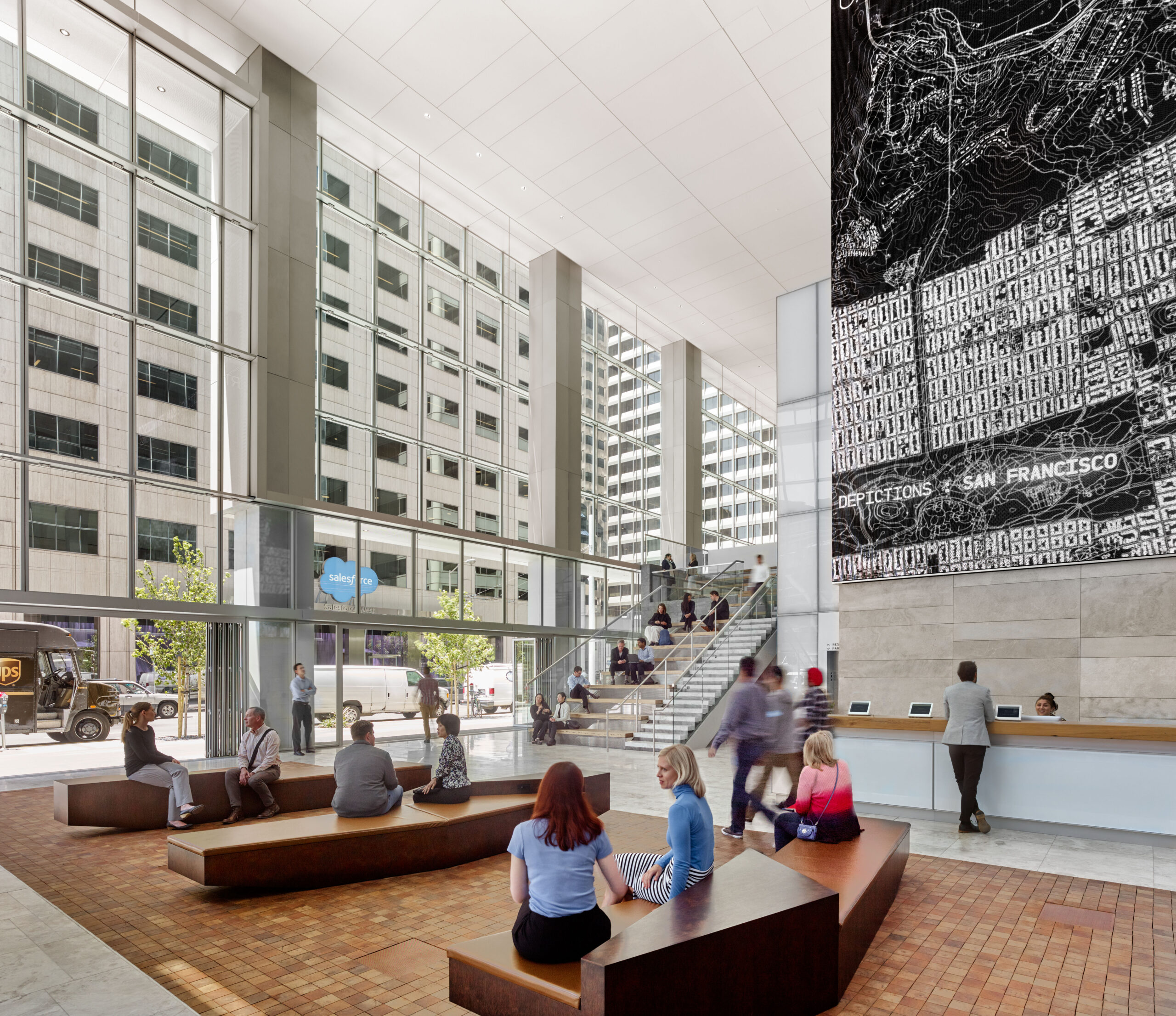
350 Mission by Skidmore, Owings & Merrill (SOM), San Francisco, California | Photo by Cesar Rubio
For decades, museum-like lobbies have been a beacon of building identity and prestige. Nowadays, they are not enough when office owners face challenges such as retaining tenants at a time when remote and hybrid work has taken hold. A fresh perspective on office lobby and reception areas emerged before the pandemic disrupted the office landscape. However, the global health crisis served as a catalyst, compelling the industry to reevaluate the multifaceted roles a lobby could fulfill within the office property realm.
For a long time, office building owners have exhibited their art collections as a “kind of cultural arms race with other corporations.” This way of enriching lobbies is not necessarily because of their association with the art world, but to inspire and impress visitors and employees. But somehow, this impressive exhibition of art, which comes to symbolize company values, ends up giving lobbies an air of exclusiveness, sometimes cold and austere.
Repositioning: Experimenting with Lobby Design for Activation
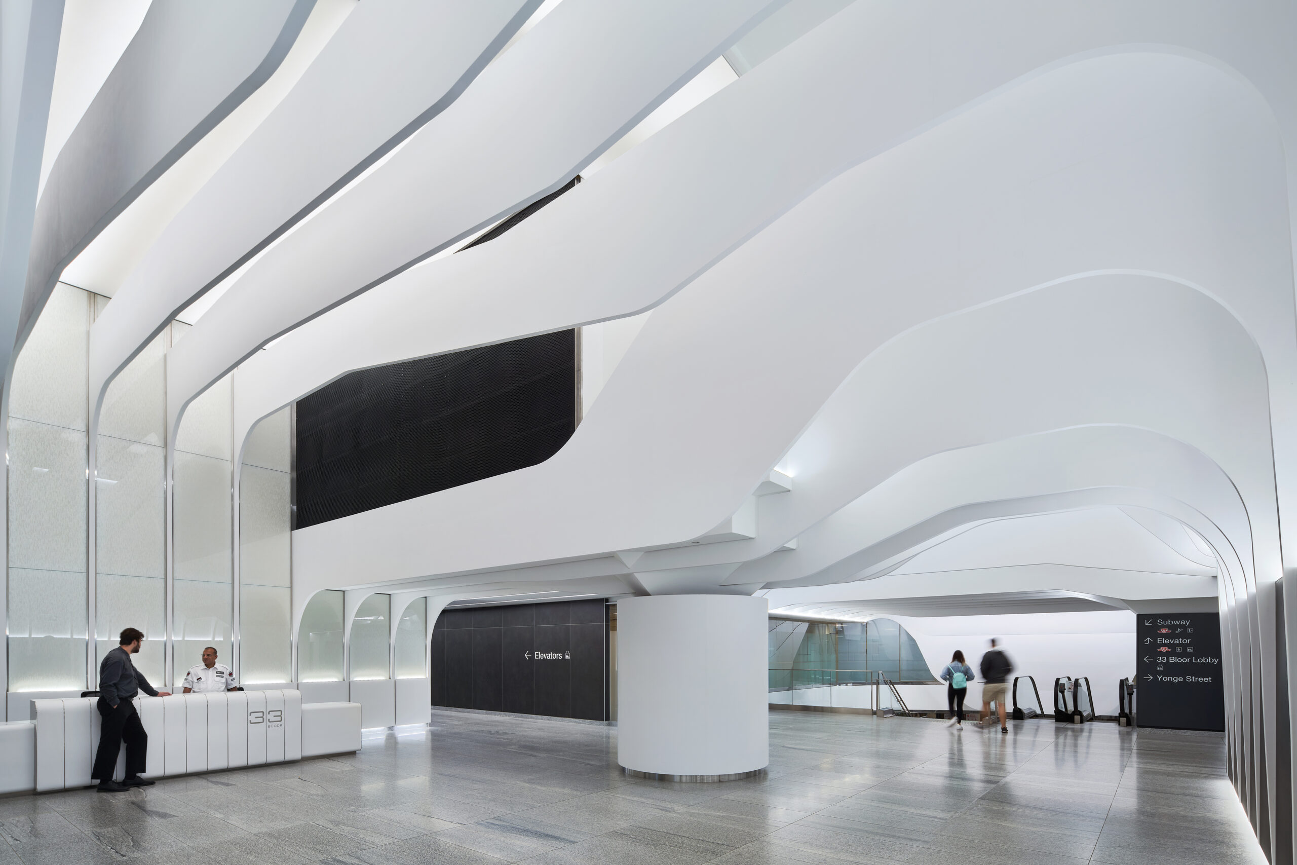
33 Bloor East by WZMH Architects, Toronto, Canada | Photo by Michael Muraz
The office lobby is transitioning from an impermeable boundary separating private and public areas to a more porous space connected to the street and the community. The examples below illustrate a design evolution that takes into account office building tenants, potential renters and the surrounding urban fabric. In essence, the office building lobby is evolving from being a prototypical, unchanging space to becoming more tailored to the unique characteristics of its location.
Amidst the difficulties of leasing space in a competitive office market and enticing employees to return to the workplace, office property owners have felt the pressure to enhance amenities. Looking at creating an experience that will intrigue and encourage workers to come back to the office, lobbies are the focus of their repositioning plan.
Repositioning is an approach that holds immense appeal for office building owners and developers, whether they aim to retain current tenants, attract new ones or explore fresh uses for their spaces. Potential considerations may involve reaching a broader audience, updating its design and infrastructure, and finding new uses for underutilized areas.
Adding amenities to the lobby — a coffee kiosk, a co-working space, or a lounge area, for example — not only creates a more inviting atmosphere but also serves as an additional revenue source.
Flexible Urban Living Rooms: Opening the Lobby to the Street Fabric and Activity
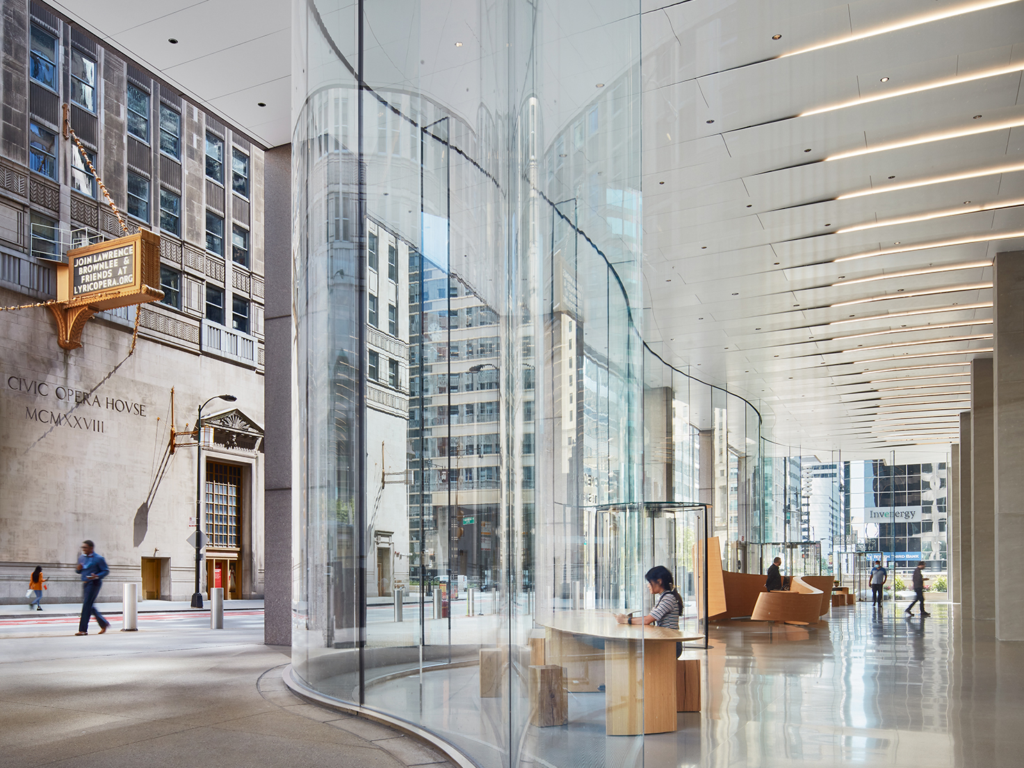
CME Center by Krueck Sexton Partners, Chicago, Illinois
Lobbies were not designed for people spending time. They have been spaces with sparse seating, greeting people in and out. The new trend in lobby design shifts away from a scheme of underused spaces and favors a more engaging and multifunctional setting. Many office owners and developers are now pushing the boundaries of lobby design and activation, seeking innovative ways to make a memorable impression and stand out in a changing urban landscape.
In Chicago’s bustling business district, the CME Center lobby has undergone a comprehensive transformation, catering to the demand for inviting urban spaces appealing to young professionals for work and social interaction. Through innovative lighting design, curved glass panels, and a white solid-surface interior, the lobby creates an engaging street-level environment that blurs the line between indoors and outdoors, forming a unified urban living room. Integrated lighting and ventilation within the ceiling create a sense of scale and structure while offering intuitive navigation. The minimalist material palette allows users to activate the space, successfully converting the outdated lobby into a flexible urban living room, ensuring high tenant retention and 95% occupancy even during the pandemic.
The Lobby as a Multipurpose Destination: Balancing the Private and Public realms
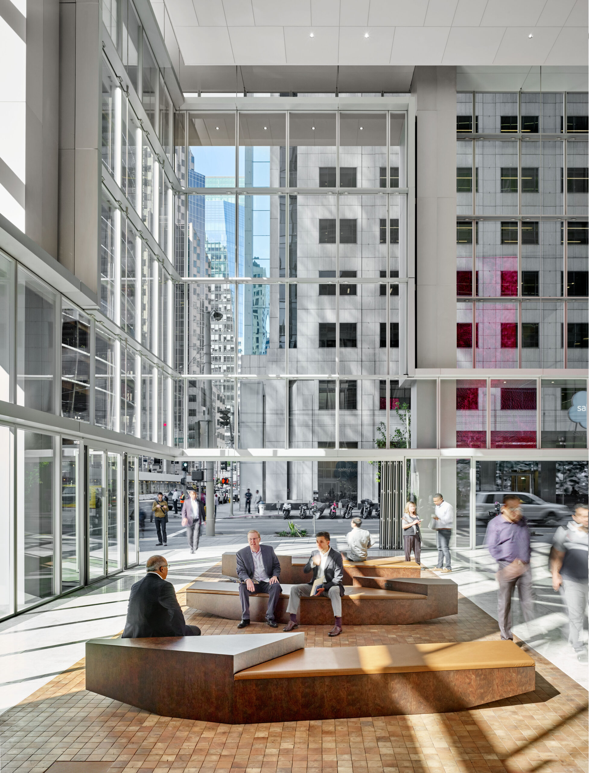
350 Mission by Skidmore, Owings & Merrill (SOM), San Francisco, California | Photo by Cesar Rubio
This strategic approach can enhance functionality and aesthetics to align with the evolving urban and environmental dynamics. As owners rethink their lobbies to serve more purposes, there is a growing trend toward creating “porous” areas. In this regard, the lobby becomes an area where the general public can walk into and sit in the lounge, purchase food or beverages, or conduct an informal meeting, an area that falls between the public and private domain. Balancing public and private space in lobby areas is something many office building owners are thinking about. This idea translates into the lobby as a destination.
350 Mission is a cutting-edge 30-story office building in San Francisco’s Financial District. Its remarkable fifty-foot-high street-level living room that actively engages with the surrounding urban environment defies traditional corporate office design while contributing to the evolving downtown street life. The project blurs the lines between public and private spaces, incorporating communal open areas and a lobby with amphitheater seating. A dynamic digital media wall encourages pedestrians to interact with the vibrant urban living room. 350 Mission’s innovative architectural approach not only welcomes the public into the building but also offers private amenities to enhance the public realm, setting a new benchmark for Class-A office buildings.
Office Building Lobbies as Transit Hubs
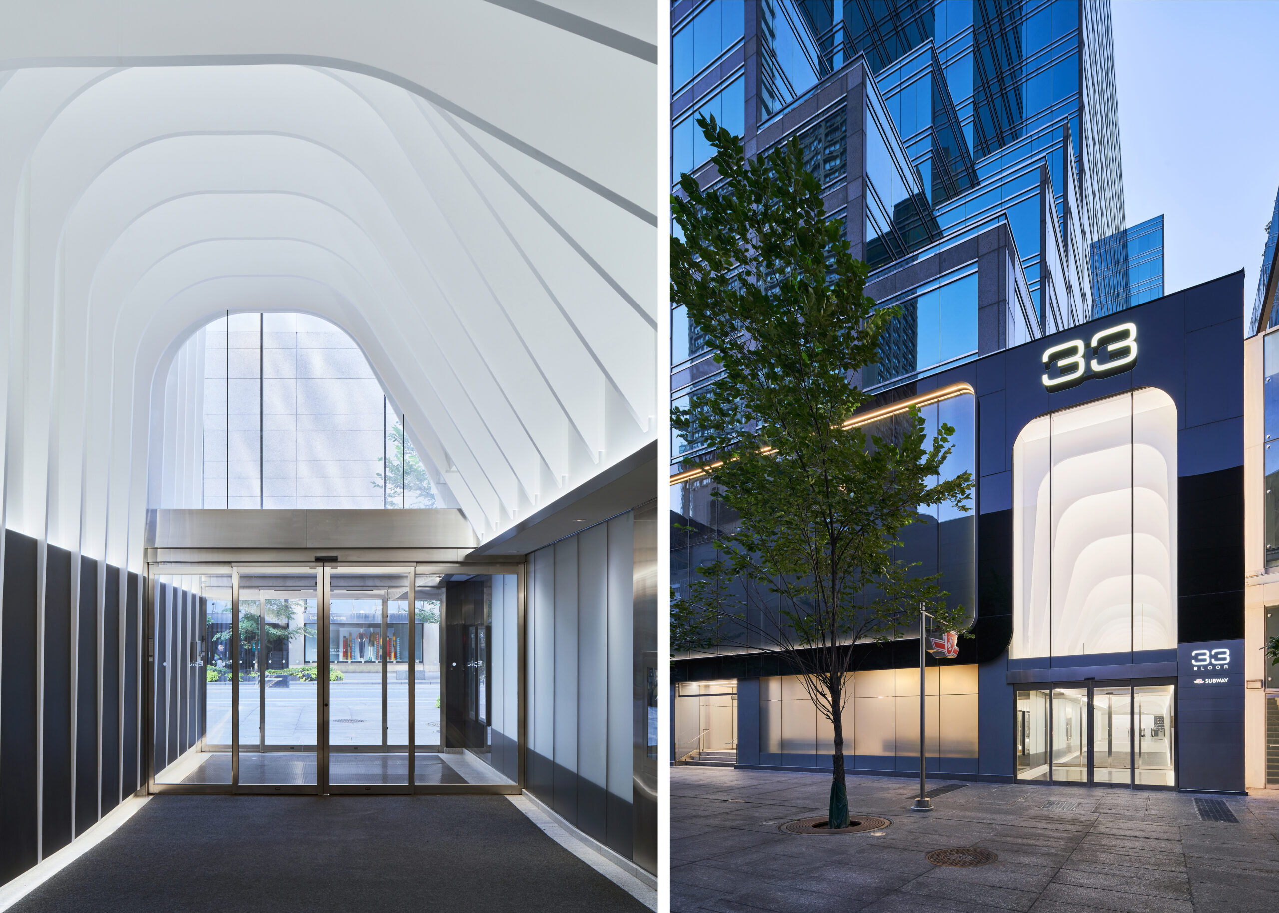
33 Bloor East by WZMH Architects, Toronto, Canada | Photo by Michael Muraz
Some office building lobby repositioning projects have successfully integrated seamless access to public transit systems. These forward-thinking designs acknowledge that the modern workforce values convenience and connectivity. By incorporating transit access directly within the office building lobby, they highlight the significance of seamless transportation in the daily lives of employees and visitors. Moreover, the integration of public transit access into office building lobbies exemplifies a commitment to a more efficient, user-friendly, and interconnected urban future.
The project is a redesign of the ground floor of a seventeen-story office building located at 33 Bloor Street East in Toronto, a bustling area near a major subway interchange. The goal was to enhance the public transit experience and alleviate congestion. This involved creating a striking southern entrance with organically shaped ceiling arches that guide pedestrians from multiple streets to the subway entrance. The arches also serve as a natural wayfinding system and feature LED lighting for added visual appeal.
Enhancing the Lobby’s Function as a Stimulating Setting for Collaborative Work and Social Interaction
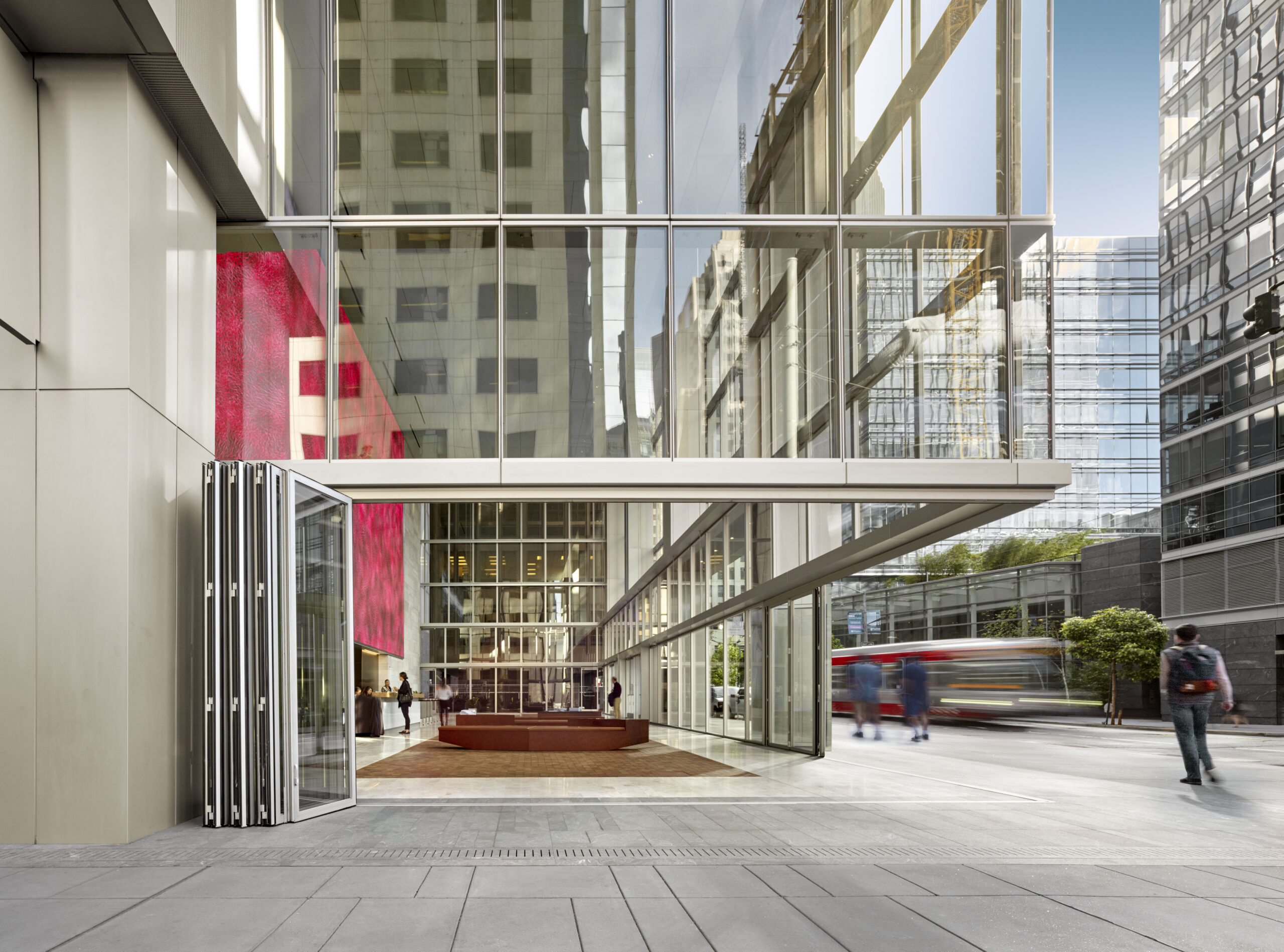
350 Mission by Skidmore, Owings & Merrill (SOM), San Francisco, California | Photo by Cesar Rubio
The evolving trend in lobby design responds thoughtfully to the dual role of lobbies, catering not only to their functionality within office buildings but also to their potential to engage and enrich the surrounding community. The goal is to create lobbies that are inviting and stimulating, moving away from a strictly “security gate” feel. This doesn’t mean sacrificing security. It’s about handling security differently. Turnstile check-in points, for instance, are now often placed discreetly to the side.
To fulfill the aspiration of crafting welcoming and comfortable lobby settings, office building owners engage in partnerships with architects and designers to maximize the potential of their lobbies. Temporary food and beverage stalls add convenience for building occupants and ensure that the space retains a fresh and appealing atmosphere. Restaurants or bars transform lobbies from mere passageways into vibrant destinations, while ample seating encourages collaborative work and fosters social interaction. Moreover, meeting in neutral, non-office settings is conducive to building business relationships. As they say, “The best deals are made on the golf course.”
The judging process for Architizer's 14th A+Awards is now underway. Subscribe to our Awards Newsletter to receive updates about Public Voting, and stay tuned — winners will be announced later this spring.
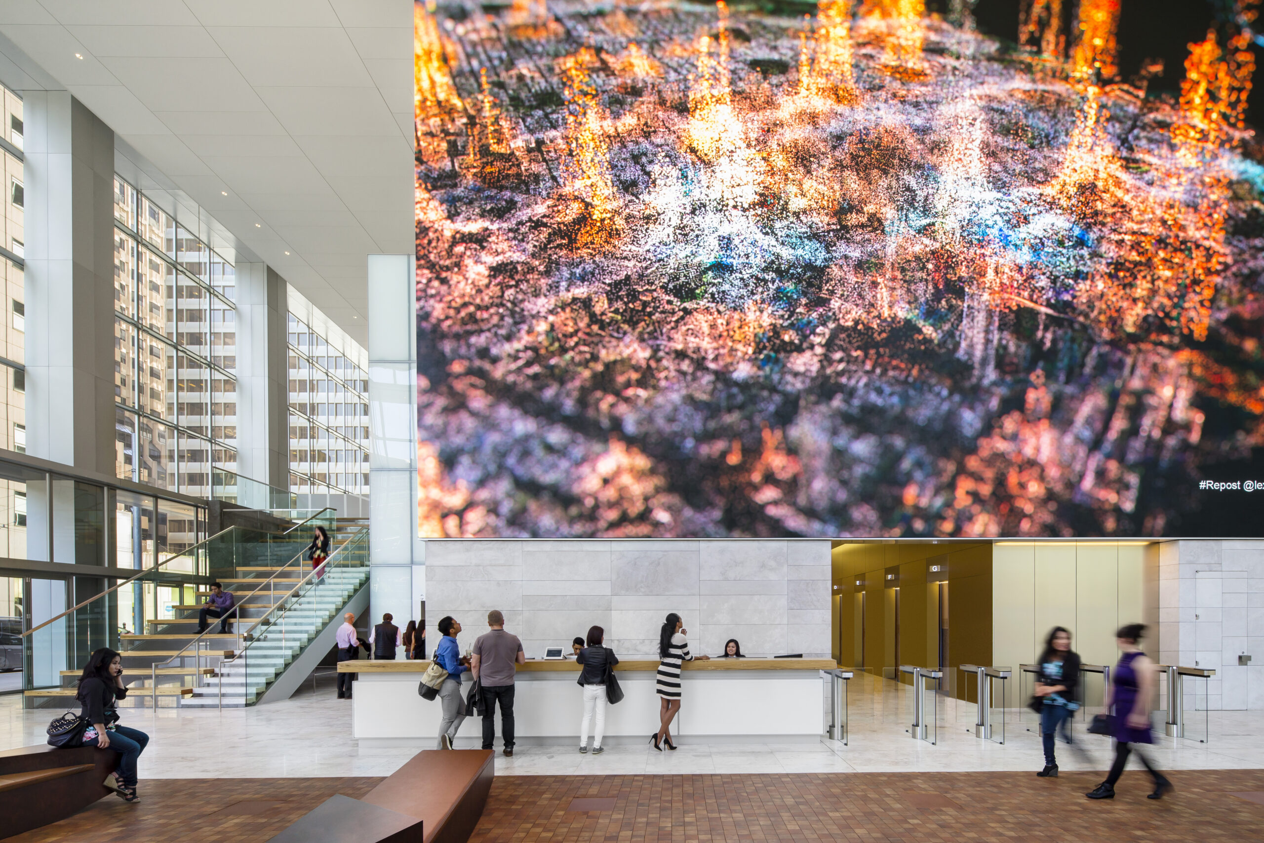
 350 Mission