Winner of both of the Jury and Popular Choice awards in the Architecture + Engineering category and the Special Honoree Project of the Year Award in the 2019 A+Awards, Heatherwick Studio continues to impress. Following in the footsteps of the stunning Bombay Sapphire Distillery, which won multiple A+ Awards back in 2015, the firm’s Coal Drops Yard project garnered accolades with its unique revitalization of a historic industrial site in central London.
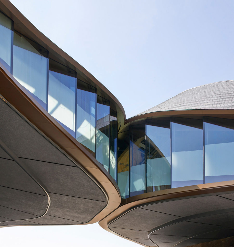
In awe of the development, especially its “kissing” roofs feature, we spoke with project leader Tamsin Green to learn more about the project’s formation.
 Nathaniel Bahadursingh: First of all, congratulations on the award!
Tamsin Green: Thank you. We’re really excited to be a part of these awards. It means a lot when you’ve worked for this long on a project that’s so important.
Coal Drops Yard is an exemplar in blending historic and modern architecture to create something completely new. What key features of this historic site inspired the design?
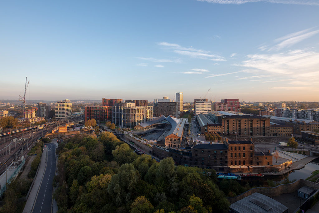
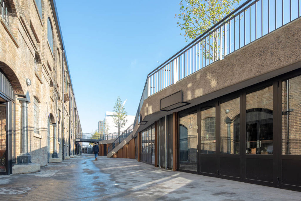
Well, the first thing is, the site is totally unique. It’s two existing Coal Drops buildings that were built to receive and distribute coal. It’s a prime example of this kind of industrial typology, not many of which still exist. The buildings had a really colorful life. They were first used for this industrial Coal Drops process, and then they became warehouses and later nightclubs, which were much loved by London in the ’80s and ’90s.
When we approached the site, we were really thinking about all these different phases, and what we could do to add to the next part of the story for the buildings. Because of their industrial use, the typology had a couple of challenges that we were really aware of from the start. One was the long length of the buildings. The eastern building is 150 meters (492 feet) long and quite far apart from the other side, more than 30 meters (98 feet) apart at their southern end. This gave them a really strong north-south axis, which would encourage through traffic but not really encourage people to stay and linger there.
This large distance between the buildings really challenged us in terms of creating a retail environment — typically you want the dimensions between buildings to be more like 8 meters (26 feet), so people can see from one side of the street to another. In this context, you have to work quite hard to get people to really circulate between the buildings and to create a flow of people. We were responding to these challenges and this story, thinking how we could come up with something that would provide a focus to the site and a kind of heart that pulled everything together. We wanted to focus on the human use of those spaces.
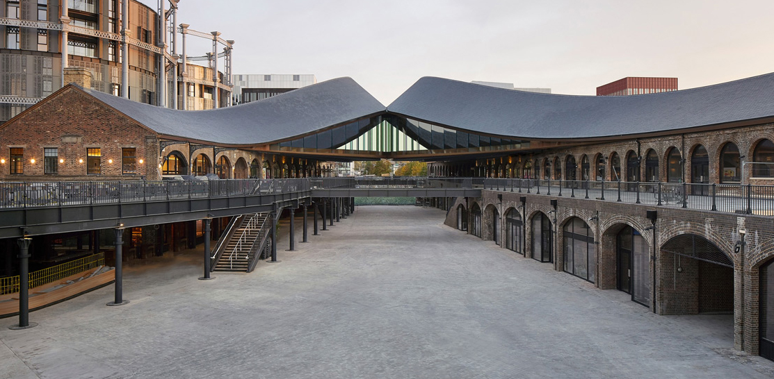
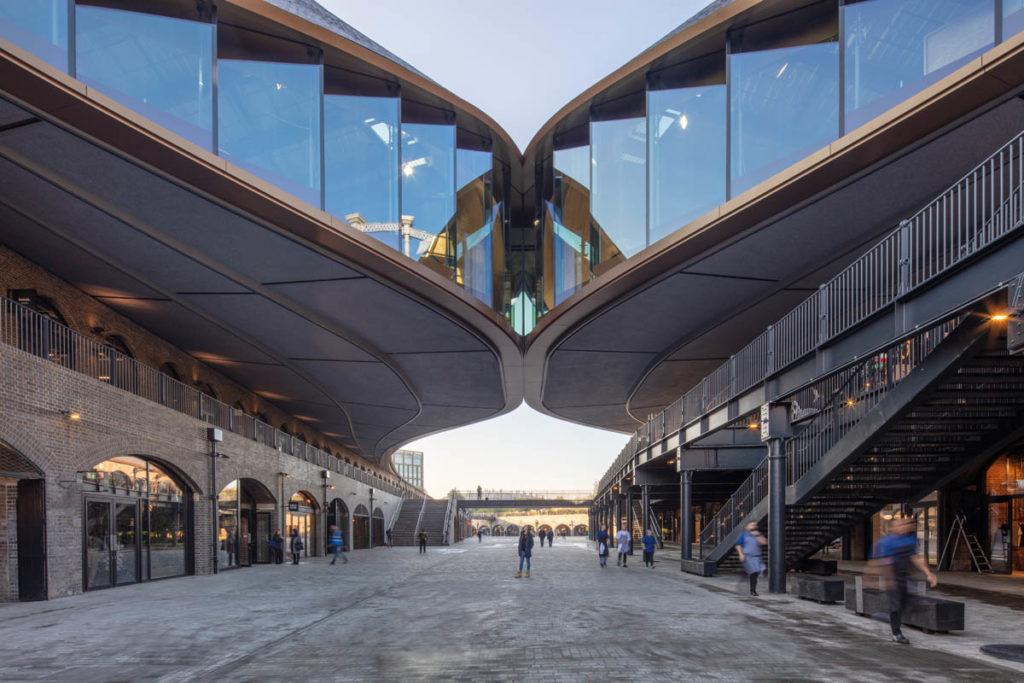 Perhaps the most outstanding feature of the project is the point at which the two roofs rise up to meet each other in a “kiss”. How was this detail conceived and what were the challenges in taking it from concept to reality?
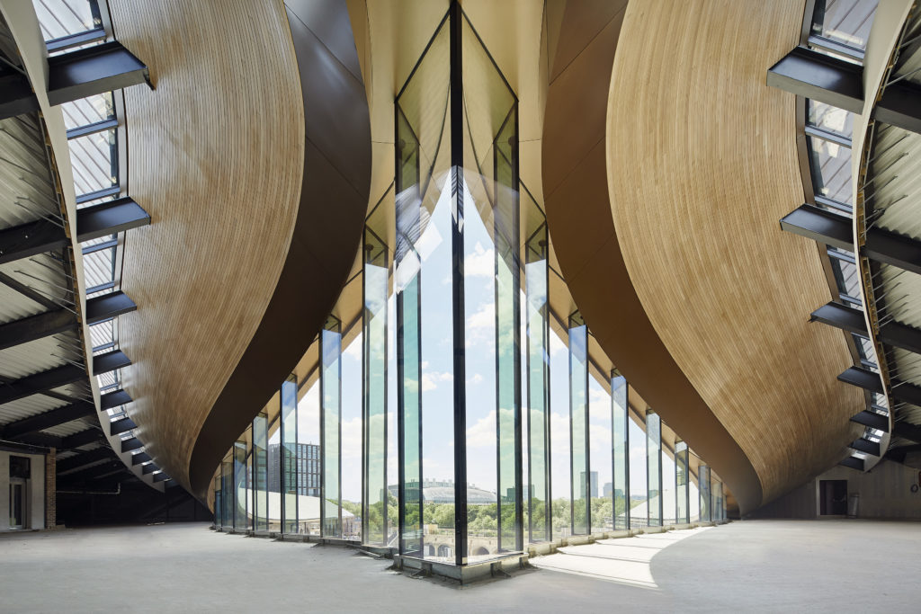
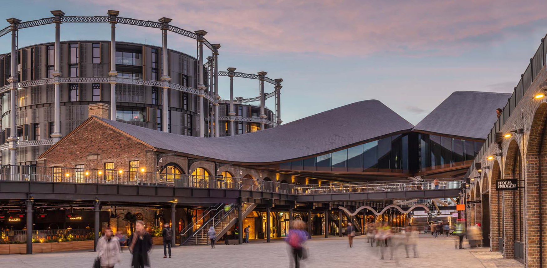
Once we knew what we were trying to create, we settled on working with the long roofscape of the buildings, because we knew that this would need to be removed as part of refurbishment works. We also wanted to keep the views of the buildings’ long elevations, which were really significant. When we were making sketch models at our studio’s workshop, there was this idea of peeling, which created a really interesting way of working with what was there. Rather than imposing a new language on the buildings, we wanted to work with existing elements in order to create this additional level to the site, and to create a roof that would frame the space below.
The idea was that this space in the middle would become something theatrical that worked on many levels. This was part of the reason why we wanted to create this third level on the roof so that you could look up and see people, and also look down and see people. We wanted the space to be highly three dimensional.
The biggest challenge in doing that was that the existing buildings, having been built over 150 years ago, couldn’t take any additional load from the new structure of this roof. So it had to be designed to be completely self-supporting. For that we worked very closely with Arup, who were doing the structural engineering, to design a roof structure that could be supported on a series of new columns.
There are 104 new columns threaded down through the existing building, like stilts which sit on new foundations. On top of that, the roof structure sits, making it completely independent of the existing structure. This involved a huge amount of coordination and site surveys to understand where the existing buildings were out of tolerance.
Kissing Roofs
This isn’t the first A+ Award winning project you have. Bombay Sapphire Distillery won multiple A+ Awards back in 2015, which also relates to England’s industrial heritage. Were there lessons learned during that project that you applied to Coal Drops Yard?
Yes. Similar to the Bombay Sapphire project, our design for Coal Drops worked to restore as much of a heritage site as possible and to open up the site for people to use and enjoy. I think both of these sites have been adapted and added to over time.
Much of our work in deciding how to adapt them was to create a coherence and legibility to the existing buildings that could change them for their new uses and also secure their long term future. At Bombay Sapphire, we widened the existing river that ran through the site and removed a lot of the modern buildings that have been added over time, which had confused the existing spaces and made it more difficult for people to flow and circulate through them.
At Coal Drops, when we first visited the site back in 2014, there were some additional viaduct structures which ran through the site and some modern additions to the buildings. We felt that removing those elements could enable the buildings to be better enjoyed for their new youth, whilst maintaining what was significant about the sites.
 Were there any features of the project that weren’t realized, or that had to be radically altered during the design and construction process?
Yes — in fact, the whole idea of the project wasn’t our original idea. Our original idea that we had for the scheme was challenged when we first met with the local planning team back in the early days of 2014. The planners at Camden Council challenged us to think again about how we approached the site and how we could specifically maintain the identity of the two buildings in how they met and came together. So our original design was working with the roofscape and the idea of this peeling, but it felt like we were blending the two buildings together in the way that we did that.
They really challenged us to keep the identity of two things coming together. This led us down a different path of exploration in terms of how we create that gesture, which led us to the idea of these two buildings meeting and “kissing”.
Roof Interior
What materials and building products would you say are central to the project, and why were they chosen?
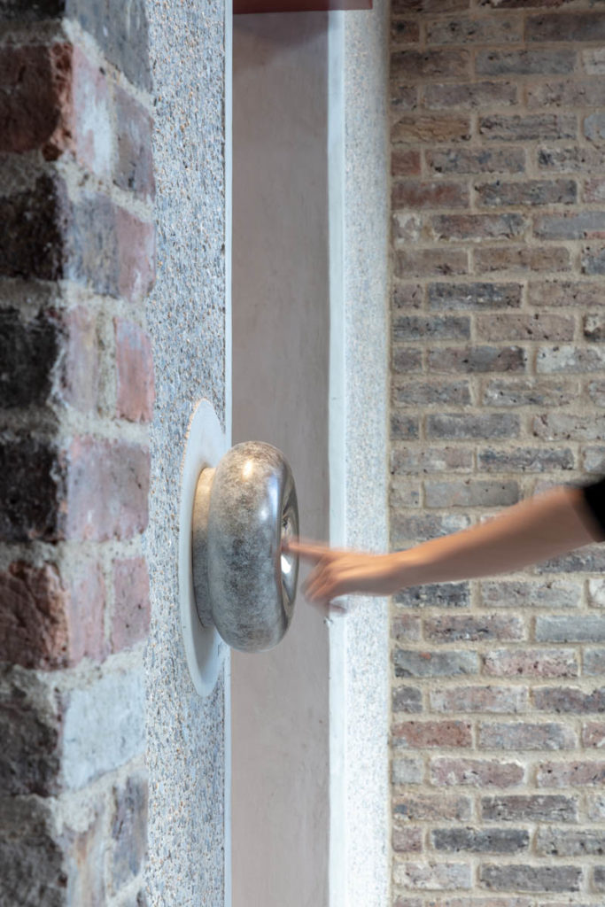
Our approach to materials is to reuse and replace like-for-like wherever possible because of the historic setting. When introducing new elements, we wanted to use high quality new materials that could also age as the existing materials do.
The new roof slate is from Wales, which is from the same quarry as the original roof slate originating back to the Victorian days. The new granite throughout the public realm is the same scale and color palette as the original granite, which unfortunately couldn’t be reused.
We’ve really tried to work with those existing materials, but then to compliment them with new high quality materials where we could.
 What has the public reaction to the project been like?
It was a really interesting project to work on because it’s right in the center of London, but many people weren’t really aware of the site because it had never been publicly accessible. However, during the construction process, the site was very visible. There wasn’t hoarding all around, and part of the adjacent gardens opened up while it was under construction.
So, people were watching it being built and it was interesting that people had the opportunity to really see a part of the city center develop and change. When it opened, people seemed to feel like they had been part of the journey of it developing and the area changing.
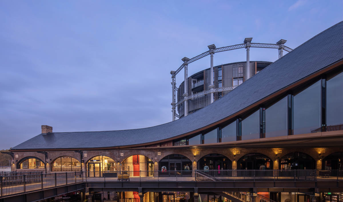
Image © Luke Hayes
The project has been very popular on social media and Instagram. People seem to have discovered a lot of the smaller details that were very important to us in terms of the human scale. It’s still very new, so time will tell.
What does winning an A+ Awards Building of the Year mean to you?
The success of Coal Drops is amazing for the studio. It’s an incredibly important project for us, especially because it’s part of our neighborhood in King’s Cross. It’s where our studio is based and has been for a long time, so we’re very invested in the local environment. I think winning a Popular Choice award is a great feeling, and it’s a testament to how people have perceived the project.
Hit the button below to see every A+Award winner and finalist in this year’s incredible competition:
See the 2019 A+Award-Winning Projects
Top image: Coal Drops Yard © FRENER & REIFER
 Bombay Sapphire Distillery
  Coal Drops Yard