Architizer's 14th A+Awards judging is live! Subscribe to our Awards Newsletter for updates on Public Voting and the big winner reveal later this spring.
The Museum of Modern Art, one of New York’s most esteemed cultural landmarks, changed its look yet again in 2017 — this time with a $450 million renovation and expansion by Diller Scofidio + Renfro in collaboration with Gensler. Phase 1 of the major multiyear expansion included a new east end of the museum that features new gallery space, a resurrected and extended Bauhaus staircase, a remodeled café as well as alternative retail space and lounge areas overlooking MoMA’s Philip Johnson–designed sculpture garden.
The two-stage project began in February 2016 and includes this east wing renovation as well as the two-year construction of the museum’s new west side, a project meant to increase MoMA’s gallery space by 30 percent to a total of 175,000 square feet.
Since its most recent redesign in 2004 by Japanese architect Yoshio Taniguchi, MoMA has been dubbed too congested and too confusing to navigate. DS+R was brought on to increase flow throughout the museum. Phase 1 of the project reconfigured 15,000 square feet of existing space in the Ronald S and Jo Carole Lauder Building into two loft-like third-floor galleries that will house collections and special exhibitions dedicated to architecture and design.
The historic Bauhaus staircase — perhaps the most striking structure featured in the first stage of the renovation — was extended with new steps made with small slabs of Grand Antique marble from the Arege region in France. The staircase seemingly floats from one level to the next supported by a thin metal foundation and glass railing that cuts into the marble at a sloped angle.

The staircase critically enhances access to the second-floor galleries and the new first-floor lounge facing the sculpture garden. It will also serve as the museum’s entrance during phase 2 of construction.
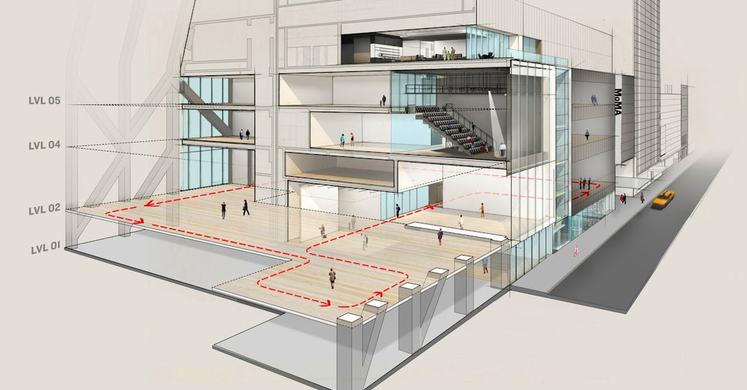
For the new west section, DS+R will create a stack of flexible galleries of varying height, allowing room for different types of exhibitions as well as new media, performance and film. The street-level galleries, featuring a dedicated projects room and a contemporary design space, will be open to the public for free. A sixth-floor lounge with an outdoor terrace will also face the street but include views of activity going on below.

North/south section-perspective through the new gallery spaces at the Museum of Modern Art, looking east along 53rd St. © 2017 Diller Scofidio + Renfro
Galleries on the second, fourth and fifth floors extend through 53W53 — a residential skyscraper with a diagrid structure by Jean Nouvel — and provide an additional 11,500 square feet on each floor.

Elevation of the Museum of Modern Art on 53rd St. with cutaway view below street level. © 2017 Diller Scofidio + Renfro
Phase 2 will also transform MoMA’s main lobby into a light-filled two-story space. This will ease circulation upon entry and link to the new galleries on the east side of the building.
The MoMA Design and Bookstore will also be moved down one level but will still be visible from the street via a glazed façade. This will open up space for the museum’s continual expansion, as well.

Stacked plans highlighting the new and renovated spaces at the Museum of Modern Art. © 2017 Diller Scofidio + Renfro
This isn’t the first time the world-renowned museum has taken on intense structural changes. The built world of MoMA as we know it today has gone through a handful of iterations since its inception in 1928, including the complete contemporary redesign by Taniguchi. So why, in the nearly 90 years that MoMA has existed, has it undergone so much construction?

View of the Marlene Hess and James D. Zirin Lounge (left) and view of the second floor looking east with new Museum Store, espresso bar and the Daniel and Jane Och Lounge (right). Photos by Iwan Baan
Like many New York museums right now — think the Whitney Museum and the Smithsonian American Museum of Natural History — it is outgrowing its original architecture and in need of a 21st-century makeover. Since MoMA is set in the heart of Midtown Manhattan where space is minimal and everyone is building upward, creating a more sizable setup is no simple matter. With DS+R’s detailed expansion, however, it seems that the museum might enjoy a second life — or maybe fourth if you count past attempts at change.
Either way, the MoMA we experience today won’t be the MoMA we visit in 2019. According to the architects, it will be spacious, sunny and intrinsically connected with the surrounding urban streetscape thanks to the new Nouvel building and the free street-level galleries.
Architizer's 14th A+Awards judging is live! Subscribe to our Awards Newsletter for updates on Public Voting and the big winner reveal later this spring.
Images courtesy Museum of Modern Art


