Architects and designers worth their salt acknowledge that lighting design — when thoughtfully executed — can greatly enhance their projects, from focal interior walls and temporary installations to massive structures and façades. Perhaps that’s why the annual Lumen Awards, founded by the Illuminating Engineering Society’s New York City chapter (IESNYC) to celebrate excellence in lighting design, has become an increasingly significant awards program in our industry. In fact, a record-breaking number of lighting and design professionals (nearly 900 reportedly) attended the 49th annual Lumen Gala in Manhattan last month to honor 10 projects at three levels. These are:
AWARD OF EXCELLENCE


Photography by Magda Biernat, OTTO
U.S. Air Force Academy – Center for Character & Leadership Development (Colorado Springs)
Lighting designer: Brandston Partnership
Architect: SOM
A soaring 105-foot-tall sloped atrium of sorts — really a glazed structure with an oculus — tops the center’s gathering space to mark the direction to the navigational beacon known as Polaris. Central to its design is a truss system of horizontal plates that act both as shading and reflecting elements. LED floodlights ringing this structure’s base uplight the structure at night as well as reflect light off an array of mirrors to illuminate the spaces below.
Jury comments: “The light is so beautifully transformed in this project that you really feel the power of the architecture and symbolism of each space within. The oculus inside the Honor Board Room is as inspiring as the oculus of the Pantheon.”
AWARDS OF MERIT


Photography by Halkin Mason Photography
SteelStacks Campus (Bethlehem, Pennsylvania)
Lighting designer: L’Observatoire International
Landscape architect: WRT
Redeveloped into a 10-acre arts and cultural campus, this site is now home to performance venues, parks and plazas. But perhaps its most striking resident is the former Bethlehem Steel plant, a complex of factory and furnace structures so striking, it called for an equally dramatic lighting program. L’Observatoire conceived a clever and artistic lighting scheme of saturated colors to highlight the functions of the old factory: At sundown the lights are red; in the second phase, the lights transition to a deeper red; and continuing on, the sequence eventually leads to blue to reference the furnaces being ignited, getting hotter and gradually cooling down. At the end of the hour-long light “show,” which progresses from one end of the complex to the other, the LEDs flicker to create a sparkle effect.
Jury comments: “The lighting designer accomplished a very difficult task: illuminating the existing jumbled forms in a manner that highlights the strength and fire of a bygone era. The careful selection of the warm backdrop visually emphasizes the path of cool circulation and brings warmth and life to the inanimate cold steel-scape.”


Photography by Magda Biernat, OTTO
Squarespace Global Headquarters (New York City)
Lighting designer: Lighting Workshop
Architect: A+I
For this popular designer-website company, a black-and-white backdrop defines areas for two dominant modes of working, black often indicating collaborative or communal space and white signaling heads-down solitary work. To go with this contemporary loft aesthetic, the lighting designer implemented a grid of porcelain sockets with bare lamps that, in the white areas are left exposed and, in the black zones, are recessed. Throughout the day, the entire system dims to warm to mimic natural sunlight. Finally, thousands of apertures in a black sculptural ceiling above the communal area reveal the lit white ceiling above, recalling a starry night sky.
Jury comments: “The lighting design is as solid as the architectural design. I liked how the typical grid of downlights was broken up nicely by linear indirect sources and decorative pendants. The totality of the fresh, simply complex lighting design is very well thought out and consistently used in various ways with recurring themes that tie in and contrast nicely with the architecture and interior design.”


Photography by Jason Schmidt
Saks Fifth Avenue at Brookfield Place (New York City)
Lighting designer: Lighting Workshop
Architects: Found Associates, Sargenti Architects
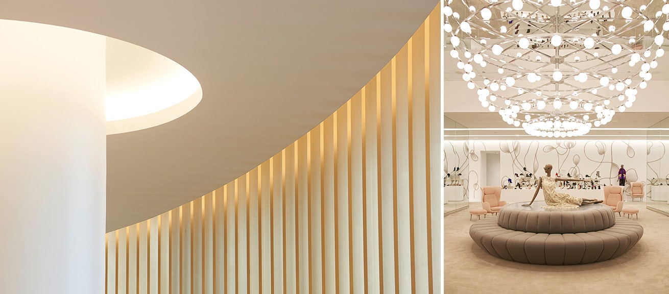
This two-story retail space boasts a clean, sophisticated and airy aesthetic enhanced by lighting that softly washes the architectural forms and surfaces while highlighting luxury product collections. A focal point within the project is a dramatic rotunda delineated by cove lighting and a veil of brass fins that produce a warm glow. And above the shoe salon, a mirrored ceiling reflects an almost infinite pattern of orbs from two 14-foot-diameter hemispherical chandeliers suspended below it.
Jury comments: “There is something sophisticated and elegant about the minimal lighting scheme that works seamlessly with the architectural features. While the large, swooping recessed curves of architectural lighting featured the retail display in a bold expression, the playful decorative pendants sustained the theme without feeling disjointed.”


Photography by Nacasa & Partners
Hyundai Capital Convention Hall (Seoul)
Lighting designer: KGM Architectural Lighting
Architect: Gensler
A multipurpose space that accommodates training, videos, events and presentations requires lighting that’s flexible. So KGM addressed this by conceiving a “shell” that conceals a variety of lighting: adjustable downlights, stage lights, ambient cove lighting and linear wall lights, all of which can be individually controlled for different situations. Also part of this project, an adjacent screening hall was designed as a black box with accent lighting in the bench risers and minimal downlights.
Jury comments: “A fine example of fantastic balance between interior design of materials, architecture of space and simplistic effective lighting to create fascinating tangible and intangible graphics, shapes, reflections and volumes in a physical environment. The futuristic lighting and architectural design made the space feel like a [James] Turrell installation.”
CITATION AWARDS


Photography by Albert Vecerka/ESTO
Manus x Machina: Fashion in the Age of Technology at the Metropolitan Museum of Art (New York City)
Lighting designer: Dot Dash
Architect: OMA


Photography by Peter Aaron
The Met Breuer (New York City)
Lighting designer: SBLD Studio
Architect: Beyer Blinder Belle


Photography by James Ewing, OTTO
Park Avenue Armory Veteran’s Room (New York City)
Lighting designer: Fisher Marantz Stone
Architects: Herzog & de Meuron, PBDW


Photography by Chris Cooper
599 Lexington Avenue (New York City)
Lighting designer: Tillotson Design Associates
Architect: FXFOWLE


Photography by Brian Stacy
1.8 by Janet Echelman at Renwick Gallery, Smithsonian American Art Museum (Washington, D.C.)
Lighting designer: Arup
Artist: Studio Echelman


