Architizer's 14th A+Awards judging is live! Subscribe to our Awards Newsletter for updates on Public Voting and the big winner reveal later this spring.
Since 2000, the Serpentine has been inviting excellent architects from around the world to design the Serpentine Pavilion in Kensington Gardens, London. The temporary pavilion standing from June to October every year has become one of the most exciting annual events for architects and the cultural industry. For this year, the Serpentine commissioned the first non-architect designer, Chicago-based artist Theaster Gates, to perform his creativity with the architectural support of Adjaye Associates.
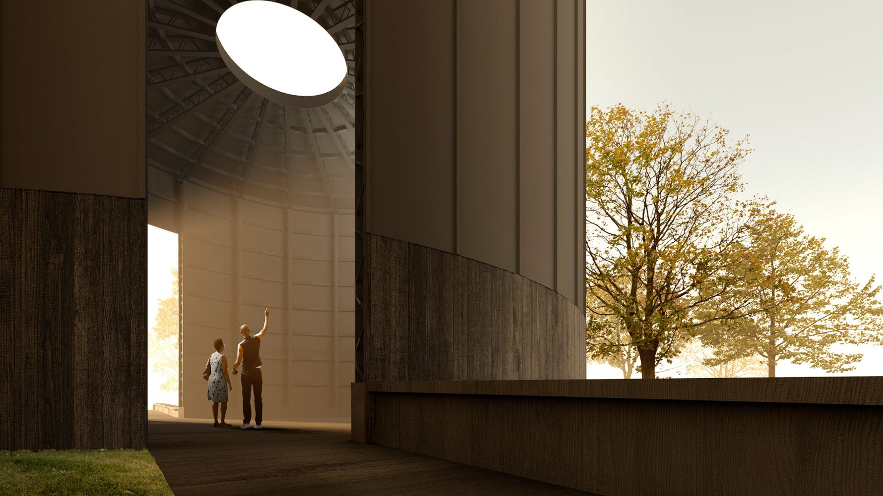
The proposal has been released last week. It is a dark, tall cylindrical timber structure with an oculus on top. Named Black Chapel, the 2022 pavilion aims to provide a sacred space for reflection and conviviality. Will it be an inspiring success that survives London’s weather and regulations or again a compromise between concept and reality? Let’s set judgment aside until four months from now when the structure is unveiled. Until then, we’re casting our eyes into the past and assessing his predecessor’s pavilions.
2012: Herzog & de Meuron and Ai Weiwei
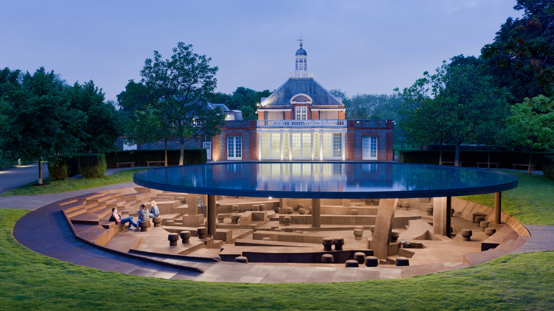
2012 Serpentine Pavilion, © Iwan Baan.
The 2012 pavilion designed by Herzog & de Meuron and the artist Ai Weiwei was a Serpentine Pavilion retrospective itself. The pavilion was half-underground, with the circular roof that collected rainwater being placed at 1.5 meters above ground, a height close to average eye level. Under the roof, 12 columns representing the 2012 pavilion and its 11 precedents stood among terrains reconstructed following the traces of the previous pavilions.
2013: Sou Fujimoto
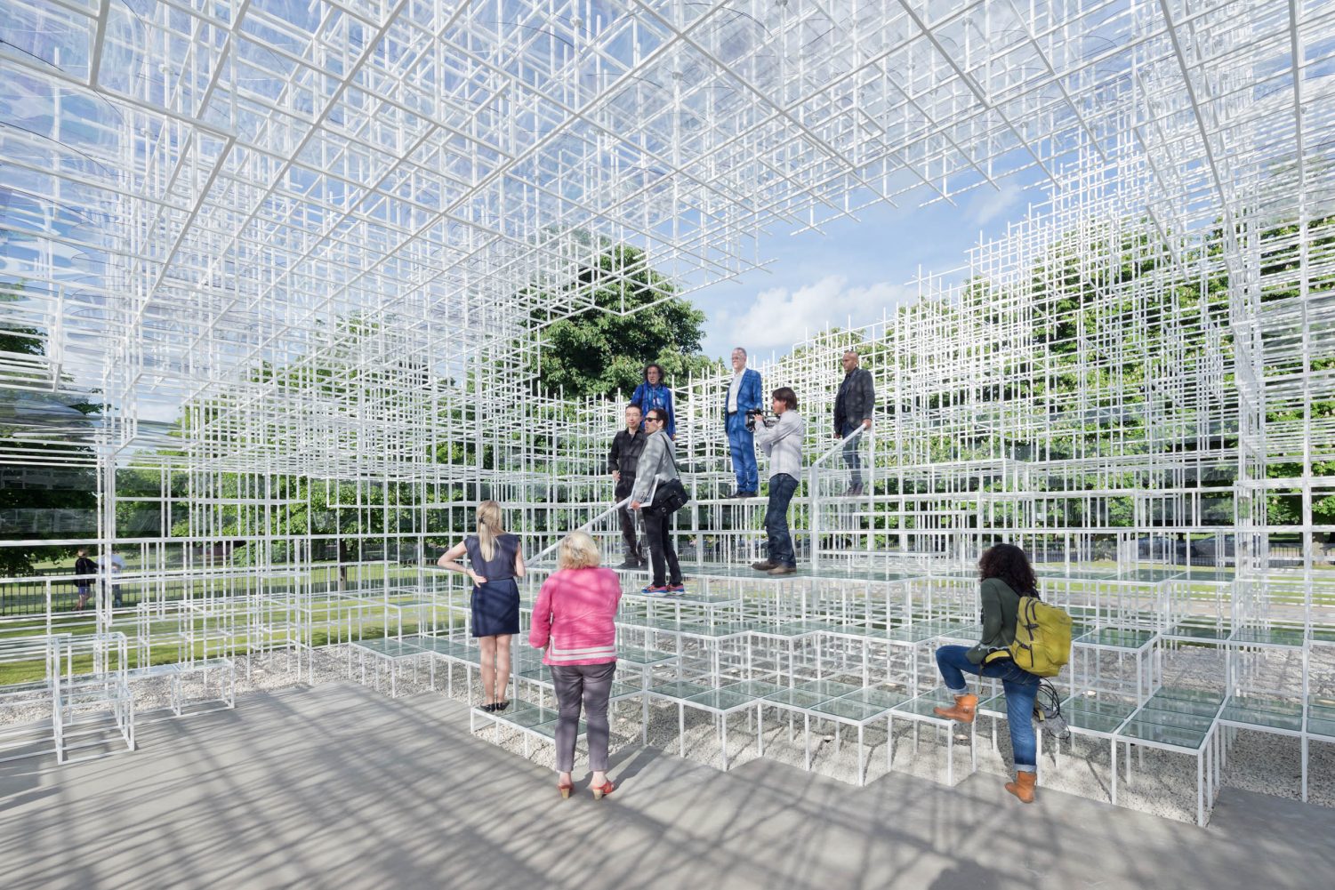
2013 Serpentine Pavilion, © Iwan Baan.
With his 2013 pavilion, Sou Fujimoto continued to explore the relation between architecture and nature, just like his other projects. Countless 20mm steel bars painted in white formed an airy structure whose boundaries were vague, spaces were undefined and free. The form changed as visitors walked around and viewed it from different angles. The structure was solid that people could walk onto it but also translucent that kept the Serpentine Gallery and the surrounding landscapes within sight.
2014: Smiljan Radić
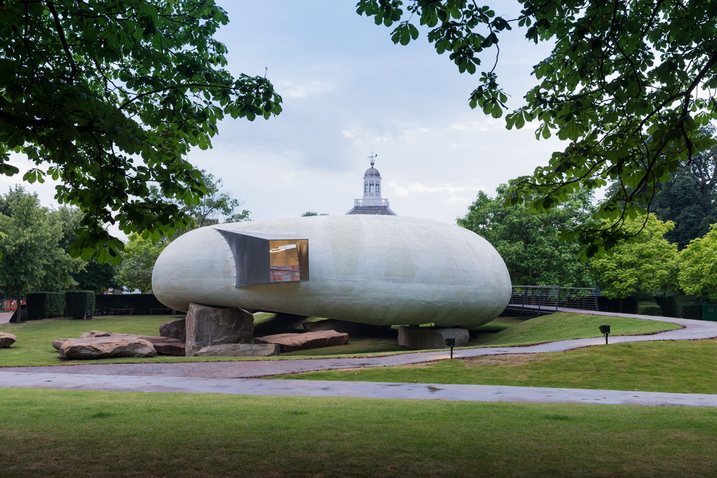
2014 Serpentine Pavilion, © Iwan Baan.
Resembling a huge shell, the 2014 pavilion took the visitors for a short trip to Brobdingnag — the utopian land of the giants in Jonathan Swift’s famous book, Gulliver’s Travels. The pipe structure contained a looping space within it, with four irregular openings introducing the landscape of Kensington Gardens into the pavilion. Constructed from fiberglass, the “shell” appeared solid and milky white from the outside and texturized orange from the inside, as if you were walking in a shell. The massive stones used as supports are made as natural as possible to merge the pavilion with the landscape.
2015: SelgasCano
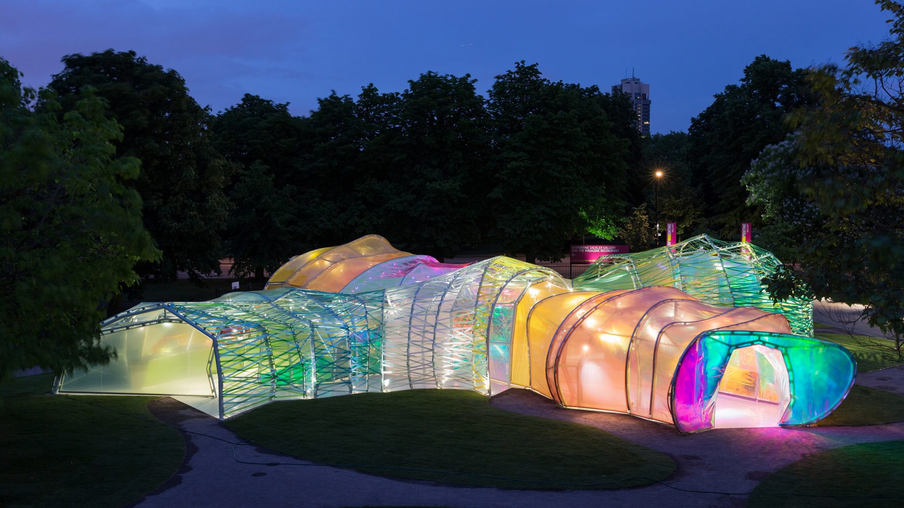
2015 Serpentine Pavilion, © Iwan Baan.
Inspired by London’s underground transport, SelgasCano responded to the 2015 pavilion commission with a group of colorful tunnels fused together. The steel frames that acted as the skeleton of the pavilion was constructed off-site to save more on-site construction time for the ETFE panels and ribbons installation. Supported by the steel frames were a double-skin system of color-diffusing ETFE and colored ribbons that provided a dramatic visual experience. To achieve desired atmospheres, the visual effect from both inside and outside the pavilion were checked constantly throughout the construction.
2016: Bjarke Ingels Group (BIG)
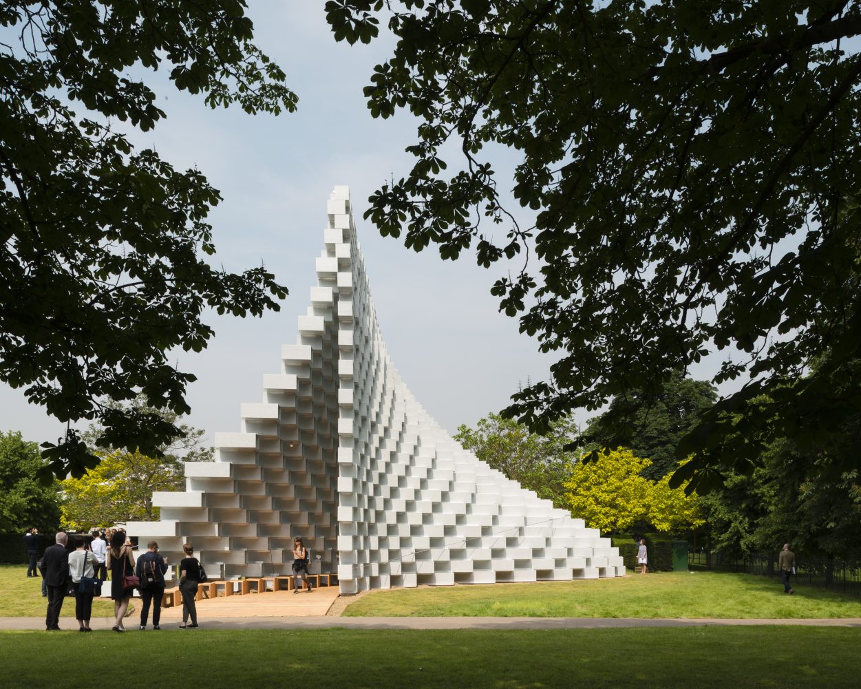
2016 Serpentine Pavilion, © Jim Stephenso.
The 2016 Pavilion by BIG was an “unzipped wall” built from hollowed fiberglass bricks that function both as the main structure and a holistic envelope. The form split downwards into two, leaving a cavity in-between for housing the café and events. The modular structure of white, opaque fiberglass outlined a solid, volumetric form. Meanwhile, from the direction parallel to the serpentine gallery, natural light penetrated through the structure to keep the highly industrialized space connected to its natural surroundings.
2017: Diébédo Francis Kéré
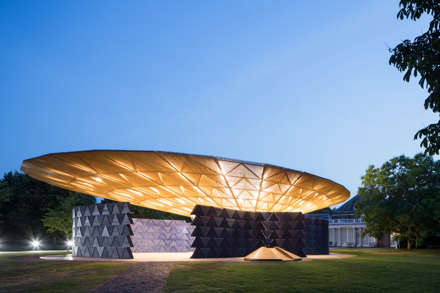
2017 Serpentine Pavilion, © Iwan Baan.
Kéré innovatively combined elements of London and his home town Gando in Burkina Faso to produce a community structure that connected different times and spaces. The large timber canopy was a reinterpreted form of the massive tree at the heart of his home town. Half-enclosed by the walls of Indigo blue, the canopy of the pavilion similarly provided an open-air courtyard where visitors could sit and relax during sunny days. On rainy days, the funnel-like canopy collected rainwater and let them fall freely onto the permeable courtyard floor.
2018: Frida Escobedo
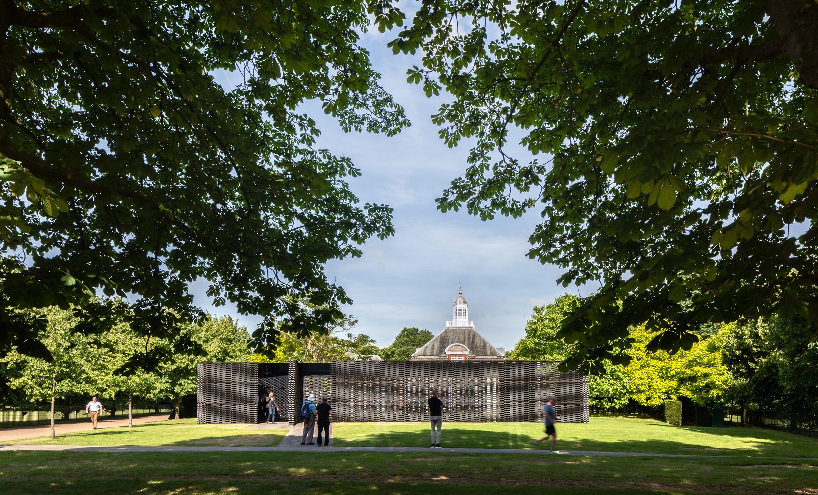
2018 Serpentine Pavilion, © Rafael Gamo.
Using locally produced cement tiles, Frida Escobedo created a sheltered courtyard for reflection and encounter. The curvy tiles were oriented perpendicularly layer by layer, forming a traditional type of breeze wall common to Mexican architecture. These walls facilitated ventilation while providing rhythmic visuals that please the eye. A shallow pool by the seating area projected the sky and daylight onto the mirror attached to the bottom of the roof, emphasizing the presence of time and capturing moments.
2019: Junya Ishigami
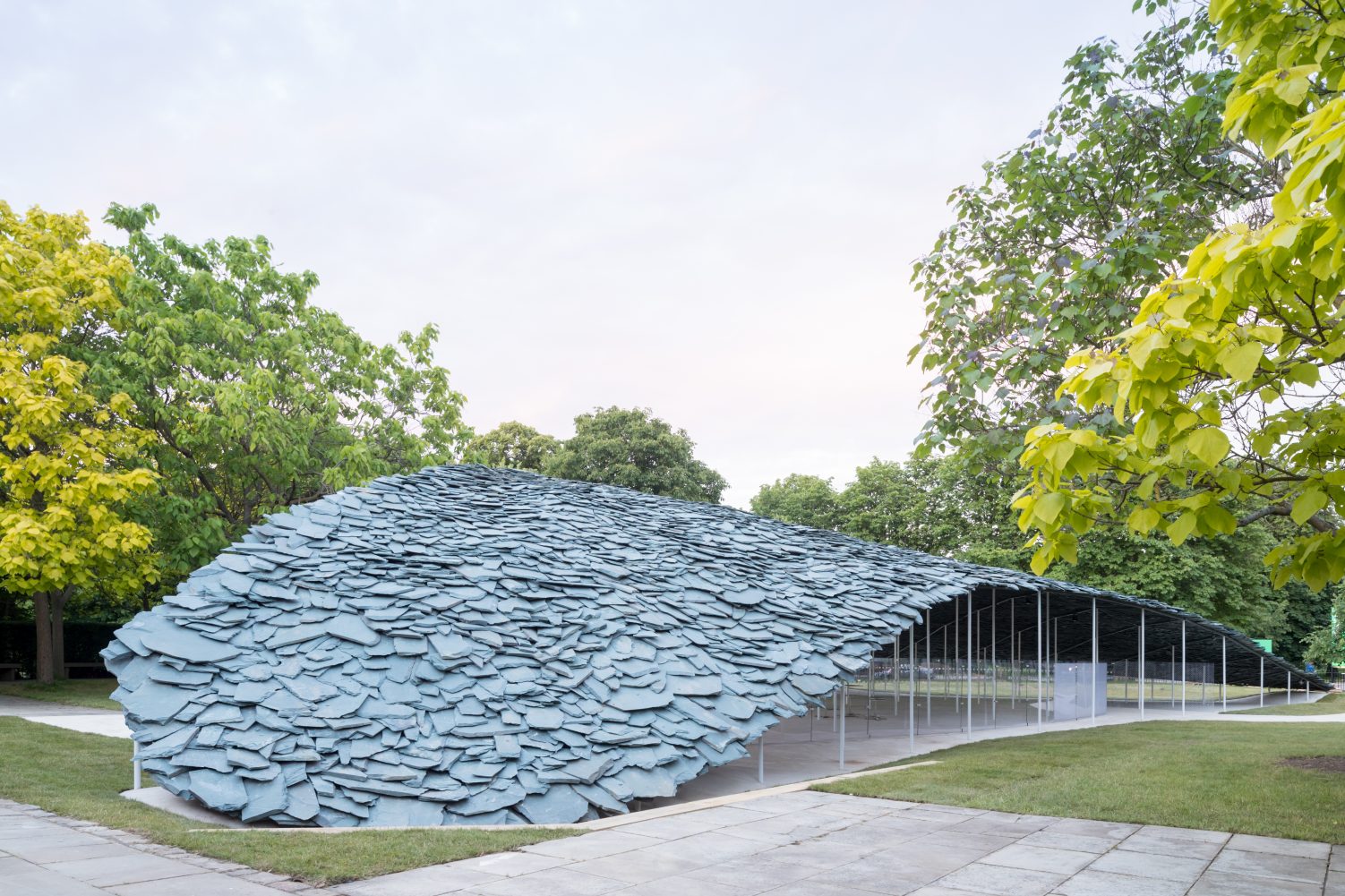
2019 Serpentine Pavilion, © Iwan Baan.
Junya Ishigami continued his nature-centric design approach on the 2019 Pavilion. The vertical components — thin supporting columns and glazing — were kept minimalist both formally and numerically to make the roof visually float. In contrast to the transparency of the vertical components, the roof consisted of grey slates of unprocessed shapes that form a roof possessing both lightness and weightiness. The idea behind this solid yet organic roof was to make the architecture an extension of the natural landscape around it.
2021/20: Sumayya Vally, Counterspace
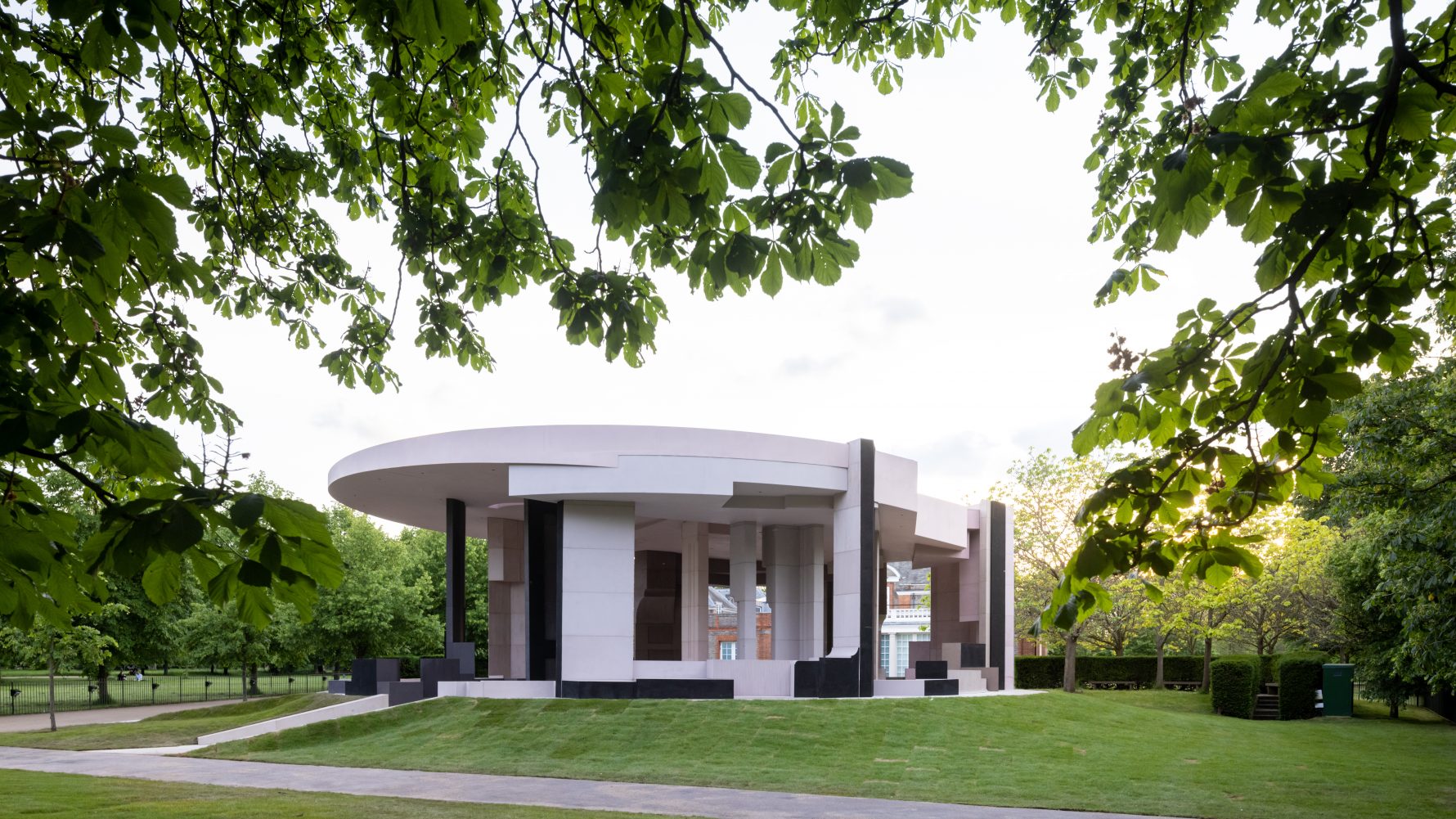
2021 Serpentine Pavilion, © Iwan Baan.
The 2021 Pavilion featured an eye-catching circular roof that provided a sheltered space of generous area and height. The geometrical structure was made of recycled steel covered in timber, with micro-cement applied on the surface. Comprising the pavilion, the pink and brown forms were not arbitrary but abstracted fragments of London. A variety of community spaces in London ranging from mosques to bookshops were translated into components on which people can sit and lie.
Architizer's 14th A+Awards judging is live! Subscribe to our Awards Newsletter for updates on Public Voting and the big winner reveal later this spring.
