Architizer’s newest print publication is available for pre-order! How to Visualize Architecture is an educational guide designed to help you master the craft of architectural storytelling and visual communication. Secure your copy today.
“Queen of the curve”
“Starchitect!”
“First female [insert accolade here]”
The late, great Zaha Hadid has been written about plenty — her work scrutinized and loved by the media — for her story and background as well as the distinctive architectural style she helped popularize and push forward. Her innovations caused the kinds of controversies that only come alongside an uncompromising vision. Her work became bigger than the efforts of one person and was rarely noted for simplicity.
While Hadid was still a student at London’s Architectural Association, though, her hand drawings displayed skill and experimentation — yes — but also an understated quality and attention to detail that hadn’t yet developed into the headline-grabbing work she would later become known for. There was barely a curve in sight.
In an exhibition catalog published by the Pamphlet Architecture series, five projects from her years at the Architectural Association — as she was just beginning work with OMA, 1977 to 1981 — are presented and offer a rare look at where her legacy really began. Proposals for Malevich’s Tektonik, Museum of the 19th Century London, Extension of the Dutch Parliament in the Hague, residence for the Irish Prime Minister and 59 Eaton Place are included, with more than a dozen beautiful plans and sections for each.
All text description courtesy of Elia Zenghelis, Rem Koolhaas and OMA
1. Malevich’s Tektonik, London, 1976/77
The Hotel:
“Zaha Hadid undertook in her horizontal Tektonik the task of handling the ‘mutation’ factor for the architectural and programmatic requirements of the project single-handed. Ignoring the rules, she designed the whole thing, discovering in Malevich’s apparent random composition ‘a method’ for meeting this demand: this method was called tic-tic.”

Horizontal Tektonik designed as a hotel on the Thames, on the Hungerford Bridge

Sections through hotel
“The design is a hotel which sits over Hungerford Bridge (carrying the railway from Charing Cross Station to Waterloo and the south of England), and adds an architectural bridge between 19th century London and the South Bank. Reef for the shipwrecks of many architectural movements of the recent past: Festival Hall, Queen Elizabeth Hall, Hayward Gallery, the National Theatre. The project consists of 14 levels, which systematically follow and exploit the volumetric envelope of the Tektonik, turning all constraints into possibilities for enriching the program for a hotel.”
The Club:
“The aim of this project was to insert into an existing architecture a new part. This was both an extension of architectural propositions introduced by the program inspired by one of Malevich’s Tektoniks, and a way to develop an interior architecture of programmatic and iconographic effectiveness: a special architecture that could be inserted into existing structure, so as to accommodate the rapid shits in Metropolitan culture. The ‘club’ as social unit was a suitable vehicle for this program.”

Night club: main floor – pool, beach, bar and restaurant; glass floor over changing rooms leading to sauna

Elevation from embankment
“To give more substance to the earlier project, as well as to perfect the method, the club is inserted in the Tektonic Hotel, levels 7 and 8, elaborating these in detail, both in terms of program and design.”
2. Museum of the 19th Century London, 1977/78

Conceptual plan with station, museum and superimposed various levels of the hotel
“The Museum is primarily ideological and conjectural, in that beyond specifying the program and designing it in detail, it lays down demonstrable principles for what the role and presence of today’s urban architecture should be, with particular relevance and emphasis on its relationship to, and correspondence with it historical and cultural context.”

Elevation
“This is accomplished in two ways: through the elaboration of a precise social and programmatic scenario, appropriate to the metropolitan location, and secondly through the display of a formal symbolic sensitivity unknown to today’s European contextual architects.”

The activities on the roof of the hotel (which cuts diagonally across the long museum building) are reconstructions of what takes place in the squares below.
3. Extension of the Dutch Parliament, the Hague, 1978/79
“At this time, both the Dutch government and the Dutch parliament are housed in a historical complex at the center of the Hague, the so-called Binnenhof. It consists of a rectangular ‘fortress’ — to which, since the early middle ages each architectural period has made its contribution — on a rectangular lake. At the center of the rectangle is the Gothic ‘Ridderzaal’ (Knights Hall), once a church, now the secular symbol of Dutch Parliamentary Democracy.”

Axonometric
“Through historical circumstances, government and parliament are intertwined in this architectural complex in a way that denies their political opposition. To correct this situation, a triangular site just outside the original rectangle was designated as the site for a needed extension of the parliamentary accommodation that had to be, at the same time, a ‘correction’ of the symbolism by performing an architectural conceptual separation between the government and representatives.
“The total program had to be divided between existing structures that had to be preserved, and the new part, which had to represent the autonomy of the parliamentary process. In this scheme, the tradition whereby each age manifests itself on the wall of the Binnenhof, is maintained by creating a gap that is then occupied by two slabs, one horizontal, the other vertical.
“The horizontal slab — a podium made of glass brick — contains all accommodation from contained meeting rooms in a basement to more open rooms on the ground floor, so that the entire building becomes a covered forum for political activity, directly accessible to the general public from the adjoining plaza. A small ‘skyscraper’ of oval rooms connected by a ramp, breaks through the roof. It also contains a mezzanine for the press, as representatives of the general public.”

Ground floor plan (00m)
“An ambulatory runs through the middle of the second, vertical slab, through the assembly hall itself, toward the ‘smoke-filled’ room. Above the ambulatory are three floors, where the political parties can discuss and formulate their positions and then ‘filter down’ to the ambulatory and from there to the assembly. Below the ambulatory are three floors for the professional managers of parliamentary procedure.”

The Ambulatory and its Connections
“The assembly itself links the two slabs, it is a ‘bridge’ between the ‘amateurs’ of the population at large, and the ‘professionals’ that they have elected. It also forms a new entrance porch to the Binnenhof, which focuses, once again, on the Ridderzaal. From the ‘forum,’ an escalator leads directly to the public gallery in the assembly hall, a rectangle that completely surrounds the parliamentary procedure.”
4. Residence for the Irish Prime Minister, Dublin, 1979/80
“Architects were invited to submit proposals in a single stage competition for a residence for the Prime Minister together with a State Guest House. The site lies a few miles outside Dublin to the north, in Phoenix Park, an dis one of a number of official and embassy residences in this area.”

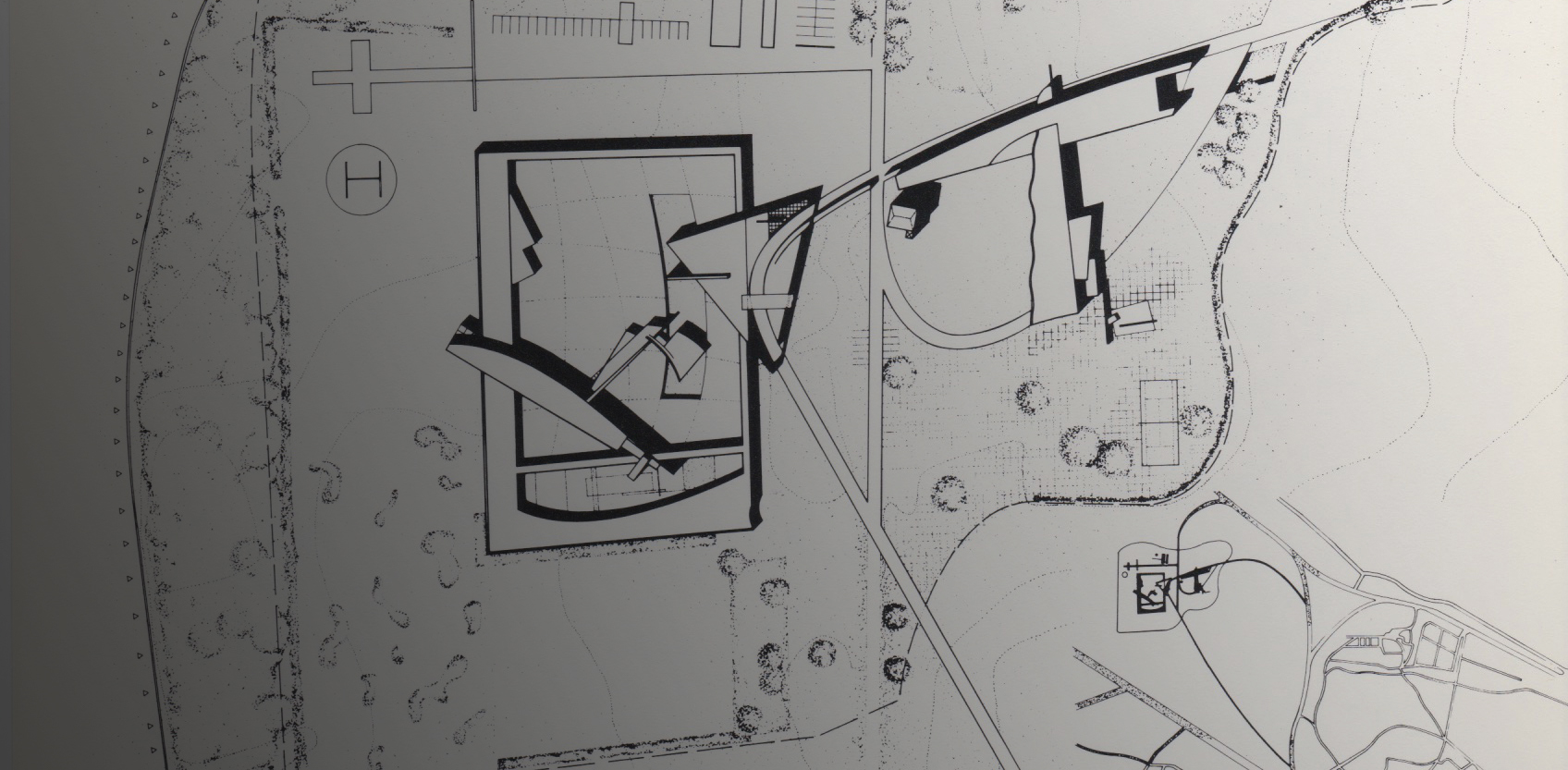
Site plan
“Existing on the site is the Prime Minister’s Georgian country residence with various out-buildings, stables, walled garden, and medieval tower. Retention of the existing house and out-buildings is not mandatory, but the medieval tower is to be retained.
“The primary concern of the design was to create two separate entities. The Prime Minister’s house with the reception room and the State Guest House. Each entity must have its own sense of independence and privacy. The State Guest House which is not likely to be used throughout the year and the Prime Minister’s house, for it acts as a family residence.”

Ground floor plan: Prime Minister’s Residence: reception rooms, private apartments, existing tower; State Guest House: lodgings and services, secondary suite, entrance, study and library area, pool and sports; staff quarters and service building
“The two houses were to be connected not only by the road but by a covered walkway. The road system works like an artery feeding the various houses on the site. The reception rooms in the Prime Minister’s residence border the eastern approach road and provide a screen for the Prime Minister’s residence which in turn intersects the reception rooms, creating a private garden area for the permanent inhabitants.
“The State Guest House is placed within the existing walled garden with all the rooms situated and contained around its perimeter. The only two elements which break away from the confines of the wall are the entrance reception block and the principal suite which floats out over the garden.
“The only control imposed up on nature occurs within this area, while the rest of the parkland is left free from any intervention. The forms of the plan are designed to induce a feeling of freedom from gravity, a feeling of liberation from bureaucratic and stressful aspects of political and public life. They indicate a new aesthetic, a dynamic which has no reference to Ireland’s history and architectural typologies.”
5. 59 Eaton Place, 1980/81
“The apartment is located in Belgravia in a very sterile, white-washed street with an absence of any nature. Number 59 was constructed at the turn of the century as a large terraced town house and is typical of the style of buildings in the Belgravia area. In common with the properties in the immediate vicinity, the premises proved to be to large for a single occupier and were converted into maisonettes some 14 years ago.
“The building is constructed as a ground floor and four upper levels, and is divided to form three self-contained maisonettes and a basement. In early 1980 two acts of urban change took pace in Belgravia: an explosion at the Italian Consulate at 38 Eaton Place, which wrecked the entire building; and new urban living injected into 59 Eaton Place.”

Ground floor showing materials
“The clients had modest requirements: they wanted elegance and comfort. They had acquired an apartment which had undergone many changes in the past 20 years and, being stripped of all its ornaments, the house needed a certain newness.
“The apartment spans three floors and has three vertical conditions: The front, which has partly maintained its classical elegance; The back, which is an extension added in the mid-60s, humble and minimal in terms of its materials and overloaded with divisions; The middle zone, which had confronted the conflicts, had neither any glory of the past nor the comfort of the present, but could only look forward to the future. Our task was to renovate it.
“All the ground floor and the old living room were allocated to formal occasions; the only intrusion was the addition of new materials on the floors and a new fireplace. The lobby and dining room underwent the most drastic change to release it from its present state of limbo. A new staircase was installed, which extends the public domain to the second floor where a new cloakroom is created.”

Perspective of dining room and lobby
“The top floor is the client’s private quarters, with two master bedrooms – the one coinciding with the formal living room being the most flamboyant, its materials of silk and stone. The library is abstracted, with basic colors, minimum furniture but maximum treatment of the walls to house all the books and mechanical equipment. The gymnasium with Jacuzzi at the top of the new extension is the most clinical.”
These images are from Pamphlet Architecture 8: Planetary Architecture, which is now available in the anthology Pamphlet Architecture 1-10 from Princeton Architectural Press.
Architizer’s newest print publication is available for pre-order! How to Visualize Architecture is an educational guide designed to help you master the craft of architectural storytelling and visual communication. Secure your copy today.
Credits: Dutch Parliament Extension: Office for Metropolitan Architecture (OMA): Zaha Hadid, Rem Koolhaas, Elia Zenghelis with: Richard Perlmutter, Ron Steiner, Elias Veneris; Residence for the Irish Prime Minister with: Kami Ahari, Jonathan Dunn, Camilla Ween; 59 Eaton Place with: Kasha Knapkiewicz, Jonathan Dunn, Special effects: Bijan Ganjei, Models, column construction: Gus Hutcheson, Early stages: Kami Ahari, Jamie Campbell; Contractors: R L Ruggles & Sons; Quantity Survey: Alan Thomas & Associates; Engineers: Ron Wilson at Vincent Grant; Exhibition: Nan Lee, Wendy Galway, N. Ayoubi; Catalog: Anna Ruszkowska, Laura Beck


