As architects, we are constantly rethinking the materials, forms, and spaces that we create. Central to many designs, glass is one material that invites innovation and new applications. Channel Glass Wall Systems (A+Awards Jury Winner in the Product+Building category) are made from panels of U-shaped cast glass that comes in a variety of lengths and widths. The systems are normally ribbons of molten glass formed into continuous glass channels with varying finishes and dimensions. These glass walls end up looking virtually seamless and can extend multiple stories in buildings.
Channel glass systems can be combined with a variety of other materials and structural elements to create greatly diverse forms, building envelopes, and spaces. The following projects show this variety across many different building scales and typologies. Each one is designed to respond to its context, whether it is urban or more rural. The projects use channel glass to express ephemerality, light, texture, and rhythm, as well as indicate different programmatic and civic functions. Almost all of the projects are public, and they each play off different levels of transparency between exterior and interior while directing views.

© Steven Holl Architects

© Steven Holl Architects
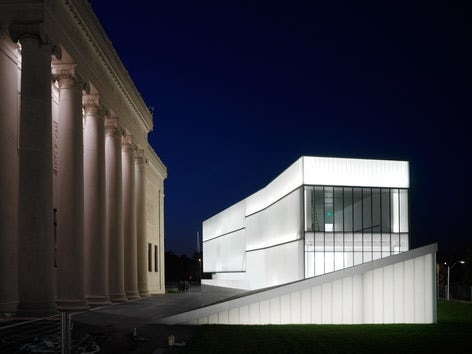
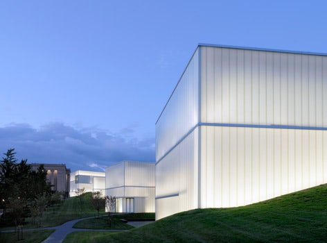
Nelson-Atkins Museum of Art by Steven Holl Architects, Kansas City, Mo.
One of the most celebrated designs in North America, the Nelson-Atkins Museum of Art’s Bloch Building addition was created as five “light gathering lenses” along the eastern edge of the site. Multiple layers of translucent glass combine to merge landscape, architecture, and art. The galleries are punctuated by views of the landscape and different lighting levels are controlled by screens embedded in the façade’s glass cavities.

© OMA

© OMA
Seoul National University Museum by OMA, Seoul, South Korea
Conceived as a basic rectangular box, the Seoul National University Museum was carefully designed in relationship to its topography and the small hill nearby. A central core is the only point of contact with the ground, and a translucent façade showcases the building’s structural steel truss work. As OMA states, the building “both defines and defeats the hill.”

© H3 Hardy Collaboration Architecture, LLC

© H3 Hardy Collaboration Architecture, LLC
Lincoln Center Theater LCT3 by H3 Hardy Collaboration Architecture, LLC, New York City
An addition to Eero Saarinen’s Lincoln Center Theater, LCT3 was designed on the rooftop of the Vivian Beaumont Theater. Structure directly informs the design, where steel trusses, aluminum screen walls, and glass curtain walls are all housed in a simple rectangular volume. Trusses become a visible element of both the interior and exterior architecture.

© Schwartz/Silver Architects

© Schwartz/Silver Architects
Shaw Center for the Arts by Schwartz/Silver Architects, Baton Rouge, La.
The Shaw Center for the Arts was designed to transform Baton Rouge and the city’s sense of itself and its possibilities. Created in 2008, the building houses Louisiana State University’s Museum of Art, performing arts facilities, and theaters. Channel glass was used extensively throughout the façade of the building in varying lengths, proportions, and finishes.

© Rüssli Architects AG

© Andy Ryan Photography, Inc.
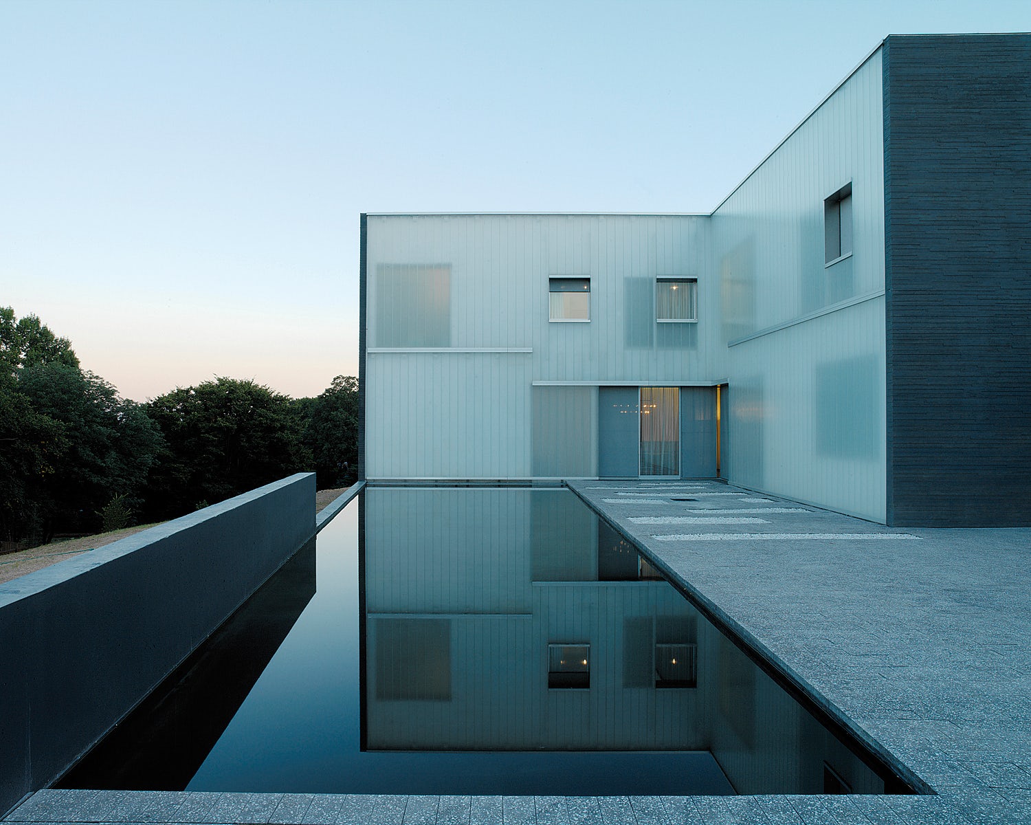
Swiss Embassy Residence in Washington D.C. by Rüssli Architects AG, Washington
With views to the Washington Monument, the Swiss Embassy Residence houses spaces for working and living. The building is rigidly geometrical and includes sandblasted translucent glass panels. The highest point of a large park, the residence explores an interplay between transparency and opacity.


Institute of Contemporary Art by Diller Scofidio + Renfro, Boston
The first museum built in Boston in over 100 years, the ICA combines an intimate space for viewing art with a civic building for public programs. The museum includes public space on the ground floor that is delineated by an overhead cantilevered gallery. Channel glass is used throughout the building as a means to both reveal, and sometimes enclose, the interior program.

© Pelli Clarke & Partners

© Pelli Clarke & Partners
Minneapolis Central Library by César Pelli, Minneapolis
The Minneapolis Central Library was defined by themes of light, transparency, and openness. It was designed with a flexible lighting system and furniture integrated lighting. Channel glass was used throughout the building to meet the conceptual goals and lighting needs.


