Public voting for the 2015 A+Awards is now open, which means that YOU have the power to select the very best architecture in the world. With the A+Awards, recognizing the best projects is no longer domain of a small group of judges — everyone gets a say in who will be crowned victorious in over 90 categories, and your opinion counts! Check out all of the finalists and cast your vote here
Perhaps inspired by BIG’s joyful experimentations with LEGO in recent times, one can perceive a growing trend for pixelated designs amongst this year’s A+Award Finalists — from the graphic treatment of façades to full three-dimensional extrusions, firms are formulating structures in true Minecraft manner. Here are five notable examples across a range of categories: check them out, and be sure to vote for your favorites here!


FORMSTELLE by Format Elf Architekten
Category: Office – Low Rise (1–4 Floors)
This single-story office in Töging am Inn, Germany, is wrapped in a laser-cut honeycomb of halftone-effect apertures. This reads as a homogenous façade, shielding views to the interior while providing ample amounts of light for employees working in the minimalist open-plan space.

© Alexandre Wasilewski

© Alexandre Wasilewski

© Alexandre Wasilewski
Oiseau des Iles by CANVA5 and Antonini Darmon Architects
Category: Multi-Unit Housing – Mid Rise (5–15 Floors)
The external façade of this multi-unit housing block in Nantes, France, has been dissected into a grid, in-filled with a combination of walls, semi-opaque blinds, and covered balconies that break up the building volume.


Brick Spris Coffe by Hooba Design
Category: Restaurants
The interior of this contemporary Iranian café is covered with a sculptural skin of earthen-colored bricks with glazed turquoise sides. Slivers of light between each brick element create a calm atmosphere for conversation and contemplation.


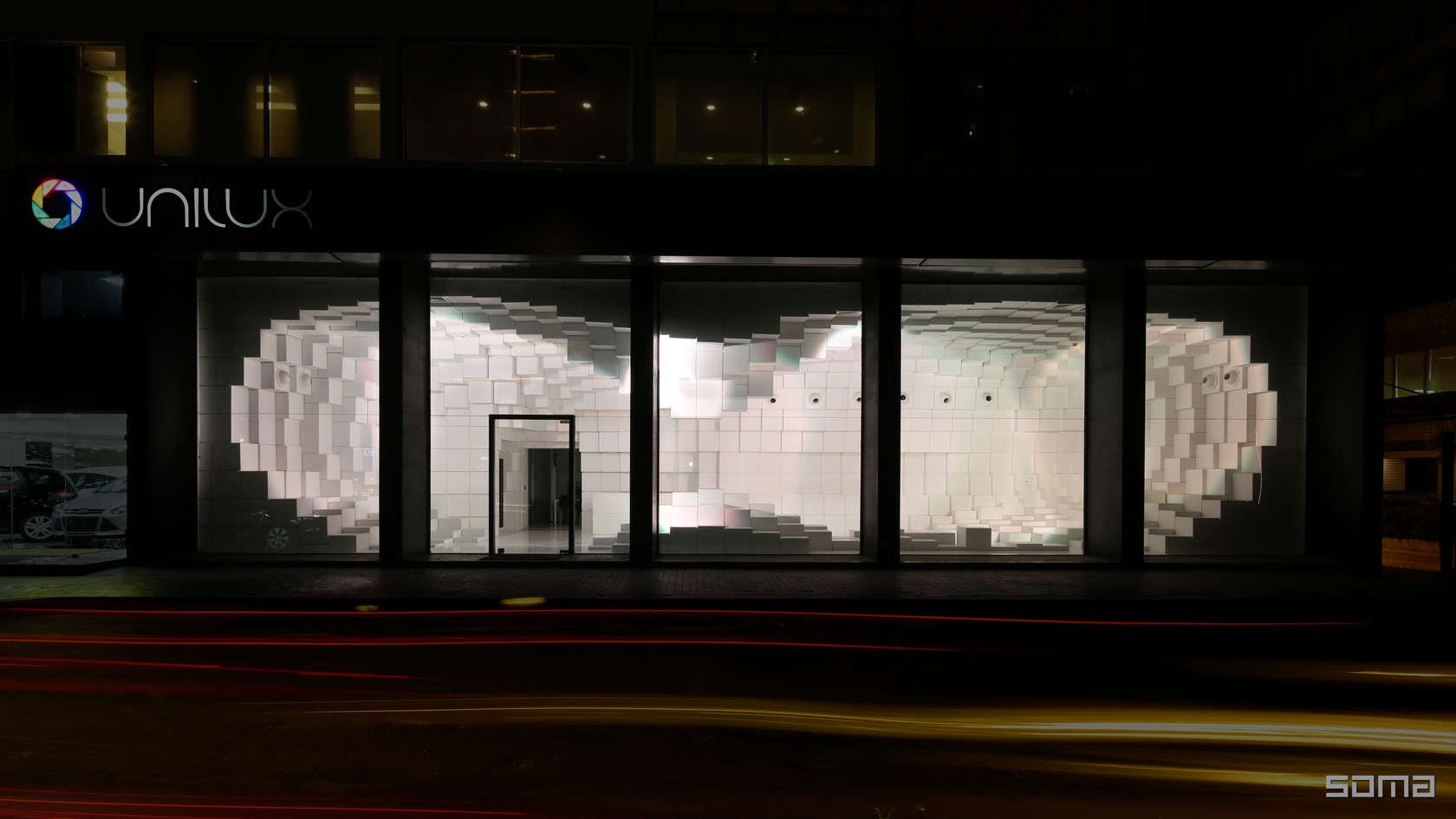
Unilux by SOMA
Category: Retail
This parametrically designed showroom in Beirut, Lebanon is distinctive for its flowing cubic display space, a cave-like volume that reads like a futuristic, snow-white homage to Snøhetta’s Reindeer Pavilion.

© Cosmin Dragomir

© Cosmin Dragomir

© Cosmin Dragomir
Multifunctional Sports Hall Cluj-Napoca by DICO si TIGANAS Architecture and Engineering
Category: Stadium/Arena
This sports hall in Romania is housed within a levitating cage of sun-shielding louvers that expand and contract across the façade.

© FG+SG | Fotografia de Arquitectura


© FG+SG | Fotografia de Arquitectura
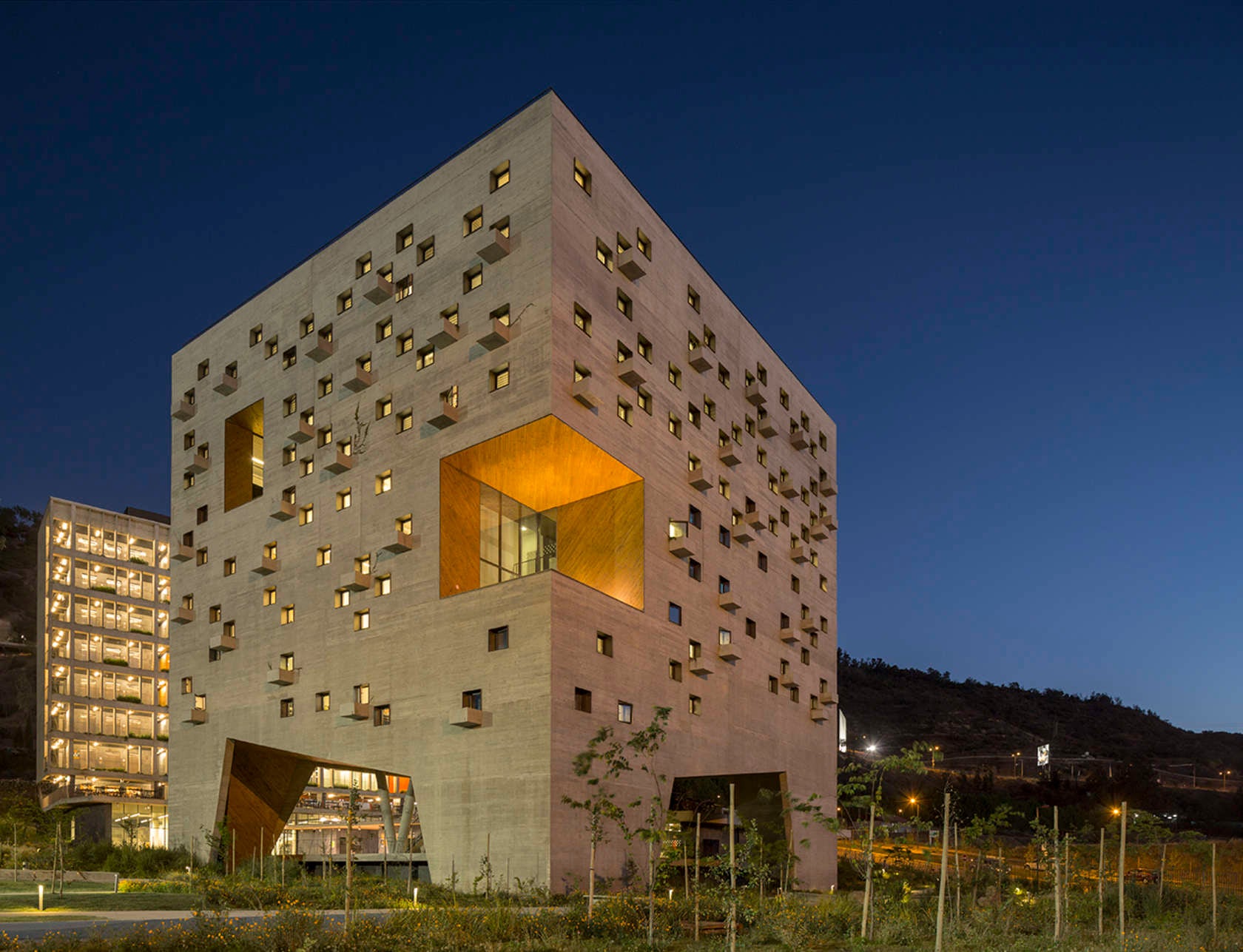
Economics and Business Faculty, Diego Portales University by Duque Motta & AA and RHGH
Category: Higher Education & Research Facilities
A monolithic stone cube is punctuated by a cascade of cubic voids and extrusions, turning this University building in Santiago, Chile, into an exhibition of light and shadow in the late afternoon sun.
Seeing spots yet? Check out all of the 2015 A+Awards finalists and vote for your favorites!


