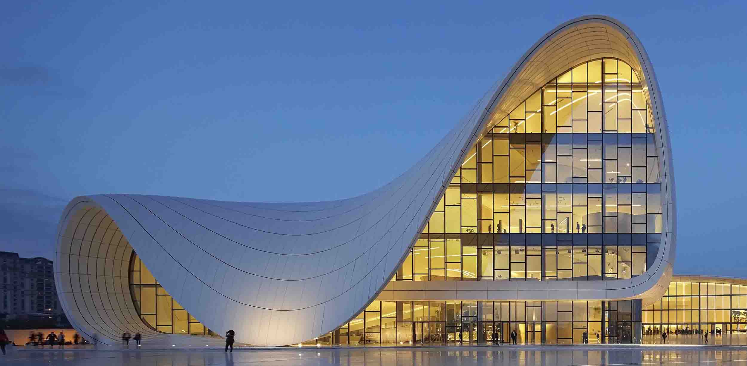
Public voting for the 2015 A+Awards is now open, which means that YOU have the power to select the very best architecture in the world. With the A+Awards, recognizing the best projects is no longer domain of a small group of judges — everyone gets a say in who will be crowned victorious in over 90 categories, and your opinion counts! Check out all of the finalists and cast your vote here
Architects are not known for their love of color: Some would have you believe we live in a world of snow white buildings and jet black clothing, with numerous shades of gray in between. However, some designers are not afraid to utilize the full spectrum, aiming to communicate, orientate, shock, show off, or simply inject more fun into their architecture.
Here are seven projects that channel color in fantastic fashion; pick out your favorite hues and then be sure to vote for them over here!


Taipei International Flower Trade Center by H.P. Chueh Architects & Planners
Category: Commercial – Mixed Use
This market place in Taipei takes inspiration from the hues of flowers sold within, with rhythmic bands of vibrant color enlivening the elevations of the industrial complex.

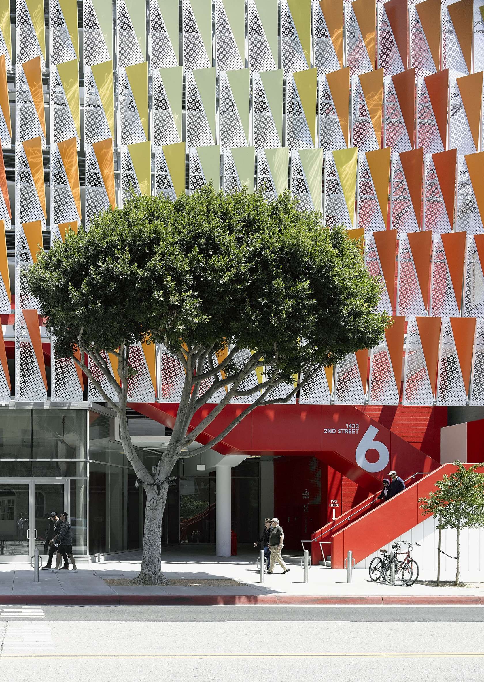

City of Santa Monica Public Parking Structure #6by Behnisch Architekten
Category: Parking Structures
This multi-story car park in California is clad with metal fins, each one a warm shade of red, orange, or golden yellow. The sense of warmth is heightened further still by the bold red pedestrian staircases cascading down the elevation.

© Unknown
© Unknown
Kaleidoscope Kindergarten by A2arquitectos
Category: Kindergartens
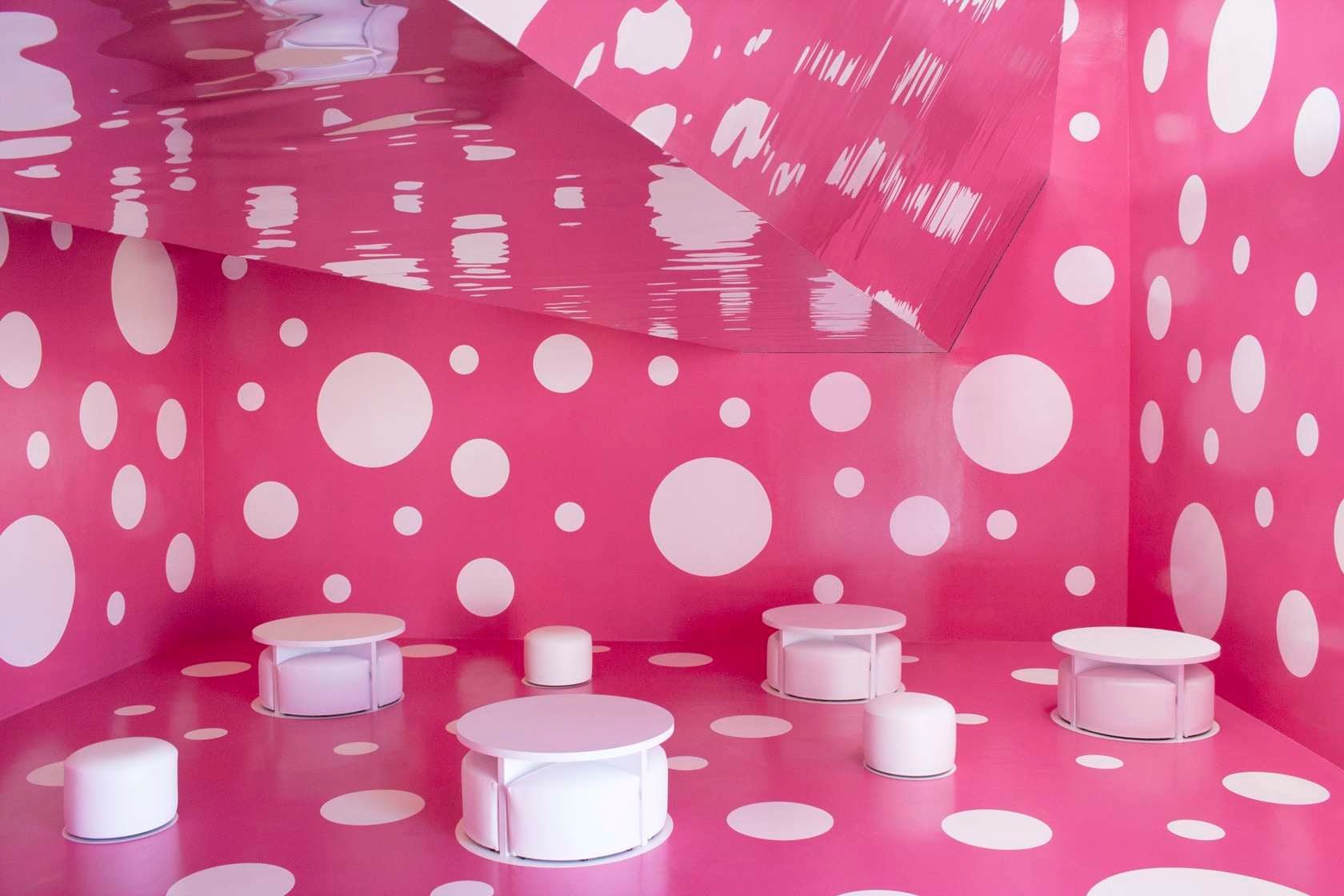
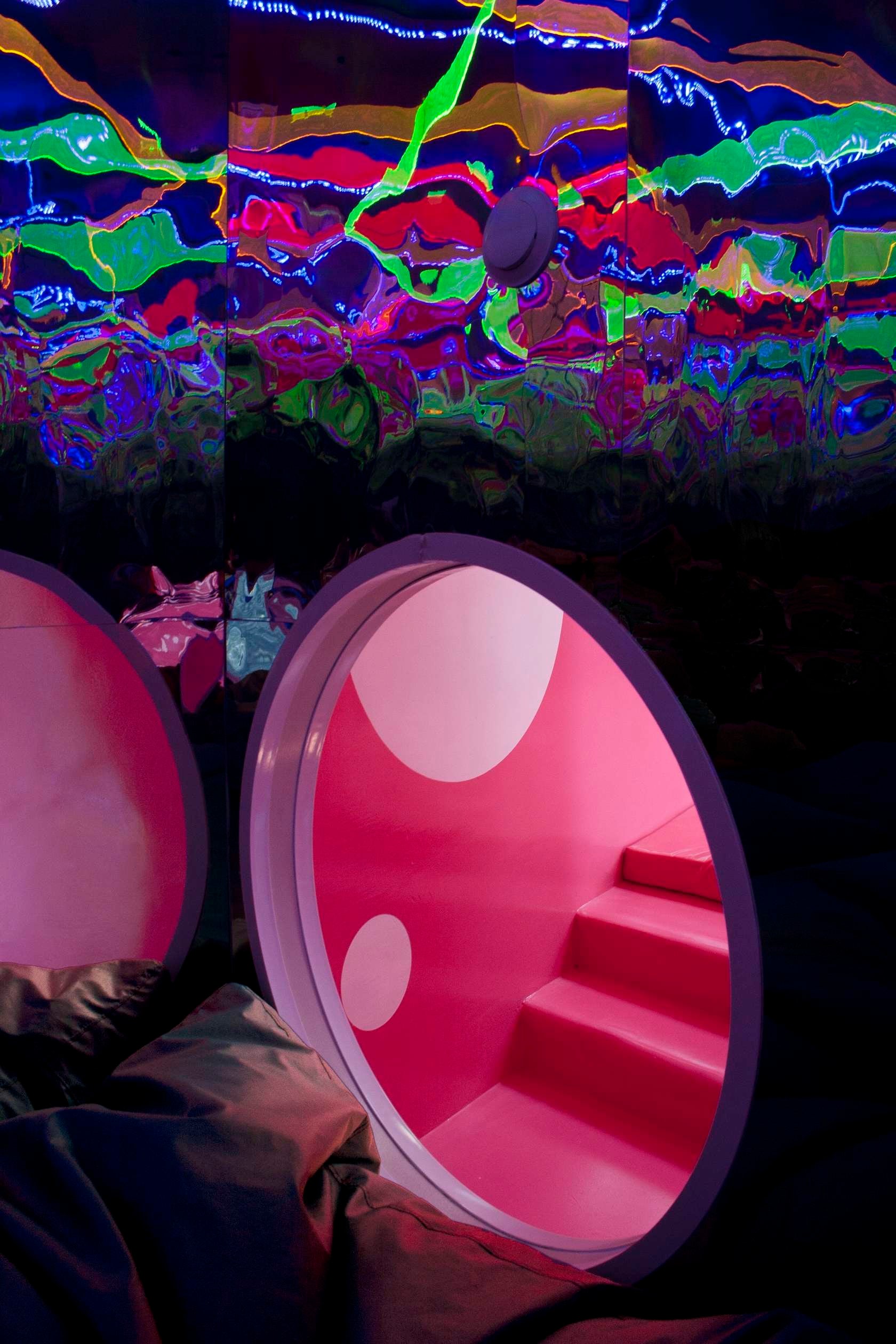
The main feature of this kindergarten in Majorca is a human-scale kaleidoscope, through which kids can adventure and experience a plethora of visual effects. The kaleidoscope is accompanied some truly psychedelic spaces, including a bright pink play room and a bathroom from outer space…


50 by Storp Weber Architects
Category: Residential Interiors
A dilapidated former pub in London was transformed into a contemporary living space — with a bold injection of red at its heart. The crimson library holds the client’s collection of vintage records, and forms a stunning contrast with the neutral, naturally finished surfaces throughout the rest of the house.


Cone Garden Bocksili by LIVESCAPe
Category: Public Park
This pop-up garden installation in Grand-Metis, Canada, employs the complementary colors to great effect: Construction cones become sculptural modules, forming a flowing mound of orange-red plant pots in a luscious forest clearing.

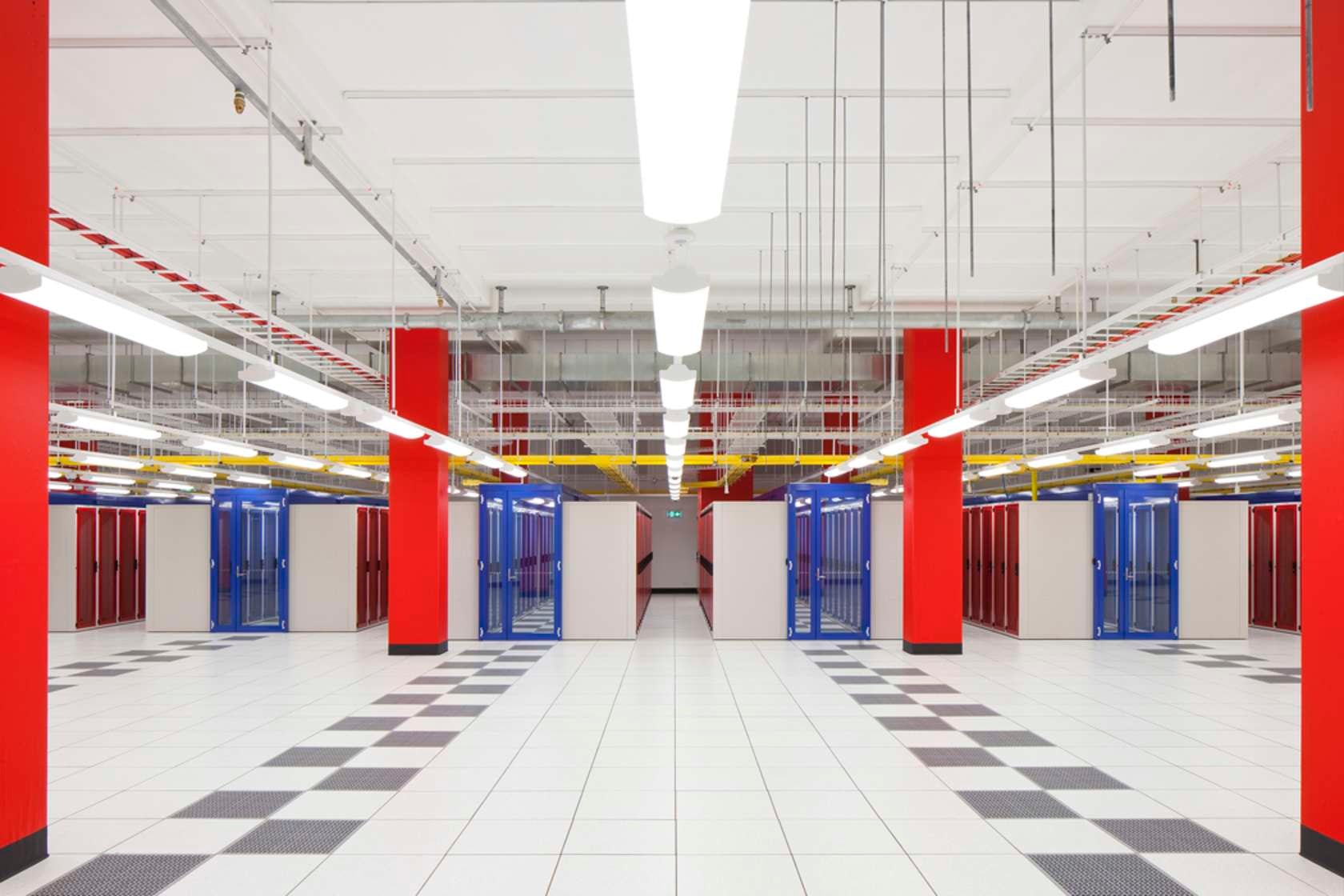

Sydney Data Centre for NEXTDC by Greenbox Architecture
Category: Architecture +Communication
This data center utilizes color for wayfinding — red, orange, and blue define different programmatic areas within the facility — and for branding, with the fiery red of NEXTDC’s corporate logo framing the external windows.
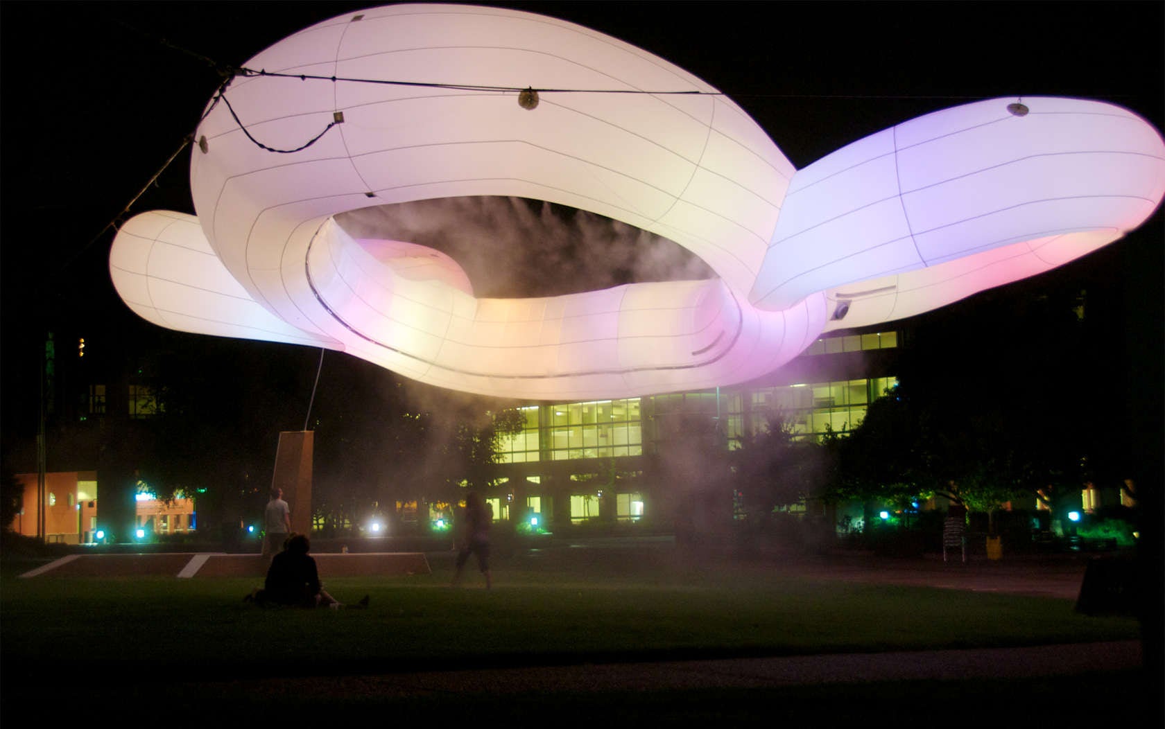


#MIMMI by Urbain DRC
Category: Architecture +Communication
MIMMI stands for the Minneapolis Interactive Macro-Mood Installation, and color plays a key role in the sculpture’s functionality. On display over the summer of 2013, the hue of the giant pavilion sculpture would change according to the emotions of those around it as they used to social media to express their moods throughout the day and night.
Looking to broaden your palette (so to speak)? Check out all of the 2015 A+Awards finalists and vote for your favorites!


