Architizer's 14th A+Awards judging is live! Subscribe to our Awards Newsletter for updates on Public Voting and the big winner reveal later this spring.
The combination of two competing ideas — purity and hybridity — found in traditional Japanese houses is still present in Japan’s contemporary architecture where the idea of “software” underlies physical structures. In the case of the A+Award-winning 1.8m-Width House in Tokyo, the interior layout is largely a hybrid space of shifting floor plates and multi-use areas.
Despite its extremely limited lot size, YUUA Architects and Associates‘ project epitomizes the vitality of the inherently Japanese concern with staging and social aspects of architecture.

Commissioned by a “couple with two cats,” the 1.8-Width House is an example of an ultra-compact house, kyo-sho-jutaku in Japanese, built on tiny pockets of land and suited to young people looking to build their homes in over-populated areas like Tokyo, where skyrocketing property prices have forced a generation of designers to rethink the concept of urban living.
Principal and cofounder Madoka Aihara relates that she “learned how to make houses as expansive and open as possible while preserving privacy by designing small houses.”

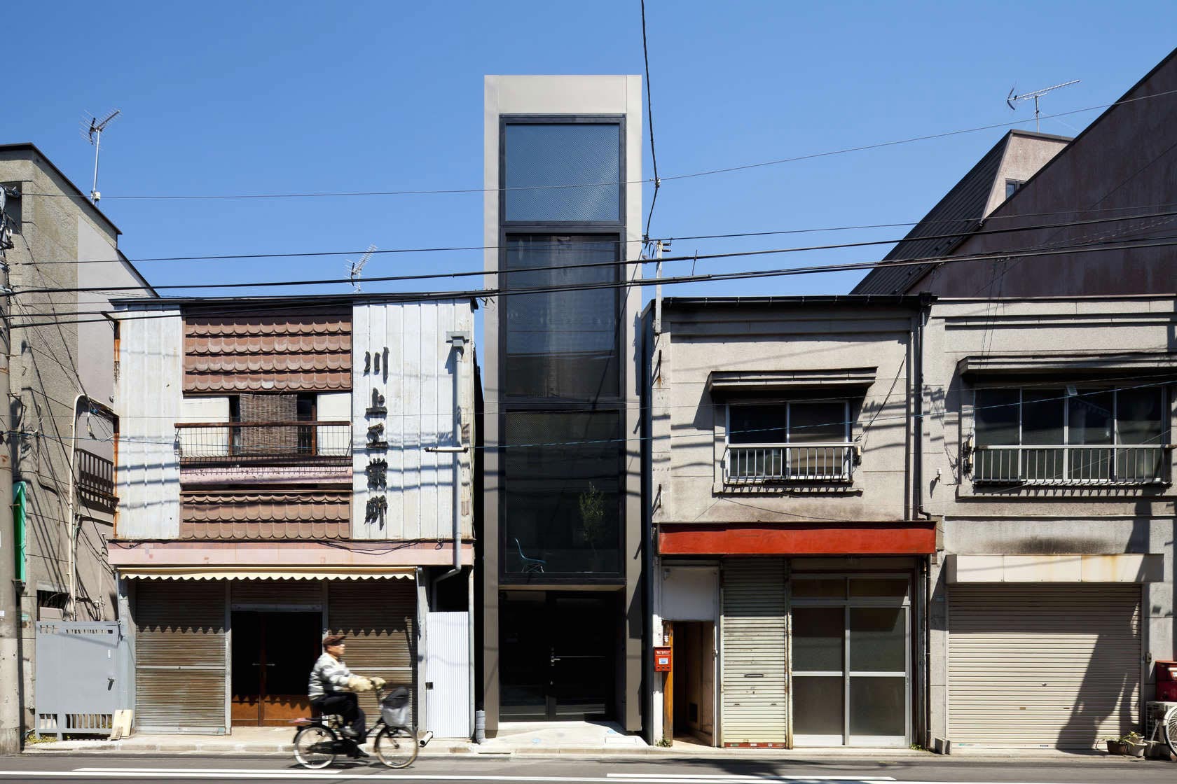
The building’s entire street-facing façade overlooking a quiet residential neighborhood is fully glazed: the windows allows natural light to enter during the day while concealing the occupants from outside views, preserving the core idea of intimacy.
At night, the house reveals its contents, but only exposes areas that are used periodically; the living and dining spaces are cleverly situated deeper in the volume of the building. “The layer of the floors shuts out the views looking up from the street.”

Its tranquil glazed exterior evokes a kind of large-scale vitrine that houses the floors within, like slices in a vertical exploded view through the building’s height. Every inch of the house is focused on the two narrow façades, ultimately overriding the verticality of the space through the visual and organizational strength of its lateral axis.
In the interest of “expressing the client’s personality into spaces” — YUUA’s primary objective — Aihara acknowledged their request for maximizing the space. “They required that the floors were separated into several levels and it worked as stages of multifold life activities, so that the house became a fun place.”

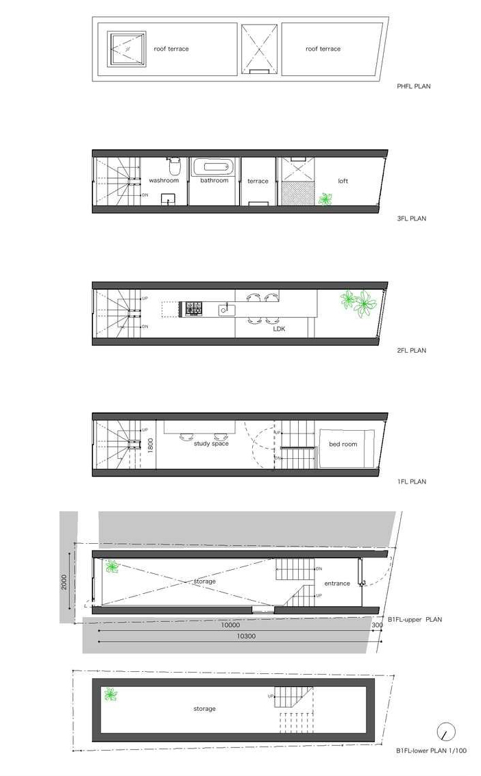
A recessed entrance leads to a partly submerged storage area and an elevated ground. The smaller height difference between this space and the first floor reminds of the traditional Japanese entryway areas known as genkan, small areas at street level where people remove their shoes and step up onto a raised floor. This slight height difference dominates the rest of the building and offers glimpses of the windows from different levels of the house.

The first floor serves as a study space connected to a small platform with a bed. The living room merges with the kitchen and dining space on the second floor as well as a contemplative area near the window.
Starting with the first floor, the role of vertical communication is taken over by a rear spiral staircase, which connects the study, living area, and the loft space, including a bathroom, washroom, and a small terrace nestled in the middle of the building’s length. Two skylights serve to illuminate parts of the house furthest from the windows, while the orientation of the fenestrated façades and the utilization of an air circulator facilitate natural ventilation.

There are almost no closed spaces within the house. Instead, open shelves around the stairs and in the kitchen accentuate the fluidity of volumes and impart a distinctive warmth to the minimalist interior.
The choice of dark walls may seem counterintuitive — especially considering the predominant whitewashed surfaces and airy spaces of the contemporary Japanese architectural milieu — but Aihara notes that “the edges of space are blurred by the dark color, like the space beyond the earth’s atmosphere … I think the dark color obscures the feeling of narrowness.” Meanwhile, the spatial organization, delicate volumetric nuances, and geometrical purity echoes the design principles behind iconic Japanese housing projects such as Sou Fujimoto Architects’ House NA.


Using a steel-frame construction method to minimize columns and beams and maximize the interior space, the architects were able to form small volumes that feel both interconnected and functionally distinct. Through the thoughtful aggregation of spaces, the house continues the paradigm of flexibility found in both traditional and contemporary Japanese houses where architecture concerns itself more with relationships and less with form.


Asked about YUUA’s mission statement, Aihara responded, “We would like to make spaces suitable for an environment and make the people feel comfortable in it and cherish it” — an admirable goal that they have clearly achieved with the 1.8m-Width House.
Architizer's 14th A+Awards judging is live! Subscribe to our Awards Newsletter for updates on Public Voting and the big winner reveal later this spring.

 1.8-M Width House


