Now accepting registrations for its 2021 edition, the One Photo Challenge lays down a simple question: Is it possible to capture a single photograph that tells a powerful story about architecture? With 2 grand prizes of $2,500 and global recognition on the table, this is an incredible opportunity to showcase your skills. Register today to receive key updates as the competition approaches:
Register for the 2021 One Photo Challenge
There’s no one way to produce a captivating image. A myriad of factors are at play in determining whether a photograph can attract the attention of the masses and go viral.
In the case of architectural photography, many details can influence the popularity of an image, including the beauty of the architecture itself, the surrounding environment, the popularity of the architect, the composition of the image, or the story behind the photograph. Therefore, it may be best to examine viral photographs from the past to see what qualities made them so popular. Here are eight of Architizer’s most liked photos in our Instagram history coupled with what made them so noteworthy:
1. Instill some mystery
This eery photograph of identical, castle-like homes within a hilly landscape was widely shared and commented on when published in January 2019. The image is surreal, catching the eye of its audience and prompting questions in people’s minds. Where is this located? Why are all these chateaux identical? Why is the space between them unfinished? The mysterious nature of the photograph, as well as the compositional power of repetition, adds to its quality as a viral image.
2. Add an element of surprise
This unique project appears to be seamlessly integrated into the natural terrain of Vals, Switzerland. The surprising nature of the home is amplified by the photograph’s composition, in which the surrounding environment completely frames the dwelling. It also has a very deep depth of field, in which every element is sharp and in focus. The home itself appears flat, as if it were photoshopped into the image. The overall contrast between natural and building allows the viewer to instantly focus on the home, while appreciating the way the architect has embedded space within this picturesque landscape.
3. Inspire awe
The wide, aerial perspective and natural lighting play pivotal roles in this image. The perspective allows viewers to grasp the epic scale and formal ingenuity of the structure, provoking a sense of awe. You’re able to see in full view the museum’s organic system of intersected disks stretching around the ancient Amiri palace. The lighting, coming from what seems to be a sunset, accentuates the structure’s striking form. The combination of light and shade give depth to the photograph.
4. Harness symmetry
The dusk lighting in this image compliments the soft, smooth form of Styen Studio’s iconic chapel roof. The distinctive shape of the structure is further emphasized through the pool in the foreground, which reflects a blurred silhouette of the building. The beauty of this image also comes down to its near perfect symmetry. The point-of-view perspective allows viewers to realistically experience the journey into the chapel. Finally, the warm interior lighting provides a nice contrast with the darker, more muted exterior.
5. Show spaces in use
Displaying the way architecture is used can provide a lot of information to the viewer. You can clearly see how the architecture can function, instead of seeing an empty, lifeless space. Without this lady, it wouldn’t be clear that those vertical beams could provide support to lean and casually sit. Knowing this subtle feature, I formed a greater appreciation for the design.
6. Capture a moment in time
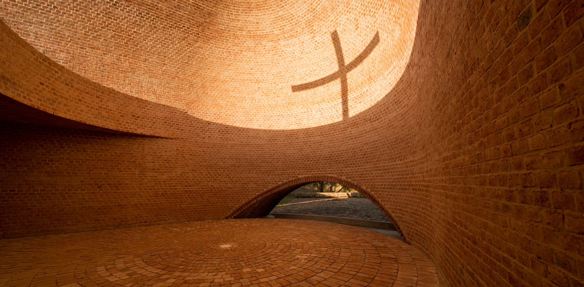
The power of this photograph lies in its capture of a unique moment in time. Vertical and horizontal poles were carefully positioned in the opening of this minimalist brick chapel, creating a crucifix-shaped shadow when the sun reaches a precise position in the sky. As a result, the viewer is immediately able to understand the purpose and significance of the building, despite the lack of any other detail. It is prove that even the most simple of images can provides a great level of symbolic depth.
7. Keep an Eye for Detail
While sweeping views of skylines and majestic architectural icons traditionally garner attention o Instagram, it is possible for even the smallest of details to make a splash. The amazing undulating walls of Hooba Design’s Brick Spris Coffee Shop are made up of traditional terracotta bricks and transparent, light-reflecting blocks, something that is highlighted with the inclusion of a hand installing one of the elements. The material texture, atmospheric lighting and human scale all adds up to a highly satisfying and share-able image.
Now show us what you can do: Register for the One Photo Challenge and submit your best drawings for a chance to win $2,500 and more amazing prizes:


