Architects: Showcase your next project through Architizer and sign up for our inspirational newsletter.
Today, urban landscapes are expanding at rapid rates across the world. Cities are sprawling outwards, as the demand for households steadily increases. This approach to place-making is both inefficient and unsustainable. Reuse, adaptation and transformation are some of the key approaches cities should take in order to provide spaces that meet people’s needs and improve the livelihood of their citizenry.
Urban revitalization, particularly present in socially and economically blighted neighborhoods, aims to reorganize an existing city structure rather than erase it. When looking specifically at public spaces, revitalization works to serve local communities by providing cultural, social and economic nodes of development. Here’s an assemblage of seven great examples of how urban revitalization can materialize.
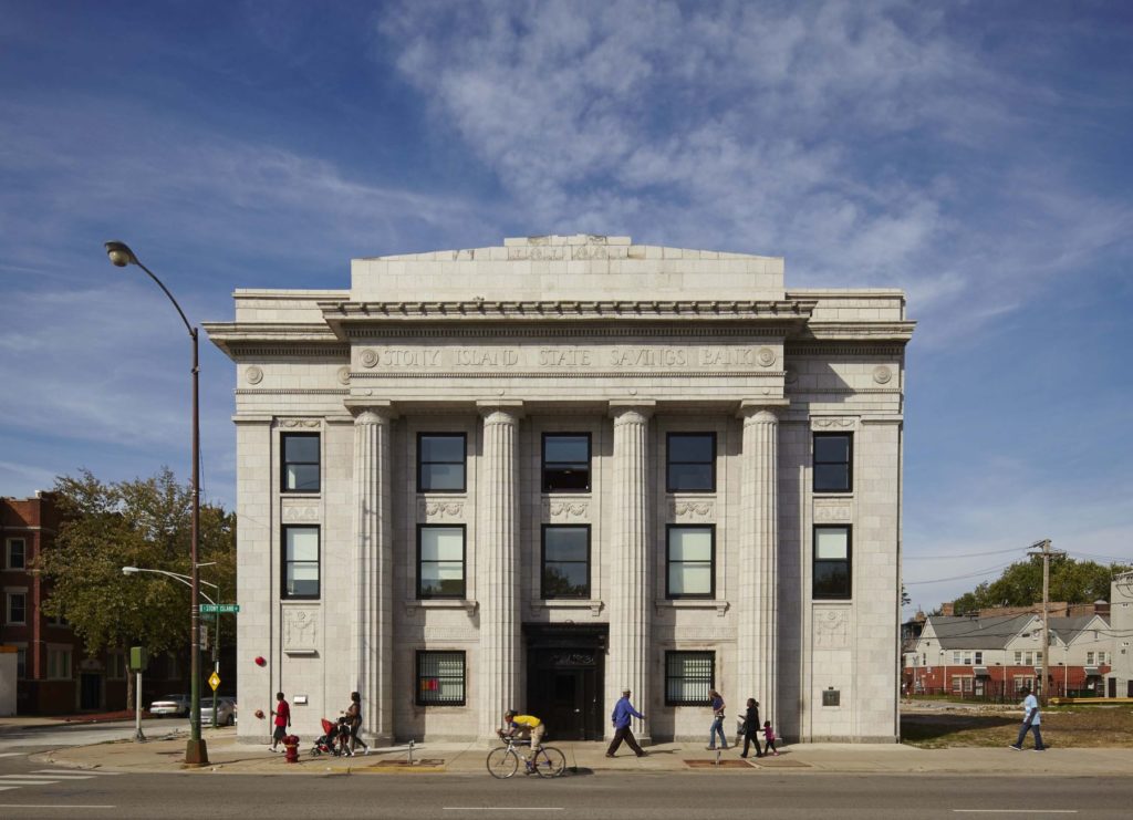
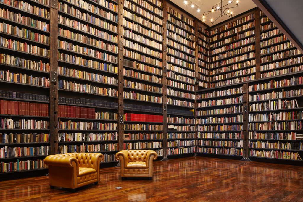
Photos by Tom Harris. © Hedrich Blessing; courtesy of Rebuild Foundation
Stony Island Arts Bank by Rebuild Foundation, Chicago, IL
Designed and built in 1923, a formerly vibrant community savings and loan bank, situated in Chicago’s south side, had become vacant and abandoned by the 1980s. In 2012, Chicago-born artist, urban planner and professor Theaster Gates purchased the 17,000-square-foot ruin for just $1.00 from the city. Through his Rebuild Foundation, a nonprofit organization that seeks to foster culture and development in underinvested neighborhoods, Gates transformed the bank into a contemporary art gallery, media archive, library, and community center.
Though it’s entirely renovated, details of the bank’s age and history, such as peeling paint and damaged ceiling tiles, have been preserved to physically merge the past and present. The bank has become an institution of and for the south side of Chicago, that celebrates and preserves African American culture.
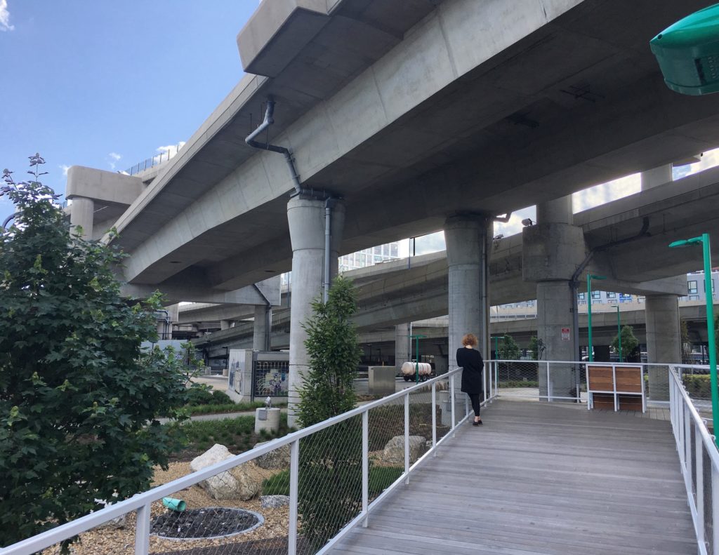
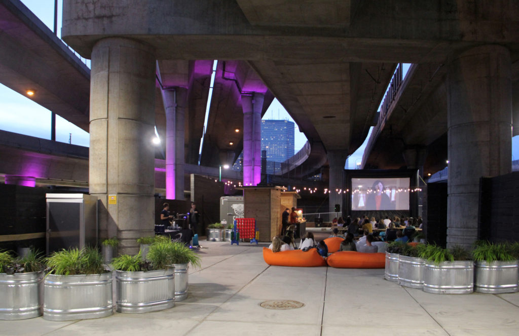
Infra-Space 1; images courtesy of Landing Studio
Infra-Space 1 by Landing Studio, Boston, MA
This is a pilot project of a state-wide Massachusetts Department of Transportation led study to revitalize landscapes under elevated highway viaducts. These areas commonly have detrimental characteristics, being inaccessible, foreboding, dark, loud, and interrupting the urban fabric. Infra-Space 1 introduces multimodal connections and increases safety and comfort through new uses and lighting.
It’s converted the under-highway landscapes into a green stormwater infrastructure to treat the vast amounts of runoff from the highway that would otherwise contaminate local waterways. Combined, these features re-organize and re-purpose transportation infrastructure into a quality urban realm and public access landscape.
City Thread by SPORTS, Chattanooga, TN
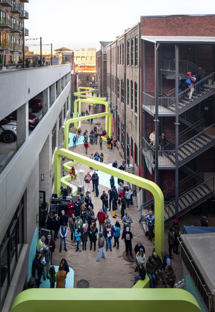
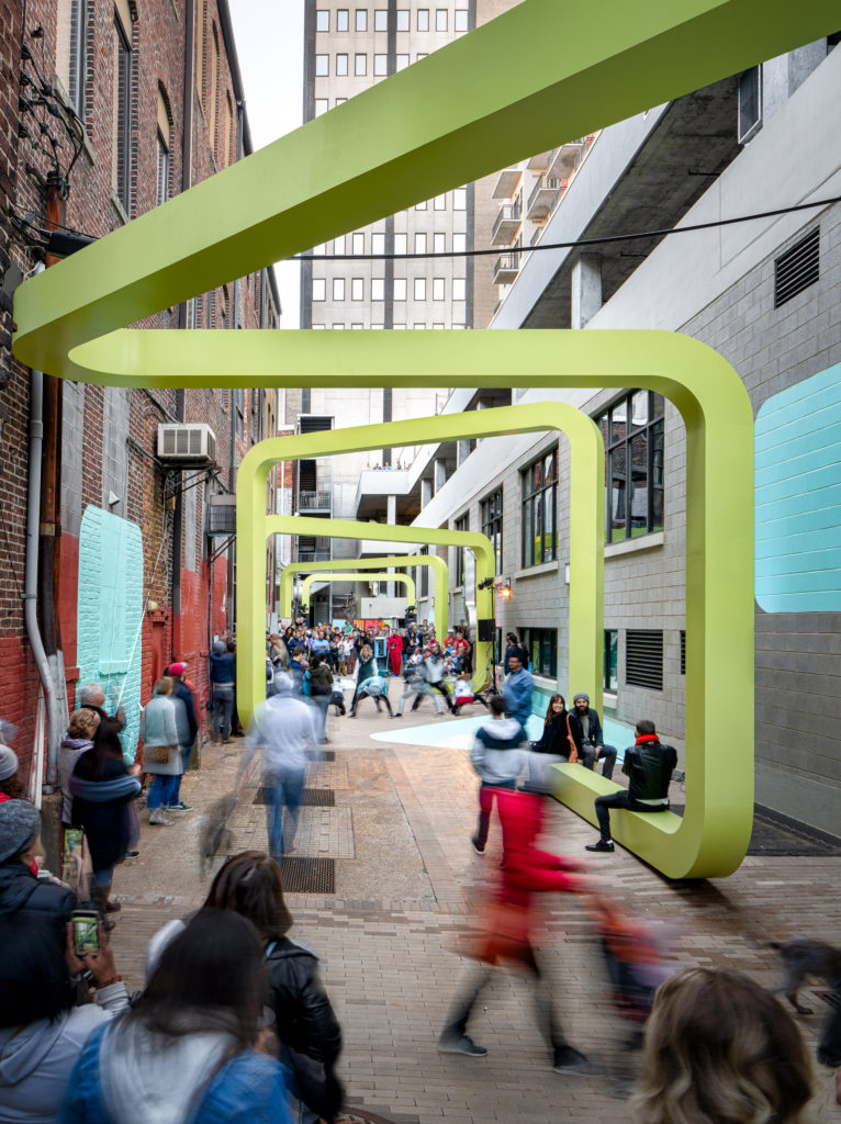
Winner of the Passageways 2.0 international design competition, City Thread transformed a formerly neglected 6,200-square-foot alley in downtown Chattanooga, Tennessee into an active, public space. The project was developed by River City Company, a non-profit economic development organization, and designed and built by SPORTS, a multidisciplinary architecture and design collaborative.
The project serves as a social connector where people can come together for both unique public events and informal gatherings. The corridor breaks from the surrounding urban fabric with a neon green, zig-zagging steel tube and painted graphic surfaces. These features also function to segment the space into a variety of smaller enclaves or “urban rooms”, which supports different types of activities. Furthermore, its design is intended to allow all users to discover varying ways of utilizing the space.
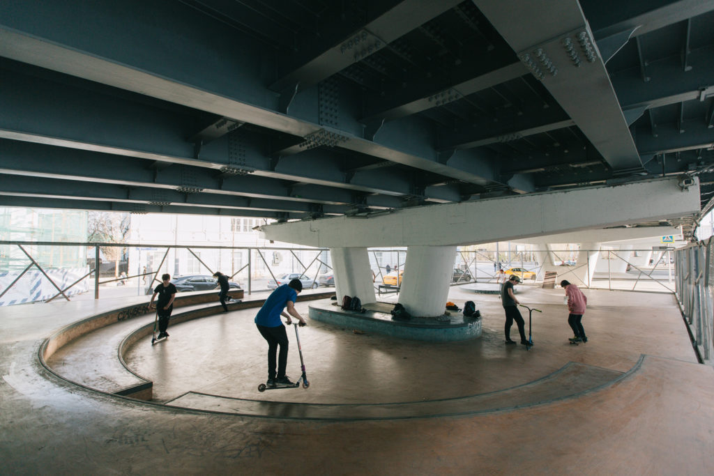
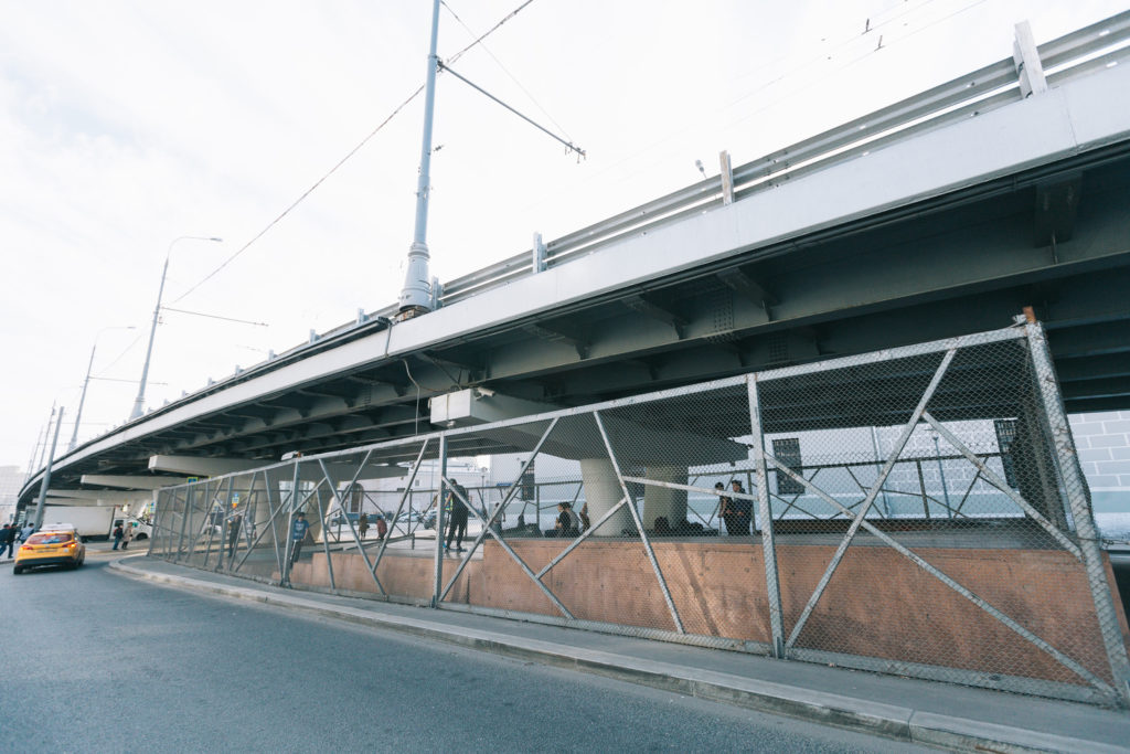
Skate park beneath an overpass; images courtesy of Strelka KB
A Skate-Spot Near the Krymsky Overpass by Snøhetta, Strelka KB and Strelka Architects, Moscow, Russia
This skate park, slotted beneath a skyway in central Moscow, is part of a reconstruction plan to revitalize a former abandoned and featureless parking lot. Due to the site’s proximity to a metro station and park, a skate park made for a fitting addition. It’s now a public space that boosts Moscow’s social life and serves as a new point of attraction for young people. To address the pre-existing, monotonous gray color, special colored concrete was added to the floor. The park can also be enjoyed all year long because the overpass protects it from precipitation and the sun.
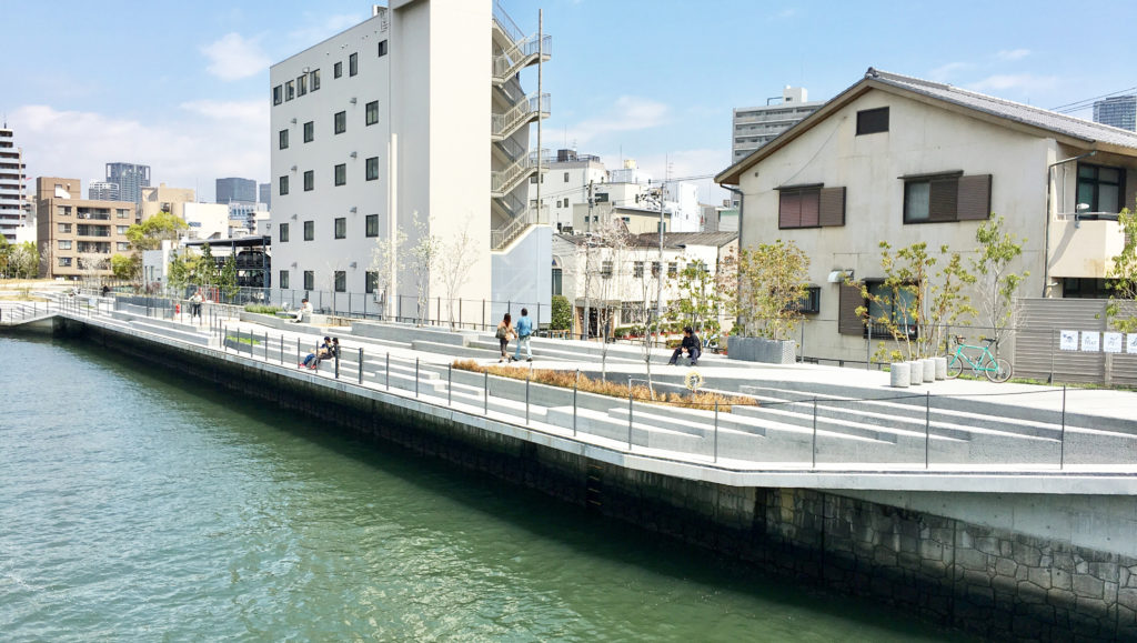
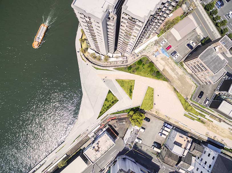
Tocotocodandan: Flood Defense as Waterfront Public Space by RYOKO IWASE, Osaka, Japan
Prone to natural disasters, Japan invests heavily in infrastructure and training to ensure the safety of its citizens. High flood defense walls, for example, protect cities like Osaka from the risk of flooding. However, they simultaneously disconnect citizens from their coastlines and waterfronts. Tocotocodandan remedies this by reimagining infrastructure as public space. It provides a public space and waterfront promenade that also functions as flood defense. It’s converted the hard, engineered infrastructure of the original flood defense wall into a terraced landscape with room for varied interpretation, inhabitation and appropriation. Greenery has also been integrated into the space, which softens the concrete structure and creates a more inviting atmosphere.
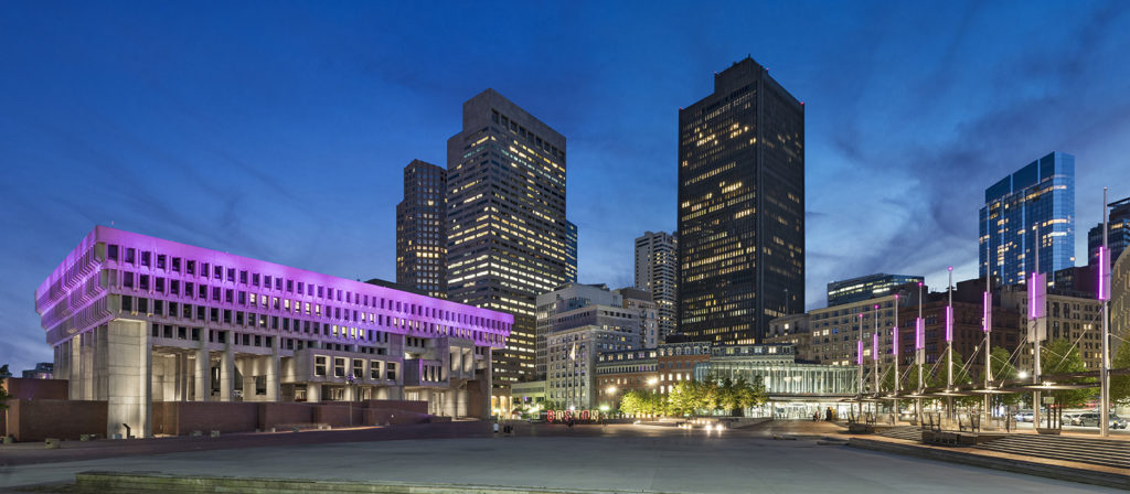
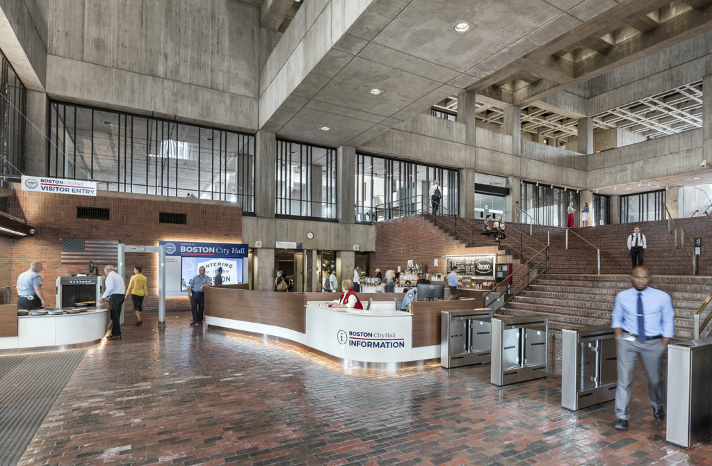
Boston City Hall, Location: Boston MA, Architect: Utile Design
Boston City Hall Public Spaces Renovation by Utile, Boston, MA
Referred to in the past as the “World’s Ugliest Building”, the A+Award-winning Boston City Hall Public Spaces Renovation drastically transformed the building’s public areas. Rather than alter the fundamental structure of the site, Utile simplified formerly complicated spaces. They redesigned the security sequence, improving navigation through new way finding, added comfortable seating for visitors, implemented LEDs to improve energy efficiency and celebrate the building’s brutalist architecture, and redesigned the permitting, licensing, and ticketing transaction windows. Through adapting it to changing programs and accentuating its significant features, Boston City Hall retains its original character.
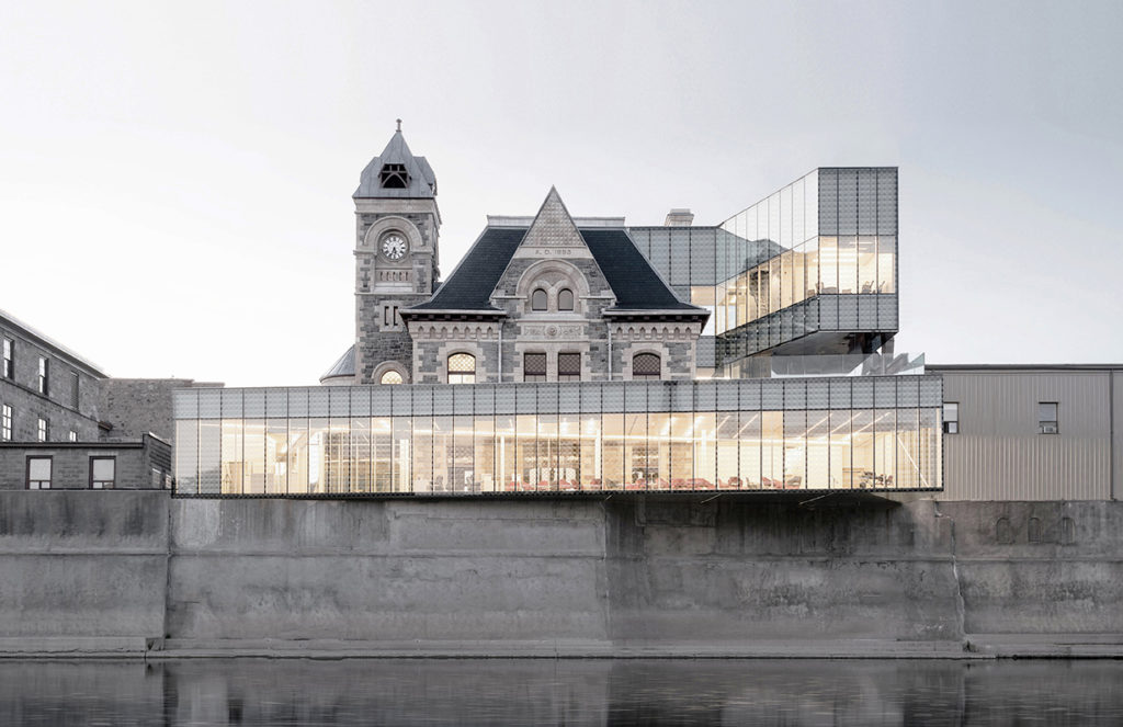
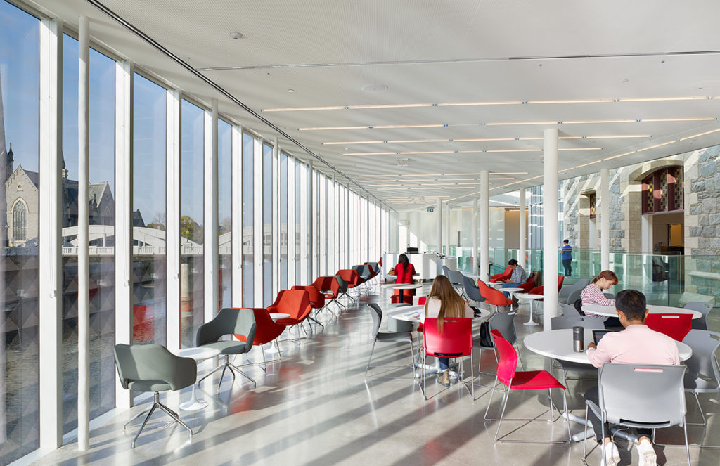
Idea Exchange Old Post Office by RDHA, Cambridge, Canada
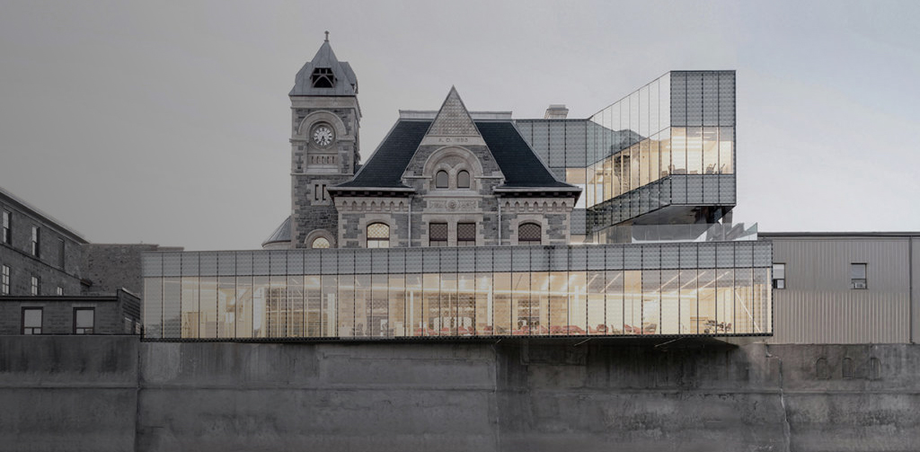
A finalist in the 2019 A+ Awards, the Idea Exchange Old Post Office is Canada’s first ‘bookless’ library, providing an array of spaces for public learning and creation. The original structure, a post office dating back to 1885, features a new 9,000-square-foot transparent pavilion that wraps around the original building and stretches over the water. The character of the historic building and the new, contemporary space are in constant dialogue as a result of this openness. RDHA has created a bastion of creativity for the surrounding community while simultaneously preserving the heritage of the site.
Architects: Showcase your next project through Architizer and sign up for our inspirational newsletter.
 boston city hall