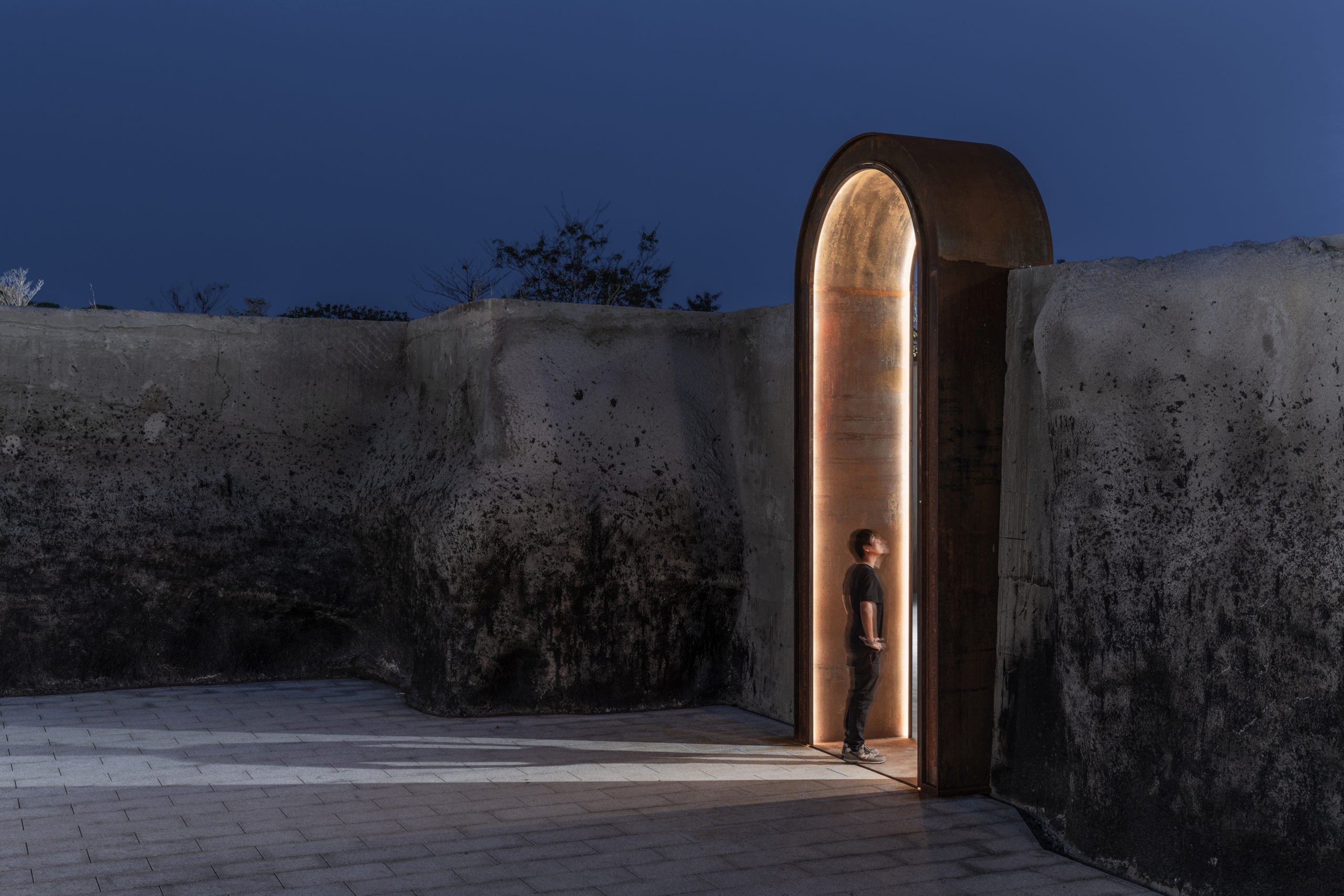
The jury is deliberating... stay tuned for the winners of Architizer's A+Product Awards! Register for the A+Product Awards Newsletter to receive future program updates.
“Concrete jungle” is widely used to describe modern cities and is most often associated with a hard, cold image where massive buildings block the sky. Yet, lightweight spatial installations have the potential to revitalize small corners of cities by making them pleasurable to spend time in. More and more architects are transforming circulation spaces from being parts of the city that people walk through into places that people walk to. This collection features urban space interventions that make generic urban fabrics interesting, creating public spaces of intimate scales.
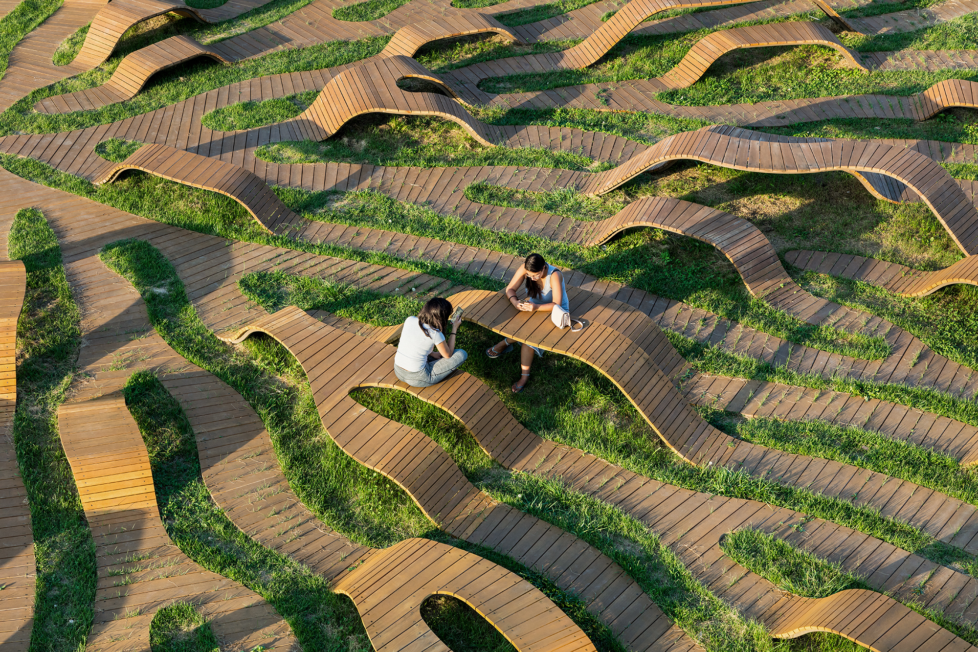
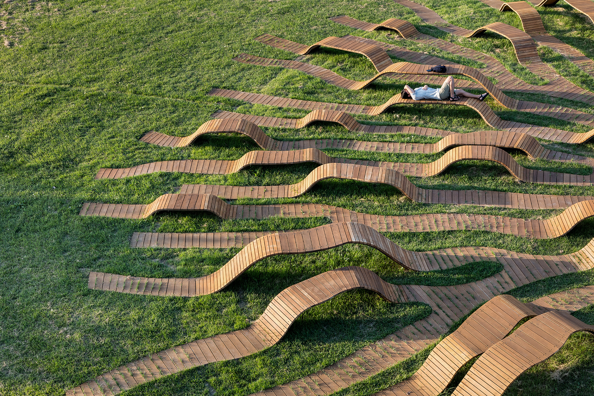
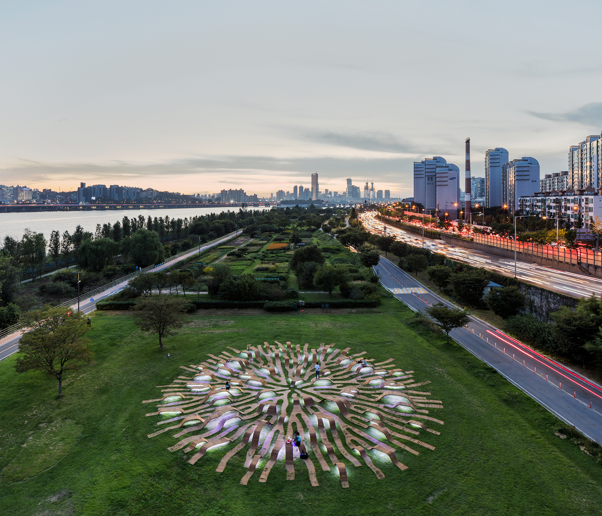 Root Bench, Seoul, South Korea by Yong Ju Lee Architecture
Located within an urban green space, Root Bench is a piece of public furniture with a diameter of 100 feet (30 meters). The art installation consists of undulating “roots” that form a root system. The roots are wooden decks fixed to metal frames, arching at various levels above ground. Both children and adults can freely utilize the benches of different heights as seats, tables and as a landscape to play with — or more. The project’s shape was generated using a computer algorithm, and it looks both organic and artificially patterned.
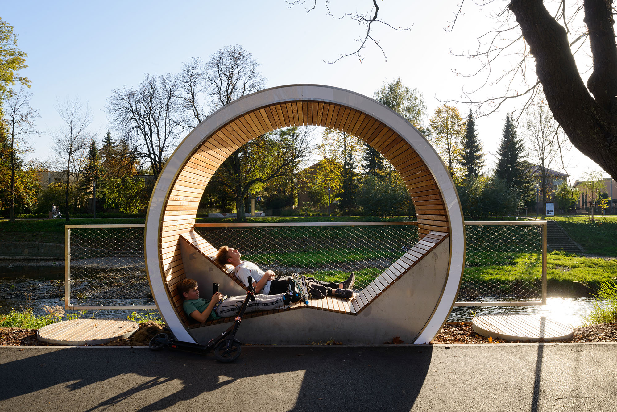
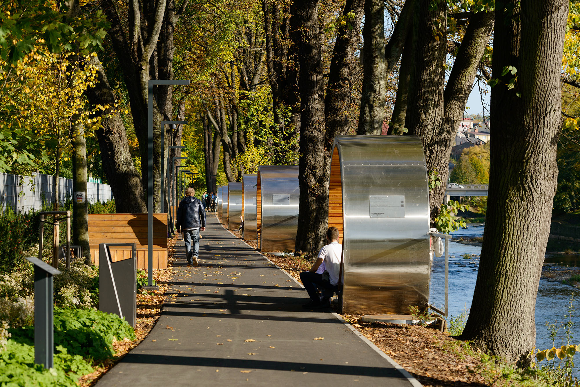 Open Air Museum Cieszyn / Český Tĕšín, Cieszyn, Poland by RS+ Robert Skitek
The project is situated on a strip of land immediately next to a river. A row of “rings” is placed between the pedestrians and the river. Each ring is a roofed space that accommodates at least two people. The ring structure allows both the people sitting in the rings and the pedestrians to enjoy a view of the city’s landscape. By not putting any partition or glazing between the seats and the pedestrians, the rings are completely open to any passerby.
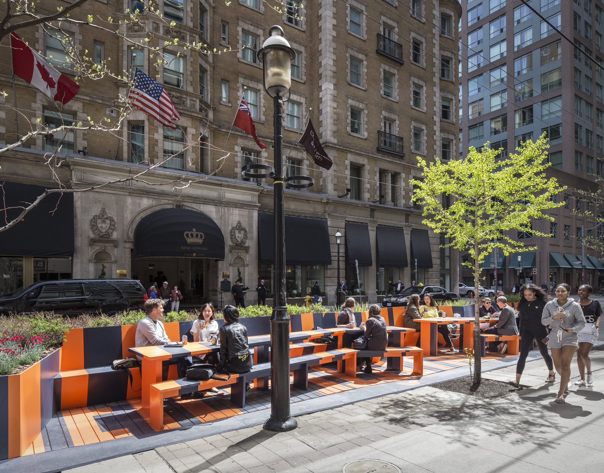
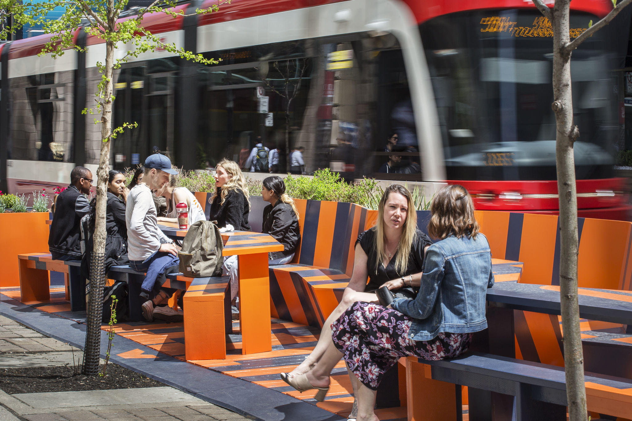 Face to Face | Tête à Tête, Toronto, Canada by PLANT Architect Inc.
The bright orange of this urban installation is very eye-catching within the historic contexts of central Toronto. It comprises benches facing either the road or the pedestrians and long tables between them, all placed along the road. The width of the tables varies, forming meandering edges and the benches zig-zag accordingly. Being completely open-air and visible from even across the road, this lightweight installation encourages conversations, whilst people sitting and walking are also visually interacting.
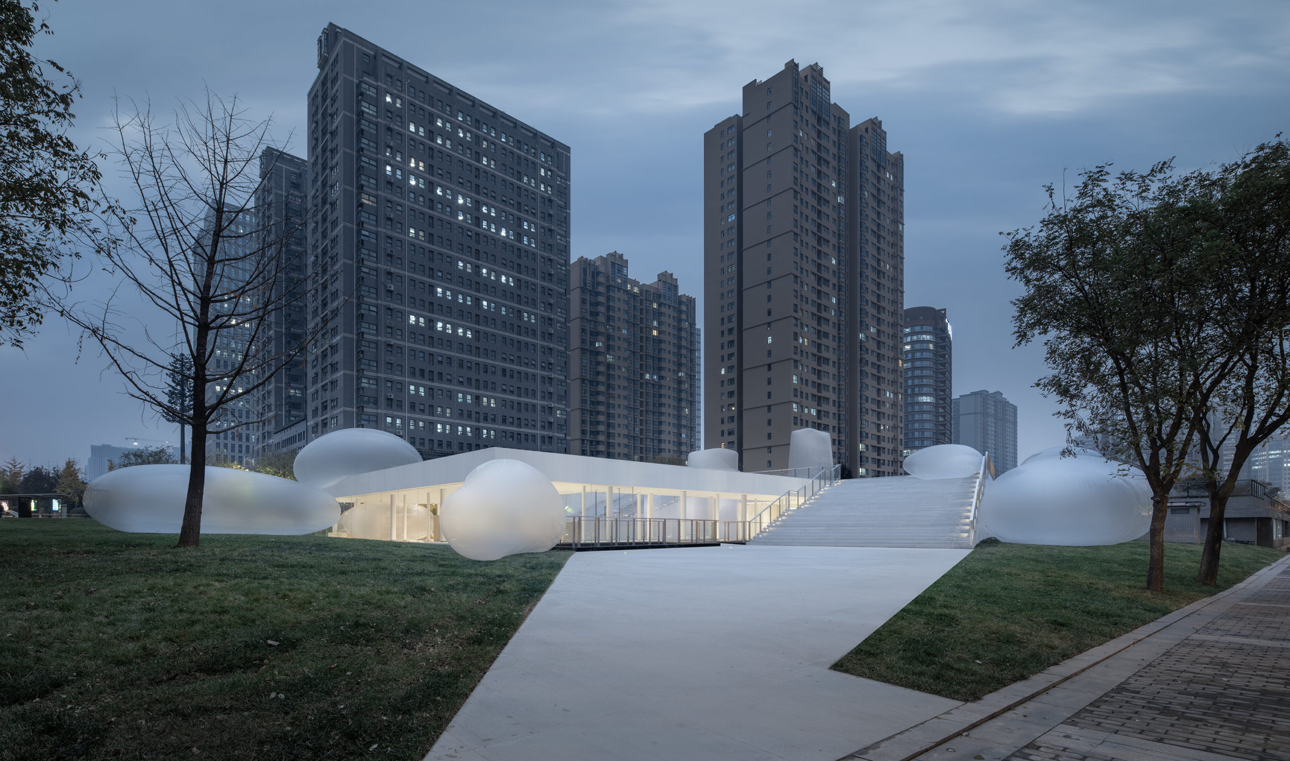
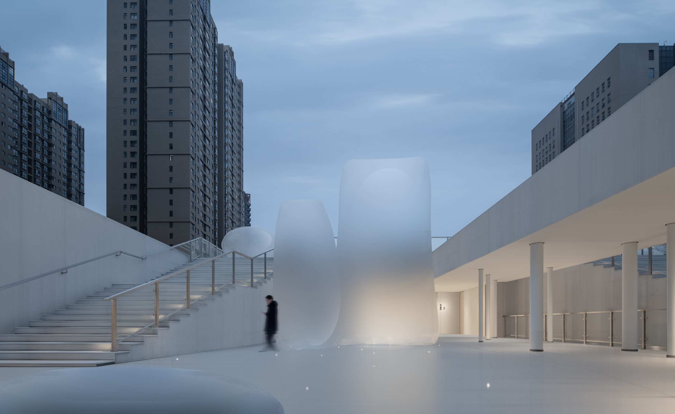 [Cheng Dong. A Coherent City] No. 12 public building, Xi’an, China by Sangu Design
The air-inflated volumes in the No. 12 public building project create a surreal atmosphere in the middle of a rather generic urban fabric. The 15 volumes are all of different shapes and are placed on the rooftop platform, inside and around the public building on the grass. These volumes are not functional, though not interactive either. They are not obstructing the circulation or blocking the sight, but rather making everyday scenes more visually interesting — and perhaps mentally stimulating — by blurring parts of them.
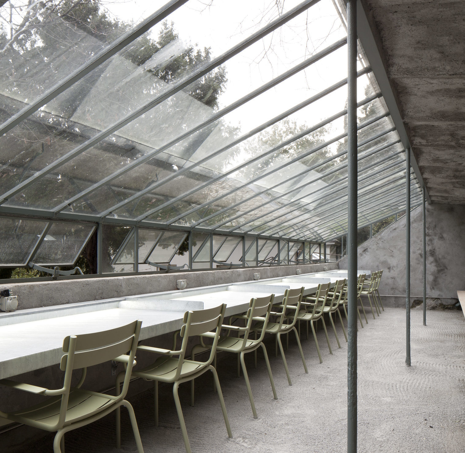
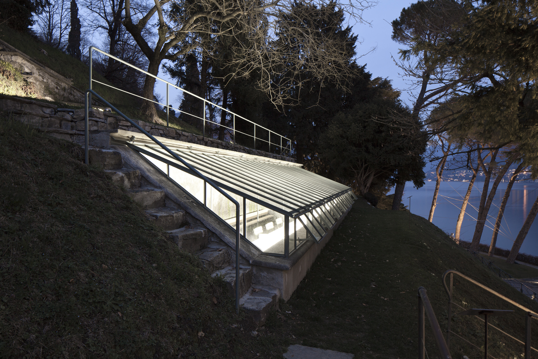 Serra piccola del Grumello, Como, Italy by Brambilla Orsoni Architetti Associati
The small reading room is renovated from an abandoned structure that faces a lake and the lakeside cityscape. The structure is half underground, with a fully glazed roof inviting natural light into the space. Seats, sockets, Wi-Fi connection and a beautiful view make it a nice place to work, study or relax. During the night, the structure is lit up from the inside, making it visible even from a distance. Immediately accessible from the walkway above it, the reading room is also available as a rest point for people using the park.
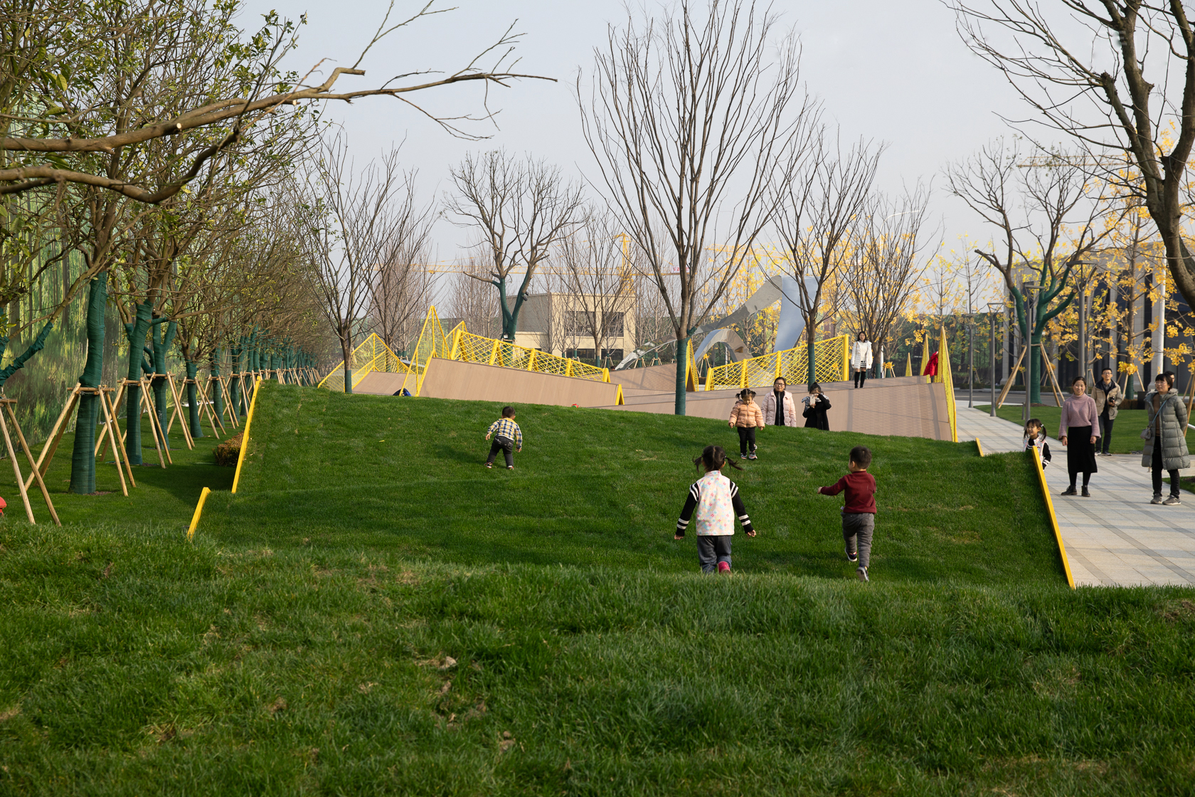
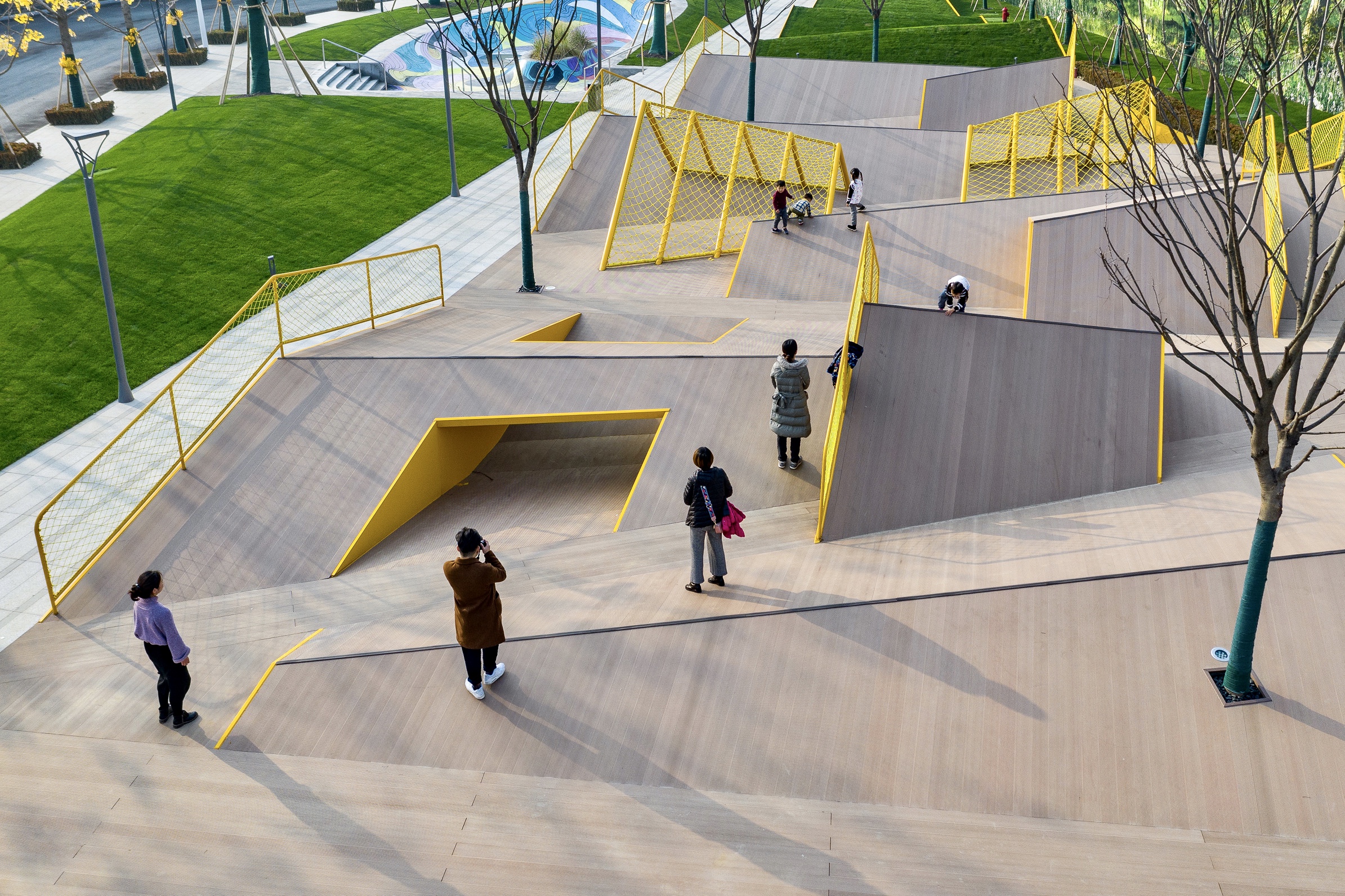 The Folds, Changzhou, China by Atelier Scale
The Folds employs simple forms to provide an outdoor playground for children to explore. The structure starts with folded lawns, blending into the rest of the urban green area. The folds are exaggerated later, forming artificial landscapes where children need to ascend the folds with their hands and feet or lower themselves to pass under the folds. Other than decked folds, structures made of steel frames and nets are installed as well, adding variety to the landscape. The simplicity of the forms welcomes children and parents to walk and sit on them.
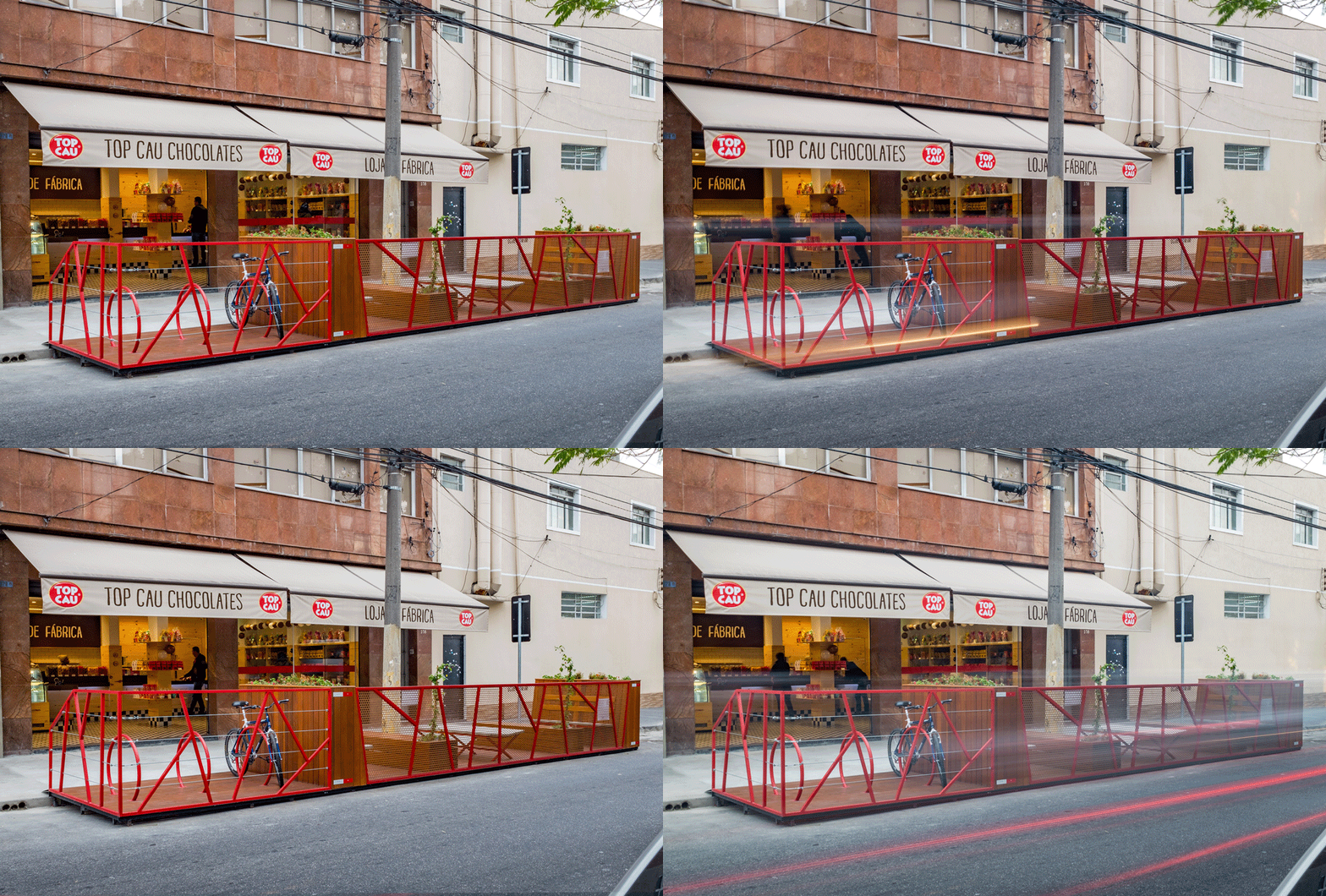
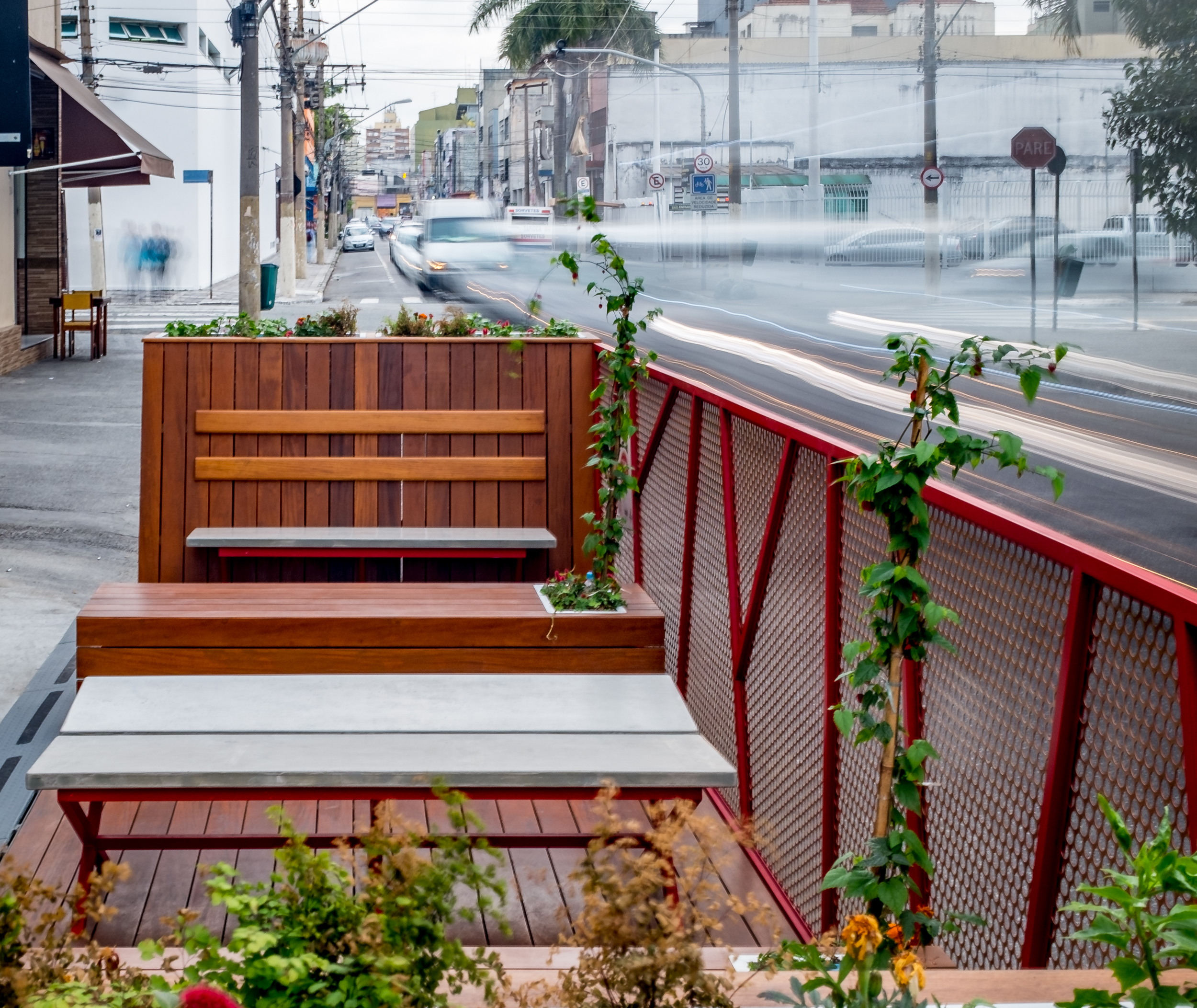 Cel. Emidio Piedade Parklet, São Paulo, Brazil by Estudio HAA!
The Parklet occupies two parking lots and turns them into parking lots for three bicycles as well as places for people to sit down. The sitting area is protected from the road by steel frames and meshes which also keep the road visible to the pedestrians. The city supports the installation of parklets with clear guidelines, ensuring that all parklets meet the safety regulations. Rather than blurring the boundary between the road and the walkway, the parklet is more like an extension of the walkway that reclaims the road for pedestrians.
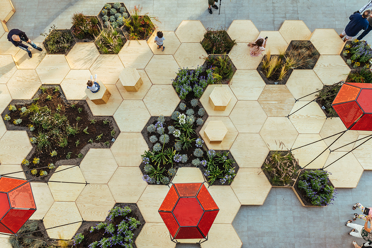
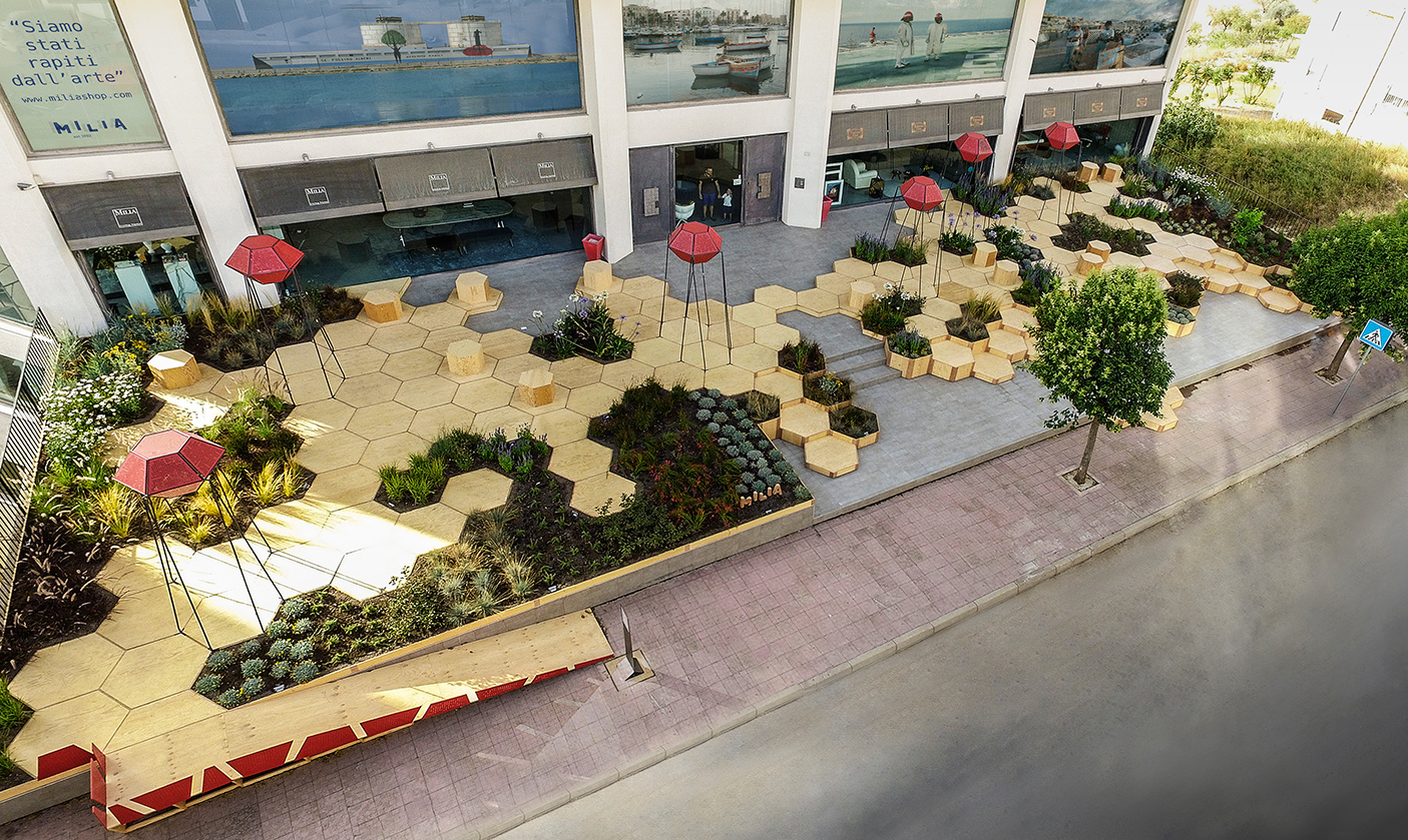 Zighizaghi, Favara, Italy by OFL Architecture
Zighizaghi features hexagon units that are either planted with vegetation or decked with plywood that people can walk or sit on. The hexagons turn this part of the city into a video game scene, making it relaxing and delightful that invites people to gather around. The red, three-dimensional objects standing on thin rods are speakers that play music to people. A normal urban surface is slightly elevated and made outstanding, attracting people while enriching the urban landscape.
The jury is deliberating... stay tuned for the winners of Architizer's A+Product Awards! Register for the A+Product Awards Newsletter to receive future program updates.
 [Cheng Dong. A Coherent City] No. 12 public building
  Cel. Emidio Piedade Parklet
  Face to Face | Tête à Tête
  Open Air Museum Cieszyn. Český Tĕšín.
  Root Bench
  Serra piccola del Grumello
  The Folds
  Zighizaghi