
Architects: Showcase your next project through Architizer and sign up for our inspirational newsletter.
A popular saying, widely but not definitively attributed to Elvis Costello, holds that “writing about music is like dancing about architecture.” In addition to skewering music critics — a perennial punching bag — this joke asserts the ultimate integrity of each individual art form. What is expressed in one medium, the logic goes, you cannot translate into another.
Album art presents an interesting challenge to Costello’s formalist maxim. While a sleeve design cannot really tell you what the music inside sounds like, it can become a part of the total work, bringing a visual component to the listening experience. In cases when architecture finds its way onto an album cover, these buildings also get bound up with the music. When this is pulled off effectively, music and architecture can speak to each other in intriguing ways.
As we put together this list, we did a good amount of dancing about architecture, or at least tapping our feet while considering the subtle, sometimes ingenious ways musicians have played with architectural iconography over the years. What follows are just 15 examples of memorable album covers featuring architecture. This is far from a complete list, so please share your own examples in the comments.
Spotify users: click here to listen to the full playlist!

Via Facebook
Stars: The North (2012)
Regular readers of Architizer know how much we love Moshe Safdie’s Habitat 67 housing complex. When it was unveiled at Expo 67 in Montreal, Safdie’s arrangement of 354 identical prefabricated concrete housing units presented a challenging and original vision for the future of urban living. In one way, Habitat 67 represents an attempt to use principles of musical composition in architectural design. Like a great musician, Safdie creates a sense of liveliness and vitality within a framework built on repetition.
The photograph of Habitat 67 the indie pop band Stars selected for the cover of their 2012 album “The North” is washed out and saturated to create a nostalgic, technicolor effect, which differs in important ways from how the raw concrete of Safdie’s building appears in person. The aerial point of view highlights umbrellas and other indications of domestic life on the roof terraces, making the cover more of a mise-en-scènethan an architectural portrait. Overall, the sunny utopianism of this album cover perfectly matches the wistful pop music inside. A bit saccharine, perhaps, but it hits the spot on a bright summer day.
Via Wikipedia
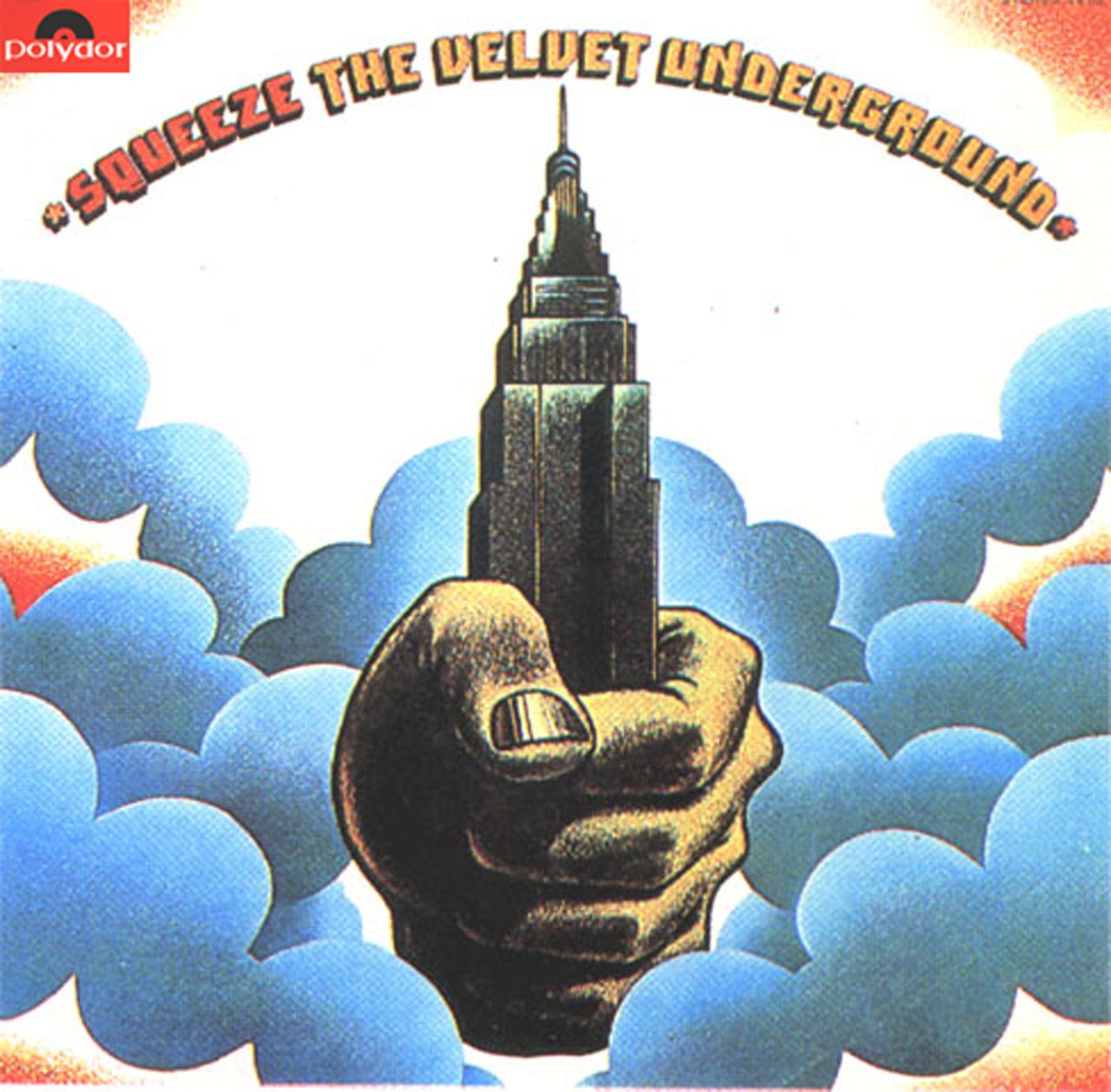
The Velvet Underground: Squeeze (1973)
“Squeeze” is a footnote in the annals of music history. Although it was released under the legendary imprimatur of the Velvet Underground, it only features one member of the actual group: Doug Yule, a multi-instrumentalist who didn’t join the group until after the release of their second album. The resulting work, “Squeeze,” found little commercial or critical success. Unlike the canonical Velvet Underground albums, this one is largely free of conflict, irony or venom, as if someone had squeezed the life out of the band.
One high point of “Squeeze” is the album cover. The illustration is similar, stylistically, to the cover of the Velvets’ 1970 album, “Loaded,” which depicted pink smoke emanating from a New York City subway stairwell. Symbolically, though, the imagery could not be any more different. No longer an emanation from “underground,” “Squeeze” announces itself as a beacon from the heavens, grabbing New York City by the neck, i.e., the Empire State Building. The hand pictured could belong to Yule, as if, against all odds, he has taken hold of the band — and he isn’t letting go.

Via Architizer
In 2011, the Canadian band Azari & III riffed on the imagery of “Squeeze” for their self-titled debut album. The giant disembodied hand in their illustration grasps the Burj Khalifa, an icon of power and prosperity in the era of globalization. Referencing “Squeeze” in a debut was an interesting choice on the part of Azari & III, given the album’s ambivalent reputation. Good design, however, is good design, and this album cover is every bit as striking as its predecessor. There is something eerie about the manicured hand in this image: Its loose grip somehow seems more menacing than the squeezed fist on the Velvets’ cover.

Via Wikipedia
Meat Loaf: Bat Out of Hell II: Back Into Hell (1993)
To love Meat Loaf — the food or the recording artist — is to embrace maximalism. Guitars scream, pianos whirl and Meat Loaf howls throughout his sixth album, “Bat Out of Hell II: Back Into Hell,” which consists almost entirely of neo-Wagnerian ballads that reach for all the highs of popular music while stubbornly refusing any of the lows. Like a well-salted homemade foodstuff, the album leaves listeners feeling exhausted, oddly greasy and craving a glass of water. It’s much more American than apple pie; it’s as American as Oreos.
The cover image, created by the sci-fi/fantasy illustrator Michael Whelan, features a gigantic bat perched atop the Chrysler Building holding an innocent Valkyrie hostage. Luckily, the monster is about to meet his match in the form of a flaxen-haired hero who rides a flying motorcycle and clutches a ball of light. Like the album itself, the charm of this image lies in its emancipatory shirking of restraint. There is some kinship between Meat Loaf’s aesthetic and that of the Chrysler Building, that jewel of the Manhattan skyline that embraces decoration for its own sake. In architecture, like life, we often look for balance, restraint and utility. Other times, however, it’s best to “just pray to the Gods of Sex and Drums and Rock and Roll,” as Meat Loaf understands so well.

Via Wikipedia
Drake: Views (2016)
Canada loves Drake, even more than the rest of the world. It was not surprising, then, that the melancholic rapper featured the CN Tower, a fellow Toronto icon, on the cover of his fourth studio album, “Views.” In this image, Drake can be seen sitting atop the CN Tower, legs dangling perilously off the edge. The clouds, like Drake’s troubled thoughts, are dark and gray, and like the lukewarm reviews that would follow the album’s release, they loom closely behind him. Indeed, many of the album’s lyrics seem to anticipate the rapper’s imminent fall from critical grace. In the single “Hotline Bling,” Drake grasps nostalgically, even pathetically, at a memory of adoration lost, haranguing a woman who “used to call [him] on [her] cell phone.”
If you listen closely, it becomes apparent that what Drake is really getting at with this record is an understanding that change, even banal change, is painful for human beings. The cover’s juxtaposition of his own tiny, fragile corpus with the mighty tower that supports it is an expression of human impermanence, a feeling that is familiar to anyone who spends time contemplating iconic architecture.

Via Wikipedia
Unknown Mortal Orchestra: Unknown Mortal Orchestra (2011)
The Petrova Gora Monument, which appears on the cover of Unknown Mortal Orchestra’s debut album, commemorates 300 Serbs who died resisting the Axis-aligned Ustaše militia during World War II. It stands at the highest peak of Petrova Gora, a mountain range in present-day Croatia. The monument, which was designed by Vojin Bakić and completed in 1981, now stands in a state of disrepair. The museum inside is no longer operational, and many of the planks that make up the stainless steel façade have been stolen. Nevertheless, there is a kind of quiet, albeit awkward dignity to this futuristic Soviet-era structure that no amount of vandalism can strip away. Standing alone in the countryside, the monument does not immediately announce its purpose, lending it an otherworldly air.
The alien quality of the structure is what recommended it to Unknown Mortal Orchestra, an American and New Zealand psychedelic rock band that likes to cultivate a sense of mystery itself. “I liked the idea of this mysterious building that you don’t know what it is or where it is, but it’s from the past, built for the future, and is now in disrepair,” explained band member Ruban Nielson. “It seemed to match the music, so we used an image of that that looked like a tourist photo.”

Via Wikipedia
Modest Mouse: The Lonesome Crowded West (1997)
Modest Mouse are America’s answer to Radiohead: a witty, observant, sometimes paranoid group who chronicle the emptiness and dissatisfaction people face in our highly commodified, media-saturated societies. “The Lonesome Crowded West,” the band’s second full length, is darker and in some ways less polished than the better-selling albums that would follow, but in this reporter’s humble view, it is by far their greatest achievement. More than any other artwork I know of, this album captures the sense of openness one finds on long drives through rural America, a feeling that is paradoxically both exhilarating and crushing.
The photographs on the album sleeve, fittingly, are taken from the low vantage point of a car window. The buildings captured in these images are the towers of the Westin Seattle: cylindrical, international style affairs erected in 1969. Posed against a purple evening sky and nestled within a black frame, these towers take on an effect of impossible distance on the album cover. We relate to them in the same way a truck driver relates to the many cities he passes through before arriving at his destination.

Via Wikipedia
Nas: Illmatic (1994)
One of the most iconic album covers of all time, the sleeve for Nas’s “Illmatic” features a semi-transparent childhood portrait of the rapper superimposed over an image of a New York City block. The child and the social environment that formed him are thus depicted as totally entwined, a fact with important resonance given the harrowing vision of urban life Nas presents in his songs.
For the album cover, Nas was very deliberate in choosing a photo of himself at age seven. “That was the year I started to acknowledge everything [around me],” he explained in a 1994 interview. “That’s the year everything set off. That’s the year I started seeing the future for myself and doing what was right. The ghetto makes you think. The world is ours. I used to think I couldn’t leave my projects. I used to think if I left, if anything happened to me, I thought it would be no justice or I would be just a dead slave or something. The projects used to be my world until I educated myself to see there’s more out there.”
Since its release, this album cover concept has been subject to numerous parodies and appropriations. None of this, however, has blunted the power of the original. Like any iconic image, this one has seeped into the very fabric of our culture.

Via Wikipedia
Mazzy Star: She Hangs Brightly (1990)
In addition to having one of the most memorable architectural album covers of all time, Mazzy Star’s debut album, “She Hangs Brightly,” is distinguished by being one of the best albums ever recorded. The first two tracks, “Halah” and “Blue Flower” rank with the most poignant, perfectly balanced love songs in history, mixing the incomparable, languid vocals of Hope Sandoval with the psychedelic guitar work of Dave Roback. Even Kurt Cobain listed this as one of his top 50 albums of all time.
The album cover is almost as elegant as the music inside, featuring a photograph of the interior of the Art Nouveau Hotel Tassel in Brussels. There is something about the 1990s that seems to gel with Art Nouveau aesthetics. Perhaps it was our own Belle Époque. Seriously, though, if you have not heard this album yet, please head to your nearest Spotify immediately to rectify that situation. Better yet, do what I did and purchase it on 180 gram vinyl. You will not be disappointed, but you might cry. A lot.

Via Facebook
Yes: Going for the One (1977)
The Century Plaza Towers in Los Angeles were designed by Minoru Yamasaki, the architect best known for designing the Twin Towers of the World Trade Center in New York. Like the Twin Towers, the Century Plaza Towers follow Yamasaki’s “New Formalist” principles and are thus marked by strict symmetry and an understated, classical sense of grandeur. Unlike the Twin Towers, these buildings have a unique, triangular footprint, a fact that can be somewhat unsettling to visitors accustomed to rectangular buildings.
The slightly jarring, angular effect of these buildings is exaggerated in the cubist rendition of the towers featured on the cover of Yes’s eighth studio album, “Going for the One.” The nude man in the foreground of this image is facing an impossible scene, a mess of jutting, intersecting planes that feels like something out of Rem Koolhaas’s “Delirious New York.” The image almost seems to echo Yes’s songwriting method, which some critics at the time compared to a “kitchen sink” in which multiple elements were thrown together haphazardly, without being successfully integrated. Perhaps Yes intended this cover to be a commentary on this criticism of the band. In any case, the image is appealing in itself, a winning composition of blue, orange and white that even Yamasaki could appreciate.
Via Wikipedia
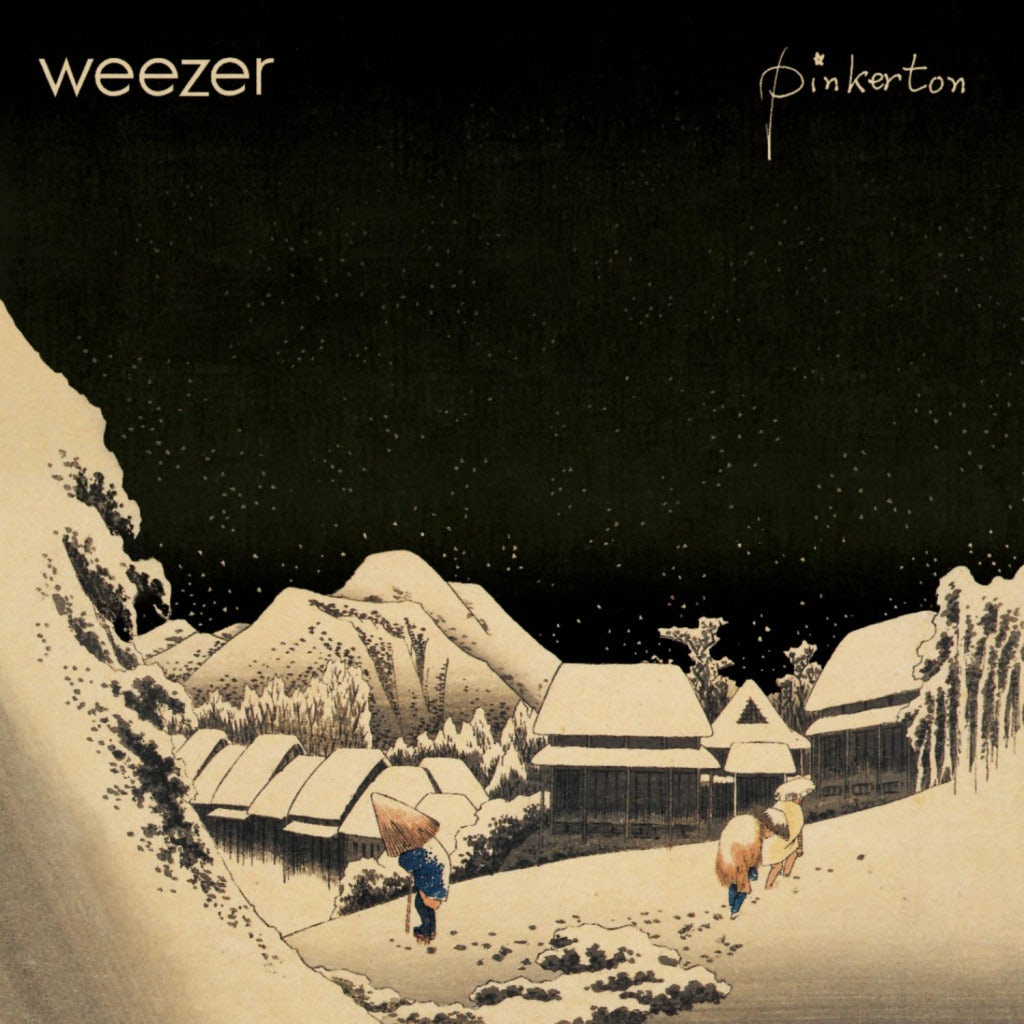
Weezer: Pinkerton (1996)
Westerners tend to see Japan through a romanticized lens, a tradition that stretches from Puccini’s 1904 opera “Madame Butterfly” to the most recent season of HBO’s “Girls,” in which Shoshana, a character played by Zosia Mamet working abroad in Japan, mentions to a friend that she loves the country so much she sometimes worries that she “made it up.” Weezer picked up this theme in their 1996 album “Pinkerton,” a loose concept album based on “Madame Butterfly” that focuses on the way idealism leads to despair. In songs like “Why Bother?” and “Pink Triangle,” singer Rivers Cuomo confronts the fact that he finds himself heartbroken every time he gets his hopes up.
Laced throughout this album, dark by Weezer’s standards, is an idea of Japan as the home of innocence, imagination and idealized, inaccessible fangirls. The album cover features a 19th-century woodblock illustration by Hiroshige called “Night Snow at Kambara.” The traditional Japanese houses in the background, roofs blanketed by snow, present a picturesque image of a Japanese village. The contrast between the serenity of this image and the noisy opening to the album’s first track, “Tired of Sex,” echoes the gulf between fantasy and reality that the album explores so memorably.
For a critical take on the Western tendency to romanticize Asian cultures, check out Edward Said’s landmark 1978 book “Orientalism,” in which he explores how these types of attitudes are connected to the legacy of colonialism.

Via Wikipedia
The Magnetic Fields: The House of Tomorrow (1992)
This is the only entry on the list with a title better suited to an architecture exhibit than an album. An EP, this record clocks in at only 12:21 but contains some of the Magnetic Fields’ best songs, including “Love Goes Home to Paris in the Spring.” Both the title of this EP and its cover art — a colorized photograph of the 1904 St. Louis World’s Fair — reference the utopianism of the early 20th century, a time when the future was contemplated with hope rather than dread and an architectural exhibition could keep the press busy for weeks.
The subtitle of the EP is “five loop songs,” pointing to the fact that each of the tracks consists of a single, repeated loop. Like a designer of modular homes, songwriter and multi-instrumentalist Stephin Merritt is keen to show off how much he can do with absolutely minimal component parts. The utopianism in the title stands in ironic contrast to the sardonic, frankly depressed content of the songs. Sample lyric: “Every time you feel wonderful, baby, I feel bad / Either I don’t love you or you don’t love me, oh yeah.”

Via Wikipedia
Sufjan Stevens: Illinois (2005)
The second entry in Sufjan Stevens’ quixotic, possibly ironic “50 states” series, in which Stevens promised to create a concept album for each united state, “Illinois” is one of the most ambitious works of the aughts. In nearly every song, Stevens walks a razor-thin line between whimsy and heartbreak, nestling devastating songs like “Casimir Pulaski Day” and “John Wayne Gacy” within an overall conceptual framework that involves children’s choirs and song titles like “They Are Night Zombies!! They Are Neighbors!! They Have Come Back From the Dead!! Ahhh!” During the tour for the album, Stevens would wear a boy scout uniform and butterfly wings onstage. Stevens’ ambition to fuse an appreciation for kitsch Americana with a respectful interest in the lives of ordinary Americans is something few others would have thought of and even fewer could have pulled off with any sort of success.
The cover art for this album matches its sensibility perfectly. A crowded, mural-like portrait featuring the Chicago skyline, UFOs, Al Capone and a goat, this image reflects an image of Illinois as a land suffused with folklore. One of the strongest aspects of the illustration is the irregular, felt-tip rendition of Chicago’s skyscrapers. Rendering these awesome towers in an amateurish hand makes them appear folksy and familiar, reminding us that these buildings form the backdrop of Chicagoans’ lives. “I was in love with the place,” Sufjan sings of America’s first city of architecture, “in my mind.”
Fun fact: The original album sleeve featured an image of Superman. This was removed in subsequent printings after Stevens’ label, Asthmatic Kitty, became aware that using Superman’s image in this way constituted copyright infringement.

Via Wikipedia
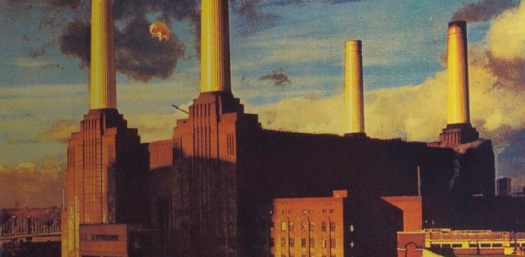
Pink Floyd: Animals (1977)
Loosely based on George Orwell’s classic novella Animal Farm, Pink Floyd’s “Animals” depicts class society as various types of animals: sheep, dogs, pigs and “Pigs on the Wing.” At turns dreamy and depressing, “Animals” is the product of a band with nothing left to prove, who are able to put aside distractions and focus on crafting a work that perfectly matches their vision. The photograph on the cover features the Battersea Power Station in West London. Something about the composition makes it look impossibly enormous, an impenetrable fortress of industrialism reminiscent of the Ministry buildings in Michael Radford’s film adaptation of “1984.” The icy structure is offset a bit by the whimsical image of a flying pig.
Fun fact: The original plan for the album art included a giant, pig-shaped helium balloon. The idea was to take a photograph of the power station with the pig floating in front of it. Unfortunately, on the day of shooting, the helium balloon escaped. The pig flew through Heathrow airspace, forcing the cancellation of flights and eventually landed in a nearby farm, ironically frightening a flock of sheep. Because the balloon plan failed, the image of the pig that appears on the album sleeve was simply superimposed on a photo of the factory.

Via Pitchfork
Baio: The Names (2015)
Baio is the stage name of Chris Baio, the bassist of Vampire Weekend, a band comprised of Columbia University alumni that stormed into the public consciousness in 2007 with a set of catchy, Afrobeat-inflected songs about Cape Cod and Oxford commas. Baio’s debut solo album, “The Names,” takes its title from a Don DeLillo novel, following in the proud Vampire Weekend tradition of having good taste. Baio’s sophistication is seen most markedly in the sleeve for “The Names,” which features a photograph by Matthias Heinrich of a building in Hamburg.
“I came across him on design blog about five years ago,” Baio said of Heinrich in an interview with The Spaces. “To return to that idea of estrangement, Matthias takes pictures in Berlin and Hamburg — where the one I used for the album artwork was shot — and my experiences of those cities have always been extremely grey, so to see insanely colorful photos taken there fascinated me.”
As the interview continued, Baio came around to the subject of the font featured on the sleeve. “[This] is from the opening sequence of the Ingmar Bergman film, ‘Persona,’”he explains. “It’s probably my favorite five minutes of any movie ever.” Design fans should be happy to learn that Chris Baio is one of their own. It doesn’t hurt that the songs on this tastefully appointed debut are as infectious as the album art. “Sister of Pearl” was stuck in my head for a good week when it was released last summer.

Via Wikipedia
Wilco: Yankee Hotel Foxtrot (2002)
The story of Wilco’s fourth album, “Yankee Hotel Foxtrot,” is told time and again. Completed in early 2001, Wilco’s label, Reprise Records of Warner Music Group, originally refused to release it, believing the art rock production was too experimental to appeal to a mainstream audience. In response, Wilco pulled out of their contract and decided to stream the album on their website for free, a pioneering move in these early days of file sharing. Eventually, Wilco was able to arrange for the official release of their album through Nonesuch Records, a different Warner imprint, in April 2002.
Streaming of “Yankee Hotel Foxtrot” began on September 18, 2001, just one week after the attacks of September 11, which happened to have been the original scheduled release date of the album. Fans immediately made connections between the album’s artwork — which features the two towers of Marina City in Wilco’s hometown of Chicago — and the Twin Towers of the World Trade Center. Furthermore, lyrics such as “Tall buildings shake / Voices escape” and song titles like “War on War” reminded listeners of the attacks. While coincidental, these connections were all felt as poignant to listeners, who interpreted the album as a meditation on life in uncertain times.
The album’s sparse production — which features a generous amount of radio static — and abstract lyrics all contribute a mood of vulnerability almost anyone can relate to. In this context, the elegant towers on the cover take on a more intimate meaning. Like us, they look lost, framed only by a blank insensate sky. “Oh distance has no way,” Jeff Tweedy sings, “of making love understandable.”
Architects: Showcase your next project through Architizer and sign up for our inspirational newsletter.